The contribution graph is the calendar heatmap every other product copied, and its five-step bucketing is the deliberate trade that made it legible.
Admin and devtools · DevOps and CIDevOps and CI
Build health, deploy frequency and how long the pipeline takes. Owned and read by the same team.
Products 2
Deploy state, build logs and edge metrics in one console, with a log tail that has to stay readable while it moves.
DevOps and CI · Admin and devtoolsPatterns seen in this domain 4
Captures
Newest first within each product.
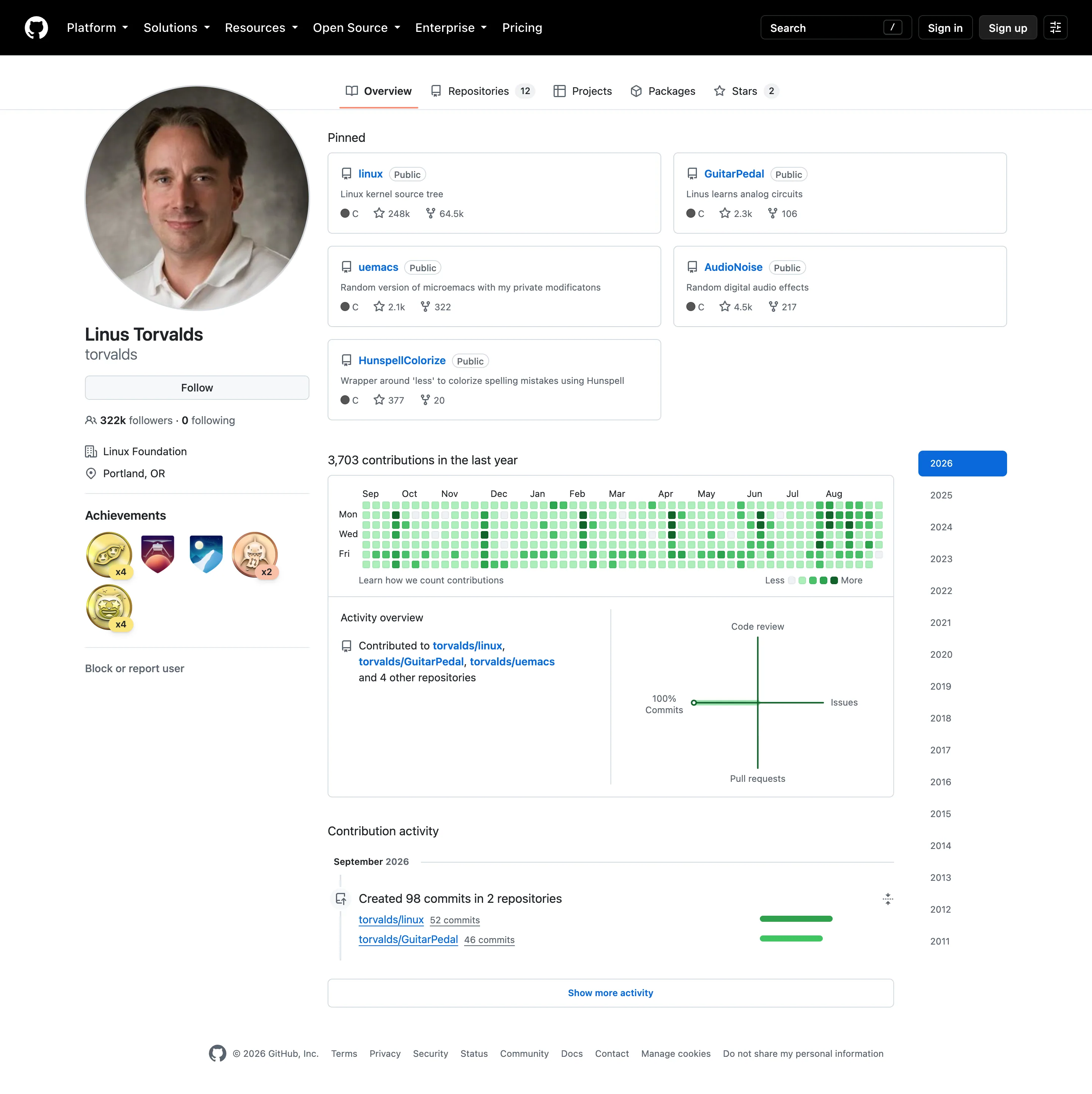
Time-range picker. Sixteen years as a list. No arbitrary range, no relative window—the only unit on offer is a calendar year. Calendar heatmap. Fifty-three columns of weeks, seven rows of weekdays, and only Mon, Wed and Fri labelled to save the space. KPI tile. The total sits above the grid, so the cells have a denominator. Most calendar heatmaps omit this. Sequential and diverging scales. Five discrete steps rather than a continuous ramp, which is why ten commits and thirty share a colour.
- Calendar heatmap Fifty-three columns of weeks, seven rows of weekdays, and only Mon, Wed and Fri labelled to save the space.
- KPI tile The total sits above the grid, so the cells have a denominator. Most calendar heatmaps omit this.
- Sequential and diverging scales Five discrete steps rather than a continuous ramp, which is why ten commits and thirty share a colour.
- Time-range picker Sixteen years as a list. No arbitrary range, no relative window—the only unit on offer is a calendar year.