Problem
A year of daily numbers is 365 points. As a line it is a hairy band where weekends and weekdays average together. The viewer wants to see that Tuesdays are busy, that August was quiet, and that one week in March went strange.
Solution
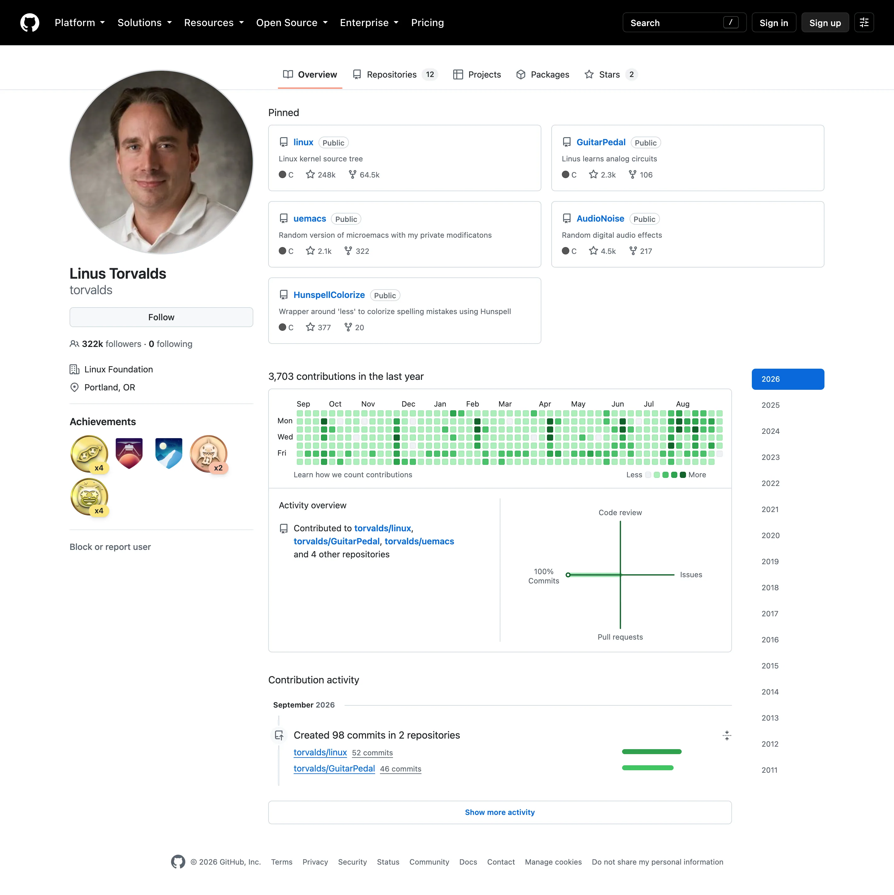
One cell per day, laid out as a calendar. Weeks as columns, days of the week as rows, colour for magnitude. A year fits in a strip a few centimetres tall and the eye picks out both the weekly rhythm and the seasonal one without being told to look.
The layout is the encoding. Because every row is the same weekday, a weekend effect appears as two consistently pale rows across the whole chart, which no line chart shows without being asked. Because columns are consecutive weeks, a quiet fortnight is a pale vertical gap. Both readings come free from the arrangement.
GitHub’s contribution graph is what made the pattern universally legible, and it also shows the pattern’s main weakness. Its cells are bucketed into a handful of intensity levels rather than mapped continuously, so a day with 4 commits and a day with 40 can look similar. That is a deliberate trade: coarse buckets make the rhythm readable and make individual days approximate. It works for that use and fails for any question about magnitude.
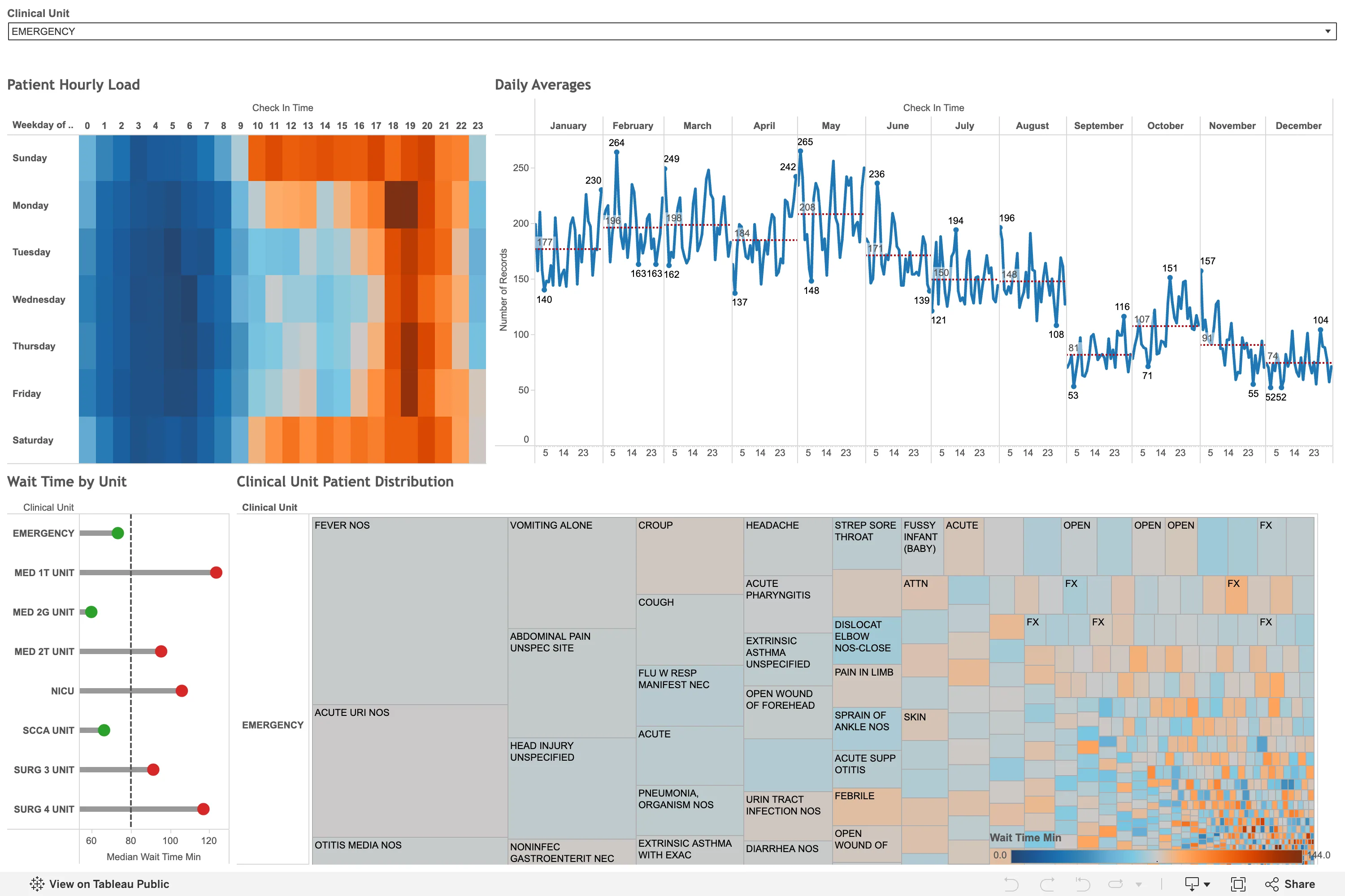
The variant worth knowing is the punch card: hour of day against day of week, cells sized or coloured by volume. Same idea, different cycle, and usually a better answer for anything with a daily shape rather than a weekly one.
Use when
The data has a genuine calendar rhythm, the period is long enough that a line chart becomes dense, and the question is about pattern rather than value. Deploys, incidents, sales, activity, on-call load.
Don’t use when
Exact values matter, or the period is short. A month of data in this layout is four columns and a line chart says more. Also poor for anything without a weekly cycle, where the row structure encodes nothing and only adds work.
Trade-offs
Colour carries all the magnitude, so the scale choice determines what is visible and a poorly chosen ramp can flatten a real seasonal change into uniformity. Outliers dominate: one enormous day pushes everything else to the bottom of the scale unless the range is clamped. The grid is small, so it fails at wallboard distance and on phones. And the pattern is strongly associated with GitHub, which means viewers arrive expecting “activity” semantics and read a gap as someone not working rather than as a metric being low.
Checklist
- Does this data actually have a weekly or seasonal cycle worth showing?
- Is the colour scale continuous or bucketed, and does that suit the question?
- Is the range clamped so one outlier does not flatten the rest?
- Is the scale legend present, with real values on it?
- Does a zero-value day look different from a day with no data?
- Are weekends or non-working days distinguished where that matters?
- Which day does the week start on, and does it match the audience’s convention?
- Is there a hover giving the date and the exact value?
- Does the grid stay legible at the size it renders at?
- Would viewers import GitHub’s “activity” reading and misinterpret a pale cell?
Compare
GitHub’s contribution graph is the reference implementation and the reason the pattern needs no explaining, using coarse intensity buckets that make the rhythm legible while making individual days deliberately approximate. Grafana has no calendar-layout panel in core, so teams reach for community plugins or reshape data into the standard heatmap, losing the calendar semantics that make the layout worth having. Datadog applies the punch-card variant to incident and alert timing, which is the strongest operational use of the idea because on-call load genuinely has an hour-of-day shape. Observable and D3 are where most bespoke versions get built, which is why the pattern is common in one-off analyses and rare inside monitoring products.
Related
Heatmap is the general form, with continuous axes rather than calendar ones. Cohort grid uses the same cell-grid reading against cohort age. Sequential and diverging scales decides whether the colour ramp reveals or flattens. Status history is the strip version when the value is a state rather than a magnitude. Time series is the alternative when exact values matter more than rhythm.