Skip to content
KONIGI

Dashboards / Data information / Target and progress

7 of 7

Target and progress

The number only matters relative to a goal, and the viewer needs to see distance to it.

Updated September 9, 2026

Problem

Someone committed to a number. The viewer needs to know how far along they are and whether that pace gets them there, and the current value alone answers neither.

Solution

Few designed the bullet graph for exactly this, explicitly to replace the gauges and meters that were eating dashboards. It is linear, it is small, and it carries four things at once: the featured measure as a bar, a target as a perpendicular marker crossing it, qualitative ranges as bands behind it, and optionally a comparative measure like the same figure a year ago.

The detail in Few’s spec that most implementations skip: encode the qualitative ranges as intensities of a single hue rather than distinct colors, dark for poor through light for good. Three bands in red, amber, and green is the version everyone builds and it fails for colorblind readers, who then have three indistinguishable grey bands and no fallback. Same information, one hue, works for everybody.

The second thing that separates a real progress display from a filled rectangle is pace. Being 60% of the way to a quota is good in week eleven and catastrophic in week fifty. A progress bar that doesn’t encode expected-progress-by-now is showing the viewer half the question. Error budget displays get this right by construction, because burn rate is the whole point.

Use when

There is a real, agreed target, and the gap to it is actionable. Quota attainment, SLO budget, campaign pacing, capacity against a limit.

Don’t use when

The “target” is decorative. A progress bar against a number nobody committed to is a bar chart with extra implication, and it teaches viewers to ignore the ones that matter. Also don’t use it when the metric has no meaningful ceiling; progress toward infinity is just a value.

Trade-offs

Progress displays compress time out of the picture. They say where you are, rarely how fast, and almost never whether the rate is enough. They also invite gaming, because the moment a bar is on a wall someone starts optimizing the bar. Fixed targets go stale quietly, and a bar sitting at 140% for a quarter is a sign the target was wrong, not that the team is winning. And the bar’s full width implies the target is the maximum, which is wrong for anything that can and should overshoot.

Checklist

  • Who set this target, when, and is it still the right one?
  • Is expected progress by now shown, or only progress to date?
  • What happens visually past 100%, and is overshooting good here?
  • Are the qualitative bands encoded as intensities of one hue rather than red/amber/green?
  • Would a colorblind reader get the same reading as everyone else?
  • Is the target a line the eye can locate precisely, or a color boundary it has to estimate?
  • Does the bar start at zero, and if the range doesn’t, is that labelled?
  • Is the underlying number visible, or only the proportion?
  • If this is a budget being consumed, does the display show burn rate as well as balance?
  • What does it show before the period starts, and after it ends?

Compare

Grafana’s bar gauge is the closest thing in the category and stops short of a bullet graph: thresholds color the bar itself rather than sitting behind it as ranges, so the qualitative context and the measure share one channel instead of two. Honeycomb frames the same pattern as error budget rather than progress, showing what’s left and how fast it’s going, which answers the pace question the generic progress bar drops. Tableau ships Few’s bullet graph as a built-in, which is why it’s the version most analysts have actually seen. Netdata largely skips targets, on the position that a per-second chart with a threshold line already says everything a progress bar would.

Gauge is the pattern Few built this one to replace, and the entry there covers when the radial version survives. KPI tile is the smaller container that shows the value without the distance. Metric targets is where the goal gets defined in the first place, and it’s usually the thing that’s actually broken when a progress bar misleads. Threshold line puts the same idea on a time axis. Semantic status color governs the bands.
Target and progress anatomy A bullet graph broken into four numbered parts: label, qualitative ranges as three intensities of one hue, the featured measure as a bar, and the target as a perpendicular marker crossing it. Below, two bars both sixty percent full, one in week eleven of the quarter and one in week fifty. Anatomy · Few's bullet graph Q3 revenue US$ thousands 1 0 250 500 750 1,000 2 3 4 1 LABEL AND UNITS Outside the graphic, so the bar stays a bar. 2 QUALITATIVE RANGES Poor, satisfactory, good as three intensities of one hue. Red, amber and green become three identical greys for a colourblind reader. 3 FEATURED MEASURE One bar, flat fill, no gradient. It is the only thing in the graphic the eye should land on. 4 TARGET A marker crossing the bar, not a number printed somewhere else on the page. Sixty percent of quota, two different weeks Both bars are sixty percent full. The mark is where each should be by now. Quota attainment Week 11 of 52 Quota attainment Week 50 of 52
Wireframe — the pattern's anatomy, not any one product's version of it

Implementation

shadcn's Progress is a percentage of itself. A dashboard target needs three numbers: where you are, where you should be by now, and where you finish. A bar that only knows the first is the one that reports green all quarter.

shadcn
npx shadcn@latest add progress
Tokens
--background--foreground--muted--muted-foreground--border--status-critical--status-nominal--chart-1
Q3 revenueUS$ thousands720 / 1,000

Pace says 63% by now—ahead

Progress.tsxCarries a pace marker, so ahead and behind are visible rather than inferred.

/**
 * Progress against a target needs the pace marker, not just the fill.
 *
 * 62% of the way to a number is good news in week eleven and bad news in week
 * two, and a bar showing only the fill cannot tell you which. `expected` is the
 * position you should have reached by now, drawn as a tick, so ahead and behind
 * are read rather than calculated.
 */
export function Progress({
  value,
  target,
  expected,
  label,
  unit,
}: {
  value: number;
  target: number;
  /** Outside the graphic, so the bar stays a bar. */
  unit?: string;
  /** Where pace says you should be. Required—the bar is misleading without it. */
  expected: number;
  label: string;
}) {
  const pct = Math.min(100, (value / target) * 100);
  const pacePct = Math.min(100, (expected / target) * 100);
  const behind = value < expected;

  return (
    <div>
      <div className="flex items-baseline justify-between gap-3 text-sm">
        <span className="text-foreground">{label}{unit && <span className="ml-2 text-xs text-muted-foreground">{unit}</span>}</span>
        <span className="tabular-nums text-muted-foreground">
          {value.toLocaleString()} / {target.toLocaleString()}
        </span>
      </div>
      <div className="relative mt-2 h-2 w-full overflow-hidden rounded-full bg-muted">
        <div
          className="h-full rounded-full"
          style={{ width: `${pct}%`, background: behind ? "hsl(var(--status-warn))" : "hsl(var(--status-nominal))" }}
        />
        {/* The tick sits on top, because pace is a fact about the bar rather
            than a second quantity competing with it. */}
        <span
          className="absolute top-[-2px] h-[calc(100%+4px)] w-px bg-foreground"
          style={{ left: `${pacePct}%` }}
          aria-hidden="true"
        />
      </div>
      <p className="mt-1 text-xs text-muted-foreground">
        Pace says {Math.round(pacePct)}% by now—{behind ? "behind" : "ahead"}
      </p>
    </div>
  );
}

demo.tsxHow it is called: value, target, and where pace says it should be.

import { Progress } from "./Progress";

/** Progress against a target, with the pace tick saying where it should be by now. */
export default function Demo() {
  return (
    <div className="w-[480px] max-w-full">
      <Progress label="Q3 revenue" unit="US$ thousands" value={720} target={1000} expected={625} />
    </div>
  );
}
What it renders. Identical markup in both panes, with only the token values changing.

Examples

Captures whose hotspots reference this pattern, grouped by product and dated. The dashed boxes are this pattern; hover any box for the note.

Tableau Public

Thousands of dashboards made by people who are not designers, published without a review step. The best available sample of what the pattern language looks like in the wild.

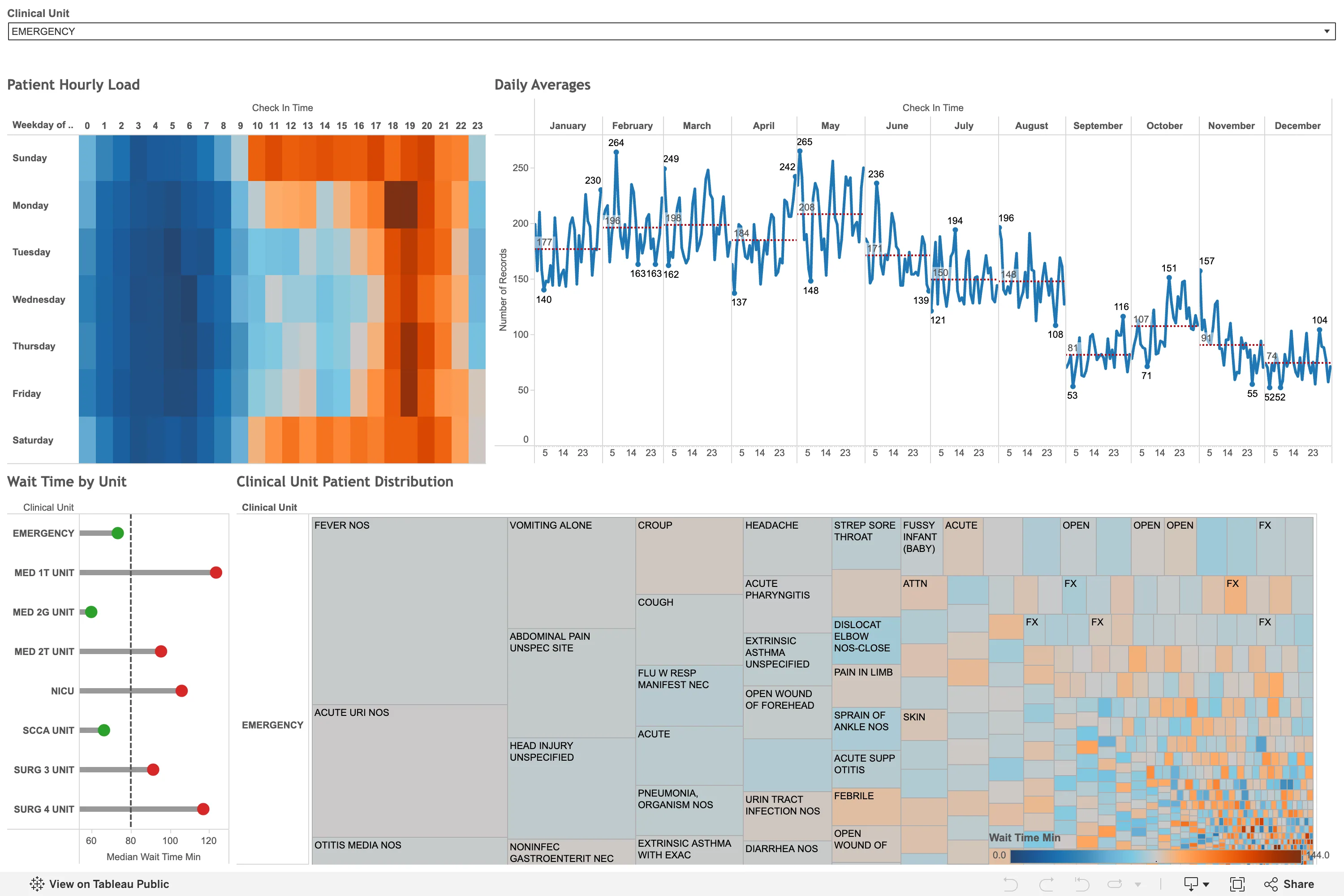
Emergency Department / Clinical Dashboard September 11, 2026 Tableau Public embed view; emergency department patient flow workbook dense · light · desktop-web
Worth recording partly for what it is not. I went looking for a bed map, and what the public web has instead is this: analysis about an emergency department rather than the board the department actually runs on. There is no row per bed, no occupancy, no waiting-for column. Track boards live inside the patient record and never leave it, which is why that pattern has no example here and probably never will. What this does have is the punch card the calendar-heatmap entry names as the better answer for anything with a daily rather than weekly shape: weekday down the side, hour of day across the top, and the busy band from roughly ten to twenty-one is legible instantly without anyone labelling it. Its ramp is the problem—a blue-to-orange diverging scale on a patient count, which has no meaningful centre, so the midpoint sits wherever the data happened to average. The treemap beneath it degenerates into a mosaic of unlabelled slivers about a third of the way across.
  • Calendar heatmap The punch-card variant: hour of day against weekday. The busy band reads in a second, from the layout alone.
  • Small multiples Twelve month panels on one shared y-axis, so the seasonal fall from 265 in May to 52 in December is comparable across all of them.
  • Sequential and diverging scales A diverging blue-orange ramp on wait time, which has no meaningful centre, so the midpoint is wherever the mean fell.
  • Target and progress Each unit against a median reference line, green below and red above. A target marker doing the work of a threshold.
  • Filter bar One dropdown, full width, showing its selected value rather than a count. Everything below is scoped to it.
Show 1 more example Hide the rest

Grafana

The reference implementation for panel grids, template variables, and stat panels; most other tools are defined by how they differ from it.

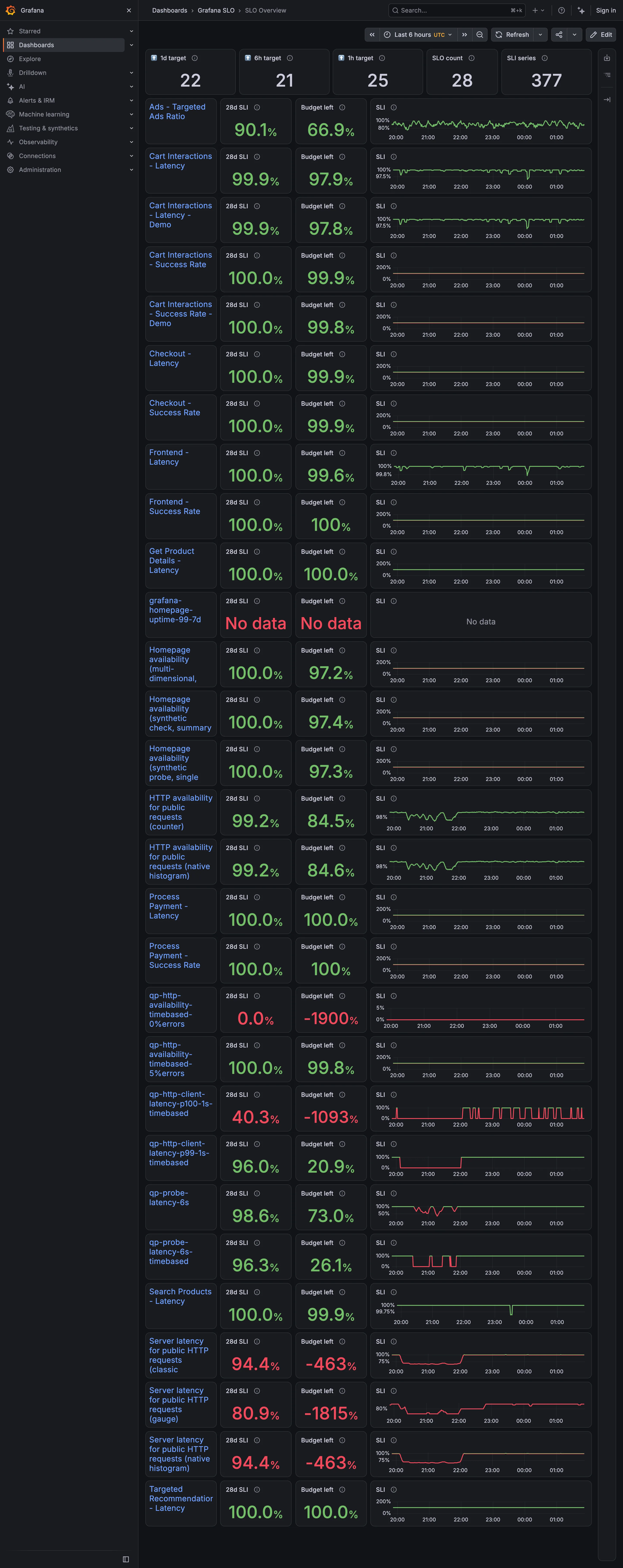
Grafana SLO / SLO Overview September 10, 2026 Grafana Play (signed out; no version string exposed) dense · dark · desktop-web
Twenty-eight objectives, each a row carrying a 28-day indicator, the budget remaining, and a sparkline. The budget column is where it comes apart. Four rows read −1900%, −1815%, −1093% and −463%. A budget is the amount of failure an objective permits, so it bottoms out at −100% and everything past that is the display reporting how wrong the target was rather than how broken the service is. Those four sit in the same column, in the same type, as a row reading 99.8%. Two rows above them an objective reports "No data" in the same red, which is a third thing again and looks like the second. Meanwhile eleven rows sit at exactly 100.0% with a full budget—objectives that cannot fire. The sparkline column is scaled per row, so one row's axis runs 0 to 200% and its neighbour's runs 96 to 100, and the shapes are not comparable down the page even though the layout invites exactly that.
  • Metric targets The budget column: the derived quantity that turns a target from a binary into a rate.
  • Target and progress Budget left, −1900%. Past −100% the number is measuring the objective, not the service.
  • Error and stale state No data, in the same red as a breach. A third state wearing the second one's colour.
  • Small multiples A column of sparklines, each on its own axis. One runs 0–200%, the next 96–100%.
  • Header KPI strip Five tiles counting targets, objectives and series. None of them says whether any of it is met.