Skip to content
KONIGI

Dashboards / Page layout / Header KPI strip

2 of 5

Header KPI strip

The first row of the page has to answer 'is it okay' before the rest asks 'why'.

Updated September 10, 2026

Problem

Someone opens the page. In the first second they need to know whether anything requires them, before any chart has had a chance to demand interpretation.

Solution

A row of summary values across the top, all the same shape, each one a state rather than a number to think about. Four to six of them, sharing an anatomy so precisely that the eye reads the row as one object and only stops where something differs.

The uniformity is the pattern. Six tiles with six layouts is six things to read. Six tiles with identical label position, number size and delta placement is one thing to scan, and the odd one out announces itself without being looked for.

Which numbers go in the strip is the harder question, and the test is not importance but actionability. A number belongs here if a viewer would do something different depending on its value. Total requests is important and rarely actionable; error rate is both. Strips fill up with impressive-sounding totals because they are easy to agree on, and every one of them lowers the signal of the tiles either side.

Count matters more than it seems. Four to six reads as a row. Nine reads as a grid, and a grid has no privileged reading order, so the scan the pattern exists to enable stops happening. If nine numbers genuinely qualify, the page needs a second level, not a longer strip.

Few’s space argument applies here too: whatever goes in the strip is occupying the most valuable region of the page, so a tile that shows a bare value where a bullet graph would have shown value, target and qualitative range is wasting the site’s best real estate.

Use when

The page is monitored rather than explored, and there is a small set of numbers that determine whether anyone needs to keep reading.

Don’t use when

The page is analytical. On an exploratory dashboard the summary numbers are the least interesting thing on screen, and putting them first trains people to scroll past the top of the page.

Trade-offs

The strip takes the most valuable band of the page and spends it on the least detailed content. Every tile added dilutes the rest, and tiles are politically easy to add and hard to remove. Colour-coded state in the top row is trusted more than anything else on the page, which makes stale or wrong thresholds up here more damaging than anywhere else. And a strip of instantaneous values with no trend can say “fine” during a rapid deterioration that any of the charts below would have shown.

Checklist

  • Would a viewer act differently depending on each of these values? If not, why is it here?
  • How many tiles, and does the row still read as a row?
  • Do all tiles share label position, number size, and delta placement exactly?
  • Does each tile carry context—a delta, a target, a sparkline—or just a number?
  • Is state encoded so the odd one out is findable without reading?
  • Where do the threshold colours come from, and when were they last reviewed?
  • Do the tiles cover the same time window as each other and as the page?
  • What does the strip show when a source is down?
  • Is the strip readable at wallboard distance if this page ever goes on a wall?
  • What is the process for adding a tile, and is there one for removing?

Compare

Grafana builds the strip from stat panels in the top row of the grid, so uniformity is a matter of whoever configured them using the same options six times, and drift between tiles is the normal state of a dashboard more than a year old. Plausible makes the strip the primary navigation: the top row of metrics is clickable and switches what the main chart plots, which turns the summary into a control rather than a readout. Datadog ties the row to the page’s tag scope so the strip re-scopes with the rest of the page, keeping the summary honest when someone filters to one region. AWS CloudWatch offers single-value widgets with sparkline backgrounds but no shared anatomy, so the row’s coherence depends entirely on the author, which is why most CloudWatch strips look assembled rather than designed.

KPI tile is the unit this row is made of and covers what belongs inside one. Panel grid is the layout system the strip sits at the top of. Semantic status color is what makes the odd tile findable. Delta indicator is the context a bare number needs. Overview then detail is the structure the strip is the first level of.
Header KPI strip anatomy Five tiles across the top of a page, every one sharing the same label position, number size and delta placement, so the row reads as one object. Below, the same five values with five different layouts, which reads as five things. One shape, five times Error rate 0.04% 0.01 P95 312ms 24ms Checkouts 4,182 3.1% Queue depth 7 12 Budget left 61% 9 pts 1 2 1 SHARED ANATOMY Label, number and delta on the same baselines across all five. The eye reads the row as one object and stops only where something differs. 2 ACTIONABLE, NOT BIG A number belongs here if someone would do something different depending on its value. Total requests is important and rarely that. Four to six reads as a row. Nine reads as a grid, and a grid has no reading order. The same five numbers, five layouts Error rate 0.04% 312ms P95 latency Checkouts 4,182 Queue 7 Budget left 61% Same five values. Now it is five things to read instead of one row to scan.
Wireframe — the pattern's anatomy, not any one product's version of it

Implementation

The first row answers whether it is okay before the rest asks why. Four tiles is the ceiling worth defending; a fifth means somebody could not choose and the row stops being scannable.

shadcn
npx shadcn@latest add card
Tokens
--card--card-foreground--accent--muted-foreground--border--ring--direction-up--direction-down--direction-flat

vs previous hour

KpiStrip.tsxOne anatomy repeated. The row is typed at four to six tiles, every tile has to say what someone does when it moves, the window belongs to the strip, and a source that is down says so.

import { Card } from "@/components/ui/card";
import { directionColor, directionGlyph, type Polarity } from "../red-green-direction/direction";

export type Tile = {
  label: string;
  /** null is a source that is down. The tile says so instead of showing the
   *  last number it had. */
  value: string | null;
  /** Signed change over the strip's window. `text` is the change in the unit
   *  the label uses ("24ms", "9 pts"); `value` carries the sign. */
  delta: { value: number; text: string };
  polarity?: Polarity;
  /** What someone does differently when this moves. Required, because the
   *  test for a place in the strip is actionability rather than importance,
   *  and a tile that cannot answer it is a total wearing a KPI's clothes. */
  action: string;
};

/** Four to six reads as a row. Nine reads as a grid, and a grid has no reading
 *  order, so the type stops at six. */
export type Row =
  | [Tile, Tile, Tile, Tile]
  | [Tile, Tile, Tile, Tile, Tile]
  | [Tile, Tile, Tile, Tile, Tile, Tile];

export function KpiStrip({ tiles, window, onSelect }: {
  tiles: Row;
  /** One window for the whole row. Tiles cannot be compared over different
   *  periods, so it is a property of the strip rather than of a tile. */
  window: string;
  onSelect?: (tile: Tile) => void;
}) {
  return (
    <div>
      <Card className="grid divide-x" style={{ gridTemplateColumns: `repeat(${tiles.length}, minmax(0, 1fr))` }}>
        {/* One anatomy, every time: label, number, delta, on the same three
            baselines. The eye stops only where a value differs. */}
        {tiles.map((t) => {
          const polarity = t.polarity ?? "higher-is-better";
          return (
            <button
              key={t.label}
              type="button"
              title={t.action}
              onClick={() => onSelect?.(t)}
              className="px-4 py-3 text-left hover:bg-accent/50 focus-visible:outline-none focus-visible:ring-1 focus-visible:ring-ring"
            >
              <p className="text-[11px] uppercase tracking-wide text-muted-foreground">{t.label}</p>
              {t.value === null ? (
                <>
                  <p className="mt-1.5 text-2xl tabular-nums text-muted-foreground">—</p>
                  <p className="mt-1 text-[11px] text-muted-foreground">source down</p>
                </>
              ) : (
                <>
                  <p className="mt-1.5 text-2xl tabular-nums text-card-foreground">{t.value}</p>
                  <p className="mt-1 text-[11px] tabular-nums" style={{ color: directionColor(t.delta.value, polarity) }}>
                    <span aria-hidden="true">{directionGlyph(t.delta.value)} </span>
                    {t.delta.text}
                  </p>
                </>
              )}
            </button>
          );
        })}
      </Card>
      <p className="mt-1.5 text-right text-[10px] text-muted-foreground">{window}</p>
    </div>
  );
}

demo.tsxHow it is called: five checkout tiles against the previous hour. Hover a tile for the action it exists for.

import { KpiStrip, type Row } from "./KpiStrip";

/** Five tiles for a checkout service, each with the thing it changes. */
const TILES: Row = [
  { label: "Error rate", value: "0.04%", delta: { value: -0.01, text: "0.01" }, polarity: "lower-is-better", action: "Above 0.5% the release is rolled back." },
  { label: "P95", value: "312ms", delta: { value: 24, text: "24ms" }, polarity: "lower-is-better", action: "Above 400ms the on-call engineer is paged." },
  { label: "Checkouts", value: "4,182", delta: { value: 3.1, text: "3.1%" }, action: "A drop of 10% against last week opens an incident." },
  { label: "Queue depth", value: "7", delta: { value: -12, text: "12" }, polarity: "lower-is-better", action: "Above 50 a second worker is started." },
  { label: "Budget left", value: "61%", delta: { value: -9, text: "9 pts" }, action: "Below 25% non-urgent deploys are frozen." },
];

export default function Demo() {
  return <KpiStrip tiles={TILES} window="vs previous hour" onSelect={() => {}} />;
}
What it renders. Identical markup in both panes, with only the token values changing.

Examples

Captures whose hotspots reference this pattern, grouped by product and dated. The dashed boxes are this pattern; hover any box for the note.

Tableau Public

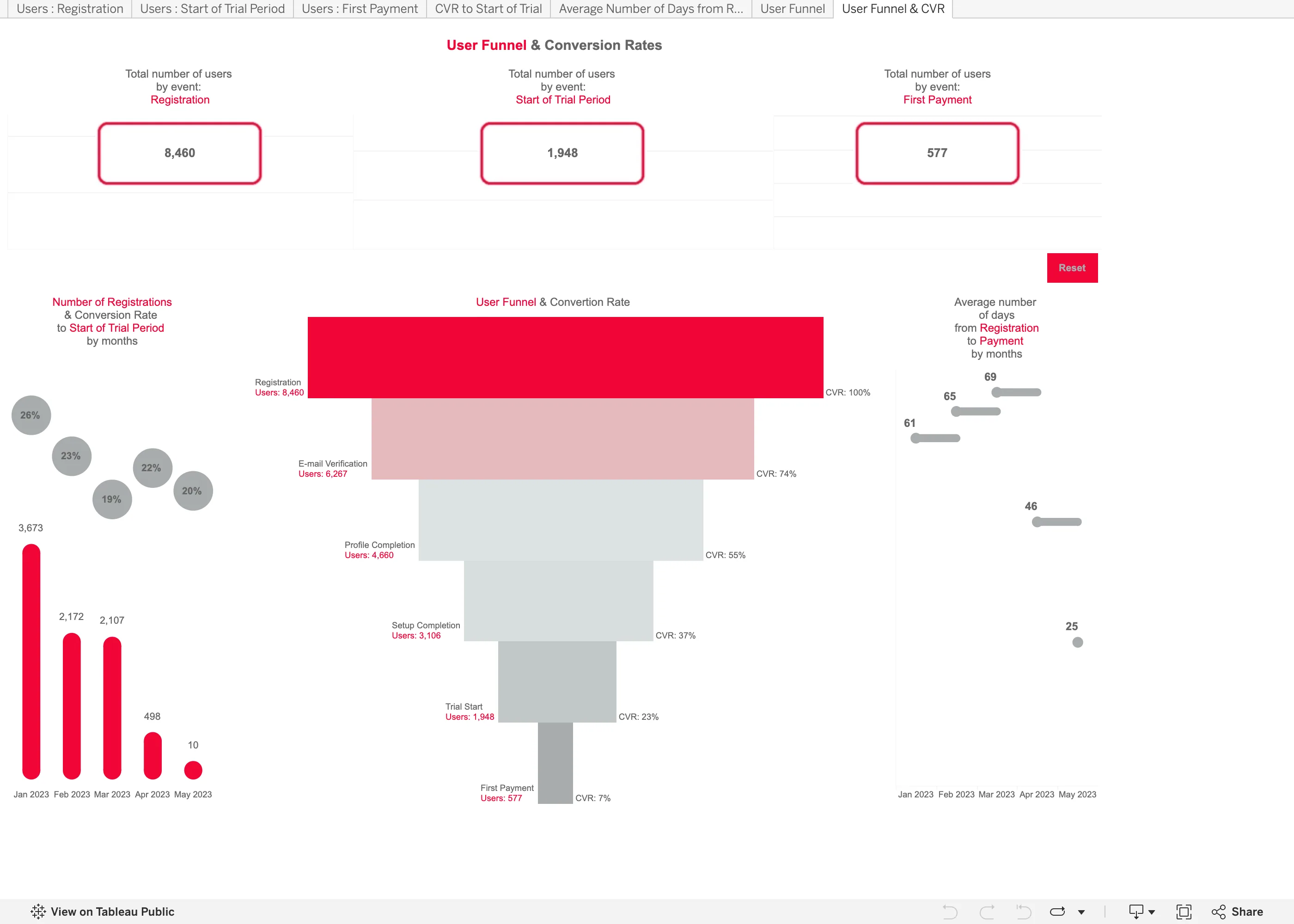
Thousands of dashboards made by people who are not designers, published without a review step. The best available sample of what the pattern language looks like in the wild.

User Funnel & Conversion Rates September 11, 2026 Tableau Public embed view; workbook published by Tetiana Berezhna medium · light · desktop-web
Another published workbook rather than anything Tableau designed, and it makes both of the mistakes the funnel entry names. It shows one number per step, not two. The labels down the right read CVR 100%, 74%, 55%, 37%, 23%, 7%, and every one of those is overall conversion—the share of the original 8,460 still present. Step conversion is missing, which matters because the worst step in this funnel is invisible: 1,948 people start a trial and 577 pay, so that step converts at 30%, and nothing on the chart says 30. You have to divide two numbers printed four inches apart. The second is the rendering. It is drawn as a taper, so quantity is encoded as the width of a trapezoid, and the eye compares areas rather than lengths. Plain horizontal bars would have been easier to read and easier to label. The panel on the left has a third problem: a 20% conversion rate sits above a bar of 10 registrations, next to a 26% rate over 3,673, at the same size and in the same grey.
  • Funnel Drawn as a taper, so the count is the width of a trapezoid. Length would have read more accurately for nothing.
  • Funnel Overall conversion only. The trial-to-payment step converts at 30% and no number on the chart says so.
  • Ratio and rate A 20% rate over 10 registrations drawn the same size as a 26% rate over 3,673.
  • Header KPI strip Three counts, boxed and centred, with no delta and no base. The first and last are the funnel's own endpoints.
  • Tabs as genres Seven worksheet tabs across the top, named after the data rather than the question—Users : Registration, CVR to Start of Trial.
Show 9 more examples Hide the rest

Tableau Public

Thousands of dashboards made by people who are not designers, published without a review step. The best available sample of what the pattern language looks like in the wild.

Shopify Customer Journey September 10, 2026 Tableau Public embed view; workbook published by Lovelytics medium · light · desktop-web
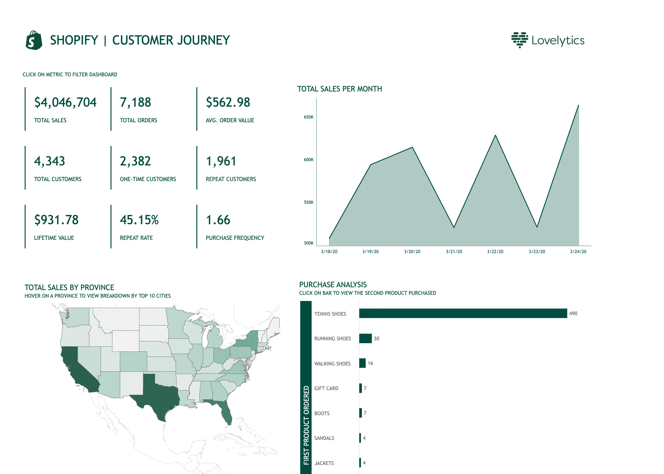
Tableau Public is the product; the design decisions here are the author's. This workbook was published by Lovelytics, so read it as what a competent analyst builds in Tableau rather than as how Tableau thinks dashboards should look. What is instructive is that it carries three separate lines of small-caps instruction—"click on metric to filter dashboard", "hover on a province to view breakdown by top 10 cities", "click on bar to view the second product purchased". Every interaction on the page needed a label, because none of them announces itself. That is the honest cost of cross-filtering: it is powerful and it is invisible until someone tells you it is there. Two other things. The tile block is nine values in a three-by-three grid, which is past the point where a strip has a reading order—the eye has to be told where to start and isn't. And the chart titled "Total sales per month" is plotting seven days, on a y-axis that begins at 500K, so a roughly twenty-five percent spread draws as a mountain range.
  • Cross-filter The tiles are the filter. It needed a line of instruction above it, because nothing about a number says it is clickable.
  • Header KPI strip Nine values in a grid rather than four to six in a row, so there is no privileged place for the eye to start.
  • Time series Titled per month, plotting seven days, on an axis starting at 500K. A 25% spread rendered as a cliff.
  • Hover detail The breakdown by city exists only on hover, so it is unavailable on touch and invisible in this screenshot.
  • Geo map with markers A choropleth of raw sales, unnormalised, so California and Texas lead partly by being large and populous.
  • Ranked list 490 against 30 for second place, so every bar below the first is a sliver and the ordering is all you get.

Grafana

The reference implementation for panel grids, template variables, and stat panels; most other tools are defined by how they differ from it.

Grafana SLO / SLO Overview September 10, 2026 Grafana Play (signed out; no version string exposed) dense · dark · desktop-web
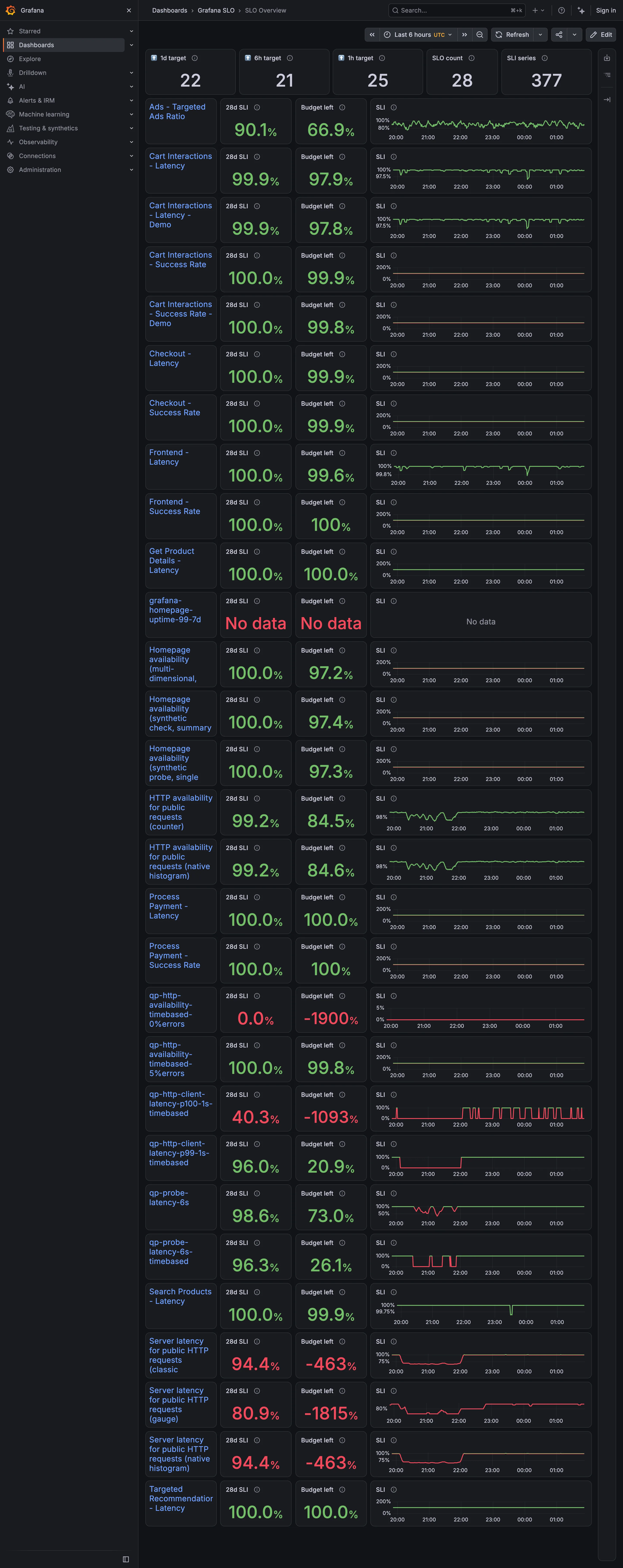
Twenty-eight objectives, each a row carrying a 28-day indicator, the budget remaining, and a sparkline. The budget column is where it comes apart. Four rows read −1900%, −1815%, −1093% and −463%. A budget is the amount of failure an objective permits, so it bottoms out at −100% and everything past that is the display reporting how wrong the target was rather than how broken the service is. Those four sit in the same column, in the same type, as a row reading 99.8%. Two rows above them an objective reports "No data" in the same red, which is a third thing again and looks like the second. Meanwhile eleven rows sit at exactly 100.0% with a full budget—objectives that cannot fire. The sparkline column is scaled per row, so one row's axis runs 0 to 200% and its neighbour's runs 96 to 100, and the shapes are not comparable down the page even though the layout invites exactly that.
  • Metric targets The budget column: the derived quantity that turns a target from a binary into a rate.
  • Target and progress Budget left, −1900%. Past −100% the number is measuring the objective, not the service.
  • Error and stale state No data, in the same red as a breach. A third state wearing the second one's colour.
  • Small multiples A column of sparklines, each on its own axis. One runs 0–200%, the next 96–100%.
  • Header KPI strip Five tiles counting targets, objectives and series. None of them says whether any of it is met.
Grafana — Examples / Stats
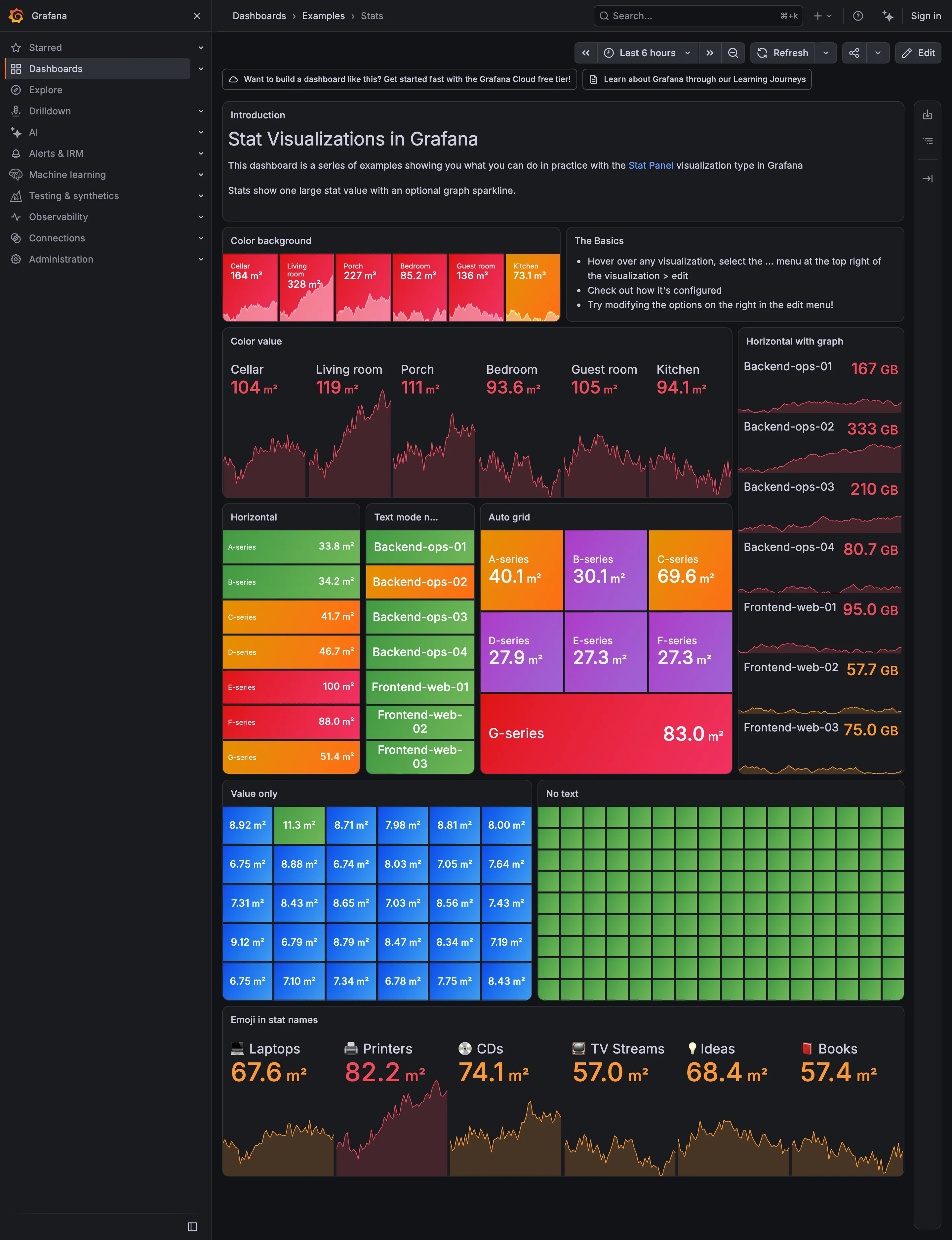
Header KPI strip. Six tiles sharing one anatomy, which is the arrangement that reads as a row rather than as six things. KPI tile. Label, value, unit and a sparkline behind it. No delta, no base, no window. Dark-first data palette. The dark half of the pair. The same six values in the light capture arrive as pale pink on white. Semantic status color. No text at all. Colour is the only carrier, which is the WCAG failure stated as a feature. Sparkline. A column of them, each scaled to its own series, which is the comparison Tufte warns the arrangement invites. KPI tile. Thirty numbers with no labels—the value with nothing attached to it. Grayscale with alerts. Seven rows, seven different colours, no resting state. Nothing here can read as abnormal. Semantic status color. Whole-tile background colour: the loudest channel available, spent on all six.
Examples / Stats September 10, 2026 Grafana Play (signed out; no version string exposed) dense · dark · desktop-web
A showcase rather than a working dashboard, which is what makes it useful: it is Grafana demonstrating every visual option the stat panel has, in one place, with nothing else competing. Two things are worth reading it for. The first is that across roughly sixty tiles here, not one carries a comparison. Every option on display is about how the number looks—background colour, value colour, orientation, text mode, grid packing—and none is about what the number should be measured against. The panel type that most needs a delta and a base is being shown off without either. The second is the colour. Every single tile on this page is coloured, and the "No text" panel is ninety-odd green rectangles carrying no label and no value at all, which is colour as the sole carrier of meaning at its purest. Both of those are reasonable for a catalogue of options and neither survives being copied onto a real page.
  • KPI tile Label, value, unit and a sparkline behind it. No delta, no base, no window.
  • Dark-first data palette The dark half of the pair. The same six values in the light capture arrive as pale pink on white.
  • Sparkline A column of them, each scaled to its own series, which is the comparison Tufte warns the arrangement invites.
  • Semantic status color Whole-tile background colour: the loudest channel available, spent on all six.
  • Grayscale with alerts Seven rows, seven different colours, no resting state. Nothing here can read as abnormal.
  • KPI tile Thirty numbers with no labels—the value with nothing attached to it.
  • Semantic status color No text at all. Colour is the only carrier, which is the WCAG failure stated as a feature.
  • Header KPI strip Six tiles sharing one anatomy, which is the arrangement that reads as a row rather than as six things.
Linux node / fleet overview September 9, 2026 Grafana Play (signed out; no version string exposed) medium · dark · desktop-web
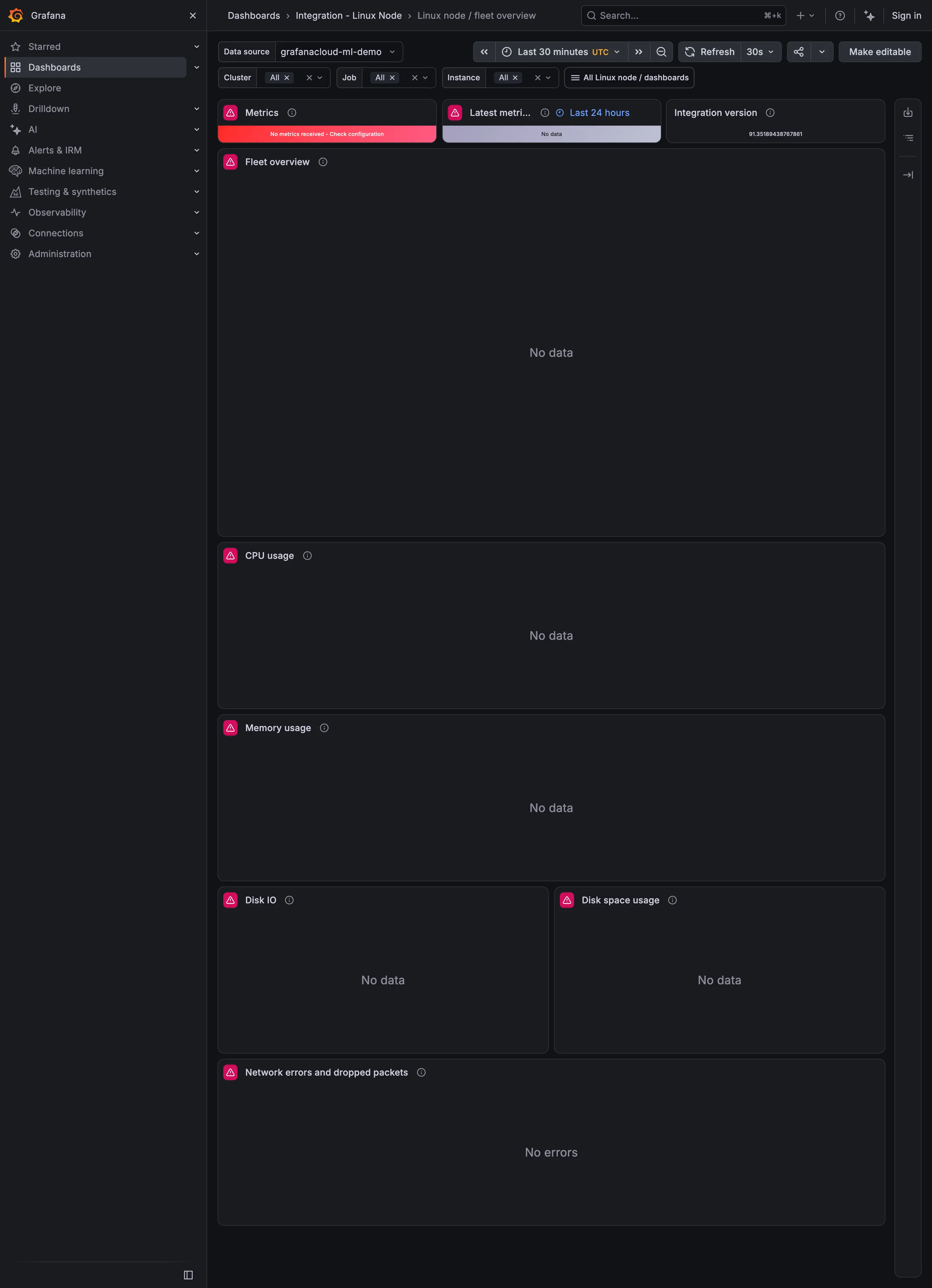
Captured while Play's demo data source was returning nothing, which makes this a better example of empty and error states than of the fleet overview it is meant to be. Three things are worth noticing. The top-left tile is red and reads "No metrics received - Check configuration", which is an actual diagnosis and the best thing on the page. The tile beside it exists to report when data last arrived, and it says "No data", so the freshness indicator has no freshness to report and doesn't say why. And every chart below says "No data" while the network panel says "No errors". A viewer scanning this page cannot tell from the words alone whether the network is clean or whether it is as unknown as everything else, which is the exact confusion the empty-state pattern exists to prevent.

Home Assistant

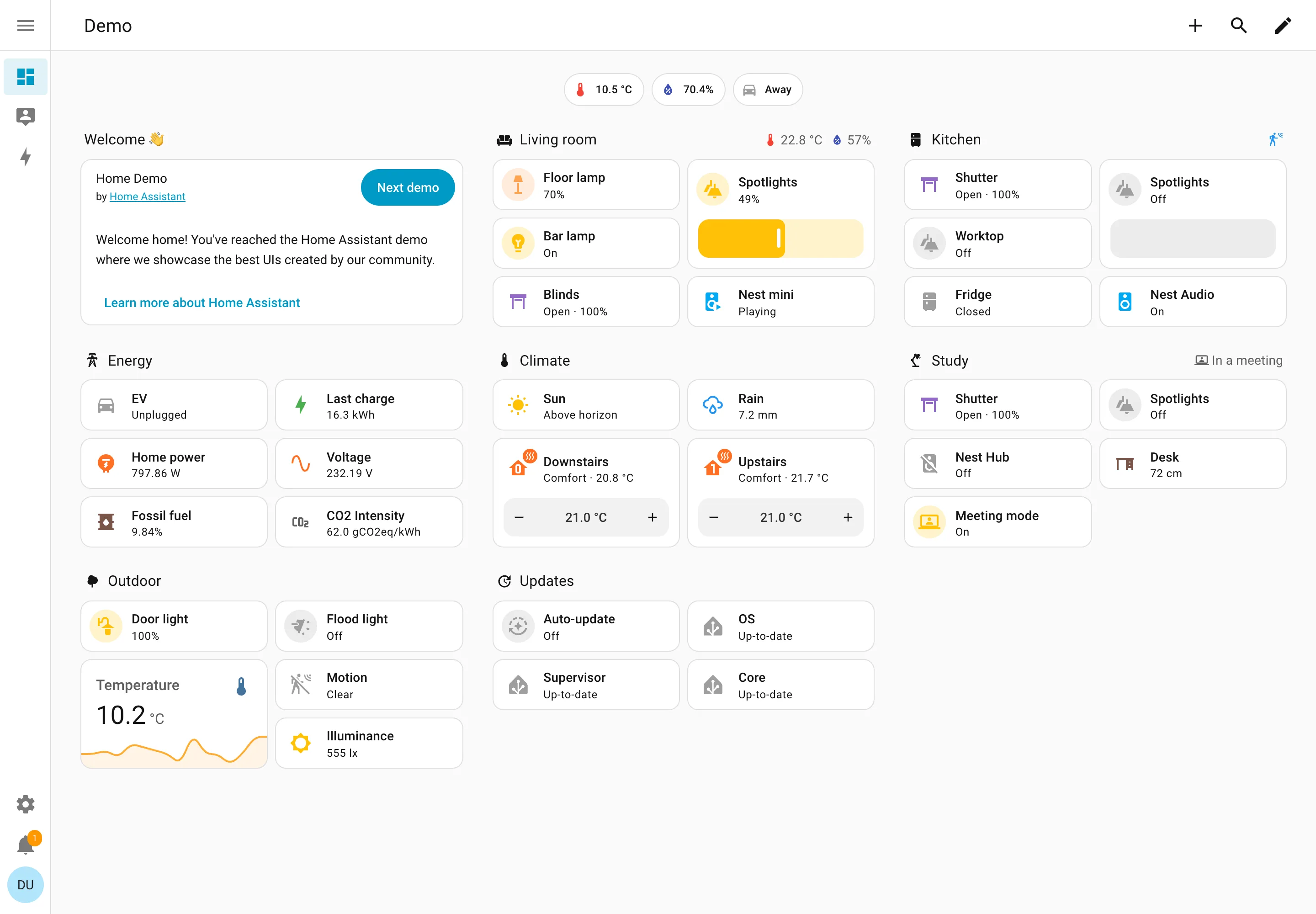
A card grid people genuinely rearrange, on a wall tablet, which is where resizable layouts either work or quietly stop describing the house.

Demo dashboard at phone width September 10, 2026 Home Assistant public demo (signed out, 390px viewport) medium · light · mobile
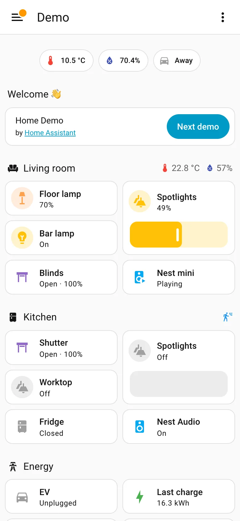
The same dashboard as the desktop capture at 390 pixels. It is a reflow rather than a designed phone page, and for this content that is defensible—a list of things with states doesn't need width the way a chart does, sections stay intact, nothing is dropped, and the slider becomes a much better touch target than it was with a mouse. What doesn't survive is the order. On desktop the sections sit in three columns and each column reads down: Welcome, Energy, Outdoor on the left. On the phone they come out row by row instead, so Energy falls from second in its column to fourth on the page and Kitchen climbs from the far right to third. Nothing about the desktop layout expressed which of those mattered more, so the reflow had nothing to preserve and picked an order from the source. The rail is the other casualty and goes exactly where these always go, into a hamburger.
  • Mobile adaptation Reflowed, not rebuilt. Section order comes out row-major here and column-major on desktop, so priority shifts.
  • Sidebar and canvas The rail is gone. Everything it held is now behind one button, which is the usual and unavoidable trade.
  • Resizable card grid Two columns of cards inside each section rather than a single stack, so the page stays short enough to scroll.
  • Header KPI strip The three chips survive the switch intact, which is what a strip of four to six is for.
Home Assistant — Demo dashboard
Resizable card grid. Cards a household arranges itself, grouped by room. Sections are one column each rather than a free canvas. Semantic grouping. Grouped by where the thing physically is, and the group header carries that room's temperature and humidity. Sidebar and canvas. Collapsed to icons by default, because on a wall tablet the canvas is worth more than the labels. Sparkline. One card carrying a number and the shape behind it, with no axis and no legend. Semantic status color. Amber means on, and the card says 49% anyway. Colour repeats the word instead of replacing it. Header KPI strip. Three chips above everything: outside temperature, humidity, and whether anyone is home. Dashboard builder. A pencil in the corner. Editing is one click from reading, which is why these pages actually get rearranged.
Demo dashboard September 10, 2026 Home Assistant public demo (signed out) medium · light · desktop-web
The grouping axis here is physical space—Living room, Kitchen, Study, Outdoor—which nothing else in this gallery uses, and it works for the same reason process mimics work: the viewer already holds the model. The thing worth stealing is the state labelling. Every entity says its state in words: Open · 100%, Off, Closed, Playing, Up-to-date, Unplugged. The amber tint on an icon repeats what the word already said rather than replacing it, so the page is readable with no colour at all. That isn't accessibility diligence so much as an audience constraint—you cannot train a household on a colour key the way you can train an on-call rota, so the words have to carry. Each section header also doubles as a summary: Living room reports 22.8°C and 57% humidity beside its own name, and Study reports "In a meeting". And this is a control surface as much as a display—the Spotlights card is a slider you drag, the thermostats have plus and minus.
  • Resizable card grid Cards a household arranges itself, grouped by room. Sections are one column each rather than a free canvas.
  • Semantic grouping Grouped by where the thing physically is, and the group header carries that room's temperature and humidity.
  • Semantic status color Amber means on, and the card says 49% anyway. Colour repeats the word instead of replacing it.
  • Header KPI strip Three chips above everything: outside temperature, humidity, and whether anyone is home.
  • Sidebar and canvas Collapsed to icons by default, because on a wall tablet the canvas is worth more than the labels.
  • Sparkline One card carrying a number and the shape behind it, with no axis and no legend.
  • Dashboard builder A pencil in the corner. Editing is one click from reading, which is why these pages actually get rearranged.

Kibana

Query-first rather than panel-first: the search bar is the primary control and the charts are downstream of it, which inverts Grafana's arrangement.

Kibana — Dashboards / [Flights] Global Flight Dashboard
Panel grid. Twelve columns, and the biggest panel is a table rather than the headline chart. Size isn't carrying priority here. Ratio and rate. Delay rates up to 100% with no denominator anywhere. One flight and a thousand flights render identically. Stacked composition. Stacked to 100%, so the total is discarded on purpose and only the mix of delay types remains. Annotation. Event markers along the top of the series, numbered and grouped, on the data's own axis. Header KPI strip. Five tiles in three different sizes and two different layouts, so the row reads as five things. Compare periods. "vs 1 week earlier, 76.9%"—the comparison base is named and the expression isn't. Filter bar. Declared controls under the query bar: two pickers and a price range. Both mechanisms on screen at once. Share and embed. Share, export and full-screen in the header. Whether the range and filters travel with them is the whole question.
Dashboards / [Flights] Global Flight Dashboard September 10, 2026 Elastic demo environment, sample flight data (guest session) dense · light · desktop-web
Two things on this page are worth arguing with. The first is the table on the right, sorted by delay rate: Chicago/Rockford 100%, Syracuse 100%, Birmingham 75%. A hundred percent of flights delayed is either a catastrophe or one flight, and nothing in the table says which, because the denominator isn't a column. The cells are on a red ramp, so the two rows that are almost certainly a sample of one are the loudest thing in the panel. The second is the tile row: Delayed 25.2%, then beside it "Delayed vs 1 week earlier—76.9%". Seventy-six point nine percent of what? It could be last week's rate, it could be this week as a proportion of last week, it could be the change. Three different numbers, one label, and the tile picks whichever the query returned. What the page gets right is the filtering: a KQL bar for people who know the syntax and three declared controls underneath for people who don't, both visible at once.
  • Ratio and rate Delay rates up to 100% with no denominator anywhere. One flight and a thousand flights render identically.
  • Compare periods "vs 1 week earlier, 76.9%"—the comparison base is named and the expression isn't.
  • Share and embed Share, export and full-screen in the header. Whether the range and filters travel with them is the whole question.
  • Filter bar Declared controls under the query bar: two pickers and a price range. Both mechanisms on screen at once.
  • Panel grid Twelve columns, and the biggest panel is a table rather than the headline chart. Size isn't carrying priority here.
  • Stacked composition Stacked to 100%, so the total is discarded on purpose and only the mix of delay types remains.
  • Annotation Event markers along the top of the series, numbered and grouped, on the data's own axis.
  • Header KPI strip Five tiles in three different sizes and two different layouts, so the row reads as five things.

Netdata

Per-second charts, hundreds per node, with a per-chart anomaly ribbon instead of a band on the series.

Netdata — Metrics / System
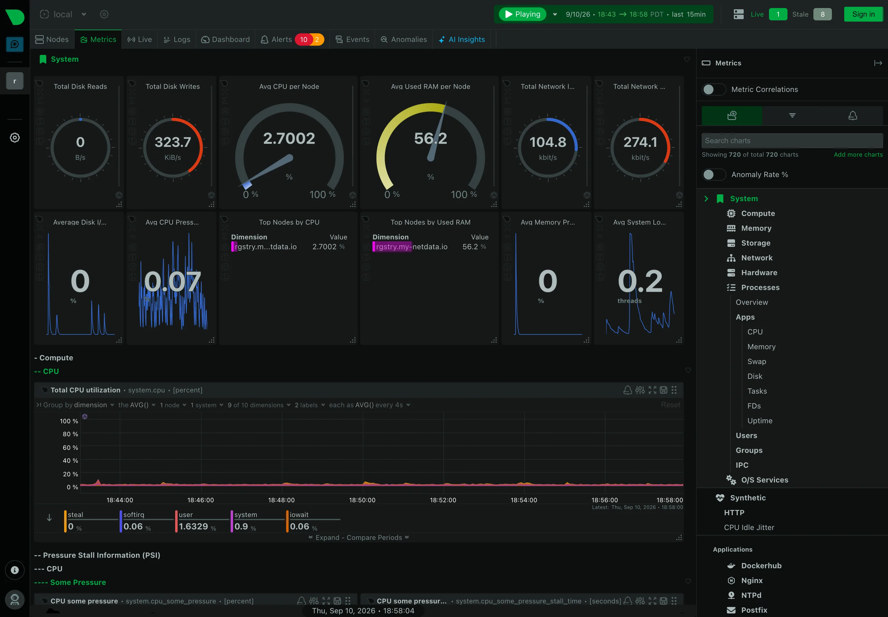
Header KPI strip. Twelve tiles in two rows, in four different layouts. It reads as twelve things rather than one strip. Sidebar and canvas. The rail is the dashboard. A generated tree of every metric family the agent found. Gauge and dial. Arcs for disk reads and writes, where the maximum is invented—this is a rate, not a capacity. Dashboard builder. A query builder inline in the panel header: group by, aggregation, node and dimension count. Search across panels. 720 charts, so search is the navigation and the tree is the filing system nobody browses. Semantic grouping. Sections generated by the collector rather than chosen. Consistent, and about nothing in particular. Compare periods. Offered per chart rather than per dashboard, which is the scoping trap: one panel shifted, the rest not. Freshness indicator. Live 1, Stale 8. Most products would have drawn all nine and said nothing.
Metrics / System September 10, 2026 Netdata Agent v2.10.0-686-nightly (public registry node, signed out) dense · dark · desktop-web
Structurally the opposite of Grafana, and worth the comparison. Nobody built this page. The right rail says "showing 720 of total 720 charts" and the tree beneath it—System, Compute, Memory, Storage, Network, Hardware, Processes, then Apps, Users, Groups, O/S Services, and every application it found—is generated from what the agent collects. The canvas is the same hierarchy rendered downward, four levels deep, headings prefixed with dashes: System, then Compute, then CPU, then the chart. There is no editorial layer at all, which means nothing is missing and nothing is prioritised. The header also does something most products won't: it reports "Live 1, Stale 8" beside the node count, so eight of the nine machines behind this view are not currently reporting and the page says so rather than drawing their last known values.
  • Sidebar and canvas The rail is the dashboard. A generated tree of every metric family the agent found.
  • Search across panels 720 charts, so search is the navigation and the tree is the filing system nobody browses.
  • Header KPI strip Twelve tiles in two rows, in four different layouts. It reads as twelve things rather than one strip.
  • Gauge and dial Arcs for disk reads and writes, where the maximum is invented—this is a rate, not a capacity.
  • Semantic grouping Sections generated by the collector rather than chosen. Consistent, and about nothing in particular.
  • Freshness indicator Live 1, Stale 8. Most products would have drawn all nine and said nothing.
  • Dashboard builder A query builder inline in the panel header: group by, aggregation, node and dimension count.
  • Compare periods Offered per chart rather than per dashboard, which is the scoping trap: one panel shifted, the rest not.

Plausible Analytics

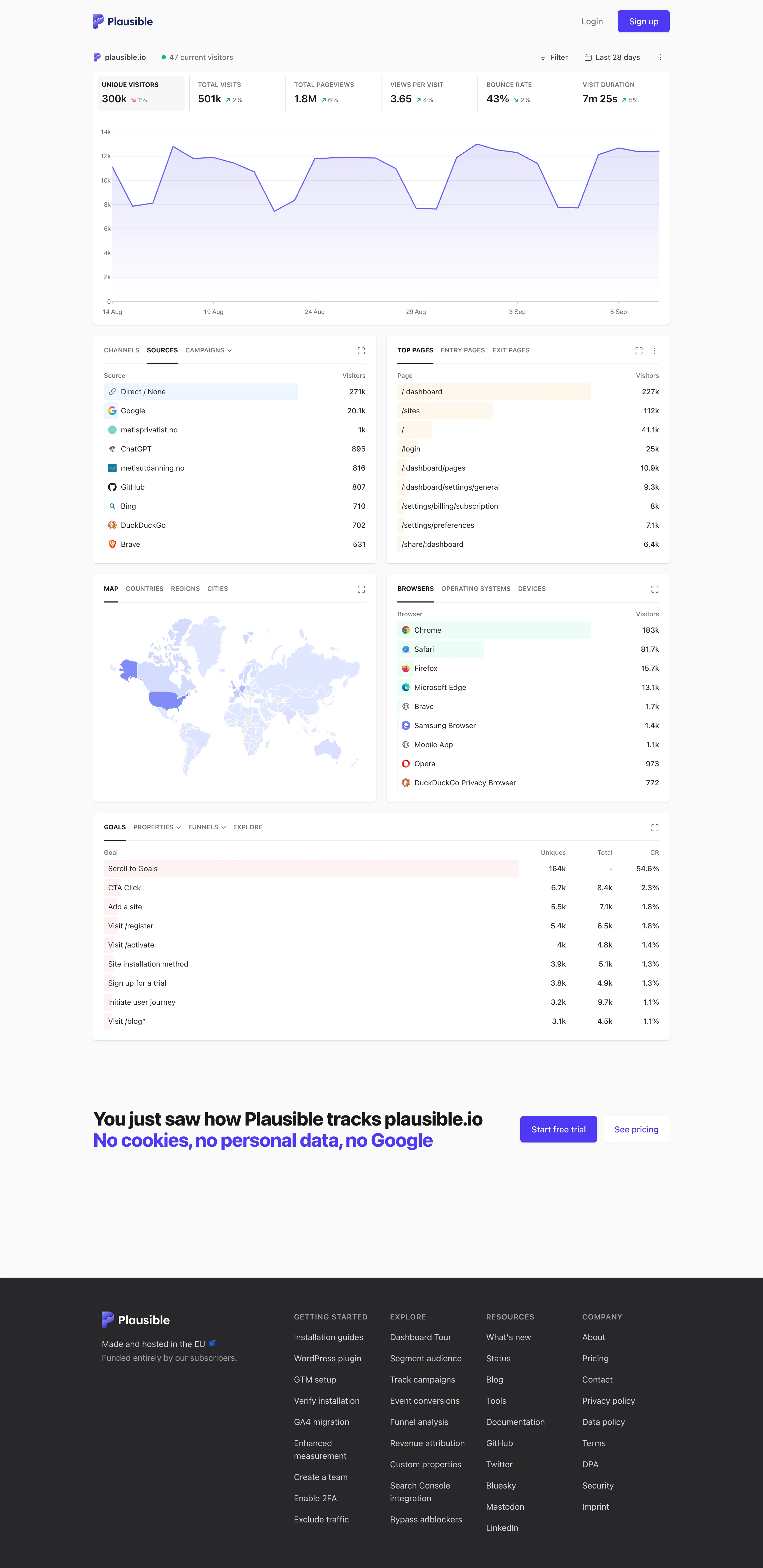
One column, top to bottom, where the metric row doubles as the chart's control. The clearest working argument that a dashboard can have exactly one interaction.

Plausible Analytics — Live demo / plausible.io
Single-column narrative. One column, top to bottom, no panel arrangement and nothing to configure before reading starts. Overview then detail. The decomposition: sources, pages, geography, browsers, goals. Same subject, narrowed, no navigation. Ranked list. Sorted with an in-row bar, no share of total and no other row. Direct 271k versus Google 25.1k, out of what? Geo map with markers. A choropleth pale enough that every country but one reads as the same white. Raw counts, unnormalised. Header KPI strip. Six tiles sharing one anatomy, each with a delta. The boxed one is selected, and the chart below plots it. Ratio and rate. Bounce rate 43%, with the denominator two tiles away and the window only in the header. Tabs as genres. Tabs inside the panel—channels, sources, campaigns—so one card answers three questions in one slot.
Live demo / plausible.io September 10, 2026 Plausible live demo, plausible.io's own stats (signed out) medium · light · desktop-web
My single-column-narrative entry names Plausible as the reference implementation and says the trick is that the metric row doubles as the chart's control. Here it is doing exactly that: six tiles across the top, the first one boxed because it's selected, and the chart underneath plotting that metric and no other. Click a different tile and the chart follows. The page therefore has one interaction, and it is the same gesture as paying attention. Everything below reads as a single column in argument order—headline, then the shape behind it, then what it decomposes into, then goals. Two things it doesn't do. The ranked lists carry a count and a bar and no share of total, so Direct at 271k against Google at 25.1k tells you the ordering and not whether the top row is most of the traffic. And the choropleth is so pale that outside the United States almost every country is the same near-white, which is the encoding spending a whole panel to say "mostly America".
  • Single-column narrative One column, top to bottom, no panel arrangement and nothing to configure before reading starts.
  • Header KPI strip Six tiles sharing one anatomy, each with a delta. The boxed one is selected, and the chart below plots it.
  • Ratio and rate Bounce rate 43%, with the denominator two tiles away and the window only in the header.
  • Overview then detail The decomposition: sources, pages, geography, browsers, goals. Same subject, narrowed, no navigation.
  • Ranked list Sorted with an in-row bar, no share of total and no other row. Direct 271k versus Google 25.1k, out of what?
  • Geo map with markers A choropleth pale enough that every country but one reads as the same white. Raw counts, unnormalised.
  • Tabs as genres Tabs inside the panel—channels, sources, campaigns—so one card answers three questions in one slot.