Skip to content
KONIGI

Dashboards / Color / Grayscale with alerts

3 of 6

Grayscale with alerts

If everything is colored, nothing is; normal should be gray.

Updated September 10, 2026

Problem

The dashboard has eleven colours on it and all of them mean something. By the third week nobody sees any of them, and the one that indicates a genuine fault has the same visual weight as the brand-blue line that has been flat since launch.

Solution

Draw the normal state in greys. Reserve colour for abnormal, and make saturation carry severity.

This is the core of ISA-101 and the high-performance HMI school it comes from, developed for control rooms where an operator watches a screen for eight hours and has to notice the one thing that changed. Base graphics in greys and neutrals; roughly nine-tenths of the screen neutral; bright colour reserved for abnormal conditions and active alarms; muted or low-intensity colour for early-stage states and full saturation held back for the severe ones.

The consequence is what makes it worth adopting outside process control: anything coloured on the screen is by definition something wrong, so it gets found without being searched for. The operator is not scanning. They are waiting for colour to appear, which is a far cheaper cognitive task and one that survives fatigue.

The discipline is harder than the rule. Every team wants their series to be their colour, every chart library ships a categorical palette on by default, and brand guidelines arrive wanting the accent on everything. Each of those is individually reasonable and collectively fatal, because the budget being spent is attention, and it is fixed.

WCAG’s use-of-colour requirement pushes the same direction from a different angle: colour must not be the only means of conveying information. A page that is grey until something is wrong still needs the wrong thing to be labelled, positioned or shaped differently, not merely tinted.

Use when

The screen is monitored continuously rather than read occasionally, the normal state is the common state, and noticing change matters more than reading values. Control rooms, NOC walls, on-call dashboards.

Don’t use when

The page is analytical and every series is equally interesting. Exploration needs categorical distinction, and a grey exploratory chart is just hard to read. Comparison work wants a palette; monitoring wants a resting state.

Trade-offs

Grey pages look unfinished to stakeholders, and defending one takes political capital that gets spent repeatedly rather than once. Categorical distinction genuinely suffers: greyscale supports perhaps four distinguishable series before viewers give up on the legend. The scheme rests entirely on thresholds being right, because the alerting colour only appears when a rule fires, so a badly-set rule produces a page that is calm and wrong. And in a genuinely bad incident everything colours at once, which is exactly when the scheme provides the least discrimination.

Checklist

  • What fraction of a healthy screen carries colour, and is it close to none?
  • Does saturation encode severity, or is every abnormal state equally loud?
  • Is anything coloured for a reason other than abnormality—branding, series identity, decoration?
  • Does the abnormal state have a non-colour signal too, per WCAG?
  • Which thresholds turn colour on, and when were they last reviewed?
  • What does the page look like when six things are wrong at once?
  • Do greys carry enough separation to still show structure and hierarchy?
  • Does the scheme survive a projector, a cheap wall TV, and a colourblind viewer?
  • Is there a categorical palette hiding in a chart library default somewhere on this page?
  • Who has authority to say no to the next request for a coloured element?

Compare

Industrial HMI software built to ISA-101 is where the discipline is enforced rather than encouraged, because a control room has a regulator and a fatigued operator and neither tolerates decoration. Netdata goes the opposite way by default, colouring densely across hundreds of charts, which suits a tool used for investigation rather than for standing watch. Grafana ships categorical palettes on by default and puts the whole burden on the dashboard author, so the muted approach is achievable and almost never the path of least resistance. Datadog sits in between with monitor status driving colour on status-oriented views while general dashboards stay fully coloured, which is coherent per-view and inconsistent across a product someone uses all day.

Semantic status color defines what the alerting colours mean once they appear. Dense small-multiple layout is the layout that most needs this discipline to work at all. Categorical series palette is the opposing requirement and the entry that covers when distinction wins. Process mimic is the display type this convention was written for. Wallboard mode is the other context where a calm resting state matters most.
Grayscale with alerts anatomy Two copies of the same six-panel screen. In the first, five panels are neutral grey, one is faintly marked as an early-stage state and one is fully marked as an alarm. In the second, every panel is marked, so nothing stands out. The same screen, two colour budgets Nine-tenths neutral Every team got their colour 1 2 3 4 1 NORMAL IS GREY Base graphics, chrome and every healthy series in neutrals. Roughly nine-tenths of the screen. 2 SATURATION IS SEVERITY Muted colour for an early-stage state. Full saturation held back for the severe ones. 3 NEVER COLOUR ALONE The alarmed panel also gets a border and a glyph. A tint on its own is a coin flip. 4 THE BUDGET Every exception is individually reasonable and collectively fatal. Attention is fixed.
Wireframe — the pattern's anatomy, not any one product's version of it

Implementation

A page where everything is coloured has no way to say "look here". Colour is spent, not applied, and this is the budget: the chrome is grey and the only saturated thing on screen is the thing that needs a person.

npm
lucide-react
Tokens
--card--foreground--muted--muted-foreground--border--status-warn--status-critical
prodeu-west15m

QuietWall.tsxNeutral unless a panel's status says otherwise. Warn is muted, critical is saturated and thicker, and both carry a border and the status glyph.

import { cn } from "@/lib/utils";
import { STATUS_META, type Status } from "../semantic-status-color/status";

/**
 * A monitoring wall that is grey until something is wrong.
 *
 * Chrome, labels and every healthy series are neutral. Colour is spent only
 * on a panel whose status is not nominal, and saturation carries severity:
 * warn is muted, critical is full strength and thicker. A coloured panel also
 * gets a border and the status glyph, so the state survives a projector and
 * a colourblind viewer, and colour is never the only thing saying it.
 *
 * Which status a panel holds is the caller's decision. The thresholds live
 * with whoever owns the rule, not in the drawing.
 */
export type Panel = { key: string; values: number[]; status: Status };

type Props = {
  panels: Panel[];
  unit: string;
  columns?: number;
  onOpen?: (panel: Panel) => void;
};

const STROKE: Record<Status, string> = {
  nominal: "stroke-muted-foreground",
  warn: "stroke-status-warn opacity-60",
  critical: "stroke-status-critical",
  unknown: "stroke-muted-foreground opacity-40",
};

const FRAME: Record<Status, string> = {
  nominal: "border-border",
  warn: "border-status-warn/50",
  critical: "border-status-critical",
  unknown: "border-dashed border-border",
};

const W = 84, H = 40;

export function QuietWall({ panels, unit, columns = 3, onOpen }: Props) {
  // One scale for the wall, so a climb is a climb.
  const all = panels.flatMap((p) => p.values);
  const lo = Math.min(...all), hi = Math.max(...all), span = hi - lo || 1;
  const n = panels[0]?.values.length ?? 1;
  const x = (i: number) => 6 + (i / (n - 1)) * (W - 12);
  const y = (v: number) => H - 4 - ((v - lo) / span) * (H - 8);

  return (
    <div className="grid gap-2" style={{ gridTemplateColumns: `repeat(${columns}, minmax(0, 1fr))` }}>
      {panels.map((panel) => {
        const { label, Icon } = STATUS_META[panel.status];
        const loud = panel.status !== "nominal";
        const last = panel.values[panel.values.length - 1];
        const d = panel.values.map((v, i) => `${i ? "L" : "M"}${x(i).toFixed(1)} ${y(v).toFixed(1)}`).join(" ");
        return (
          <button
            key={panel.key}
            type="button"
            onClick={() => onOpen?.(panel)}
            aria-label={`${panel.key}, ${label}, ${last} ${unit}`}
            className={cn("relative rounded-[2px] border bg-muted p-1.5 text-left", FRAME[panel.status])}
          >
            <span className="block text-[9px] leading-none text-muted-foreground">{panel.key}</span>
            {loud && (
              <Icon
                className={cn("absolute right-1 top-1 size-3", panel.status === "critical" ? "text-status-critical" : "text-status-warn opacity-60")}
                aria-hidden="true"
              />
            )}
            <svg viewBox={`0 0 ${W} ${H}`} className="mt-1 w-full" aria-hidden="true">
              <path
                d={d}
                fill="none"
                strokeWidth={panel.status === "critical" ? 2 : 1.5}
                strokeLinejoin="round"
                className={STROKE[panel.status]}
              />
            </svg>
          </button>
        );
      })}
    </div>
  );
}

demo.tsxHow it is called: six services, four nominal, one warn, one critical. Statuses come from the alert rules.

import { QuietWall, type Panel } from "./QuietWall";

/**
 * Six services, errors per minute. Four are healthy and grey. payments has
 * crossed the warn threshold and is coloured but muted. checkout is critical
 * and is the only saturated thing on the screen. The statuses arrive from the
 * alert rules; the wall only draws them.
 */
const PANELS: Panel[] = [
  { key: "edge", values: [16, 22, 14, 28, 22], status: "nominal" },
  { key: "api", values: [20, 26, 18, 30, 24], status: "nominal" },
  { key: "auth", values: [22, 16, 24, 18, 26], status: "nominal" },
  { key: "queue", values: [16, 24, 18, 26, 20], status: "nominal" },
  { key: "payments", values: [18, 22, 28, 34, 38], status: "warn" },
  { key: "checkout", values: [14, 18, 32, 44, 48], status: "critical" },
];

export default function Demo() {
  return (
    <div className="w-[320px] rounded-lg border bg-card p-4">
      <div className="mb-3 flex gap-2 text-[10px] text-muted-foreground">
        <span className="rounded-[2px] bg-muted px-2 py-0.5 text-foreground">prod</span>
        <span className="rounded-[2px] bg-muted px-2 py-0.5">eu-west</span>
        <span className="rounded-[2px] bg-muted px-2 py-0.5">15m</span>
      </div>
      <QuietWall panels={PANELS} unit="errors/min" onOpen={(p) => { location.hash = `#service-${p.key}`; }} />
    </div>
  );
}
What it renders. Identical markup in both panes, with only the token values changing.

Examples

Captures whose hotspots reference this pattern, grouped by product and dated. The dashed boxes are this pattern; hover any box for the note.

Ignition

A public SCADA demo running live simulated plant data, with a runtime toggle between simple and photorealistic pump and pipe rendering—the ISA-101 argument as a setting.

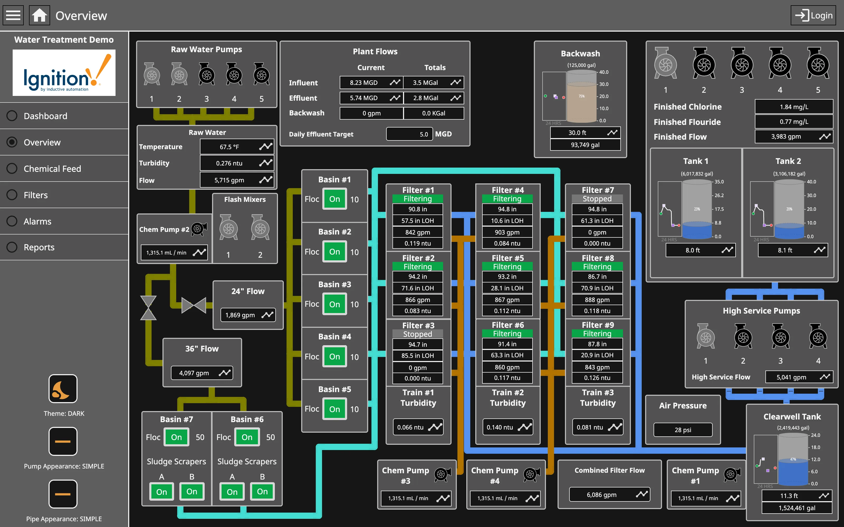
Ignition — Water Treatment / Overview
Process mimic. Flat two-dimensional shapes, values placed where the instrument is, and the flow ordered by process rather than by geography. Dense small-multiple layout. Nine filters, identical four-value panels. Reading one teaches you all nine, and the two stopped ones are found by shape. Gauge and dial. Tank level as a filled vertical scale—a bounded range where the endpoints are the physical tank, which is the case the gauge survives. Grayscale with alerts. Green for running, on every unit. The opposite of grey-at-rest, and it works only while stopped is the rare case. Process mimic. Pump and pipe appearance switchable between simple and photorealistic. The whole ISA-101 argument, shipped as a setting. Semantic status color. Stopped is grey and says Stopped. Colour and word together, so the state survives a monochrome screen.
Water Treatment / Overview September 11, 2026 Ignition Perspective public demo, Water Treatment (signed out) dense · dark · desktop-web
A real process mimic with live simulated plant data, and it settles two arguments from the entry. The first: the layout is topologically faithful and geometrically loose. Raw water pumps at the left, flash mixers, seven basins, nine filters, tanks, high service pumps, clearwell—the flow reads left to right because that is the process order, not because that is where the equipment stands. The second is where it departs from ISA-101, and the departure is deliberate. Green here means running. Every basin, every flocculator, every filter that is working is green, so most of the screen is coloured and the two stopped filters are the grey ones. That inverts the high-performance HMI rule—colour reserved for abnormal—and spends the budget on the ninety percent case. It is still readable, because the abnormal state is the absence of a colour everything else has, but it only works while "stopped" is rare. The pipe colours are a third channel again, encoding which fluid is in them rather than any state at all.
  • Process mimic Flat two-dimensional shapes, values placed where the instrument is, and the flow ordered by process rather than by geography.
  • Grayscale with alerts Green for running, on every unit. The opposite of grey-at-rest, and it works only while stopped is the rare case.
  • Dense small-multiple layout Nine filters, identical four-value panels. Reading one teaches you all nine, and the two stopped ones are found by shape.
  • Semantic status color Stopped is grey and says Stopped. Colour and word together, so the state survives a monochrome screen.
  • Gauge and dial Tank level as a filled vertical scale—a bounded range where the endpoints are the physical tank, which is the case the gauge survives.
  • Process mimic Pump and pipe appearance switchable between simple and photorealistic. The whole ISA-101 argument, shipped as a setting.
Show 2 more examples Hide the rest

Grafana

The reference implementation for panel grids, template variables, and stat panels; most other tools are defined by how they differ from it.

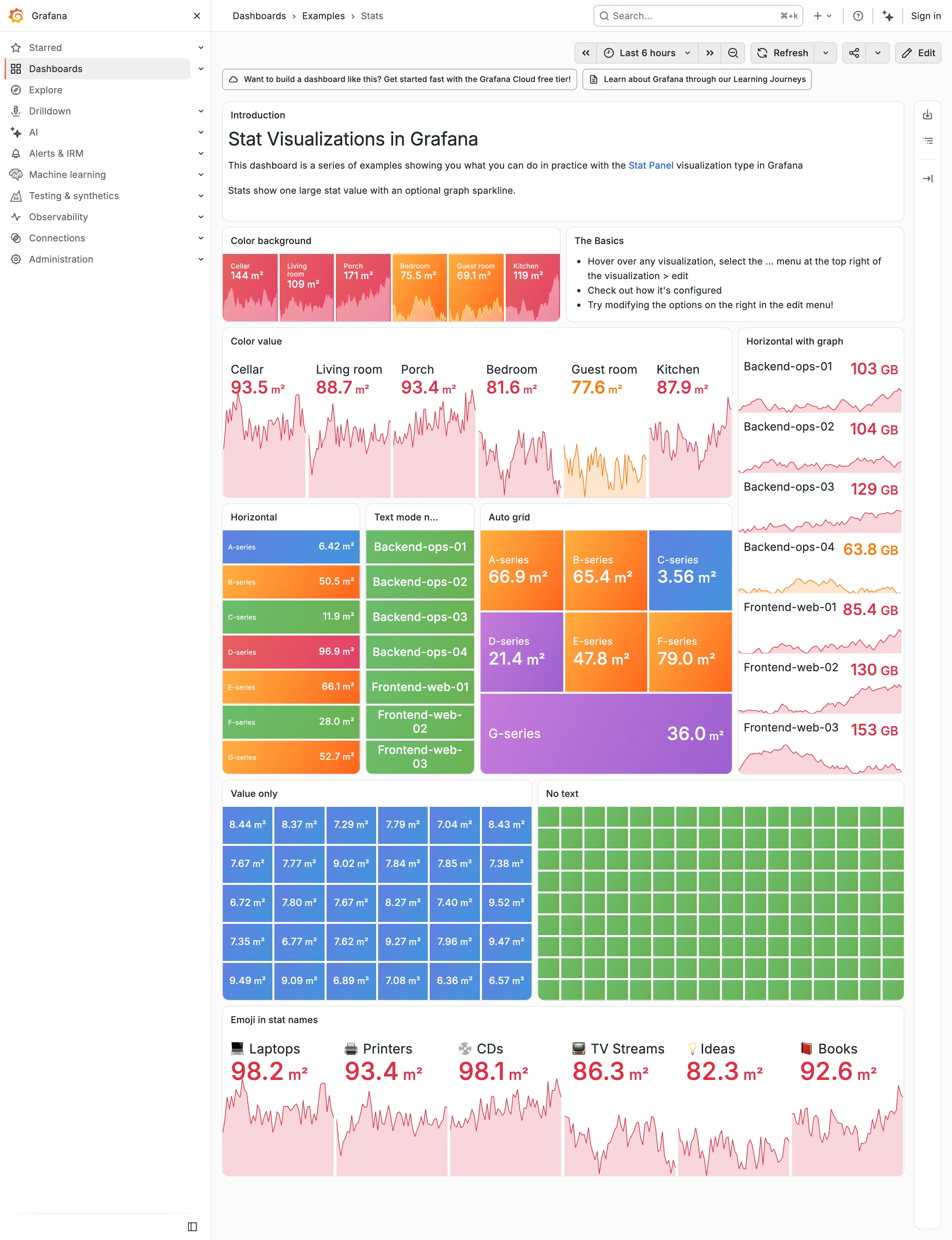
Examples / Stats, light theme September 10, 2026 Grafana Play (signed out; ?theme=light) dense · light · desktop-web
The same dashboard as the dark Stats capture, same data, same palette, one URL parameter apart. Put them side by side and the palette turns out to have been designed on charcoal. On the dark version the value colours carry because they are brighter than the ground—reds, oranges and greens against near-black. Here they have to carry by being darker than the ground instead, and the same hues arrive as pale pink and pale salmon. Look at the Color value panel: six numbers at 30-odd pixels, and 93.5, 88.7, 93.4, 81.6, 77.6 and 87.9 are all light pink on white. The column on the right is worse, because 63.8 GB lands on pale orange. Nothing about the theme switch is broken, and nothing was chosen for this ground. That's the whole argument for designing the dark case first and deriving the other one: the constrained case should set the lightness range, and here the unconstrained one did.
  • Dark-first data palette The same six values as the dark capture. Bright-on-charcoal became pale-on-white, and the contrast went with it.
  • Dark-first data palette 63.8 GB in pale orange on white. On the dark version the identical colour was the readable one.
  • Semantic status color Whole-tile fills survive the switch, because the text sits on the colour rather than being the colour.
  • Grayscale with alerts Ninety green rectangles, identical in both themes. Nothing here can read as abnormal on either ground.
  • Sparkline The area fills under each value drop to near-white here, so the shape that was legible on charcoal is a smudge.
Grafana — Examples / Stats
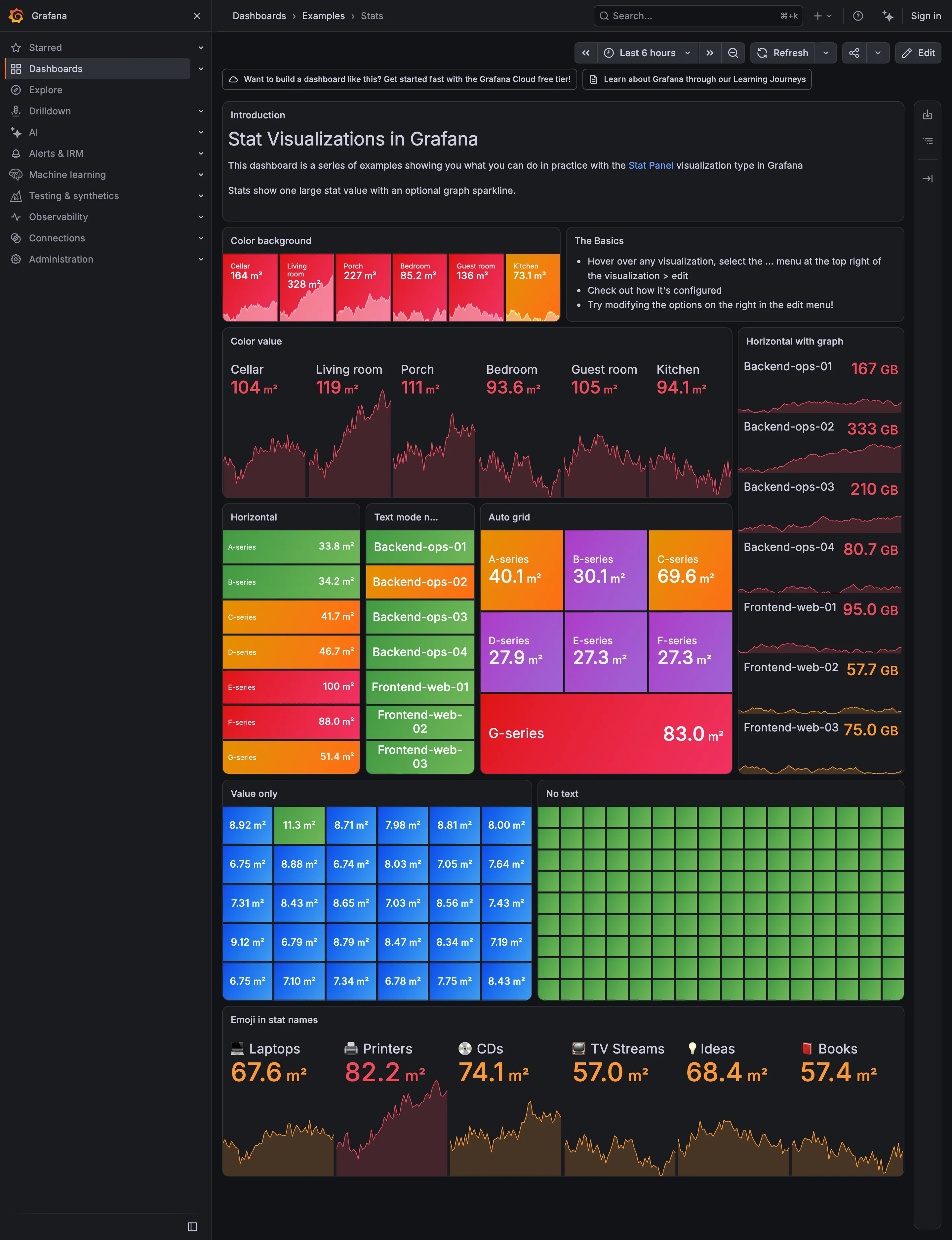
Header KPI strip. Six tiles sharing one anatomy, which is the arrangement that reads as a row rather than as six things. KPI tile. Label, value, unit and a sparkline behind it. No delta, no base, no window. Dark-first data palette. The dark half of the pair. The same six values in the light capture arrive as pale pink on white. Semantic status color. No text at all. Colour is the only carrier, which is the WCAG failure stated as a feature. Sparkline. A column of them, each scaled to its own series, which is the comparison Tufte warns the arrangement invites. KPI tile. Thirty numbers with no labels—the value with nothing attached to it. Grayscale with alerts. Seven rows, seven different colours, no resting state. Nothing here can read as abnormal. Semantic status color. Whole-tile background colour: the loudest channel available, spent on all six.
Examples / Stats September 10, 2026 Grafana Play (signed out; no version string exposed) dense · dark · desktop-web
A showcase rather than a working dashboard, which is what makes it useful: it is Grafana demonstrating every visual option the stat panel has, in one place, with nothing else competing. Two things are worth reading it for. The first is that across roughly sixty tiles here, not one carries a comparison. Every option on display is about how the number looks—background colour, value colour, orientation, text mode, grid packing—and none is about what the number should be measured against. The panel type that most needs a delta and a base is being shown off without either. The second is the colour. Every single tile on this page is coloured, and the "No text" panel is ninety-odd green rectangles carrying no label and no value at all, which is colour as the sole carrier of meaning at its purest. Both of those are reasonable for a catalogue of options and neither survives being copied onto a real page.
  • KPI tile Label, value, unit and a sparkline behind it. No delta, no base, no window.
  • Dark-first data palette The dark half of the pair. The same six values in the light capture arrive as pale pink on white.
  • Sparkline A column of them, each scaled to its own series, which is the comparison Tufte warns the arrangement invites.
  • Semantic status color Whole-tile background colour: the loudest channel available, spent on all six.
  • Grayscale with alerts Seven rows, seven different colours, no resting state. Nothing here can read as abnormal.
  • KPI tile Thirty numbers with no labels—the value with nothing attached to it.
  • Semantic status color No text at all. Colour is the only carrier, which is the WCAG failure stated as a feature.
  • Header KPI strip Six tiles sharing one anatomy, which is the arrangement that reads as a row rather than as six things.