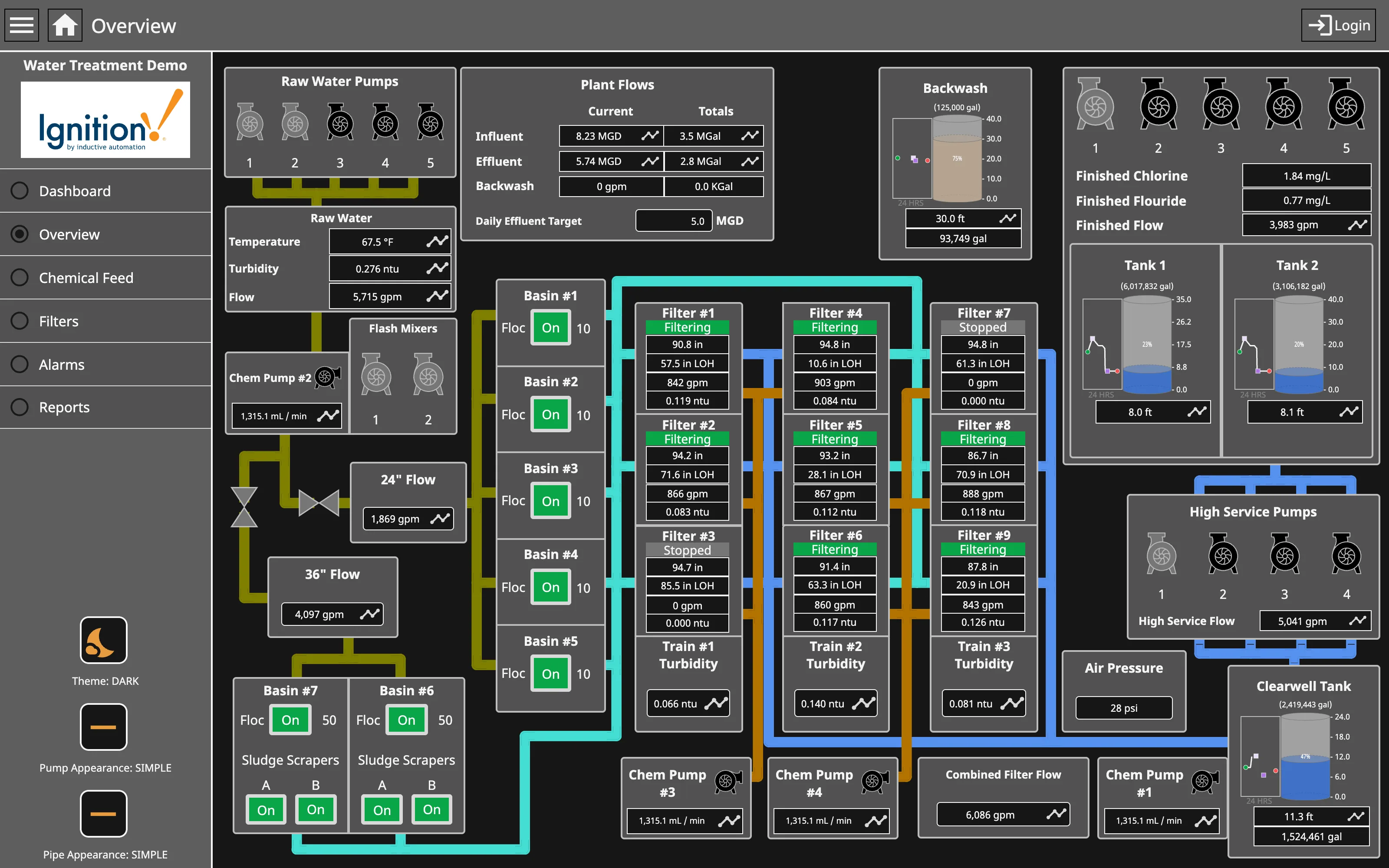
Problem
The person who owns this system already knows what every panel means. They do not want to navigate; they want to stand back and see forty things at once, because the pattern across the forty is the diagnosis.
Solution
Fill the page with many small charts of consistent shape and let the viewer scan. Refuse to summarise, refuse to hide, and accept that each individual panel is too small to read comfortably—because reading one is not the task.
This works for the same reason small multiples work generally: identical axes and identical encoding mean the eye compares shapes without translating. The one that is wrong is wrong-shaped, and it is findable in a page of forty in about a second. That ability degrades fast if panels differ in scale, size or type, so uniformity matters more here than in any other layout.
The audience assumption is doing heavy lifting and should be stated. This layout is for someone who has the system’s normal appearance memorised. To them the page is a single instrument with forty needles. To anyone else it is noise, and no amount of labelling fixes that, because the meaning is in the deviation from a baseline they don’t have.
Colour is where the layout is usually thrown away. Forty panels each using a full categorical palette produces a page where nothing stands out. Grayscale-with-alerts is the discipline that makes density work: draw everything muted and let colour mean abnormal, so the page is grey until it isn’t.
Use when
The audience is expert and consistent, the metrics are genuinely parallel, and the diagnostic question is comparative rather than specific.
Don’t use when
The audience is mixed, or the page is anyone’s entry point. A newcomer opening a wall of charts learns that the dashboard is not for them. Give them an overview and let this be a level below it.
Trade-offs
Density trades individual legibility for comparison, which is the right trade only for the people it was built for. Query cost is real: forty panels means forty queries on every load and every refresh, which is why these pages are slow and why the loading state matters more here than anywhere. The layout is unusable on anything but a large screen, so the mobile version is either a very long scroll or nothing. And because every panel is small and nobody reads individual titles, panels that broke months ago stay on the page indefinitely.
Checklist
- Do all panels share the same y-scale where they are meant to be compared?
- Are panel type and size uniform enough that a deviation is shape, not styling?
- Is the page muted by default so colour can mean abnormal?
- How many queries does one page load fire, and how long until it settles?
- What does the page look like at 20% loaded, and is that state honest?
- Is there an overview above this, for people who are not the expert audience?
- How does a broken panel announce itself when nobody reads individual titles?
- What is the smallest screen this is usable on, and what happens below it?
- Are panels ordered by something meaningful, or by the order they were added?
- Who is this page for, and does anyone else ever open it?
Compare
Netdata is the pattern in its most committed form: hundreds of charts per node, per-second resolution, arranged by subsystem, on the explicit position that pre-summarising is what makes problems invisible. Grafana hosts the best-known example in the Node Exporter family of dashboards, where the density is a community convention rather than a product feature, assembled panel by panel on a 24-unit grid. Datadog discourages the shape in favour of scoped pages and its host map, so the equivalent view is reached by narrowing rather than by scanning everything. Honeycomb rejects the premise: the argument is that a wall of pre-chosen charts can only show questions someone anticipated, and the interesting failure is always in a dimension nobody put on the wall.
Related
Small multiples is the underlying visual technique, stated properly. Panel grid is the machinery. Collapsible row is the concession this layout usually has to make to stay navigable. Grayscale with alerts is what makes density readable rather than merely dense. Wallboard mode is the sibling that optimises for distance instead of expertise.