Problem
The operator does not think in metrics. They think in tanks, valves, pumps and the pipe that runs between the second reactor and the condenser. A dashboard of named numbers asks them to rebuild that picture on every glance.
Solution
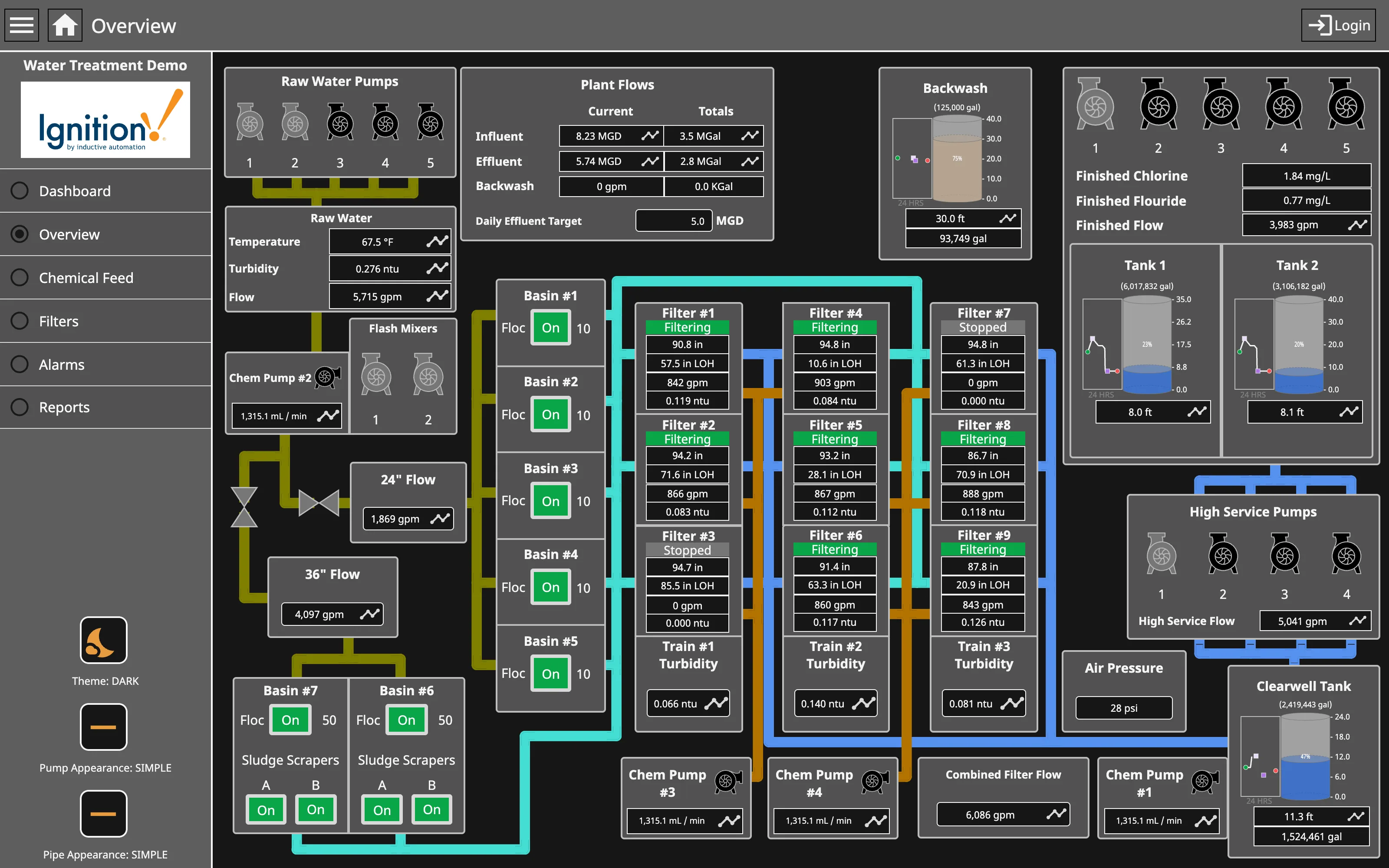
Draw the plant. Vessels, lines and equipment laid out as they physically relate, with live values placed where the instrument actually sits and states shown on the equipment itself. The display becomes a schematic that happens to be alive.
This is the oldest pattern in the collection by decades. SCADA systems have used mimic diagrams since supervisory control began, and the reasoning has not changed: an operator who already holds a spatial model of the process can read a matching schematic faster than any list, and can reason about consequences—close this valve and that vessel’s level rises—in a way a table of tags cannot support.
The modern discipline around it comes from ISA-101 and the high-performance HMI movement, which was a direct reaction to mimics that had become photorealistic. Three-dimensional pipes, gradients, animated fluid and bright equipment colours all encode nothing while consuming the attention budget. The corrective is severe: flat two-dimensional shapes, greys and neutrals for the base graphic, and colour held back for abnormal conditions and alarms, with saturation carrying severity.
The consequence is a display that looks almost blank in normal operation, which is the point. Anything coloured is something wrong, so it is found rather than searched for.
Layout fidelity is a genuine question rather than a given. A mimic that mirrors physical geometry exactly can be harder to read than one arranged by process flow, because plants are laid out for construction and maintenance rather than for comprehension. Most good mimics are topologically faithful and geometrically loose.
Use when
Operators hold a physical or topological model of the system, the relationships between components matter as much as their values, and the same people watch the same display for long shifts.
Don’t use when
There is no physical referent. Drawing a schematic of an abstract system invents a spatial arrangement that carries false meaning, and viewers will read adjacency as relationship whether it is one or not.
Trade-offs
Mimics are expensive to build and expensive to keep true: the plant changes and the diagram does not, and a wrong schematic is far more dangerous than a stale chart because it is trusted spatially. They scale badly, so a large process becomes many linked displays and navigation between them becomes its own design problem. They resist responsive layout almost completely. And the decorative pull is relentless, because a realistic-looking mimic demos well to people who will never operate it.
Checklist
- Is the layout faithful to process flow, and is geometric fidelity helping or hurting?
- Is the base graphic greyscale, with colour reserved for abnormal states?
- Does anything animate, and does the animation encode real information?
- Is equipment state readable without colour alone?
- What happens when a value is stale or its source is unreachable?
- How many linked displays exist, and how does an operator move between them?
- What keeps the diagram in step with the physical plant when it changes?
- Is the display readable from where the operator actually sits?
- Are alarm states distinguishable from setpoint deviations?
- Does a new operator get taught this display, or expected to absorb it?
Compare
Ignition, WinCC and the other industrial SCADA platforms are where this pattern lives, and their template libraries have been steadily stripped of the 3D chrome that characterised them a decade ago as ISA-101 took hold. Grafana has a canvas panel that can approximate a mimic by placing elements freely and binding them to data, which brings the pattern into general observability and lacks the alarm-state model that makes an industrial version safe. Building management and energy systems use the same encoding for chillers, air handlers and circuits, with the same drift problem when the building is modified. Service map is the closest thing in software, and it differs in a way worth noting: its topology is discovered from traffic rather than drawn by an engineer, so it cannot go stale in the way a mimic can.
Related
Grayscale with alerts is the colour discipline this pattern depends on entirely. Gauge is the instrument that legitimately stays round in this context. Semantic status color governs equipment states. Service map is the software analogue with discovered rather than drawn topology. Wallboard mode covers the control-room viewing conditions.