Problem
Checkout is failing. Checkout calls six things, and two of those call four more, and the person on call has been here three weeks and does not have that graph in their head.
Solution
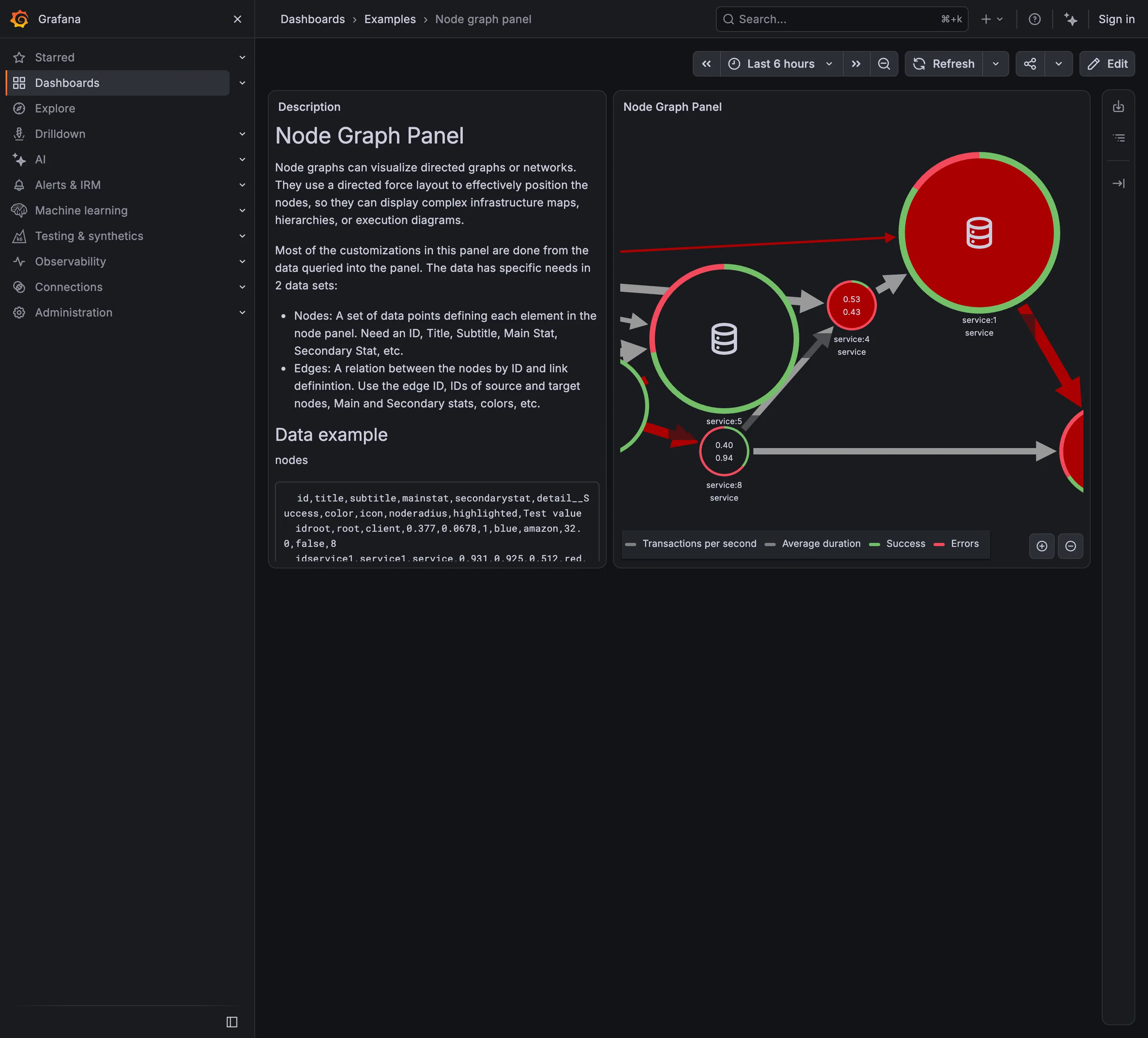
Nodes for services, edges for calls between them, both derived from traces rather than from a diagram somebody drew. Datadog states the ambition plainly: decompose the application into its component services and draw the observed dependencies in real time. Nodes are services as they appear in instrumentation; edges are aggregate calls from one service to another.
The word doing the work is observed. An architecture diagram in a wiki describes what someone intended eighteen months ago. A service map describes what actually made a request in the last few minutes, which is how teams discover the dependency nobody documented and the one everybody thought had been removed. Datadog’s version ages a service or connection out after thirty days without traces, so the map has a definition of “gone” as well as of “new”.
Health goes on the node. Datadog colours service node borders red or yellow from a consolidated health state pulled from anomalies, paging monitors and incidents. That consolidation is the design decision worth copying: a topology view where every node shows five metrics is unreadable, and one where each node shows a single derived state is scannable in a second and then drilled into.
Drawing the graph is easy. Laying it out is the hard part. Real service graphs are dense, cyclic and unbalanced, and generic force-directed layout produces a hairball that reorders itself on every refresh. A map a viewer cannot form a stable mental image of has failed regardless of how correct the edges are.
Use when
The estate is big enough that no one holds it in their head, calls cross team boundaries, and the question is “what is downstream of this” during an incident.
Don’t use when
There are eight services and everyone knows them. Also don’t use it as a monitoring surface: a topology view is a navigation and blast-radius tool, and a page that watches it continuously would be better off watching the four metrics that matter.
Trade-offs
Service maps only know what is instrumented, so an uninstrumented dependency is invisible in a view whose entire promise is completeness, which is worse than not having the view. Layout instability destroys recognition between visits. Aggregate edges hide direction of causality: a red edge tells you two services are having a bad time together and not which one started it. And at real scale the graph exceeds what a screen can carry, so every product has to pick a grouping, and the grouping determines what you are able to notice.
Checklist
- Is the map derived from traces, or from something a human maintains?
- What is the time window, and does an edge disappear when calls stop?
- Does a node carry one derived state, or several competing metrics?
- Is the layout stable between refreshes and between people?
- Can the viewer see call volume and error rate on an edge, not just its existence?
- What happens at a hundred services, and what grouping is available?
- Can you get from a node to that service’s traces, logs and dashboards?
- Are uninstrumented dependencies flagged, or silently absent?
- Is direction of the call visible, and distinguishable from direction of blame?
- Does a colourblind reader get the same health reading as everyone else?
Compare
Datadog builds the map automatically from APM traces, consolidates each service’s health into one border colour, and ages entries out after thirty days of silence, so the graph maintains itself in both directions. Jaeger ships a plainer dependency view derived from the same span parent-child relationships, which is enough to answer “who calls this” without pretending to be a monitoring surface. Grafana approaches it through Tempo’s service graph, assembled from span metrics, so the topology lives beside the dashboards rather than in a separate product. Netdata works at the host and container layer instead, mapping what is running where rather than what calls what, which answers a different question people often bring to the same screen.
Related
Trace waterfall is one instance of what this view aggregates, and the natural drill target. Host map is the same spatial idea applied to infrastructure rather than to calls. Drill-down is what a node click has to do. Semantic status color decides what a red node means. Overview then detail is the structure this pattern sits at the top of.