Skip to content
KONIGI

Dashboards / Meta information / Legend and series toggle

5 of 6

Legend and series toggle

Too many series on one chart; the viewer needs to isolate the ones that matter without leaving the chart.

Updated September 10, 2026

Problem

Fourteen services on one chart. The viewer wants to compare two of them, and the other twelve are in the way. Editing the query is not an option, because they will want a different two in thirty seconds.

Solution

Make the legend a control. Clicking a series isolates it; modifier-clicking builds a set; clicking again restores everything. The chart becomes explorable without anyone touching a query.

Grafana’s behaviour is the one most products converged on and it is worth stating exactly, because it surprises people the first time: clicking a series label removes all other series from view. It isolates rather than hides. To build up a comparison you Ctrl or Cmd-click additional labels, and clicking a label twice returns to showing everything.

Isolate-on-click is the right default, and the reason is the asymmetry of intent. Someone with fourteen series almost always wants one or two, so isolating gets them there in one click while hiding would take twelve. The cost is that the first click is destructive-looking and undiscoverable, which is why the double-click-to-restore has to be reliable.

The legend also has a second job that has nothing to do with toggling: identifying which line is which. This is where it either earns its space or wastes it. Grafana offers List and Table modes, placement at Bottom or Right, and the ability to put values and calculations in the legend itself. Table mode with a value column turns the legend into a sortable summary and often removes the need for a separate panel.

Placement matters more than it looks. A legend at the bottom pushes the chart up and gets cut off with many series. A legend on the right takes horizontal space permanently but scrolls gracefully, which is why dense charts end up on the right.

The accessibility point is unavoidable here: a legend that maps colour to name is the mechanism by which a chart’s meaning depends entirely on colour. WCAG’s requirement that colour not be the sole carrier of information means either direct labelling, distinguishable line styles, or an interaction that lets someone isolate a series and read its name.

Use when

More than about four series share a chart and viewers compare subsets that differ by person and by question.

Don’t use when

There is one series, where the legend is a label pretending to be furniture. Or when there are fifty, where the legend is a scrolling list nobody reads and small multiples would answer better.

Trade-offs

Toggle state is invisible to anyone who didn’t set it, so a screenshot of an isolated chart looks like a chart with one series and gets read as such. It rarely persists into a shared link, so the thing you found is not the thing they open. Legends consume real space that the chart wanted. And with many series the legend becomes the dominant object on the panel, which is a strong signal the chart is the wrong shape rather than the legend the wrong size.

Checklist

  • Does clicking a series isolate it or hide it, and is that discoverable?
  • Is there a reliable one-action restore?
  • Can the viewer build a set of two or three, and how?
  • Does the legend carry values or calculations, or only names?
  • Is placement right for the series count, and does it scroll rather than truncate?
  • Are series names readable, or truncated into ambiguity?
  • Does the chart’s meaning survive for someone who cannot distinguish the colours?
  • Does toggle state go into the URL or a shared link?
  • Is series order stable between refreshes?
  • At what series count should this be small multiples instead?

Compare

Grafana isolates on click and builds sets with Ctrl or Cmd, offers list and table legends with values in them, and lets the legend sit bottom or right, which makes it as much a summary table as a key. Datadog leans on hover-to-highlight over click-to-isolate, so exploring is transient and nothing persists into a state someone could misread. Honeycomb mostly avoids the problem by grouping at query time: rather than toggling fourteen series off a chart, you change what you grouped by and get the two you wanted. Netdata puts a dimension list under every chart with per-dimension toggling, which at hundreds of charts makes the legend the primary way of narrowing anything.

Time series is the chart this sits on. Categorical series palette is what makes the mapping between key and line possible at all. Hover detail is the other way to answer “which line is this”. Small multiples is the answer when the series count has outgrown one chart. Cross-filter is the page-wide version of narrowing by selection.
Legend and series toggle anatomy Fourteen series with a table-mode legend on the right carrying a value column. Below, the same chart after one click on a legend label, which isolates that series rather than hiding it. Fourteen series, legend as a control Series Last checkout 312 search 208 cart 184 user 141 feed 96 9 more 1 2 1 PLACEMENT On the right it costs width permanently and scrolls gracefully. At the bottom it pushes the chart up and gets cut off. 2 TABLE MODE A value column turns the legend into a sortable summary, and often removes the need for a panel next to it. One click on a label It isolates rather than hides, because someone with fourteen series wants one. checkout 312 13 hidden
Wireframe — the pattern's anatomy, not any one product's version of it

Implementation

The legend does something here. Once a chart has more than three series the reader needs to isolate one, and making that work inside the chart is cheaper than a filter that reloads the page.

npm
recharts
Tokens
--card--card-foreground--muted-foreground--border--chart-1--chart-2--chart-3--chart-4--chart-5--chart-6--chart-7--chart-8
SeriesLast
  • 312
  • 208
  • 184
  • 141
  • 96

LegendChart.tsxA table-mode legend that isolates on click, adds on modifier click, restores on the second click, and folds the tail behind a count.

import { useState, type MouseEvent } from "react";
import { Line, LineChart, XAxis, YAxis } from "recharts";
import { seriesColors } from "../categorical-series-palette/seriesColor";

export type Series = { key: string; values: number[] };

/**
 * The legend is the control. One click on a label isolates that series,
 * because someone looking at fourteen almost always wants one; a modifier
 * click adds to the set; clicking the last selected label restores all.
 * Table mode carries the last value, which is usually the number the viewer
 * came for and saves a panel beside the chart.
 */
export function LegendChart({ labels, series, rows = 5, defaultSelected = [], onSelectionChange, width = 420, height = 170 }: {
  labels: string[];
  series: Series[];
  /** Legend rows shown before "n more". The rest are one click away, not gone. */
  rows?: number;
  /** Isolated keys. Empty means every series is drawn. Put this in the URL. */
  defaultSelected?: string[];
  onSelectionChange?: (keys: string[]) => void;
  width?: number;
  height?: number;
}) {
  const [selected, setSelected] = useState<string[]>(defaultSelected);
  const [expanded, setExpanded] = useState(false);

  const select = (keys: string[]) => { setSelected(keys); onSelectionChange?.(keys); };
  const toggle = (key: string, e: MouseEvent) => {
    const additive = e.metaKey || e.ctrlKey;
    if (additive) select(selected.includes(key) ? selected.filter((k) => k !== key) : [...selected, key]);
    else if (selected.length === 1 && selected[0] === key) select([]);
    else select([key]);
  };

  // Sorted by last value, so the legend is the summary table it looks like.
  const sorted = [...series].sort((a, b) => b.values.at(-1)! - a.values.at(-1)!);
  const { assigned, other } = seriesColors(sorted.map((s) => s.key));
  const colorOf = (key: string) => assigned.find((a) => a.key === key)?.color ?? other!.color;
  const isolated = selected.length > 0;
  const shown = isolated ? sorted.filter((s) => selected.includes(s.key)) : expanded ? sorted : sorted.slice(0, rows);
  const hidden = isolated ? series.length - selected.length : series.length - shown.length;

  const data = labels.map((label, i) => Object.fromEntries([["label", label], ...series.map((s) => [s.key, s.values[i]])]));

  return (
    <div className="grid grid-cols-[1.3fr_1fr] gap-5">
      <div className="overflow-x-auto rounded-lg border bg-card p-4">
        <LineChart width={width} height={height} data={data} margin={{ top: 4, right: 4, bottom: 0, left: 0 }}>
          <XAxis interval={0} dataKey="label" hide />
          <YAxis hide domain={[0, "dataMax + 20"]} />
          {sorted.map((s) => (
            <Line key={s.key} dataKey={s.key} stroke={colorOf(s.key)} strokeWidth={isolated ? 2.5 : 2}
              hide={isolated && !selected.includes(s.key)} dot={false} isAnimationActive={false} />
          ))}
        </LineChart>
      </div>

      <div className="rounded-lg border bg-card p-4">
        <div className="flex items-baseline justify-between border-b pb-2 text-[11px] uppercase tracking-wide text-muted-foreground">
          <span>Series</span><span>Last</span>
        </div>
        <ul className="mt-1 text-xs tabular-nums">
          {shown.map((s) => (
            <li key={s.key} className="flex items-center gap-2 py-1.5">
              <span className="size-2.5 rounded-[2px]" style={{ background: colorOf(s.key) }} />
              <button type="button" onClick={(e) => toggle(s.key, e)} className="text-card-foreground hover:underline"
                aria-pressed={selected.includes(s.key)} title="Click to isolate. Cmd-click to add. Click again to restore.">
                {s.key}
              </button>
              <span className="ml-auto text-card-foreground">{s.values.at(-1)}</span>
            </li>
          ))}
        </ul>
        {hidden > 0 && (
          <button type="button" className="mt-1 w-full border-t pt-2 text-left text-[11px] text-muted-foreground hover:underline"
            onClick={() => (isolated ? select([]) : setExpanded(true))}>
            {isolated ? `${hidden} hidden` : `${hidden} more`}
          </button>
        )}
      </div>
    </div>
  );
}

demo.tsxHow it is called: fourteen services by requests per second, five legend rows, the rest one click away.

import { LegendChart } from "./LegendChart";

/**
 * Fourteen services, requests per second over seven hours. The legend shows
 * the top five and folds the rest; click "checkout" to isolate it and the
 * footer reads "13 hidden". The eight busiest get a colour by key, the rest
 * share the muted "other".
 */
const LABELS = ["09:00", "10:00", "11:00", "12:00", "13:00", "14:00", "15:00"];

const SERIES = [
  { key: "checkout", values: [220, 236, 226, 268, 258, 292, 312] },
  { key: "search", values: [150, 158, 154, 176, 168, 194, 208] },
  { key: "cart", values: [128, 134, 130, 152, 148, 170, 184] },
  { key: "user", values: [96, 100, 98, 114, 110, 130, 141] },
  { key: "feed", values: [68, 70, 66, 80, 78, 90, 96] },
  { key: "auth", values: [60, 58, 64, 70, 72, 80, 84] },
  { key: "payments", values: [48, 52, 50, 58, 60, 66, 71] },
  { key: "inventory", values: [42, 44, 46, 50, 54, 58, 63] },
  { key: "shipping", values: [36, 38, 36, 42, 44, 48, 52] },
  { key: "notifications", values: [30, 32, 30, 36, 38, 40, 44] },
  { key: "catalog", values: [26, 28, 26, 30, 32, 34, 37] },
  { key: "reviews", values: [20, 22, 20, 24, 26, 28, 29] },
  { key: "recommendations", values: [16, 16, 18, 18, 20, 22, 22] },
  { key: "media", values: [12, 12, 14, 12, 14, 14, 15] },
];

export default function Demo() {
  return <LegendChart labels={LABELS} series={SERIES} onSelectionChange={(keys) => console.log("isolated:", keys)} />;
}
What it renders. Identical markup in both panes, with only the token values changing.

Examples

Captures whose hotspots reference this pattern, grouped by product and dated. The dashed boxes are this pattern; hover any box for the note.

Grafana

The reference implementation for panel grids, template variables, and stat panels; most other tools are defined by how they differ from it.

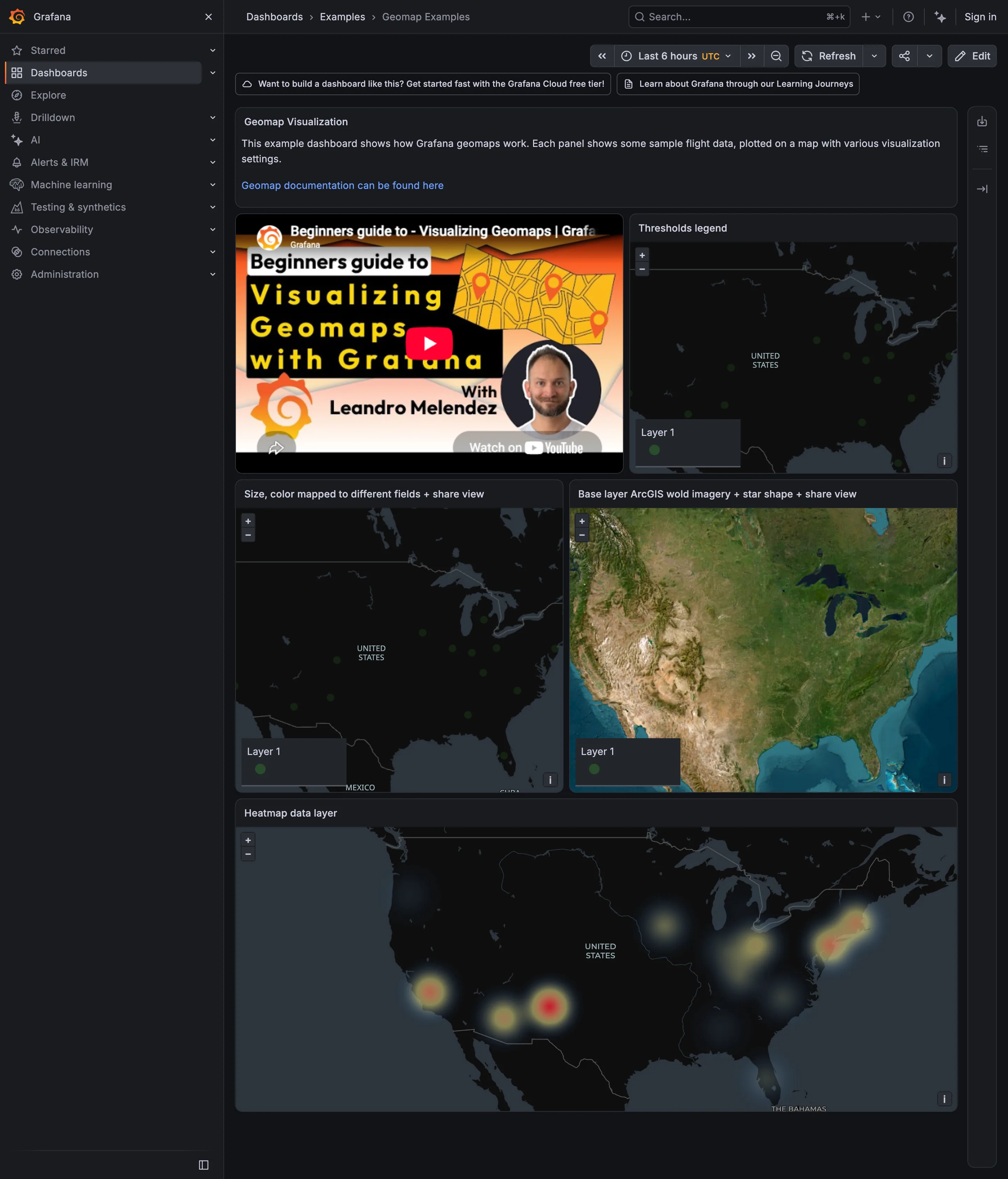
Examples / Geomap September 10, 2026 Grafana Play (signed out; no version string exposed) medium · dark · desktop-web
Four maps of the same flight data, and the base map does more damage than any of the data settings. On the three dark panels the markers are small green dots on dark grey, which at this size is close to the contrast floor; on the satellite panel they are small green dots on terrain that is already green, brown and blue, and they effectively disappear. The base layer is supposed to be context and recede, and imagery is the loudest option available. The density layer along the bottom is the honest one: it stops pretending individual points resolve, and the clusters on both coasts read immediately. Its radius is doing a great deal of unlabelled work, though, and the blobs merge into clouds at a setting nobody can see. Three of the four panels also carry a legend that says "Layer 1", which is a legend occupying a corner and naming nothing.
Show 2 more examples Hide the rest

Grafana

The reference implementation for panel grids, template variables, and stat panels; most other tools are defined by how they differ from it.

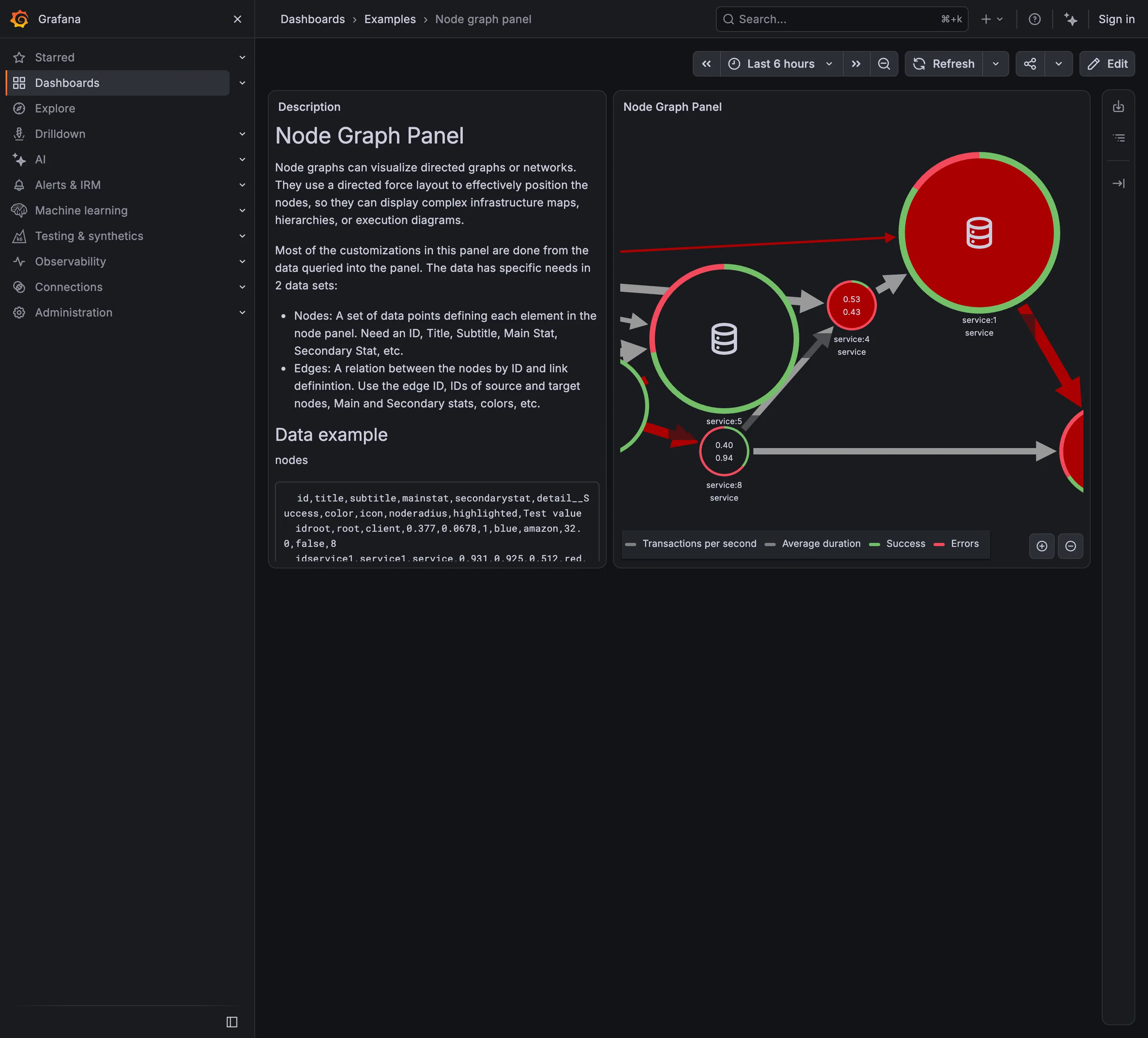
Examples / Node graph panel September 10, 2026 Grafana Play (signed out; no version string exposed) sparse · dark · desktop-web
Seven services, and the panel is already too small to hold them. Three nodes are cut in half by the right edge and at least one more is somewhere past it, which is the force layout doing what force layouts do to a graph with more nodes than room. That is the hard part of this pattern and it is visible here at a scale of seven. Each node also carries four things at once: a number, a second number, and a ring split between a green arc and a red one. The legend names all four. A topology view where every node reports four measures is a view you read node by node, which is the opposite of what a map is for —one derived state per node is scannable in a second and drills into the rest. Here almost every ring is mostly red, so the channel that could have carried that state is saturated and distinguishes nothing.
  • Service map Nodes for services, edges for calls, both from instrumentation rather than from a diagram.
  • Semantic status color One node: two numbers inside and a success/error ring around it. Four measures, no verdict.
  • Legend and series toggle Four series named for a graph with seven nodes, which is the legend doing more work than the map.
  • Zoom and pan on time The only route to the nodes pushed off the right edge, and it doesn't move the rest of the page.

Netdata

Per-second charts, hundreds per node, with a per-chart anomaly ribbon instead of a band on the series.

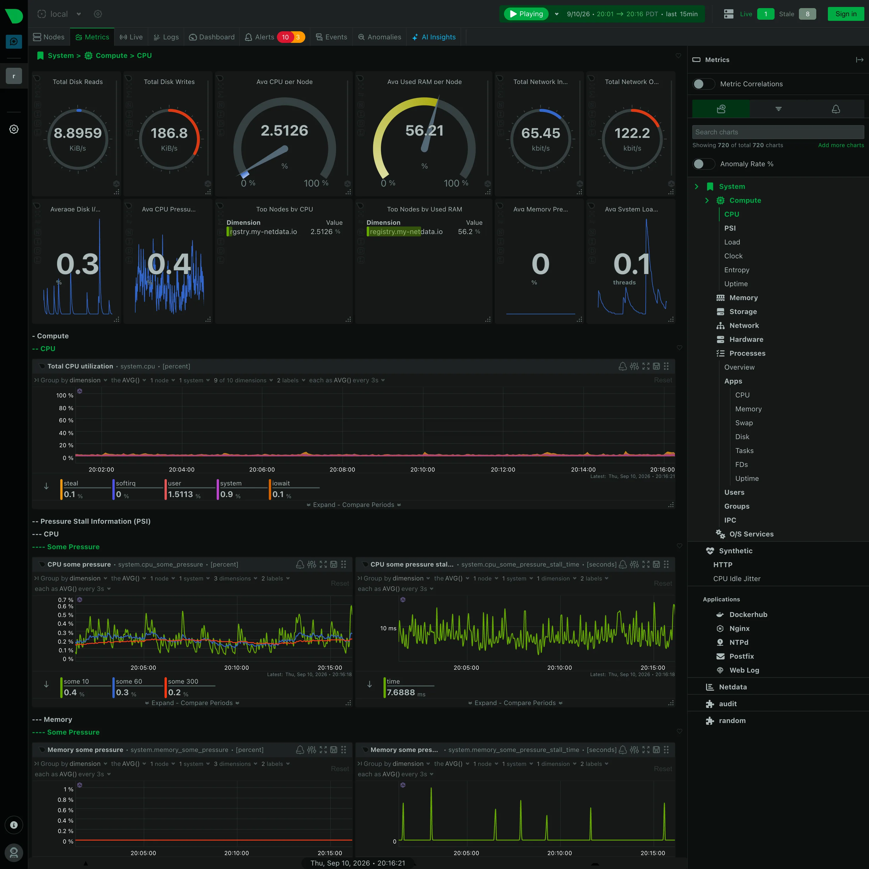
Metrics / System › Compute › CPU September 10, 2026 Netdata Agent (public registry node, signed out) dense · dark · desktop-web
Further down the same generated page, and the section nesting is the thing to look at: "− Compute", then "−− CPU", then "−− Pressure Stall Information (PSI)", then "−−− CPU", then "−−−− Some Pressure". Four levels, each collapsible, each named by the collector rather than by a person, and the depth is signalled with leading dashes because there was no design pass to give them a hierarchy in type. It is consistent and completely unedited. Every chart also carries its own query builder in the header—group by, aggregation, node count, dimension count, sample interval—so a panel here is a live query you can re-scope in place rather than a saved configuration. Worth noting what is not in this shot: the sidebar has an Anomaly Rate toggle, switched off, and Netdata's answer to the anomaly problem is a separate derived rate per chart rather than a band drawn around the series. This capture shows the control, not the thing it draws.
  • Collapsible row Four levels of section, depth carried by leading dashes. Generated by the collector, and never edited.
  • Gauge and dial Six arcs. Two are percentages where the endpoints mean something; four are rates in KiB/s and kbit/s on an invented maximum.
  • Legend and series toggle The legend is a value table: steal 0.1, softirq 0, user 1.5113, system 0.9, iowait 0.1, each with its own bar.
  • Dashboard builder A query builder in every chart header, so the panel is a live query rather than a saved configuration.
  • Overview then detail System › Compute › CPU. The breadcrumb is the only thing telling you where in 720 charts you are.