Problem
Latency is up in some regions and fine in others. A table sorted by region gives the answer eventually. A map gives it immediately, because the pattern is usually geographic—a submarine cable, a weather event, a data centre.
Solution
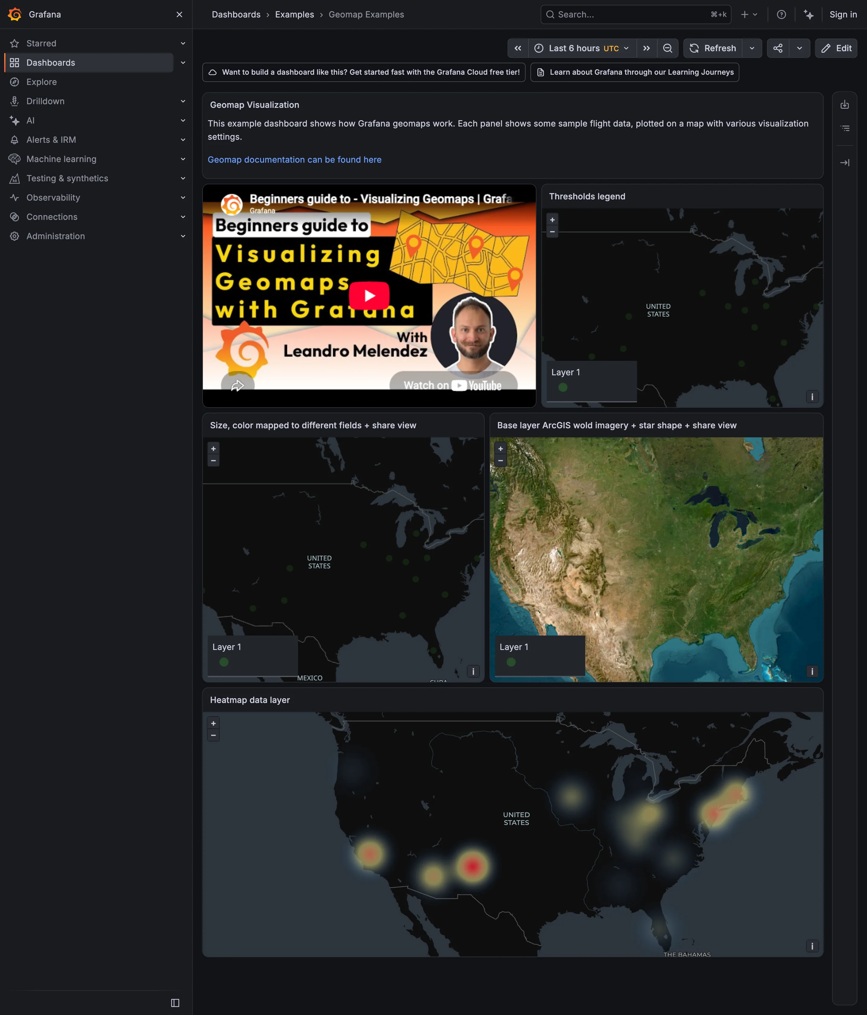
Put the values on a map. Markers at points, colour on regions, or density where the volume is high enough that individual points stop resolving.
The three encodings answer different questions and are not interchangeable.
Markers suit discrete located things: stores, sensors, data centres, incidents. Size or colour carries the measure. They fail by overlapping, so at density they need clustering, and clustering introduces its own reading problem because a cluster of five and a cluster of five hundred must look different.
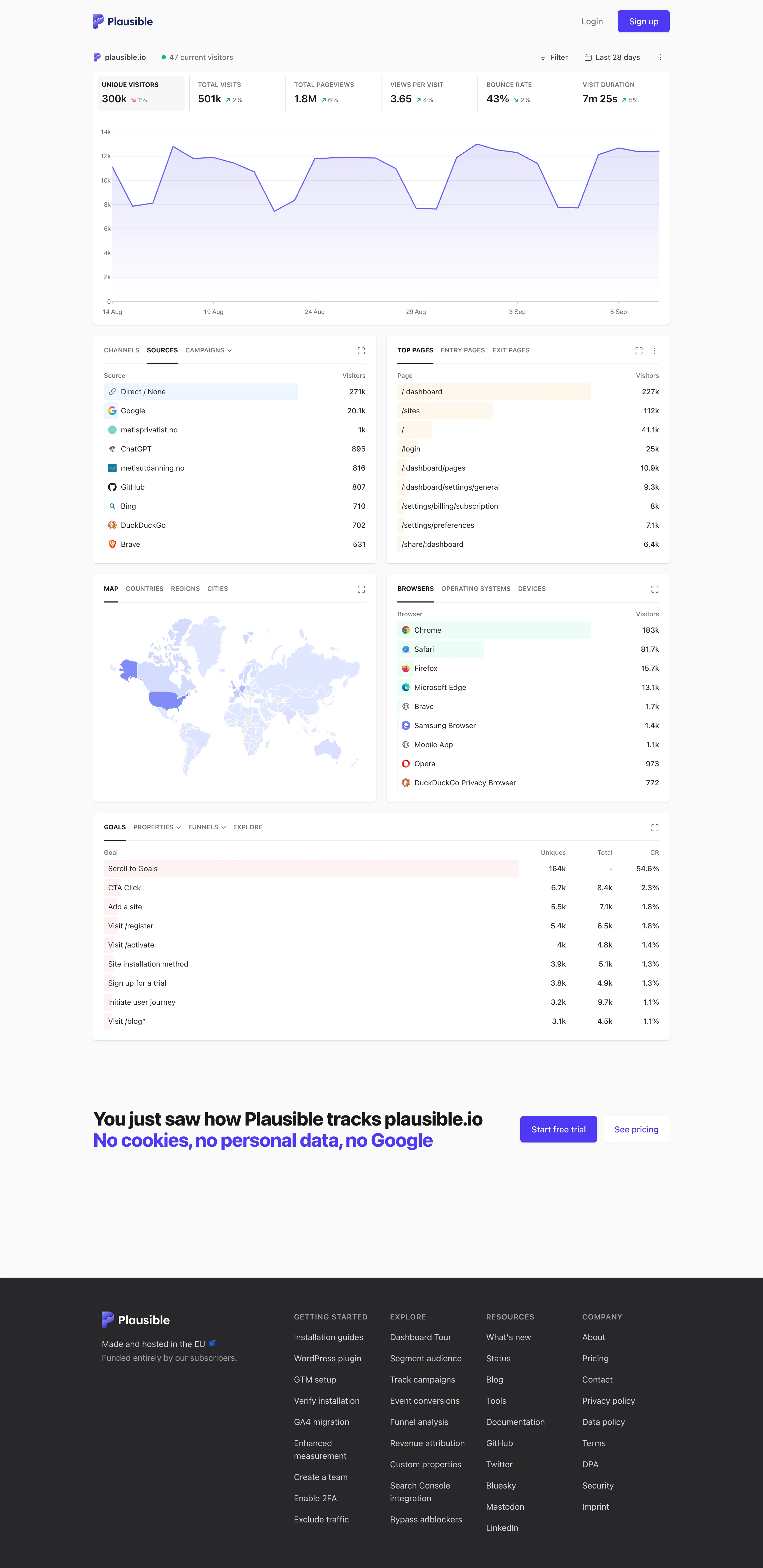
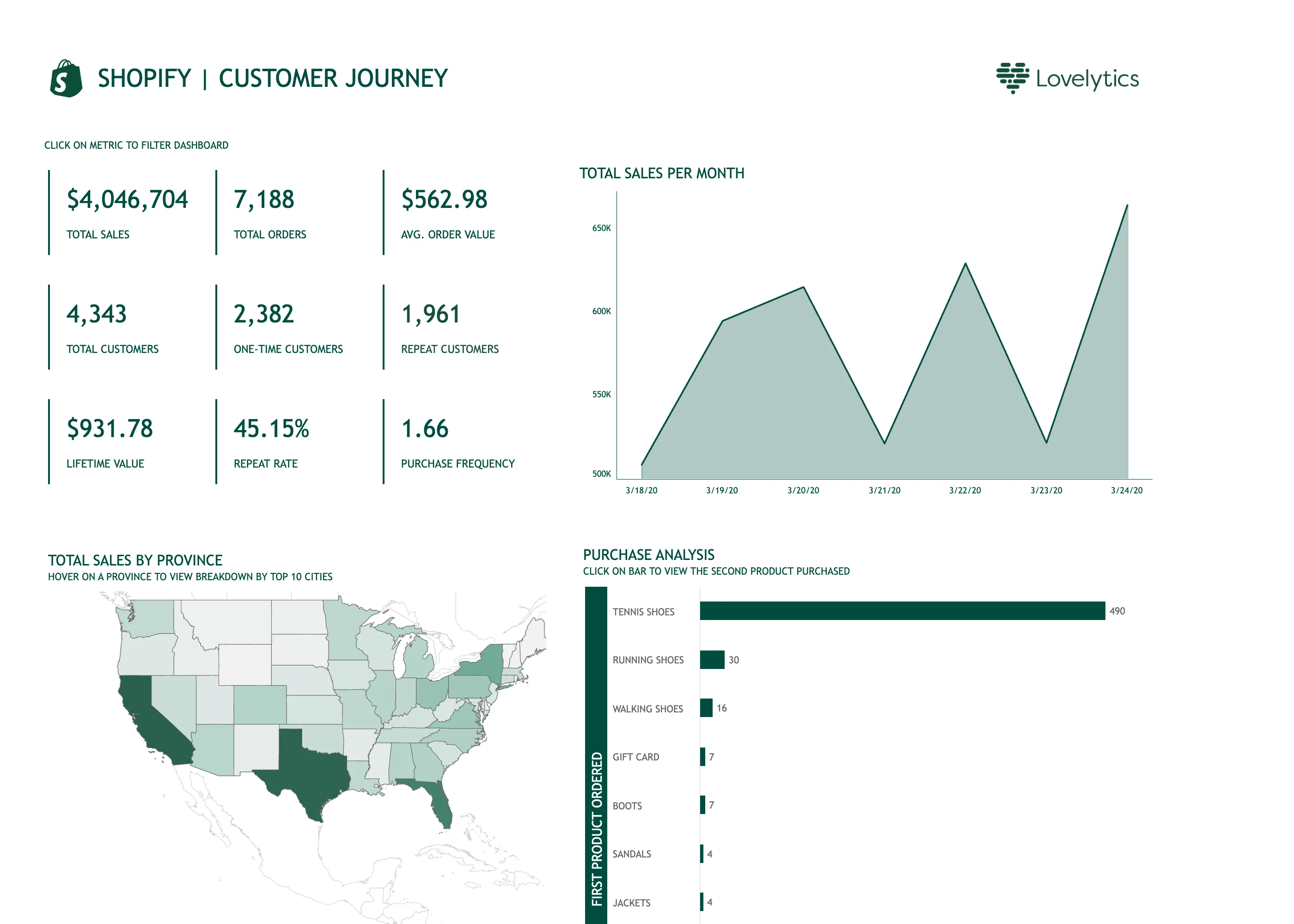
Choropleth fills administrative regions with colour, and carries a well-known distortion: the eye reads area, so a large sparsely-populated region dominates a small dense one carrying ten times the volume. Normalising by population or by area is not optional, and a choropleth of raw counts is close to always a map of where people live.
Density or heat suits high-volume point data where individual points are meaningless. It is honest about aggregation but hides outliers, and its radius parameter changes the apparent story more than most people realise.
Grafana’s geomap exposes these as layer types over a configurable base map, which is the right model: the base map is context and should recede, while the data layer carries the meaning. Base maps that are dark, detailed and full of labels compete directly with the data drawn on them.
The projection question is real but usually settled: web maps use Web Mercator, which inflates area with latitude, so on a choropleth of raw values Greenland and Russia look enormously important. Worth knowing when the map covers high latitudes.
Use when
Location genuinely explains the variation, and the audience thinks geographically. Delivery, retail, field equipment, edge infrastructure, anything with a physical footprint.
Don’t use when
Location is a label rather than a cause. Plotting per-country revenue on a map when the interesting comparison is between two countries makes an easy comparison hard, and a bar chart would have ranked them in one glance.
Trade-offs
Maps are the most persuasive chart type in this collection and frequently the least informative, which makes them a favourite of stakeholder decks. They spend enormous space on geography that carries no data—oceans, empty land—and that space comes from the panels that would have shown the trend. Base map tiles are usually an external dependency, so the panel has a network failure mode nothing else on the page has. And precise location can be personally identifying, so a map of user events is a privacy decision as much as a design one.
Checklist
- Which encoding is this, and does it match the question?
- If choropleth, is the value normalised by population or area rather than raw?
- Does region area distort importance, especially at high latitudes?
- At full density, do markers overlap, and does clustering distinguish sizes?
- Does the base map recede, or does it compete with the data?
- Where do the map tiles come from, and what shows if they fail?
- Does the colour ramp work for colourblind viewers and in the page’s theme?
- Can the viewer get from a marker or region to the underlying records?
- Is the default viewport right for the audience, or centred on someone else’s country?
- Could precise points identify individuals, and should they be aggregated?
Compare
Grafana’s geomap builds the panel as stackable layers—markers, heatmap, GeoJSON—over a swappable base map, which makes it flexible and makes the base map a decision most dashboard authors never consciously take. Datadog ties maps to tag scope so a region view narrows the rest of the page, which is the pattern working as navigation rather than as illustration. Kibana carries the strongest geospatial tooling of the observability tools, with real spatial queries rather than only display, reflecting Elasticsearch’s geo-query heritage. Mapping-first tools like Mapbox and Felt are worth naming because they treat the base map as a design surface rather than a backdrop, which is the discipline general dashboard tools skip.
Related
Host map is the same spatial scanning idea with an invented rather than geographic layout. Heatmap shares the density encoding without the geography. Sequential and diverging scales governs the choropleth ramp and is where most map errors actually live. Drill-down is what a marker click owes. Data table is the unglamorous alternative that often answers faster.