Skip to content
KONIGI

Dashboards / Data information / Ranked list

4 of 7

Ranked list

The viewer needs to know which few items dominate, not the distribution of all of them.

Updated September 9, 2026

Problem

Something is consuming the budget, or throwing the errors, or taking the time. There are nine thousand candidates and the viewer needs the handful that account for most of it.

Solution

Sort descending, cut at N, show the values. The sort is trivial. The cut is the pattern, and everything interesting is about what happens at the cut line.

Say what’s below it. A top ten with no total is a list of ten things and no sense of whether they’re 90% of the problem or 4% of it. An “other” row, or a share-of-total figure on each line, converts a leaderboard into an answer. Without it the viewer cannot tell a heavy-tailed distribution from a flat one, and those call for completely different responses.

Say what the ranking is over. Top ten endpoints by latency over the last hour is not the top ten at any moment inside that hour. A ranked list computed across a window silently averages away the thing that spiked for ninety seconds and then left, which on an operational dashboard is frequently the thing you were looking for.

Watch the churn. Over a high-cardinality dimension the membership of the top ten changes on every refresh, and a list that reorders itself while someone is reading it is unusable. This is the axis observability tools diverge on: Honeycomb’s whole argument is that high cardinality is where the answers are and the tooling should hold up under it, rather than pre-aggregating the interesting dimensions away before anyone can rank by them.

Use when

The distribution is genuinely skewed and the viewer’s job is triage. Which customers, which endpoints, which queries, which hosts.

Don’t use when

The values are close together. Ten items within a few percent of each other produce a ranking that is noise given an ordering, and readers treat position as meaningful whether or not it is. Show the distribution instead. Also don’t rank when the set is small enough to show entirely.

Trade-offs

Ranking imposes a total order on things that may not have one, and readers over-trust position: first and second read as meaningfully different even when they differ by a rounding error. The cut at N is arbitrary and usually invisible, so an item at position eleven is indistinguishable from one at position nine hundred. Ranked lists also concentrate attention on the head by construction, which is the point, and which means slow accumulating problems in the tail never surface. And on a shared dashboard the list becomes a scoreboard, which changes behavior in ways nobody specified.

Checklist

  • Why N? Is it ten because ten is the answer or because ten fits?
  • Is the total, or each item’s share of it, visible?
  • Is there an “other” row, and does it carry the count of what’s in it?
  • Is the ranking over the whole window, and would a per-interval ranking say something different?
  • How stable is the membership between refreshes, and is the list readable while it updates?
  • Are ties broken deterministically, so the order doesn’t jitter?
  • Can two adjacent rows be distinguished, or are they within noise?
  • Can the viewer click through to the item, and do they land somewhere scoped correctly?
  • What’s the cardinality of this dimension, and does the query hold up at that cardinality?
  • Does the list say what it’s ranked by, in the units the viewer thinks in?

Compare

Grafana builds this out of a bar gauge or a sorted table, which means the “other” row and the share-of-total are things whoever wrote the query has to remember, and they usually don’t. Honeycomb treats ranking as a step inside the analysis loop rather than a finished panel, so a top-N is somewhere you group by a dimension and then keep going, which suits a high-cardinality field where the interesting item was never in anyone’s top ten. Sentry ranks issues by event count and keeps a sparkline on each row, so the list carries shape as well as order and a spiking issue at position twelve is still visible. Netdata ranks per-node and per-second, so the list turns over fast enough that it reads as a live view rather than a standing. Cloudflare Radar strips the magnitudes out entirely: its top tens are a number, a name and nothing else, with no bar and no share of total. That is the most aggressive answer available to the question this pattern raises, and it holds up because for a reader who came for one fact the rank genuinely is the whole finding.

Data table is this pattern without the cut, and the right answer once the viewer wants to sort by something else. Drill-down is where a rank position should take them. Filter bar is how they narrow the population before ranking it. Stacked composition answers the share-of-total question graphically. Cross-filter is what turns a list item into a scope for the rest of the page.
Ranked list anatomy A top-five list of endpoints by error count, with a share-of-total column, a cut line, and an "other" row below it accounting for the remaining twenty-one percent across 2,140 endpoints. Anatomy Errors · last 1 hour Share 1 2 1 /api/checkout 41% 3 2 /api/search 19% 3 /api/cart 9% 4 /api/user 6% 5 /api/feed 4% 4 other · 2,140 endpoints 21% 5 1 RANKED BY The measure and the window. Top ten over an hour is not the top ten at any moment in it. 2 SHARE OF TOTAL Turns a leaderboard into an answer. 3 ROW Rank, name, value. The bar is optional; it only earns space if the top item dwarfs the rest. 4 THE CUT Where N stops. Arbitrary unless you say why. 5 OTHER The row almost every list omits. Without it, a heavy tail and a flat one look the same. Over a high-cardinality dimension the membership churns on every refresh.
Wireframe — the pattern's anatomy, not any one product's version of it

Implementation

A top-N is a table that has given up sorting. The rank is the finding, so the bar is drawn inside the row rather than beside it, and the tail is named instead of being silently dropped.

Tokens
--card--card-foreground--muted-foreground--border--status-warn--chart-1
Errors · last 1 hourShare
  1. 141%
  2. 219%
  3. 39%
  4. 46%
  5. 54%
other · 2,140 endpoints21%

RankedList.tsxTakes the top rows, the total and the cardinality, and computes each share and the other row from them. The window is a required prop.

export type Ranked = { name: string; value: number };

/**
 * Sort descending, cut at N, and account for the cut. The list takes the
 * top rows plus two numbers the query already knows, the total and the
 * cardinality, so it can draw the "other" row every leaderboard omits. Without
 * that row a heavy tail and a flat one look the same.
 */
export function RankedList({ measure, window, top, total, cardinality, noun, onSelect }: {
  /** What the rows are ranked by, in the viewer's units. "Errors". */
  measure: string;
  /** The window the ranking covers. Top five over an hour is not the top
   *  five at any moment in it, so the window is required, not a caption. */
  window: string;
  /** The rows above the cut. Sorted here, ties broken by name so the order
   *  never jitters between refreshes. */
  top: Ranked[];
  /** Sum of the measure across every item, above and below the cut. */
  total: number;
  /** How many items the dimension has. The other row carries the count. */
  cardinality: number;
  /** What an item is called: "endpoints", "tenants", "queries". */
  noun: string;
  onSelect?: (name: string) => void;
}) {
  const rows = [...top].sort((a, b) => b.value - a.value || a.name.localeCompare(b.name));
  const above = rows.reduce((n, r) => n + r.value, 0);
  const other = { value: total - above, count: cardinality - rows.length };
  const pct = (v: number) => `${Math.round((v / total) * 100)}%`;
  // Bars are scaled to the top row, so the lead's size is the first thing read.
  const bar = (v: number) => ({ width: `${(v / rows[0].value) * 70}px` });

  return (
    <div className="w-[340px] rounded-lg border bg-card p-4">
      <div className="flex items-baseline justify-between border-b pb-2 text-[11px] uppercase tracking-wide text-muted-foreground">
        <span>{measure} · {window}</span>
        <span>Share</span>
      </div>
      <ol className="mt-1">
        {rows.map((r, i) => (
          <li key={r.name} className="flex items-center gap-2 py-1.5 text-xs">
            <span className="w-3 tabular-nums text-muted-foreground">{i + 1}</span>
            <button type="button" onClick={() => onSelect?.(r.name)} disabled={!onSelect}
              className="w-24 truncate text-left text-card-foreground enabled:hover:underline" title={`${r.value.toLocaleString("en-GB")} ${measure.toLowerCase()}`}>
              {r.name}
            </button>
            <span className="h-2 rounded-[1px] bg-chart-1" style={bar(r.value)} />
            <span className="ml-auto tabular-nums text-card-foreground">{pct(r.value)}</span>
          </li>
        ))}
      </ol>
      {other.count > 0 && (
        <div className="mt-1 flex items-center gap-2 border-t border-dashed pt-2.5 text-xs text-status-warn">
          <span>other · {other.count.toLocaleString("en-GB")} {noun}</span>
          <span className="h-2 rounded-[1px] bg-status-warn" style={bar(other.value)} />
          <span className="ml-auto tabular-nums">{pct(other.value)}</span>
        </div>
      )}
    </div>
  );
}

demo.tsxHow it is called: five endpoints out of 2,145, ten thousand errors in the hour.

import { RankedList } from "./RankedList";

/**
 * Ten thousand errors in the last hour across 2,145 endpoints. Five of them
 * account for 79%; the other row says what the remaining 2,140 add up to.
 */
export default function Demo() {
  return (
    <RankedList
      measure="Errors"
      window="last 1 hour"
      top={[
        { name: "/api/checkout", value: 4100 },
        { name: "/api/search", value: 1900 },
        { name: "/api/cart", value: 900 },
        { name: "/api/user", value: 600 },
        { name: "/api/feed", value: 400 },
      ]}
      total={10_000}
      cardinality={2145}
      noun="endpoints"
      onSelect={(name) => console.log("open", name)}
    />
  );
}
What it renders. Identical markup in both panes, with only the token values changing.

Examples

Captures whose hotspots reference this pattern, grouped by product and dated. The dashed boxes are this pattern; hover any box for the note.

Cloudflare Radar

A public dashboard with no account, no filters worth the name, and an audience of journalists. Designed for people who will read one number and leave.

Cloudflare Radar — Worldwide Overview
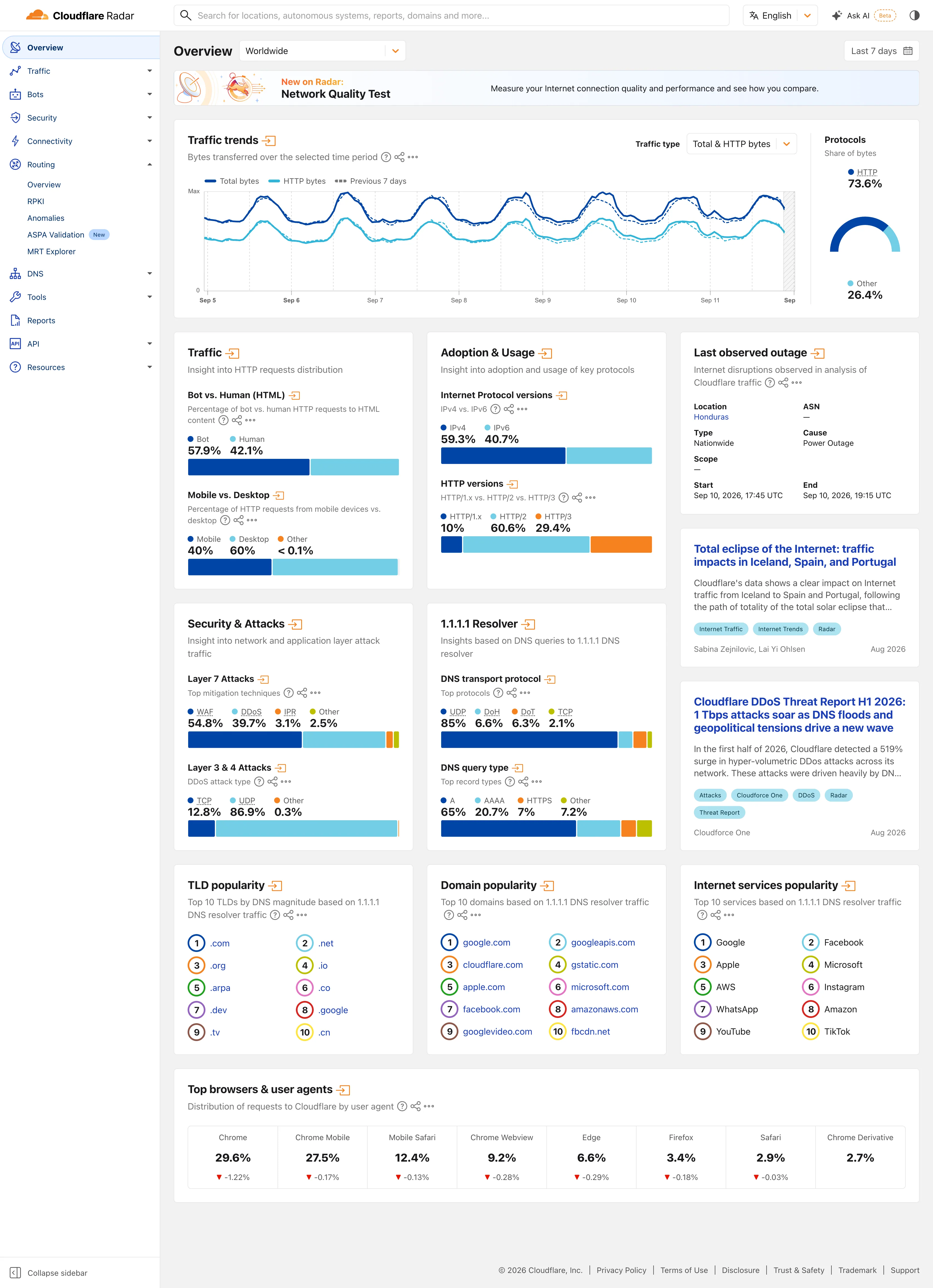
Multi-page dashboard. Eleven sections behind one rail, with the open one expanded in place. Radar is a site of dashboards, not a dashboard. Compare periods. The dotted series is the previous seven days, drawn on the same axis rather than beside it. Delta indicator. Eight shares with their change under them, all of them fractions of a point, which tells you how still this data is. Overview then detail. Two summaries and an arrow each. The panel exists to tell you whether the full page is worth opening. Ratio and rate. Shares only, never counts, and both sides of the split are named so the denominator is never in doubt. Stacked composition. Four mitigation techniques to 100%. The bar is almost redundant next to the printed figures, which is the point. Ranked list. A top ten with no magnitudes at all. The rank is the whole finding.
Worldwide Overview September 11, 2026 Public site, signed out; no version string exposed medium · light · desktop-web
Radar is a dashboard for people who did not come to use a dashboard. The audience is journalists, researchers and the merely curious, nobody has an account, and the design follows from that in two ways worth copying. Two controls scope the whole page—where, and when—and neither is a filter in the sense the rest of this gallery means it; the only other selector on the page sits inside the traffic panel. Everything else that looks like a control is a link. Each panel is a standing summary of a section that has its own full page behind the arrow in its heading, so the overview works as a table of contents rather than a filtered view of one dataset. And almost every value is printed as text above the chart that encodes it: "Bot 57.9%, Human 42.1%" sits over the bar rather than inside it. You can read the number without reading the chart, which is the right trade when most of your readers will take one figure and leave.
  • Multi-page dashboard Eleven sections behind one rail, with the open one expanded in place. Radar is a site of dashboards, not a dashboard.
  • Compare periods The dotted series is the previous seven days, drawn on the same axis rather than beside it.
  • Overview then detail Two summaries and an arrow each. The panel exists to tell you whether the full page is worth opening.
  • Ratio and rate Shares only, never counts, and both sides of the split are named so the denominator is never in doubt.
  • Stacked composition Four mitigation techniques to 100%. The bar is almost redundant next to the printed figures, which is the point.
  • Ranked list A top ten with no magnitudes at all. The rank is the whole finding.
  • Delta indicator Eight shares with their change under them, all of them fractions of a point, which tells you how still this data is.
Show 3 more examples Hide the rest

Grafana

The reference implementation for panel grids, template variables, and stat panels; most other tools are defined by how they differ from it.

Examples / Polystat Visualization Showcase September 10, 2026 Grafana Play (signed out; no version string exposed) medium · dark · desktop-web
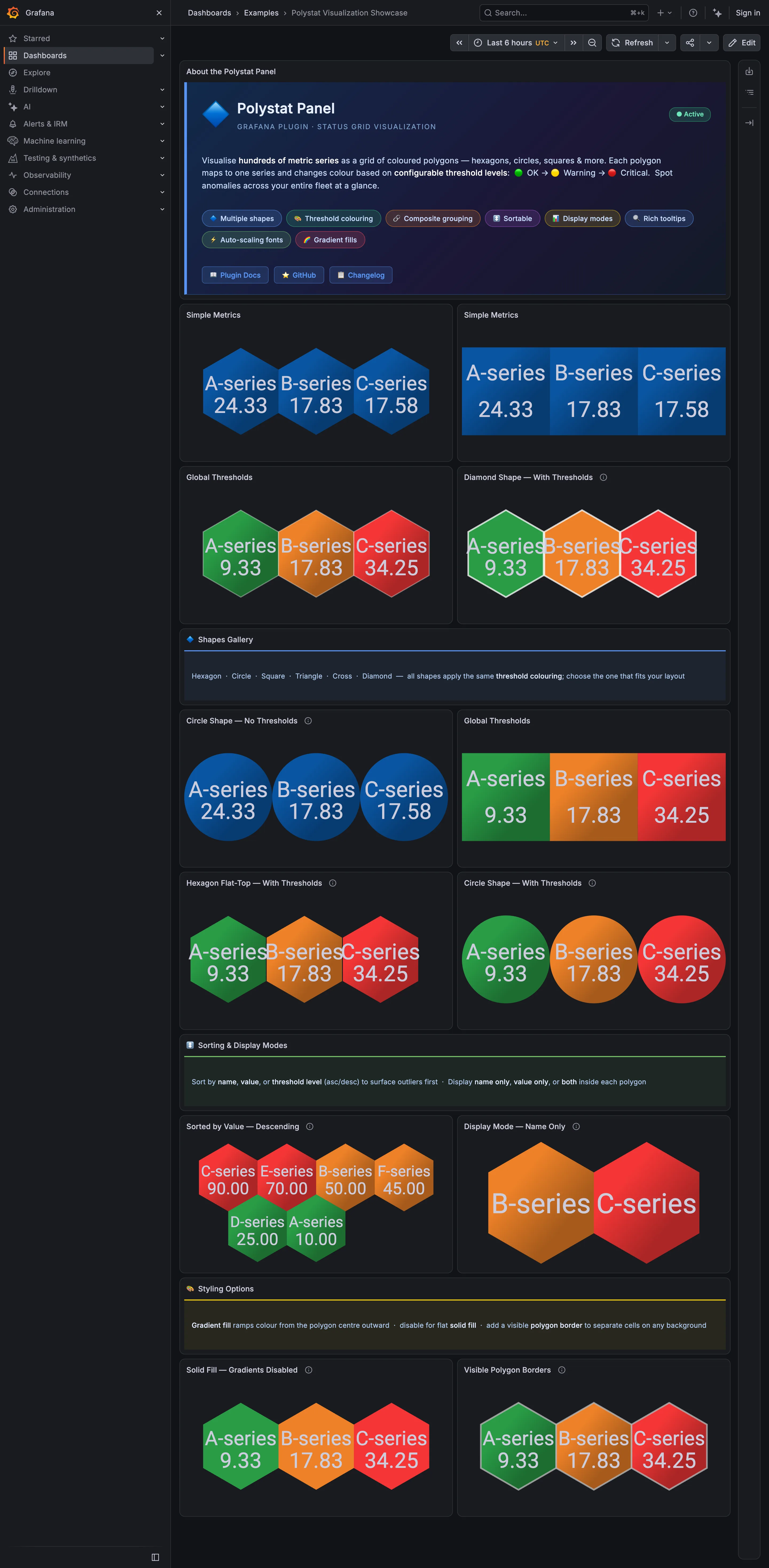
The plugin's own description is the host map pattern stated plainly —"visualise hundreds of metric series as a grid of coloured polygons" and "spot anomalies across your entire fleet at a glance"—and the shapes gallery halfway down says all six shapes "apply the same threshold colouring; choose the one that fits your layout." The page then disproves its own claim. The hexagon panels tile with every neighbour sharing an edge, so three cells read as one block. The circle panels leave a gap between every pair, so three cells read as three things you have to compare one at a time. At six cells that difference is a preference. At three hundred it is the difference between a cluster you see and a cluster you assemble, which is why the shape is a structural choice rather than a styling one.
  • Host map Hexagons sharing edges. Adjacent unhealthy cells merge into one shape, which is the point of the tiling.
  • Host map The same data as circles: a gap around every cell, so nothing clusters.
  • Semantic status color A closed set of three—OK, warning, critical—applied as the whole cell fill.
  • Ranked list Sorted descending so the worst cell lands where the eye starts. No share of total, and no row for the rest.
  • KPI tile Name-only mode: two cells carrying a label, a colour and no number at all.

Plausible Analytics

One column, top to bottom, where the metric row doubles as the chart's control. The clearest working argument that a dashboard can have exactly one interaction.

Plausible Analytics — Live demo / plausible.io
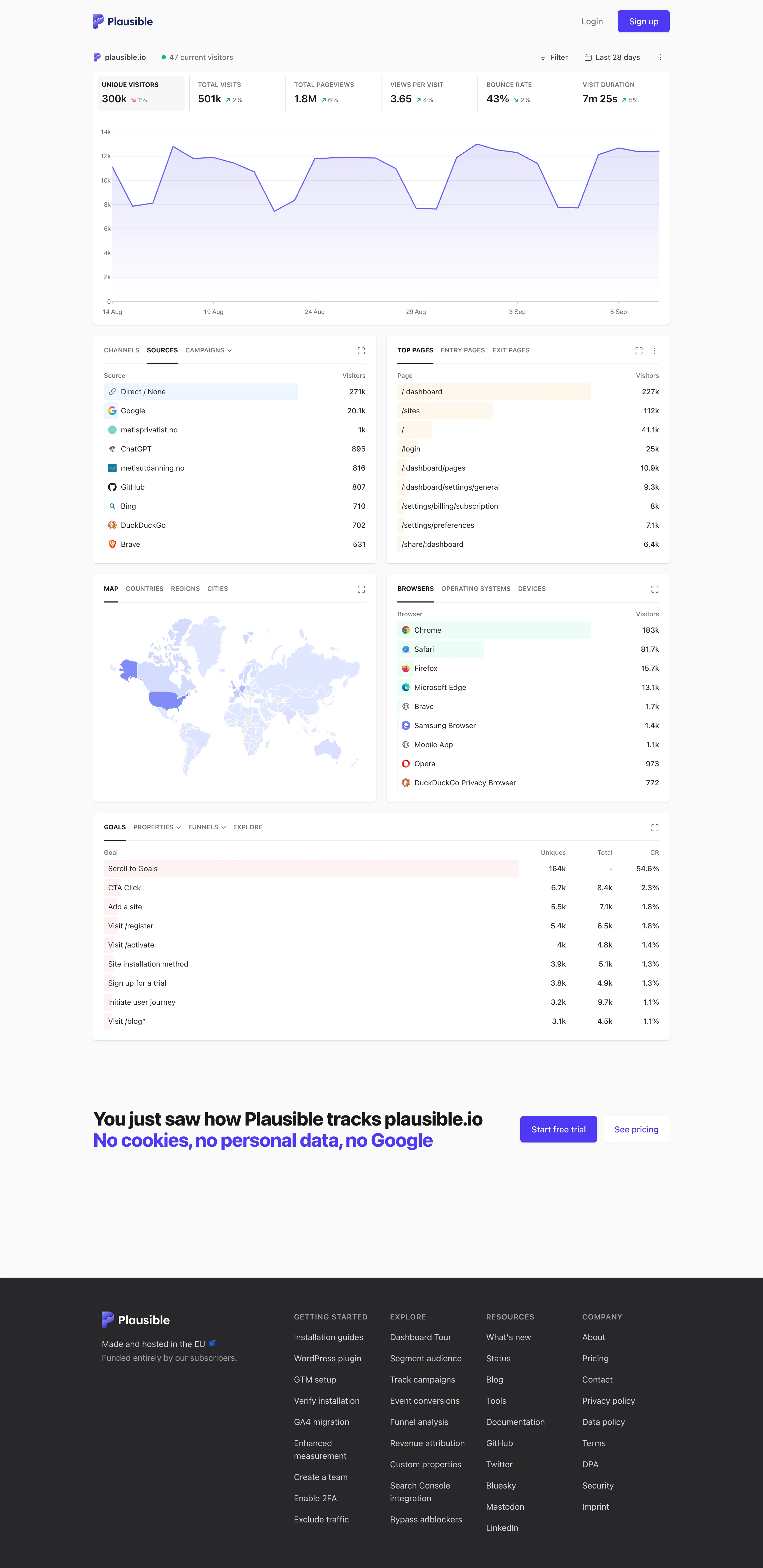
Single-column narrative. One column, top to bottom, no panel arrangement and nothing to configure before reading starts. Overview then detail. The decomposition: sources, pages, geography, browsers, goals. Same subject, narrowed, no navigation. Ranked list. Sorted with an in-row bar, no share of total and no other row. Direct 271k versus Google 25.1k, out of what? Geo map with markers. A choropleth pale enough that every country but one reads as the same white. Raw counts, unnormalised. Header KPI strip. Six tiles sharing one anatomy, each with a delta. The boxed one is selected, and the chart below plots it. Ratio and rate. Bounce rate 43%, with the denominator two tiles away and the window only in the header. Tabs as genres. Tabs inside the panel—channels, sources, campaigns—so one card answers three questions in one slot.
Live demo / plausible.io September 10, 2026 Plausible live demo, plausible.io's own stats (signed out) medium · light · desktop-web
My single-column-narrative entry names Plausible as the reference implementation and says the trick is that the metric row doubles as the chart's control. Here it is doing exactly that: six tiles across the top, the first one boxed because it's selected, and the chart underneath plotting that metric and no other. Click a different tile and the chart follows. The page therefore has one interaction, and it is the same gesture as paying attention. Everything below reads as a single column in argument order—headline, then the shape behind it, then what it decomposes into, then goals. Two things it doesn't do. The ranked lists carry a count and a bar and no share of total, so Direct at 271k against Google at 25.1k tells you the ordering and not whether the top row is most of the traffic. And the choropleth is so pale that outside the United States almost every country is the same near-white, which is the encoding spending a whole panel to say "mostly America".
  • Single-column narrative One column, top to bottom, no panel arrangement and nothing to configure before reading starts.
  • Header KPI strip Six tiles sharing one anatomy, each with a delta. The boxed one is selected, and the chart below plots it.
  • Ratio and rate Bounce rate 43%, with the denominator two tiles away and the window only in the header.
  • Overview then detail The decomposition: sources, pages, geography, browsers, goals. Same subject, narrowed, no navigation.
  • Ranked list Sorted with an in-row bar, no share of total and no other row. Direct 271k versus Google 25.1k, out of what?
  • Geo map with markers A choropleth pale enough that every country but one reads as the same white. Raw counts, unnormalised.
  • Tabs as genres Tabs inside the panel—channels, sources, campaigns—so one card answers three questions in one slot.

Tableau Public

Thousands of dashboards made by people who are not designers, published without a review step. The best available sample of what the pattern language looks like in the wild.

Shopify Customer Journey September 10, 2026 Tableau Public embed view; workbook published by Lovelytics medium · light · desktop-web
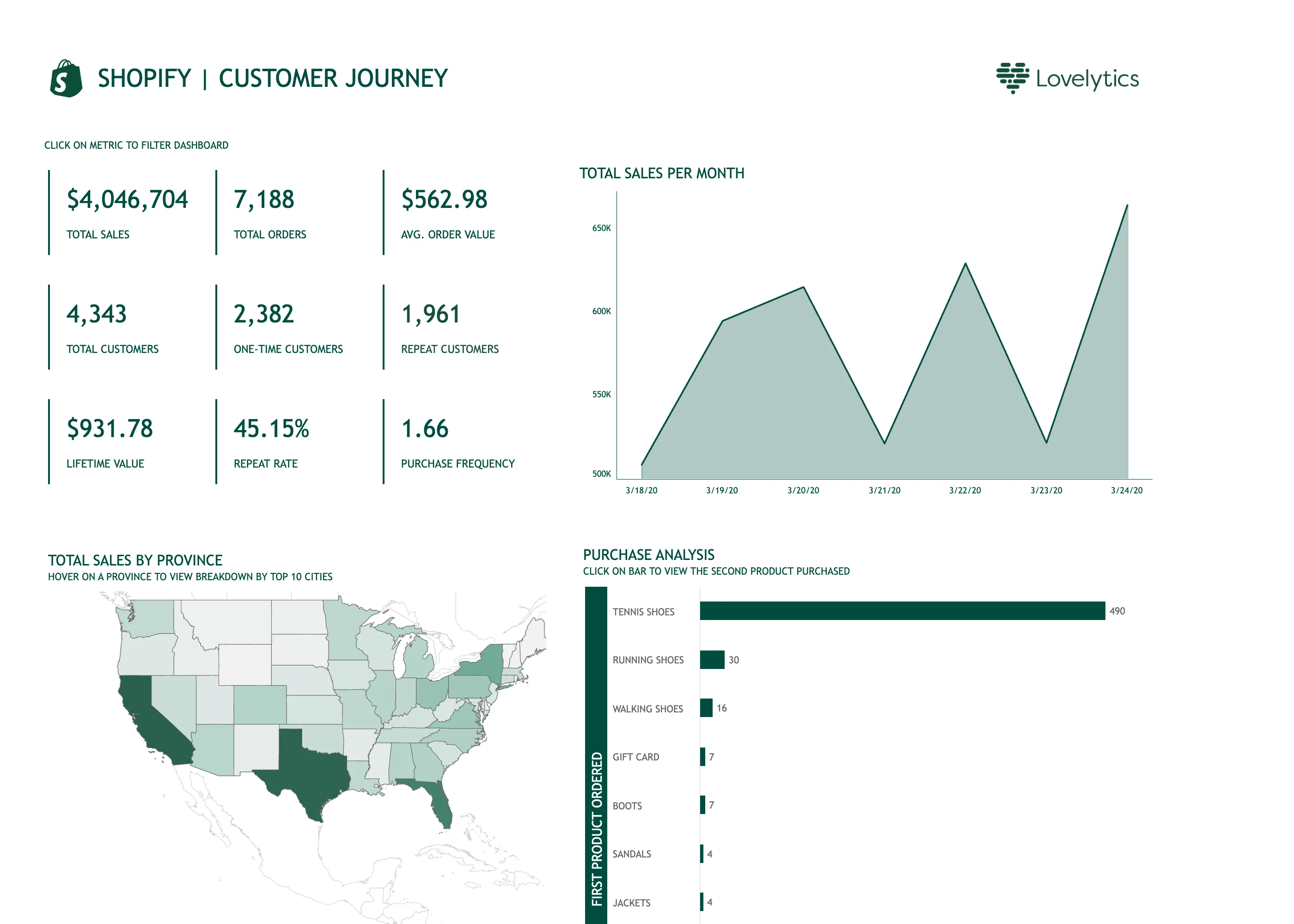
Tableau Public is the product; the design decisions here are the author's. This workbook was published by Lovelytics, so read it as what a competent analyst builds in Tableau rather than as how Tableau thinks dashboards should look. What is instructive is that it carries three separate lines of small-caps instruction—"click on metric to filter dashboard", "hover on a province to view breakdown by top 10 cities", "click on bar to view the second product purchased". Every interaction on the page needed a label, because none of them announces itself. That is the honest cost of cross-filtering: it is powerful and it is invisible until someone tells you it is there. Two other things. The tile block is nine values in a three-by-three grid, which is past the point where a strip has a reading order—the eye has to be told where to start and isn't. And the chart titled "Total sales per month" is plotting seven days, on a y-axis that begins at 500K, so a roughly twenty-five percent spread draws as a mountain range.
  • Cross-filter The tiles are the filter. It needed a line of instruction above it, because nothing about a number says it is clickable.
  • Header KPI strip Nine values in a grid rather than four to six in a row, so there is no privileged place for the eye to start.
  • Time series Titled per month, plotting seven days, on an axis starting at 500K. A 25% spread rendered as a cliff.
  • Hover detail The breakdown by city exists only on hover, so it is unavailable on touch and invisible in this screenshot.
  • Geo map with markers A choropleth of raw sales, unnormalised, so California and Texas lead partly by being large and populous.
  • Ranked list 490 against 30 for second place, so every bar below the first is a sliver and the ordering is all you get.