Problem
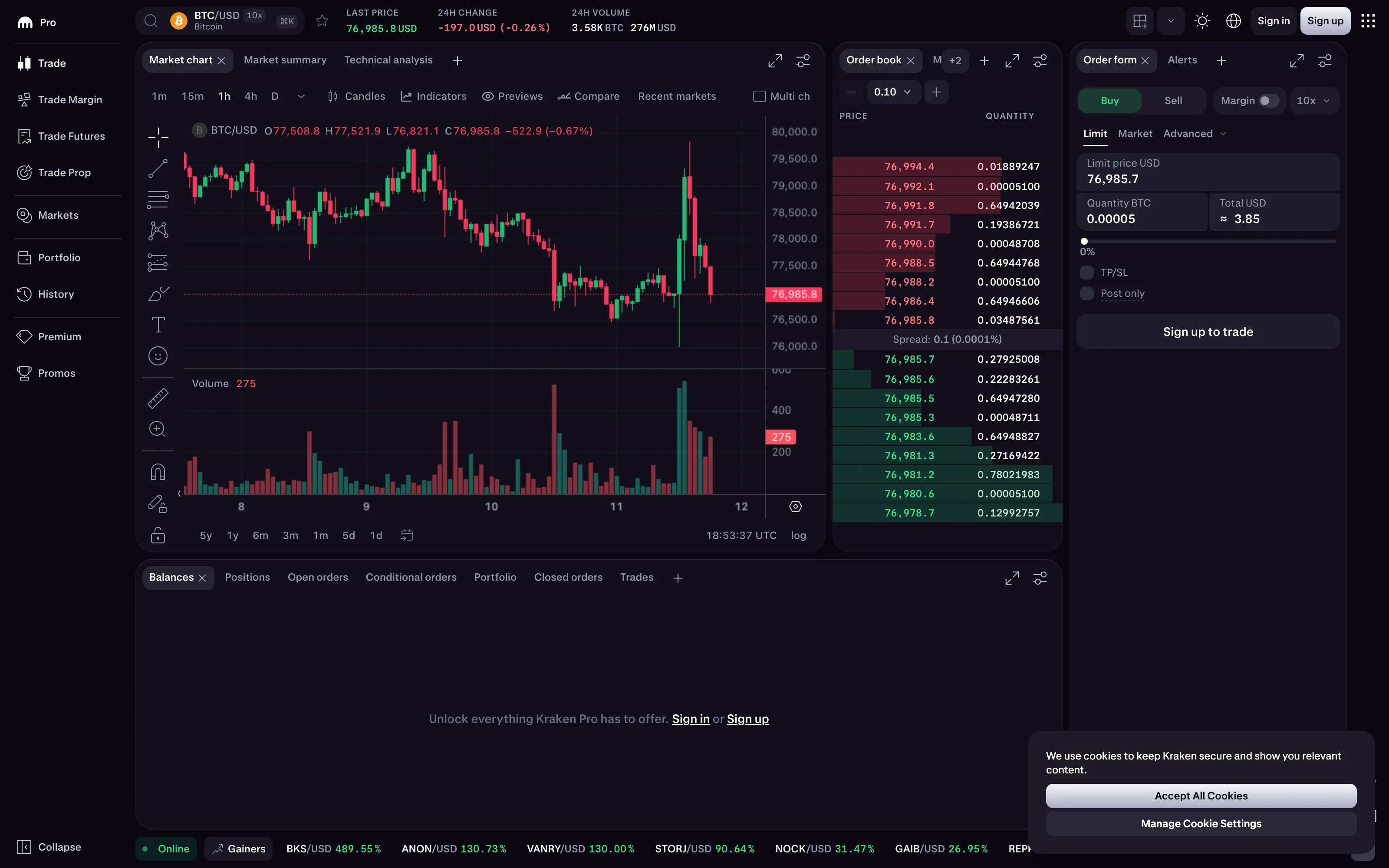
Someone is looking at a number that moved. What they need is not the number. They need the shape that produced it, and the moment the shape changed, because that moment is usually the only thing they can act on.
Solution
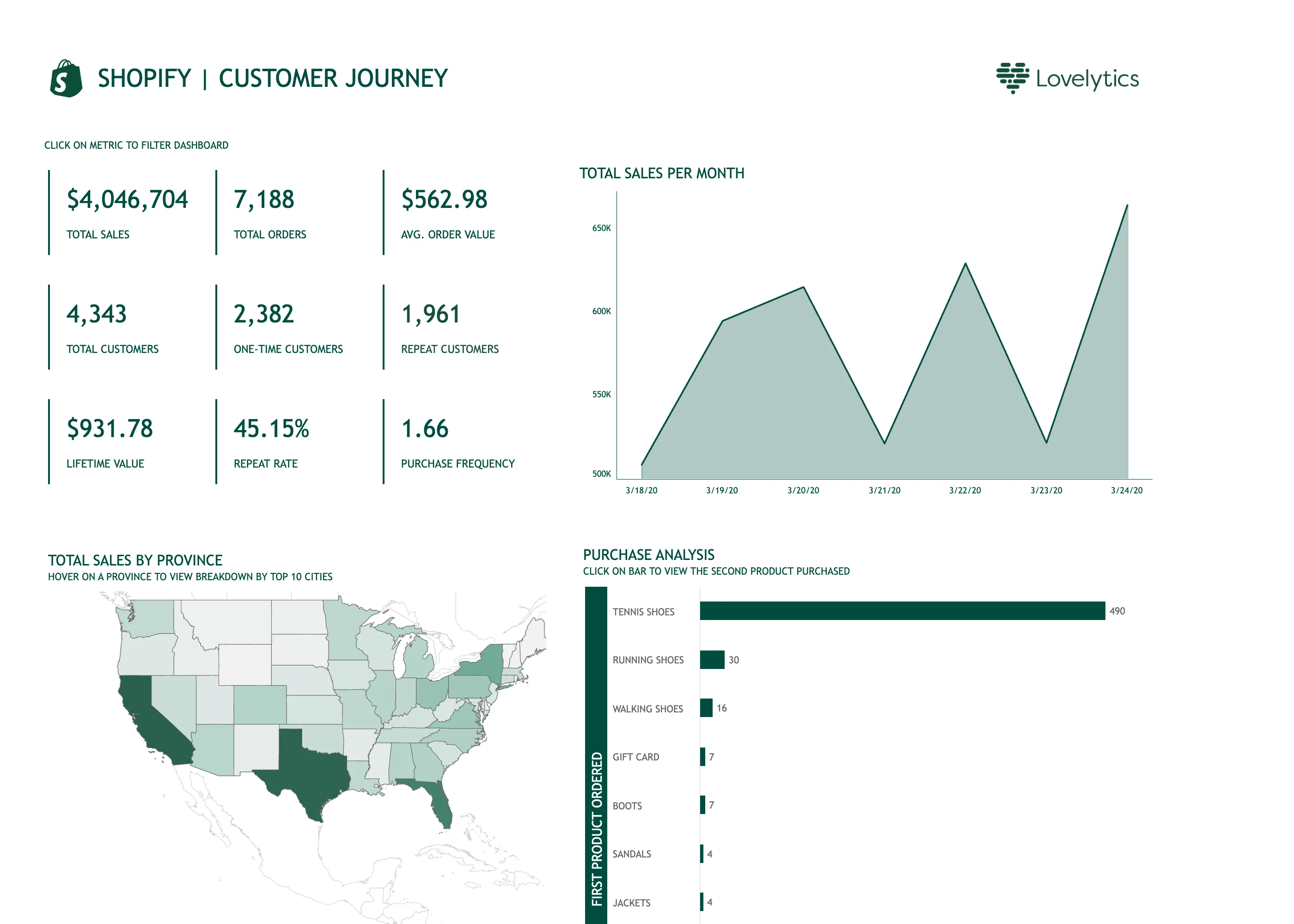
Time on the horizontal, value on the vertical, points joined by a line. That part has been settled since Playfair and nobody needs to reconsider it.
What makes or breaks the panel is everything the line implies that the data never said. A time series on a screen is always sampled, always aggregated down to the pixels available, and the aggregation is a decision the viewer can’t see. Grafana makes one piece of this explicit, which is instructive: connect null values has three positions, Never, Always, and Threshold, and the same gap in the same data reads as an outage, as a straight line through nothing, or as a judgment call, depending on which one someone picked. Most products make that choice for you and don’t mention it.
The second thing is the y-axis. A line chart doesn’t need a zero baseline the way a bar chart does, because the line encodes change and the bar encodes magnitude. That freedom is also how a 2% drift gets drawn as a cliff.
Use when
The question has “when” in it. When did it start, when did it recover, is it still happening. Also when the viewer needs a rate rather than a total, which covers most of operations.
Don’t use when
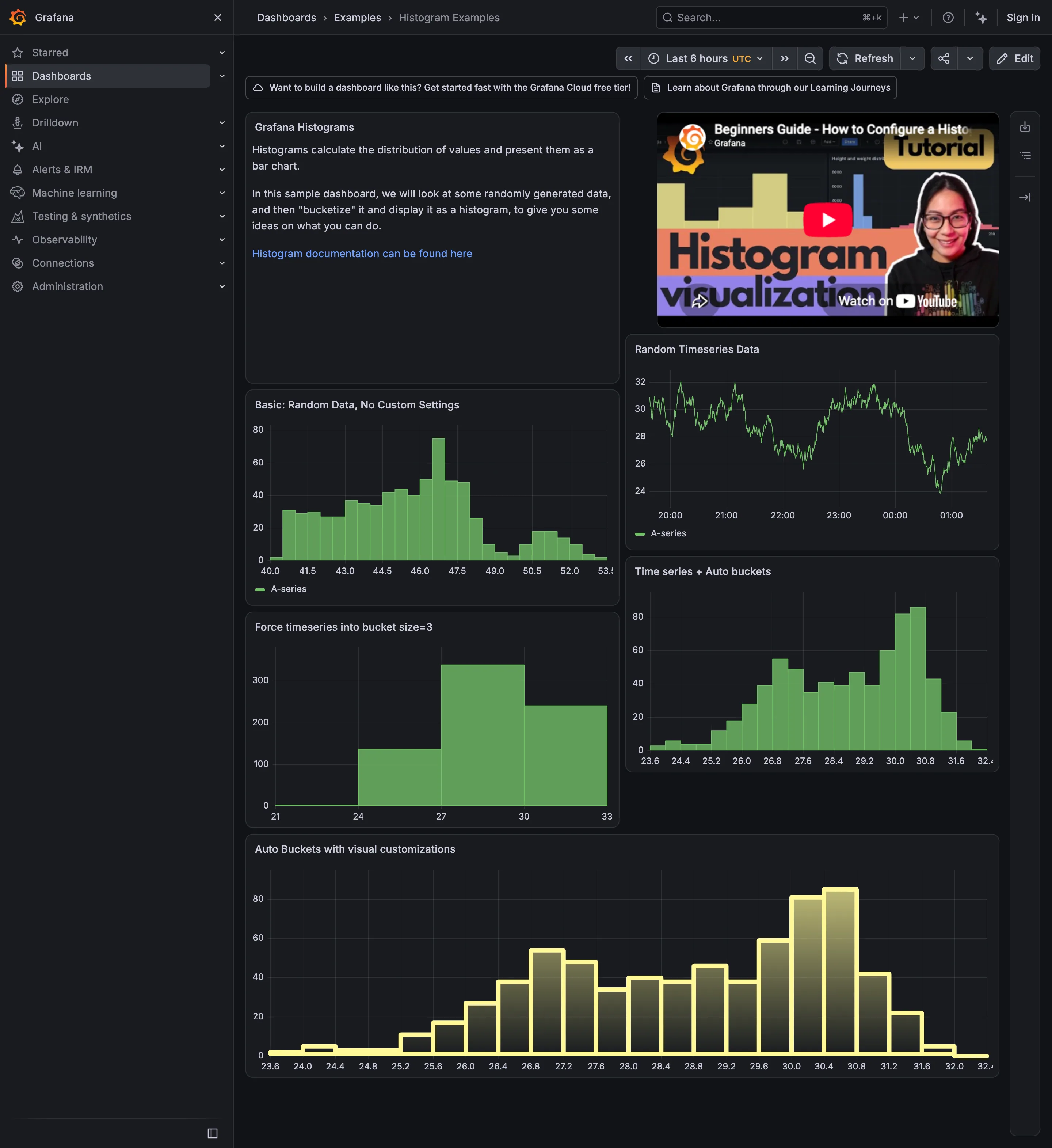
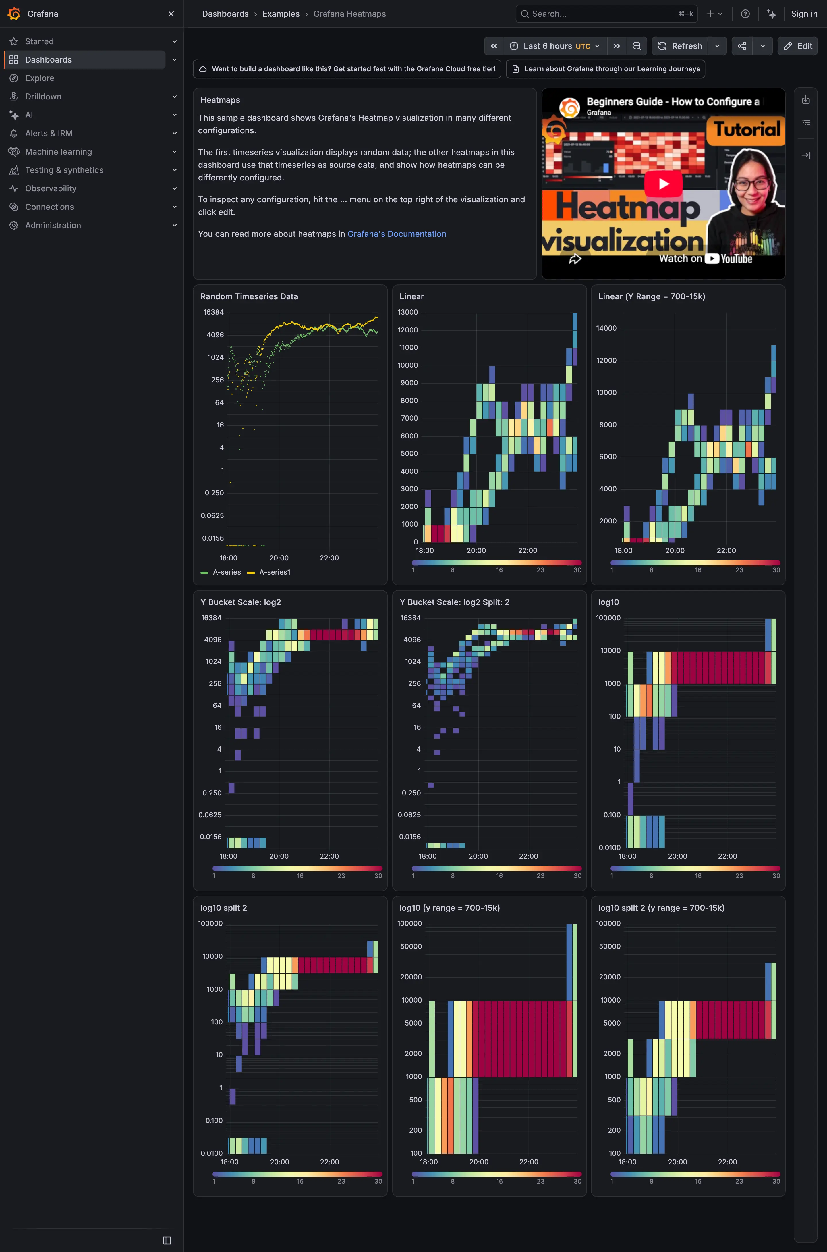
The categories have no natural order, or there are more series than a person can follow. Twelve lines on one chart is a legend exercise. If the answer is a distribution rather than a trajectory, a histogram or a heatmap will say more.
Trade-offs
The line asserts continuity between points that were sampled discretely, so it always claims to know slightly more than it does. Downsampling to fit the panel width can erase the spike that mattered; a five-second outage doesn’t survive a query returning one point per minute, and nothing on the panel admits this. Averaging over the rollup window smooths in the same direction, always toward “fine”. Y-axis autoscaling makes every chart look eventful, which teaches the viewer to ignore all of them.
Checklist
- What is the interval between points, and can the viewer tell?
- What happens to a gap: drawn as a gap, connected, or filled with zero?
- Is missing data visually distinct from a real zero?
- Does the y-axis start at zero, and if not, is that defensible for this metric?
- Does the axis rescale as data arrives, and does that make small movement look large?
- What aggregation runs when the range is wide: average, max, or last? Would max change the answer?
- Can the viewer see the time range and change it without leaving the panel?
- Where several panels share a page, do they share a time range, and a y-scale where it matters?
- Are units on the axis, and are they the units the viewer thinks in?
- How many series before this stops being readable, and what happens at that count?
Compare
Grafana exposes the gap decision as a per-panel setting with three positions, which is the most honest treatment in the category and also the reason two panels on one dashboard can disagree about the same outage. Netdata samples per second and draws it, so the chart keeps detail most tools have averaged away before it reaches the panel, at the cost of a page that never sits still. Honeycomb answers the same question with a heatmap instead of a line, arguing that a line drawn through a percentile hides the distribution that would explain it. Sentry puts the series inline on every issue row as a sparkline, the same encoding at list density, doing a job a full panel would be too expensive for.
Related
Sparkline is this pattern shrunk to sit beside a number. Anomaly band and threshold line are the two ways to put “what should this look like” on the same axes. Annotation answers the question the line provokes, which is what happened at that moment. Time-range picker is the control that makes the chart answerable at all, and zoom and pan is how the viewer narrows once they’ve found the moment.