Skip to content
KONIGI

Dashboards / Visual representation / Histogram and distribution

10 of 22

Histogram and distribution

The viewer needs the shape of a population, not a summary statistic of it.

Updated September 10, 2026

Problem

The average is 240ms. That single number is compatible with every request taking 240ms, and with half of them taking 80ms while the other half take 400ms. The viewer needs to know which world they are in.

Solution

Divide the range into buckets, count what falls in each, draw the counts as bars. The shape that comes out answers questions no summary statistic can: is this one population or two, is it symmetric or does it have a tail, is there a wall at some value where a timeout is truncating everything.

Everything then depends on the buckets, and the buckets are usually somebody’s default. Grafana’s histogram panel defaults to a Bucket count of 30 when left empty, or you set Bucket size directly and leave it blank for automatic sizing at roughly 10% of the full range. There is also a Bucket offset, for when the first bucket shouldn’t start at zero, which only does anything if it is greater than zero and smaller than the bucket size. Too few buckets and two humps merge into one. Too many and the shape dissolves into noise. Neither failure announces itself.

On the storage side the same decision has already been made before the panel sees anything. Prometheus classic histograms are counted into fixed buckets chosen at instrumentation time, which is why the quantile estimates that come back out are bounded by bucket width and not by anything about the data. Native histograms change the arrangement by bucketing at a fixed relative resolution, so the resolution follows the magnitude instead of being guessed in advance. If you are choosing bucket boundaries by hand today, that is the thing worth knowing exists.

Grafana also offers Stacking at Off, Normal or 100%, plus Combine series to merge everything into one distribution. Stacked histograms of several series are usually a mistake dressed as a feature: the reader has to compare areas that don’t share a baseline.

Use when

The population is large enough to have a shape, and the question is about that shape. Latency, response size, session length, order value, anything where the tail or a second mode is the story.

Don’t use when

The counts are small, where a histogram is a bar chart with a misleading name. Or when the change over time is the point, in which case the histogram is one frame of a film and a heatmap is the film.

Trade-offs

A histogram is a snapshot and discards time entirely, so a distribution that shifted badly an hour ago looks identical to one that has always been this shape. Bucket choice can manufacture or erase a second mode, and almost no dashboard exposes the bucket definition next to the chart. Comparing two histograms drawn at different scales is a trap readers fall into constantly, because the shapes are comparable-looking even when the axes are not. And a long tail forces a choice between clipping it, which hides the worst cases, and showing it, which squashes the body into the first two bars.

Checklist

  • How many buckets, and who chose that number?
  • Would a different bucket count merge or split a mode that matters?
  • Are the bucket edges shown, and do any of them fall on a value people care about, like a timeout?
  • Is the x-axis linear when the data is skewed, and would a log axis show more?
  • Is the tail clipped, and does the chart say so?
  • Is the y-axis a count or a proportion, and does that match the neighbouring panels?
  • If two histograms sit side by side, do they share bucket edges and axis ranges?
  • Are these buckets computed at query time or fixed at instrumentation time?
  • Does the panel report the sample size?
  • Would a heatmap answer the viewer’s actual question by adding time back?

Compare

Grafana exposes bucket count, size and offset as panel options, which is honest about the decision and also means two panels of the same metric can disagree about its shape with nothing on screen to explain why. Prometheus moves the argument upstream: classic histograms fix the buckets at instrumentation time, native histograms hold a relative resolution instead, so the same query returns a usefully different answer depending on which the service emits. Honeycomb keeps raw events rather than pre-aggregating, so a distribution is something you ask for at query time over whatever dimension you just thought of, rather than something you predicted a month ago. Datadog leans on distribution metrics with globally accurate percentiles, which trades the ability to see the shape for the ability to aggregate the summary correctly across hosts.

Heatmap is this chart with time added back, and usually the better answer on an operational page. Percentile summary is the same data reduced to a few numbers, and inherits every bucket problem described here. Ratio and rate is the other normalisation people reach for when a raw count misleads. Stacked composition is what a histogram becomes when it is misused for several series at once. Data table is the fallback for readers who need the counts rather than the picture.
Histogram and distribution anatomy The same six thousand requests bucketed twice. Eight buckets merge a fast path and a slow path into one hump and bury the timeout. Forty buckets separate them and expose the wall at two seconds where everything was truncated. Same population, two bucket counts 0 1s 2s 8 buckets · one hump 0 1s 2s 40 buckets · two, and a wall 1 2 1 TOO FEW MERGES THE HUMPS Too many and the shape dissolves into noise. Neither failure announces itself, and the count is usually somebody's default. 2 THE WALL A spike against the right edge is a timeout truncating the tail. Everything past it was recorded as exactly two seconds. The same decision was already made once, before the panel saw anything: classic histograms fix their buckets at instrumentation time, which is why the quantiles that come back out are bounded by bucket width and by nothing about the data. Is this one population or two, is there a tail, is there a wall. No summary says.
Wireframe — the pattern's anatomy, not any one product's version of it

Implementation

A distribution, not a time series with the axis relabelled. The bucket width is the whole argument: too wide and two humps merge, too narrow and noise looks like structure.

shadcn
npx shadcn@latest add toggle-group
npm
recharts
Tokens
--card--muted--muted-foreground--border--chart-1--status-warn
01s2s

40 buckets of 50ms · 6,000 requests · 401 recorded as exactly 2s, which is a timeout, not a mode

Histogram.tsxBins raw samples itself, so the bucket count is a prop and not the collector's default. Flags a wall at the top of the range.

import { Bar, BarChart, ReferenceLine, XAxis, YAxis } from "recharts";

/**
 * The bucket count is the whole argument, so it is a required prop rather
 * than a default someone forgot. Too few and two humps merge; too many and
 * the shape dissolves into noise. Neither failure announces itself.
 */
export type Bin = { lo: number; hi: number; count: number };

export function bin(samples: number[], buckets: number, min: number, max: number): Bin[] {
  const width = (max - min) / buckets;
  const bins: Bin[] = Array.from({ length: buckets }, (_, i) => ({ lo: min + i * width, hi: min + (i + 1) * width, count: 0 }));
  for (const v of samples) {
    // The top edge is inclusive, so a sample at exactly `max` lands in the
    // last bin instead of falling off the chart.
    const i = Math.min(buckets - 1, Math.floor((v - min) / width));
    if (i >= 0) bins[i].count++;
  }
  return bins;
}

/**
 * A spike against the right edge is a timeout truncating the tail:
 * everything past it was recorded as exactly `max`. Flagged when the last
 * bin holds several times what the bins before it do.
 */
export function wall(bins: Bin[]): Bin | null {
  const last = bins[bins.length - 1];
  const before = bins.slice(-6, -1);
  const mean = before.reduce((n, b) => n + b.count, 0) / before.length;
  return last.count > 0 && last.count > 4 * mean ? last : null;
}

const fmt = (v: number) => (v === 0 ? "0" : v % 1000 === 0 ? `${v / 1000}s` : `${v}ms`);

export function Histogram({ samples, buckets, min = 0, max, width = 300, height = 150 }: {
  /** Raw values, in ms. The component bins them, so changing `buckets` rebins the same population. */
  samples: number[];
  buckets: number;
  min?: number;
  /** The top of the range. Required, because a histogram cut at the data's max hides the wall. */
  max: number;
  width?: number;
  height?: number;
}) {
  const bins = bin(samples, buckets, min, max);
  const cut = wall(bins);
  const step = (max - min) / buckets;
  const data = bins.map((b) => ({ mid: b.lo + step / 2, count: b.count }));

  return (
    <div>
      <div className="overflow-x-auto">
        <BarChart width={width} height={height} data={data} barCategoryGap={1} margin={{ top: 4, right: 8, bottom: 0, left: 8 }}>
          <XAxis interval={0} dataKey="mid" type="number" domain={[min, max]} ticks={[min, (min + max) / 2, max]} tickFormatter={fmt}
            tick={{ fontSize: 10 }} stroke="hsl(var(--border))" />
          <YAxis hide domain={[0, "dataMax"]} />
          {cut && <ReferenceLine x={cut.lo} stroke="hsl(var(--status-warn))" strokeDasharray="3 3" />}
          <Bar dataKey="count" fill="hsl(var(--chart-1))" isAnimationActive={false} />
        </BarChart>
      </div>
      <p className="mt-1 text-[10px] tabular-nums text-muted-foreground">
        {buckets} buckets of {fmt(Math.round(step))} · {samples.length.toLocaleString("en-GB")} requests
        {cut && <span className="text-status-warn"> · {cut.count} recorded as exactly {fmt(max)}, which is a timeout, not a mode</span>}
      </p>
    </div>
  );
}

demo.tsxHow it is called: six thousand requests at 40 buckets, with a toggle to rebin them at 8 and watch the humps merge.

import { useState } from "react";
import { ToggleGroup, ToggleGroupItem } from "@/components/ui/toggle-group";
import { Histogram } from "./Histogram";

/**
 * Six thousand checkout requests. The collector stored them in forty fixed
 * 50ms buckets, so the samples are rebuilt at each bucket's midpoint; the
 * 401 that hit the two-second timeout were recorded as exactly 2s. Eight
 * buckets merge the fast and slow paths into one hump and bury the wall.
 */
const PER_BUCKET = [
  375, 1865, 920, 240, 60, 21, 39, 60, 88, 103, 146, 190, 188, 164, 164, 162, 159, 108, 95, 74,
  66, 68, 53, 51, 26, 32, 21, 11, 10, 13, 6, 5, 5, 3, 3, 2, 3, 0, 0, 0,
];
const TIMED_OUT = 401;

const SAMPLES = [
  ...PER_BUCKET.flatMap((n, i) => Array.from({ length: n }, () => i * 50 + 25)),
  ...Array.from({ length: TIMED_OUT }, () => 2000),
];

export default function Demo() {
  const [buckets, setBuckets] = useState(40);
  return (
    <div className="rounded-lg border bg-card p-4">
      <Histogram samples={SAMPLES} buckets={buckets} max={2000} />
      <ToggleGroup type="single" value={String(buckets)} onValueChange={(v) => v && setBuckets(Number(v))}
        className="mt-3 justify-start gap-1" aria-label="bucket count">
        {[8, 20, 40].map((n) => (
          <ToggleGroupItem key={n} value={String(n)} size="sm" className="h-6 rounded-full border px-2 text-[10px] data-[state=on]:bg-muted">
            {n} buckets
          </ToggleGroupItem>
        ))}
      </ToggleGroup>
    </div>
  );
}
What it renders. Identical markup in both panes, with only the token values changing.

Examples

Captures whose hotspots reference this pattern, grouped by product and dated. The dashed boxes are this pattern; hover any box for the note.

Grafana

The reference implementation for panel grids, template variables, and stat panels; most other tools are defined by how they differ from it.

Examples / Histogram September 10, 2026 Grafana Play (signed out; no version string exposed) medium · dark · desktop-web
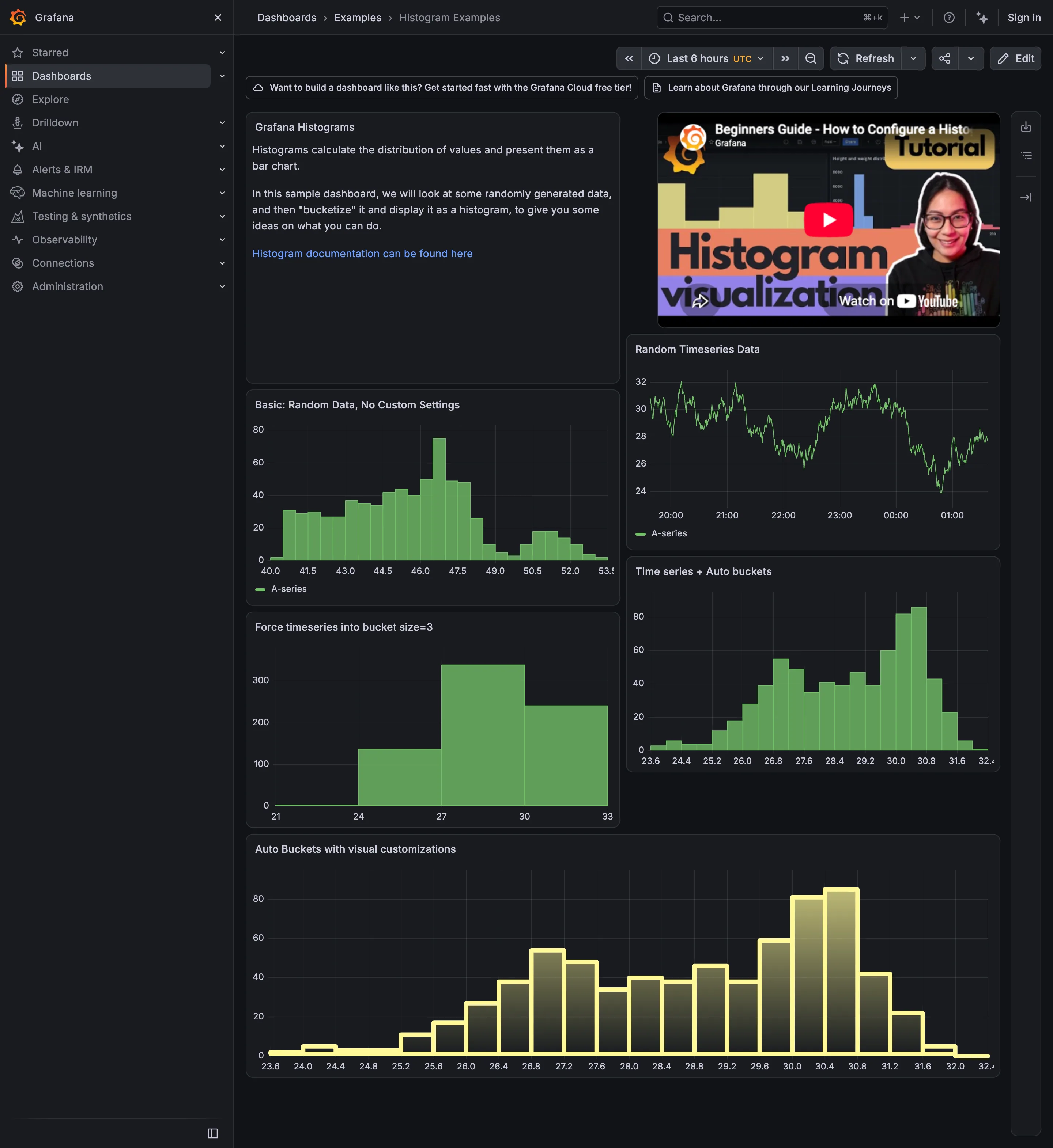
This page accidentally contains the cleanest demonstration of the bucket problem I have found in a shipped product. The panel top right is the source series, a line oscillating between 24 and 32. Directly under it, the same series on automatic buckets: roughly twenty-four bars, and it is plainly bimodal, with one hump around 27 and a taller one at 30.4. To the left of that, labelled "Force timeseries into bucket size=3", is the identical data at a bucket width of three. Four bars. One hump. The second mode has not been smoothed or de-emphasised, it is simply gone, and nothing about the chart indicates that a decision was made. Neither panel is wrong. One of them answers "is this one population or two" and the other cannot, and the only difference between them is a number in a field.
Show 1 more example Hide the rest

Kibana

Query-first rather than panel-first: the search bar is the primary control and the charts are downstream of it, which inverts Grafana's arrangement.

Kibana — Discover / filebeat logs
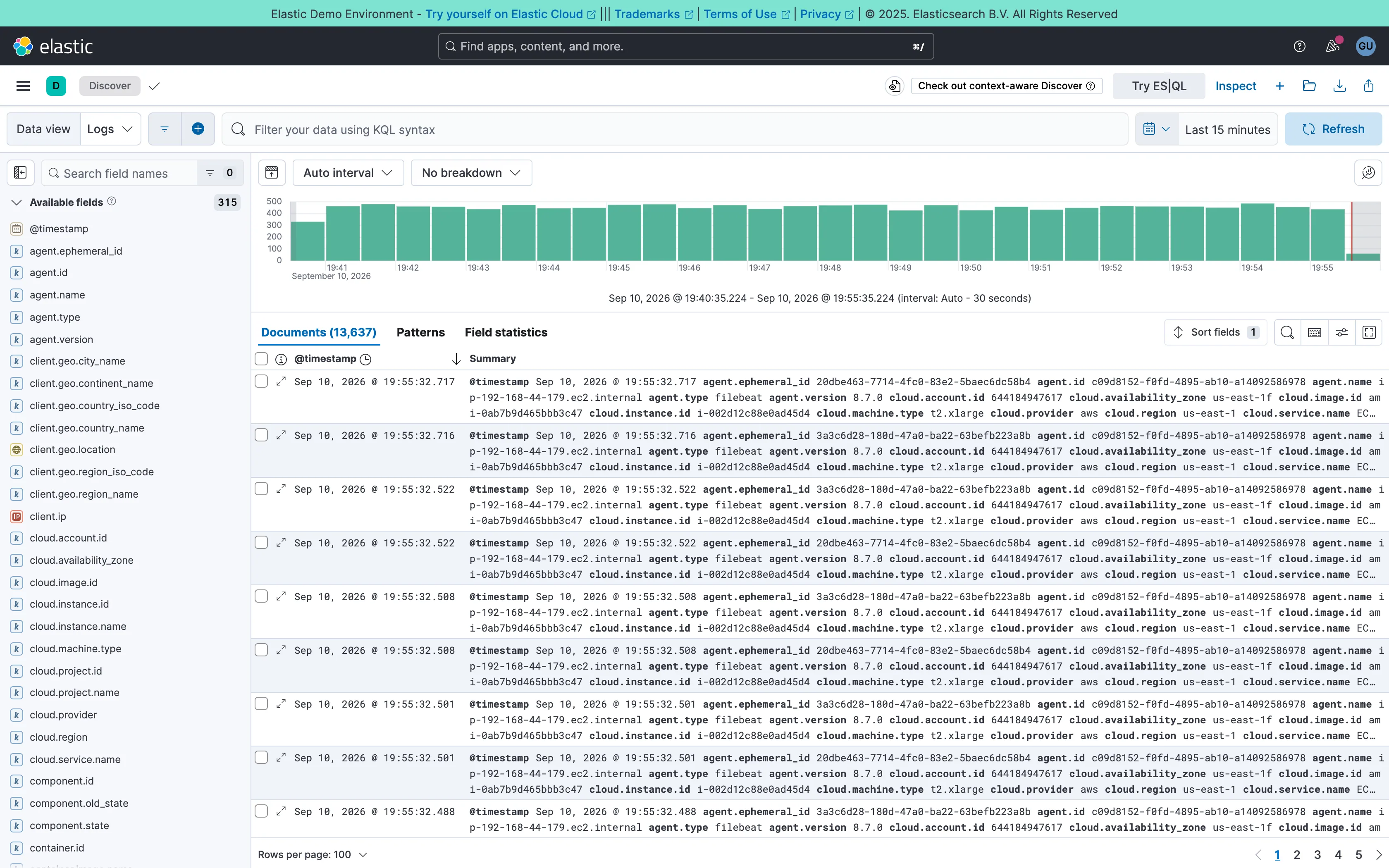
Two-pane list and detail. Fields on the left, records on the right, both on screen at once. The oldest working shape for a queue there is. Data table. One column called Summary holding every field on the record. Complete, and unreadable at a glance. Histogram and distribution. Volume over the window at a 30-second auto interval. The final bar is the bucket still filling, and it always reads low. Filter bar. A query language in the bar rather than chips. Powerful, and it hides what's applied from anyone who didn't type it. Detail on demand. An expander on every row. Inline rather than a side panel, so it pushes the rest of the list down. Time-range picker. Relative by default, with the refresh control beside it rather than buried in a settings menu. Search across panels. 315 fields, so the sidebar opens with a filter box. Past a certain count a tree is a filing system nobody browses.
Discover / filebeat logs September 10, 2026 Elastic demo environment (guest session; no version string exposed) dense · light · desktop-web
Two panes: 315 fields down the left, 13,637 documents on the right, and a volume histogram over both. The left pane is the good half—it opens with a search box rather than a tree, which is the only sane way to navigate that many fields. The right pane is where it falls over. The documents table ships with two columns, a timestamp and "Summary", and Summary is every field on the record concatenated into one cell: agent.ephemeral_id, agent.id, agent.name, agent.type, agent.version, cloud.account.id, cloud.availability_zone, and on for three wrapped lines per row. It is technically complete and it cannot be scanned, so the first thing anyone does here is pick columns—which is to say the default view's job is to make you configure it. Underneath, the pager reads 100 rows per page across 137 pages, and the sort control sits above a table showing the first of them.
  • Two-pane list and detail Fields on the left, records on the right, both on screen at once. The oldest working shape for a queue there is.
  • Detail on demand An expander on every row. Inline rather than a side panel, so it pushes the rest of the list down.
  • Data table One column called Summary holding every field on the record. Complete, and unreadable at a glance.
  • Search across panels 315 fields, so the sidebar opens with a filter box. Past a certain count a tree is a filing system nobody browses.
  • Filter bar A query language in the bar rather than chips. Powerful, and it hides what's applied from anyone who didn't type it.
  • Time-range picker Relative by default, with the refresh control beside it rather than buried in a settings menu.
  • Histogram and distribution Volume over the window at a 30-second auto interval. The final bar is the bucket still filling, and it always reads low.