Problem
Four hundred hosts. Three of them are pinned at 100% CPU. A time series with four hundred lines is a solid colour block, and a table of four hundred rows requires the viewer to already know which column to sort by.
Solution
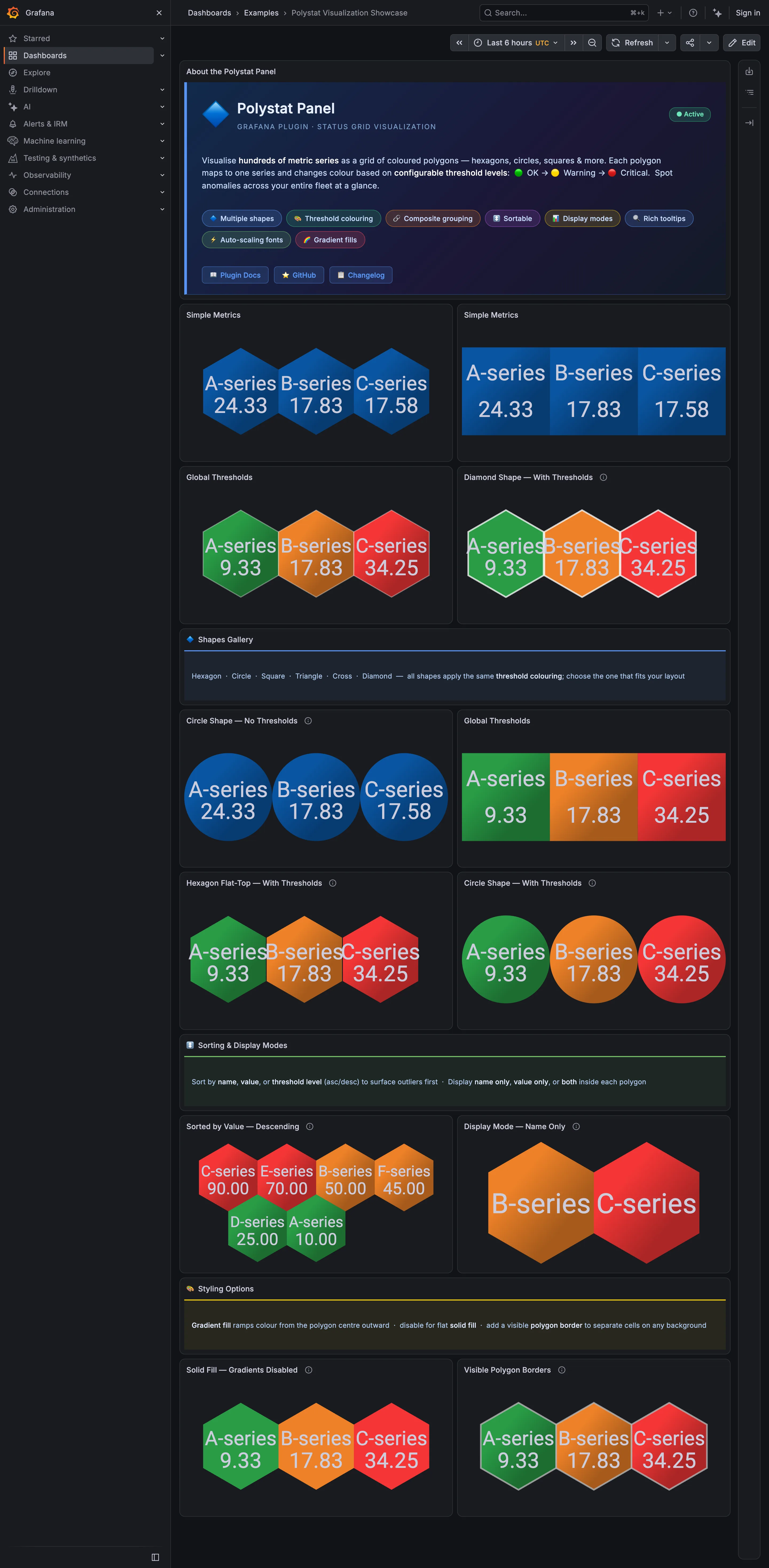
Give every machine one cell, colour the cell by a metric, and arrange the cells so position carries meaning. The viewer scans for the odd colour, then clicks it.
Datadog’s host map is the version everyone else is compared to. Hosts are hexagonal cells; the colour of each object represents CPU usage by default, ranging from green at 0% utilised to orange at 100%. A Fill by control swaps that for another metric, memory or error logs among them, and cells can also be sized by a metric.
The part that turns a pretty picture into a diagnostic tool is grouping. Datadog lets you group by multiple tags at once—group by availability zone and then instance type and the cells arrange first by zone, then subdivide by type. That nesting is what converts “one machine is hot” into “every machine in one availability zone is hot”, which is a different incident with a different cause. Filtering supports AND, NOT, OR and wildcards over the same tags.
Hexagons rather than squares is a real choice, not a stylistic one. Hexagons tile with every neighbour sharing an edge, so a cluster of unhealthy cells reads as a blob rather than as a diagonal that the eye has to assemble. It also makes cell count changes less visually disruptive than a grid that reflows into rows.
Use when
The fleet is large, roughly homogeneous, and the question is “which ones are unusual right now”. Especially good the moment somebody says “is it all of them or just one”.
Don’t use when
There are twelve hosts, or the machines are so heterogeneous that one metric doesn’t mean the same thing across them. Also a poor fit for anything you need history on: the map is emphatically now.
Trade-offs
One cell carries one metric, so a host that is fine on CPU and drowning on disk looks healthy. Colour is doing all the encoding, which puts the pattern at the mercy of the ramp and of the viewer’s colour vision. Position is meaningful only inside a grouping, so a viewer who doesn’t know the grouping reads an arbitrary arrangement as if it were a floor plan. And at genuinely large scale cells shrink below the size at which colour is readable, which is where grouping stops being an enhancement and becomes mandatory.
Checklist
- What metric fills the cell, and does it mean the same thing on every host here?
- Is the grouping visible and labelled, or is the arrangement effectively random to the viewer?
- Can the viewer group by more than one dimension, and does nesting read clearly?
- Does the colour ramp encode magnitude or state, and is the difference obvious?
- What happens at the fleet size this team actually runs?
- Can a cell be too small to read, and what does the view do about it?
- Does clicking a cell go somewhere scoped to that host?
- Is a host with no data distinguishable from a healthy one?
- Would a colourblind viewer find the same outliers?
- Is there any way to see whether this pattern of colour is new or has been like this all week?
Compare
Datadog owns this pattern: hexagon tiling, a default CPU fill from green to orange, arbitrary Fill by metrics, size by metric, and nested grouping over tags with boolean filtering. Netdata answers the same question with a node list carrying live per-second charts, trading the instant spatial scan for the ability to see whether a host has been like this for ten minutes or ten seconds. Grafana has no first-class equivalent, so teams build it from a stat panel grid or a geomap, which works and puts the burden of layout and grouping on whoever assembles the dashboard. Honeycomb rejects the framing outright, on the argument that the interesting dimension is rarely “host” and that pre-choosing it is what makes an unknown-unknown invisible.
Related
Service map is the same spatial idea over calls instead of machines. Semantic status color governs the fill. Ranked list is the non-spatial answer to the same question and is often the better one. Drill-down is what a cell click owes the viewer. Grayscale with alerts is the discipline that keeps a four-hundred-cell map from being four hundred coloured things.