Skip to content
KONIGI

Dashboards / Data information / KPI tile

2 of 7

KPI tile

A person needs to know the current value of one number, and whether it's fine, before they look at anything else.

Updated September 9, 2026

Problem

Someone opens the dashboard with one question: is the thing I’m responsible for okay right now? They need the answer in the first second, and they need it before the charts, tables, and filters have a chance to compete for attention.

Solution

A tile that shows one number large, one label small, and one piece of context. The context is what separates a KPI tile from a decoration. It’s usually a delta against a prior period, a color that encodes state, or a sparkline of the recent trend. Stephanie Evergreen’s line applies: a big number with no context is a number the reader has to interpret alone, which means most readers won’t.

The tile earns its size by being scannable as a group. Six tiles in a row read as a status strip. Six tiles with six different layouts read as six problems.

Use when

The number is a leading indicator of something the viewer acts on. Error rate, p95 latency, open incidents, cash balance, orders today. The viewer looks at it many times a day.

Don’t use when

The number only matters in relation to a series. Monthly revenue with no comparison is a chart, not a tile. And don’t lead a page with tiles when the page’s job is analysis rather than monitoring; on an exploratory dashboard the big numbers are the least interesting thing on the screen.

Trade-offs

Tiles take space in the most valuable region of the page and say one thing each. Every tile you add lowers the weight of every other tile. Color-coded state is fast but fails when the thresholds behind the color are wrong or stale, and users trust the color more than the number. Percentages and rates in tiles hide the denominator; 99.9% of what?

Checklist

  • Does the label say what the number is in the viewer’s words, not the metric name in the database?
  • Is there a unit, and is it the unit the viewer uses?
  • What time window does this number cover, and can the viewer tell?
  • What is the number compared against, and is that comparison honest (same window, same denominator)?
  • If the tile is colored, where are the thresholds defined, and who can change them?
  • What does the tile show when the data source is down, empty, or stale?
  • Can the viewer click it, and if so, where do they land?
  • Do all tiles in the row share the same anatomy: label position, number size, delta placement?
  • Are the digits tabular so the row doesn’t jitter as values change?
  • Is the number still readable from across the room if this ever goes on a wall?

Compare

Grafana’s stat panel is the most configurable version in the wild: value, sparkline background, threshold coloring, and unit formatting are all first-class, which means it’s also the easiest to misuse. Sentry puts a sparkline and an event count inline on every issue row rather than in a tile, which is the same pattern at list density. Stripe’s home tiles pair today’s value with a ghost line of the prior period, so the comparison is a shape, not a percentage. Plausible uses a strip of five tiles as the entire top of the page and switches the main chart when you click one, which turns the tile into a navigation control.

Delta indicator is the context most tiles carry. Sparkline is the other. Header KPI strip is the layout tiles usually live in. Semantic status color is what makes a tile readable at a glance and dangerous when the thresholds are wrong. Freshness indicator answers the question a tile can’t: as of when?
KPI tile anatomy A tile broken into four numbered parts: label, value, context and window. Below, the context slot filled three ways—a delta, a state colour, and a trend line. Anatomy Checkout success 1 99.4% 2 3 Last 24 hours 4 1 LABEL What the viewer calls it, not the column name. 2 VALUE One number, sized to be read across a room. 3 CONTEXT Delta, state colour, or trend. Without one of the three, the number is a decoration. 4 WINDOW How much time the number covers. The context slot, three ways All three answer the same question: is 99.4% fine? 0.3 pts Delta ABOVE TARGET State colour Trend Six tiles read as one status strip only when all six pick the same answer.
Wireframe — the pattern's anatomy, not any one product's version of it

Implementation

Composition rather than a component. A tile is shadcn's Card plus the three pieces this library already specifies—the delta with its window, the freshness of the data, and a status the viewer can read at a glance.

shadcn
npx shadcn@latest add card
Tokens
--foreground--muted--muted-foreground--border--status-nominal--chart-1--direction-up

Checkout success

99.4%

+0.3%Last 24 hours

KpiTile.tsxAssembles Delta and the freshness dot. The context slot is not optional.

import { Card } from "@/components/ui/card";
import { Delta } from "../delta-indicator/Delta";
import { Sparkline } from "../sparkline/Sparkline";
import { freshness, FRESHNESS_COLOR } from "../freshness-indicator/freshness";
import type { Polarity } from "../red-green-direction/direction";

/**
 * A tile is a composition, not a primitive.
 *
 * shadcn gives you the Card. What it cannot give you is the rule that a number
 * without context is a decoration: the viewer needs to know which way it moved,
 * against what, and how old it is. So `delta` and `lastArrival` are required
 * props rather than optional garnish, and a tile that cannot supply them should
 * be a plain figure instead of pretending to be a KPI.
 */
export function KpiTile({
  label,
  value,
  delta,
  window,
  polarity = "higher-is-better",
  lastArrival,
  expectedEveryMs,
  now,
  trend,
}: {
  label: string;
  value: string;
  delta: number;
  window: string;
  polarity?: Polarity;
  lastArrival: Date;
  expectedEveryMs: number;
  /** The clock to age against. Defaults to now; pass one to render on a server. */
  now?: Date;
  /** The shape that got here: the third context signal, beside the delta. */
  trend?: number[];
}) {
  const { state } = freshness(lastArrival, expectedEveryMs, now);
  return (
    <Card className="p-4">
      <div className="flex items-start justify-between gap-2">
        <p className="text-xs text-muted-foreground">{label}</p>
        <span
          className="mt-1 size-2 shrink-0 rounded-full"
          style={{ background: FRESHNESS_COLOR[state] }}
          title={`data is ${state}`}
        />
      </div>
      <p className="mt-1 text-2xl font-semibold tabular-nums text-card-foreground">{value}</p>
      {trend && (
        <div className="mt-2 text-chart-1">
          <Sparkline values={trend} width={130} height={26} />
        </div>
      )}
      <Delta value={delta} window={window} polarity={polarity} />
    </Card>
  );
}

demo.tsxHow it is called: label, value, delta, window, and when the data last arrived.

import { KpiTile } from "./KpiTile";

/**
 * One tile with its context signals: the delta, the trend, the window, and
 * the freshness dot. The clock is fixed so the dot renders the same on the
 * server and in the browser.
 */
const NOW = new Date("2026-09-15T09:00:00Z");

export default function Demo() {
  return (
    <div className="w-[272px]">
      <KpiTile
        label="Checkout success"
        value="99.4%"
        delta={0.3}
        window="Last 24 hours"
        trend={[98.6, 98.9, 98.5, 99.2, 99.0, 99.4, 99.3, 99.4]}
        lastArrival={new Date(NOW.getTime() - 40_000)}
        expectedEveryMs={60_000}
        now={NOW}
      />
    </div>
  );
}
What it renders. Identical markup in both panes, with only the token values changing.

Examples

Captures whose hotspots reference this pattern, grouped by product and dated. The dashed boxes are this pattern; hover any box for the note.

GitHub

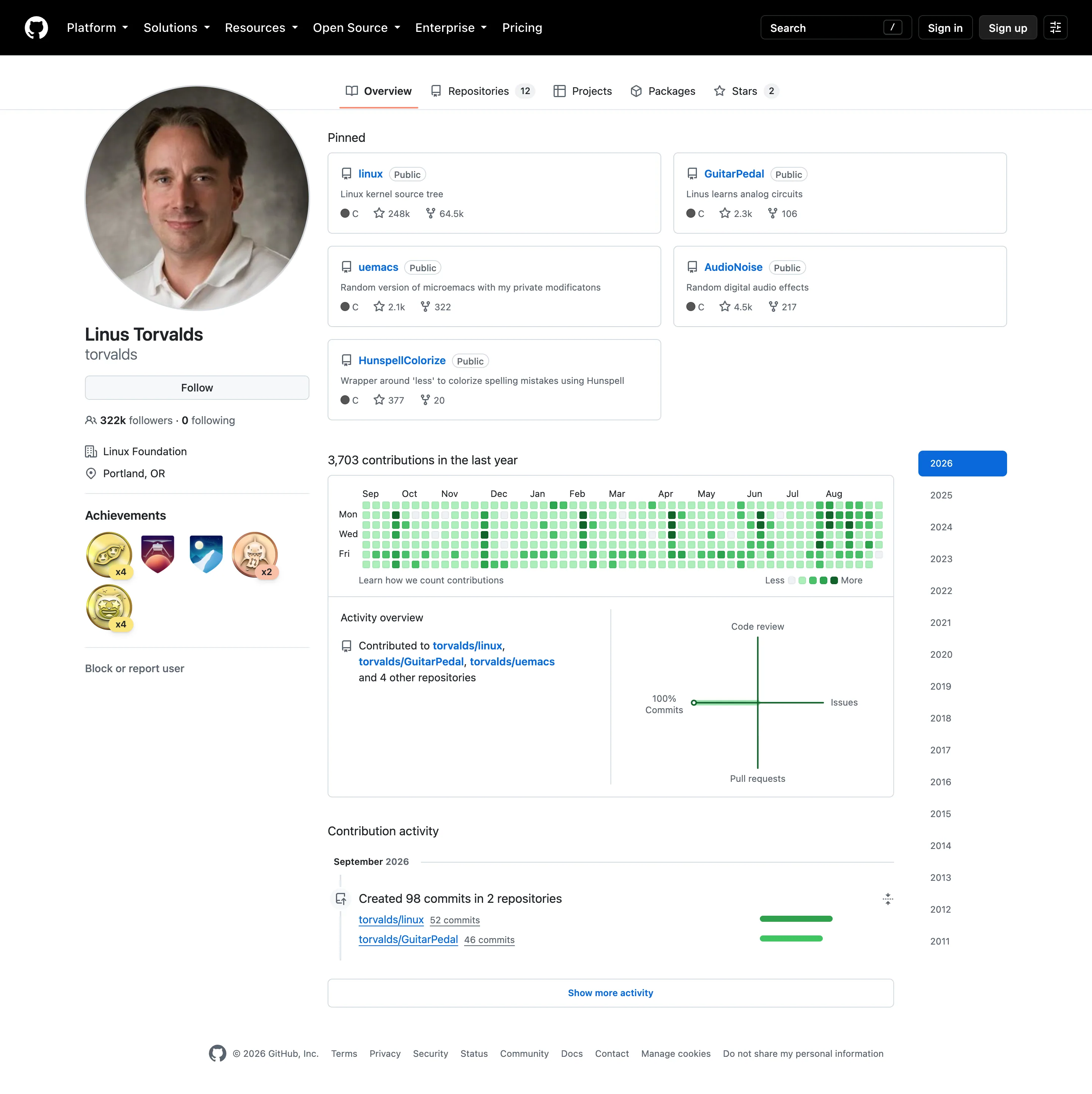
The contribution graph is the calendar heatmap every other product copied, and its five-step bucketing is the deliberate trade that made it legible.

Profile / contribution graph September 11, 2026 github.com, signed out (public profile) medium · light · desktop-web
The calendar heatmap everyone else copied, and a good demonstration of what it trades away. 3,703 contributions across 365 days is about ten a day, and the scale has five steps, so almost every cell here lands in the middle two and the year reads as one flat field of mid-green. A day with five commits and a day with twenty-five are the same colour. That is the deliberate choice—coarse buckets make the rhythm readable and make any individual day approximate—but on a profile this active there is no rhythm left to read either, because the bucketing has flattened the variation it was meant to reveal. The layout still earns its place: weeks as columns and weekdays as rows means a weekend effect would show as two pale rows across the full width, and here it doesn't, which tells you something true about this person's week. The panel beside it is worse off. It is a four-axis diagram of code review, issues, pull requests and commits, and with 100% commits it collapses to a single straight line.
  • Calendar heatmap Fifty-three columns of weeks, seven rows of weekdays, and only Mon, Wed and Fri labelled to save the space.
  • KPI tile The total sits above the grid, so the cells have a denominator. Most calendar heatmaps omit this.
  • Sequential and diverging scales Five discrete steps rather than a continuous ramp, which is why ten commits and thirty share a colour.
  • Time-range picker Sixteen years as a list. No arbitrary range, no relative window—the only unit on offer is a calendar year.
Show 2 more examples Hide the rest

Grafana

The reference implementation for panel grids, template variables, and stat panels; most other tools are defined by how they differ from it.

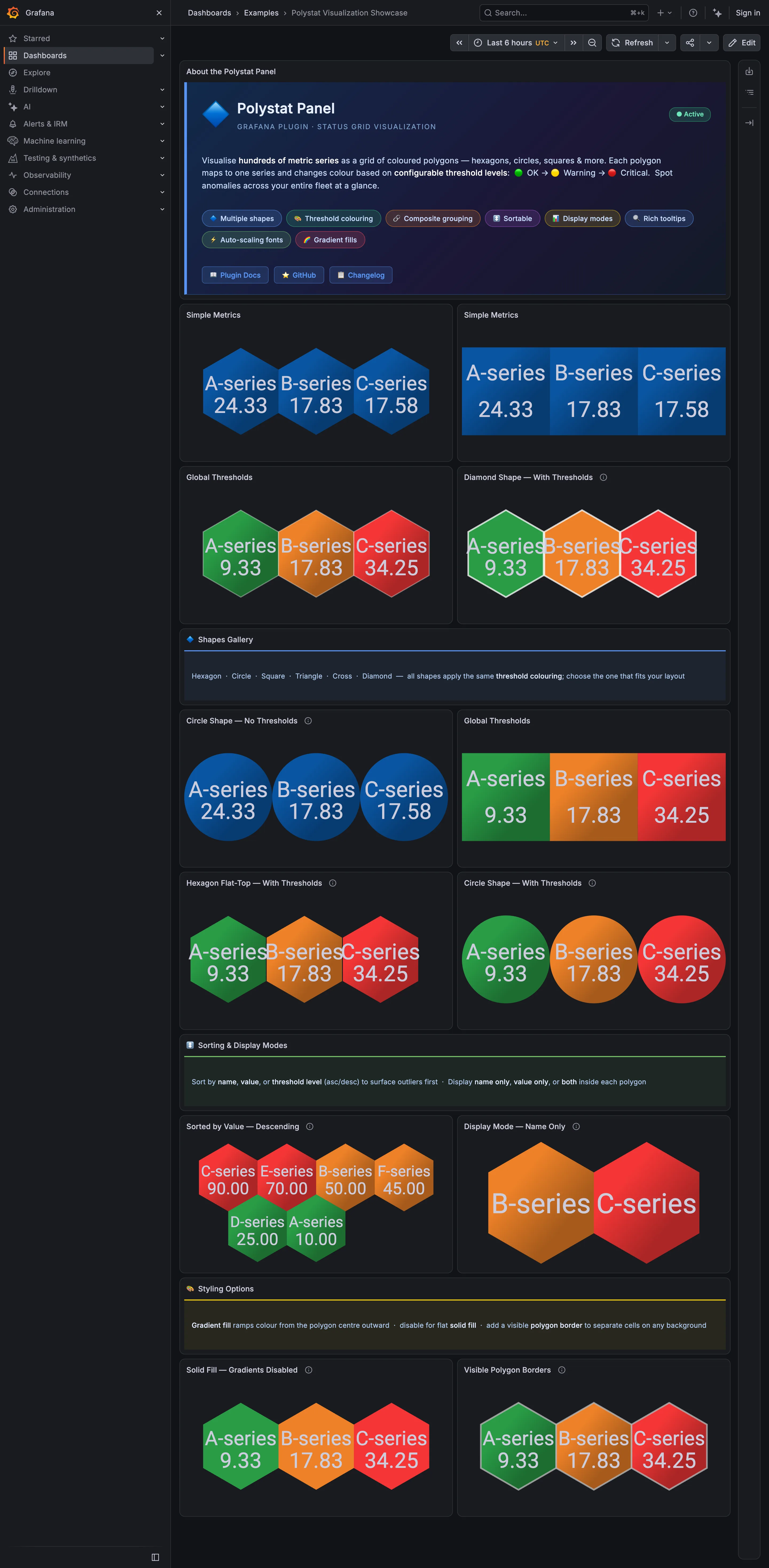
Examples / Polystat Visualization Showcase September 10, 2026 Grafana Play (signed out; no version string exposed) medium · dark · desktop-web
The plugin's own description is the host map pattern stated plainly —"visualise hundreds of metric series as a grid of coloured polygons" and "spot anomalies across your entire fleet at a glance"—and the shapes gallery halfway down says all six shapes "apply the same threshold colouring; choose the one that fits your layout." The page then disproves its own claim. The hexagon panels tile with every neighbour sharing an edge, so three cells read as one block. The circle panels leave a gap between every pair, so three cells read as three things you have to compare one at a time. At six cells that difference is a preference. At three hundred it is the difference between a cluster you see and a cluster you assemble, which is why the shape is a structural choice rather than a styling one.
  • Host map Hexagons sharing edges. Adjacent unhealthy cells merge into one shape, which is the point of the tiling.
  • Host map The same data as circles: a gap around every cell, so nothing clusters.
  • Semantic status color A closed set of three—OK, warning, critical—applied as the whole cell fill.
  • Ranked list Sorted descending so the worst cell lands where the eye starts. No share of total, and no row for the rest.
  • KPI tile Name-only mode: two cells carrying a label, a colour and no number at all.
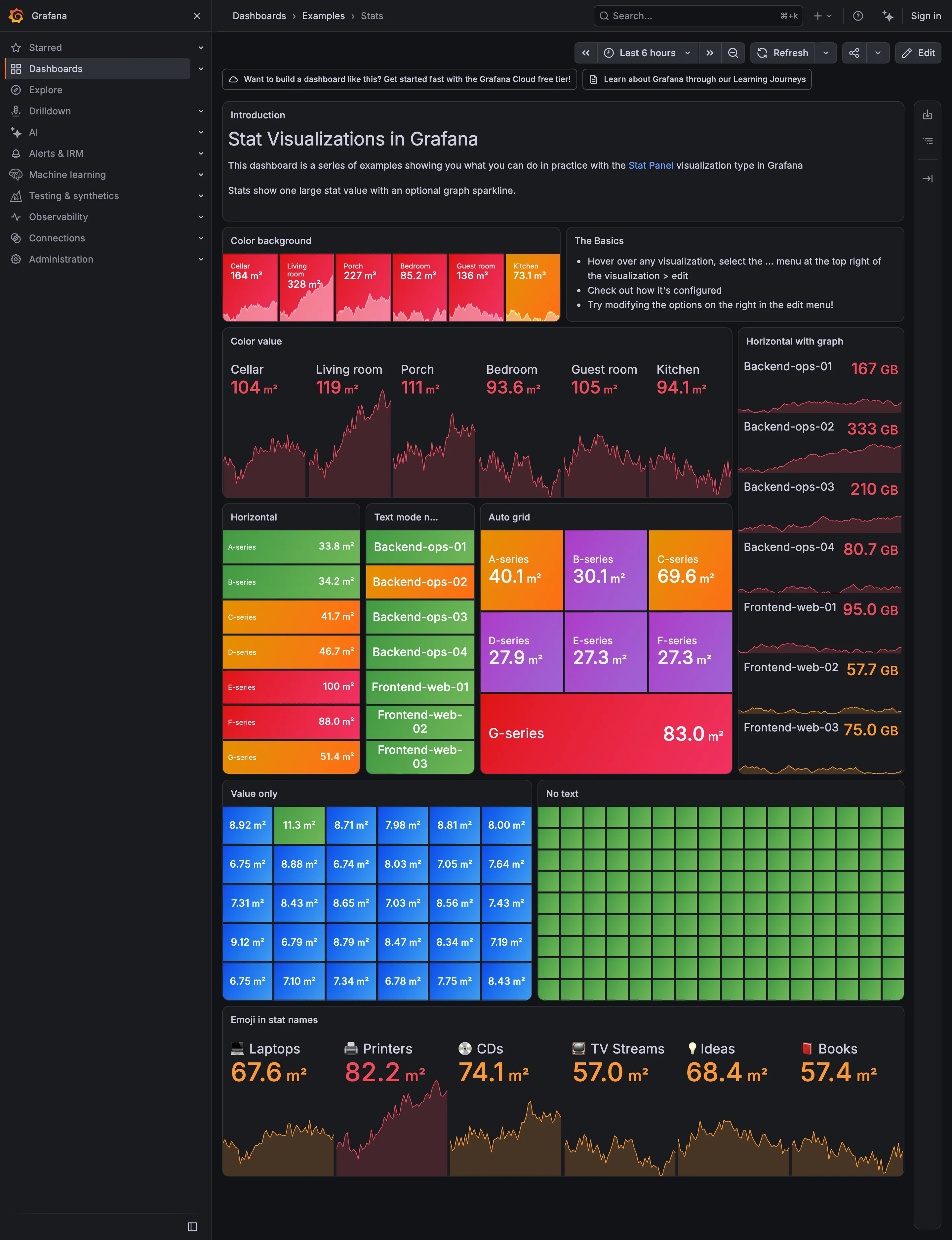
Grafana — Examples / Stats
Header KPI strip. Six tiles sharing one anatomy, which is the arrangement that reads as a row rather than as six things. KPI tile. Label, value, unit and a sparkline behind it. No delta, no base, no window. Dark-first data palette. The dark half of the pair. The same six values in the light capture arrive as pale pink on white. Semantic status color. No text at all. Colour is the only carrier, which is the WCAG failure stated as a feature. Sparkline. A column of them, each scaled to its own series, which is the comparison Tufte warns the arrangement invites. KPI tile. Thirty numbers with no labels—the value with nothing attached to it. Grayscale with alerts. Seven rows, seven different colours, no resting state. Nothing here can read as abnormal. Semantic status color. Whole-tile background colour: the loudest channel available, spent on all six.
Examples / Stats September 10, 2026 Grafana Play (signed out; no version string exposed) dense · dark · desktop-web
A showcase rather than a working dashboard, which is what makes it useful: it is Grafana demonstrating every visual option the stat panel has, in one place, with nothing else competing. Two things are worth reading it for. The first is that across roughly sixty tiles here, not one carries a comparison. Every option on display is about how the number looks—background colour, value colour, orientation, text mode, grid packing—and none is about what the number should be measured against. The panel type that most needs a delta and a base is being shown off without either. The second is the colour. Every single tile on this page is coloured, and the "No text" panel is ninety-odd green rectangles carrying no label and no value at all, which is colour as the sole carrier of meaning at its purest. Both of those are reasonable for a catalogue of options and neither survives being copied onto a real page.
  • KPI tile Label, value, unit and a sparkline behind it. No delta, no base, no window.
  • Dark-first data palette The dark half of the pair. The same six values in the light capture arrive as pale pink on white.
  • Sparkline A column of them, each scaled to its own series, which is the comparison Tufte warns the arrangement invites.
  • Semantic status color Whole-tile background colour: the loudest channel available, spent on all six.
  • Grayscale with alerts Seven rows, seven different colours, no resting state. Nothing here can read as abnormal.
  • KPI tile Thirty numbers with no labels—the value with nothing attached to it.
  • Semantic status color No text at all. Colour is the only carrier, which is the WCAG failure stated as a feature.
  • Header KPI strip Six tiles sharing one anatomy, which is the arrangement that reads as a row rather than as six things.