Skip to content
KONIGI

Dashboards / Data information / Sparkline

6 of 7

Sparkline

The viewer needs the shape of the recent past next to the number, without the cost of a full chart.

Updated September 9, 2026

Problem

The viewer needs to know the shape of the last hour as well as the value right now, and there is room for a number but not for a chart.

Solution

Tufte’s definition is the specification: “a small intense, simple, word-sized graphic with typographic resolution.” Data-intense, design-simple. The data-ink ratio is 1.0, which means no frame, no tick marks, no axis, no legend. Everything that isn’t data comes out.

Stripping the axis is what makes a sparkline fit beside a number. It is also the entire problem, because a line with no axis has no scale, and the reader will supply one anyway.

This bites hardest in a column of them, which is where sparklines are most useful and most misleading. Scale each row to its own min and max and a metric that wobbled between 99.1% and 99.2% draws the same dramatic peaks as one that collapsed from 90% to 10%. Scale them all together and every small series flatlines into a dash. Tufte covers this directly, citing Bissantz: min-to-max scaling within each series invites false comparison, zero-to-max buries the detail. His answer is to standardize, showing variance against a common baseline, which is the only version that survives being read as a column.

Aspect ratio is the other lever. Tufte argues for shapes that put the interesting slopes near 45 degrees, because a sparkline squashed flat hides the movement and one stretched tall invents it.

Use when

A number is already on screen and the viewer’s next question is “has it been doing that long”. Also in tables, where one column of shapes replaces a chart per row.

Don’t use when

The exact values matter, or the viewer needs to read a specific point. A sparkline answers “what shape” and refuses to answer “how much”, and adding labels to fix that turns it back into a small chart with all the costs of one.

Trade-offs

No axis means no scale, and no scale means the reader’s interpretation depends entirely on a normalization decision nobody surfaced. Sparklines are also small enough to become decoration; a dashboard where every tile grew a background wiggle has added ink and no information. They rarely survive being resized, and they are nearly invisible to a screen reader unless the underlying numbers are also available. Grafana is candid about the size problem: the stat panel hides the sparkline automatically when the panel gets too small, which is the right behavior and also means the same dashboard tells different stories at different widths.

Checklist

  • Is each sparkline scaled to itself, to the column, or to a fixed baseline? Can the viewer tell?
  • If they’re in a column, would a reader comparing two rows reach a true conclusion?
  • What time window does the line cover, and is it the same window as the number beside it?
  • Are the endpoints marked, so the viewer knows which end is now?
  • Is the current value’s position within the recent range visible, or just the shape?
  • Does the aspect ratio put the interesting slopes near 45 degrees, or has it flattened them?
  • What happens to gaps in the data?
  • Does the sparkline survive the smallest size this container gets, and what shows if it doesn’t?
  • Is the same information reachable as text for a screen reader?
  • Is this sparkline doing work, or is it a texture the tile grew?

Compare

Grafana renders the sparkline as a background wash behind the stat value rather than beside it, and hides it when the panel shrinks, so it reads as atmosphere for the number instead of a chart in its own right. Sentry puts one on every issue row in the list, which is the pattern at its most useful: the shape tells you whether an error is new, constant, or spiking, without opening anything. Netdata effectively inverts the pattern by making the full charts small and numerous enough that it never needs a miniature. Honeycomb mostly declines it, on the same argument it makes about percentiles, that a single line hides the distribution underneath it.

KPI tile is where a sparkline usually lives, and delta indicator is the other way to give that tile context. Time series is this pattern at full size with the axes put back. Data table is the other host, where a sparkline column replaces a chart per row. Small multiples is what happens when you keep the axes but repeat the chart, and it is the honest alternative when the comparison between rows actually matters.
Sparkline anatomy A word-sized line drawn inside a line of text, with a grey band for the normal range and the last value marked and printed beside it. Below, the same three series scaled each to its own minimum and maximum, then on one common scale. Anatomy, drawn at the size it's meant to be 1 2 Checkout p95 312ms 90 days 3 4 1 WORD-SIZED Small, intense, simple and sized to the line of text it sits in. That's Tufte's whole spec. 2 NO FRAME, NO AXIS Data-ink ratio 1.0. Everything that isn't data comes out, ticks and gridlines first. 3 NORMAL BAND The only scale it gets. A grey stripe saying what the last ninety days counted as normal. 4 LAST VALUE Marked on the line and printed beside it, because a line with no axis has no number. Three series, two scalings Sparklines are most useful in a column, which is where they mislead hardest. 99.1–99.2% 78–74% 90–10% Each to its own min and max 99.1–99.2% 78–74% 90–10% One common scale
Wireframe — the pattern's anatomy, not any one product's version of it

Implementation

A word-sized chart with no axes, no gridlines and no tooltip. Everything a normal chart adds is what makes a sparkline stop working, so the component has to actively refuse those things rather than merely omit them.

Tokens
--foreground--card--muted--muted-foreground--border--chart-1--direction-up

Checkout p95312ms90 days

Sparkline.tsxRenders a path from values. No axes, and the endpoint dot is the only emphasis.

/**
 * A sparkline is sized to sit in a line of text, so it gets no axes, no
 * gridlines, no legend and no tooltip. Those are the things that make a chart
 * readable at chart size and unreadable at word size.
 *
 * The one piece of emphasis is the final point, because the question a
 * sparkline answers is "what shape got us to the number beside it".
 */
export function Sparkline({
  values,
  width = 72,
  height = 20,
}: {
  values: number[];
  width?: number;
  height?: number;
}) {
  if (values.length < 2) return null;
  const min = Math.min(...values);
  const max = Math.max(...values);
  const span = max - min || 1;
  const x = (i: number) => (i / (values.length - 1)) * (width - 2) + 1;
  const y = (v: number) => height - 1 - ((v - min) / span) * (height - 2);
  const d = values.map((v, i) => `${i ? "L" : "M"}${x(i).toFixed(1)} ${y(v).toFixed(1)}`).join(" ");

  return (
    <svg
      width={width}
      height={height}
      viewBox={`0 0 ${width} ${height}`}
      // Decorative: the number beside it carries the meaning, and a screen
      // reader reading out a path description helps nobody.
      aria-hidden="true"
      className="inline-block align-middle overflow-visible"
    >
      <path d={d} fill="none" stroke="currentColor" strokeWidth="1.25" strokeLinejoin="round" strokeLinecap="round" />
      <circle cx={x(values.length - 1)} cy={y(values[values.length - 1])} r="1.9" fill="currentColor" />
    </svg>
  );
}

demo.tsxHow it is called: the values, inline beside the number and its window.

import { Sparkline } from "./Sparkline";

/** Inline beside the number it belongs to, at text size, with the window named. */
export default function Demo() {
  return (
    <p className="flex items-baseline gap-3 text-sm text-foreground">
      Checkout p95
      <span className="self-center text-chart-1">
        <Sparkline values={[296, 310, 288, 322, 305, 330, 298, 315, 312]} width={180} height={24} />
      </span>
      <span className="tabular-nums text-direction-up">312ms</span>
      <span className="text-xs text-muted-foreground">90 days</span>
    </p>
  );
}
What it renders. Identical markup in both panes, with only the token values changing.

Examples

Captures whose hotspots reference this pattern, grouped by product and dated. The dashed boxes are this pattern; hover any box for the note.

Grafana

The reference implementation for panel grids, template variables, and stat panels; most other tools are defined by how they differ from it.

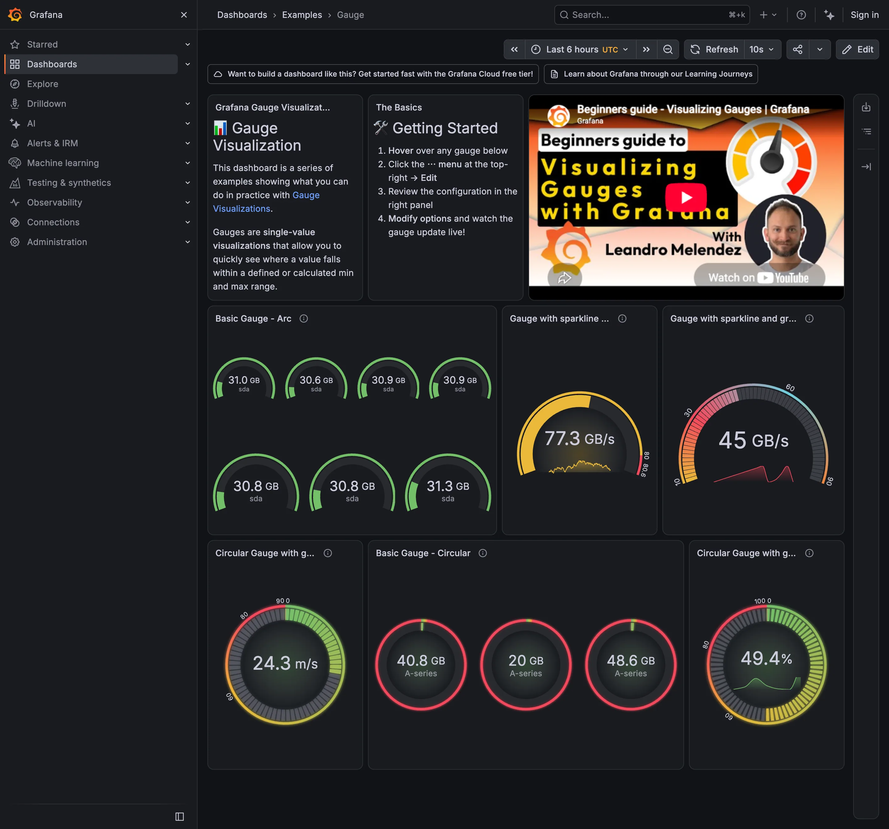
Examples / Gauge September 10, 2026 Grafana Play (signed out; no version string exposed) medium · dark · desktop-web
Nine gauges, and the page makes Few's argument against them without meaning to. The panel at bottom left holds seven arcs reading 30.6, 30.8, 30.8, 30.9, 30.9, 31.0 and 31.3 GB. Seven squares, seven needles, to say that seven disks are all about the same. The same seven values as a bullet graph would be seven short bars in a fraction of the height, and the one that was different would be obvious rather than requiring you to read each label. What the gauges do carry is a bounded range where the endpoints mean something, which is the case the pattern survives: these are percentages and capacities, not rates. The panel beside them is where it stops working—three circular gauges at 40.8, 20 and 48.6 GB, all with a red arc, so a value and another value two and a half times larger get the same verdict.
  • Gauge and dial Seven arcs to report that seven disks agree. This is the area argument in one panel.
  • Sparkline A sparkline inside the arc: the same series encoded twice in one square.
  • Sequential and diverging scales The arc runs pink through green with no perceptual order, so position on it means nothing without the number.
  • Semantic status color 40.8, 20 and 48.6 all arc red. The threshold fires for everything, so it says nothing.
  • Threshold line and region The coloured band around the rim is the threshold, drawn as a region rather than a line.
Show 3 more examples Hide the rest

Grafana

The reference implementation for panel grids, template variables, and stat panels; most other tools are defined by how they differ from it.

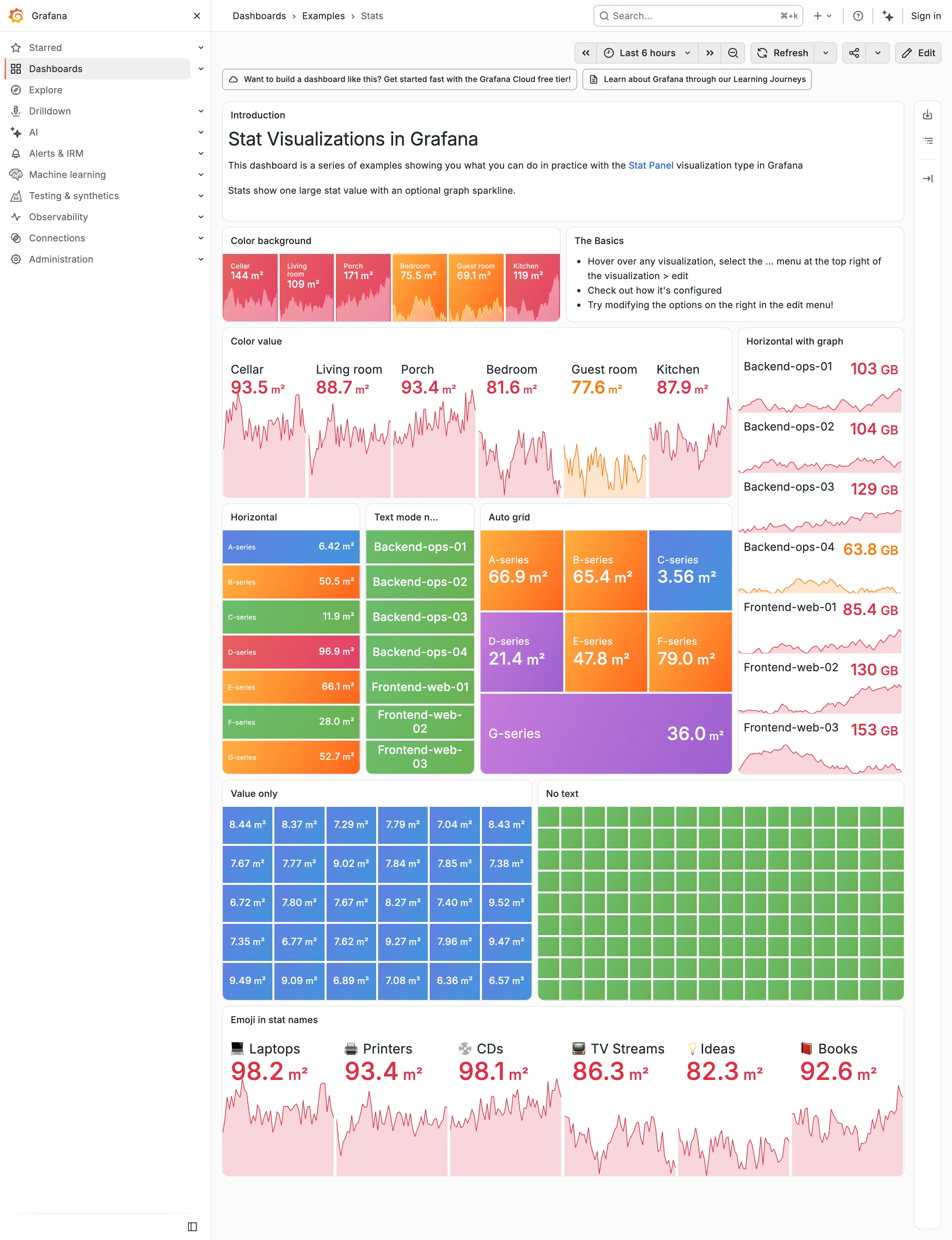
Examples / Stats, light theme September 10, 2026 Grafana Play (signed out; ?theme=light) dense · light · desktop-web
The same dashboard as the dark Stats capture, same data, same palette, one URL parameter apart. Put them side by side and the palette turns out to have been designed on charcoal. On the dark version the value colours carry because they are brighter than the ground—reds, oranges and greens against near-black. Here they have to carry by being darker than the ground instead, and the same hues arrive as pale pink and pale salmon. Look at the Color value panel: six numbers at 30-odd pixels, and 93.5, 88.7, 93.4, 81.6, 77.6 and 87.9 are all light pink on white. The column on the right is worse, because 63.8 GB lands on pale orange. Nothing about the theme switch is broken, and nothing was chosen for this ground. That's the whole argument for designing the dark case first and deriving the other one: the constrained case should set the lightness range, and here the unconstrained one did.
  • Dark-first data palette The same six values as the dark capture. Bright-on-charcoal became pale-on-white, and the contrast went with it.
  • Dark-first data palette 63.8 GB in pale orange on white. On the dark version the identical colour was the readable one.
  • Semantic status color Whole-tile fills survive the switch, because the text sits on the colour rather than being the colour.
  • Grayscale with alerts Ninety green rectangles, identical in both themes. Nothing here can read as abnormal on either ground.
  • Sparkline The area fills under each value drop to near-white here, so the shape that was legible on charcoal is a smudge.
Grafana — Examples / Stats
Header KPI strip. Six tiles sharing one anatomy, which is the arrangement that reads as a row rather than as six things. KPI tile. Label, value, unit and a sparkline behind it. No delta, no base, no window. Dark-first data palette. The dark half of the pair. The same six values in the light capture arrive as pale pink on white. Semantic status color. No text at all. Colour is the only carrier, which is the WCAG failure stated as a feature. Sparkline. A column of them, each scaled to its own series, which is the comparison Tufte warns the arrangement invites. KPI tile. Thirty numbers with no labels—the value with nothing attached to it. Grayscale with alerts. Seven rows, seven different colours, no resting state. Nothing here can read as abnormal. Semantic status color. Whole-tile background colour: the loudest channel available, spent on all six.
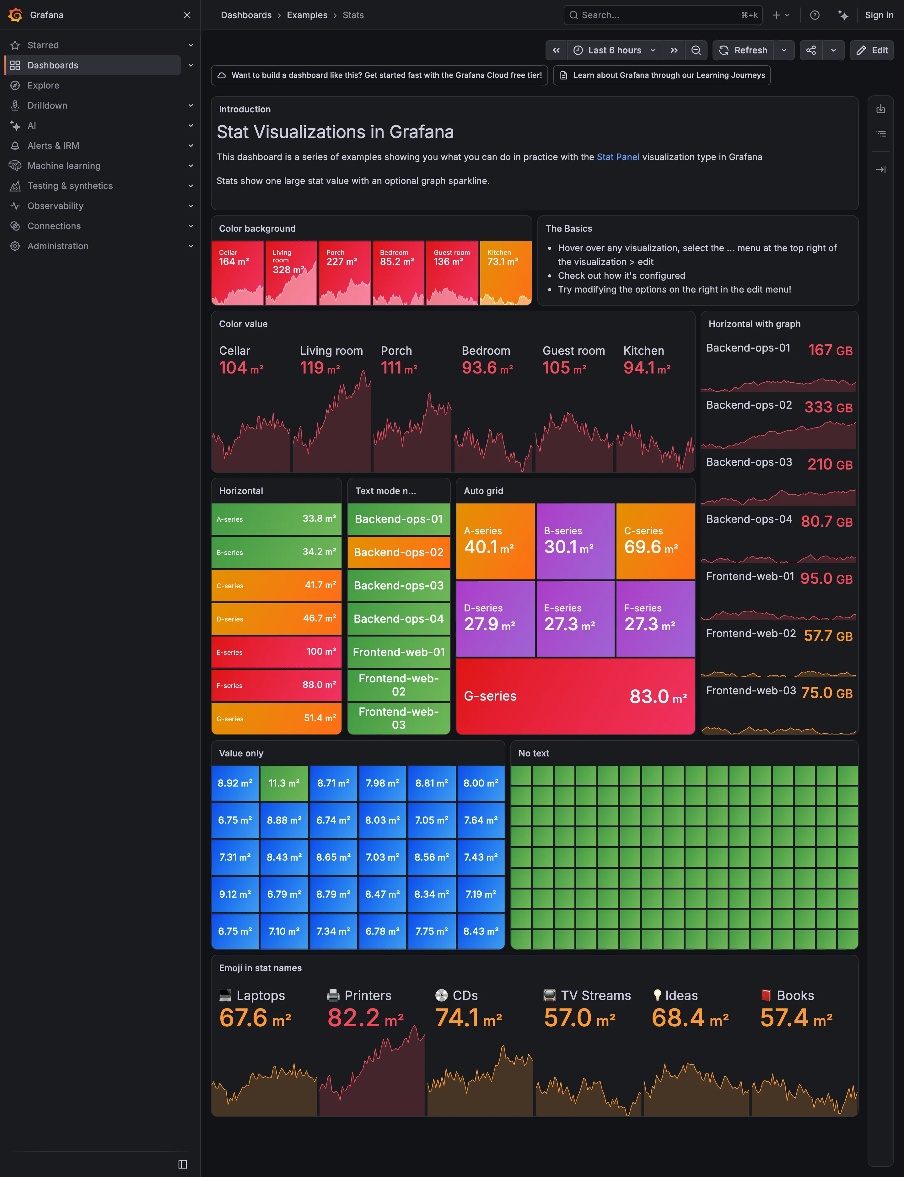
Examples / Stats September 10, 2026 Grafana Play (signed out; no version string exposed) dense · dark · desktop-web
A showcase rather than a working dashboard, which is what makes it useful: it is Grafana demonstrating every visual option the stat panel has, in one place, with nothing else competing. Two things are worth reading it for. The first is that across roughly sixty tiles here, not one carries a comparison. Every option on display is about how the number looks—background colour, value colour, orientation, text mode, grid packing—and none is about what the number should be measured against. The panel type that most needs a delta and a base is being shown off without either. The second is the colour. Every single tile on this page is coloured, and the "No text" panel is ninety-odd green rectangles carrying no label and no value at all, which is colour as the sole carrier of meaning at its purest. Both of those are reasonable for a catalogue of options and neither survives being copied onto a real page.
  • KPI tile Label, value, unit and a sparkline behind it. No delta, no base, no window.
  • Dark-first data palette The dark half of the pair. The same six values in the light capture arrive as pale pink on white.
  • Sparkline A column of them, each scaled to its own series, which is the comparison Tufte warns the arrangement invites.
  • Semantic status color Whole-tile background colour: the loudest channel available, spent on all six.
  • Grayscale with alerts Seven rows, seven different colours, no resting state. Nothing here can read as abnormal.
  • KPI tile Thirty numbers with no labels—the value with nothing attached to it.
  • Semantic status color No text at all. Colour is the only carrier, which is the WCAG failure stated as a feature.
  • Header KPI strip Six tiles sharing one anatomy, which is the arrangement that reads as a row rather than as six things.

Home Assistant

A card grid people genuinely rearrange, on a wall tablet, which is where resizable layouts either work or quietly stop describing the house.

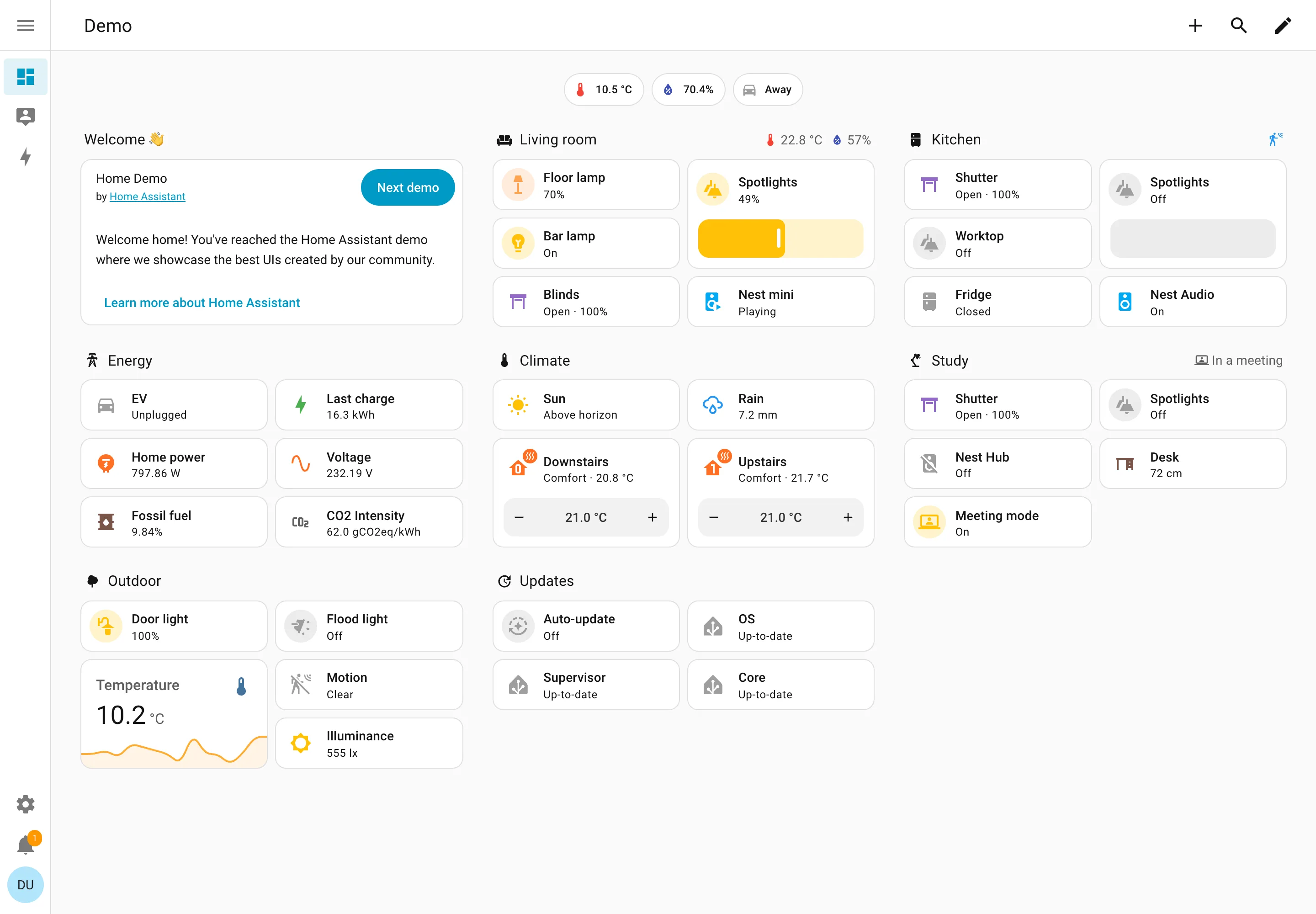
Home Assistant — Demo dashboard
Resizable card grid. Cards a household arranges itself, grouped by room. Sections are one column each rather than a free canvas. Semantic grouping. Grouped by where the thing physically is, and the group header carries that room's temperature and humidity. Sidebar and canvas. Collapsed to icons by default, because on a wall tablet the canvas is worth more than the labels. Sparkline. One card carrying a number and the shape behind it, with no axis and no legend. Semantic status color. Amber means on, and the card says 49% anyway. Colour repeats the word instead of replacing it. Header KPI strip. Three chips above everything: outside temperature, humidity, and whether anyone is home. Dashboard builder. A pencil in the corner. Editing is one click from reading, which is why these pages actually get rearranged.
Demo dashboard September 10, 2026 Home Assistant public demo (signed out) medium · light · desktop-web
The grouping axis here is physical space—Living room, Kitchen, Study, Outdoor—which nothing else in this gallery uses, and it works for the same reason process mimics work: the viewer already holds the model. The thing worth stealing is the state labelling. Every entity says its state in words: Open · 100%, Off, Closed, Playing, Up-to-date, Unplugged. The amber tint on an icon repeats what the word already said rather than replacing it, so the page is readable with no colour at all. That isn't accessibility diligence so much as an audience constraint—you cannot train a household on a colour key the way you can train an on-call rota, so the words have to carry. Each section header also doubles as a summary: Living room reports 22.8°C and 57% humidity beside its own name, and Study reports "In a meeting". And this is a control surface as much as a display—the Spotlights card is a slider you drag, the thermostats have plus and minus.
  • Resizable card grid Cards a household arranges itself, grouped by room. Sections are one column each rather than a free canvas.
  • Semantic grouping Grouped by where the thing physically is, and the group header carries that room's temperature and humidity.
  • Semantic status color Amber means on, and the card says 49% anyway. Colour repeats the word instead of replacing it.
  • Header KPI strip Three chips above everything: outside temperature, humidity, and whether anyone is home.
  • Sidebar and canvas Collapsed to icons by default, because on a wall tablet the canvas is worth more than the labels.
  • Sparkline One card carrying a number and the shape behind it, with no axis and no legend.
  • Dashboard builder A pencil in the corner. Editing is one click from reading, which is why these pages actually get rearranged.