Skip to content
KONIGI

Dashboards / Structure / Semantic grouping

2 of 4

Semantic grouping

Panels belong together by meaning, and the layout should say so.

Updated September 10, 2026

Problem

A dashboard has twenty panels arranged in the order somebody added them. Two panels that describe the same subsystem sit six rows apart, and a panel about payments sits next to one about disk latency because both were built on a Tuesday.

Solution

Group panels by what they mean, label the groups, and let adjacency carry information. Everything about one service together; everything about one stage of a pipeline together; everything one role cares about together.

The reason this matters more on a dashboard than on most pages is that people do not read dashboards, they scan them. Scanning uses proximity: things near each other are assumed related, whether or not anyone intended it. That assumption is made before any label is read, which means an ungrouped layout is not neutral. It is actively making false claims.

The hard part is choosing the axis, because there are usually three defensible ones and they conflict.

By subsystem—database, cache, queue, web—suits people who own components and matches how incidents are usually scoped.

By signal type—traffic, errors, latency, saturation—suits people diagnosing, and puts comparable panels next to each other so a shared shape is visible.

By audience—what the on-call needs, what the product owner needs—suits pages read by more than one role, and tends to produce duplication.

Picking one and applying it consistently beats a page that groups by subsystem at the top and signal type further down, which is the state most mature dashboards drift into as different people add sections.

Group labels are the visible output and they get written last, which is why they are so often nouns with no information: “Metrics”, “Other”, “Misc”. A group called “Misc” is a confession that the grouping is unfinished.

Use when

The panel count is beyond a handful, the content has real structure, and viewers scan rather than read top to bottom.

Don’t use when

There are six panels. Grouping six things into three groups adds ceremony and reduces the information density of every label.

Trade-offs

Any grouping privileges one question over the others, so the page is fast for the question it was arranged around and slower for every other. Groups resist change: once a section exists, panels get added to whichever one looks closest rather than prompting a rethink. Consistency across a dashboard estate is nearly impossible to maintain without a template, and inconsistent grouping across pages costs more than no grouping. And a grouped layout usually implies collapsing, which brings its own set of problems.

Checklist

  • What is the grouping axis, and is it applied consistently down the whole page?
  • Would a different axis serve the primary reader better?
  • Does every group have a label that says something specific?
  • Is there a group called Misc, Other or Metrics?
  • Does proximity anywhere imply a relationship that does not exist?
  • Are groups ordered by importance, or by when they were added?
  • Do the same groups appear in the same order across related dashboards?
  • Does a new panel have an obvious home, or does it default to the last group?
  • Are group boundaries visible without relying on colour?
  • Does the grouping still make sense after the last reorganisation?

Compare

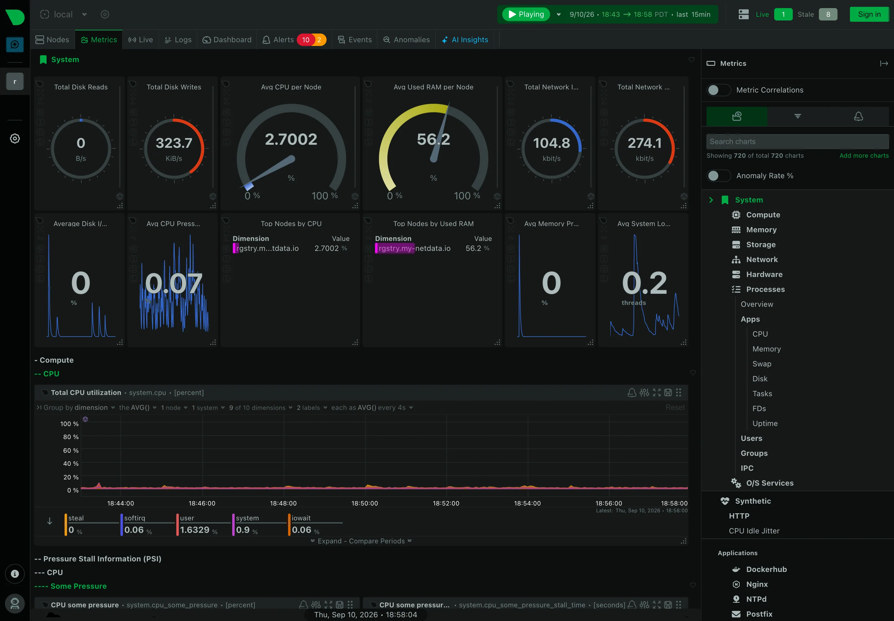
Grafana provides rows as the grouping mechanism, so a group is a labelled collapsible band, and the label is the only thing carrying the semantics. Datadog offers group widgets that nest within a page and can carry their own status, so a group is an object with state rather than only a divider. Netdata derives grouping from the collectors themselves—CPU, memory, disks, network, per application—which means the structure is generated rather than curated and is consistent across every node by construction. Honeycomb has little of this, because a board is a set of queries rather than a spatial arrangement, and the grouping question moves to which queries belong on which board.

Panel grid is the mechanism adjacency is expressed through. Collapsible row is what a group usually becomes. Tabs as genres is the same idea promoted to page level. Multi-page dashboard is where grouping goes when sections outgrow one page. Dense small-multiple layout is the case where grouping matters most, because scanning is the only way the page works.
Semantic grouping anatomy The same twelve panels twice. First in an even unlabelled grid, where proximity claims relationships nobody intended. Then in three labelled clusters with space between them, so adjacency means something. The same twelve panels, two layouts Even grid, no labels Proximity still makes claims Traffic Errors Saturation Grouped, labelled, spaced 1 2 3 1 PROXIMITY People scan rather than read, and assume things near each other relate. An even grid isn't neutral. 2 THE LABEL Written last, which is why so many say nothing. A group called "Misc" is a confession. 3 ONE AXIS Subsystem, signal type or audience. Pick one. Pages drift into all three as people add sections.
Wireframe — the pattern's anatomy, not any one product's version of it

Implementation

Panels that belong together by meaning, laid out so the grouping is visible without a box around everything. A heading and a gap do more work than a border, and cost less ink.

shadcn
npx shadcn@latest add separator card
Tokens
--card--muted-foreground--border--status-warn--status-critical

Traffic

Requests / s

1,240

Active sessions

8,912

Egress

210 MB/s

Errors

5xx rate

0.21%

4xx rate

2.4%

Failed jobs

3

Saturation

CPU

61%

Memory

78%

Queue depth

42

PanelGroups.tsxOne grouping axis per page, a labelled section per group, and a label that says nothing gets flagged.

import type { ReactNode } from "react";
import { Separator } from "@/components/ui/separator";
import { cn } from "@/lib/utils";

/** One axis per page. Subsystem, signal type or audience, chosen once, so a
 *  page cannot group by service at the top and by signal further down. */
export type Axis = "subsystem" | "signal" | "audience";

export type Group = {
  /** Specific. "Misc", "Other" and "Metrics" are confessions, and they are
   *  flagged rather than silently accepted. */
  label: string;
  /** Ordered by importance, never by when they were added. */
  panels: ReactNode[];
};

type Props = {
  axis: Axis;
  groups: Group[];
  columns?: 2 | 3 | 4;
};

const SAYS_NOTHING = /^(misc|miscellaneous|other|metrics|general|stuff)$/i;
const COLS = { 2: "grid-cols-2", 3: "grid-cols-3", 4: "grid-cols-4" };

export function PanelGroups({ axis, groups, columns = 3 }: Props) {
  return (
    <div className="flex flex-col gap-5" data-axis={axis}>
      {groups.map((g) => {
        const empty = SAYS_NOTHING.test(g.label.trim());
        return (
          // A heading and a gap do the work. No box around everything, and
          // the boundary is visible without colour.
          <section key={g.label} aria-label={g.label}>
            <h3
              className={cn("text-[11px] uppercase tracking-[0.1em]", empty ? "text-status-warn" : "text-muted-foreground")}
              title={empty ? `"${g.label}" says nothing about what is inside. Name the ${axis}.` : undefined}
            >
              {g.label}
            </h3>
            <Separator className="mb-2 mt-1.5" />
            {g.panels.length > 0 ? (
              <div className={cn("grid gap-2", COLS[columns])}>{g.panels}</div>
            ) : (
              <p className="text-[11px] text-muted-foreground">Nothing here yet.</p>
            )}
          </section>
        );
      })}
    </div>
  );
}

demo.tsxHow it is called: nine panels by signal type, traffic then errors then saturation.

import { Card } from "@/components/ui/card";
import { cn } from "@/lib/utils";
import { PanelGroups } from "./PanelGroups";

/**
 * Nine panels grouped by signal type. Traffic, errors, saturation, in that
 * order, because that is the order a person diagnosing reads them. One error
 * panel is firing and sits where a reader would look for it.
 */
const Stat = ({ label, value, critical }: { label: string; value: string; critical?: boolean }) => (
  <Card className={cn("p-3 shadow-none", critical && "border-status-critical")}>
    <p className="text-xs text-muted-foreground">{label}</p>
    <p className={cn("mt-1 text-lg font-semibold tabular-nums", critical && "text-status-critical")}>{value}</p>
  </Card>
);

export default function Demo() {
  return (
    <div className="rounded-lg border bg-card p-4">
      <PanelGroups
        axis="signal"
        groups={[
          {
            label: "Traffic",
            panels: [
              <Stat key="rps" label="Requests / s" value="1,240" />,
              <Stat key="sessions" label="Active sessions" value="8,912" />,
              <Stat key="bw" label="Egress" value="210 MB/s" />,
            ],
          },
          {
            label: "Errors",
            panels: [
              <Stat key="5xx" label="5xx rate" value="0.21%" />,
              <Stat key="4xx" label="4xx rate" value="2.4%" />,
              <Stat key="jobs" label="Failed jobs" value="3" critical />,
            ],
          },
          {
            label: "Saturation",
            panels: [
              <Stat key="cpu" label="CPU" value="61%" />,
              <Stat key="mem" label="Memory" value="78%" />,
              <Stat key="queue" label="Queue depth" value="42" />,
            ],
          },
        ]}
      />
    </div>
  );
}
What it renders. Identical markup in both panes, with only the token values changing.

Examples

Captures whose hotspots reference this pattern, grouped by product and dated. The dashed boxes are this pattern; hover any box for the note.

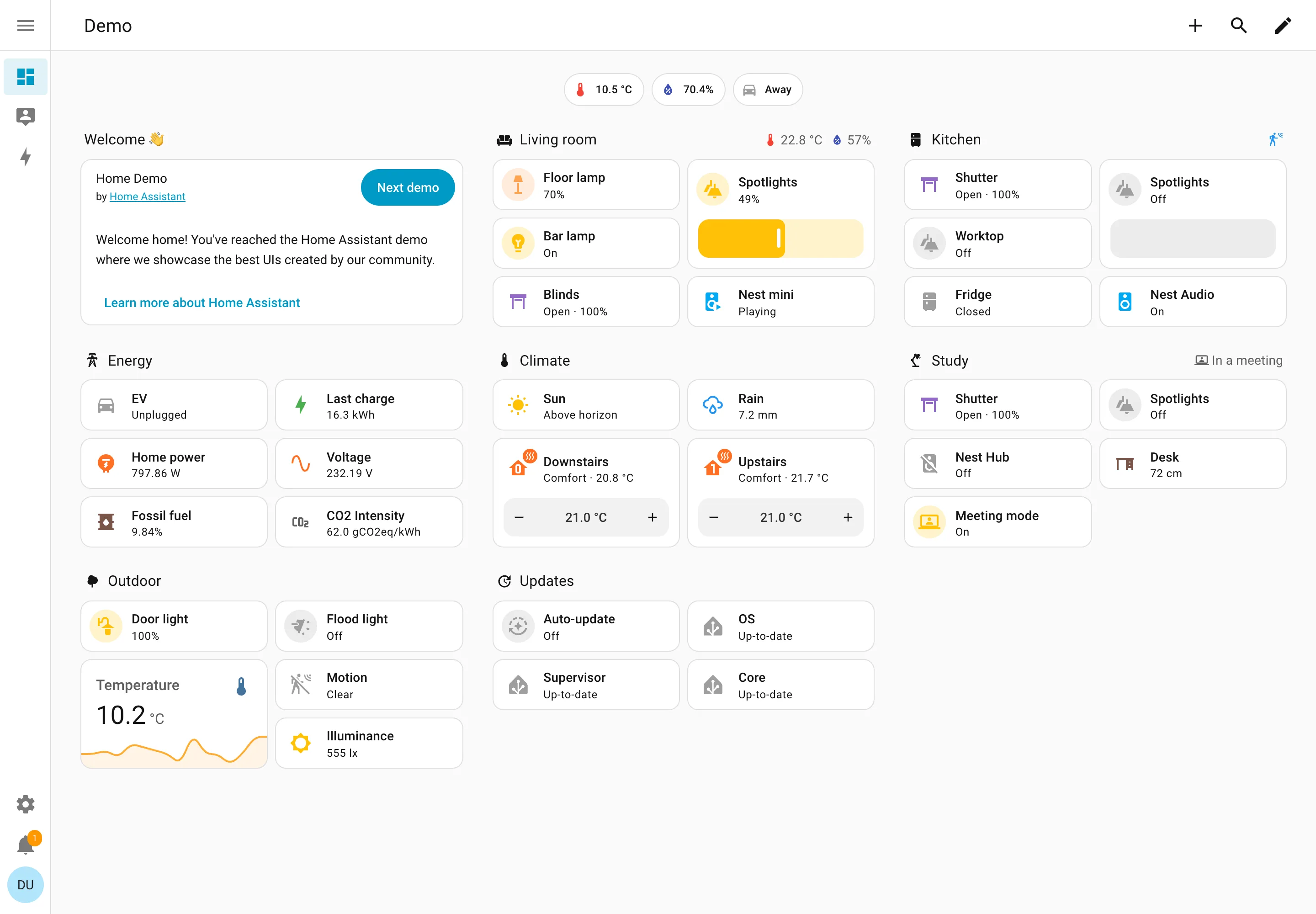
Home Assistant

A card grid people genuinely rearrange, on a wall tablet, which is where resizable layouts either work or quietly stop describing the house.

Home Assistant — Demo dashboard
Resizable card grid. Cards a household arranges itself, grouped by room. Sections are one column each rather than a free canvas. Semantic grouping. Grouped by where the thing physically is, and the group header carries that room's temperature and humidity. Sidebar and canvas. Collapsed to icons by default, because on a wall tablet the canvas is worth more than the labels. Sparkline. One card carrying a number and the shape behind it, with no axis and no legend. Semantic status color. Amber means on, and the card says 49% anyway. Colour repeats the word instead of replacing it. Header KPI strip. Three chips above everything: outside temperature, humidity, and whether anyone is home. Dashboard builder. A pencil in the corner. Editing is one click from reading, which is why these pages actually get rearranged.
Demo dashboard September 10, 2026 Home Assistant public demo (signed out) medium · light · desktop-web
The grouping axis here is physical space—Living room, Kitchen, Study, Outdoor—which nothing else in this gallery uses, and it works for the same reason process mimics work: the viewer already holds the model. The thing worth stealing is the state labelling. Every entity says its state in words: Open · 100%, Off, Closed, Playing, Up-to-date, Unplugged. The amber tint on an icon repeats what the word already said rather than replacing it, so the page is readable with no colour at all. That isn't accessibility diligence so much as an audience constraint—you cannot train a household on a colour key the way you can train an on-call rota, so the words have to carry. Each section header also doubles as a summary: Living room reports 22.8°C and 57% humidity beside its own name, and Study reports "In a meeting". And this is a control surface as much as a display—the Spotlights card is a slider you drag, the thermostats have plus and minus.
  • Resizable card grid Cards a household arranges itself, grouped by room. Sections are one column each rather than a free canvas.
  • Semantic grouping Grouped by where the thing physically is, and the group header carries that room's temperature and humidity.
  • Semantic status color Amber means on, and the card says 49% anyway. Colour repeats the word instead of replacing it.
  • Header KPI strip Three chips above everything: outside temperature, humidity, and whether anyone is home.
  • Sidebar and canvas Collapsed to icons by default, because on a wall tablet the canvas is worth more than the labels.
  • Sparkline One card carrying a number and the shape behind it, with no axis and no legend.
  • Dashboard builder A pencil in the corner. Editing is one click from reading, which is why these pages actually get rearranged.
Show 2 more examples Hide the rest

Kibana

Query-first rather than panel-first: the search bar is the primary control and the charts are downstream of it, which inverts Grafana's arrangement.

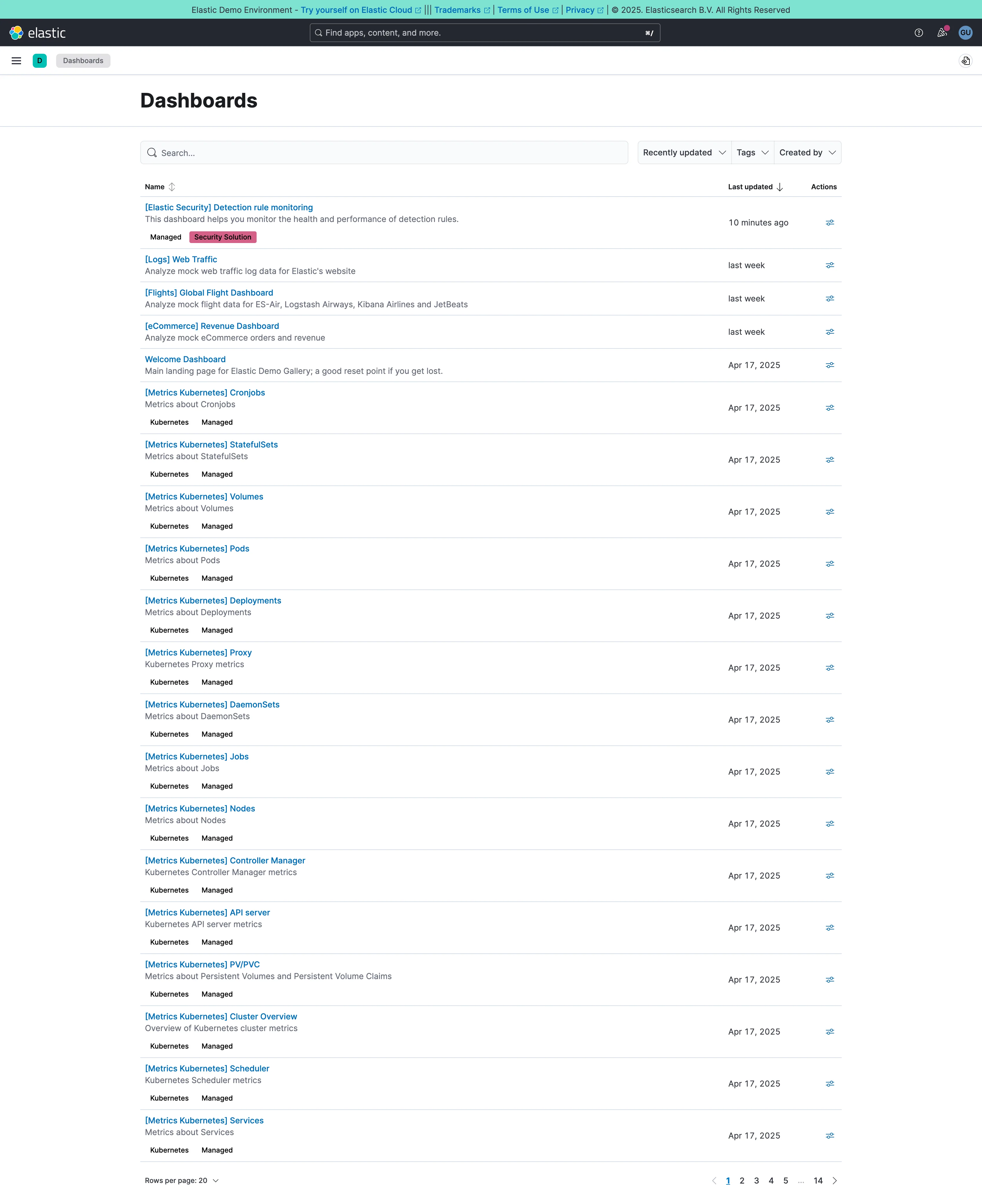
Dashboards / list September 10, 2026 Elastic demo environment (guest session) medium · light · desktop-web
The estate, rather than a dashboard. Twenty rows a page and fourteen pages, so something close to 280 dashboards, and sixteen of the twenty on this first page are called "[Metrics Kubernetes] something"—Cronjobs, StatefulSets, Volumes, Pods, Deployments, Proxy, DaemonSets, Jobs, Nodes. They were generated by an integration rather than designed, they all landed on the same day, and they will sit in this list forever. That's the shape every mature dashboard estate takes, and it's why search stops being a convenience at this scale: nobody is browsing to page nine. The list does two things well. Each row carries a one-line description under the title, which is the difference between a name and an answer. And the bracket prefix is doing the work a folder would, so the generated ones sort together and stay out of the way of the four a person actually made.
  • Multi-page dashboard A set of peers with no landing page. Fourteen pages of them, and nothing says which is the one the team uses.
  • Search across panels Past about fifty dashboards this is the navigation and the list below it is a filing system nobody browses.
  • Semantic grouping Tags and a bracket prefix standing in for folders, which is what keeps 250 generated pages out of the way.
  • Data table Name, description, last updated, actions. The description column is what makes this a list you can read rather than scan.

Netdata

Per-second charts, hundreds per node, with a per-chart anomaly ribbon instead of a band on the series.

Netdata — Metrics / System
Header KPI strip. Twelve tiles in two rows, in four different layouts. It reads as twelve things rather than one strip. Sidebar and canvas. The rail is the dashboard. A generated tree of every metric family the agent found. Gauge and dial. Arcs for disk reads and writes, where the maximum is invented—this is a rate, not a capacity. Dashboard builder. A query builder inline in the panel header: group by, aggregation, node and dimension count. Search across panels. 720 charts, so search is the navigation and the tree is the filing system nobody browses. Semantic grouping. Sections generated by the collector rather than chosen. Consistent, and about nothing in particular. Compare periods. Offered per chart rather than per dashboard, which is the scoping trap: one panel shifted, the rest not. Freshness indicator. Live 1, Stale 8. Most products would have drawn all nine and said nothing.
Metrics / System September 10, 2026 Netdata Agent v2.10.0-686-nightly (public registry node, signed out) dense · dark · desktop-web
Structurally the opposite of Grafana, and worth the comparison. Nobody built this page. The right rail says "showing 720 of total 720 charts" and the tree beneath it—System, Compute, Memory, Storage, Network, Hardware, Processes, then Apps, Users, Groups, O/S Services, and every application it found—is generated from what the agent collects. The canvas is the same hierarchy rendered downward, four levels deep, headings prefixed with dashes: System, then Compute, then CPU, then the chart. There is no editorial layer at all, which means nothing is missing and nothing is prioritised. The header also does something most products won't: it reports "Live 1, Stale 8" beside the node count, so eight of the nine machines behind this view are not currently reporting and the page says so rather than drawing their last known values.
  • Sidebar and canvas The rail is the dashboard. A generated tree of every metric family the agent found.
  • Search across panels 720 charts, so search is the navigation and the tree is the filing system nobody browses.
  • Header KPI strip Twelve tiles in two rows, in four different layouts. It reads as twelve things rather than one strip.
  • Gauge and dial Arcs for disk reads and writes, where the maximum is invented—this is a rate, not a capacity.
  • Semantic grouping Sections generated by the collector rather than chosen. Consistent, and about nothing in particular.
  • Freshness indicator Live 1, Stale 8. Most products would have drawn all nine and said nothing.
  • Dashboard builder A query builder inline in the panel header: group by, aggregation, node and dimension count.
  • Compare periods Offered per chart rather than per dashboard, which is the scoping trap: one panel shifted, the rest not.