Problem
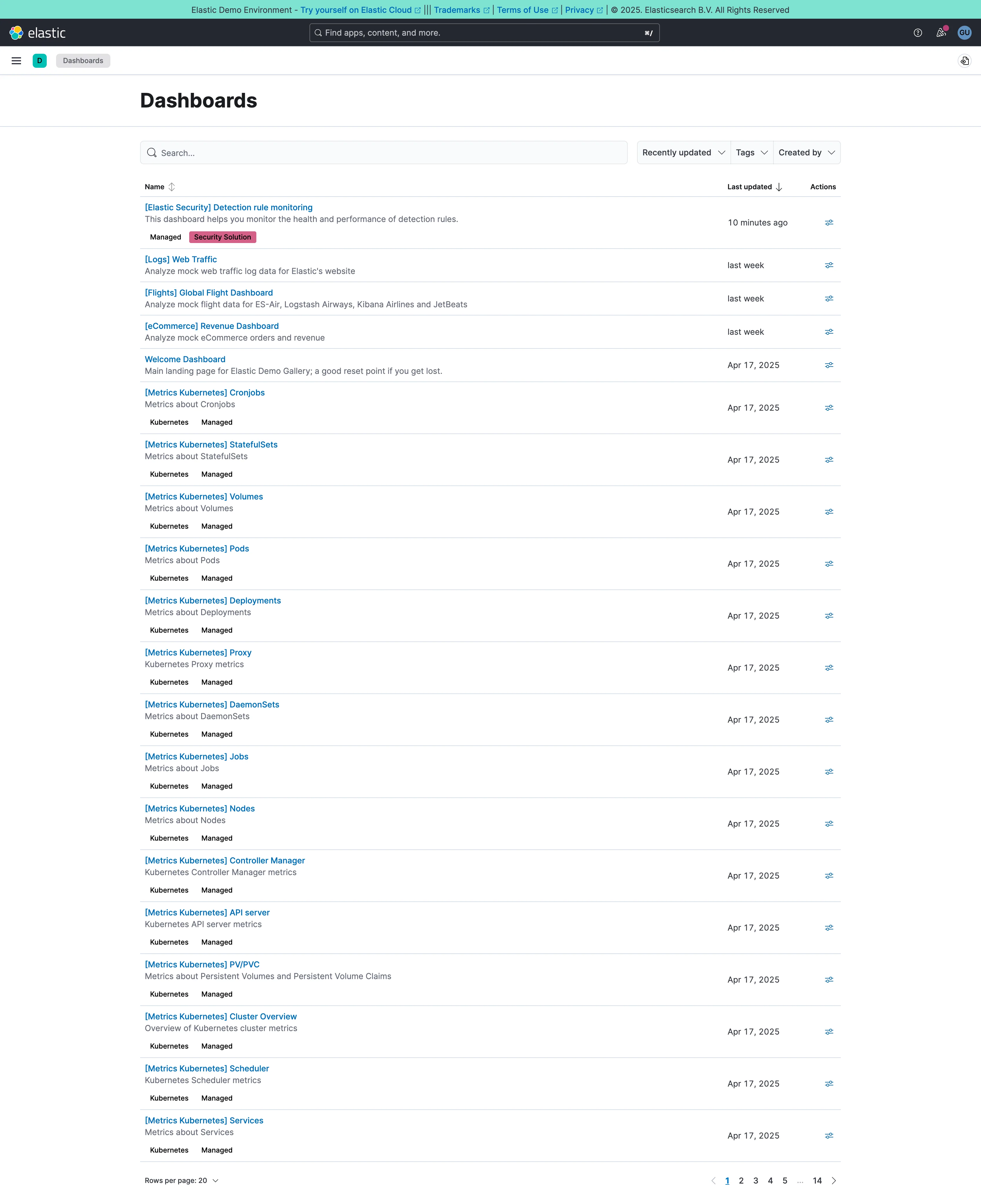
There are four hundred dashboards. Someone needs the one with the checkout latency panel. They know the word “checkout”. They do not know which folder somebody filed it under in 2023.
Solution
A search box that reaches everything and a keyboard shortcut that opens it from anywhere. Past a certain scale this stops being a convenience and becomes the primary navigation, and the folder tree becomes a filing system nobody browses.
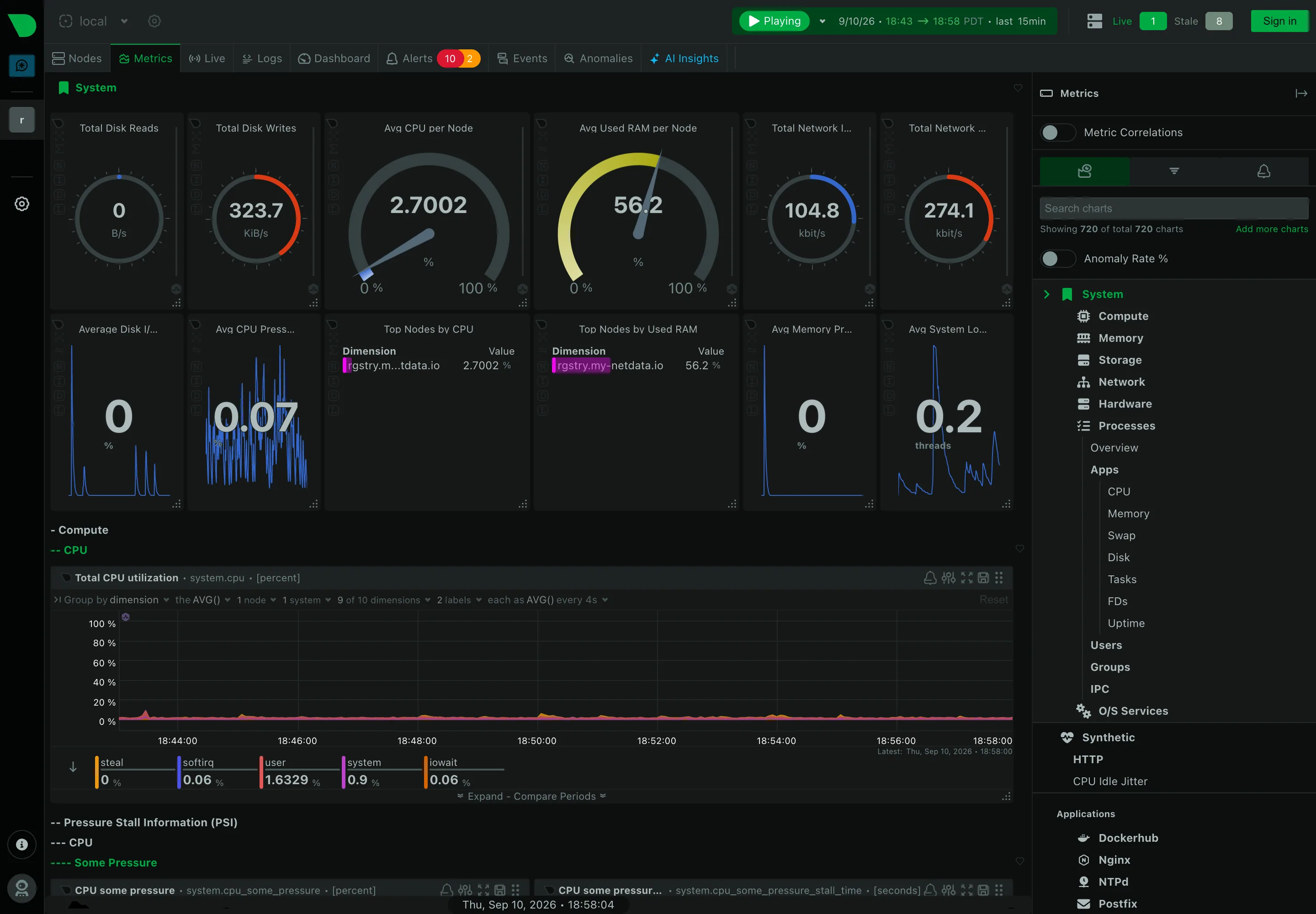
The threshold is lower than most teams expect. Somewhere around fifty dashboards, hierarchy stops being memorable and search takes over. Every mature dashboarding product has arrived at the same place, and the tell is that Grafana’s own guidance for finding things at scale is search rather than the folder structure it also provides.
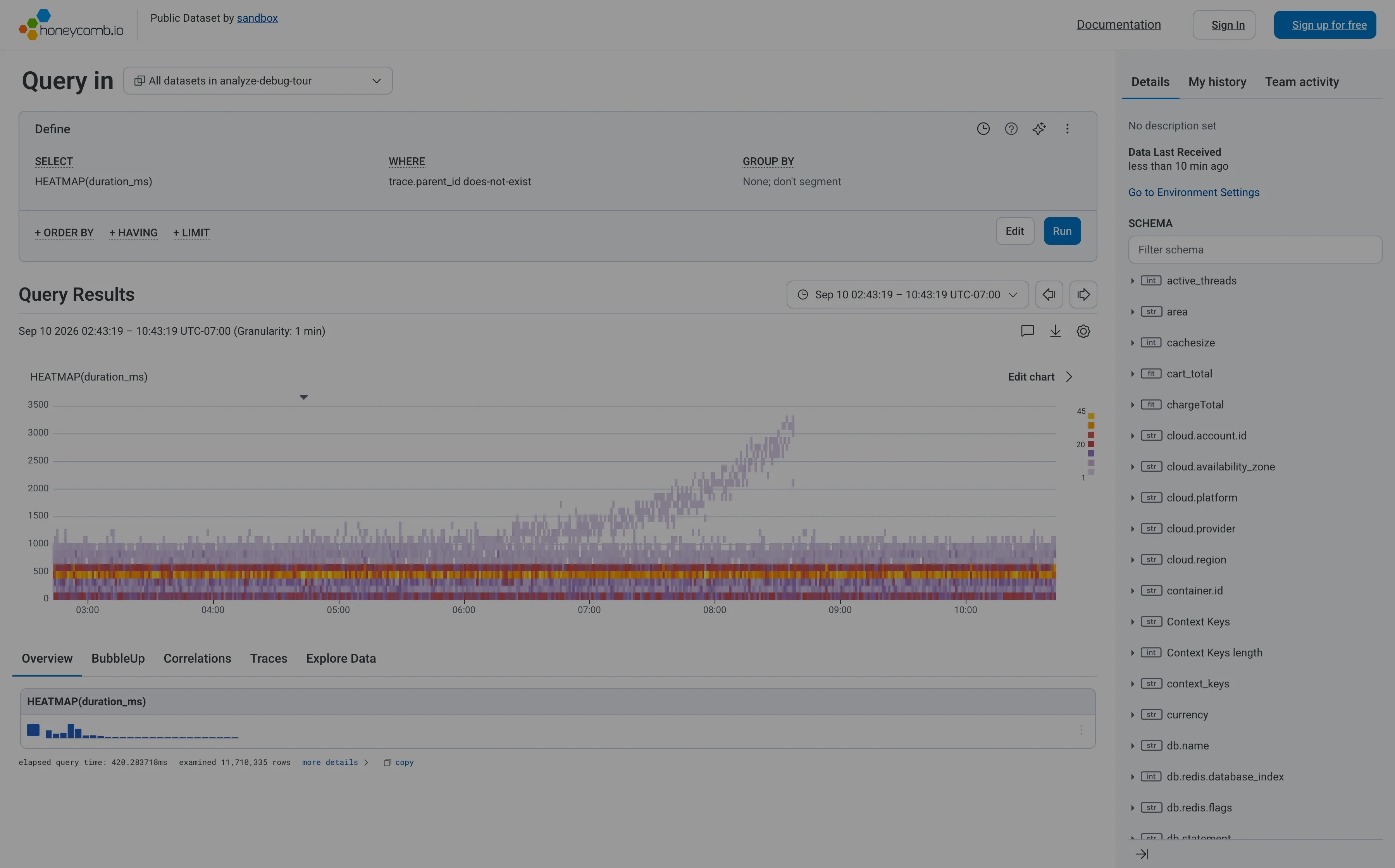
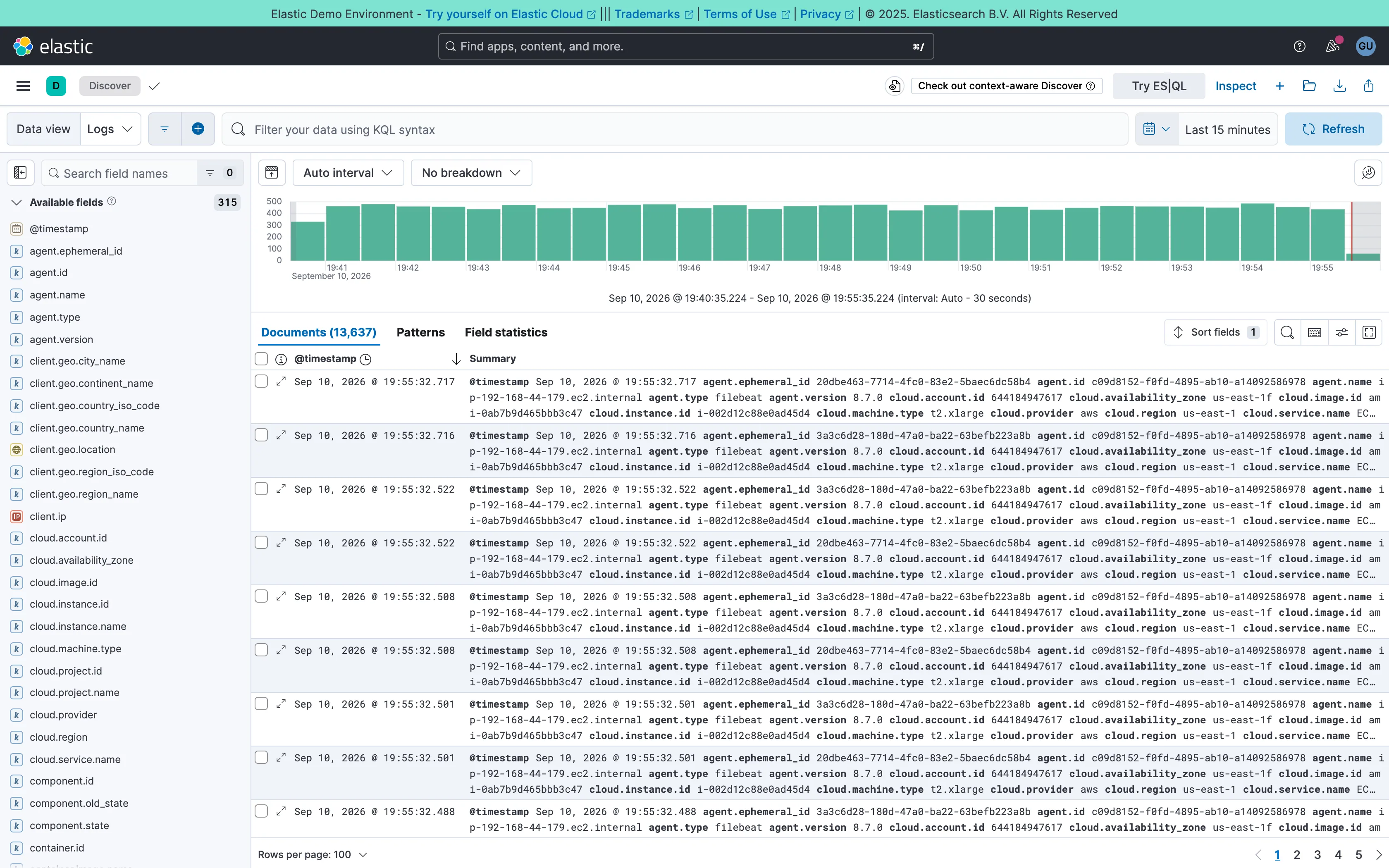
What search covers is the design decision. Dashboard titles alone is the cheapest and least useful, because the word someone remembers is usually a panel title, a metric name or a tag rather than the dashboard’s name. Reaching into panel titles, descriptions, tags and queries is much more useful and much more expensive, and it is where the difference between a search box and a real one lies.
Two behaviours separate a good implementation.
It says why each result matched. A list of dashboard names, where the match was on a panel three screens down, forces the viewer to open each one and hunt. Showing the matching panel or tag turns a list into an answer.
It is reachable without the mouse. A command palette on a keyboard shortcut collapses navigate-to-anything into two seconds, and once it exists people stop using the navigation entirely.
The complication nobody solves well is that dashboards accumulate duplicates. Search over four hundred dashboards where six are called “API Overview” returns six results, and nothing on screen says which is the one the team actually uses.
Use when
The estate is beyond what anyone can hold in their head, viewers arrive knowing a term rather than a location, and the same people navigate many times a day.
Don’t use when
There are eight dashboards. Search over a small set adds an interaction where a visible list would have been faster, and it hides the shape of what exists from anyone new.
Trade-offs
Search rewards knowing the vocabulary and punishes exploration, so a newcomer who does not know the word finds nothing and concludes it does not exist. It removes the incentive to maintain structure, which accelerates the sprawl that made search necessary. Ranking is hard and usually recency-based, which surfaces whatever somebody edited most recently rather than what is authoritative. And searching query text finds copies and forks as readily as originals, with no signal about which is canonical.
Checklist
- What does search cover: dashboard titles, panel titles, descriptions, tags, query text?
- Does each result say why it matched?
- Is there a keyboard shortcut, and does it work from every page?
- What ranks results, and does that favour authoritative over recent?
- Are duplicates and forks distinguishable in the results?
- Is there any signal of which dashboard a team actually uses?
- What does a zero-result search offer next?
- Can results be filtered by tag, folder or owner?
- Does search reach dashboards the viewer cannot access, and how is that handled?
- Is anything encouraging structure, or has search made sprawl free?
Compare
Grafana treats dashboard search as the real navigation at scale, with tag and folder filtering layered on, which is an honest acknowledgement that a folder tree stops working somewhere in the low hundreds. Datadog runs a global search across dashboards, monitors, logs and traces from one field, so the unit found is a resource of any type rather than a page. Sentry has a smaller estate and pushes search into the issue stream instead, where the query language does the narrowing that navigation does elsewhere. Command palettes in developer tools generally are worth studying here, because they solved the same problem—many destinations, keyboard-first, results that explain themselves—and set the expectation people now bring to dashboards.
Related
Sidebar and canvas is the navigation search eventually replaces. Filter bar is the same narrowing applied to data rather than to destinations. Saved view is what people build once search has found the thing twice. Multi-page dashboard is the structure being searched. Explain this metric covers the vocabulary problem that makes search fail for newcomers.