Skip to content
KONIGI

Dashboards / Meta information / Data source badge

2 of 6

Data source badge

The viewer needs to know where a panel's data comes from and whether that source is healthy.

Updated September 10, 2026

Problem

Two panels on the same dashboard disagree about the same number. One reads from the warehouse, one from the production replica, and nothing on the page says so, so the argument that follows is about which team is wrong rather than about which source is which.

Solution

Say where the number came from, on the panel, without being asked. A small label naming the source, its health, and ideally the query behind it.

The pattern is unglamorous and its value shows up only in specific moments, which is why it gets cut. Those moments are expensive: an incident where a source is lagging, a review where two numbers disagree, and the first week of anyone new who has no idea the company has three places a “user count” can come from.

Grafana’s model makes the need obvious. Data sources are configured objects, panels reference them by name, and a single dashboard can mix Prometheus, Loki, a SQL database and a spreadsheet in adjacent panels. Nothing about the rendered result reveals that, and the panels look equally authoritative.

There are three separable things a badge can carry, and they are worth distinguishing rather than bundling.

Identity. Which configured source this is. Cheapest, most useful, almost always sufficient.

Health. Whether that source is currently reachable and current. This overlaps with freshness and error states, and the badge is the right home for it when the panel is otherwise fine—a healthy-looking chart from a source that is twenty minutes behind is the case nothing else catches.

Derivation. What was actually asked. A link to the query, or the query itself in a popover. This is the one that ends disputes, and the one most products treat as an advanced feature.

Use when

A page mixes sources, or the same metric exists in more than one system, or the audience will act on the number without knowing the plumbing. Any executive-facing dashboard qualifies on the last point alone.

Don’t use when

Every panel on the page reads from one source and everyone knows it. Then the badge is repeated noise, and saying it once at page level is enough.

Trade-offs

Badges take space from the panel and get read only occasionally, which makes them permanently vulnerable at design review. Source names are internal and often meaningless to the audience—prom-prod-2 tells an executive nothing and might tell an engineer the wrong thing. Health indicators need their own monitoring, and a badge that shows healthy because its check is also broken is worse than no badge. And exposing the query invites people to reason about SQL they may misread, which is a real cost weighed against the disputes it settles.

Checklist

  • Does the panel say which source it read from?
  • Is the source name meaningful to this audience, or only to the person who configured it?
  • Does the badge carry health as well as identity?
  • If the source is lagging but responding, does anything on the page say so?
  • Can a viewer reach the query behind the number?
  • Do two panels showing the same metric from different sources make that visible?
  • Is the badge redundant on a single-source page, and could it be stated once?
  • Does the health check have its own failure mode, and what does the badge show then?
  • Is the badge reachable by screen reader, or is it an icon with a tooltip?
  • When a source is renamed or replaced, what updates the badges?

Compare

Grafana treats data sources as first-class configured objects that panels reference by name, which makes mixed-source dashboards easy to build and makes provenance entirely a matter of whether the author chose to surface it. Datadog mostly removes the question by owning ingestion, so the interesting provenance is the tag scope rather than the connector, and its UI reflects that. Honeycomb collapses source and query into one thing—you are always looking at a dataset you named in the query—so provenance is never ambiguous and never needs a badge. Looker pushes hardest in the other direction with a modelling layer, so a metric has one definition and the badge question becomes “which model version”, which is a better question and a harder one to answer in a corner of a panel.

Freshness indicator answers when, where this answers where from, and the two are usually needed together. Error and stale state is what the panel shows once the source stops answering. Explain this metric covers the definition question that provenance raises. Empty state is where an unreachable source often surfaces first. Alert rule is what should notice a source going quiet before a viewer does.
Data source badge anatomy Two adjacent panels that look equally authoritative. Each carries a badge naming its source; one badge also reports that its source is twenty minutes behind, which nothing else on the healthy-looking chart would have said. Two panels, two sources, one page Requests per second prom-prod view query Active users finance-sheet 20m view query 1 2 3 1 IDENTITY Which configured source this is. Cheapest, most useful, almost always enough. 2 HEALTH Reachable and current. A healthy-looking chart from a source twenty minutes behind is the case nothing else catches. 3 DERIVATION What was actually asked. The one that ends disputes, and the one most products file under advanced. One dashboard can mix four sources in adjacent panels. Nothing rendered says so.
Wireframe — the pattern's anatomy, not any one product's version of it

Implementation

Where a panel's numbers come from, and whether that source is healthy. Two panels side by side can be drawn from different systems with different lags, and nothing on a chart says so.

shadcn
npx shadcn@latest add badge button popover card
Tokens
--card--foreground--muted-foreground--border--state-live--state-stale--status-critical--status-unknown
Requests per second
prom-prod
Active users
finance-sheet 20m

SourceBadge.tsxSource name, a health dot computed from the age of the newest sample, and the query behind the number in a popover.

import { Badge } from "@/components/ui/badge";
import { Button } from "@/components/ui/button";
import { Popover, PopoverContent, PopoverTrigger } from "@/components/ui/popover";
import { cn } from "@/lib/utils";
import { freshness, FRESHNESS_COLOR } from "../freshness-indicator/freshness";

/**
 * A configured source, the way Grafana holds one: a name a viewer recognises,
 * the arrival time of its newest sample, the cadence it should arrive at, and
 * the query that was run against it.
 */
export type Source = {
  name: string;
  lastArrival: Date | null;
  expectedEveryMs: number;
  query?: string;
};

type Props = {
  source: Source;
  /** The clock to age against. Pass one to render on a server. */
  now?: Date;
  /** Where "view query" goes when the query is too long for a popover. */
  onViewQuery?: (source: Source) => void;
};

/** 20m, 1h 05m. Rounded down: a lag is never reported shorter than it is. */
const lag = (ms: number) => {
  const m = Math.floor(ms / 60_000);
  const h = Math.floor(m / 60);
  return h ? `${h}h ${String(m % 60).padStart(2, "0")}m` : `${m}m`;
};

/**
 * Identity, health and derivation on one pill. Identity is always shown.
 * Health is computed from the sample age, so a source that answers every
 * request but has nothing new to say cannot look current. Derivation opens
 * inline, because a query behind a settings gate ends no disputes.
 */
export function SourceBadge({ source, now = new Date(), onViewQuery }: Props) {
  const { state, ageMs } = freshness(source.lastArrival, source.expectedEveryMs, now);
  const behind = state === "late" || state === "stale";
  const text = behind && ageMs !== null ? `${source.name} ${lag(ageMs)}` : source.name;
  const said =
    state === "unknown" ? `${source.name}, no samples` :
    behind ? `${source.name}, ${lag(ageMs ?? 0)} behind` :
    `${source.name}, current`;

  return (
    <span className="inline-flex items-center gap-2">
      <Badge
        variant="outline"
        aria-label={said}
        title={said}
        className={cn(
          "gap-1.5 rounded-full px-2 py-0.5 text-[10px] font-normal text-muted-foreground",
          state === "late" && "border-state-stale text-state-stale",
          state === "stale" && "border-status-critical text-status-critical",
          state === "unknown" && "border-status-unknown text-status-unknown",
        )}
      >
        <span className="size-1.5 rounded-full" style={{ background: FRESHNESS_COLOR[state] }} aria-hidden="true" />
        {text}
      </Badge>

      {source.query && (
        <Popover modal={false}>
          <PopoverTrigger asChild>
            <Button variant="outline" size="sm" className="h-5 rounded-md px-2 text-[10px] text-muted-foreground" onClick={() => onViewQuery?.(source)}>
              view query
            </Button>
          </PopoverTrigger>
          <PopoverContent align="end" className="w-80 p-3">
            <p className="text-[10px] uppercase tracking-wide text-muted-foreground">{source.name}</p>
            <pre className="mt-2 whitespace-pre-wrap font-mono text-[11px] leading-relaxed text-foreground">{source.query}</pre>
          </PopoverContent>
        </Popover>
      )}
    </span>
  );
}

demo.tsxHow it is called: two panels, one on a current Prometheus, one on a sheet twenty minutes behind.

import { Card } from "@/components/ui/card";
import { Sparkline } from "../sparkline/Sparkline";
import { SourceBadge, type Source } from "./SourceBadge";

/**
 * Two panels on one page, each with its own source. Prometheus is current.
 * The finance sheet is polled every ten minutes and its newest row is twenty
 * minutes old, so its badge says so. The clock is fixed so both badges render
 * the same on the server and in the browser.
 */
const NOW = new Date("2026-09-15T09:00:00Z");
const ago = (minutes: number) => new Date(NOW.getTime() - minutes * 60_000);

const PROM: Source = {
  name: "prom-prod",
  lastArrival: ago(0.25),
  expectedEveryMs: 15_000,
  query: 'sum(rate(http_requests_total{job="api", env="prod"}[5m]))',
};
const SHEET: Source = {
  name: "finance-sheet",
  lastArrival: ago(20),
  expectedEveryMs: 10 * 60_000,
  query: "SELECT date, active_users FROM 'Active users'!A:B ORDER BY date",
};

function Panel({ title, source, values }: { title: string; source: Source; values: number[] }) {
  return (
    <Card className="p-4">
      <div className="flex items-start justify-between gap-2 border-b pb-2">
        <span className="text-[11px] uppercase tracking-wide text-muted-foreground">{title}</span>
        <SourceBadge source={source} now={NOW} />
      </div>
      <div className="mt-3 text-muted-foreground">
        <Sparkline values={values} width={268} height={60} />
      </div>
    </Card>
  );
}

export default function Demo() {
  return (
    <div className="grid grid-cols-2 gap-5">
      <Panel title="Requests per second" source={PROM} values={[32, 44, 36, 60, 52, 74, 78]} />
      <Panel title="Active users" source={SHEET} values={[40, 48, 42, 56, 50, 62, 66]} />
    </div>
  );
}
What it renders. Identical markup in both panes, with only the token values changing.

Examples

Captures whose hotspots reference this pattern, grouped by product and dated. The dashed boxes are this pattern; hover any box for the note.

Honeycomb

Query-first; heatmaps and BubbleUp replace the dashboard-of-panels model with draw-a-region cross-filtering.

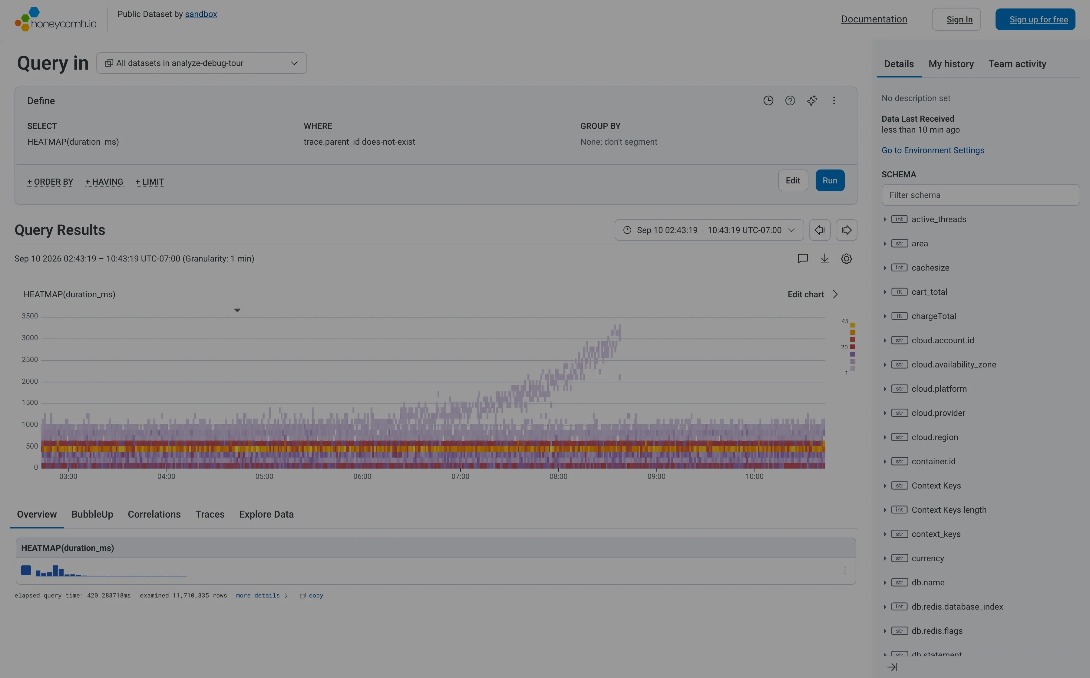
Honeycomb — Query / HEATMAP(duration_ms)
Heatmap. Linear y-axis, so the band holding most requests is six percent of the panel height and the empty top half gets the rest. Search across panels. The schema is the navigation, and it opens with a filter box rather than a tree you're expected to browse. Dashboard builder. No panel to configure—the query is the page. WHERE trace.parent_id does-not-exist is how you say root spans only. Tabs as genres. Five readings of one result: overview, BubbleUp, correlations, traces, raw. Each tab is a different question, not a different subject. Freshness indicator. When data last arrived, not when the page last ran. The one of the three ages that actually matters. Time-range picker. Absolute, with the granularity stated beside it, and arrows that step to the previous window rather than retyping it. Data source badge. Elapsed query time and 11,710,335 rows examined. The panel reporting its own cost and scope, which almost nothing else does.
Query / HEATMAP(duration_ms) September 10, 2026 Honeycomb sandbox, public dataset (signed out; no version string exposed) medium · light · desktop-web
My heatmap entry cites Honeycomb as the argument for log-scale y-buckets, so it's worth recording that this is Honeycomb's own sandbox rendering the same chart on a linear axis. The result is the failure the argument warns about: the ticks run 0 to 3500 evenly, the dense band where almost every request actually lives is squashed into the bottom sixth of the panel, and the top half is mostly empty. What survives anyway is the thing a percentile can't tell you. The solid band under a second doesn't move across the whole window, while from about 07:00 a separate purple tail climbs to 3000ms and keeps going. Two populations, one of them fine and one of them deteriorating. A p95 line over this data would have risen and said nothing about which. The other thing worth stealing: the footer reports elapsed query time and that it examined 11,710,335 rows, so the panel tells you what it cost and how much it looked at. Cookie banner and a no-signup onboarding modal were removed to take the shot; nothing of the product's own UI was.
  • Heatmap Linear y-axis, so the band holding most requests is six percent of the panel height and the empty top half gets the rest.
  • Dashboard builder No panel to configure—the query is the page. WHERE trace.parent_id does-not-exist is how you say root spans only.
  • Tabs as genres Five readings of one result: overview, BubbleUp, correlations, traces, raw. Each tab is a different question, not a different subject.
  • Search across panels The schema is the navigation, and it opens with a filter box rather than a tree you're expected to browse.
  • Time-range picker Absolute, with the granularity stated beside it, and arrows that step to the previous window rather than retyping it.
  • Data source badge Elapsed query time and 11,710,335 rows examined. The panel reporting its own cost and scope, which almost nothing else does.
  • Freshness indicator When data last arrived, not when the page last ran. The one of the three ages that actually matters.
Show 1 more example Hide the rest

Grafana

The reference implementation for panel grids, template variables, and stat panels; most other tools are defined by how they differ from it.

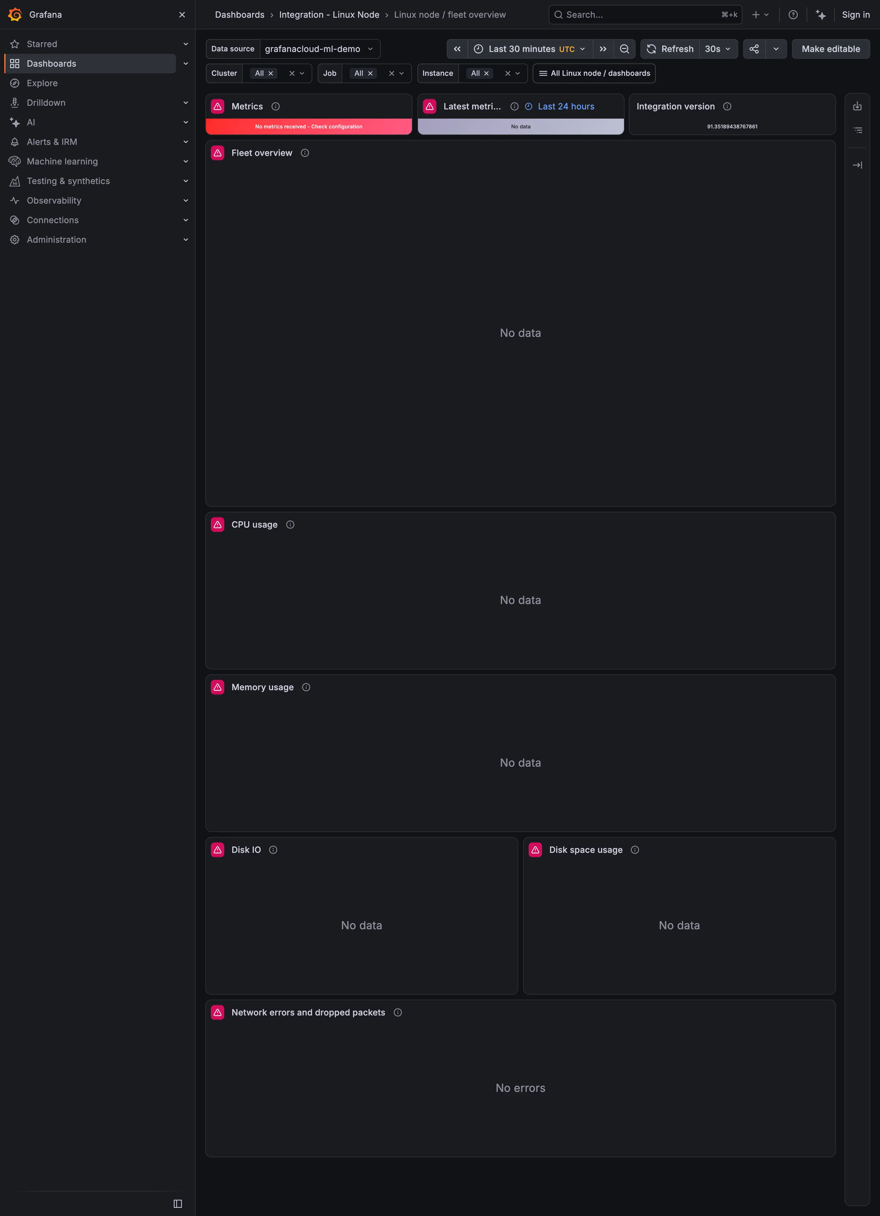
Linux node / fleet overview September 9, 2026 Grafana Play (signed out; no version string exposed) medium · dark · desktop-web
Captured while Play's demo data source was returning nothing, which makes this a better example of empty and error states than of the fleet overview it is meant to be. Three things are worth noticing. The top-left tile is red and reads "No metrics received - Check configuration", which is an actual diagnosis and the best thing on the page. The tile beside it exists to report when data last arrived, and it says "No data", so the freshness indicator has no freshness to report and doesn't say why. And every chart below says "No data" while the network panel says "No errors". A viewer scanning this page cannot tell from the words alone whether the network is clean or whether it is as unknown as everything else, which is the exact confusion the empty-state pattern exists to prevent.