Skip to content
KONIGI

Dashboards / Structure / Tabs as genres

4 of 4

Tabs as genres

The same data serves different questions and each deserves its own page.

Updated September 10, 2026

Problem

One dataset, four audiences. The editor wants to know which posts did well, the growth lead wants acquisition, the ad ops lead wants revenue, and the founder wants one number. Serving all four on one page serves none of them.

Solution

A small fixed set of named tabs, each a complete view for one kind of question. Overview, Content, Audience, Revenue. The tab names are the taxonomy, and they are chosen from the reader’s questions rather than from the data model.

The distinction from ordinary multi-page structure is what the split is along. Multi-page splits by subject or by volume. Tabs-as-genres splits by kind of question, which is why the tab names are so often verbs-in-disguise: Content means “what did we publish and how did it do”, Audience means “who are they and where from”. Naming them after data tables—Events, Sessions, Users—moves the burden of translation back onto the reader and is the most common way this pattern fails.

The set has to be small and stable. Four to six tabs is a set a person learns. Nine is a menu, and once it is a menu the tab strip is navigation and should be a sidebar instead. Stability matters because the value is muscle memory: a reader who knows Revenue is third gets there without reading.

The Overview tab is a special case and usually the one done worst. It is not a place for the panels that did not fit elsewhere. Its job is to answer the top question and to route people to the right tab, which makes it the only tab whose purpose is partly navigational.

Shared state is the same requirement as any page set: time range and filters must carry, or the tabs are four dashboards that happen to share a header.

Use when

One dataset genuinely answers several distinct kinds of question, the audiences differ, and the set of question-kinds is stable enough to name once.

Don’t use when

The tabs would be sequential steps rather than parallel questions, or the set keeps growing. A tab strip that gained three entries this year is a navigation problem being deferred.

Trade-offs

Tabs hide everything except the current one, so cross-genre comparison is impossible and the tab nobody opens rots invisibly. The names are load-bearing and hard to change once people have learned them, which means an early naming mistake persists for years. Analytics on tab usage usually reveal that one tab carries most of the traffic, which raises an uncomfortable question about the other three. And tabs imply equal weight, when in practice one is almost always primary.

Checklist

  • Are the tabs kinds of question, or names of data tables?
  • Would the intended reader recognise their question in a tab name?
  • How many tabs, and is the set stable?
  • Does the Overview tab route people, or is it a leftovers drawer?
  • Do time range and filters carry across tabs?
  • Does the URL identify the tab, so a link opens the right one?
  • Which tab gets the traffic, and do the others justify their place?
  • Can a reader tell what is on a tab without opening it?
  • What is the process for adding a tab, and has it been used recently?
  • Would a sidebar serve better at this count?

Compare

Google Analytics popularised this arrangement for web data and shows both sides of it: the genre names are recognisable to non-experts, and the set has grown across versions until the strip became a tree. Plausible deliberately refuses the pattern, keeping everything on one page, which works because it carries far fewer metrics and is a direct statement that tabs are a symptom of scope. Sentry uses top-level genres—Issues, Performance, Releases—that are genuinely different questions about the same events, which is the pattern applied correctly at product scale. Grafana has no tab primitive within a dashboard, so genre tabs are separate dashboards linked in a row, and keeping them consistent is entirely manual.

Multi-page dashboard is the general form and covers the state-sharing requirements. Semantic grouping is the same instinct applied within one page. Sidebar and canvas is what a tab strip should become once it stops being a set. Single-column narrative is the alternative for an audience small enough to serve with one sequence. Saved view is what readers build when the tabs do not match their actual question.
Tabs as genres anatomy A page with a shared header carrying the time range and filters, a strip of five named tabs below it with one active, and the view for that tab. Below, the same strip named from the data model and named from the reader's questions. Anatomy Overview Content Audience Revenue Sources 1 2 3 1 SHARED STATE Time range and filters live above the strip and carry across. Without that they are four dashboards that share a header. 2 FOUR TO SIX A set a person learns, and stable enough to build muscle memory on. Nine is a menu, and a menu should be a sidebar. 3 THE OVERVIEW TAB Not the place for panels that didn't fit elsewhere. Its job is to answer the top question and route people to the right tab. Named from the data model Events Sessions Users Pageviews Named from the question Overview Content Audience Revenue
Wireframe — the pattern's anatomy, not any one product's version of it

Implementation

The same data serving different questions, each with its own page. Tabs named after questions beat tabs named after data sources, because the reader arrives with a question rather than a table name.

shadcn
npx shadcn@latest add tabs button dropdown-menu
npm
lucide-react
Tokens
--card--card-foreground--muted--muted-foreground--border--chart-1

konigi.com · all posts

184,300 readers this week, up 6% on the week before.

GenreTabs.tsxThree to five genres plus Overview, each required to state the question it answers and its one-line answer. Overview is built from those answers, so it routes. Range and filters sit above the strip and reach every tab.

import type { ReactNode } from "react";
import { ChevronDown } from "lucide-react";
import { Button } from "@/components/ui/button";
import { DropdownMenu, DropdownMenuContent, DropdownMenuItem, DropdownMenuTrigger } from "@/components/ui/dropdown-menu";
import { Tabs, TabsList, TabsTrigger } from "@/components/ui/tabs";

/** What every tab receives. Range and filters live above the strip and
 *  carry across; a tab that kept its own would be a separate dashboard. */
export type Shared = { range: string; filter: string };

export type Genre = {
  id: string;
  /** Named from the reader's question, never from a table. */
  name: string;
  /** The question, spelled out. Required: a tab that cannot state the
   *  question it answers is named after a data source. Shown under the
   *  strip so a reader knows what is on a tab before opening it. */
  question: string;
  /** This tab's one-line answer right now. The overview is built from
   *  these, which is what makes it a router rather than a leftovers drawer. */
  answer: string;
  view: (shared: Shared) => ReactNode;
};

/** With Overview, four to six tabs. Nine is a menu, and a menu is a sidebar. */
export type Genres = [Genre, Genre, Genre] | [Genre, Genre, Genre, Genre] | [Genre, Genre, Genre, Genre, Genre];

export const RANGES = ["24h", "7d", "28d", "90d"] as const;

export function GenreTabs({ genres, topline, shared, onShared, onFilter, tab, onTab }: {
  genres: Genres;
  /** The top question's answer, for the reader who wants one number. */
  topline: ReactNode;
  shared: Shared;
  onShared: (next: Shared) => void;
  onFilter: () => void;
  /** "overview" or a genre id. Put it in the URL so a link opens the right tab. */
  tab: string;
  onTab: (id: string) => void;
}) {
  const current = genres.find((g) => g.id === tab);

  return (
    <div className="rounded-lg border bg-card">
      <div className="flex items-center gap-2 border-b px-3 py-2">
        <p className="text-xs text-muted-foreground">{shared.filter}</p>
        <DropdownMenu modal={false}>
          <DropdownMenuTrigger asChild>
            <Button variant="outline" size="sm" className="ml-auto h-6 px-2 text-[11px]">last {shared.range} <ChevronDown className="size-3" /></Button>
          </DropdownMenuTrigger>
          <DropdownMenuContent align="end" className="min-w-24">
            {RANGES.map((r) => <DropdownMenuItem key={r} className="text-xs" onSelect={() => onShared({ ...shared, range: r })}>last {r}</DropdownMenuItem>)}
          </DropdownMenuContent>
        </DropdownMenu>
        <Button variant="outline" size="sm" className="h-6 px-2 text-[11px]" onClick={onFilter}>filter</Button>
      </div>

      <Tabs value={tab} onValueChange={onTab}>
        <TabsList className="h-9 w-full justify-start gap-3 rounded-none border-b bg-transparent px-3">
          <TabsTrigger value="overview" className="rounded-none border-b-2 border-transparent px-0 text-xs data-[state=active]:border-chart-1 data-[state=active]:shadow-none">Overview</TabsTrigger>
          {genres.map((g) => (
            <TabsTrigger key={g.id} value={g.id} title={g.question} className="rounded-none border-b-2 border-transparent px-0 text-xs data-[state=active]:border-chart-1 data-[state=active]:shadow-none">{g.name}</TabsTrigger>
          ))}
        </TabsList>
      </Tabs>

      <div className="p-3">
        {current ? (
          <>
            <p className="text-xs text-muted-foreground">{current.question}</p>
            <p className="mt-1 text-sm text-card-foreground">{current.answer}</p>
            <div className="mt-3">{current.view(shared)}</div>
          </>
        ) : (
          <>
            {/* Answer the top question, then route. */}
            <div className="grid gap-2" style={{ gridTemplateColumns: `repeat(${genres.length}, minmax(0, 1fr))` }}>
              {genres.map((g) => (
                <button key={g.id} type="button" onClick={() => onTab(g.id)} className="rounded border bg-muted p-2.5 text-left hover:border-foreground/40">
                  <p className="text-xs text-card-foreground">{g.name}</p>
                  <p className="mt-1 text-[11px] leading-snug text-muted-foreground">{g.answer}</p>
                </button>
              ))}
            </div>
            <div className="mt-3 rounded border p-3">{topline}</div>
          </>
        )}
      </div>
    </div>
  );
}

demo.tsxHow it is called: Content, Audience, Revenue and Sources for one publication, landing on Overview. Hover a tab for its question.

import { useState } from "react";
import { GenreTabs, type Genres, type Shared } from "./GenreTabs";

const figure = (label: string, value: string) => (
  <div className="rounded border bg-muted px-3 py-2">
    <p className="text-[10px] uppercase tracking-wide text-muted-foreground">{label}</p>
    <p className="text-lg tabular-nums text-card-foreground">{value}</p>
  </div>
);
const grid = (...items: ReturnType<typeof figure>[]) => <div className="grid grid-cols-2 gap-2">{items}</div>;

/** One publication's week, four readers. The editor, the growth lead, the
 *  ad ops lead and whoever wants to know where people came from. */
const GENRES: Genres = [
  { id: "content", name: "Content", question: "What did we publish, and how did it do?", answer: "Nine posts; three passed 20k reads and the Okafor interview did 41k.", view: (s) => grid(figure(`posts, last ${s.range}`, "9"), figure("top post reads", "41,200")) },
  { id: "audience", name: "Audience", question: "Who are they, and are they coming back?", answer: "184k readers, 62% new; returning readers up 4 pts.", view: (s) => grid(figure(`readers, last ${s.range}`, "184,300"), figure("returning", "38%")) },
  { id: "revenue", name: "Revenue", question: "What did it earn?", answer: "£12,400, with ad fill at 91% and 212 new members.", view: (s) => grid(figure(`revenue, last ${s.range}`, "£12,400"), figure("new members", "212")) },
  { id: "sources", name: "Sources", question: "Where did readers come from?", answer: "Search 48%, newsletter 22%, social 14%; search up 9 pts.", view: (s) => grid(figure(`search share, last ${s.range}`, "48%"), figure("newsletter share", "22%")) },
];

/** Lands on Overview. The range in the header is the range on every tab. */
export default function Demo() {
  const [shared, setShared] = useState<Shared>({ range: "7d", filter: "konigi.com · all posts" });
  const [tab, setTab] = useState("overview");
  return (
    <GenreTabs
      genres={GENRES}
      topline={
        <p className="text-sm text-card-foreground">
          <span className="text-2xl tabular-nums">184,300</span> readers this week, up 6% on the week before.
        </p>
      }
      shared={shared}
      onShared={setShared}
      onFilter={() => {}}
      tab={tab}
      onTab={setTab}
    />
  );
}
What it renders. Identical markup in both panes, with only the token values changing.

Examples

Captures whose hotspots reference this pattern, grouped by product and dated. The dashed boxes are this pattern; hover any box for the note.

Tableau Public

Thousands of dashboards made by people who are not designers, published without a review step. The best available sample of what the pattern language looks like in the wild.

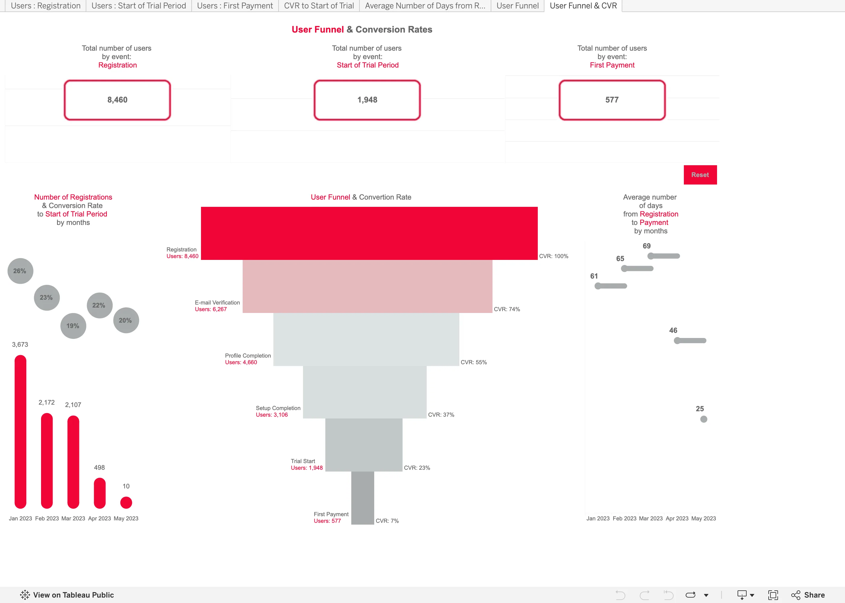
User Funnel & Conversion Rates September 11, 2026 Tableau Public embed view; workbook published by Tetiana Berezhna medium · light · desktop-web
Another published workbook rather than anything Tableau designed, and it makes both of the mistakes the funnel entry names. It shows one number per step, not two. The labels down the right read CVR 100%, 74%, 55%, 37%, 23%, 7%, and every one of those is overall conversion—the share of the original 8,460 still present. Step conversion is missing, which matters because the worst step in this funnel is invisible: 1,948 people start a trial and 577 pay, so that step converts at 30%, and nothing on the chart says 30. You have to divide two numbers printed four inches apart. The second is the rendering. It is drawn as a taper, so quantity is encoded as the width of a trapezoid, and the eye compares areas rather than lengths. Plain horizontal bars would have been easier to read and easier to label. The panel on the left has a third problem: a 20% conversion rate sits above a bar of 10 registrations, next to a 26% rate over 3,673, at the same size and in the same grey.
  • Funnel Drawn as a taper, so the count is the width of a trapezoid. Length would have read more accurately for nothing.
  • Funnel Overall conversion only. The trial-to-payment step converts at 30% and no number on the chart says so.
  • Ratio and rate A 20% rate over 10 registrations drawn the same size as a 26% rate over 3,673.
  • Header KPI strip Three counts, boxed and centred, with no delta and no base. The first and last are the funnel's own endpoints.
  • Tabs as genres Seven worksheet tabs across the top, named after the data rather than the question—Users : Registration, CVR to Start of Trial.
Show 2 more examples Hide the rest

Honeycomb

Query-first; heatmaps and BubbleUp replace the dashboard-of-panels model with draw-a-region cross-filtering.

Honeycomb — Query / HEATMAP(duration_ms)
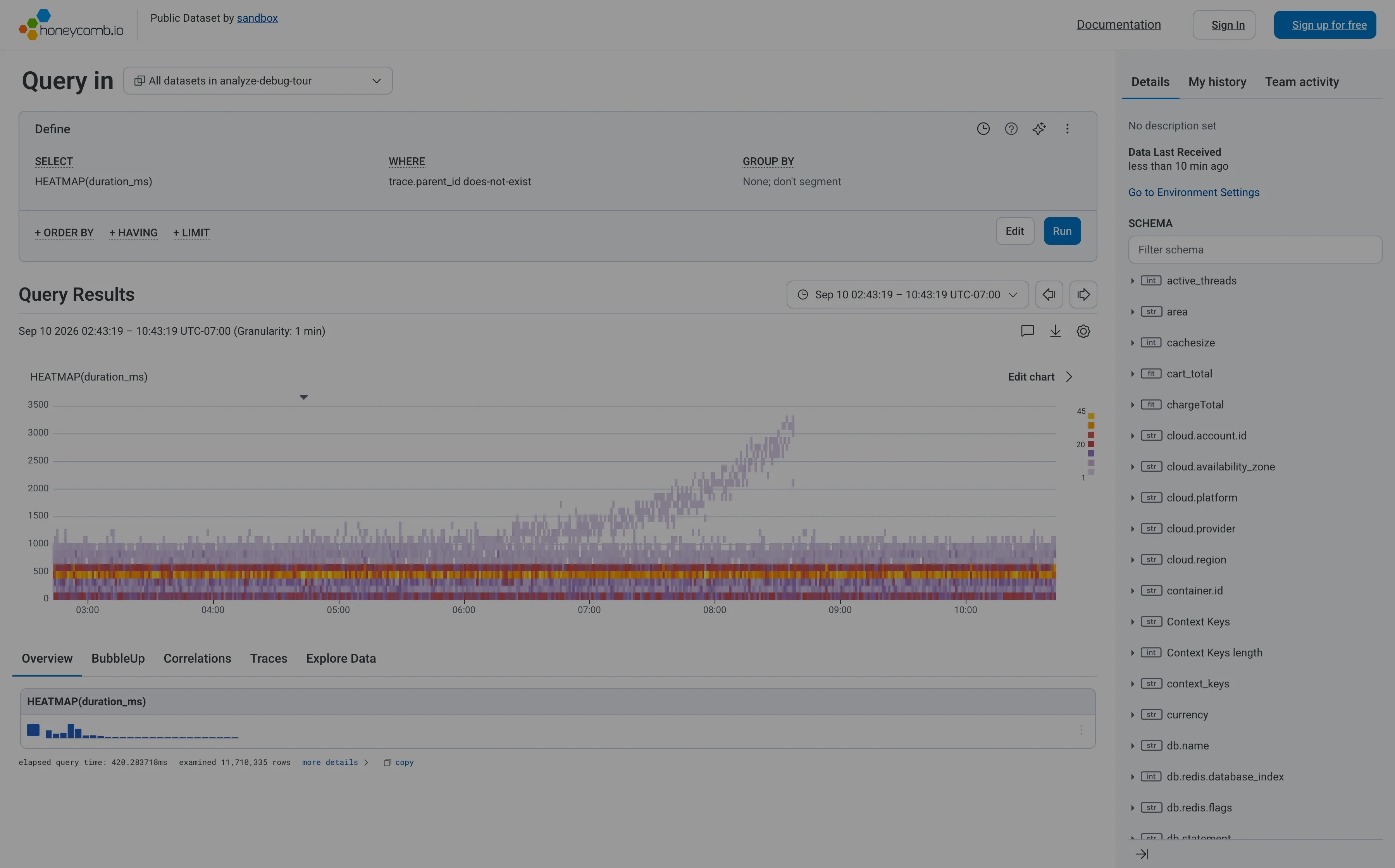
Heatmap. Linear y-axis, so the band holding most requests is six percent of the panel height and the empty top half gets the rest. Search across panels. The schema is the navigation, and it opens with a filter box rather than a tree you're expected to browse. Dashboard builder. No panel to configure—the query is the page. WHERE trace.parent_id does-not-exist is how you say root spans only. Tabs as genres. Five readings of one result: overview, BubbleUp, correlations, traces, raw. Each tab is a different question, not a different subject. Freshness indicator. When data last arrived, not when the page last ran. The one of the three ages that actually matters. Time-range picker. Absolute, with the granularity stated beside it, and arrows that step to the previous window rather than retyping it. Data source badge. Elapsed query time and 11,710,335 rows examined. The panel reporting its own cost and scope, which almost nothing else does.
Query / HEATMAP(duration_ms) September 10, 2026 Honeycomb sandbox, public dataset (signed out; no version string exposed) medium · light · desktop-web
My heatmap entry cites Honeycomb as the argument for log-scale y-buckets, so it's worth recording that this is Honeycomb's own sandbox rendering the same chart on a linear axis. The result is the failure the argument warns about: the ticks run 0 to 3500 evenly, the dense band where almost every request actually lives is squashed into the bottom sixth of the panel, and the top half is mostly empty. What survives anyway is the thing a percentile can't tell you. The solid band under a second doesn't move across the whole window, while from about 07:00 a separate purple tail climbs to 3000ms and keeps going. Two populations, one of them fine and one of them deteriorating. A p95 line over this data would have risen and said nothing about which. The other thing worth stealing: the footer reports elapsed query time and that it examined 11,710,335 rows, so the panel tells you what it cost and how much it looked at. Cookie banner and a no-signup onboarding modal were removed to take the shot; nothing of the product's own UI was.
  • Heatmap Linear y-axis, so the band holding most requests is six percent of the panel height and the empty top half gets the rest.
  • Dashboard builder No panel to configure—the query is the page. WHERE trace.parent_id does-not-exist is how you say root spans only.
  • Tabs as genres Five readings of one result: overview, BubbleUp, correlations, traces, raw. Each tab is a different question, not a different subject.
  • Search across panels The schema is the navigation, and it opens with a filter box rather than a tree you're expected to browse.
  • Time-range picker Absolute, with the granularity stated beside it, and arrows that step to the previous window rather than retyping it.
  • Data source badge Elapsed query time and 11,710,335 rows examined. The panel reporting its own cost and scope, which almost nothing else does.
  • Freshness indicator When data last arrived, not when the page last ran. The one of the three ages that actually matters.

Plausible Analytics

One column, top to bottom, where the metric row doubles as the chart's control. The clearest working argument that a dashboard can have exactly one interaction.

Plausible Analytics — Live demo / plausible.io
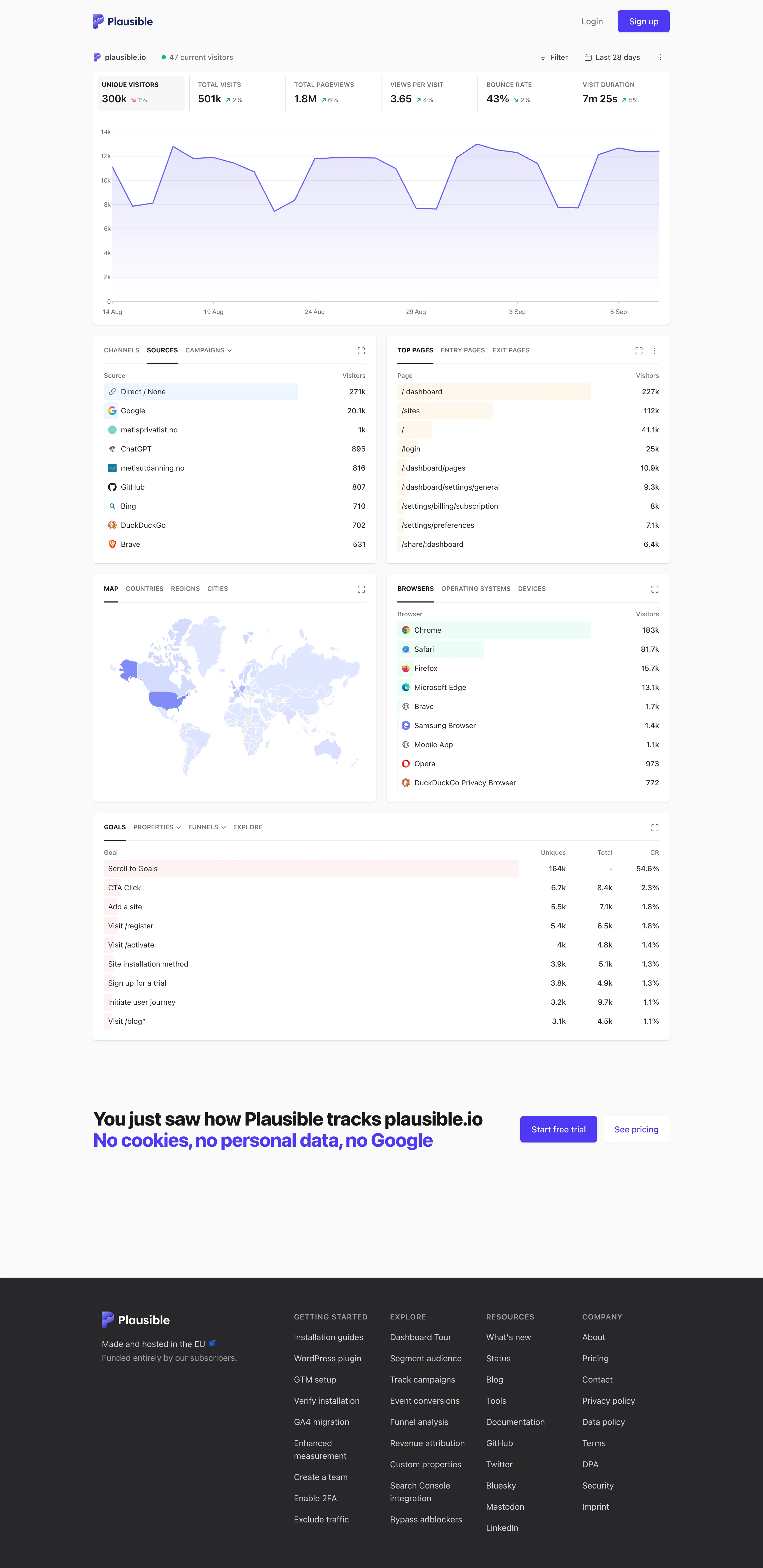
Single-column narrative. One column, top to bottom, no panel arrangement and nothing to configure before reading starts. Overview then detail. The decomposition: sources, pages, geography, browsers, goals. Same subject, narrowed, no navigation. Ranked list. Sorted with an in-row bar, no share of total and no other row. Direct 271k versus Google 25.1k, out of what? Geo map with markers. A choropleth pale enough that every country but one reads as the same white. Raw counts, unnormalised. Header KPI strip. Six tiles sharing one anatomy, each with a delta. The boxed one is selected, and the chart below plots it. Ratio and rate. Bounce rate 43%, with the denominator two tiles away and the window only in the header. Tabs as genres. Tabs inside the panel—channels, sources, campaigns—so one card answers three questions in one slot.
Live demo / plausible.io September 10, 2026 Plausible live demo, plausible.io's own stats (signed out) medium · light · desktop-web
My single-column-narrative entry names Plausible as the reference implementation and says the trick is that the metric row doubles as the chart's control. Here it is doing exactly that: six tiles across the top, the first one boxed because it's selected, and the chart underneath plotting that metric and no other. Click a different tile and the chart follows. The page therefore has one interaction, and it is the same gesture as paying attention. Everything below reads as a single column in argument order—headline, then the shape behind it, then what it decomposes into, then goals. Two things it doesn't do. The ranked lists carry a count and a bar and no share of total, so Direct at 271k against Google at 25.1k tells you the ordering and not whether the top row is most of the traffic. And the choropleth is so pale that outside the United States almost every country is the same near-white, which is the encoding spending a whole panel to say "mostly America".
  • Single-column narrative One column, top to bottom, no panel arrangement and nothing to configure before reading starts.
  • Header KPI strip Six tiles sharing one anatomy, each with a delta. The boxed one is selected, and the chart below plots it.
  • Ratio and rate Bounce rate 43%, with the denominator two tiles away and the window only in the header.
  • Overview then detail The decomposition: sources, pages, geography, browsers, goals. Same subject, narrowed, no navigation.
  • Ranked list Sorted with an in-row bar, no share of total and no other row. Direct 271k versus Google 25.1k, out of what?
  • Geo map with markers A choropleth pale enough that every country but one reads as the same white. Raw counts, unnormalised.
  • Tabs as genres Tabs inside the panel—channels, sources, campaigns—so one card answers three questions in one slot.