Problem
The reader is not an analyst. They opened this to find out how things are going, they will spend ninety seconds, and a grid of twenty panels asks them to decide where to look before they have learned anything.
Solution
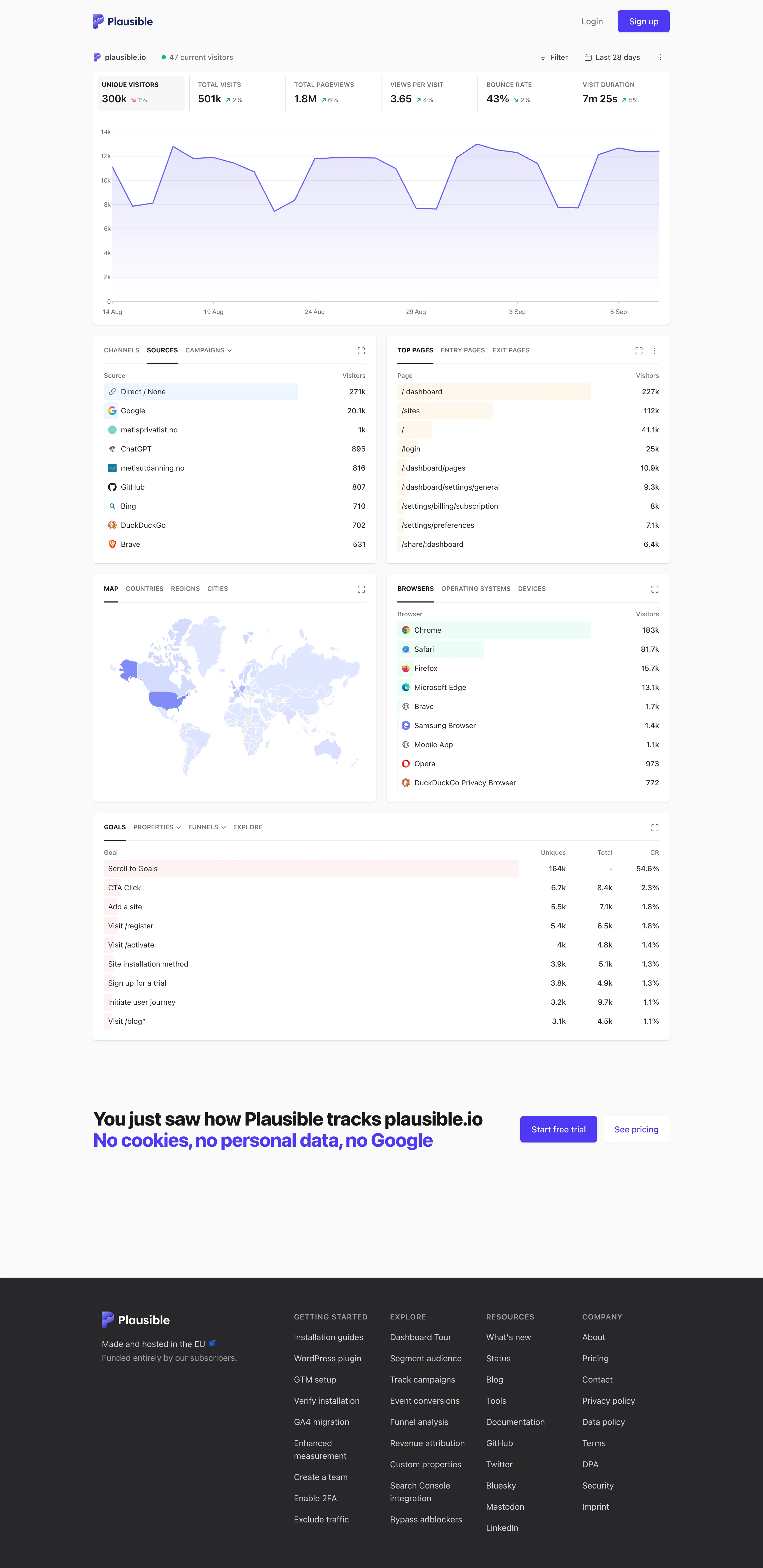
One column, top to bottom, in the order the argument runs. A summary, then the main chart, then the breakdowns, then the detail. No configuration, no panel arrangement, no choices to make before reading starts.
The grid’s weakness is precisely the freedom it gives: a grid has no reading order, so the viewer supplies one, and a viewer without expertise supplies a bad one. A single column removes that decision. Position becomes sequence, and sequence can carry an argument—here is the headline, here is the shape behind it, here is what it decomposes into.
That structure has a real consequence for what belongs on the page. In a grid, a marginal panel costs a corner. In a column, it costs the reader’s place in the sequence, so the editorial bar is much higher and the page stays shorter. The constraint does the pruning that a grid never forces.
Plausible is the reference implementation for this in analytics, and the choice that makes it work is that the top metric row doubles as a control: selecting a metric changes what the main chart plots. That collapses configuration into reading, so the page has one interaction and it is the same gesture as paying attention.
The failure mode is length. A single column with thirty sections is a scroll, and a scroll has the same problem as a grid—no priority—with the added cost that nothing below the fold is ever seen.
Use when
The audience is non-expert or occasional, the page has a story rather than a set of independent readings, and someone can take responsibility for the order.
Don’t use when
Viewers are comparing across sections. Anything that needs two things visible at once fails in a column, and that is most investigation work. Also poor where different roles need different things, since a single sequence serves the first audience and inconveniences the rest.
Trade-offs
A column wastes horizontal space on wide screens, and the usual remedy—letting content stretch—makes charts too wide to read. It scales badly with content, degrading into a long scroll with no way to skip. It demands editorial authority that most dashboards do not have, because someone has to say no. And its strength for a naive reader is a weakness for an expert, who now scrolls past four things they did not need to reach the one they did.
Checklist
- Is there a real argument here, and does the order carry it?
- Does the first screen answer the question most readers arrive with?
- What is the reading time, and does it match the audience’s attention?
- How many sections before this becomes a scroll rather than a sequence?
- Is anything below the fold that matters, and does anything signal it is there?
- Can a repeat visitor skip to what they came for?
- How wide do charts get on a large screen, and are they still readable?
- Is there any configuration, and could it be removed?
- Who owns the order, and what is the process for adding a section?
- Would an expert user find this slower than a grid?
Compare
Plausible is the clearest example, and the design decision worth stealing is making the summary row a control so choosing a metric and reading it are the same action. Public status pages run the same shape for the same reason: an unknown reader with no context needs one obvious order and no options. Grafana can approximate it with full-width panels stacked vertically, which works and gives up nothing structural, since a grid one column wide is a column. Google Analytics is the counter-example most people have used, having moved steadily toward configurable multi-panel reports and, in doing so, toward requiring expertise its casual audience does not have.
Related
Panel grid is the alternative this pattern is defined against. Header KPI strip is usually the first section. Mobile adaptation ends up here by necessity, since a phone layout is a single column whether or not anyone designed it. Dense small-multiple layout is the opposite extreme, for the opposite audience. Auto-insight is what a narrative page reaches for when it wants to explain rather than only present.