Skip to content
KONIGI

Dashboards / Screenspace / Mobile adaptation

3 of 6

Mobile adaptation

The on-call engineer is looking at this on a phone at 3 a.m.

Updated September 10, 2026

Problem

The page loaded from a link in an alert. The person reading it is standing up, holding a phone, half awake, and needs to know within about fifteen seconds whether to open a laptop.

Solution

Decide what the phone version is for, then build that, rather than reflowing the desktop grid and hoping.

The distinction that makes this tractable: the mobile case is almost never analysis. It is triage. Somebody wants to know whether this is real, how bad, and whether it can wait. A phone layout designed for those three questions is a different page from the desktop one, and much shorter.

Reflow alone fails predictably. A twelve-column grid collapsing to one column produces an order determined by the source, which is usually the order panels were added. The most important panel ends up eighth. Nothing about the desktop layout expressed priority in a way the reflow could preserve, which is why priority has to be declared rather than inferred.

Three specific capabilities disappear on touch and need replacements rather than degradation.

Hover is gone. Anything only available in a tooltip is unavailable. Values that mattered enough to be on hover need to be on the page.

Precision pointing is gone. WCAG’s target size minimum exists because fingers are not cursors; drag-to-zoom on a chart, legend toggling and dense table rows all need larger targets or different interactions.

Horizontal space is gone. Wide tables and long legends have no version that works, so they need to become cards, or to be dropped.

The honest position, which few teams take, is that some dashboards should have no mobile version at all. A forty-panel investigation surface has no fifteen-second story, and shipping a scrollable version of it teaches people to squint at something that cannot help them.

Use when

People genuinely arrive on a phone, usually from an alert or a link, and there is a short answer worth giving them.

Don’t use when

The page’s whole value is density and comparison. Better to show a deliberate summary with a “open on desktop” path than a technically-responsive page nobody can use.

Trade-offs

A real mobile version is a second design with a second maintenance cost, and it drifts. Deciding what to cut is a political conversation, because every panel belongs to someone. Testing on real devices at real brightness in real conditions rarely happens. And a good mobile summary creates its own risk: people start making decisions from it that needed the full picture, because it was easier to reach.

Checklist

  • What are the two or three questions someone on a phone actually has?
  • Does panel order in the collapsed layout reflect priority, or source order?
  • Is anything essential only reachable by hover?
  • Do interactive targets meet the minimum size for fingers?
  • What happens to wide tables and long legends?
  • Is chart text legible at phone size, or scaled-down desktop type?
  • How does this behave over a bad mobile connection?
  • Is there a clear route to the full version when the summary is not enough?
  • Has anyone opened this on a phone, at night, at low brightness?
  • Should this dashboard have a mobile version at all?

Compare

Grafana reflows its grid to a single column below a breakpoint, which keeps every dashboard technically usable on a phone and rarely produces a priority order anyone chose. Datadog and most modern observability products ship dedicated mobile apps rather than responsive dashboards, which is an admission that triage on a phone is a different product rather than a narrower page. Sentry ports well by accident, because its primary surface is a list of issues and lists are what phones are good at. Public status pages are again the best-adapted example, since they are frequently read on a phone by someone who just found out something is broken, and they carry roughly three pieces of information for exactly that reason.

Panel grid is what reflows, and the entry that covers why collapse order is rarely the priority order. Hover detail is the capability that disappears entirely. Sidebar and canvas is the navigation that has to become something else. Detail on demand is the interaction pattern that adapts best to a small screen. Header KPI strip is usually the only part of a dashboard worth keeping on a phone.
Mobile adaptation anatomy A twelve-panel desktop grid, the same grid reflowed to one column where the panel that mattered lands eighth, and a phone page designed for triage instead, which answers three questions and stops. One dashboard, three phones' worth of it Twelve columns Reflowed Is it real yes How bad 4.1% of checkouts Can it wait no Designed for triage 1 2 3 1 NOTHING DECLARED PRIORITY The desktop layout expressed importance through size and position, and neither survives a reflow to one column. 2 SO IT LANDS EIGHTH The order comes from the source, which is usually the order panels were added. 3 TRIAGE, NOT ANALYSIS Is this real, how bad, can it wait. Hover is gone, so anything that lived in a tooltip has to be on the page. Some dashboards should have no phone version. A forty-panel surface has no fifteen-second story.
Wireframe — the pattern's anatomy, not any one product's version of it

Implementation

An on-call engineer at 3 a.m. holding a phone. Reflow to one column is the easy half; the hard half is deciding which two panels come first, and a phone layout that is the desktop order squeezed is a decision nobody made.

Tokens
--card--card-foreground--foreground--muted-foreground--border--status-critical

Checkout failures

Is it real
yes
How bad
4.1% of checkouts
Can it wait
no
Open the full dashboard

TriagePage.tsxThree answers the caller must supply, a share computed from the counts, and one thumb-sized route to the full page. Nothing in a tooltip.

import { cn } from "@/lib/utils";

/**
 * The phone version, designed for triage rather than reflowed from the grid.
 *
 * Three questions and a way out. Is it real, how bad, can it wait, then a
 * route to the full dashboard for the case where the answer is "open the
 * laptop". Every answer is a prop the caller has to supply, so a page that
 * cannot answer one of them is a page that should not have a phone version.
 * Nothing lives in a tooltip, because there is no hover, and the one target
 * is tall enough for a thumb.
 */
type Props = {
  title: string;
  /** Has the alert been corroborated by a second signal? A single rule
   *  firing is a claim; two is a fact. */
  real: boolean;
  /** How bad, as a share of a named thing. Rendered as "4.1% of checkouts",
   *  computed here so the page and the source cannot disagree. */
  affected: number;
  total: number;
  of: string;
  /** Whether it can wait until morning. The rule that decides lives with
   *  the alert, not here. */
  canWait: boolean;
  /** The full desktop page. Required: a summary with no way past it is a
   *  dead end at 3 a.m. */
  fullHref: string;
  onOpenFull?: () => void;
};

const yesNo = (b: boolean) => (b ? "yes" : "no");

export function TriagePage({ title, real, affected, total, of, canWait, fullHref, onOpenFull }: Props) {
  const share = `${((affected / total) * 100).toFixed(1)}% of ${of}`;

  return (
    <div className="flex flex-col gap-2 rounded-lg border bg-card p-3">
      <p className="truncate text-[11px] text-muted-foreground">{title}</p>

      <dl className="flex flex-col gap-2">
        <div className={cn("rounded-[2px] border p-2", real && "border-foreground")}>
          <dt className="text-[10px] text-muted-foreground">Is it real</dt>
          <dd className="text-base font-medium text-card-foreground">{yesNo(real)}</dd>
        </div>
        <div className="rounded-[2px] border p-2">
          <dt className="text-[10px] text-muted-foreground">How bad</dt>
          <dd className="text-[11px] tabular-nums text-card-foreground">{share}</dd>
        </div>
        <div className="rounded-[2px] border p-2">
          <dt className="text-[10px] text-muted-foreground">Can it wait</dt>
          <dd className={cn("text-base font-medium", canWait ? "text-card-foreground" : "text-status-critical")}>{yesNo(canWait)}</dd>
        </div>
      </dl>

      {/* 44px tall: the WCAG minimum for a finger, and the one control on the page. */}
      <a
        href={fullHref}
        onClick={onOpenFull}
        className="flex min-h-11 items-center justify-center rounded-md border text-xs text-card-foreground"
      >
        Open the full dashboard
      </a>
    </div>
  );
}

demo.tsxHow it is called: a checkout alert, 287 of 7,000 failed, corroborated, cannot wait.

import { TriagePage } from "./TriagePage";

/**
 * The page an alert links to. 287 of the last 7,000 checkouts failed, which
 * the page states as 4.1%, a second signal agrees, and it cannot wait.
 */
export default function Demo() {
  return (
    <div className="w-[180px]">
      <TriagePage
        title="Checkout failures"
        real={true}
        affected={287}
        total={7000}
        of="checkouts"
        canWait={false}
        fullHref="/dashboards/checkout"
      />
    </div>
  );
}
What it renders. Identical markup in both panes, with only the token values changing.

Examples

Captures whose hotspots reference this pattern, grouped by product and dated. The dashed boxes are this pattern; hover any box for the note.

Home Assistant

A card grid people genuinely rearrange, on a wall tablet, which is where resizable layouts either work or quietly stop describing the house.

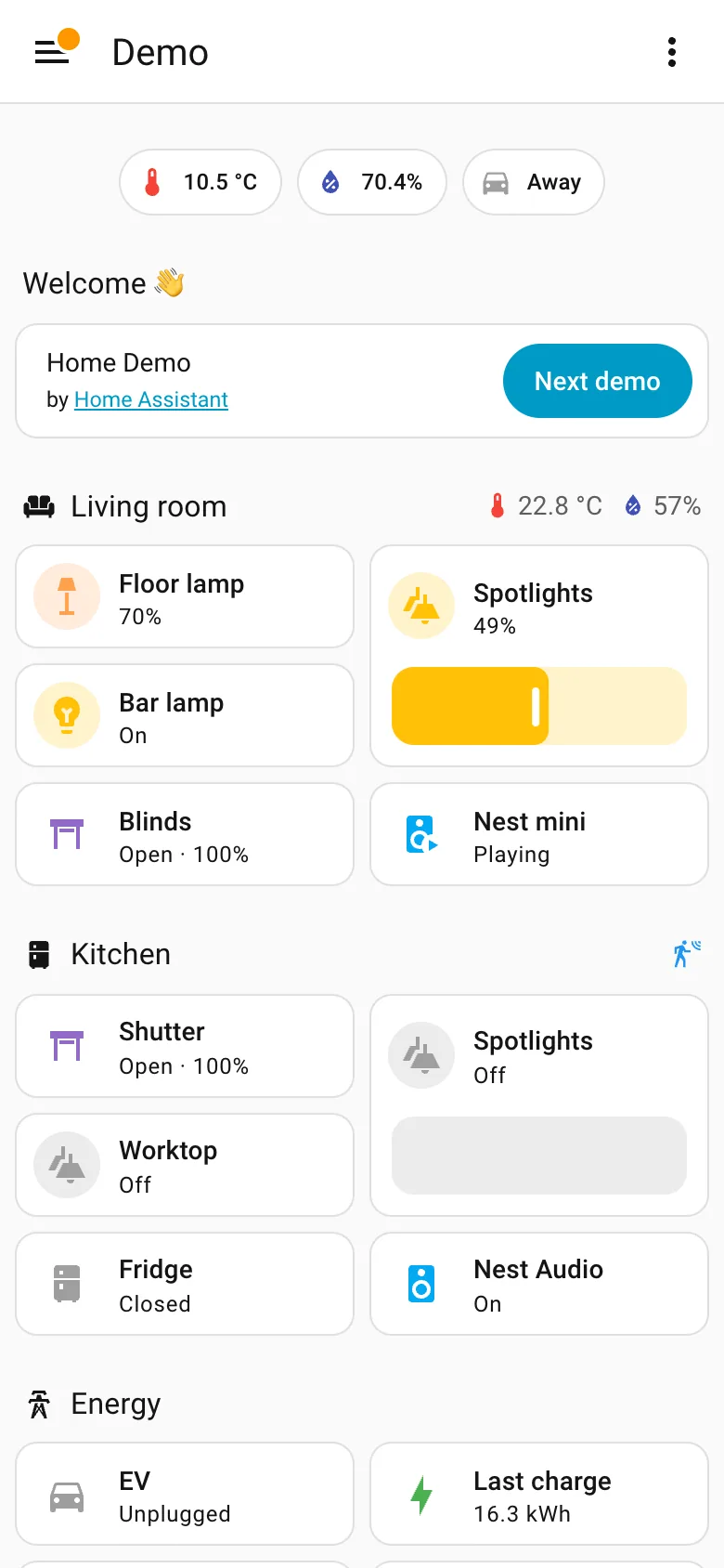
Demo dashboard at phone width September 10, 2026 Home Assistant public demo (signed out, 390px viewport) medium · light · mobile
The same dashboard as the desktop capture at 390 pixels. It is a reflow rather than a designed phone page, and for this content that is defensible—a list of things with states doesn't need width the way a chart does, sections stay intact, nothing is dropped, and the slider becomes a much better touch target than it was with a mouse. What doesn't survive is the order. On desktop the sections sit in three columns and each column reads down: Welcome, Energy, Outdoor on the left. On the phone they come out row by row instead, so Energy falls from second in its column to fourth on the page and Kitchen climbs from the far right to third. Nothing about the desktop layout expressed which of those mattered more, so the reflow had nothing to preserve and picked an order from the source. The rail is the other casualty and goes exactly where these always go, into a hamburger.
  • Mobile adaptation Reflowed, not rebuilt. Section order comes out row-major here and column-major on desktop, so priority shifts.
  • Sidebar and canvas The rail is gone. Everything it held is now behind one button, which is the usual and unavoidable trade.
  • Resizable card grid Two columns of cards inside each section rather than a single stack, so the page stays short enough to scroll.
  • Header KPI strip The three chips survive the switch intact, which is what a strip of four to six is for.