Skip to content
KONIGI

Dashboards / Interaction / Hover detail

4 of 8

Hover detail

The chart shows shape; the viewer needs the exact value at one moment without leaving it.

Updated September 10, 2026

Problem

The line peaked somewhere around 14:20 at something like 400. The viewer needs the actual timestamp and the actual number, and does not want to leave the chart, open a table, or change the range to find it.

Solution

Follow the cursor and report what is under it. Shneiderman’s phrase for the task is details-on-demand, and the demand here is the lowest-cost one available: move the mouse.

The design decisions are all about how much to say and how many panels to say it in.

How much. A tooltip showing one series is precise and unhelpful when the question is “what were the others doing”. Showing all series at that timestamp answers the comparison but becomes a wall of text on a chart with twelve lines, so implementations end up needing all three modes: single, all, and none. Sorting the all-series list by value rather than by series name is a small change that makes it readable.

How many panels. A shared crosshair draws the same time position across every chart on the page, which converts a page of separate charts into one coordinated instrument, and is the single highest-value feature in this pattern. Once it exists, “did memory spike at the same moment” stops requiring measurement against the screen edge.

The thing that separates a good tooltip from a bad one is restraint about what it adds. A tooltip is the right place for the exact value, the exact timestamp, the units, and the series identity. It is the wrong place for a paragraph, a second chart, or an action, because it appears and disappears based on where the mouse happens to be.

Use when

The chart’s job is shape but the viewer occasionally needs precision, which describes nearly every time series on a dashboard someone investigates with.

Don’t use when

The precise value is the primary need. If viewers hover every time, they wanted a table. And never put anything essential behind hover alone, because hover does not exist on touch and does not exist for keyboard navigation.

Trade-offs

Hover is invisible until used, so features that only exist there are undiscoverable, and viewers who don’t know to hover conclude the chart can’t tell them. It’s unavailable on touch devices, which means the mobile version of the dashboard silently loses a capability rather than replacing it. Tooltips occlude the very data they describe, and the bigger they get the more they cover. And a tooltip that follows the cursor closely enough to feel responsive will flicker at panel edges unless someone has thought about collision.

Checklist

  • Does the tooltip show one series or all of them, and can the viewer choose?
  • If all, are they sorted by value rather than alphabetically?
  • Is there a shared crosshair across panels, and does it align to the same timestamp?
  • Are units and full precision shown, rather than the axis’s rounded version?
  • Is the timestamp in a stated timezone?
  • Does the tooltip avoid covering the point it describes?
  • What is the touch equivalent, and does it exist?
  • Is any of this reachable by keyboard?
  • Does the tooltip stay legible at twelve series, and what happens at fifty?
  • Is anything only available on hover that a viewer would need to find first?

Compare

Grafana treats the tooltip as a panel option with single, all and hidden modes plus a shared crosshair set at dashboard level, so the coordination is a deliberate setting rather than a default. Datadog links hover across a whole page by default, which makes correlation the path of least resistance and is the main reason its dashboards feel like one instrument. Honeycomb puts less weight on hover because the heatmap’s answer comes from selecting a region rather than reading a point, so the pointer’s job is drawing rather than inspecting. Netdata synchronises the crosshair across every chart on the page, which at per-second resolution across dozens of charts is what makes the density usable rather than overwhelming.

Time series is the chart this most often sits on. Detail on demand is the same idea at panel scale rather than point scale. Legend and series toggle is the other way to answer “which line is which”. Mobile adaptation is where this pattern needs a replacement rather than a fallback. Explain this metric is what a tooltip should not try to become.
Hover detail anatomy Three stacked charts with one crosshair drawn through all of them at the same instant, and a tooltip listing every series at that timestamp sorted by value rather than by name. One crosshair, three panels Latency Memory Errors 14:07:20 checkout 412ms search 308ms cart 191ms user 96ms 1 2 1 SHARED CROSSHAIR Turns a page of separate charts into one coordinated instrument. "Did memory spike at the same moment" stops needing a ruler. 2 SORTED BY VALUE Not by series name. A small change that makes a twelve-line tooltip readable. The exact value, the timestamp, the units, the series. Not a paragraph, not an action.
Wireframe — the pattern's anatomy, not any one product's version of it

Implementation

The exact value at one moment, without leaving the chart. A shared crosshair reading every series at the hovered timestamp is worth more than a per-series tooltip, because the comparison is usually the question.

npm
recharts
Tokens
--foreground--card--popover--popover-foreground--muted-foreground--border--status-critical--chart-1--chart-2--chart-3--chart-4

Latency

Memory

Errors

14:07:20 UTC

  • checkout412ms
  • search308ms
  • cart191ms
  • user96ms
  • rss1280MB
  • 5xx34/s

HoverDetail.tsxOne hovered index drives a crosshair through every panel and a readout sorted by value, with units and a stated timezone. Arrow keys move it.

import { useState, type KeyboardEvent } from "react";
import { Line, LineChart, ReferenceDot, ReferenceLine, XAxis, YAxis } from "recharts";
import { cn } from "@/lib/utils";

export type Series = { key: string; label: string; color: string };
export type Panel = { title: string; unit: string; series: Series[] };
/** One row per sample; `t` is epoch ms and every series key is a column. */
export type Row = { t: number } & Record<string, number>;

/** Full precision with the unit, never the axis's rounded version. */
const fmt = (v: number, unit: string) => `${v}${unit}`;
const hhmmss = (t: number) => new Date(t).toISOString().slice(11, 19);

/**
 * One crosshair through every panel and one readout for the instant under it.
 * The hovered index is the only state, so all the panels agree on the
 * timestamp by construction, and the readout is a list of exact values sorted
 * by size rather than by name.
 */
export function HoverDetail({ panels, data, defaultIndex = 0, width = 340, height = 64 }: {
  panels: Panel[];
  data: Row[];
  /** Which sample the crosshair starts on. */
  defaultIndex?: number;
  width?: number;
  height?: number;
}) {
  const [i, setI] = useState(defaultIndex);
  const row = data[i];
  const move = (e: { activeTooltipIndex?: number }) => {
    if (typeof e?.activeTooltipIndex === "number") setI(e.activeTooltipIndex);
  };
  // The keyboard equivalent: arrows walk the samples.
  const key = (e: KeyboardEvent) => {
    if (e.key === "ArrowLeft") setI((n) => Math.max(0, n - 1));
    if (e.key === "ArrowRight") setI((n) => Math.min(data.length - 1, n + 1));
  };

  return (
    <div className="grid grid-cols-[1.4fr_1fr] gap-5" tabIndex={0} onKeyDown={key} aria-label="hover detail; arrow keys move the crosshair">
      <div className="flex flex-col gap-2 rounded-lg border bg-card p-4">
        {panels.map((p) => (
          <div key={p.title}>
            <p className="text-[11px] uppercase tracking-wide text-muted-foreground">{p.title}</p>
            <div className="overflow-x-auto">
              <LineChart width={width} height={height} data={data} margin={{ top: 6, right: 4, bottom: 2, left: 4 }} onMouseMove={move}>
                <XAxis interval={0} dataKey="t" type="number" domain={["dataMin", "dataMax"]} hide />
                <YAxis hide domain={[0, "auto"]} />
                {p.series.map((s) => (
                  <Line key={s.key} type="linear" dataKey={s.key} stroke={s.color} strokeWidth={2} dot={false} isAnimationActive={false} />
                ))}
                <ReferenceLine x={row.t} stroke="hsl(var(--foreground))" />
                {p.series.map((s) => (
                  <ReferenceDot key={s.key} x={row.t} y={row[s.key]} r={3} fill={s.color} stroke="none" />
                ))}
              </LineChart>
            </div>
          </div>
        ))}
      </div>

      <div className="self-start rounded-lg border bg-popover p-3" role="status" aria-live="polite">
        <p className="border-b pb-2 text-[11px] tabular-nums text-popover-foreground">{hhmmss(row.t)} UTC</p>
        {panels.map((p, n) => (
          <ul key={p.title} className={cn("text-[11px] tabular-nums", n > 0 && "border-t")}>
            {[...p.series].sort((a, b) => row[b.key] - row[a.key]).map((s) => (
              <li key={s.key} className="flex justify-between py-1">
                <span className="inline-flex items-center gap-1.5 text-popover-foreground">
                  <span className="size-2 rounded-[1px]" style={{ background: s.color }} aria-hidden />
                  {s.label}
                </span>
                <span className="text-popover-foreground">{fmt(row[s.key], p.unit)}</span>
              </li>
            ))}
          </ul>
        ))}
      </div>
    </div>
  );
}

demo.tsxHow it is called: three panels over one set of rows, starting on the sample the drawing points at.

import { HoverDetail, type Panel, type Row } from "./HoverDetail";

/** Forty seconds at five-second resolution. The crosshair starts on 14:07:20. */
const T0 = Date.UTC(2026, 8, 15, 14, 7, 0);
const cols = {
  checkout: [180, 236, 210, 356, 412, 268, 302, 290],
  search: [96, 130, 112, 240, 308, 160, 200, 240],
  cart: [120, 130, 125, 170, 191, 140, 150, 145],
  user: [60, 70, 64, 88, 96, 72, 80, 76],
  rss: [640, 720, 760, 1240, 1280, 920, 840, 880],
  errors: [2, 4, 6, 30, 34, 12, 8, 6],
};
const DATA: Row[] = cols.checkout.map((_, i) => ({
  t: T0 + i * 5_000,
  ...Object.fromEntries(Object.entries(cols).map(([k, v]) => [k, v[i]])),
}));

const PANELS: Panel[] = [
  {
    title: "Latency", unit: "ms",
    series: [
      { key: "checkout", label: "checkout", color: "hsl(var(--chart-1))" },
      { key: "search", label: "search", color: "hsl(var(--chart-2))" },
      { key: "cart", label: "cart", color: "hsl(var(--chart-3))" },
      { key: "user", label: "user", color: "hsl(var(--chart-4))" },
    ],
  },
  { title: "Memory", unit: "MB", series: [{ key: "rss", label: "rss", color: "hsl(var(--chart-2))" }] },
  { title: "Errors", unit: "/s", series: [{ key: "errors", label: "5xx", color: "hsl(var(--status-critical))" }] },
];

export default function Demo() {
  return <HoverDetail panels={PANELS} data={DATA} defaultIndex={4} />;
}
What it renders. Identical markup in both panes, with only the token values changing.

Examples

Captures whose hotspots reference this pattern, grouped by product and dated. The dashed boxes are this pattern; hover any box for the note.

Tableau Public

Thousands of dashboards made by people who are not designers, published without a review step. The best available sample of what the pattern language looks like in the wild.

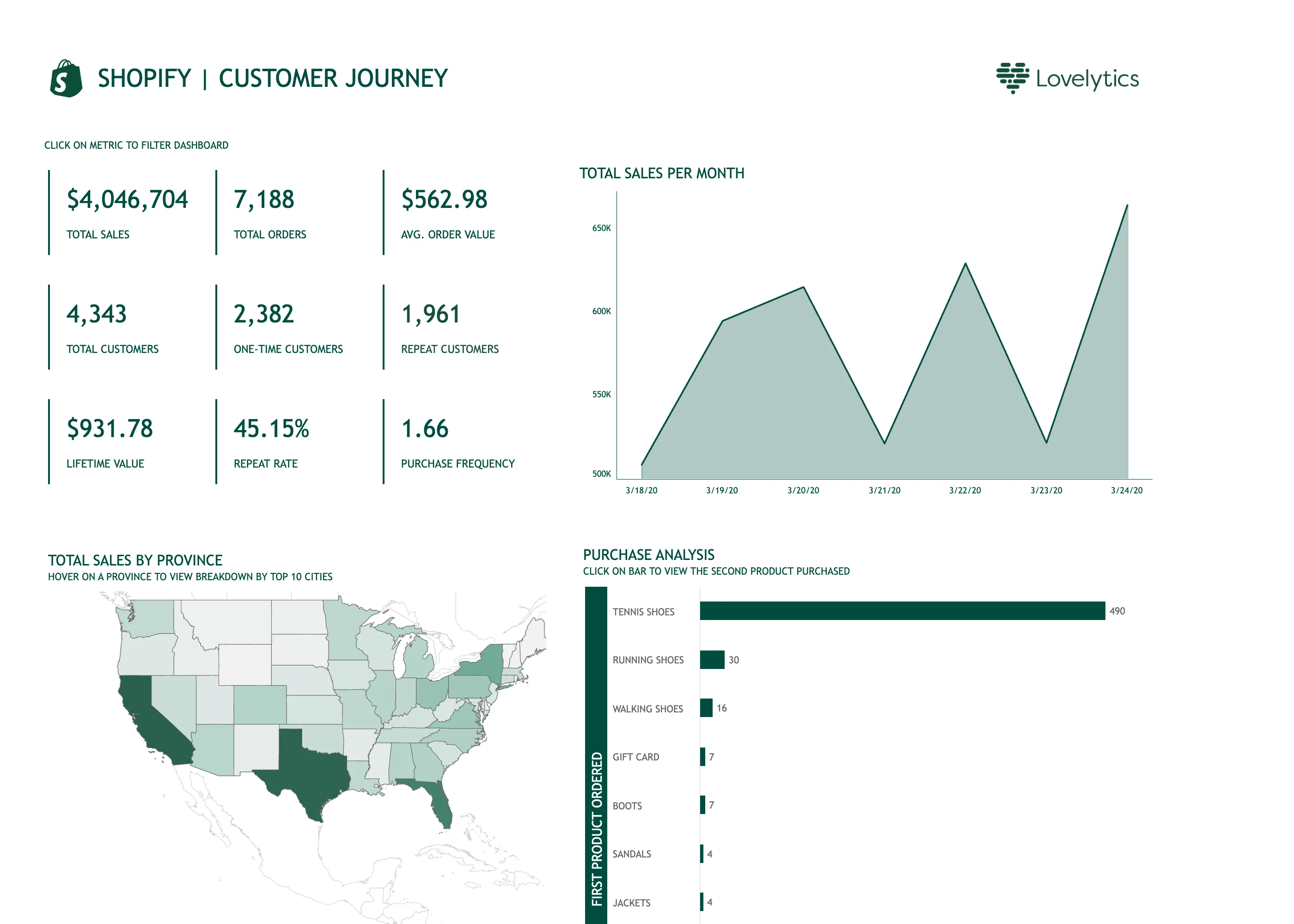
Shopify Customer Journey September 10, 2026 Tableau Public embed view; workbook published by Lovelytics medium · light · desktop-web
Tableau Public is the product; the design decisions here are the author's. This workbook was published by Lovelytics, so read it as what a competent analyst builds in Tableau rather than as how Tableau thinks dashboards should look. What is instructive is that it carries three separate lines of small-caps instruction—"click on metric to filter dashboard", "hover on a province to view breakdown by top 10 cities", "click on bar to view the second product purchased". Every interaction on the page needed a label, because none of them announces itself. That is the honest cost of cross-filtering: it is powerful and it is invisible until someone tells you it is there. Two other things. The tile block is nine values in a three-by-three grid, which is past the point where a strip has a reading order—the eye has to be told where to start and isn't. And the chart titled "Total sales per month" is plotting seven days, on a y-axis that begins at 500K, so a roughly twenty-five percent spread draws as a mountain range.
  • Cross-filter The tiles are the filter. It needed a line of instruction above it, because nothing about a number says it is clickable.
  • Header KPI strip Nine values in a grid rather than four to six in a row, so there is no privileged place for the eye to start.
  • Time series Titled per month, plotting seven days, on an axis starting at 500K. A 25% spread rendered as a cliff.
  • Hover detail The breakdown by city exists only on hover, so it is unavailable on touch and invisible in this screenshot.
  • Geo map with markers A choropleth of raw sales, unnormalised, so California and Texas lead partly by being large and populous.
  • Ranked list 490 against 30 for second place, so every bar below the first is a sliver and the ordering is all you get.