Problem
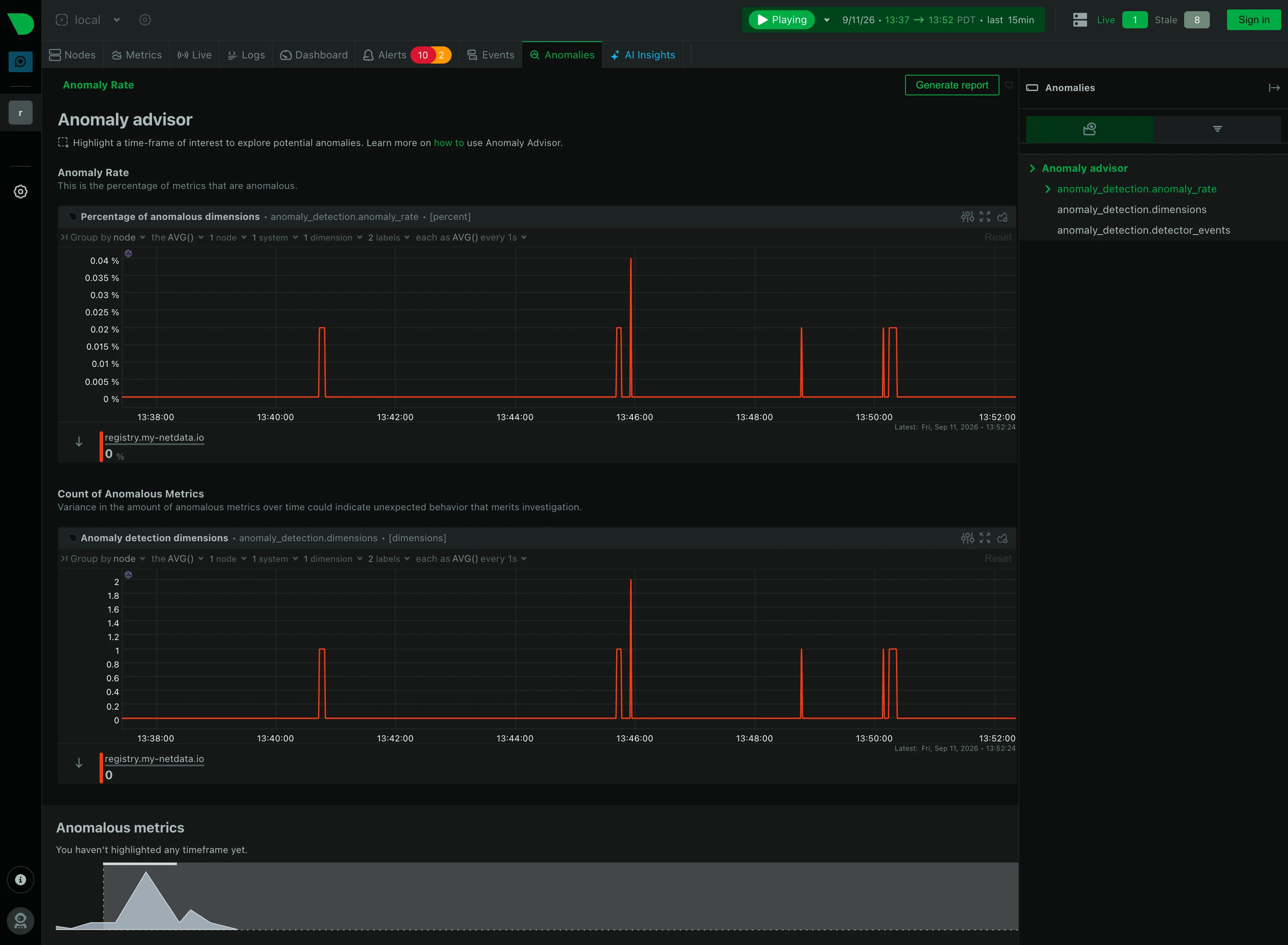
There is a bump in one chart. The viewer wants to know what everything else was doing during that bump, for those particular requests, and the alternative is retyping a filter into six panels and hoping they agree.
Solution
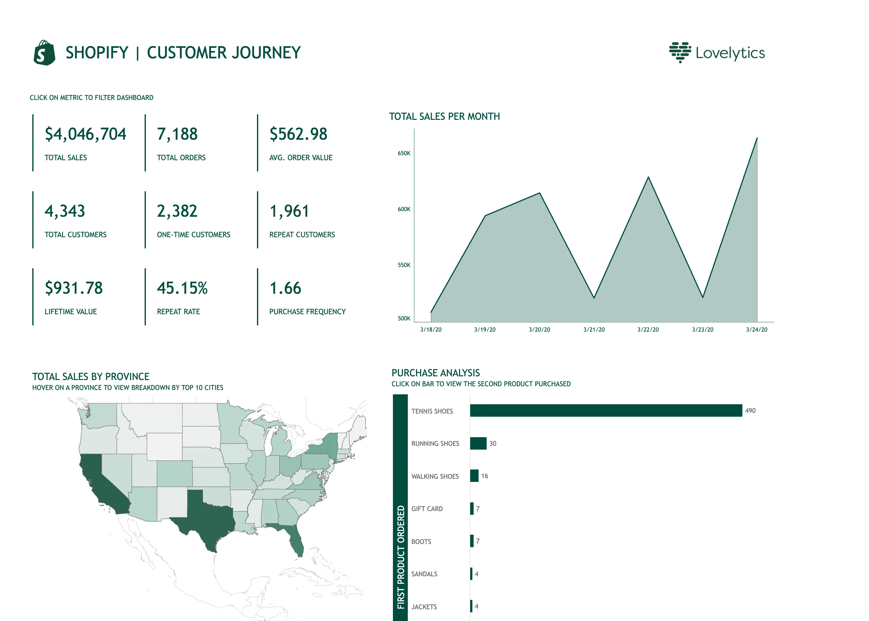
Make a selection in one view act as a filter on all the others. Drag a region, click a bar, pick a slice, and the rest of the page redraws to describe only what was selected.
This is brushing and linking, one of the oldest ideas in information visualisation, and it maps onto two of Shneiderman’s seven tasks at once: filter, and relate. Its power is that it asks no questions. The viewer does not need to know the name of the dimension that explains the bump—they only need to be able to point at the bump.
Honeycomb’s BubbleUp is the most aggressive version of the idea. Draw a box around an anomalous region of a heatmap and it computes the distribution of every dimension inside the box against the baseline outside it, then ranks dimensions by how different they are. A selection works as a hypothesis as much as a filter. The viewer supplies the “this looks wrong” and the tool supplies the “because these requests all came from one build”.
Two design decisions decide whether an ordinary implementation is any good. First, is the selection visible after it is made—a page that has silently filtered itself is a page that will be screenshotted and misread. Second, can it be undone in one action, because exploratory filtering is only exploratory if reversing it is free.
Use when
The panels on a page describe the same underlying population from different angles, and the viewer’s question is “what else is true of these”.
Don’t use when
The panels are independent. Cross-filtering unrelated queries produces panels that quietly show nothing, or worse, show something that looks like an answer. Also avoid where filtering is expensive enough that each selection costs seconds, because the pattern lives on immediacy.
Trade-offs
Coordinated views multiply query load, so one drag can fire a dozen queries. State becomes invisible: the difference between “no data” and “filtered to nothing” is the whole page, and viewers who did not make the selection cannot tell. Sharing gets harder, because a screenshot of a cross-filtered dashboard omits the thing that makes it true. And the selection model has to be consistent across panel types, which is where most implementations fracture—drag means brush on a chart and text-select on a table.
Checklist
- Is the active selection visible, in words, somewhere persistent?
- Can it be cleared in one action, and is that action obvious?
- Does every panel honour the selection, and do the ones that can’t say so?
- How many queries does a single selection fire, and how long until the page settles?
- Is a filtered-to-empty panel distinguishable from a broken one?
- Does the selection go into the URL so it can be shared?
- Is the interaction the same gesture across chart, table and map?
- Can selections combine, and is the combination shown as AND?
- Does a stale selection survive a time-range change, and should it?
- What does a screenshot of this state fail to communicate?
Compare
Honeycomb turns the selection into analysis rather than only filtering: BubbleUp compares everything inside the drawn region against the baseline outside it and ranks the dimensions that differ, which answers “why” rather than only “what else”. Tableau made the pattern mainstream in BI, where selecting a mark filters every other sheet on the dashboard by default, and the default is exactly why analysts expect it everywhere else. Grafana has no general cross-filtering between panels; the equivalent runs through template variables that panels read from, which is explicit, shareable through the URL, and requires someone to wire it. Datadog scopes a whole page by tags so a selection changes the page’s context rather than each panel’s query, which keeps panels consistent at the cost of finer-grained selections.
Related
Filter bar is the same narrowing expressed as controls rather than gestures. Drill-down is the navigate-away alternative. Heatmap is the surface this pattern most often selects on. Zoom and pan is cross-filtering restricted to the time axis. Template variable is how Grafana approximates it, and the reason the selection ends up in the URL.