Skip to content
KONIGI

Dashboards / Interaction / Zoom and pan on time

8 of 8

Zoom and pan on time

The interesting thing is ten minutes wide on a seven-day chart.

Updated September 10, 2026

Problem

There is a spike at some point in the last six hours. The viewer wants the ninety seconds around it. Doing that through a date picker means reading an approximate timestamp off an axis, converting it, and typing it twice.

Solution

Let the viewer draw the range on the chart. Drag across the region and the range becomes the selection; the whole page follows.

Shneiderman lists zoom as its own task, distinct from filter, and the distinction is worth keeping: zoom changes the window on the same population, filter changes which population. Confusing the two is why some products zoom the axis without re-querying and end up showing an interpolated view of data they never fetched at that resolution.

Two properties separate a usable implementation from an irritating one.

The whole page moves together. Zooming one panel and leaving the others at six hours produces a dashboard whose panels disagree, which is worse than not zooming. The gesture has to update the shared range, which means zoom and the range picker are the same control with two interfaces, and they have to stay in sync in both directions.

Getting back is free. Exploration means overshooting. Without a zoom-out and a history of previous ranges, every wrong drag costs a retype, and viewers stop drilling in as a result.

Underneath both, the query has to change with the window. Zooming from six hours to ninety seconds should fetch finer data, not stretch coarse points. A panel that zooms without re-querying gives a magnified picture of an average, which looks like detail and contains none.

Use when

Any time-series page someone investigates with, especially where the interesting event is short relative to the default window.

Don’t use when

The range is fixed by the report’s meaning—a month-end view that can be zoomed produces a chart whose title no longer describes it. Also skip it on a wallboard, where there is no pointer and an accidental zoom persists until someone notices.

Trade-offs

Drag-to-zoom collides with every other drag gesture: selecting a region to annotate, brushing to cross-filter, and panning all want the same input, so products end up with modifier keys nobody discovers. Zoom state is easy to lose and easy to over-persist—a range someone zoomed into during an incident is still there next morning if it was saved. Fine zoom levels can outrun retention or resolution, so the viewer keeps zooming and the data gets less precise rather than more. And on touch, pinch conflicts with page scroll in a way no dashboard has convincingly solved.

Checklist

  • Does dragging on one panel change the range for the whole page?
  • Does the time-range picker update to reflect a zoom, and vice versa?
  • Is there a one-action zoom out, and a history of previous ranges?
  • Does the query re-run at a finer interval, or is coarse data being stretched?
  • What is the finest range this data supports, and what happens past it?
  • How does drag-to-zoom coexist with any other drag gesture on the same chart?
  • Does the zoomed range go into the URL?
  • Is an accidental zoom easy to notice and easy to undo?
  • On touch, what is the gesture, and does it fight the page scroll?
  • Does a zoomed range persist into a saved view, and should it?

Compare

Grafana treats a drag on any panel as setting the dashboard’s time range, so zoom and the picker are one piece of state, and the zoomed window lands in the URL where it can be shared. Netdata goes further and synchronises pan and zoom across every chart on the page continuously, which at per-second resolution turns dozens of charts into one scrubbable instrument. Honeycomb folds the gesture into the query: narrowing the window is editing what you asked for, so there is no separate zoom state that can drift away from the result. Datadog keeps the drag for range selection and hangs actions off the selection, so the same gesture that zooms can also export or annotate the window.

Time-range picker is the same control in typed form, and the two must agree. Cross-filter is the other thing a drag can mean, and the conflict has to be resolved deliberately. Hover detail is how the viewer finds the moment worth zooming to. Time series is the chart underneath. Annotation is what usually explains whatever they zoomed in on.
Zoom and pan on time anatomy A ten-minute region dragged out of a seven-day chart, and the result. The zoomed chart has fetched finer data rather than stretching the coarse points it already had, so it contains detail the first chart never held. Ten minutes out of seven days Last 7 days 3 14:02 to 14:12 back to 7d 4 1 2 1 DRAW THE RANGE Zoom and the range picker are one control with two interfaces, and they have to stay in sync in both directions. 2 THE QUERY CHANGES TOO Going from six hours to ninety seconds has to fetch finer data. A panel that zooms the axis alone magnifies an average. 3 THE WHOLE PAGE MOVES Zooming one panel and leaving the others at six hours makes a dashboard whose panels disagree, which is worse than not zooming. 4 GETTING BACK IS FREE Exploration means overshooting. Without a history of previous ranges, every wrong drag costs a retype and people stop drilling in. Zoom changes the window on the same population. Filter changes the population.
Wireframe — the pattern's anatomy, not any one product's version of it

Implementation

Drag to select a window, and a context strip underneath keeping the full range visible. Without the strip a reader who has zoomed four times has no idea where they are.

shadcn
npx shadcn@latest add button
Tokens
--card--muted-foreground--border--chart-1
14:02 to 14:12
14:0214:12

Last 7 days

ZoomableChart.tsxDrag reports a range and owns nothing; the page holds the shared range, re-queries, and passes the previous one back for the return button. A context strip marks the window inside the full range.

import { useState, type PointerEvent } from "react";
import { Button } from "@/components/ui/button";

/**
 * The range is not this component's to own. Drag draws a window and the
 * chart reports it; the page holds the shared range, re-runs the query at a
 * finer interval, and hands back `data` for the new window. That is what
 * keeps every panel on the page at the same range and stops a zoom from
 * stretching coarse points it already had.
 *
 * The context strip underneath keeps the full range visible, so a reader who
 * has zoomed four times can still see where they are.
 */
export type Range = { from: number; to: number; label?: string };
export type Sample = { t: number; value: number };

const hhmm = (t: number) => new Date(t).toISOString().slice(11, 16);
/** "7d", "6h", "10m": the size of a window, for the back button. */
export const span = ({ from, to }: Range) => {
  const m = Math.round((to - from) / 60_000);
  return m >= 1440 ? `${Math.round(m / 1440)}d` : m >= 60 ? `${Math.round(m / 60)}h` : `${m}m`;
};
const title = (r: Range) => r.label ?? `${hhmm(r.from)} to ${hhmm(r.to)}`;

function linePath(data: Sample[], range: Range, w: number, h: number) {
  if (data.length < 2) return "";
  const max = Math.max(...data.map((d) => d.value));
  const x = (t: number) => ((t - range.from) / (range.to - range.from)) * w;
  const y = (v: number) => h - 4 - (v / max) * (h - 12);
  return data.map((d, i) => `${i ? "L" : "M"}${x(d.t).toFixed(1)} ${y(d.value).toFixed(1)}`).join(" ");
}

export function ZoomableChart({ range, data, onRangeChange, previous, onBack, context, width = 300, height = 100 }: {
  range: Range;
  /** Samples for `range`, at the interval the query chose for it. */
  data: Sample[];
  onRangeChange: (range: Range) => void;
  /** The range before this one. Getting back has to be one action. */
  previous?: Range;
  onBack?: () => void;
  /** The full range and its samples, drawn as a strip with the current window marked. */
  context?: { range: Range; data: Sample[] };
  width?: number;
  height?: number;
}) {
  const [drag, setDrag] = useState<{ x0: number; x1: number } | null>(null);
  const plotH = height - 14;
  const px = (e: PointerEvent<SVGSVGElement>) => {
    const box = e.currentTarget.getBoundingClientRect();
    return Math.max(0, Math.min(width, ((e.clientX - box.left) / box.width) * width));
  };
  const release = () => {
    if (!drag) return;
    const [a, b] = [drag.x0, drag.x1].sort((m, n) => m - n);
    setDrag(null);
    if (b - a < 4) return;
    const at = (x: number) => range.from + (x / width) * (range.to - range.from);
    onRangeChange({ from: at(a), to: at(b) });
  };

  return (
    <div>
      <div className="flex items-baseline justify-between border-b pb-2">
        <span className="text-[11px] uppercase tracking-wide text-muted-foreground">{title(range)}</span>
        {previous && onBack && (
          <Button variant="link" size="sm" className="h-auto p-0 text-[10px] text-chart-1" onClick={onBack}>back to {span(previous)}</Button>
        )}
      </div>

      <svg
        width={width} height={height} viewBox={`0 0 ${width} ${height}`} className="mt-2 block max-w-full cursor-crosshair select-none touch-none"
        role="img" aria-label={`${title(range)}, drag to zoom`}
        onPointerDown={(e) => { e.currentTarget.setPointerCapture(e.pointerId); const x = px(e); setDrag({ x0: x, x1: x }); }}
        onPointerMove={(e) => drag && setDrag({ ...drag, x1: px(e) })}
        onPointerUp={release}
      >
        {drag && (
          <rect x={Math.min(drag.x0, drag.x1)} y={0} width={Math.abs(drag.x1 - drag.x0)} height={plotH} className="fill-chart-1/20 stroke-chart-1" strokeWidth={1} />
        )}
        <path d={linePath(data, range, width, plotH)} fill="none" className="stroke-chart-1" strokeWidth={2} />
        <line x1={0} y1={plotH} x2={width} y2={plotH} className="stroke-border" />
        <text x={0} y={height - 2} className="fill-muted-foreground text-[9px]">{hhmm(range.from)}</text>
        <text x={width} y={height - 2} textAnchor="end" className="fill-muted-foreground text-[9px]">{hhmm(range.to)}</text>
      </svg>

      {context && (
        <div className="mt-2">
          <p className="text-[10px] text-muted-foreground">{title(context.range)}</p>
          <svg width={width} height={28} viewBox={`0 0 ${width} 28`} className="block max-w-full" aria-hidden="true">
            <rect
              x={((range.from - context.range.from) / (context.range.to - context.range.from)) * width}
              y={0}
              width={Math.max(2, ((range.to - range.from) / (context.range.to - context.range.from)) * width)}
              height={28}
              className="fill-chart-1/20 stroke-chart-1"
              strokeWidth={1}
            />
            <path d={linePath(context.data, context.range, width, 28)} fill="none" className="stroke-muted-foreground" strokeWidth={1} />
          </svg>
        </div>
      )}
    </div>
  );
}

demo.tsxHow it is called: a ten-minute window out of seven days, with a range history and a stand-in query that returns finer samples for the smaller window.

import { useState } from "react";
import { ZoomableChart, type Range, type Sample } from "./ZoomableChart";

/**
 * Starts ten minutes deep into a seven-day chart. The page owns the range
 * and its history; each range gets its own query, so the ten-minute window
 * holds seventeen samples the seven-day one never fetched. Drag on the chart
 * to zoom further; back pops the history.
 */
const NOW = Date.parse("2026-09-15T16:47:00Z");
const WEEK: Range = { from: NOW - 7 * 86_400_000, to: NOW, label: "Last 7 days" };
const SPIKE: Range = { from: Date.parse("2026-09-12T14:02:00Z"), to: Date.parse("2026-09-12T14:12:00Z") };

/** What the query returned for each range: p95 in ms, evenly spaced across it. */
const spread = (range: Range, values: number[]): Sample[] =>
  values.map((value, i) => ({ t: range.from + (i / (values.length - 1)) * (range.to - range.from), value }));
const WEEK_DATA = spread(WEEK, [180, 240, 200, 280, 240, 580, 260, 300, 260, 320]);
const SPIKE_DATA = spread(SPIKE, [140, 180, 120, 240, 360, 560, 780, 620, 700, 480, 560, 340, 400, 260, 300, 220, 260]);

/** Stands in for the query. A real page would fetch at range / maxDataPoints. */
const query = (range: Range) => (range === WEEK ? WEEK_DATA : range === SPIKE ? SPIKE_DATA : SPIKE_DATA.filter((s) => s.t >= range.from && s.t <= range.to));

export default function Demo() {
  const [history, setHistory] = useState<Range[]>([WEEK, SPIKE]);
  const range = history[history.length - 1];
  return (
    <div className="w-fit rounded-lg border bg-card p-4">
      <ZoomableChart
        range={range}
        data={query(range)}
        onRangeChange={(next) => setHistory([...history, next])}
        previous={history[history.length - 2]}
        onBack={() => setHistory(history.slice(0, -1))}
        context={range === WEEK ? undefined : { range: WEEK, data: WEEK_DATA }}
      />
    </div>
  );
}
What it renders. Identical markup in both panes, with only the token values changing.

Examples

Captures whose hotspots reference this pattern, grouped by product and dated. The dashed boxes are this pattern; hover any box for the note.

Grafana

The reference implementation for panel grids, template variables, and stat panels; most other tools are defined by how they differ from it.

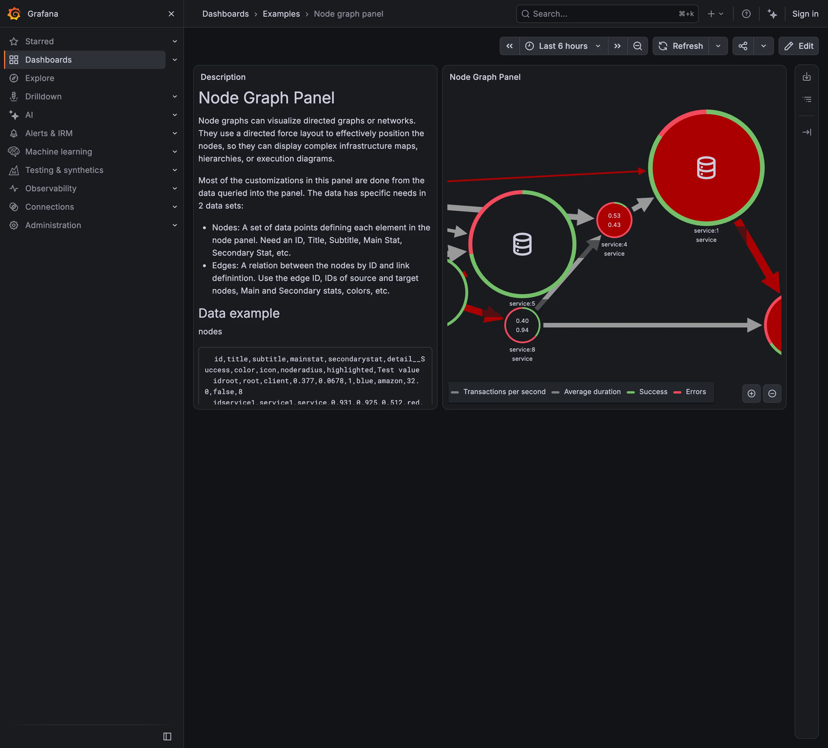
Examples / Node graph panel September 10, 2026 Grafana Play (signed out; no version string exposed) sparse · dark · desktop-web
Seven services, and the panel is already too small to hold them. Three nodes are cut in half by the right edge and at least one more is somewhere past it, which is the force layout doing what force layouts do to a graph with more nodes than room. That is the hard part of this pattern and it is visible here at a scale of seven. Each node also carries four things at once: a number, a second number, and a ring split between a green arc and a red one. The legend names all four. A topology view where every node reports four measures is a view you read node by node, which is the opposite of what a map is for —one derived state per node is scannable in a second and drills into the rest. Here almost every ring is mostly red, so the channel that could have carried that state is saturated and distinguishes nothing.
  • Service map Nodes for services, edges for calls, both from instrumentation rather than from a diagram.
  • Semantic status color One node: two numbers inside and a success/error ring around it. Four measures, no verdict.
  • Legend and series toggle Four series named for a graph with seven nodes, which is the legend doing more work than the map.
  • Zoom and pan on time The only route to the nodes pushed off the right edge, and it doesn't move the rest of the page.