Problem
Operational dashboards are templates by nature. The Kubernetes overview is the same page for every cluster. The service page is the same page for every service. Building one per instance means fifty copies that drift; building one page with a dropdown means one thing to maintain and a dashboard the viewer can point at whatever they’re worried about.
Solution
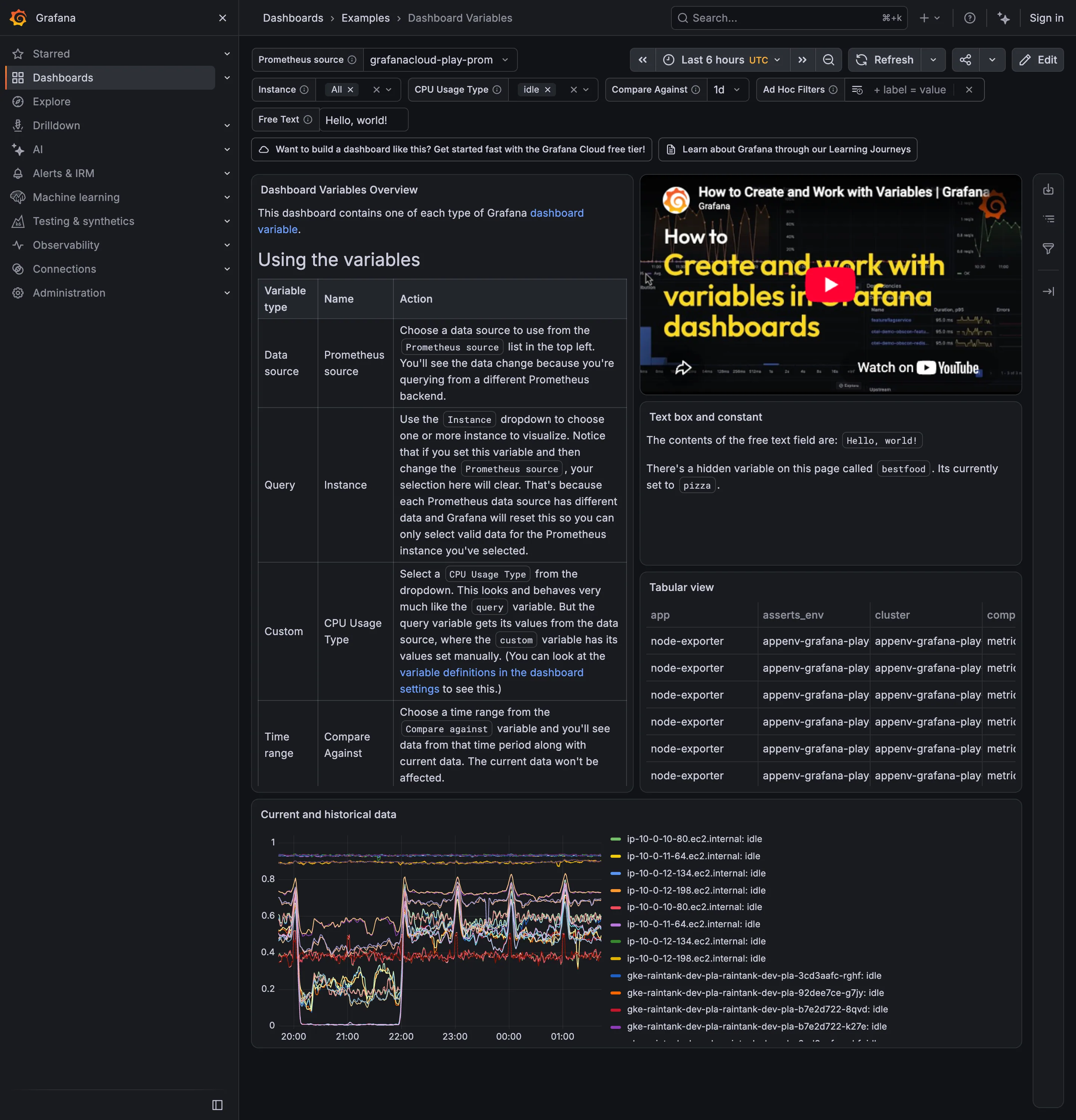
A row of selectors at the top of the dashboard, each bound to a variable that every panel’s query references. Change the selector and every panel re-queries. The selectors are populated from the data itself (a query for distinct service names) so the list is never stale. The chosen values live in the URL, which makes a scoped view a shareable link.
Bach calls this the parameterized screenspace pattern. In products it’s the difference between a dashboard and a dashboard system.
Use when
The same layout applies across many instances of one entity type, and the viewer’s first question is “which one?” Clusters, services, hosts, tenants, regions, environments.
Don’t use when
The instances need different layouts. A database dashboard and a web-server dashboard share a variable bar but not panels; forcing them into one template gives every viewer half a page of empty panels. Also avoid stacking more than four or five variables; past that, the bar becomes a query builder and belongs in a filter bar pattern with saved views.
Trade-offs
Variables make dashboards abstract. A viewer arriving by link sees “cluster: prod-us-east” and has to notice it before trusting anything below. Multi-select variables produce panels with forty series and no legend that fits. Chained variables (pick a cluster, then a namespace, then a pod) are powerful and slow, and the loading state between selections is where dashboards feel broken. And variables invite the anti-pattern of one giant dashboard for everything, which the collapsible-row pattern then has to rescue.
Checklist
- Is the current selection visible without scrolling, on every screen size?
- Are variable values in the URL, so the view can be shared and bookmarked?
- What does the dashboard show while a chained variable is reloading?
- Is there an “All” option, and does every panel behave sensibly with it?
- Does the variable list come from data, and how stale can it get?
- When a variable value no longer exists (the pod was deleted), what does the viewer see?
- Are panel titles interpolated with the variable so screenshots are self-describing?
- Can a panel opt out of a variable, and is that visible?
Compare
Grafana is the reference: query, custom, interval, and datasource variables, chaining, multi-select, and the values interpolated into panel titles. Datadog does the same with a lighter bar and adds saved views on top of the variable set, which is the right next step. Netdata inverts it: instead of a variable, the node and room hierarchy in the left rail is the selector, and every chart is already scoped. Honeycomb has no template variables because every view is a query; the “variable” is the WHERE clause, which shows the pattern is a UI over query parameters and can be replaced by one.
Related
Filter bar is what this becomes when the variables are many and arbitrary. Panel grid is what the variables scope. Drill-down is the click that usually sets a variable. Saved view is how teams stop re-selecting the same five values. Overview then detail is the navigation structure variables enable without separate pages.