Problem
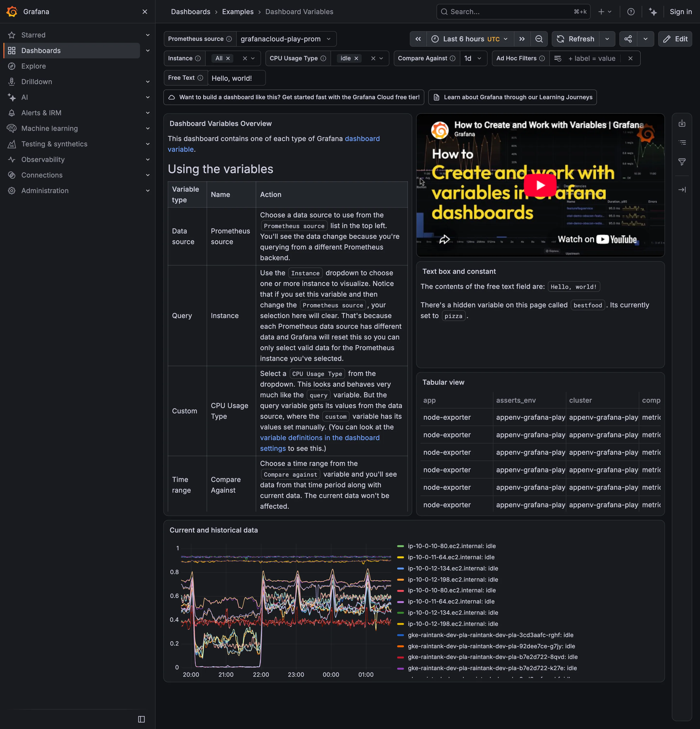
The chart has twelve lines. The legend has twelve swatches. Somewhere around the seventh, two of them are close enough that the viewer stops trusting the mapping and starts guessing.
Solution
A fixed ordered palette of qualitatively distinct hues, assigned deterministically, with a hard limit and a plan for what happens past it.
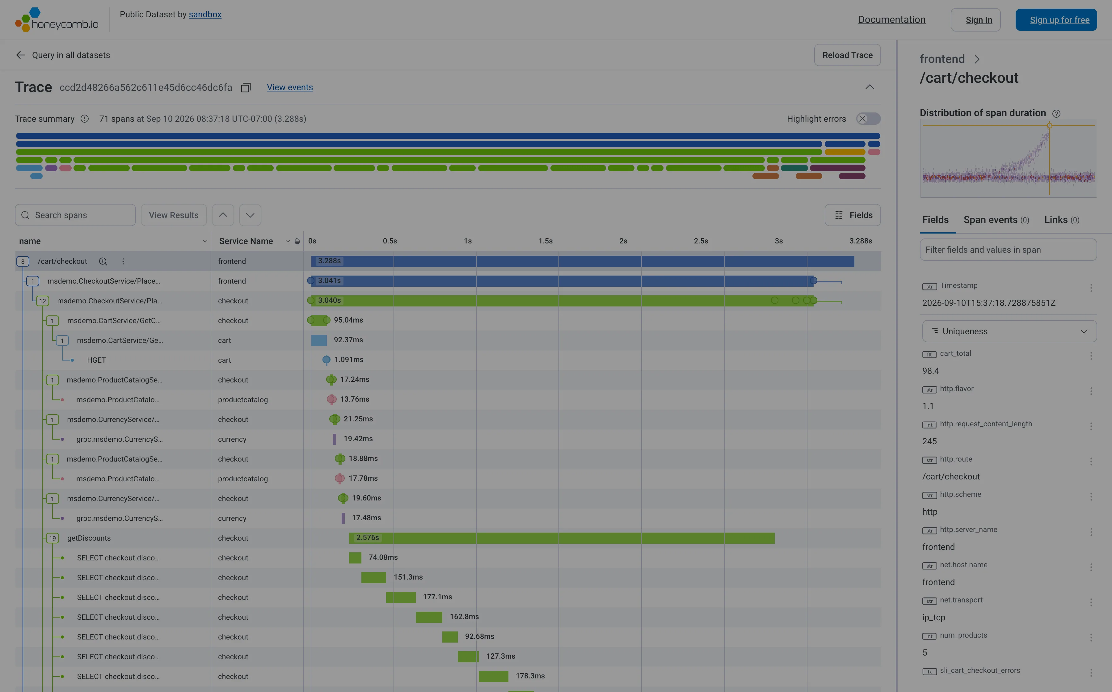
The number people can actually distinguish is smaller than any palette suggests. Somewhere between six and eight is the practical ceiling for hues that must be matched against a legend across a distance. Past that, colour stops identifying and starts merely decorating, and the honest responses are to group into an “other”, switch to small multiples, or use direct labelling instead of a key.
Three requirements decide whether a palette survives contact with real data.
Distinguishable for colour vision deficiency. Around one in twelve men and one in two hundred women have some form, most commonly red-green. A palette with red and green as adjacent series is unreadable for a meaningful slice of any audience, and this is the single most common failure. ColorBrewer’s qualitative schemes remain the best starting point precisely because they were built around this constraint rather than around looking pleasant.
Distinguishable when small and thin. A one-pixel line carries far less colour information than a legend swatch. Colours that separate cleanly as blocks converge as strokes, which is why palettes designed on filled shapes fail on line charts.
Stable assignment. If colour is assigned by query result order, a series that disappears shifts every colour after it, and the viewer’s learned mapping breaks silently. Assignment should hash from the series name or come from an explicit override, so checkout is the same colour today and next week and on the other dashboard.
WCAG’s rule applies here as everywhere: colour cannot be the only carrier. On a dense chart the practical answer is direct labelling at the line’s end, which removes the legend round-trip entirely.
Use when
Several series share one chart, the categories are unordered, and viewers need to track individual series across panels or over time.
Don’t use when
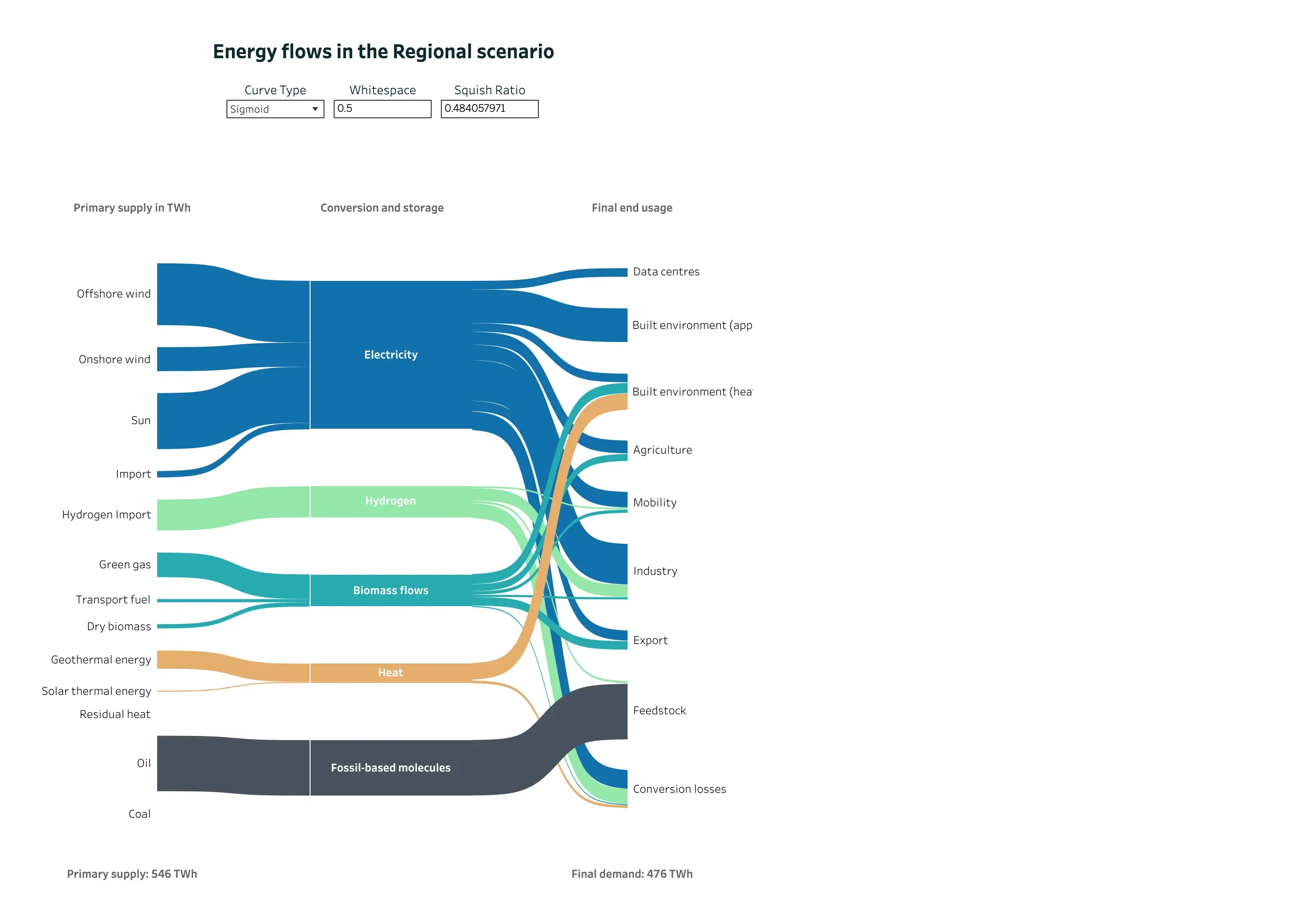
The categories have an order or a magnitude, where a sequential ramp encodes more. Or when the count is beyond what anyone can distinguish, which is the case more often than palettes admit.
Trade-offs
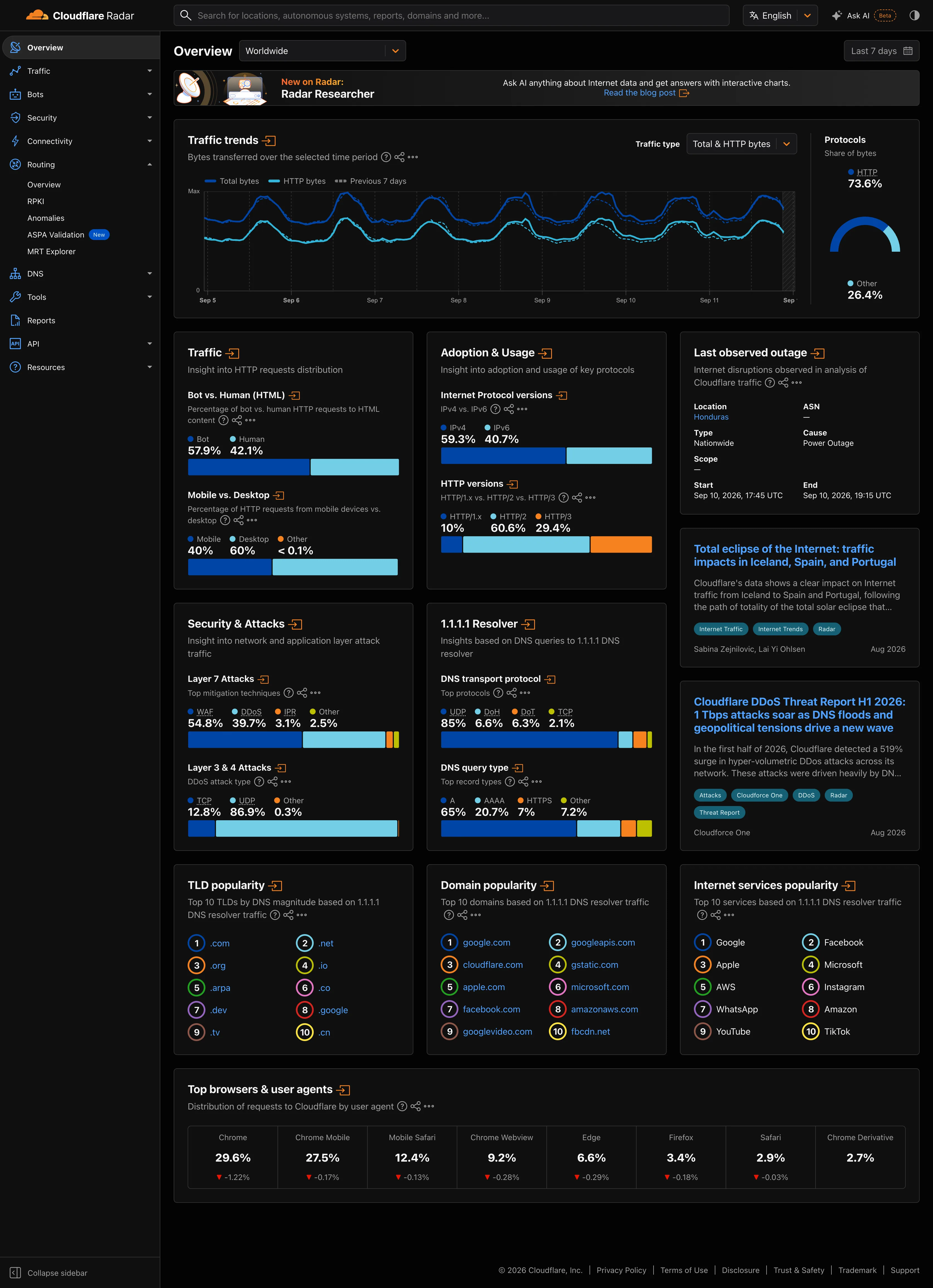
Every colour spent on a series is unavailable for status, which is the collision that quietly ruins monitoring pages: a chart whose series happen to be red and green sitting beside tiles where red and green mean failure and health. Palettes look different on dark and light themes and usually need separate tuning. Brand palettes are rarely built for data and frequently offer three hues and a lot of tints. And the more series a chart carries, the more the palette is papering over a chart that should have been split.
Checklist
- How many series can appear here at most, and does the palette cover that?
- Do any two adjacent-in-value series share similar hues?
- Does the palette survive the common colour vision deficiencies?
- Do the colours separate as thin lines, not just as legend swatches?
- Is colour assigned deterministically from the series name, or by result order?
- Does the same category get the same colour on every panel and dashboard?
- Do any series colours collide with the status palette?
- Is there a defined behaviour past the palette’s limit?
- Would direct labelling remove the need for a legend entirely?
- Does the palette have a tested dark-theme variant?
Compare
ColorBrewer is still the reference, because Cynthia Brewer’s schemes were designed against colourblind-safe, print-safe and photocopy-safe criteria rather than aesthetics, and its qualitative sets remain the best default anyone can adopt in an afternoon. Grafana ships a classic palette assigned by series order in many panels, with per-series overrides available, which means dashboards drift in colour meaning as queries change unless someone pins them. Datadog hashes series colours from tag values so the same tag keeps its colour across widgets, which is the behaviour worth copying. Observable Plot and D3 default to well-researched schemes and make the limit explicit by forcing a decision when the category count exceeds the scheme.
Related
Dark-first data palette covers the theme problem this pattern inherits. Legend and series toggle is the mechanism that makes a large palette bearable. Semantic status color is the palette this one must not collide with. Small multiples is the answer once the series count outruns the colours. Sequential and diverging scales is the right choice when the categories turn out to have an order.