Skip to content
KONIGI

Dashboards / Visual representation / Sankey and path

15 of 22

Sankey and path

Quantity flows from sources to destinations and the viewer needs to see the split.

Updated September 10, 2026

Problem

Four thousand people landed on the pricing page. A funnel says how many reached checkout. It does not say that eight hundred went to the docs first, or that the ones who did converted at three times the rate.

Solution

Draw the flow. Nodes are states, links are movements between them, and link width encodes volume. The eye follows the thick bands and the branching is visible rather than inferred.

The pattern’s ancestry is worth knowing because it explains the encoding. Sankey diagrams come from engineering, where they were used to show energy and material flows and where conservation held: what enters a node leaves it. That conservation is what makes width readable as quantity, and it is also what most product analytics violate, because people leave, sessions expire, and requests time out. A flow diagram whose bands do not conserve needs an explicit “exit” or “drop” destination, or the widths quietly stop adding up.

Where a funnel says how many survived each step, a Sankey says which route they took, and that difference matters exactly when the route varies. The interesting output is usually a path nobody designed: a loop back to search, a detour through help, a retry that succeeds.

Layout is the hard engineering problem. Node ordering within a column determines how many links cross, and crossings are what turn the diagram from legible to decorative. Good implementations minimise crossings and keep the ordering stable between renders, because a diagram that reshuffles on refresh cannot be learned.

Use when

The path branches, the branching is the question, and there are few enough distinct routes to draw. Attribution, user journeys, request routing, cost allocation, energy and material flow.

Don’t use when

The sequence is fixed, where a funnel is clearer and cheaper. Or when the paths are long-tailed: real user journeys have thousands of distinct routes, and a diagram of the top eight plus “other” is either a lie by omission or an unreadable hairball.

Trade-offs

Sankeys are the most impressive-looking chart in this collection and one of the least often necessary, which is a dangerous combination in a stakeholder review. Reading exact values off a band is near-impossible, so they answer “roughly where” and never “how many”. They need space, and shrunk into a dashboard panel they become texture. Crossing links degrade legibility fast. And truncating the long tail into “other” often hides precisely the surprising route the diagram was built to find.

Checklist

  • Do the flows conserve, and if not, is there an explicit exit node?
  • How many distinct paths exist, and what fraction is shown before “other”?
  • Does “other” carry a count, so the viewer can size what is hidden?
  • Are crossings minimised, and is node order stable between refreshes?
  • Can the viewer get an exact number for a band?
  • Is the direction of flow unambiguous?
  • Does colour encode anything, or is it decoration?
  • Is there a minimum band width below which a path is dropped, and is that stated?
  • Would a funnel or a table answer this question with less machinery?
  • Does the diagram still work at the panel size it will actually render at?

Compare

Amplitude and Mixpanel offer path analysis where the Sankey is generated from event streams and each node is clickable into the underlying users, which turns a picture into a starting point. Google Analytics has shipped several versions of a flow report over the years and each has struggled with the same long-tail problem, which is a useful demonstration that this is inherent rather than an implementation failure. Grafana has no core Sankey panel and relies on community plugins, so it appears on dashboards rarely and usually as a one-off. Datadog applies the encoding to service dependencies and request routing rather than to people, where conservation actually holds better and the node set is bounded.

Funnel is the simpler pattern for a fixed sequence and usually the right answer. Service map shows the same relationships as topology rather than as volume. Stacked composition is the static part-to-whole version. Drill-down is what a node click owes the viewer. Cohort grid is where you go when the question turns from route to time.
Sankey and path anatomy Flow from one entry point through two columns of states, with link width carrying volume. An explicit exit node absorbs everyone who left, so the widths still add up, and one band loops back to search, which is the route nobody designed. Width is volume, and it has to conserve landing browse help left cart left 1 2 3 1 LINK WIDTH The encoding comes from engineering, where what enters a node leaves it. That conservation is what makes width readable as quantity. 2 AN EXIT NODE Which product analytics violates constantly, because people leave. With nowhere for them to go, the widths quietly stop adding up. 3 THE ROUTE NOBODY DESIGNED Where a funnel says how many survived each step, this says which way they went, and that matters exactly when the route varies. Everyone who detoured through help reached the cart, and the funnel had no column for them. Node ordering within a column decides how many links cross, and crossings are what turn the diagram from legible into decorative.
Wireframe — the pattern's anatomy, not any one product's version of it

Implementation

Flow where the band width is the volume. Worth it when the branching is the question and expensive when it is not, because a Sankey with more than a few nodes becomes a plate of spaghetti nobody reads twice.

Tokens
--foreground--card--muted-foreground--border--status-warn--chart-1
landing → browse: 2,260landing → help: 700browse → cart: 1,365help → cart: 700landing → left: 1,040browse → left: 895landing: 4,000landingbrowse: 2,260browsehelp: 700helpcart: 2,065cartleft: 1,040leftleft: 895left

Sankey.tsxLays out columns from data, scales band width to volume, and sends whatever a node fails to pass on to a computed exit node so the widths conserve.

/**
 * Width is volume, and it has to conserve. What enters a node leaves it, or
 * the widths stop meaning anything, so any node whose outflow is short of its
 * inflow gets the remainder sent to an exit node in the next column. The
 * exit is computed rather than optional: product flows leak people, and the
 * diagram has to say where.
 */
export type Node = {
  id: string;
  label: string;
  column: number;
  /** What entered a node that has no inbound links, so its leak can be computed too. */
  value?: number;
};
export type Link = { from: string; to: string; value: number };

const NODE_W = 14, GAP = 14, PAD = 30;

export function Sankey({ nodes, links, exit = "left", highlight, width = 440, height = 250, onSelect }: {
  /** In display order within each column. Keep the order stable between renders so the diagram can be learned. */
  nodes: Node[];
  links: Link[];
  /** Label for the computed exit node. */
  exit?: string;
  /** A node whose bands are drawn as the route worth looking at. */
  highlight?: string;
  width?: number;
  height?: number;
  onSelect?: (link: Link) => void;
}) {
  const inflow = (n: Node) => links.filter((l) => l.to === n.id).reduce((s, l) => s + l.value, 0) || n.value || 0;
  const outflow = (id: string) => links.filter((l) => l.from === id).reduce((n, l) => n + l.value, 0);

  // Conservation: send whatever leaks out of a node to an exit in the next column.
  const cols = Math.max(...nodes.map((n) => n.column)) + 1;
  const all: Node[] = [...nodes], flows: Link[] = [...links];
  for (const n of nodes) {
    const lost = inflow(n) - outflow(n.id);
    if (n.column === cols - 1 || lost <= 0) continue;
    const id = `${exit}:${n.column + 1}`;
    if (!all.some((x) => x.id === id)) all.push({ id, label: exit, column: n.column + 1 });
    flows.push({ from: n.id, to: id, value: lost });
  }
  const size = (id: string) => Math.max(
    flows.filter((l) => l.to === id).reduce((n, l) => n + l.value, 0),
    flows.filter((l) => l.from === id).reduce((n, l) => n + l.value, 0),
  );
  const r = (v: number) => +v.toFixed(1);

  // Stack each column, scaled so the tallest column fills the height.
  const byCol = Array.from({ length: cols }, (_, c) => all.filter((n) => n.column === c));
  const scale = Math.min(...byCol.map((col) => (height - 2 * PAD - GAP * (col.length - 1)) / col.reduce((n, x) => n + size(x.id), 0)));
  const x = (c: number) => PAD + 40 + (c * (width - 2 * PAD - 60 - NODE_W)) / (cols - 1);
  const pos: Record<string, { x: number; y: number; h: number; out: number; in: number }> = {};
  byCol.forEach((col, c) => {
    let y = PAD;
    for (const n of col) { const h = size(n.id) * scale; pos[n.id] = { x: x(c), y, h, out: y, in: y }; y += h + GAP; }
  });

  const isExit = (id: string) => id.startsWith(`${exit}:`);
  const band = (l: Link) => {
    const a = pos[l.from], b = pos[l.to], h = l.value * scale;
    const y0 = a.out, y1 = b.in;
    a.out += h; b.in += h;
    const x0 = a.x + NODE_W, x1 = b.x, cx = (x0 + x1) / 2;
    return `M${x0} ${r(y0)} C${cx} ${r(y0)} ${cx} ${r(y1)} ${x1} ${r(y1)} L${x1} ${r(y1 + h)} C${cx} ${r(y1 + h)} ${cx} ${r(y0 + h)} ${x0} ${r(y0 + h)} Z`;
  };

  return (
    <svg width={width} height={height} viewBox={`0 0 ${width} ${height}`} role="img" aria-label="flow between states, band width is volume" className="block max-w-full">
      {flows.map((l) => (
        <path key={`${l.from}>${l.to}`} d={band(l)} onClick={onSelect && (() => onSelect(l))}
          className={isExit(l.to) ? "fill-muted-foreground/30" : l.from === highlight || l.to === highlight ? "fill-status-warn/50" : "fill-chart-1/40"}>
          <title>{`${all.find((n) => n.id === l.from)!.label} → ${all.find((n) => n.id === l.to)!.label}: ${l.value.toLocaleString("en-GB")}`}</title>
        </path>
      ))}
      {all.map((n) => {
        const p = pos[n.id], right = isExit(n.id), first = n.column === 0;
        const [bar, label] = right ? ["fill-muted-foreground", "fill-muted-foreground"]
          : n.id === highlight ? ["fill-status-warn", "fill-status-warn"]
          : ["fill-chart-1", "fill-foreground"];
        return (
          <g key={n.id}>
            <rect x={p.x} y={r(p.y)} width={NODE_W} height={r(p.h)} className={bar}><title>{`${n.label}: ${size(n.id).toLocaleString("en-GB")}`}</title></rect>
            <text
              x={right ? p.x + NODE_W + 8 : first ? p.x - 8 : p.x}
              y={r(right || first ? p.y + p.h / 2 + 3 : p.y - 8)}
              textAnchor={first ? "end" : "start"}
              className={`text-[9px] ${label}`}
            >{n.label}</text>
          </g>
        );
      })}
    </svg>
  );
}

demo.tsxHow it is called: landing to browse or help to cart, with the leaks computed and the detour through help highlighted.

import { Sankey } from "./Sankey";

/**
 * Four thousand people landed on the pricing page. The links only say where
 * people went; the exits are computed from what each node failed to pass on.
 * Help is highlighted because everyone who detoured through it reached the
 * cart, and the funnel had no column for them.
 */
export default function Demo() {
  return (
    <div className="w-fit rounded-lg border bg-card p-4">
      <Sankey
        nodes={[
          { id: "landing", label: "landing", column: 0, value: 4000 },
          { id: "browse", label: "browse", column: 1 },
          { id: "help", label: "help", column: 1 },
          { id: "cart", label: "cart", column: 2 },
        ]}
        links={[
          { from: "landing", to: "browse", value: 2260 },
          { from: "landing", to: "help", value: 700 },
          { from: "browse", to: "cart", value: 1365 },
          { from: "help", to: "cart", value: 700 },
        ]}
        highlight="help"
        onSelect={(l) => console.log(l)}
      />
    </div>
  );
}
What it renders. Identical markup in both panes, with only the token values changing.

Examples

Captures whose hotspots reference this pattern, grouped by product and dated. The dashed boxes are this pattern; hover any box for the note.

Tableau Public

Thousands of dashboards made by people who are not designers, published without a review step. The best available sample of what the pattern language looks like in the wild.

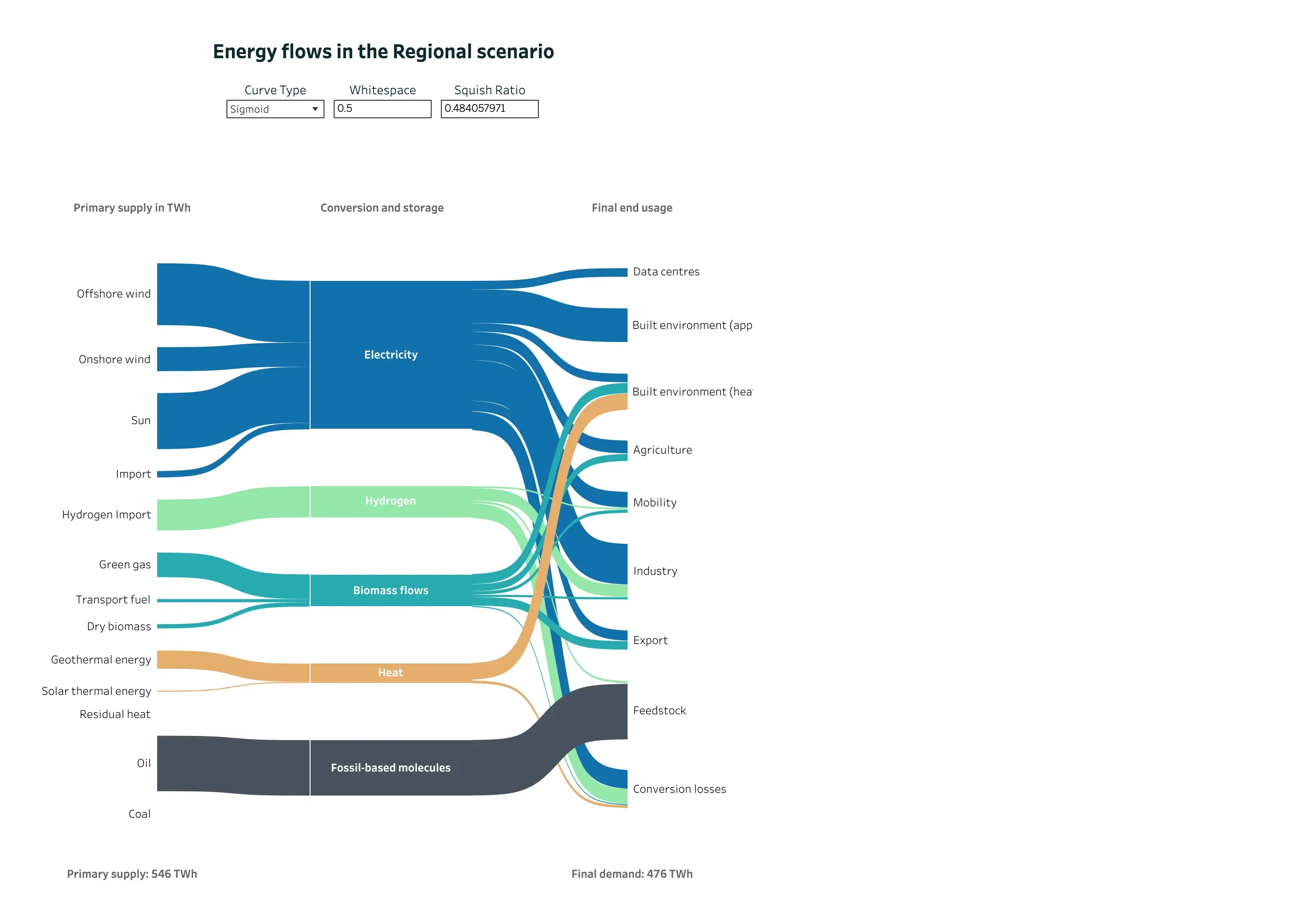
Energy flows in the Regional scenario September 11, 2026 Tableau Public embed view; workbook published by Chia Yu Lin medium · light · desktop-web
A Sankey doing the job it was invented for, published by an analyst rather than designed by Tableau. The entry argues that the form comes from engineering, where what enters a node leaves it, and that conservation is what makes band width readable as quantity—and that product analytics breaks it because people leave and nothing accounts for them. Here conservation holds and is stated: primary supply 546 TWh at the bottom left, final demand 476 TWh at the bottom right, and the missing 70 TWh has its own destination node called Conversion losses. Nothing disappears off the edge of the diagram. Colour is doing identity rather than status—blue for electricity, green for hydrogen, teal for biomass, orange for heat—and it stays consistent across all three columns, so a carrier can be traced from supply to end use without a legend. The one oddity is that the author has exposed the layout parameters as live controls, including a squish ratio printed to nine decimal places.
  • Sankey and path Three columns of nodes, link width as volume, and crossings kept to the few places where a carrier genuinely switches rank.
  • Sankey and path Conversion losses as an explicit destination. This is the node product analytics leaves out, and the reason its widths stop adding up.
  • Ratio and rate 546 TWh in, 476 TWh out, both stated. The diagram's own arithmetic is checkable from the page.
  • Categorical series palette Five carriers, five hues, held constant across every column so a band can be followed end to end.
  • Dashboard builder Curve type, whitespace and squish ratio exposed as reader-facing controls. The last one reads 0.484057971.