Problem
Retention is 34%. That number is compatible with a product that is steadily improving and one that is steadily rotting, because it averages together people who joined two years ago with people who joined last week.
Solution
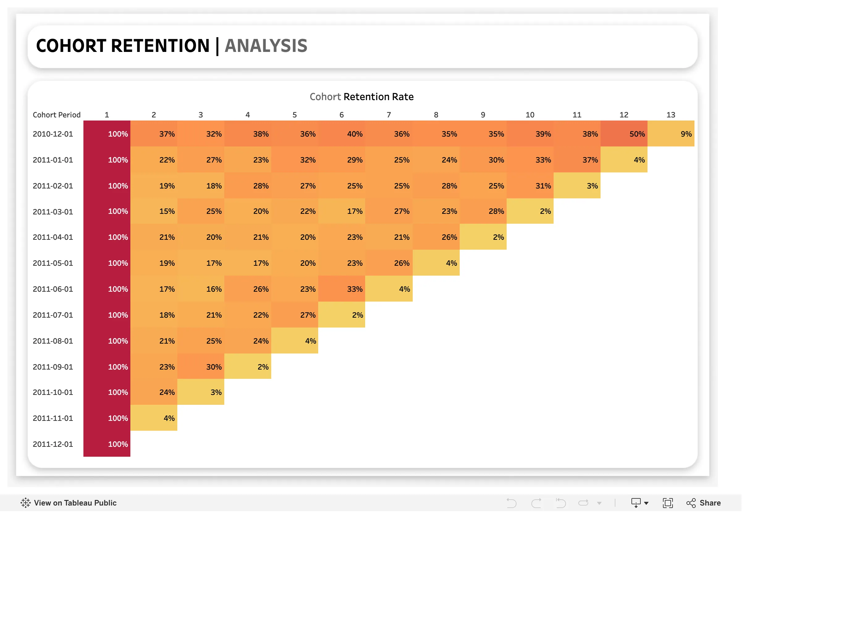
Group people by when they arrived, then follow each group forward. One row per cohort, one column per period since joining, each cell holding the share still active. Colour the cells so the grid reads as a shape.
The layout produces a triangle, and the triangle is what makes it work. Older cohorts have more columns filled because more time has passed; the newest cohort has only its first cell. Reading is two-directional and each direction answers a different question.
Across a row is the decay curve for one cohort: how fast that particular group fell away, and whether it flattened into a stable base or kept dropping.
Down a column is the comparison that actually matters, and it is the reason this beats a line chart. Column three holds every cohort’s week-three retention, which means product changes become visible: if the last four cohorts have a better week three than the four before them, something you shipped worked. A single averaged retention number cannot show that, because it mixes cohorts at different ages.
The shape people look for is a flattening curve. Retention that declines and then plateaus means a real base of returning users. Retention that keeps declining through every column means the product is a leaky bucket regardless of how good acquisition looks.
Use when
Usage is repeat-visit by nature, the population is large enough for percentages to be stable, and you need to know whether changes are working rather than only how things stand.
Don’t use when
The product is genuinely one-and-done, where retention is the wrong question. Also avoid it with small cohorts: a row of forty people produces percentages that swing on a handful of individuals and read as signal.
Trade-offs
Cohort grids are dense and take teaching. Someone seeing one for the first time reads the triangle as missing data rather than as elapsed time. The newest cohorts, which are the ones you most want to judge, have the fewest cells and the least evidence, so the grid is structurally worst at answering the most urgent question. Cohort size varies down the rows, so a percentage in a row of 80 and one in a row of 8,000 look identical and are not comparable. And the definition of “active” carries the whole result while sitting nowhere on the chart.
Checklist
- What defines the cohort—signup date, first purchase, first meaningful action?
- What counts as retained in a period, and is that definition visible?
- Are cohort sizes shown alongside the percentages?
- Is there a minimum cohort size below which cells are suppressed?
- Are period buckets days, weeks or months, and do they match the product’s natural rhythm?
- Does the colour scale run over a range that makes real differences visible?
- Can the viewer read down a column easily, or does the layout only support rows?
- Does anything mark when a significant product change shipped?
- Is the newest cohort visually distinguished as incomplete?
- Would the same data as a set of decay curves communicate better to this audience?
Compare
Amplitude and Mixpanel treat the grid as interactive analysis: cohort definition, retention event and period granularity are all controls, and the grid recomputes, which is what makes it a tool rather than a report. Looker and similar BI tools express it as a pivot with conditional formatting, so the analysis lives in SQL and the grid is presentation—flexible, and easy to build subtly wrong. Grafana has no cohort concept; the nearest thing is a heatmap over a query someone shaped into cohort-by-period, which works and gives up the row and column semantics that make the pattern readable. GitHub’s contribution graph is worth naming as the cousin that made this cell-grid reading habit mainstream, even though it plots calendar time rather than cohort age.
Related
Funnel is the same drop-off question compressed into one sequence with time removed. Calendar heatmap uses the same cell-grid encoding against calendar time. Heatmap is the general form. Compare periods is the coarser way to ask whether things are improving. Sequential and diverging scales governs whether the colour ramp reveals or flattens the differences.