Problem
Ten thousand requests happened this minute. Drawn as points they are a smear; reduced to an average they are a single line that describes none of them. The viewer needs to see the shape of the population and how that shape moves.
Solution
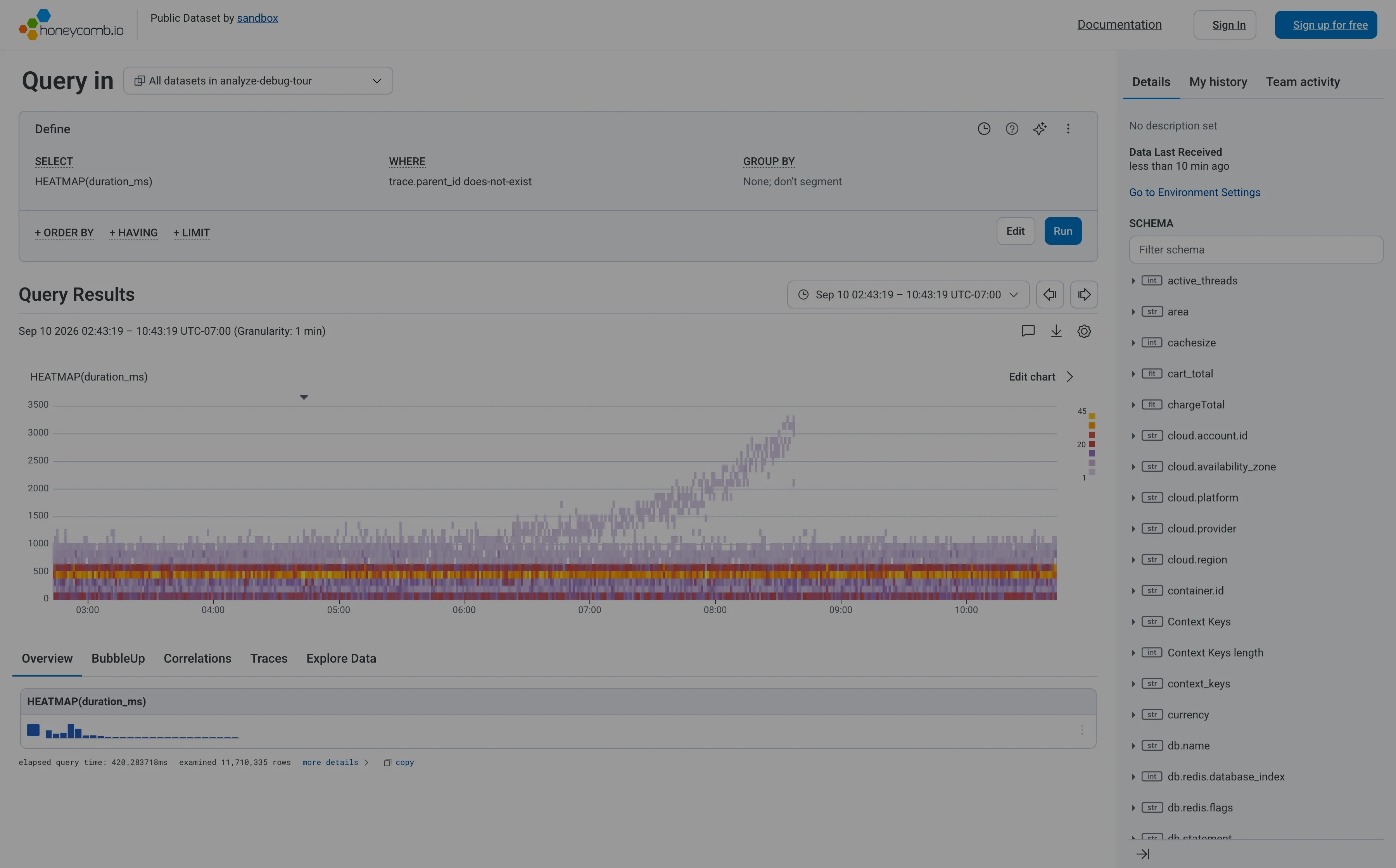
Bucket on both axes and encode the count as colour. Time across the bottom, the measured value up the side, and each cell coloured by how many events landed in it. What was an unreadable scatter becomes a band, and the interesting thing is usually that there are two bands rather than one.
That last part is why the pattern exists. A percentile line reports a position in the distribution and cannot show you that the distribution has two humps—a fast path and a slow path, cache hit and cache miss. The heatmap shows both, and shows one of them growing.
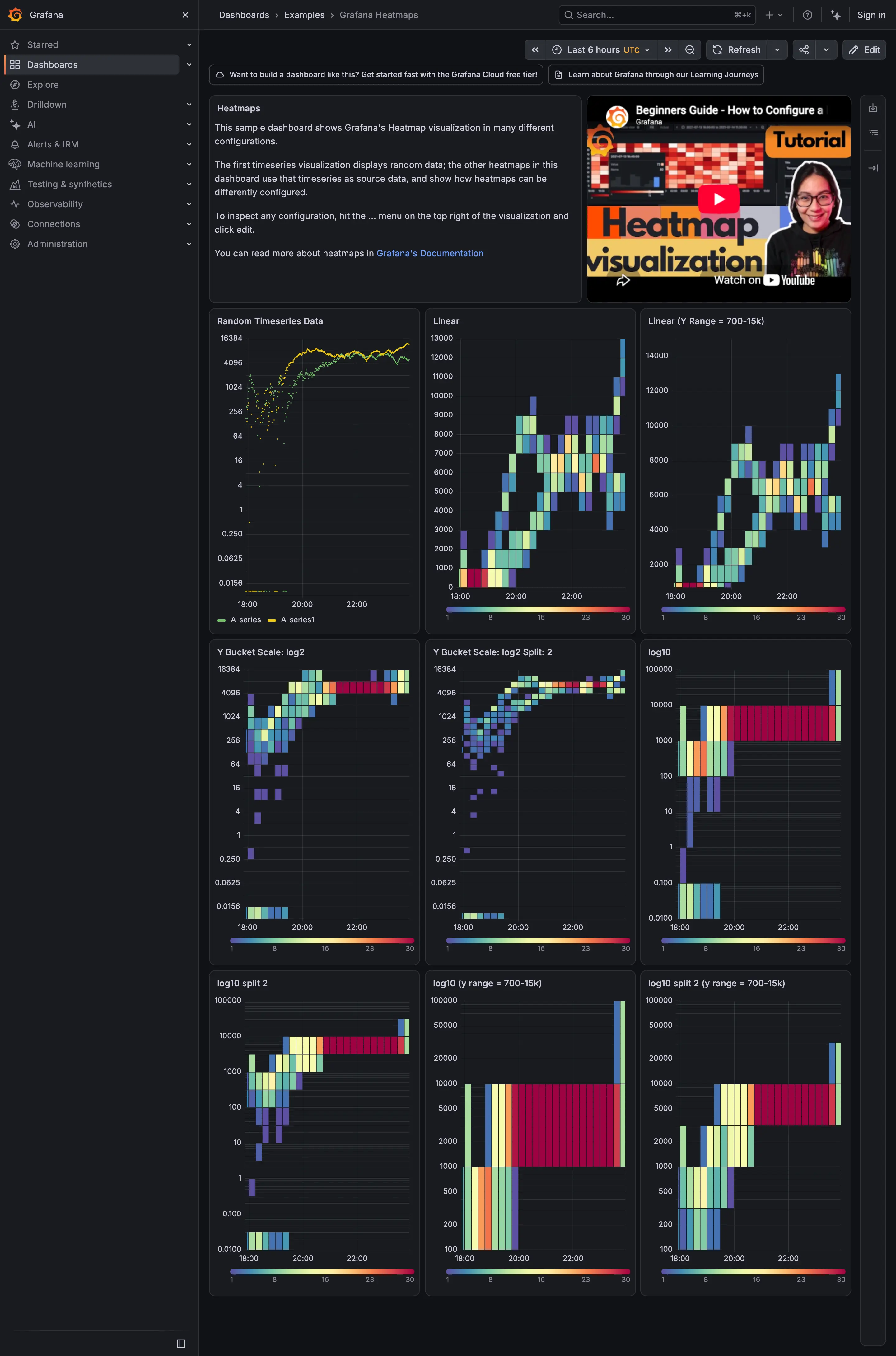
The configuration that decides whether it works is the y-axis bucketing. Grafana exposes it plainly: buckets are either pre-computed by the data source or Calculate from data in the panel, and the y scale is Linear, Logarithmic with base 2 or 10, or Symlog. Latency distributions are heavily skewed, so a linear y-axis crushes almost everything into a band at the bottom and leaves most of the panel empty. Log buckets spread the same numbers out and the structure appears. Honeycomb makes the same argument the other way round, from outliers: a log scale is how you stop a handful of enormous values from flattening everything else into one row.
Colour is the second decision. Grafana offers Scheme, where the bucket count drives the colour, and Opacity, where it drives transparency, plus Start color scale from value and End color scale at value for clamping. Clamping is what stops one catastrophic cell from consuming the whole ramp and turning every other cell the same shade of nothing.
Use when
The volume is high enough that individual events can’t be drawn, the distribution matters more than its summary, and the question is about shape over time.
Don’t use when
The volume is low. A heatmap over forty events is a sparse grid of near-identical cells, and a scatter plot would show the same thing with less machinery. Also avoid it when the audience reads the page from ten feet away—colour density needs a close look.
Trade-offs
Heatmaps take longer to learn than lines, and a viewer who hasn’t been taught to read one will see decoration. Exact values are gone: a cell says “many” and not “how many”, so the panel usually needs a hover or a companion table. Two heatmaps side by side are only comparable if they share a colour scale, and by default they don’t. And bucket boundaries are as consequential here as in a histogram while being even less visible, because the y-axis labels describe the edges of a grid nobody thinks of as buckets.
Checklist
- Are the y buckets linear or log, and does the choice suit a skewed distribution?
- If log, base 2 or base 10, and does the labelling make the base obvious?
- Where do bucket boundaries fall relative to the values people care about?
- Is the colour scale shared with any neighbouring heatmap, and if not, is that stated?
- Is the scale clamped, and does one extreme cell dominate the ramp if it isn’t?
- Does the colour ramp survive the viewer’s colour vision, and does it survive greyscale printing?
- Can the viewer get from a dense region to the underlying events?
- What does an empty cell look like, and can it be confused with a low-count cell?
- Is a companion percentile or count available for people who need a number?
- Does the panel say what one cell represents, in both axes?
Compare
Grafana treats it as a panel with a lot of knobs—bucket source, three y-scale families, two colour modes, clamps at both ends—which makes it the most configurable version and the easiest to leave on defaults that hide the data. Honeycomb builds its whole analysis loop on top of it: draw a box around the interesting region and BubbleUp compares the events inside against the baseline outside, so the heatmap is a selection surface rather than a picture. Datadog offers it as a distribution view alongside percentile lines, which lets a team keep the line they already trust and check it against the shape when it disagrees. Netdata mostly declines the pattern, because per-second resolution on ordinary charts already shows detail that other tools only recover by bucketing.
Related
Histogram is one vertical slice of a heatmap, and the better choice when time doesn’t matter. Percentile summary is the same distribution reduced to numbers, and the pattern most often replaced by this one. Time series is what a heatmap becomes when the population collapses to a single value per interval. Sequential and diverging scales governs the colour ramp. Small multiples is what the Grafana heatmap examples above are actually demonstrating: hold the data still, change one setting, and read across.