Problem
Twelve services, one metric each. On one chart that is twelve lines and a legend nobody reads. On twelve dashboards it is twelve page loads and no comparison at all.
Solution
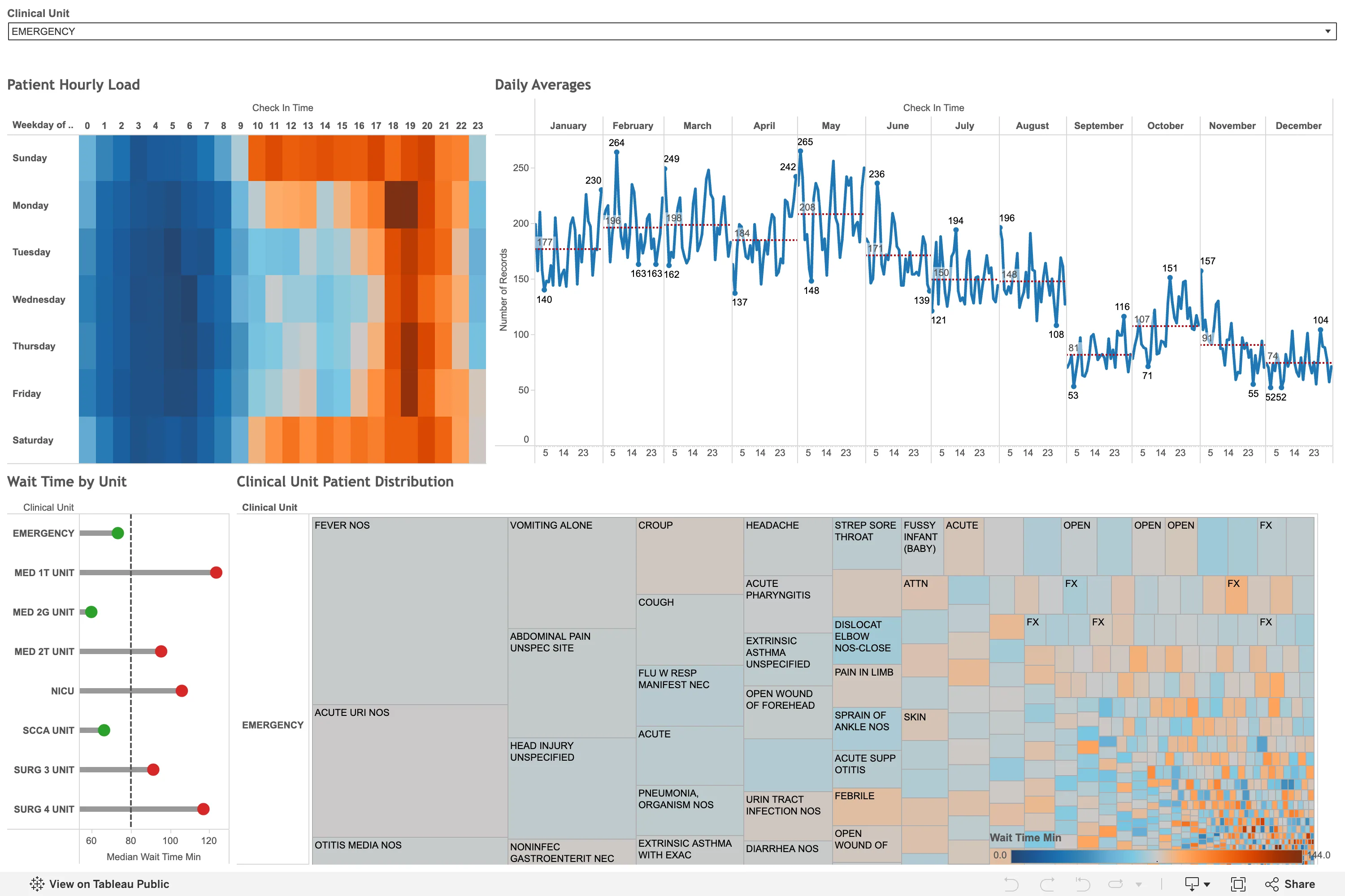
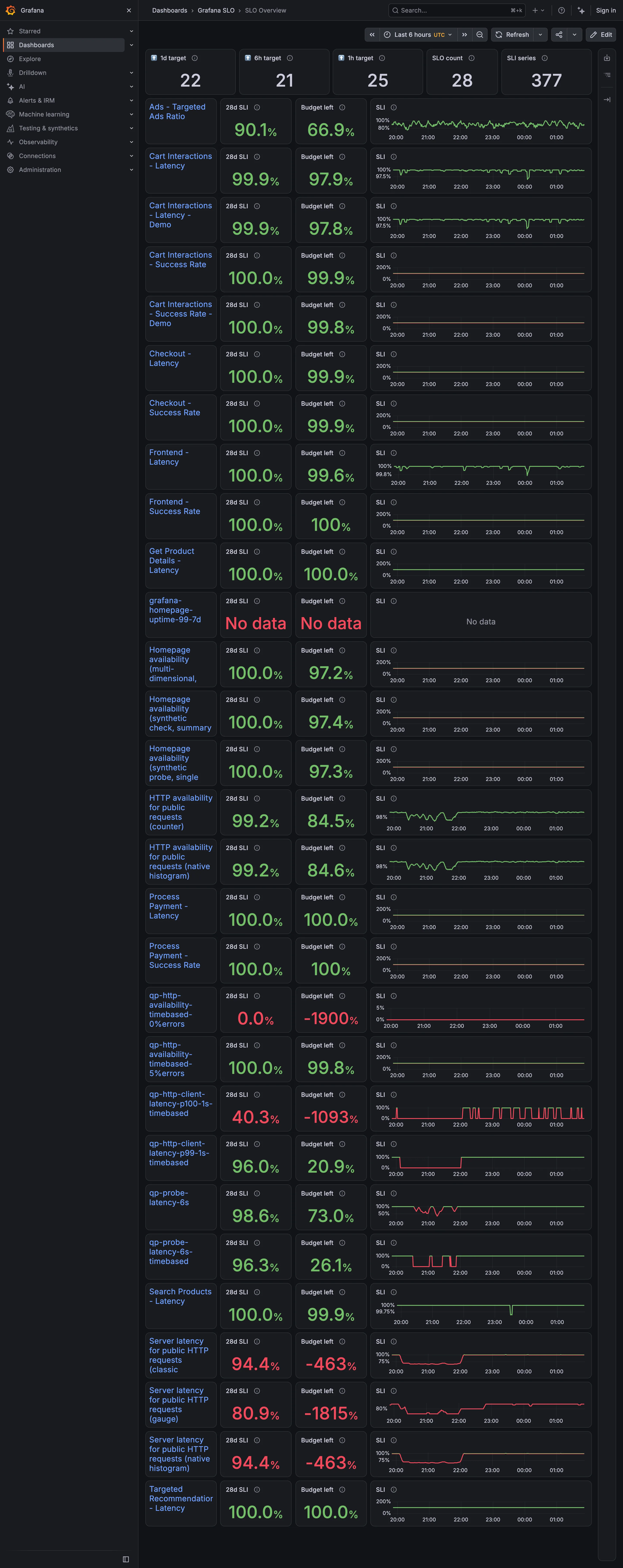
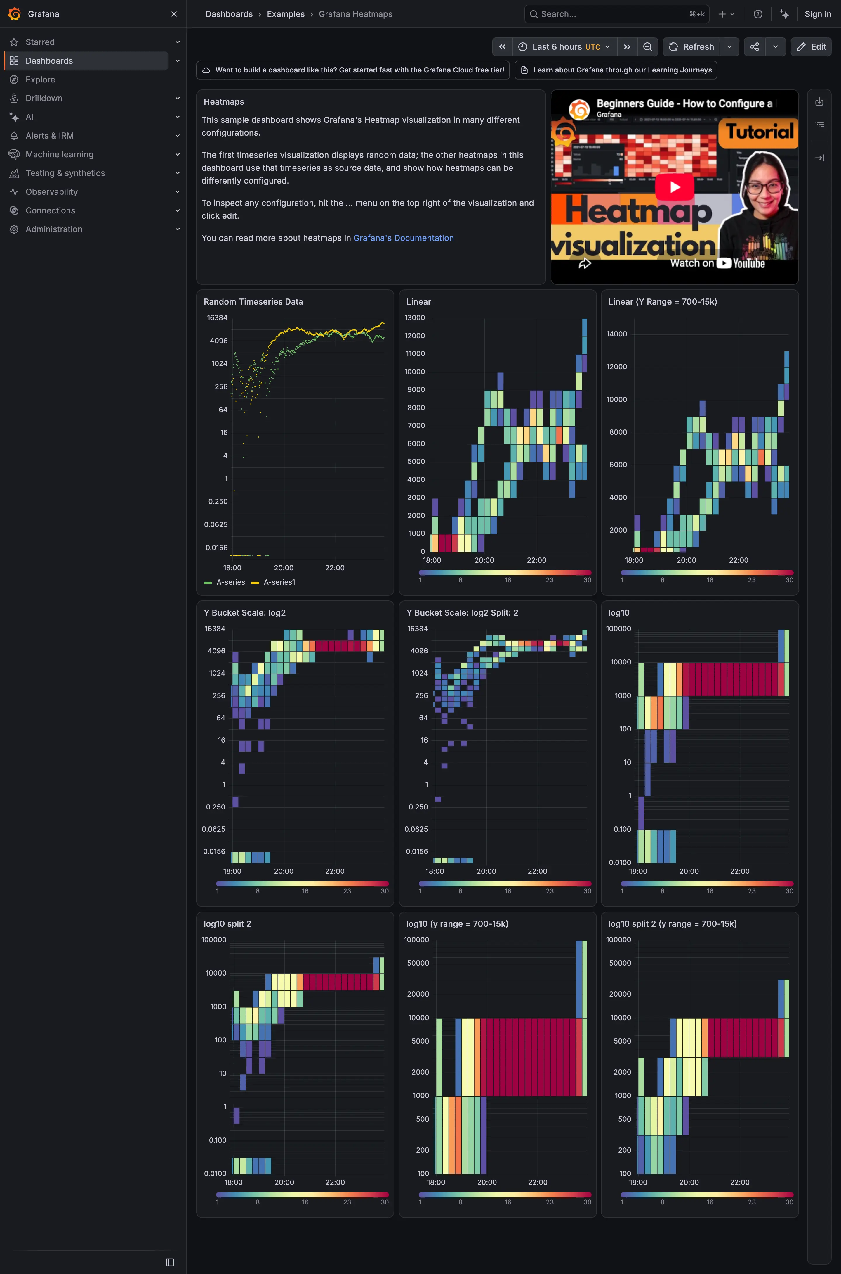
Repeat the same chart once per category, identical in every respect except the data. Same axes, same scale, same size, same colour, arranged in a grid. The viewer learns to read one chart and then reads all twelve for free.
The mechanism is worth stating precisely because it explains every rule that follows. Comparison becomes shape recognition. Once the encoding is constant, the eye does not decode each panel independently; it registers the one whose outline differs. That is a fundamentally cheaper operation than tracing a line through a tangle and matching it to a legend colour.
Everything that breaks the pattern breaks that mechanism.
Independent y-scales are the main offender. Autoscaling each panel to its own data makes every chart look equally eventful, and a service idling between 2 and 3 requests per second draws the same dramatic peaks as one saturating. If panels are meant to be compared, the scale must be shared, and if it genuinely cannot be, the panels should be visibly separated so nobody compares them by accident.
Order should mean something. Alphabetical is a default, not a decision. Sorting by magnitude, by deviation, or by a stable grouping puts the interesting panel where the eye lands.
Consistency includes colour. If each panel colours its series differently, the viewer has to check the legend twelve times and the free comparison is gone.
Grafana’s repeat-by-variable feature is the pattern automated: define one panel, repeat it across a template variable’s values, and the grid maintains itself as instances come and go. That last part matters more than the convenience, because a hand-built grid of twelve goes stale the moment there are thirteen.
Use when
Categories are parallel and comparable, the count is more than about four and less than a few dozen, and the question is which one differs.
Don’t use when
The categories are not comparable, or the count is very small—three panels is three panels, not a pattern. Above a few dozen the individual charts stop being readable and you are into dense small-multiple layout, which is a different design with a different audience.
Trade-offs
Small multiples spend a lot of space to make one comparison easy, and each panel is necessarily small, so within-panel detail is lost. They handle only one metric at a time: comparing twelve services on latency and errors means two grids or a compromise. Query cost multiplies by the panel count. And the shared-scale requirement fights the data whenever one category dwarfs the others, at which point either the small ones flatline or the large one is clipped.
Checklist
- Do all panels share a y-scale, and if not, is that visually obvious?
- Is the panel order meaningful, or alphabetical by default?
- Is the encoding identical across panels, including colour?
- Is each panel labelled clearly enough to identify without hunting?
- How many panels before individual charts stop being readable?
- Is the grid generated from the data, so new categories appear automatically?
- What happens when one category dwarfs the rest?
- How many queries does the grid fire, and how does it load?
- Is there a way to see one panel larger without leaving the comparison?
- Would a single chart with a good legend actually serve better here?
Compare
Grafana automates the pattern with panel repeat over a template variable, so the grid tracks the data rather than a snapshot of it, and leaves the shared-scale decision to whoever remembers to set it. Netdata produces small multiples as a by-product of its per-dimension charting, at a density that pushes past comparison into the dense-layout territory covered separately. Datadog offers a split-graph mode that facets a single graph by tag, which is the same idea reached from the chart rather than from the dashboard. Observable and ggplot2 are where faceting is a first-class grammar concept rather than a dashboard feature, and their default of a shared scale is a quietly better decision than most dashboard tools make.
Related
Dense small-multiple layout is this pattern pushed past legibility on purpose, for an expert audience. Time series is usually the chart being repeated. Legend and series toggle is the alternative when the series stay on one chart. Template variable is what generates the grid. Panel grid is the layout system underneath.