Skip to content
KONIGI

Dashboards / Screenspace / Panel grid

5 of 6

Panel grid

Many independent panels need to share one screen without fighting for it.

Updated September 10, 2026

Problem

Twenty panels, one screen, and no two of them want the same dimensions. A latency chart needs width to be readable, a status tile needs almost nothing, and a table needs height. Left to itself this becomes a ransom note.

Solution

Impose a coordinate system. A fixed column count, a row unit, and panels that snap to multiples of both. Everything aligns because nothing is allowed not to.

The grid is the reason dashboards look like dashboards. It also carries most of the meaning a viewer picks up before reading anything: things the same size read as equally important, things on the same row read as related, and the top-left panel reads as the answer. That last one is unavoidable, so the only question is whether the panel that lands there deserves it.

A grid is a compromise with two edges. Too few columns and every panel is either too wide or too narrow. Too many and the alignment stops being visible, at which point you have absolute positioning with extra steps. Twelve is the near-universal answer because it divides by 2, 3, 4 and 6, which covers halves, thirds, quarters and sixths without fractions.

The part that separates a grid that helps from one that merely tidies: whether panel size is allowed to mean something. If every panel is the same size, the layout says nothing about priority and the viewer has to read all twenty titles. A grid that lets one panel be four times the size of its neighbours can say “start here” without a word of copy.

Use when

More than a handful of panels share a page and viewers scan rather than read. Which is nearly every dashboard.

Don’t use when

The page has a reading order. A narrative that walks someone through an argument wants a single column, because a grid invites the eye to jump and a narrative depends on it not doing that.

Trade-offs

Grids reward panels that fit the grid, so the layout starts to shape the content: people pick a visualisation because it tiles well rather than because it answers the question. Everything looking equally considered makes it hard to tell a load-bearing panel from one somebody added in 2023 and forgot. Responsive behaviour is where grids fail, because a twelve-column layout reflowing to one column produces an order nobody designed and rarely the priority order. And drag-and-drop editing makes it trivial to create a layout that works on the author’s monitor and nowhere else.

Checklist

  • How many columns, and does the count support the fractions this page needs?
  • Does the top-left panel deserve to be the first thing read?
  • Does panel size encode importance, or is everything the same size by default?
  • Do panels on a row belong together, or did they land there by packing?
  • What order do panels take when the grid collapses to one column?
  • What is the shortest viewport this page is used at, and what falls below the fold there?
  • Is there a minimum size below which a given panel type stops being readable?
  • Do gaps and alignment survive panels with different title lengths?
  • Can an author create a layout that only works at their window size?
  • Is the arrangement stable, or does it reflow differently for different viewers?

Compare

Grafana uses a 24-unit horizontal grid with drag-and-drop sizing and a packing behaviour that pulls panels upward into gaps, which makes editing fast and means moving one panel can rearrange several others. Datadog offers both a fixed grid and a free-form canvas, so a team can choose between consistency and expressive layout, and most eventually regret whichever they picked. Kibana treats panels as cards on a resizable grid with each panel carrying its own query, which pushes coherence entirely onto whoever assembles the page. Honeycomb barely has this pattern: the primary surface is a query and its result, so composition happens in boards that collect saved queries rather than in a canvas of independent tiles.

Collapsible row is how a grid survives past one screen. Dense small-multiple layout is the grid pushed to its limit deliberately. Header KPI strip is the grid’s top row doing a specific job. Resizable card grid is what happens when the viewer, not the author, controls the arrangement. Semantic grouping is the principle that should decide adjacency.
Panel grid anatomy A twelve-column grid with its columns ruled, panels snapping to spans of twelve, six, four and three, and one panel four times the size of its neighbours so the layout says where to start without a word of copy. Twelve columns, one row unit P95 checkout latency 6 columns 3 3 1 2 1 SIZE MEANS SOMETHING A panel four times its neighbours says "start here" without copy. If every panel is the same size, the viewer has to read all twenty titles. 2 WHY TWELVE It divides by 2, 3, 4 and 6, so halves, thirds, quarters and sixths all land on a column line without fractions. Top-left reads as the answer whether you meant it to or not. The only question is whether the panel that landed there deserves it.
Wireframe — the pattern's anatomy, not any one product's version of it

Implementation

A fixed column count with panels spanning it. Twelve columns is the convention because it divides by two, three and four, which covers nearly every row a dashboard needs.

shadcn
npx shadcn@latest add card
Tokens
--card--muted--muted-foreground--border--chart-1
P95 checkout latency6×2
Error rate
Orders per minute
Payment provider
Queue depth
Failing SKUs
Latency by region
Retries
Refunds
Carts abandoned

PanelGrid.tsxTwelve columns as a constant, a panel as a span of them, authored order kept, the selected panel resized a column or a row at a time.

import type { CSSProperties, ReactNode } from "react";
import { Card } from "@/components/ui/card";
import { cn } from "@/lib/utils";

/**
 * A coordinate system, not a layout. Twelve columns because twelve divides
 * by 2, 3, 4 and 6, so halves, thirds, quarters and sixths all land on a
 * column line. Panels say how many they span and the grid does the rest.
 */
export const COLUMNS = 12;

export type Panel = {
  id: string;
  title: string;
  /** Columns of twelve. */
  w: number;
  /** Row units. Size is allowed to mean something: a panel four times its
   *  neighbours says "start here" without copy. */
  h: number;
  children?: ReactNode;
};

const clamp = (n: number, lo: number, hi: number) => Math.max(lo, Math.min(hi, n));

export function PanelGrid({ panels, onChange, selected, onSelect, rowHeight = 48, guides = false }: {
  panels: Panel[];
  onChange: (panels: Panel[]) => void;
  selected?: string;
  onSelect: (id: string) => void;
  rowHeight?: number;
  /** Rule the columns, as an editor does. */
  guides?: boolean;
}) {
  const resize = (id: string, dw: number, dh: number) =>
    onChange(panels.map((p) => (p.id === id ? { ...p, w: clamp(p.w + dw, 1, COLUMNS), h: clamp(p.h + dh, 1, 8) } : p)));

  return (
    <div className="relative">
      {guides && (
        <div aria-hidden="true" className="pointer-events-none absolute inset-0 grid grid-cols-12 max-sm:hidden">
          {Array.from({ length: COLUMNS }, (_, i) => (
            <span key={i} className={cn("border-l", i === COLUMNS - 1 && "border-r")} />
          ))}
        </div>
      )}

      {/* Authored order, no dense packing: a panel lands where its author put
          it, and the top-left is a decision rather than a side effect. */}
      <div className="relative grid grid-cols-12 gap-2 max-sm:grid-cols-1" style={{ gridAutoRows: rowHeight }}>
        {panels.map((p) => {
          const on = p.id === selected;
          return (
            <Card
              key={p.id}
              role="button"
              tabIndex={0}
              aria-pressed={on}
              onClick={() => onSelect(p.id)}
              onKeyDown={(e) => e.key === "Enter" && onSelect(p.id)}
              style={{ "--w": p.w, "--h": p.h } as CSSProperties}
              className={cn(
                "flex flex-col overflow-hidden p-3 [grid-column:span_var(--w)] [grid-row:span_var(--h)] max-sm:[grid-column:1/-1]",
                on ? "border-2 border-chart-1" : "bg-muted",
              )}
            >
              <div className="flex items-start justify-between gap-2 text-[10px]">
                <span className={on ? "text-chart-1" : "text-muted-foreground"}>{p.title}</span>
                {on && (
                  <span className="flex gap-1 tabular-nums text-muted-foreground" onClick={(e) => e.stopPropagation()}>
                    <button type="button" aria-label="narrower" onClick={() => resize(p.id, -1, 0)}>−</button>
                    {p.w}
                    <button type="button" aria-label="wider" onClick={() => resize(p.id, 1, 0)}>+</button>
                    <span className="mx-1">×</span>
                    <button type="button" aria-label="shorter" onClick={() => resize(p.id, 0, -1)}>−</button>
                    {p.h}
                    <button type="button" aria-label="taller" onClick={() => resize(p.id, 0, 1)}>+</button>
                  </span>
                )}
              </div>
              {p.children}
            </Card>
          );
        })}
      </div>
    </div>
  );
}

demo.tsxHow it is called: ten checkout panels, the latency chart at six by two, guides on.

import { useState } from "react";
import { PanelGrid, type Panel } from "./PanelGrid";

/**
 * One panel four times the size of its neighbours, top-left, so the page
 * says where to start. Selecting a panel shows its span and lets you change
 * it a column or a row at a time; the guides are on because this is the
 * layout being edited.
 */
const LATENCY = "M0 44 L52 32 L104 38 L156 14 L208 22 L260 2 L284 -4";

const START: Panel[] = [
  {
    id: "p95", title: "P95 checkout latency", w: 6, h: 2,
    children: (
      <svg viewBox="0 -6 290 58" className="mt-2 w-full" aria-hidden="true">
        <path d={LATENCY} fill="none" className="stroke-chart-1" strokeWidth="2" />
      </svg>
    ),
  },
  { id: "errors",    title: "Error rate",          w: 3, h: 1 },
  { id: "orders",    title: "Orders per minute",   w: 3, h: 1 },
  { id: "provider",  title: "Payment provider",    w: 3, h: 1 },
  { id: "queue",     title: "Queue depth",         w: 3, h: 1 },
  { id: "failing",   title: "Failing SKUs",        w: 3, h: 2 },
  { id: "regions",   title: "Latency by region",   w: 3, h: 2 },
  { id: "retries",   title: "Retries",             w: 2, h: 2 },
  { id: "refunds",   title: "Refunds",             w: 2, h: 2 },
  { id: "abandoned", title: "Carts abandoned",     w: 2, h: 2 },
];

export default function Demo() {
  const [panels, setPanels] = useState(START);
  const [selected, setSelected] = useState("p95");
  return <PanelGrid panels={panels} onChange={setPanels} selected={selected} onSelect={setSelected} guides />;
}
What it renders. Identical markup in both panes, with only the token values changing.

Examples

Captures whose hotspots reference this pattern, grouped by product and dated. The dashed boxes are this pattern; hover any box for the note.

Grafana

The reference implementation for panel grids, template variables, and stat panels; most other tools are defined by how they differ from it.

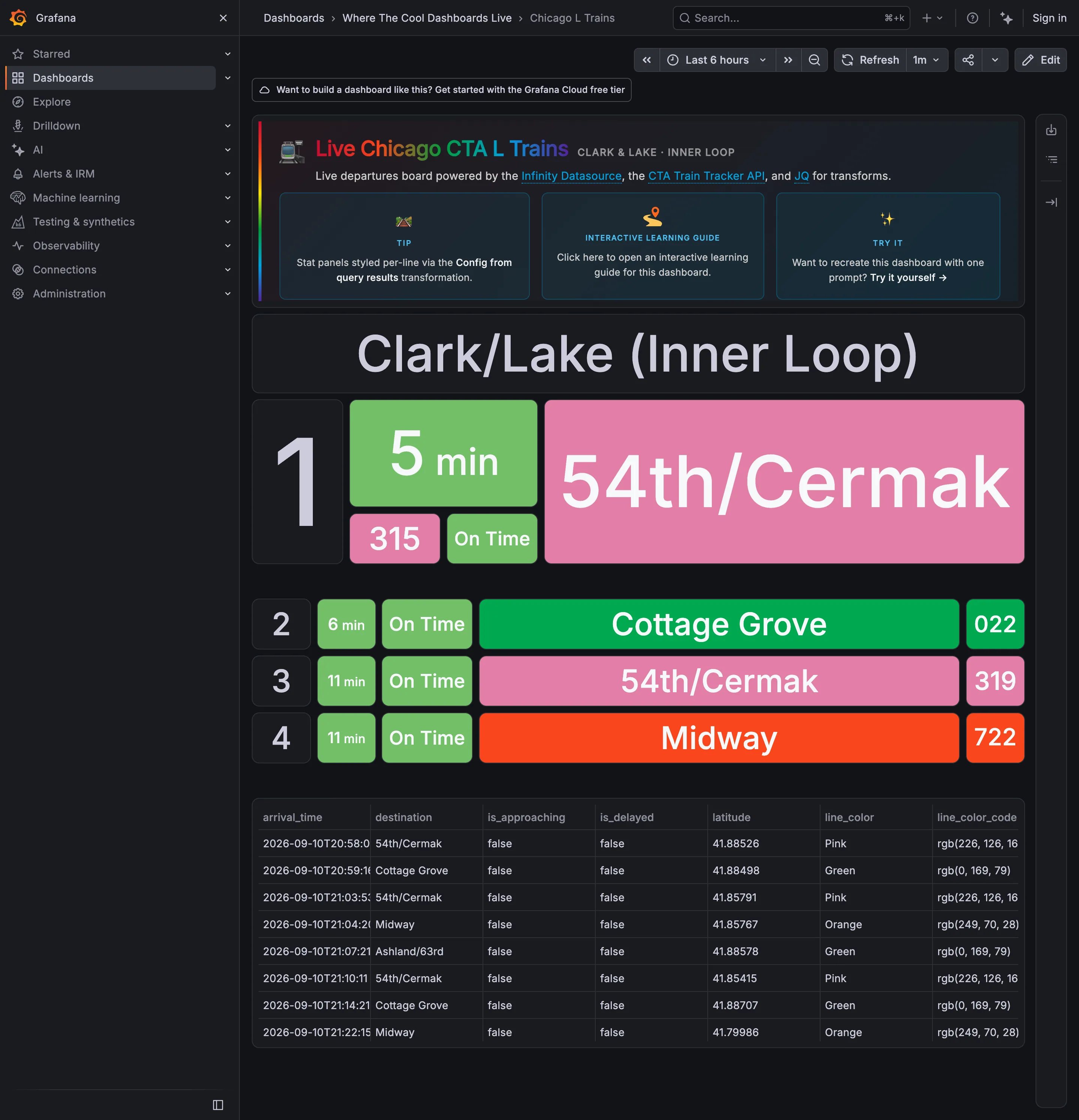
Where The Cool Dashboards Live / Chicago L Trains September 10, 2026 Grafana Play (signed out; no version string exposed) sparse · dark · wall
A live departures board for one platform, built out of stat panels against the CTA Train Tracker API, and it is the clearest wallboard in the gallery: four rows, type large enough to read across a concourse, no chrome inside the board and nothing to hover. The next train gets three times the height of the three behind it, which is the layout saying "start here" without a word of copy. The interesting problem is the colour. Pink, Green and Orange are the CTA's own line colours, inherited from the world outside the screen and already known to every rider—which is the best possible reason to use a palette. But the status chip beside them is also green when a train is on time, so on the second row "Cottage Grove" is green because it is the Green Line and "On Time" is green because it is on time, side by side, meaning two unrelated things.
  • Wallboard mode The next train, three times the height of the rest. Readable at ten feet with no pointer.
  • Panel grid Rows two to four at a third the size. Panel size is carrying the priority.
  • Semantic status color Green for on time, next to green for the Green Line. One hue, two unrelated jobs, one row.
  • Freshness indicator A countdown rather than a clock time, which is the right call and hides how old the feed is.
  • Data table The raw feed under the board, including the rgb string each line colour came from.
Show 1 more example Hide the rest

Kibana

Query-first rather than panel-first: the search bar is the primary control and the charts are downstream of it, which inverts Grafana's arrangement.

Kibana — Dashboards / [Flights] Global Flight Dashboard
Panel grid. Twelve columns, and the biggest panel is a table rather than the headline chart. Size isn't carrying priority here. Ratio and rate. Delay rates up to 100% with no denominator anywhere. One flight and a thousand flights render identically. Stacked composition. Stacked to 100%, so the total is discarded on purpose and only the mix of delay types remains. Annotation. Event markers along the top of the series, numbered and grouped, on the data's own axis. Header KPI strip. Five tiles in three different sizes and two different layouts, so the row reads as five things. Compare periods. "vs 1 week earlier, 76.9%"—the comparison base is named and the expression isn't. Filter bar. Declared controls under the query bar: two pickers and a price range. Both mechanisms on screen at once. Share and embed. Share, export and full-screen in the header. Whether the range and filters travel with them is the whole question.
Dashboards / [Flights] Global Flight Dashboard September 10, 2026 Elastic demo environment, sample flight data (guest session) dense · light · desktop-web
Two things on this page are worth arguing with. The first is the table on the right, sorted by delay rate: Chicago/Rockford 100%, Syracuse 100%, Birmingham 75%. A hundred percent of flights delayed is either a catastrophe or one flight, and nothing in the table says which, because the denominator isn't a column. The cells are on a red ramp, so the two rows that are almost certainly a sample of one are the loudest thing in the panel. The second is the tile row: Delayed 25.2%, then beside it "Delayed vs 1 week earlier—76.9%". Seventy-six point nine percent of what? It could be last week's rate, it could be this week as a proportion of last week, it could be the change. Three different numbers, one label, and the tile picks whichever the query returned. What the page gets right is the filtering: a KQL bar for people who know the syntax and three declared controls underneath for people who don't, both visible at once.
  • Ratio and rate Delay rates up to 100% with no denominator anywhere. One flight and a thousand flights render identically.
  • Compare periods "vs 1 week earlier, 76.9%"—the comparison base is named and the expression isn't.
  • Share and embed Share, export and full-screen in the header. Whether the range and filters travel with them is the whole question.
  • Filter bar Declared controls under the query bar: two pickers and a price range. Both mechanisms on screen at once.
  • Panel grid Twelve columns, and the biggest panel is a table rather than the headline chart. Size isn't carrying priority here.
  • Stacked composition Stacked to 100%, so the total is discarded on purpose and only the mix of delay types remains.
  • Annotation Event markers along the top of the series, numbered and grouped, on the data's own axis.
  • Header KPI strip Five tiles in three different sizes and two different layouts, so the row reads as five things.