Skip to content
KONIGI

Dashboards / Product mechanics / Share and embed

10 of 10

Share and embed

The dashboard has to leave the tool and keep meaning something.

Updated September 10, 2026

Problem

Someone found something. The people who need to see it do not have accounts, or will read it in a channel, or need it in a document next Thursday. Whatever leaves the tool has to still be true when it arrives.

Solution

Several mechanisms, because “share” is four different needs wearing one button.

A link to live state. Cheapest and best when the recipient has access. Everything hinges on whether the URL carries the whole state—range, filters, variables, selection—which is why the URL-state discipline that shows up across this collection pays off here.

A snapshot. A frozen copy of the data as it was, viewable without access to the source. This is the one that solves the incident-writeup problem, where a live link degrades into a link to a healthy system a week later.

An embed. The panel rendered inside somebody else’s page, usually a wiki or an internal portal, updating live.

A scheduled export. A PDF or an image arriving on a timetable, for people who will never open the tool.

Each has a different failure mode, and the common thread is that context does not travel. A screenshot in a chat loses the time range, the filters and the fact that someone had isolated one series. The image looks authoritative and is missing the thing that makes it true. Any share mechanism worth building stamps the range and the filters into what it produces.

The second common thread is access. A public snapshot is a data-exposure decision made by whoever clicked the button, usually without a review step, and snapshots are exactly the artefact that ends up indexed. Products that make public sharing frictionless without making the consequence visible are handing a security decision to someone who thinks they are sending a picture.

Use when

The audience is outside the tool, or the moment needs preserving, or the same view needs to arrive somewhere on a schedule.

Don’t use when

The recipient has access and the link would do. A snapshot where a link would work creates a second copy that immediately starts diverging from reality.

Trade-offs

Every share mechanism creates an artefact that outlives its context. Snapshots accumulate and nobody prunes them. Embeds break silently when the source panel is renamed or deleted, and the page they live in shows an empty box nobody reports. Scheduled exports keep arriving long after anyone reads them, which is the least harmful and most common form of this. And public sharing is a standing exposure risk that scales with how easy the button is to press.

Checklist

  • Does a link carry range, filters, variables and selection?
  • Is a snapshot’s capture time stamped on the snapshot itself?
  • Does a shared artefact say what was filtered when it was made?
  • Who can create a public link, and is the consequence visible at the moment of clicking?
  • Do public snapshots expire, and is there any inventory of them?
  • What does an embed show when the source panel is deleted?
  • Do scheduled exports have an owner and a review, or do they run forever?
  • Does a shared artefact carry a route back to the live view?
  • Does a snapshot include data the recipient should not see?
  • Is a stale artefact distinguishable from a current one at a glance?

Compare

Grafana offers the fullest set—direct link with current state, snapshots that can be public, panel embeds and image rendering—which covers every case and puts the public-exposure decision one click away without much ceremony. Datadog leans on scheduled reports and embeddable graphs with per-embed tokens, so an embed can be revoked without deleting the panel it came from. Honeycomb shares the query rather than a rendered result, which is the most robust artefact of the lot: a query re-run next week is honest about being a different answer, where an image pretends it is the same one. Public status pages are the extreme case, built entirely for readers with no access, and they show what a share-first design looks like when it is the product rather than a feature.

Saved view is the internal cousin, keeping state for yourself rather than sending it. Freshness indicator is what a shared artefact most needs and most often lacks. Time-range picker is the state most often lost in transit. Comment and annotate is the collaborative alternative that keeps the discussion attached to the view. Data source badge answers the provenance question a shared image raises and cannot answer.
Share and embed anatomy Four mechanisms behind one button—a live link, a frozen snapshot, an embed and a scheduled export—each with the failure it runs into. Below, the same panel shared with its range and filters stamped into it and shared without them. Four needs wearing one button Link Live state, cheapest, best when they have access. Hinges on the URL carrying all of it. Snapshot Frozen data, viewable without access. Solves the writeup that links to a healthy system. Embed Rendered inside a wiki or a portal, updating live, read by people who never open the tool. Export A PDF arriving on a timetable, for people who will never open the tool at all. Checkout errors Shared as an image Checkout errors 14:00-15:00 · eu-west 1 of 6 series isolated Stamped 1 2 1 CONTEXT DOESN'T TRAVEL It loses the range, the filters, and the fact that someone had isolated one series. It looks authoritative and is missing what made it true. 2 STAMP IT IN Any share worth building writes the window and the filters into what it produces. A public snapshot is a data-exposure decision made by whoever clicked the button, usually with no review step, by someone who thinks they are sending a picture.
Wireframe — the pattern's anatomy, not any one product's version of it

Implementation

The dashboard leaves the tool and has to keep meaning something. A shared link carrying a relative range means a different thing tomorrow, so the dialog has to make the absolute choice visible rather than defaulting quietly.

shadcn
npx shadcn@latest add tabs input button switch label
npm
lucide-react
Tokens
--background--card--card-foreground--muted-foreground--border--chart-1

Checkout errors

14:00-15:00 · eu-west

1 of 6 series isolated

SharePanel.tsxLink, snapshot, embed and export behind one set of tabs, with the range and filters stamped on the preview before anything leaves. Absolute time is the default; public is a switch that says what it does.

import { useState, type ReactNode } from "react";
import { Copy } from "lucide-react";
import { Button } from "@/components/ui/button";
import { Input } from "@/components/ui/input";
import { Label } from "@/components/ui/label";
import { Switch } from "@/components/ui/switch";
import { Tabs, TabsContent, TabsList, TabsTrigger } from "@/components/ui/tabs";

/** Four needs wearing one button, each described by what it is good for. */
export type Mechanism = "link" | "snapshot" | "embed" | "export";
const MECHANISMS: { id: Mechanism; label: string; blurb: string }[] = [
  { id: "link", label: "Link", blurb: "Live state, cheapest, best when they have access. Hinges on the URL carrying all of it." },
  { id: "snapshot", label: "Snapshot", blurb: "Frozen data, viewable without access. Solves the writeup that links to a healthy system." },
  { id: "embed", label: "Embed", blurb: "Rendered inside a wiki or a portal, updating live, read by people who never open the tool." },
  { id: "export", label: "Export", blurb: "A PDF arriving on a timetable, for people who will never open the tool at all." },
];

export type ShareState = {
  title: string;
  /** The window as it stands right now, absolute. */
  range: { from: Date; to: Date };
  /** The relative form the page is actually on, if any: "last 1h". */
  relative?: string;
  filters: string[];
  /** Set when the viewer has isolated part of the chart. It travels or it lies. */
  isolated?: { shown: number; of: number };
};

const hhmm = (d: Date) => d.toISOString().slice(11, 16);
/** What gets written onto everything that leaves. */
export const stamp = (s: ShareState) => [`${hhmm(s.range.from)}-${hhmm(s.range.to)}`, ...s.filters].join(" · ");

/**
 * One panel behind the share button, with the state it will carry shown
 * before anything is produced. The absolute range is the default and the
 * relative one is a switch, so a link that means something else tomorrow is
 * a choice rather than an accident. Public is a switch with its consequence
 * written beside it.
 */
export function SharePanel({ state, url, preview, onCopy, onSnapshot, onExport }: {
  state: ShareState;
  /** The live URL. It must carry the range, filters and selection already. */
  url: string;
  /** The panel as it will leave, rendered small. */
  preview?: ReactNode;
  onCopy: (text: string) => void;
  onSnapshot: (opts: { isPublic: boolean }) => void;
  onExport: (opts: { every: "day" | "week" }) => void;
}) {
  const [absolute, setAbsolute] = useState(true);
  const [isPublic, setPublic] = useState(false);
  const href = absolute || !state.relative ? url : url.replace(/from=[^&]*&to=[^&]*/, `range=${encodeURIComponent(state.relative)}`);
  const embed = `<iframe src="${href}&embed=1" width="600" height="300" title="${state.title}"></iframe>`;

  const copyRow = (text: string, label: string) => (
    <div className="flex gap-2">
      <Input readOnly value={text} aria-label={label} className="h-8 font-mono text-[11px]" />
      <Button variant="outline" size="sm" className="h-8 shrink-0" onClick={() => onCopy(text)}><Copy className="size-3" aria-hidden /> Copy</Button>
    </div>
  );

  return (
    <div className="flex flex-col gap-4">
      <div className="rounded-lg border bg-card p-3">
        <div className="flex items-baseline justify-between border-b pb-2">
          <p className="text-sm text-card-foreground">{state.title}</p>
          <p className="text-[11px] tabular-nums text-chart-1">{stamp(state)}</p>
        </div>
        {preview}
        {state.isolated && (
          <p className="mt-2 text-[11px] text-chart-1">{state.isolated.shown} of {state.isolated.of} series isolated</p>
        )}
      </div>

      <Tabs defaultValue="link">
        <TabsList className="grid h-auto grid-cols-4 gap-2 bg-transparent p-0">
          {MECHANISMS.map((m) => (
            <TabsTrigger key={m.id} value={m.id} className="h-full flex-col items-start gap-1 whitespace-normal rounded-lg border p-2.5 text-left data-[state=active]:border-chart-1">
              <span className="text-xs">{m.label}</span>
              <span className="text-[10px] font-normal leading-snug text-muted-foreground">{m.blurb}</span>
            </TabsTrigger>
          ))}
        </TabsList>

        <TabsContent value="link" className="mt-3 flex flex-col gap-3">
          {copyRow(href, "link")}
          <div className="flex items-center gap-2">
            <Switch id="abs" checked={absolute} onCheckedChange={setAbsolute} disabled={!state.relative} />
            <Label htmlFor="abs" className="text-xs font-normal text-muted-foreground">
              {absolute ? `Locked to ${hhmm(state.range.from)}-${hhmm(state.range.to)} today` : `Opens on "${state.relative}", so it shows a different hour tomorrow`}
            </Label>
          </div>
        </TabsContent>

        <TabsContent value="snapshot" className="mt-3 flex flex-col gap-3">
          <div className="flex items-center gap-2">
            <Switch id="pub" checked={isPublic} onCheckedChange={setPublic} />
            <Label htmlFor="pub" className="text-xs font-normal text-muted-foreground">
              {isPublic ? "Anyone with the link can read this data, no sign-in. Expires in 30 days." : "Only people who can open the dashboard."}
            </Label>
          </div>
          <Button size="sm" className="h-8 self-start" onClick={() => onSnapshot({ isPublic })}>Freeze as of {hhmm(state.range.to)}</Button>
        </TabsContent>

        <TabsContent value="embed" className="mt-3">{copyRow(embed, "embed code")}</TabsContent>

        <TabsContent value="export" className="mt-3 flex gap-2">
          <Button variant="outline" size="sm" className="h-8" onClick={() => onExport({ every: "day" })}>PDF every morning</Button>
          <Button variant="outline" size="sm" className="h-8" onClick={() => onExport({ every: "week" })}>PDF every Monday</Button>
        </TabsContent>
      </Tabs>
    </div>
  );
}

demo.tsxHow it is called: the panel's state, its live URL, and the handlers that copy, freeze and schedule.

import { SharePanel } from "./SharePanel";

/** The checkout errors panel, an hour of eu-west, one series isolated. */
const STATE = {
  title: "Checkout errors",
  range: { from: new Date("2026-09-15T14:00:00Z"), to: new Date("2026-09-15T15:00:00Z") },
  relative: "last 1h",
  filters: ["eu-west"],
  isolated: { shown: 1, of: 6 },
};
const URL = "https://ops.internal/d/checkout?from=2026-09-15T14:00Z&to=2026-09-15T15:00Z&region=eu-west&series=5xx";

/** Six points of the isolated series, drawn small so the stamp has a picture. */
const Preview = () => (
  <svg viewBox="0 0 300 40" className="mt-2 h-10 w-full" aria-hidden>
    <polyline points="4,32 56,24 108,30 160,10 212,16 274,2" fill="none" className="stroke-chart-1" strokeWidth={2} />
  </svg>
);

export default function Demo() {
  return (
    <div className="w-[560px] rounded-lg border bg-background p-4">
      <SharePanel
        state={STATE}
        url={URL}
        preview={<Preview />}
        onCopy={(text) => navigator.clipboard.writeText(text)}
        onSnapshot={(o) => console.log("snapshot", o)}
        onExport={(o) => console.log("export", o)}
      />
    </div>
  );
}
What it renders. Identical markup in both panes, with only the token values changing.

Examples

Captures whose hotspots reference this pattern, grouped by product and dated. The dashed boxes are this pattern; hover any box for the note.

Netdata

Per-second charts, hundreds per node, with a per-chart anomaly ribbon instead of a band on the series.

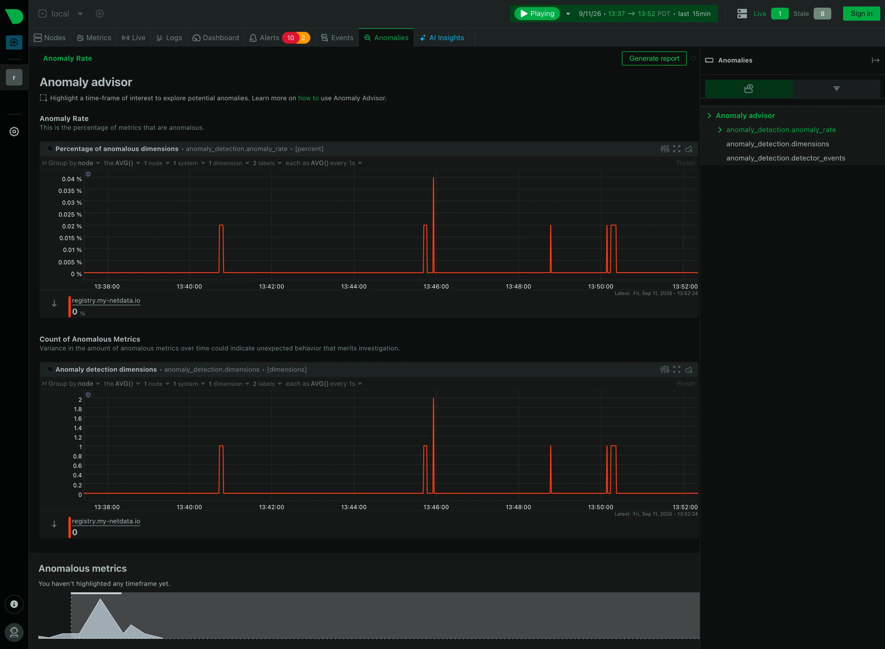
Anomalies / Anomaly advisor September 11, 2026 Netdata Agent, Anomaly advisor (public registry node, signed out) medium · dark · desktop-web
Netdata answers the anomaly problem without drawing a band at all, and the difference is worth recording. Rather than shading an expected range around each series, it scores every metric continuously and plots the result as its own series: the percentage of dimensions currently anomalous, and beneath it the count. Both sit near zero for most of the window and spike to about 0.04% at five separate moments. The trade is clear once you see it. A band tells you whether this metric is behaving, on the same axes as the metric, and needs one per chart. A rate tells you whether anything at all is behaving, in one chart, and cannot tell you which thing without a second step—which is what the panel at the bottom is for, and why it currently reads "You haven't highlighted any timeframe yet." The finding requires a brush selection before it will name a single metric.
  • Anomaly band Not a band. An anomaly rate as its own series, so one chart covers every metric instead of one band per chart.
  • Explain this metric Every section carries a sentence saying what it counts, directly under its heading rather than behind an icon.
  • Cross-filter Highlight a timeframe and the page names which metrics drove it. The selection is the query.
  • Empty state "You haven't highlighted any timeframe yet"—the reason for the blank, and the action that fills it.
  • Share and embed Generate report, top right. Whether the highlighted window travels with it is the question the button raises.
Show 1 more example Hide the rest

Kibana

Query-first rather than panel-first: the search bar is the primary control and the charts are downstream of it, which inverts Grafana's arrangement.

Kibana — Dashboards / [Flights] Global Flight Dashboard
Panel grid. Twelve columns, and the biggest panel is a table rather than the headline chart. Size isn't carrying priority here. Ratio and rate. Delay rates up to 100% with no denominator anywhere. One flight and a thousand flights render identically. Stacked composition. Stacked to 100%, so the total is discarded on purpose and only the mix of delay types remains. Annotation. Event markers along the top of the series, numbered and grouped, on the data's own axis. Header KPI strip. Five tiles in three different sizes and two different layouts, so the row reads as five things. Compare periods. "vs 1 week earlier, 76.9%"—the comparison base is named and the expression isn't. Filter bar. Declared controls under the query bar: two pickers and a price range. Both mechanisms on screen at once. Share and embed. Share, export and full-screen in the header. Whether the range and filters travel with them is the whole question.
Dashboards / [Flights] Global Flight Dashboard September 10, 2026 Elastic demo environment, sample flight data (guest session) dense · light · desktop-web
Two things on this page are worth arguing with. The first is the table on the right, sorted by delay rate: Chicago/Rockford 100%, Syracuse 100%, Birmingham 75%. A hundred percent of flights delayed is either a catastrophe or one flight, and nothing in the table says which, because the denominator isn't a column. The cells are on a red ramp, so the two rows that are almost certainly a sample of one are the loudest thing in the panel. The second is the tile row: Delayed 25.2%, then beside it "Delayed vs 1 week earlier—76.9%". Seventy-six point nine percent of what? It could be last week's rate, it could be this week as a proportion of last week, it could be the change. Three different numbers, one label, and the tile picks whichever the query returned. What the page gets right is the filtering: a KQL bar for people who know the syntax and three declared controls underneath for people who don't, both visible at once.
  • Ratio and rate Delay rates up to 100% with no denominator anywhere. One flight and a thousand flights render identically.
  • Compare periods "vs 1 week earlier, 76.9%"—the comparison base is named and the expression isn't.
  • Share and embed Share, export and full-screen in the header. Whether the range and filters travel with them is the whole question.
  • Filter bar Declared controls under the query bar: two pickers and a price range. Both mechanisms on screen at once.
  • Panel grid Twelve columns, and the biggest panel is a table rather than the headline chart. Size isn't carrying priority here.
  • Stacked composition Stacked to 100%, so the total is discarded on purpose and only the mix of delay types remains.
  • Annotation Event markers along the top of the series, numbered and grouped, on the data's own axis.
  • Header KPI strip Five tiles in three different sizes and two different layouts, so the row reads as five things.