Skip to content
KONIGI

Dashboards / Meta information / Annotation

1 of 6

Annotation

A change in the line has a cause, and the viewer shouldn't have to go find it elsewhere.

Updated September 10, 2026

Problem

Latency doubled at 14:07 and stayed there. Somewhere there is a deploy log, a change ticket, or a person who knows why, and the viewer is looking at a chart that shows the effect and nothing about the cause.

Solution

Put the event on the same axis as the data. A vertical line at the moment, a marker with a label, and detail on hover. The correlation the viewer would otherwise construct by cross-referencing two systems becomes something they see.

Grafana’s model is a good one to think in, because it separates two sources of the same visual. Built-in annotations are added by ctrl or cmd-clicking a graph, stored in Grafana itself against the -- Grafana -- data source, and fetched by a query that exists on every dashboard. Query-driven annotations come from a data source: any query returning events becomes markers. The first is a person saying “this mattered”. The second is a system saying “this happened”.

Both are necessary and they age differently. Automatic annotations from deploys, config changes and incidents are complete and never stop arriving, which is also their failure mode: a chart with forty deploy markers a day has a picket fence where a signal should be. Manual annotations are sparse, high-value, and depend on someone remembering.

Tags are what make the automatic kind survivable, because they let a panel choose which events it cares about. Grafana filters annotation queries by tag for exactly this reason.

The other useful distinction is point versus region. A deploy is a moment. A maintenance window, a traffic experiment or a degraded period is a span, and drawing a span as a line loses the duration that was the whole point. Grafana handles this with a Time regions query type defining From and To.

Use when

Charts are read to explain rather than only to monitor, and the causes live in systems the viewer would otherwise have to go and check.

Don’t use when

The event stream is high-volume and unfiltered. Forty markers is worse than none, because it converts the chart into a chart with a fence in front of it.

Trade-offs

Annotations occupy the same visual channel as thresholds and anomaly bands, so a chart can quickly have three kinds of vertical furniture competing with the series. They imply causation by adjacency: a marker near a spike reads as the explanation whether or not it is, which is a real analytical hazard on a page people trust. Manual ones are only as good as the discipline behind them, and that discipline decays. And annotations stored in the dashboard rather than in the data are lost when the dashboard is rebuilt.

Checklist

  • Where do these events come from, and does anything guarantee they keep arriving?
  • Are annotations tagged, and does each panel show only the tags it needs?
  • At the busiest time range, how many markers appear, and is the chart still readable?
  • Is a span drawn as a span, or flattened into a line?
  • Does the marker say what happened, or only that something did?
  • Can the viewer get from a marker to the underlying deploy, ticket or incident?
  • Do annotations survive the dashboard being rebuilt or duplicated?
  • Do they compete visually with thresholds and bands on the same chart?
  • Does a marker near a spike risk implying a cause nobody has verified?
  • Who can add one, and is that the right set of people?

Compare

Grafana splits the pattern cleanly into stored annotations added by hand and query-driven ones from any data source, then filters both by tag, which is the most complete treatment and also the one that most needs someone to curate the tags. Datadog treats events as a first-class stream that overlays any graph, so deploys and alerts appear on charts without per-dashboard configuration, at the cost of needing suppression when the stream is noisy. Honeycomb leans on markers tied to deploys as the main annotation, on the reasoning that in practice the question is almost always whether a release caused it. Sentry goes further and makes the release an object rather than a marker, attaching regressions to it directly, which answers the causal question rather than only placing it on an axis.

Time series is the chart this decorates. Comment and annotate is the collaborative version, where the note is addressed to a person rather than to the record. Threshold line competes for the same visual channel. Status history is the aggregated form of the same events. Zoom and pan is how a viewer gets from a marker to the detail around it.
Annotation anatomy A time series carrying two kinds of event marker: a vertical line with a label for a deploy, which is a moment, and a shaded band for a maintenance window, which is a span. Below, the same chart with every deploy of the day on it, which is a picket fence rather than a signal. Two kinds of event, on the data's own axis deploy 4a91c maintenance deploy incident config 1 2 3 1 POINT A deploy is a moment. A line, a marker and a label, with the detail on hover. 2 REGION A maintenance window or a degraded period is a span. Drawing it as a line loses the duration, which was the point. 3 TAGS What lets a panel choose the events it cares about. The same chart, every deploy of the day Automatic annotations are complete, and never stop arriving. Forty markers a day is a picket fence where a signal should be. Tags are the fix.
Wireframe — the pattern's anatomy, not any one product's version of it

Implementation

A marker saying why the line moved. Deploys, incidents and campaigns explain most of the shapes on a dashboard, and without them every reader reconstructs the cause from memory.

shadcn
npx shadcn@latest add toggle-group
npm
recharts
Tokens
--card--muted--muted-foreground--border--status-critical--status-warn--chart-1
13:2413:5714:3015:170150300450600deploy 4a91cmaintenance

AnnotatedChart.tsxRecharts with the events on the data's axis. A moment is a reference line, a span is a reference area, and the tag chips decide which arrive.

import { CartesianGrid, Line, LineChart, ReferenceArea, ReferenceLine, Tooltip, XAxis, YAxis } from "recharts";
import { ToggleGroup, ToggleGroupItem } from "@/components/ui/toggle-group";
import { cn } from "@/lib/utils";

/**
 * An event on the data's own axis. `to` is what separates a span from a
 * moment: a deploy has none, a maintenance window does, and the chart draws a
 * region for the second rather than flattening it into a line that loses the
 * duration.
 */
export type Annotation = {
  id: string;
  /** Epoch ms. */
  at: number;
  to?: number;
  /** What lets a panel choose the events it cares about. */
  tag: string;
  /** What happened, not only that something did. */
  label: string;
  /** The deploy, ticket or incident behind the marker. */
  href?: string;
};

export type Sample = { t: number; value: number };

const hhmm = (t: number) => {
  const d = new Date(t);
  return `${String(d.getUTCHours()).padStart(2, "0")}:${String(d.getUTCMinutes()).padStart(2, "0")}`;
};

const TICK = { fontSize: 10, fill: "hsl(var(--muted-foreground))" };
const POINT = "hsl(var(--chart-1))";
const REGION = "hsl(var(--status-warn))";

export function AnnotatedChart({
  data,
  annotations,
  tags,
  shown,
  onShownChange,
  width = 420,
  height = 170,
}: {
  data: Sample[];
  annotations: Annotation[];
  /** Every tag the source can deliver, in chip order. */
  tags: string[];
  /** The tags this panel shows. Forty deploy markers a day is a picket fence. */
  shown: string[];
  onShownChange: (tags: string[]) => void;
  width?: number;
  height?: number;
}) {
  const visible = annotations.filter((a) => shown.includes(a.tag));
  return (
    <div>
      <div className="overflow-x-auto">
        <LineChart width={width} height={height} data={data} margin={{ top: 8, right: 8, bottom: 0, left: -20 }}>
          <CartesianGrid vertical={false} stroke="hsl(var(--border))" />
          <XAxis interval={0} dataKey="t" type="number" domain={["dataMin", "dataMax"]} tickFormatter={hhmm} tick={TICK} stroke="hsl(var(--border))" />
          <YAxis domain={[0, "auto"]} tick={TICK} stroke="hsl(var(--border))" />
          <Tooltip labelFormatter={(t) => hhmm(Number(t))} formatter={(v) => [`${v} ms`, "p95"]} />
          {visible.map((a) =>
            a.to ? (
              <ReferenceArea key={a.id} x1={a.at} x2={a.to} fill={REGION} fillOpacity={0.12} stroke="none"
                label={{ value: a.label, position: "insideTop", fill: REGION, fontSize: 10 }} />
            ) : (
              <ReferenceLine key={a.id} x={a.at} stroke={POINT} strokeDasharray="4 3"
                label={{ value: a.label, position: "insideTopRight", fill: POINT, fontSize: 10 }} />
            ),
          )}
          <Line type="linear" dataKey="value" stroke={POINT} strokeWidth={2} dot={false} isAnimationActive={false} />
        </LineChart>
      </div>
      <ToggleGroup type="multiple" value={shown} onValueChange={onShownChange} className="mt-3 justify-start gap-2" aria-label="event tags">
        {tags.map((tag) => (
          <ToggleGroupItem key={tag} value={tag} size="sm"
            className={cn("h-6 rounded-full border px-2 text-[10px] data-[state=on]:bg-muted", tag === "incident" && "border-status-critical text-status-critical data-[state=on]:text-status-critical")}>
            {tag}
          </ToggleGroupItem>
        ))}
      </ToggleGroup>
      {/* The marker is a door, not a caption: the ticket is one click away. */}
      {visible.some((a) => a.href) && (
        <ul className="mt-2 flex flex-wrap gap-x-3 text-[10px] text-muted-foreground">
          {visible.filter((a) => a.href).map((a) => (
            <li key={a.id}><a href={a.href} className="underline">{hhmm(a.at)} {a.label}</a></li>
          ))}
        </ul>
      )}
    </div>
  );
}

demo.tsxHow it is called: the samples, two events, the tags the panel offers, and which are shown.

import { useState } from "react";
import { AnnotatedChart, type Annotation, type Sample } from "./AnnotatedChart";

/** Checkout p95 through an afternoon. Latency doubles at 14:07 and the deploy says why. */
const T0 = Date.UTC(2026, 8, 15, 13, 20);
const at = (min: number) => T0 + min * 60_000;

const DATA: Sample[] = [
  [4, 140], [17, 180], [30, 150], [43, 240], [47, 430], [57, 400],
  [70, 370], [83, 190], [96, 230], [109, 270], [117, 300],
].map(([m, value]) => ({ t: at(m), value }));

const EVENTS: Annotation[] = [
  { id: "d-4a91c", at: at(47), tag: "deploy", label: "deploy 4a91c", href: "/deploys/4a91c" },
  { id: "chg-2210", at: at(83), to: at(104), tag: "config", label: "maintenance", href: "/changes/2210" },
];

const TAGS = ["deploy", "incident", "config"];

export default function Demo() {
  const [shown, setShown] = useState(TAGS);
  return (
    <div className="rounded-lg border bg-card p-4">
      <AnnotatedChart data={DATA} annotations={EVENTS} tags={TAGS} shown={shown} onShownChange={setShown} />
    </div>
  );
}
What it renders. Identical markup in both panes, with only the token values changing.

Examples

Captures whose hotspots reference this pattern, grouped by product and dated. The dashed boxes are this pattern; hover any box for the note.

Grafana

The reference implementation for panel grids, template variables, and stat panels; most other tools are defined by how they differ from it.

Demo / Annotations September 10, 2026 Grafana Play (signed out; no version string exposed) medium · dark · desktop-web
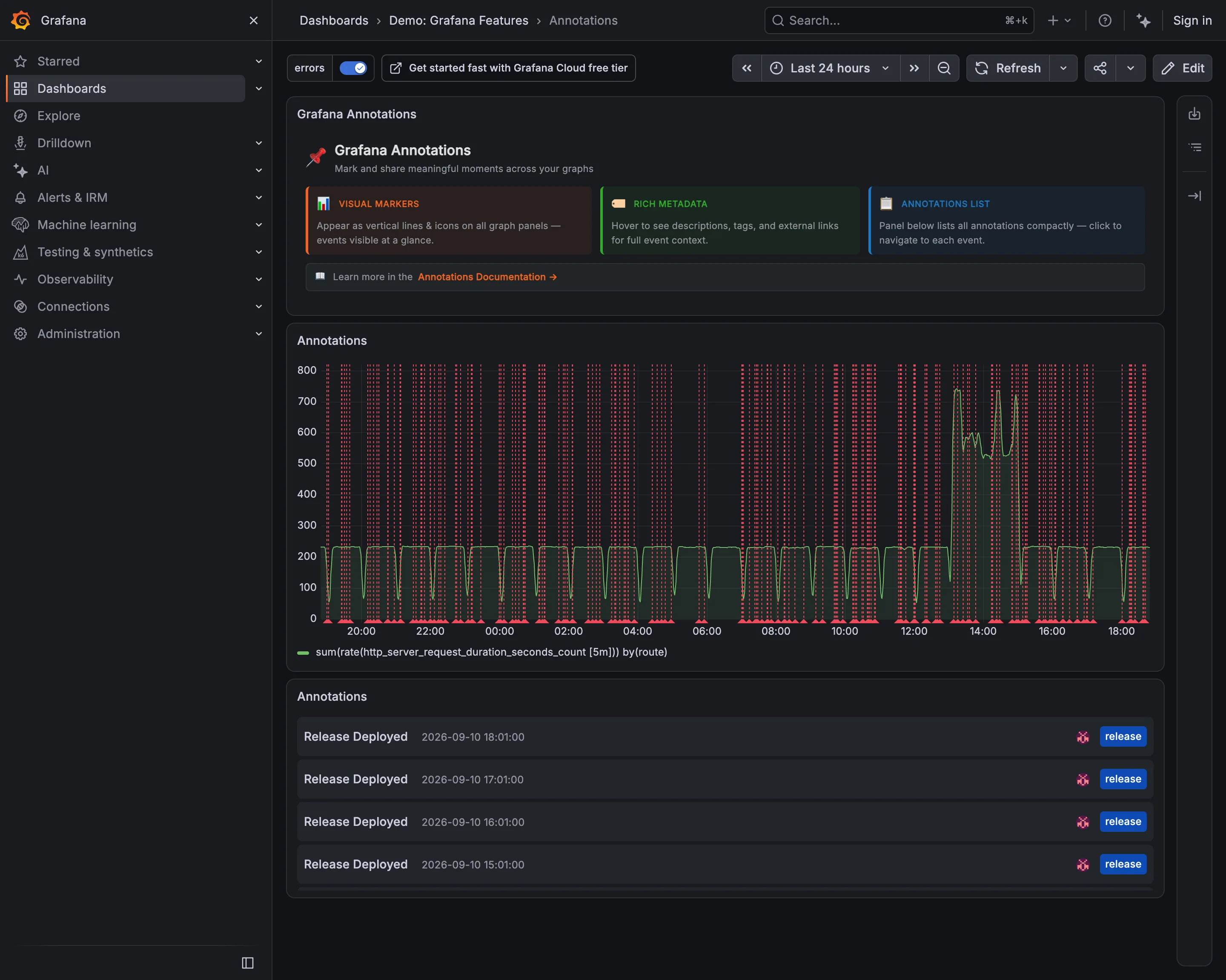
The header on this dashboard says annotations "appear as vertical lines and icons on all graph panels—events visible at a glance", and the panel directly beneath it is the counter-example. Roughly fifty red dashed lines across twenty-four hours, evenly spaced, and the request-rate series behind them is genuinely hard to follow: the fence is denser than the data. Every one of those lines is a real event correctly recorded, and the tag filter in the top left is switched on, so this is the filtered view. That is the whole problem with automatic annotations—they are complete and they never stop arriving, and completeness at this cadence is indistinguishable from noise. The list panel at the bottom is what makes them usable again: the same events, four of them, timestamped and tagged, in a form you can read.
  • Annotation Fifty deploy markers on a 24-hour chart. Each one is correct and together they are a picket fence.
  • Annotation The same events as a list, tagged release and timestamped. Readable in a way the chart is not.
  • Filter bar The tag filter that makes this survivable, already on. The chart above is the filtered version.
  • Time-range picker Twenty-four hours, which is what sets the marker density. An hour here would be three lines.
Show 1 more example Hide the rest

Kibana

Query-first rather than panel-first: the search bar is the primary control and the charts are downstream of it, which inverts Grafana's arrangement.

Kibana — Dashboards / [Flights] Global Flight Dashboard
Panel grid. Twelve columns, and the biggest panel is a table rather than the headline chart. Size isn't carrying priority here. Ratio and rate. Delay rates up to 100% with no denominator anywhere. One flight and a thousand flights render identically. Stacked composition. Stacked to 100%, so the total is discarded on purpose and only the mix of delay types remains. Annotation. Event markers along the top of the series, numbered and grouped, on the data's own axis. Header KPI strip. Five tiles in three different sizes and two different layouts, so the row reads as five things. Compare periods. "vs 1 week earlier, 76.9%"—the comparison base is named and the expression isn't. Filter bar. Declared controls under the query bar: two pickers and a price range. Both mechanisms on screen at once. Share and embed. Share, export and full-screen in the header. Whether the range and filters travel with them is the whole question.
Dashboards / [Flights] Global Flight Dashboard September 10, 2026 Elastic demo environment, sample flight data (guest session) dense · light · desktop-web
Two things on this page are worth arguing with. The first is the table on the right, sorted by delay rate: Chicago/Rockford 100%, Syracuse 100%, Birmingham 75%. A hundred percent of flights delayed is either a catastrophe or one flight, and nothing in the table says which, because the denominator isn't a column. The cells are on a red ramp, so the two rows that are almost certainly a sample of one are the loudest thing in the panel. The second is the tile row: Delayed 25.2%, then beside it "Delayed vs 1 week earlier—76.9%". Seventy-six point nine percent of what? It could be last week's rate, it could be this week as a proportion of last week, it could be the change. Three different numbers, one label, and the tile picks whichever the query returned. What the page gets right is the filtering: a KQL bar for people who know the syntax and three declared controls underneath for people who don't, both visible at once.
  • Ratio and rate Delay rates up to 100% with no denominator anywhere. One flight and a thousand flights render identically.
  • Compare periods "vs 1 week earlier, 76.9%"—the comparison base is named and the expression isn't.
  • Share and embed Share, export and full-screen in the header. Whether the range and filters travel with them is the whole question.
  • Filter bar Declared controls under the query bar: two pickers and a price range. Both mechanisms on screen at once.
  • Panel grid Twelve columns, and the biggest panel is a table rather than the headline chart. Size isn't carrying priority here.
  • Stacked composition Stacked to 100%, so the total is discarded on purpose and only the mix of delay types remains.
  • Annotation Event markers along the top of the series, numbered and grouped, on the data's own axis.
  • Header KPI strip Five tiles in three different sizes and two different layouts, so the row reads as five things.