Problem
Was it down last Tuesday? For how long? A line chart of a binary metric is a square wave nobody can read at a month’s width, and an incident log is a list of things somebody remembered to write down.
Solution
One row per thing, time along the x-axis, colour for state. Continuous coloured regions, so a week of health is a long green bar and an outage is a red notch you can see from across the room.
The encoding change matters. A time series asks the viewer to read a value and mentally threshold it. A status history has already done the thresholding and shows the conclusion, which is what makes a month of history readable in a strip a few pixels tall.
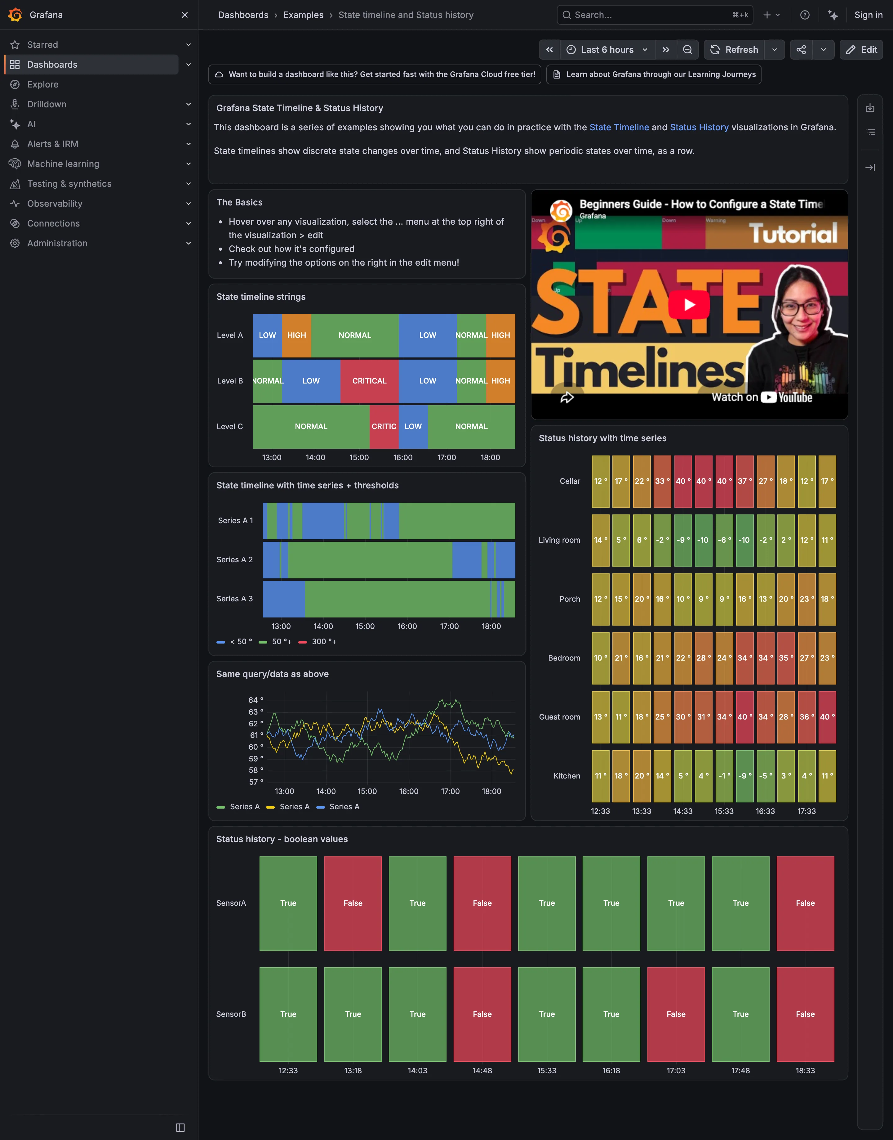
Grafana splits this into two panels and the split is instructive. The state timeline draws state as continuous regions and carries Merge equal consecutive values, which controls whether identical adjacent values are joined into one block. With merging on, a month of “up” is a single bar and the notches are unmissable. With it off, you see every sample, which matters when the sampling interval is itself the story. Show values offers Auto, Always and Never for labelling regions in place. Value mappings turn raw values into named states with colours, and thresholds can convert an ordinary numeric series into discrete coloured regions, which is how a CPU metric becomes a health strip without a separate query.
The status history panel is the discrete-sample sibling: one mark per sample rather than a continuous region, which suits checks that run on a fixed schedule where the gaps between them are real rather than interpolated.
Use when
The state is categorical and low-cardinality, and the question spans a period longer than a chart can show usefully. Uptime, deployment state, check results, on-call coverage, batch job outcomes.
Don’t use when
The underlying value is continuous and the magnitude matters. Reducing latency to green/amber/red loses the difference between 210ms and 900ms, and both are amber.
Trade-offs
The whole pattern rests on a thresholding decision made somewhere else, usually invisibly, and a status strip inherits every flaw in it while looking authoritative. Brief outages disappear below one pixel at wide time ranges, so a strip showing a clean month may be hiding forty two-minute blips. Merging consecutive values makes the display readable and destroys the distinction between “we checked continuously” and “we checked twice”. And a row per entity does not scale: forty rows is a wall of colour with no ordering principle unless somebody supplies one.
Checklist
- What turns the underlying data into a state, and where does that rule live?
- How many distinct states, and is that few enough to read as colour alone?
- What does a gap mean: healthy, unknown, or not-yet-checked?
- Are consecutive equal values merged, and does that hide the sampling interval?
- At the widest range shown, how short an outage becomes invisible?
- Is there a hover giving exact start, end and duration?
- Is the row order meaningful, and is it stable between visits?
- Would a colourblind viewer distinguish degraded from down?
- Can the viewer get from a red region to what caused it?
- Does the strip agree with the incident record, and if not, which is wrong?
Compare
Grafana ships two panels for this and the choice between them is the design decision: state timeline for continuous regions with merging, status history for one mark per discrete sample. Public status pages in the Statuspage mould reduce it to the minimum honest form—one bar per component per day, ninety days across—which is the most-read version of this pattern anywhere and the one most tuned for readers with no context. Datadog ties the strip to monitor state rather than to raw metrics, so the history you read is the history of what actually paged someone. Netdata keeps alarm transitions per node in a log-shaped view, which trades the instant scan for exact times and reasons.
Related
Threshold line is where the rule that produces these states usually gets drawn. Semantic status color governs the palette and is what makes the strip readable or not. Error and stale state covers the case this pattern most often gets wrong, which is a gap that means “unknown”. Time series is the continuous version this replaces. Annotation is how the cause gets attached to the notch.