Skip to content
KONIGI

Dashboards / Color / Semantic status color

5 of 6

Semantic status color

State has to be readable before the number is.

Updated September 10, 2026

Problem

Someone scanning a page needs to know which of forty things needs them, and they need it before they have read a single label or number.

Solution

A small closed set of colours where each one means a state and nothing else. Three or four values, defined once, applied everywhere, and never used decoratively.

The closed set is the whole pattern. The moment green also means “our brand” or “series 3”, the colour stops being a signal and becomes a coincidence the viewer has to disambiguate. Every dashboard that has lost this has lost it gradually, one reasonable exception at a time.

Two constraints have to be designed in rather than discovered.

Colour cannot be the only carrier. WCAG is explicit that colour must not be the sole means of conveying information, and roughly one in twelve men cannot separate the red and green a status palette leans on hardest. The fix is not to abandon the palette but to pair it: an icon, a shape, a word, a position. A red dot and a green dot that differ only in hue are a coin flip for a meaningful slice of any audience.

The colours must survive their background. WCAG 2.2 sets a contrast floor for non-text elements like status indicators. A palette designed on a white page and then shipped on a dark dashboard usually fails, because the mid-tone amber that read as warning on paper vanishes on charcoal. A status palette needs a light and dark variant of every value, tested in both.

The third thing, which is not a design problem but kills more implementations than either: the thresholds behind the colour. A colour is a claim that a rule fired. If the rule is stale, the page is confidently wrong in the most trusted visual channel it has.

Use when

Anywhere a viewer must triage rather than read. Status columns, tiles, maps, timelines, alert lists.

Don’t use when

The quantity is continuous and the magnitude matters. Reducing latency to amber loses the difference between 210ms and 900ms. Use colour for state and let a number or a bar carry the amount.

Trade-offs

Status palettes create a binary reading of continuous data, so values either side of a threshold look categorically different when they are nearly identical. They travel badly: the same green means “healthy” in one product and “completed” in another, and teams using both build a small daily confusion. Cultural conventions differ, notably red for up in some financial markets. And a colour that appears constantly stops being read at all, which is how a page ends up with a permanently amber tile nobody has looked at in a year.

Checklist

  • How many states, and is the set closed and written down?
  • Does any of these colours also appear decoratively or as a series colour on the same page?
  • Is there a non-colour signal for every state—icon, shape, label, position?
  • Do the colours meet contrast requirements against both light and dark backgrounds?
  • Has the palette been checked against the common colour vision deficiencies?
  • Does saturation or weight distinguish severity, or are warning and critical equally loud?
  • Where are the thresholds defined, and who can change them?
  • What does “unknown” or “no data” look like, and is it distinct from healthy?
  • Does the same colour mean the same thing across every page in this product?
  • Is anything permanently coloured, and has anyone noticed?

Compare

Grafana attaches colour to thresholds as a field property, so status colour is derived from a rule rather than set by hand, and the same thresholds drive the stat panel, the gauge, the table cell and the state timeline. That consistency is the strongest argument for defining status colour at the data layer rather than the panel layer. Sentry encodes severity levels on the event rather than on the display, so colour follows the data into lists, alerts and digests. Datadog ties colour to monitor state, meaning what you see is what would page someone, which keeps the page and the alerting honest with each other. Public status pages typically run three states and always pair colour with a word, because their audience is unknown and cannot be assumed to share any convention.

Grayscale with alerts is the discipline that decides how much of the page these colours are allowed to occupy. Threshold line is where the rule behind the colour is usually drawn. Status history is this palette applied along a time axis. Red/green direction coloring covers the finance-specific version and its accessibility problem. Header KPI strip is where a wrong status colour does the most damage.
Semantic status colour anatomy Four status values, each a swatch paired with its own shape, its own word and the threshold that fires it. Beside them, the same swatch doing three different jobs on one page: a status, a brand accent and the third series in a chart. A closed set of four State Fires when OK p95 under 300ms WARNING 300ms to 800ms CRITICAL over 800ms UNKNOWN no sample for 5m Four values, defined once HEALTHY a state a button series 3 The same swatch, three jobs 1 2 1 PAIRED, ALWAYS Every value gets a shape and a word as well as a swatch. A red dot and a green dot that differ only in hue are a coin flip for one man in twelve. 2 HOW IT GETS LOST One reasonable exception at a time. The moment the status green is also the brand green it stops being a signal and becomes a coincidence. Every colour is a claim that a rule fired. A stale rule is confidently wrong.
Wireframe — the pattern's anatomy, not any one product's version of it

Implementation

shadcn ships a Badge with four variants and none of them is a status. It has --destructive, which means a destructive action, not a system on fire. This is what you add to close that gap.

shadcn
npx shadcn@latest add badge
npm
class-variance-authority clsx tailwind-merge lucide-react
Tokens
--card--card-foreground--muted-foreground--border--status-critical--status-warn--status-nominal--status-unknown
StateFires when
  • Nominalp95 under 300ms
  • Warning300ms to 800ms
  • Criticalover 800ms
  • No datano sample for 5m

status.tsThe closed set. A fifth status cannot be invented at a call site.

import type { LucideIcon } from "lucide-react";
import { AlertTriangle, CheckCircle2, CircleHelp, OctagonAlert } from "lucide-react";

/**
 * The closed set.
 *
 * Adding a state means changing this union, which is the whole point: the
 * compiler refuses anything that is not one of these four, so a fifth status
 * cannot quietly appear at a call site six months from now. "How many states,
 * and is the set closed and written down?" stops being a review question.
 */
export const STATUSES = ["nominal", "warn", "critical", "unknown"] as const;
export type Status = (typeof STATUSES)[number];

/**
 * Every state carries a non-colour signal.
 *
 * This makes "is there a non-colour signal for every state" structural rather
 * than advisory—there is no way to render a status without also rendering its
 * icon and its label, because the component reads both from here.
 *
 * `unknown` is deliberately not a quiet success. No data and healthy are
 * different answers and they must not look alike.
 */
export const STATUS_META: Record<Status, { label: string; Icon: LucideIcon }> = {
  nominal: { label: "Nominal", Icon: CheckCircle2 },
  warn: { label: "Warning", Icon: AlertTriangle },
  critical: { label: "Critical", Icon: OctagonAlert },
  unknown: { label: "No data", Icon: CircleHelp },
};

StatusBadge.tsxWraps shadcn's Badge. The icon is structural, not decoration.

import { cva } from "class-variance-authority";
import { cn } from "@/lib/utils";
import { STATUS_META, type Status } from "./status";

/**
 * Severity is carried by three things at once: hue, lightness, and an icon.
 * Hue alone fails in greyscale and fails for the common colour vision
 * deficiencies, both of which are checklist items on this pattern.
 *
 * The tokens are --status-*, never --destructive. shadcn's --destructive means
 * "this button deletes things"; a critical alarm is a state of the world. They
 * often land on similar reds and they are not the same semantic.
 */
const statusBadge = cva(
  "inline-flex items-center gap-1.5 rounded-md border px-2 py-0.5 text-xs font-medium",
  {
    variants: {
      status: {
        nominal: "border-status-nominal/30 bg-status-nominal/10 text-status-nominal",
        warn: "border-status-warn/30 bg-status-warn/10 text-status-warn",
        critical: "border-status-critical/40 bg-status-critical/10 text-status-critical",
        unknown: "border-status-unknown/30 bg-status-unknown/10 text-status-unknown",
      },
    },
    defaultVariants: { status: "unknown" },
  },
);

export function StatusBadge({ status, className }: { status: Status; className?: string }) {
  const { label, Icon } = STATUS_META[status];
  return (
    <span className={cn(statusBadge({ status }), className)}>
      <Icon aria-hidden="true" className="size-3.5 shrink-0" />
      {label}
    </span>
  );
}

demo.tsxHow it is called: the four values from STATUSES, each beside the rule that fires it.

import { STATUSES } from "./status";
import { StatusBadge } from "./StatusBadge";

/** The closed set, each value beside the rule that fires it. */
const FIRES_WHEN = {
  nominal: "p95 under 300ms",
  warn: "300ms to 800ms",
  critical: "over 800ms",
  unknown: "no sample for 5m",
} as const;

export default function Demo() {
  return (
    <div className="w-[360px] rounded-lg border bg-card p-4">
      <div className="flex items-baseline justify-between border-b pb-2 text-[11px] uppercase tracking-wide text-muted-foreground">
        <span>State</span><span>Fires when</span>
      </div>
      <ul className="mt-1">
        {STATUSES.map((s) => (
          <li key={s} className="flex items-center justify-between gap-3 py-2 text-xs">
            <StatusBadge status={s} />
            <span className="tabular-nums text-muted-foreground">{FIRES_WHEN[s]}</span>
          </li>
        ))}
      </ul>
    </div>
  );
}
What it renders. Identical markup in all three panes, with only the token values changing.

Examples

Captures whose hotspots reference this pattern, grouped by product and dated. The dashed boxes are this pattern; hover any box for the note.

Ignition

A public SCADA demo running live simulated plant data, with a runtime toggle between simple and photorealistic pump and pipe rendering—the ISA-101 argument as a setting.

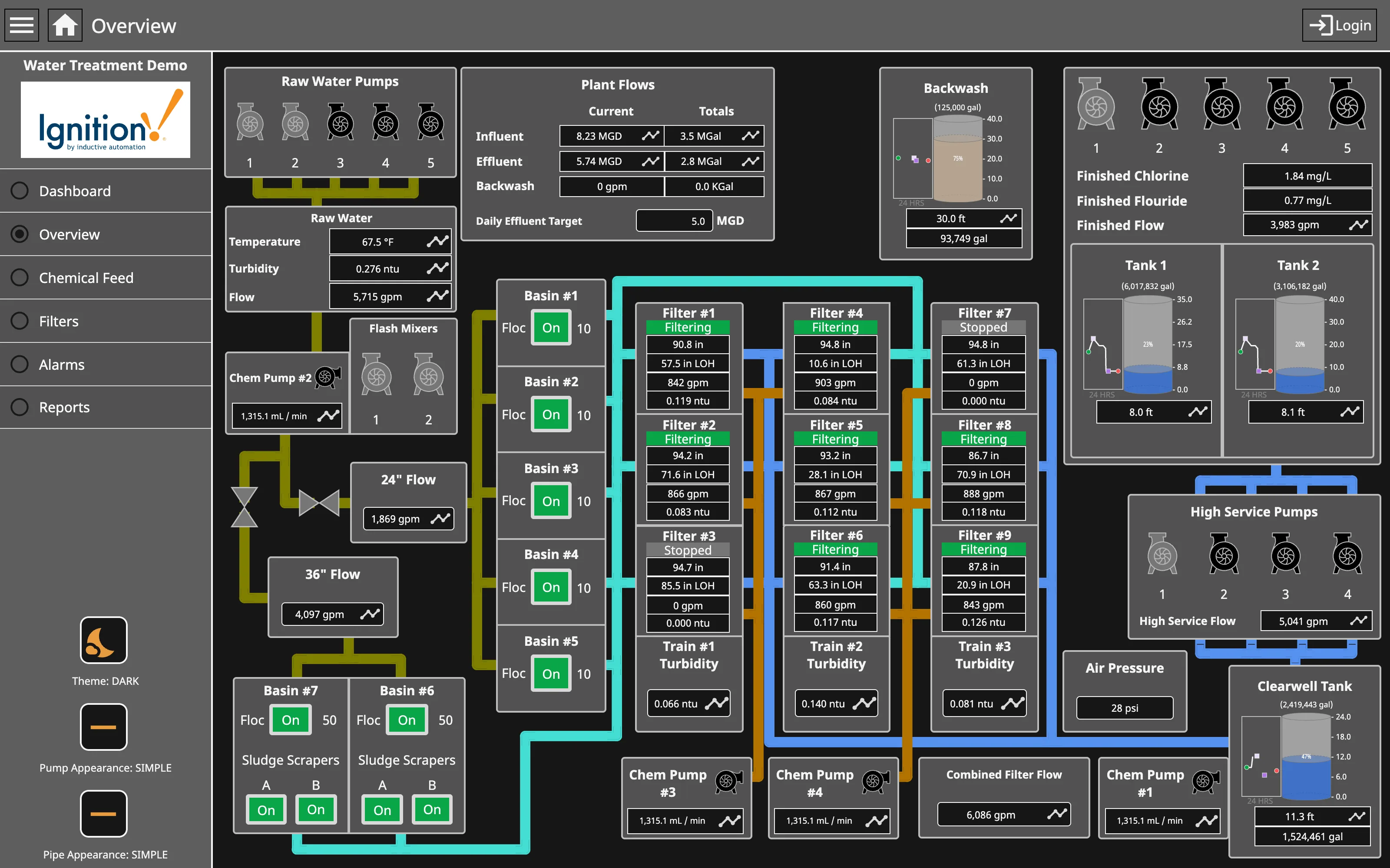
Ignition — Water Treatment / Overview
Process mimic. Flat two-dimensional shapes, values placed where the instrument is, and the flow ordered by process rather than by geography. Dense small-multiple layout. Nine filters, identical four-value panels. Reading one teaches you all nine, and the two stopped ones are found by shape. Gauge and dial. Tank level as a filled vertical scale—a bounded range where the endpoints are the physical tank, which is the case the gauge survives. Grayscale with alerts. Green for running, on every unit. The opposite of grey-at-rest, and it works only while stopped is the rare case. Process mimic. Pump and pipe appearance switchable between simple and photorealistic. The whole ISA-101 argument, shipped as a setting. Semantic status color. Stopped is grey and says Stopped. Colour and word together, so the state survives a monochrome screen.
Water Treatment / Overview September 11, 2026 Ignition Perspective public demo, Water Treatment (signed out) dense · dark · desktop-web
A real process mimic with live simulated plant data, and it settles two arguments from the entry. The first: the layout is topologically faithful and geometrically loose. Raw water pumps at the left, flash mixers, seven basins, nine filters, tanks, high service pumps, clearwell—the flow reads left to right because that is the process order, not because that is where the equipment stands. The second is where it departs from ISA-101, and the departure is deliberate. Green here means running. Every basin, every flocculator, every filter that is working is green, so most of the screen is coloured and the two stopped filters are the grey ones. That inverts the high-performance HMI rule—colour reserved for abnormal—and spends the budget on the ninety percent case. It is still readable, because the abnormal state is the absence of a colour everything else has, but it only works while "stopped" is rare. The pipe colours are a third channel again, encoding which fluid is in them rather than any state at all.
  • Process mimic Flat two-dimensional shapes, values placed where the instrument is, and the flow ordered by process rather than by geography.
  • Grayscale with alerts Green for running, on every unit. The opposite of grey-at-rest, and it works only while stopped is the rare case.
  • Dense small-multiple layout Nine filters, identical four-value panels. Reading one teaches you all nine, and the two stopped ones are found by shape.
  • Semantic status color Stopped is grey and says Stopped. Colour and word together, so the state survives a monochrome screen.
  • Gauge and dial Tank level as a filled vertical scale—a bounded range where the endpoints are the physical tank, which is the case the gauge survives.
  • Process mimic Pump and pipe appearance switchable between simple and photorealistic. The whole ISA-101 argument, shipped as a setting.
Show 10 more examples Hide the rest

Grafana

The reference implementation for panel grids, template variables, and stat panels; most other tools are defined by how they differ from it.

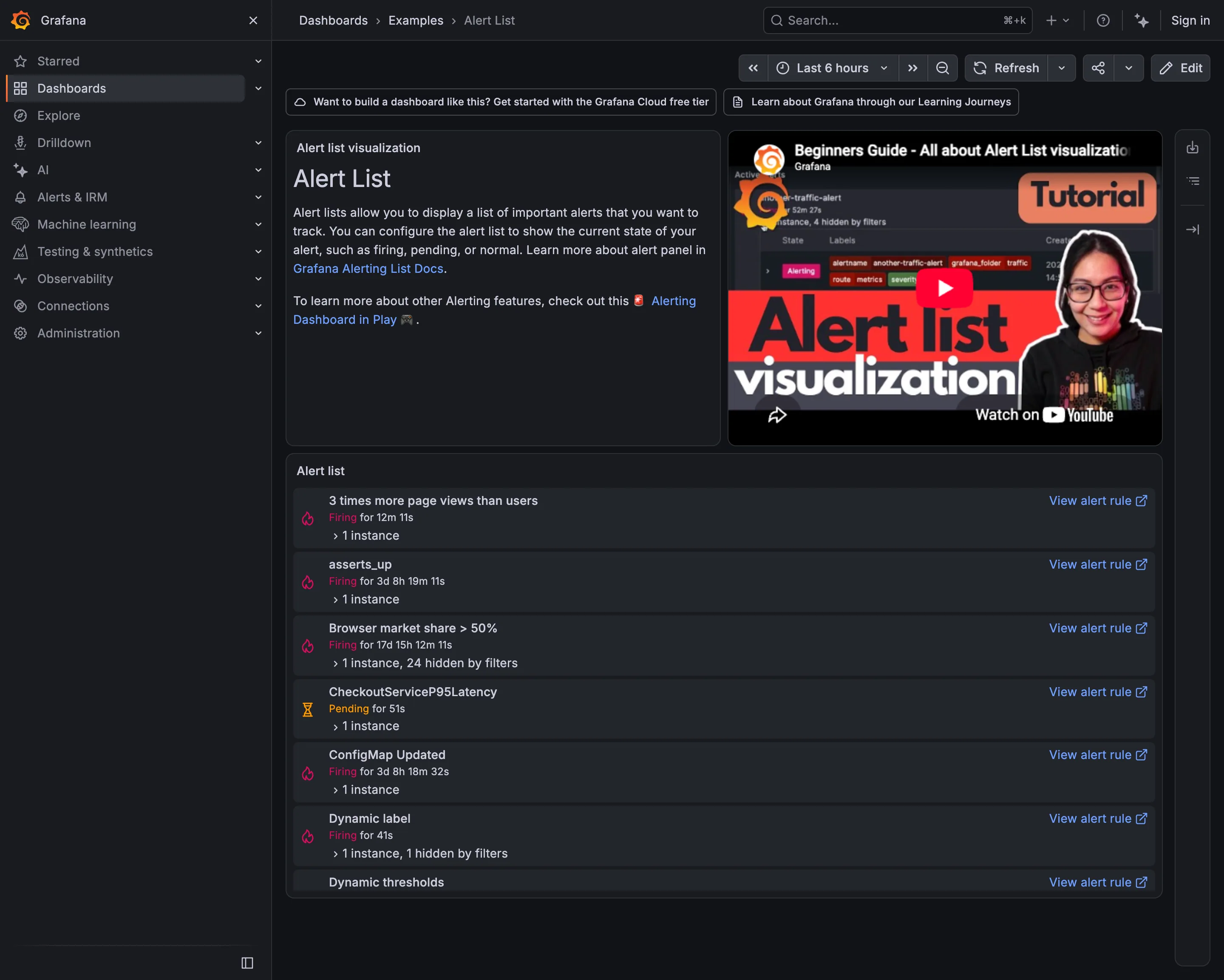
Examples / Alert List September 10, 2026 Grafana Play (signed out; no version string exposed) medium · dark · desktop-web
Seven alerts, and the durations are the story. "Browser market share > 50%" has been firing for 17 days, 15 hours and 12 minutes. Two more have been firing for over three days. An alert that has been true for two and a half weeks is not telling anyone anything—it has become part of the background, and the list it sits in is now a list you scroll past. The other thing worth reading is the names. Six alerts, six conventions: a full sentence, a metric identifier in snake case, a camel-case service name, a two-word phrase, and two that just say "Dynamic". Somebody arriving at this list at three in the morning cannot tell from the names what is broken or how badly, which is work the naming could have done for free.
  • Alert rule attached to panel Seven rules in six naming conventions. Nothing in the list conveys severity or subject.
  • Alert rule attached to panel Firing for 17 days. Still actionable, in principle; nobody has acted for two and a half weeks.
  • Semantic status color Pending rather than firing: the threshold is met and the duration isn't. Two states, both named.
  • Filter bar "1 instance, 24 hidden by filters"—the list saying what it is not showing you.
  • Drill-down The route from an alert back to the rule that defined it, on every row.
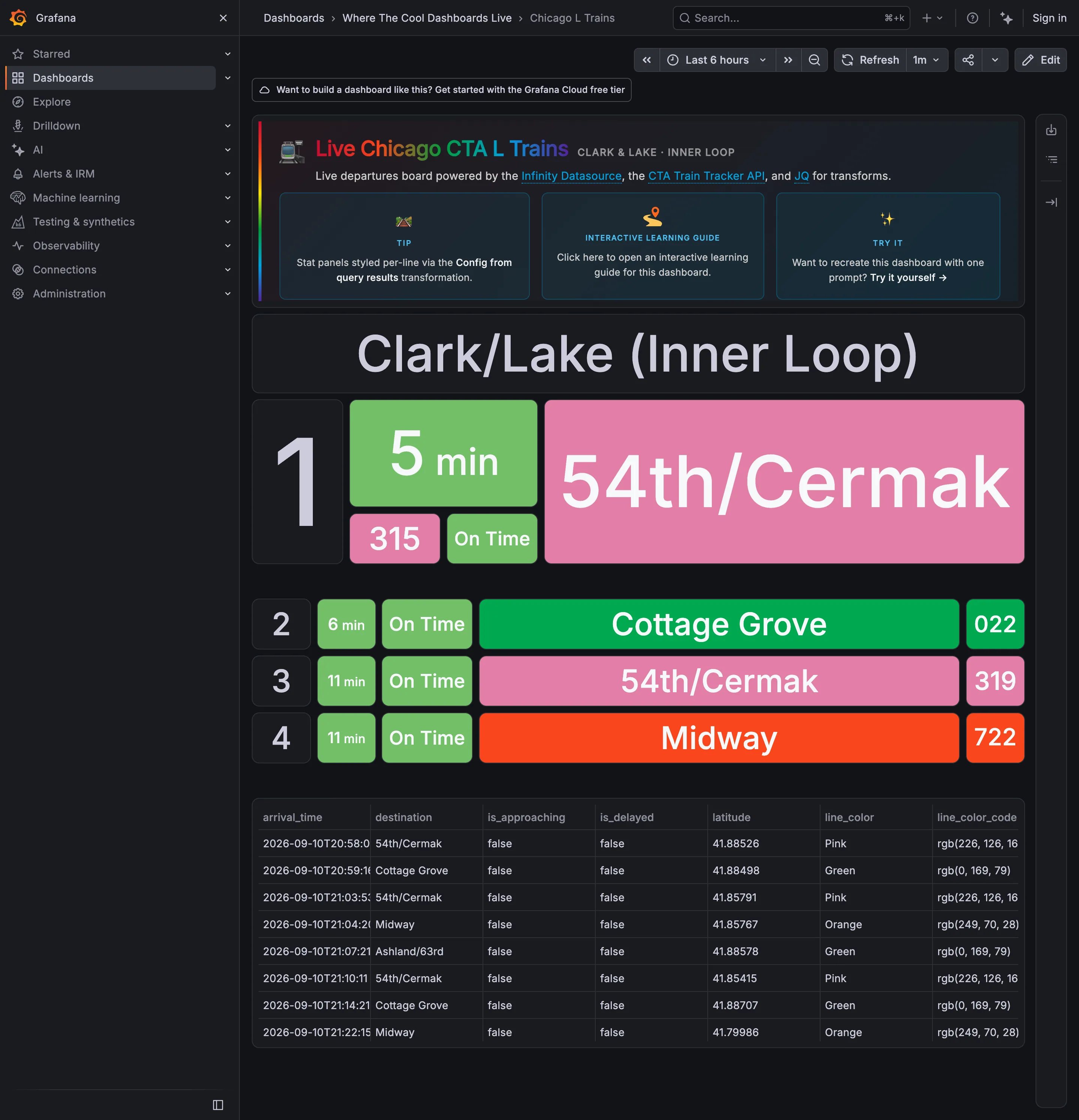
Where The Cool Dashboards Live / Chicago L Trains September 10, 2026 Grafana Play (signed out; no version string exposed) sparse · dark · wall
A live departures board for one platform, built out of stat panels against the CTA Train Tracker API, and it is the clearest wallboard in the gallery: four rows, type large enough to read across a concourse, no chrome inside the board and nothing to hover. The next train gets three times the height of the three behind it, which is the layout saying "start here" without a word of copy. The interesting problem is the colour. Pink, Green and Orange are the CTA's own line colours, inherited from the world outside the screen and already known to every rider—which is the best possible reason to use a palette. But the status chip beside them is also green when a train is on time, so on the second row "Cottage Grove" is green because it is the Green Line and "On Time" is green because it is on time, side by side, meaning two unrelated things.
  • Wallboard mode The next train, three times the height of the rest. Readable at ten feet with no pointer.
  • Panel grid Rows two to four at a third the size. Panel size is carrying the priority.
  • Semantic status color Green for on time, next to green for the Green Line. One hue, two unrelated jobs, one row.
  • Freshness indicator A countdown rather than a clock time, which is the right call and hides how old the feed is.
  • Data table The raw feed under the board, including the rgb string each line colour came from.
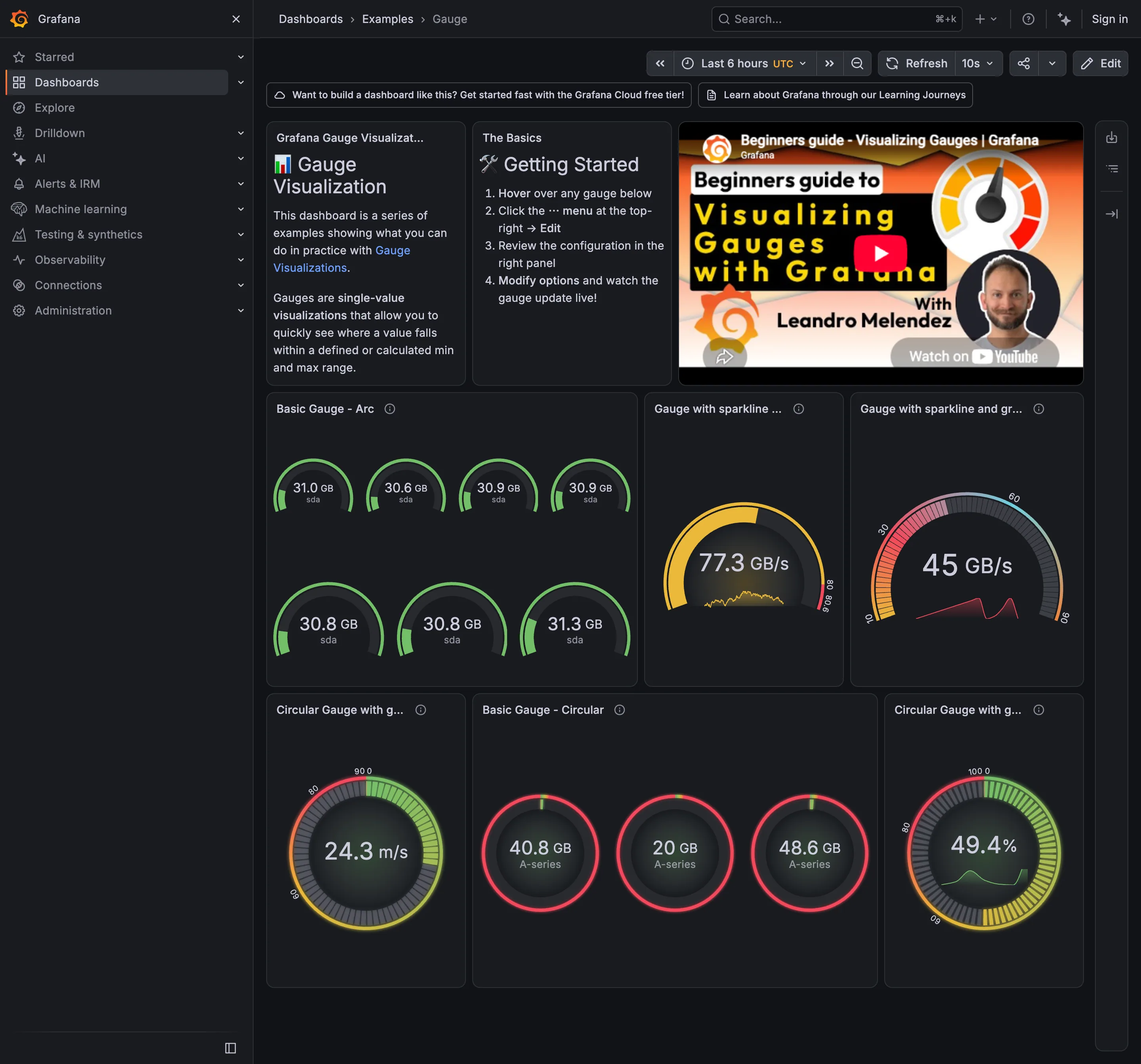
Examples / Gauge September 10, 2026 Grafana Play (signed out; no version string exposed) medium · dark · desktop-web
Nine gauges, and the page makes Few's argument against them without meaning to. The panel at bottom left holds seven arcs reading 30.6, 30.8, 30.8, 30.9, 30.9, 31.0 and 31.3 GB. Seven squares, seven needles, to say that seven disks are all about the same. The same seven values as a bullet graph would be seven short bars in a fraction of the height, and the one that was different would be obvious rather than requiring you to read each label. What the gauges do carry is a bounded range where the endpoints mean something, which is the case the pattern survives: these are percentages and capacities, not rates. The panel beside them is where it stops working—three circular gauges at 40.8, 20 and 48.6 GB, all with a red arc, so a value and another value two and a half times larger get the same verdict.
  • Gauge and dial Seven arcs to report that seven disks agree. This is the area argument in one panel.
  • Sparkline A sparkline inside the arc: the same series encoded twice in one square.
  • Sequential and diverging scales The arc runs pink through green with no perceptual order, so position on it means nothing without the number.
  • Semantic status color 40.8, 20 and 48.6 all arc red. The threshold fires for everything, so it says nothing.
  • Threshold line and region The coloured band around the rim is the threshold, drawn as a region rather than a line.
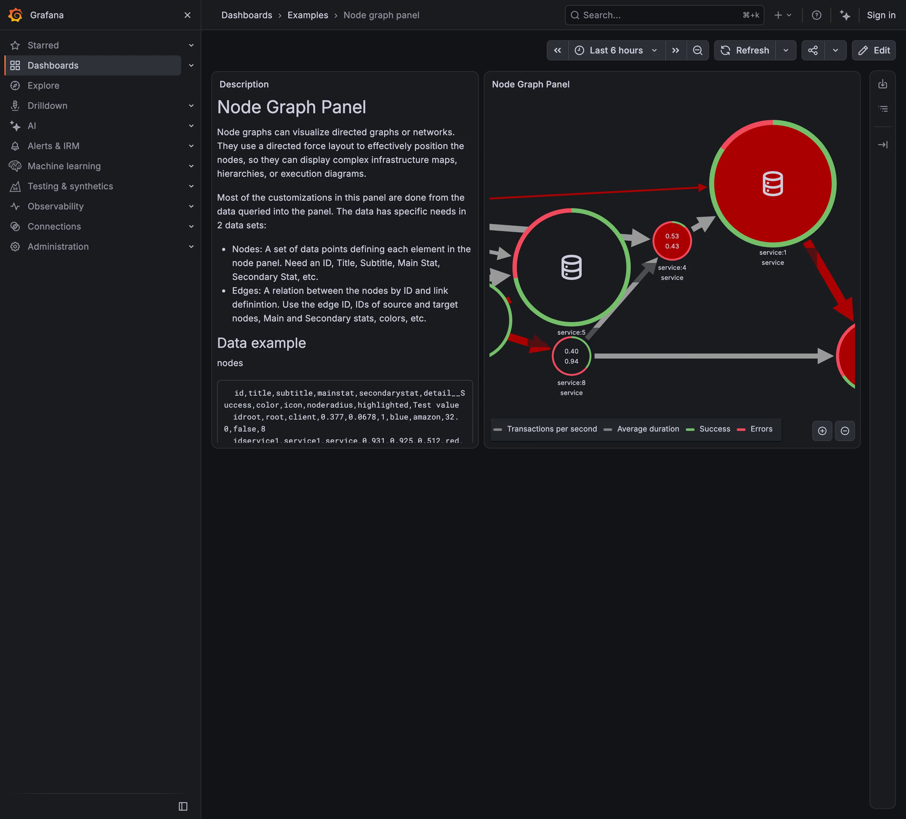
Examples / Node graph panel September 10, 2026 Grafana Play (signed out; no version string exposed) sparse · dark · desktop-web
Seven services, and the panel is already too small to hold them. Three nodes are cut in half by the right edge and at least one more is somewhere past it, which is the force layout doing what force layouts do to a graph with more nodes than room. That is the hard part of this pattern and it is visible here at a scale of seven. Each node also carries four things at once: a number, a second number, and a ring split between a green arc and a red one. The legend names all four. A topology view where every node reports four measures is a view you read node by node, which is the opposite of what a map is for —one derived state per node is scannable in a second and drills into the rest. Here almost every ring is mostly red, so the channel that could have carried that state is saturated and distinguishes nothing.
  • Service map Nodes for services, edges for calls, both from instrumentation rather than from a diagram.
  • Semantic status color One node: two numbers inside and a success/error ring around it. Four measures, no verdict.
  • Legend and series toggle Four series named for a graph with seven nodes, which is the legend doing more work than the map.
  • Zoom and pan on time The only route to the nodes pushed off the right edge, and it doesn't move the rest of the page.
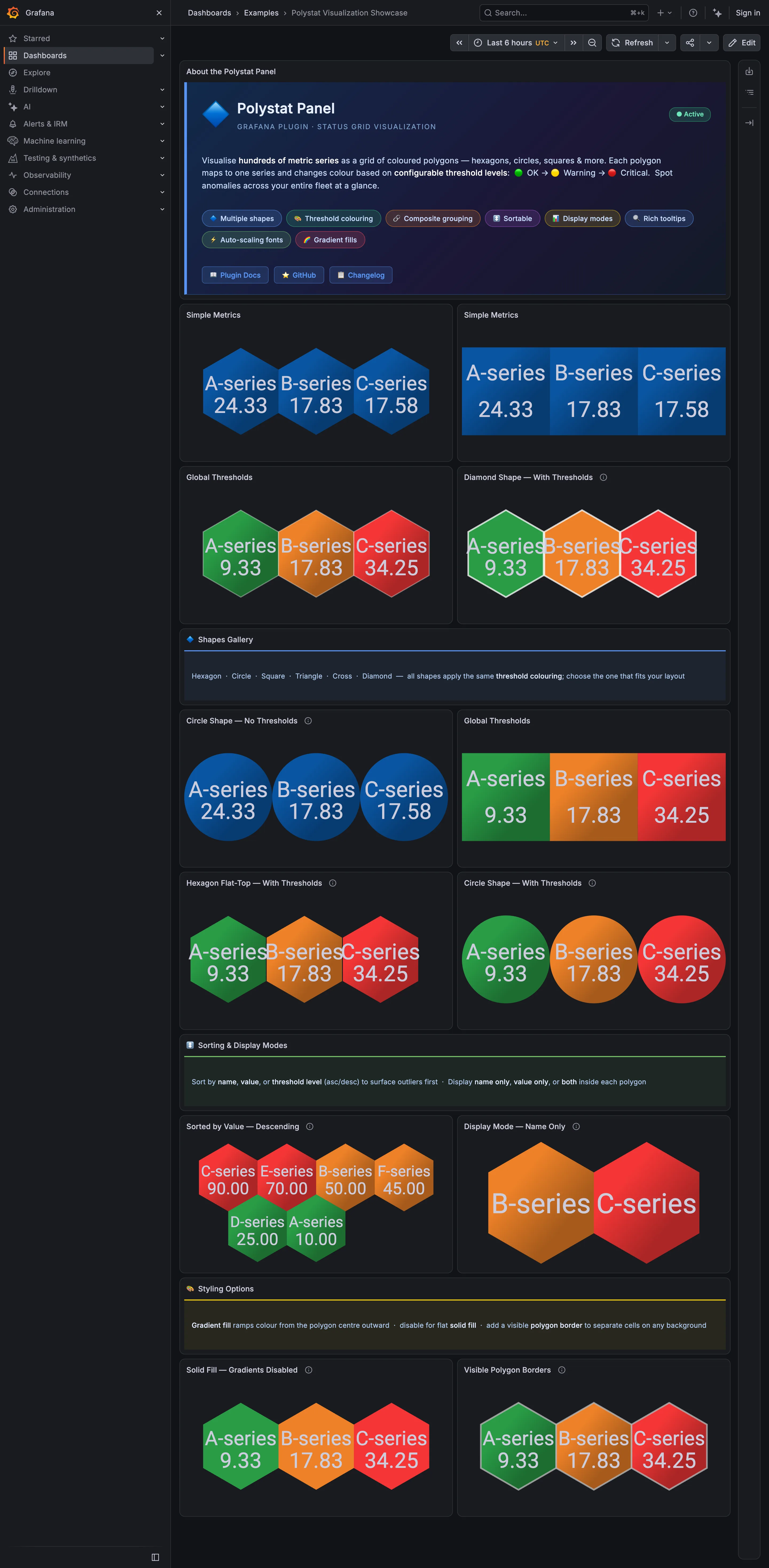
Examples / Polystat Visualization Showcase September 10, 2026 Grafana Play (signed out; no version string exposed) medium · dark · desktop-web
The plugin's own description is the host map pattern stated plainly —"visualise hundreds of metric series as a grid of coloured polygons" and "spot anomalies across your entire fleet at a glance"—and the shapes gallery halfway down says all six shapes "apply the same threshold colouring; choose the one that fits your layout." The page then disproves its own claim. The hexagon panels tile with every neighbour sharing an edge, so three cells read as one block. The circle panels leave a gap between every pair, so three cells read as three things you have to compare one at a time. At six cells that difference is a preference. At three hundred it is the difference between a cluster you see and a cluster you assemble, which is why the shape is a structural choice rather than a styling one.
  • Host map Hexagons sharing edges. Adjacent unhealthy cells merge into one shape, which is the point of the tiling.
  • Host map The same data as circles: a gap around every cell, so nothing clusters.
  • Semantic status color A closed set of three—OK, warning, critical—applied as the whole cell fill.
  • Ranked list Sorted descending so the worst cell lands where the eye starts. No share of total, and no row for the rest.
  • KPI tile Name-only mode: two cells carrying a label, a colour and no number at all.
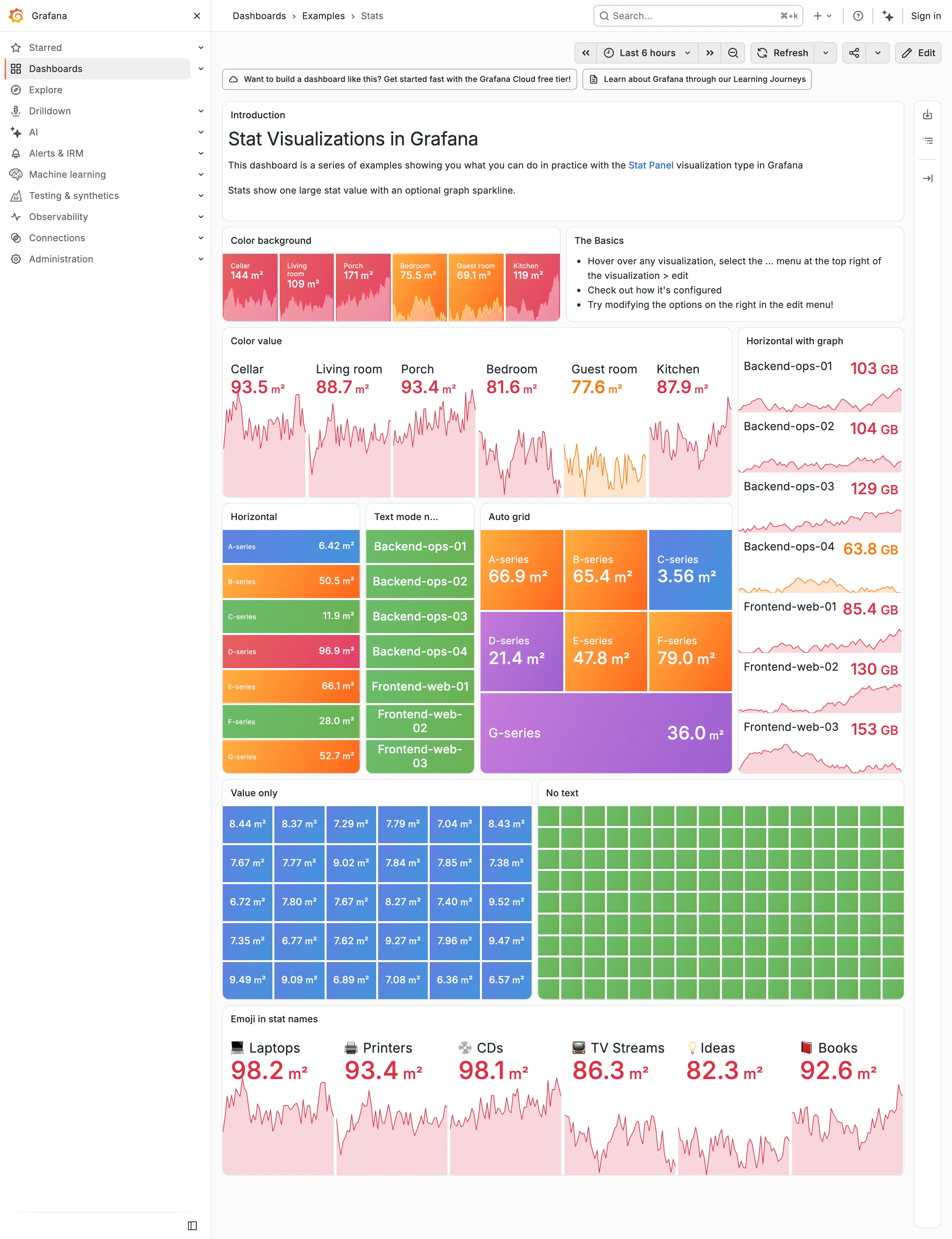
Examples / Stats, light theme September 10, 2026 Grafana Play (signed out; ?theme=light) dense · light · desktop-web
The same dashboard as the dark Stats capture, same data, same palette, one URL parameter apart. Put them side by side and the palette turns out to have been designed on charcoal. On the dark version the value colours carry because they are brighter than the ground—reds, oranges and greens against near-black. Here they have to carry by being darker than the ground instead, and the same hues arrive as pale pink and pale salmon. Look at the Color value panel: six numbers at 30-odd pixels, and 93.5, 88.7, 93.4, 81.6, 77.6 and 87.9 are all light pink on white. The column on the right is worse, because 63.8 GB lands on pale orange. Nothing about the theme switch is broken, and nothing was chosen for this ground. That's the whole argument for designing the dark case first and deriving the other one: the constrained case should set the lightness range, and here the unconstrained one did.
  • Dark-first data palette The same six values as the dark capture. Bright-on-charcoal became pale-on-white, and the contrast went with it.
  • Dark-first data palette 63.8 GB in pale orange on white. On the dark version the identical colour was the readable one.
  • Semantic status color Whole-tile fills survive the switch, because the text sits on the colour rather than being the colour.
  • Grayscale with alerts Ninety green rectangles, identical in both themes. Nothing here can read as abnormal on either ground.
  • Sparkline The area fills under each value drop to near-white here, so the shape that was legible on charcoal is a smudge.
Grafana — Examples / Stats
Header KPI strip. Six tiles sharing one anatomy, which is the arrangement that reads as a row rather than as six things. KPI tile. Label, value, unit and a sparkline behind it. No delta, no base, no window. Dark-first data palette. The dark half of the pair. The same six values in the light capture arrive as pale pink on white. Semantic status color. No text at all. Colour is the only carrier, which is the WCAG failure stated as a feature. Sparkline. A column of them, each scaled to its own series, which is the comparison Tufte warns the arrangement invites. KPI tile. Thirty numbers with no labels—the value with nothing attached to it. Grayscale with alerts. Seven rows, seven different colours, no resting state. Nothing here can read as abnormal. Semantic status color. Whole-tile background colour: the loudest channel available, spent on all six.
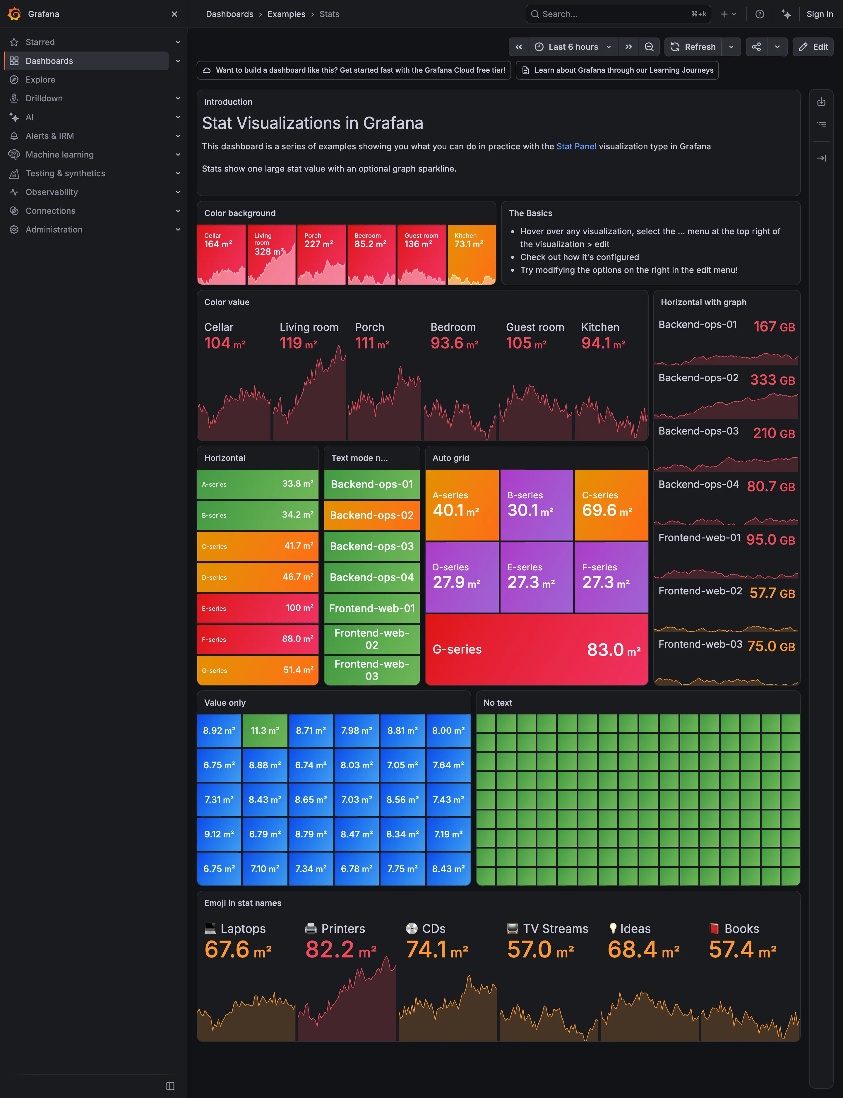
Examples / Stats September 10, 2026 Grafana Play (signed out; no version string exposed) dense · dark · desktop-web
A showcase rather than a working dashboard, which is what makes it useful: it is Grafana demonstrating every visual option the stat panel has, in one place, with nothing else competing. Two things are worth reading it for. The first is that across roughly sixty tiles here, not one carries a comparison. Every option on display is about how the number looks—background colour, value colour, orientation, text mode, grid packing—and none is about what the number should be measured against. The panel type that most needs a delta and a base is being shown off without either. The second is the colour. Every single tile on this page is coloured, and the "No text" panel is ninety-odd green rectangles carrying no label and no value at all, which is colour as the sole carrier of meaning at its purest. Both of those are reasonable for a catalogue of options and neither survives being copied onto a real page.
  • KPI tile Label, value, unit and a sparkline behind it. No delta, no base, no window.
  • Dark-first data palette The dark half of the pair. The same six values in the light capture arrive as pale pink on white.
  • Sparkline A column of them, each scaled to its own series, which is the comparison Tufte warns the arrangement invites.
  • Semantic status color Whole-tile background colour: the loudest channel available, spent on all six.
  • Grayscale with alerts Seven rows, seven different colours, no resting state. Nothing here can read as abnormal.
  • KPI tile Thirty numbers with no labels—the value with nothing attached to it.
  • Semantic status color No text at all. Colour is the only carrier, which is the WCAG failure stated as a feature.
  • Header KPI strip Six tiles sharing one anatomy, which is the arrangement that reads as a row rather than as six things.
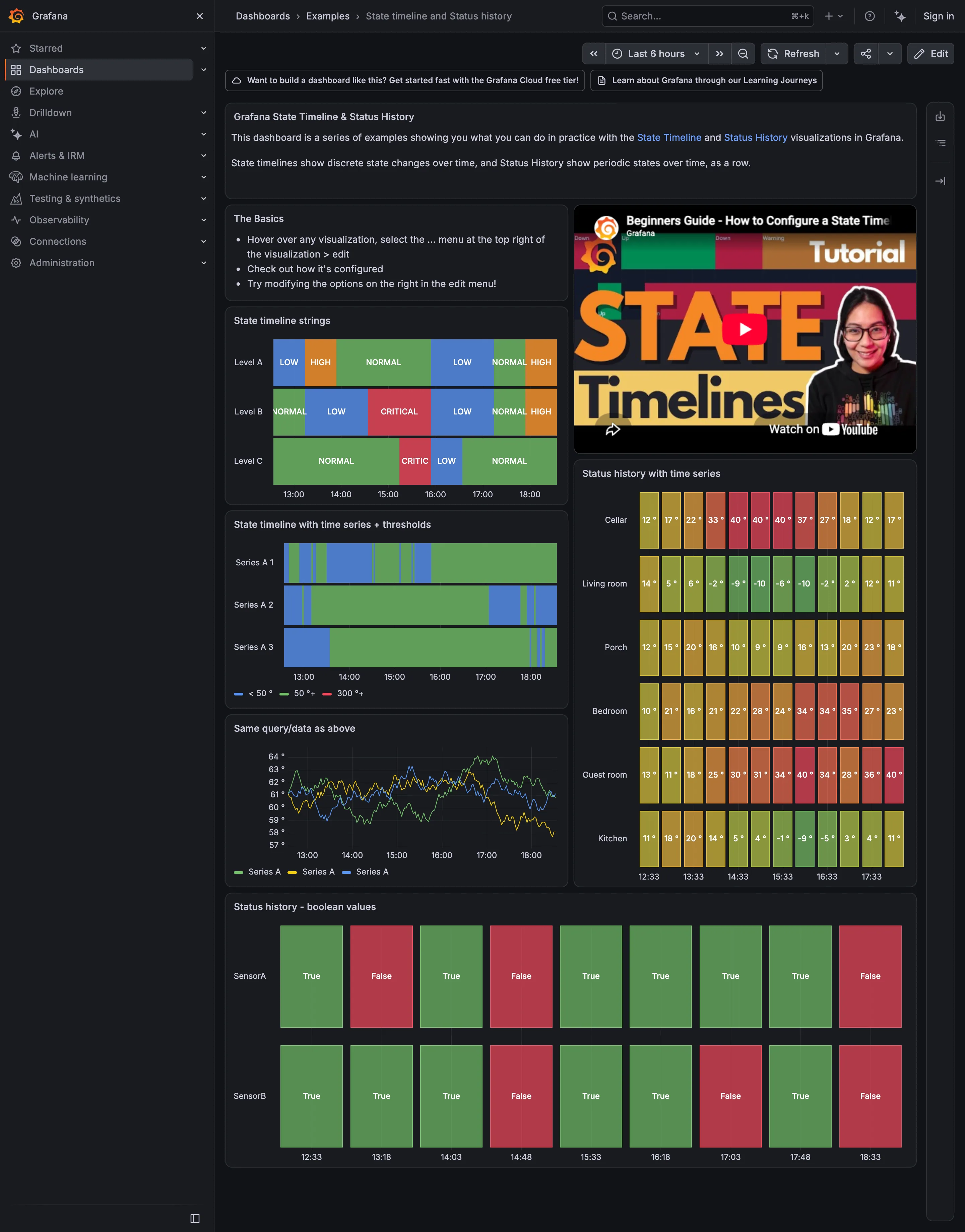
Examples / State timeline and Status history September 10, 2026 Grafana Play (signed out; no version string exposed) medium · dark · desktop-web
The most useful thing on this page is an accident of layout: the third panel down the left column draws three series as state bands, and the panel directly underneath draws the identical query as an ordinary time series. Same data, stacked one above the other. The line chart is three tangled traces oscillating between 57 and 64, and reading it means picking a series, tracing it, and thresholding it in your head. The state timeline above has already done that and shows the conclusion, and the blue stretches—below fifty—are findable without being looked for. That is the whole argument for the encoding, and Grafana has put the before and after in adjacent panels. Worth noticing too that every coloured region here carries its word inside it. LOW, HIGH, NORMAL, CRITICAL, True, False. Colour is never the only carrier on this page.
  • Status history Continuous regions with the state name written inside each one.
  • Threshold line and region Thresholds turning a numeric series into discrete bands: under 50, 50, 300.
  • Time series The same query as the panel above, untranslated. Three traces you have to threshold yourself.
  • Sequential and diverging scales One mark per sample, green through red by temperature—so green here means cold, not good.
  • Semantic status color A closed set of two, both labelled. The clearest case on the page of colour plus a word.
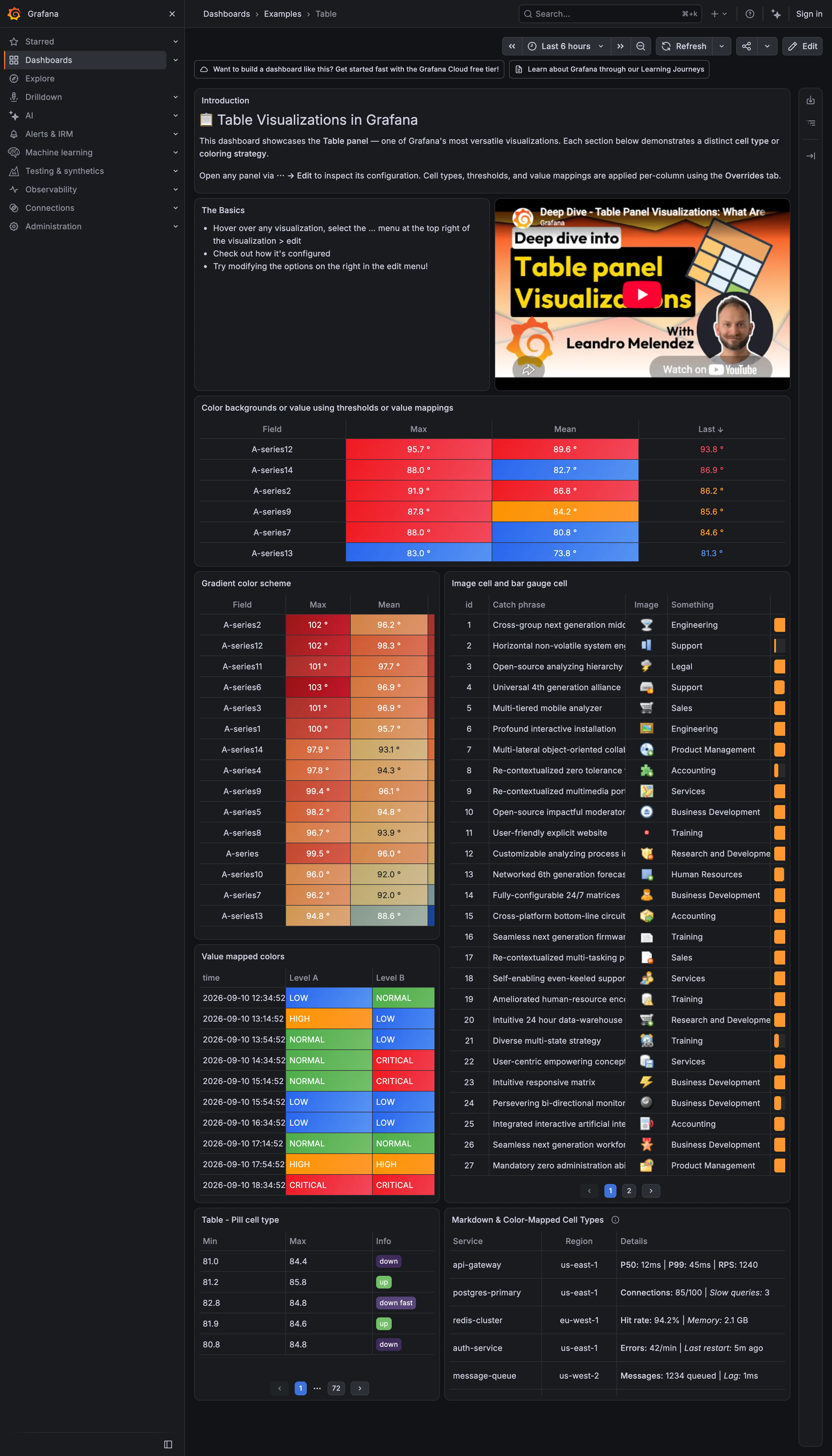
Examples / Table September 10, 2026 Grafana Play (signed out; no version string exposed) dense · dark · desktop-web
Seven tables demonstrating what a cell can hold, and the range is the point: a threshold colour on the whole cell, a continuous gradient down a column, an image, a bar rendered inside the cell, a pill, and a markdown block carrying three metrics at once. Two of them stop working at this size. The bar gauge column on the right is squeezed to a sliver about six pixels wide, so the encoding that was supposed to make magnitude visible carries nothing, and the catch-phrase column beside it truncates mid-word with no way to see the rest. The bottom-left table is the one to look at hardest. It is sorted, it has column headers you can click, and the pager under it reads page 1 of 72. Any sort applied there is a sort of the page unless the query re-runs, and nothing on screen tells you which of those is happening.
  • Data table Threshold colour filling the cell, which makes a column scannable without being read.
  • Sequential and diverging scales A continuous ramp down a sorted column: the table doing a heatmap's job.
  • Data table In-cell bar gauge clipped to a sliver, and text truncated mid-word with no escape to the full value.
  • Semantic status color Value mappings turning raw levels into a closed set, each with its word in the cell.
  • Delta indicator Pills reading up, down and down fast: direction with no magnitude and no base. Also page 1 of 72.

Home Assistant

A card grid people genuinely rearrange, on a wall tablet, which is where resizable layouts either work or quietly stop describing the house.

Home Assistant — Demo dashboard
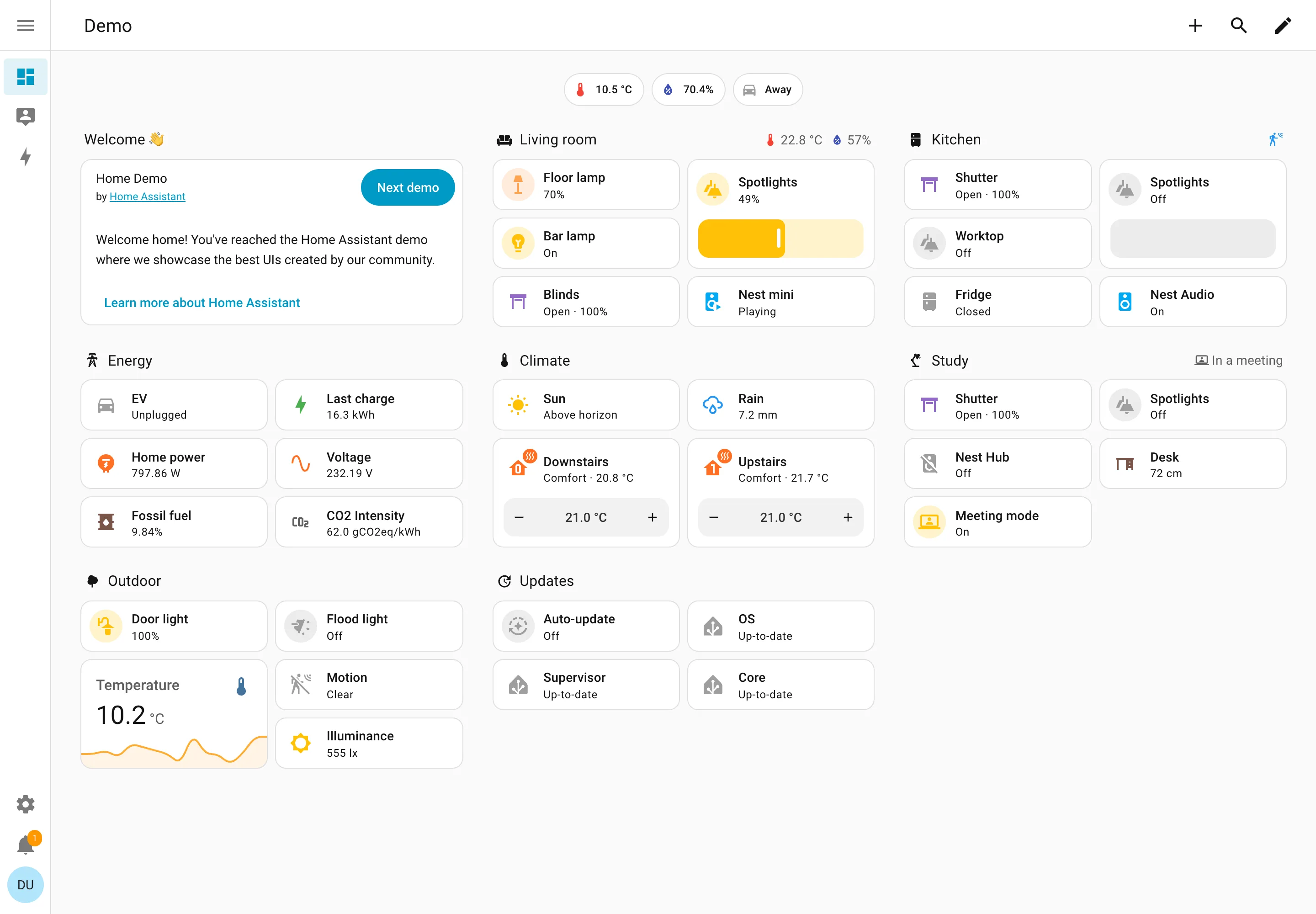
Resizable card grid. Cards a household arranges itself, grouped by room. Sections are one column each rather than a free canvas. Semantic grouping. Grouped by where the thing physically is, and the group header carries that room's temperature and humidity. Sidebar and canvas. Collapsed to icons by default, because on a wall tablet the canvas is worth more than the labels. Sparkline. One card carrying a number and the shape behind it, with no axis and no legend. Semantic status color. Amber means on, and the card says 49% anyway. Colour repeats the word instead of replacing it. Header KPI strip. Three chips above everything: outside temperature, humidity, and whether anyone is home. Dashboard builder. A pencil in the corner. Editing is one click from reading, which is why these pages actually get rearranged.
Demo dashboard September 10, 2026 Home Assistant public demo (signed out) medium · light · desktop-web
The grouping axis here is physical space—Living room, Kitchen, Study, Outdoor—which nothing else in this gallery uses, and it works for the same reason process mimics work: the viewer already holds the model. The thing worth stealing is the state labelling. Every entity says its state in words: Open · 100%, Off, Closed, Playing, Up-to-date, Unplugged. The amber tint on an icon repeats what the word already said rather than replacing it, so the page is readable with no colour at all. That isn't accessibility diligence so much as an audience constraint—you cannot train a household on a colour key the way you can train an on-call rota, so the words have to carry. Each section header also doubles as a summary: Living room reports 22.8°C and 57% humidity beside its own name, and Study reports "In a meeting". And this is a control surface as much as a display—the Spotlights card is a slider you drag, the thermostats have plus and minus.
  • Resizable card grid Cards a household arranges itself, grouped by room. Sections are one column each rather than a free canvas.
  • Semantic grouping Grouped by where the thing physically is, and the group header carries that room's temperature and humidity.
  • Semantic status color Amber means on, and the card says 49% anyway. Colour repeats the word instead of replacing it.
  • Header KPI strip Three chips above everything: outside temperature, humidity, and whether anyone is home.
  • Sidebar and canvas Collapsed to icons by default, because on a wall tablet the canvas is worth more than the labels.
  • Sparkline One card carrying a number and the shape behind it, with no axis and no legend.
  • Dashboard builder A pencil in the corner. Editing is one click from reading, which is why these pages actually get rearranged.