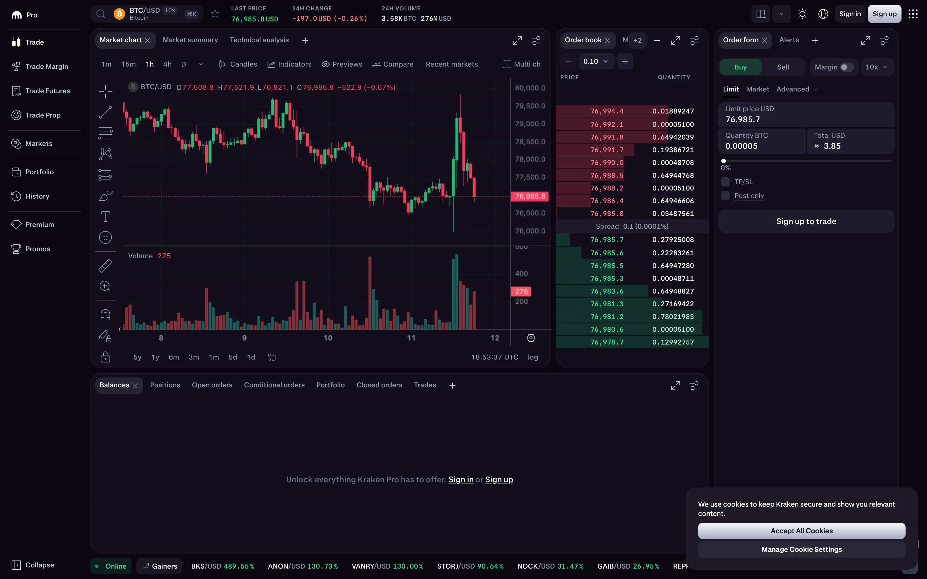
Problem
Every price, every delta, every tick is coloured green for up and red for down. The convention is so entrenched that violating it confuses everyone, and honouring it makes the display unreadable for a substantial share of the audience.
Solution
Keep the convention, and never let it carry the information alone.
The convention is genuinely strong. In Western markets green means up and red means down, and traders read it faster than they read the sign. Discarding it would cost more than it saves. But red-green is precisely the axis most colour vision deficiency runs along: deuteranomaly and protanomaly are the common forms, and around one in twelve men is affected. On a screen of nothing but red and green numbers, that person is reading unmarked values.
The redundancy that fixes it is cheap and mostly already available.
Sign and symbol. A plus or minus, an arrow, a triangle. Reading direction off a glyph is faster than reading it off a hue anyway.
Lightness as well as hue. Choosing a light green and a dark red—rather than two colours of equal lightness—means the pair survives greyscale, which is the same property that makes it survive most colour vision deficiency.
Position. In a ladder or a table, up-moves above and down-moves below is structural and needs no colour at all.
Two further complications are worth knowing. The convention inverts in several Asian markets, where red means up and is auspicious, so a platform serving both audiences needs the mapping to be a preference rather than a constant. And red is simultaneously doing duty as the status colour for “error”, so a page can end up with red meaning “down” in one panel and “broken” in the next.
Use when
The audience genuinely holds the convention and the display is dense enough that speed matters. Trading, treasury, portfolio and finance dashboards.
Don’t use when
The audience is general. Outside finance the red-green mapping carries less weight and costs the same accessibility, so a neutral encoding with explicit signs is usually better. And avoid it for anything where “up” is not obviously good or bad—up is good for revenue and bad for latency, and colouring both green because both rose is meaningless.
Trade-offs
The convention makes an entire class of display inaccessible when used alone, and the population affected rarely self-identifies at work. Redundant encoding costs space on displays already fighting for it. Palette inversion for different markets doubles testing. And the collision with status red means a viewer must infer from context whether red is a direction or a failure, which is exactly the ambiguity a semantic palette is supposed to eliminate.
Checklist
- Is direction encoded by anything other than hue?
- Do the two colours differ in lightness as well as hue?
- Does the display survive being viewed in greyscale?
- Is the up/down colour mapping a user preference for markets that invert it?
- Does red mean “down” and “error” anywhere on the same screen?
- Is the neutral or unchanged state visually distinct from both?
- Are gains and losses distinguishable at the smallest text size used?
- Has this been checked with a colour vision deficiency simulator?
- Is “up” unambiguously good or bad for this metric, and does the colour reflect that rather than the sign?
- Would an arrow or sign make the colour redundant enough to soften it?
Compare
Bloomberg and the terminal tradition established the convention and pair it with dense numeric detail, so the colour is a fast path rather than the only path for a trained reader. Crypto exchanges inherited the convention wholesale and generally add explicit signs and percentages, which makes them accidentally more accessible than the terminals they copied. Trading platforms serving multiple markets expose the colour mapping as a setting, which is the correct structural answer to a convention that is not universal. Grafana has no notion of direction colouring, so a finance dashboard built on it uses value mappings and thresholds to reconstruct it, which at least forces someone to declare the rule explicitly.
Related
Semantic status color is the palette this convention collides with. Delta indicator is where the good-versus-bad decision belongs and is most often confused with up-versus-down. Order book is the display where this is most entrenched and most consequential. Categorical series palette shares the constraint from another angle. KPI tile is where a coloured delta reaches a general audience who may not hold the convention at all.