Problem
The last trade price is one number and it describes the past. What the trader needs is what is available right now: how much someone will buy at each price below, how much someone will sell at each price above, and how thin it gets as you move away from the middle.
Solution
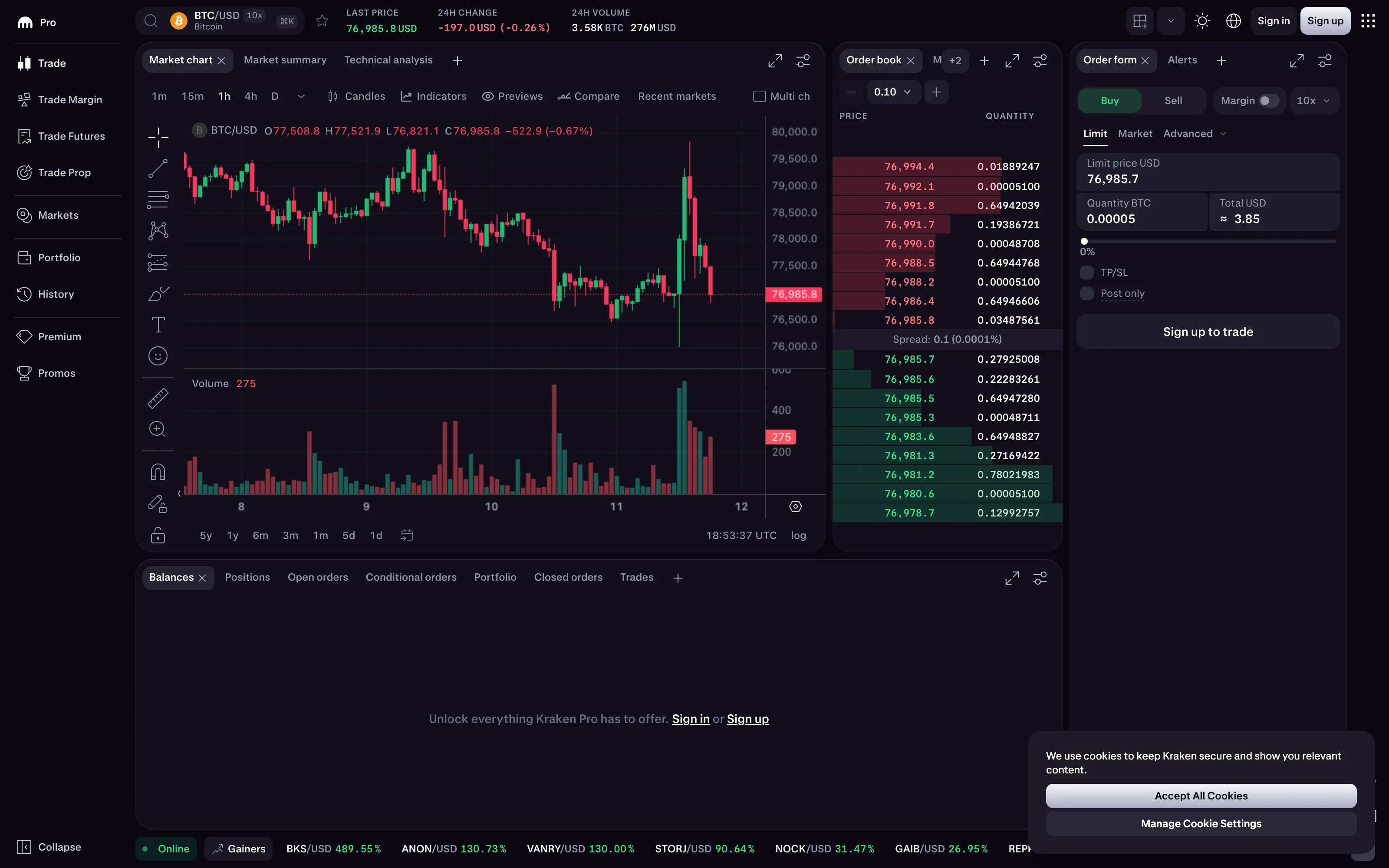
Two stacked ladders sharing a price axis. Bids below, asks above, the spread between them, each row carrying price and resting quantity. Beside or behind it, a depth chart: cumulative quantity plotted against price, producing two curves that meet at the spread.
The encoding earns its density because the shape answers questions no single number can. A steep depth curve means size can be moved without shifting the price much. A shallow one means the next order eats several levels. A wall—one price level holding far more than its neighbours—is a visible intention, and whether it is real or bait is the kind of judgement the display exists to support.
The design constraint that dominates everything is update rate. This is the most volatile display in the collection: rows change many times a second, and a naive implementation redraws so aggressively that a human cannot read it at all. The conventions that emerged are all about making change legible rather than merely current. Rows hold position while their quantities change, so the ladder does not reorder underneath the eye. New and changed levels flash briefly and decay. Aggregation by price increment collapses the tail so the levels near the spread keep their space.
Colour here is inherited rather than designed. Bid and ask sides are conventionally green and red in Western markets, which collides directly with the accessibility problem covered under red/green direction coloring, and which is inverted in several Asian markets. Position on the ladder carries the same information and does it more reliably.
Use when
Someone is deciding size and price against live resting liquidity, and the shape of that liquidity changes faster than a chart can summarise.
Don’t use when
The audience is not trading. On a monitoring or reporting dashboard, depth is detail nobody acts on, and a spread or liquidity metric says the same thing in a row.
Trade-offs
The display demands sustained attention and punishes glancing, which makes it the opposite of nearly every other pattern here. It is functionally unreadable to anyone untrained, so it cannot appear on a shared screen without explanation. High update rates cost real client performance and can mislead when the feed is throttled or the client falls behind, because a stale book looks exactly like a calm one. And the visible book is not the whole market: hidden and iceberg orders mean the display is a partial picture presented with total confidence.
Checklist
- What is the update rate, and can a person actually read at it?
- Do rows hold position while values change, or does the ladder reorder?
- Are changes marked in a way that decays, so recent activity is visible?
- Is price aggregation adjustable, and is the current increment displayed?
- Is the spread visually distinct rather than merely implied by the gap?
- Is cumulative depth available alongside per-level quantity?
- Does the display say when the feed is delayed, throttled or disconnected?
- Does side depend on colour alone, and does it survive colour vision deficiency?
- Is the colour convention right for this market’s audience?
- Does anything indicate what the book cannot see?
Compare
Bloomberg and Refinitiv terminals set the conventions most other implementations inherit, optimised for a trained full-time operator and unapologetic about density. Crypto exchanges brought the pattern to a mass audience and generally pair the ladder with a depth chart by default, which is the clearest teaching device for what the ladder means. Trading platforms with a DOM ladder let orders be placed directly on the price rows, which turns the display from a readout into a control surface and raises the stakes on every rendering decision. General dashboard tools have no equivalent, and a Grafana or Datadog rendering of a book is a table refreshing too slowly to trade on, which is a fair summary of why this pattern stayed inside specialist software.
Related
Log tail is the other pattern built for continuous high-rate arrival, and it shares the pause-and-read problem. Data table is what this degrades into at a slower update rate. Red/green direction coloring covers the accessibility trap this display walks into by convention. Wallboard mode is the trading-floor context. Time series is the summarised view the book is the raw form of.