Problem
The viewer is looking at 4,182. They have no idea whether that is good, and no idea whether to care, because a value with nothing to compare it against is trivia.
Solution
Put a second, smaller number next to the first saying how it changed. Three decisions sit inside that, and dashboards routinely get all three wrong at once.
What it’s compared against. Previous period, same period last week, same period last year, or a fixed target. Traffic has a weekly shape, so comparing Monday to Sunday manufactures a crash every week. Whatever the base is, it has to be the same length as the current window or the comparison is arithmetic dressed as insight.
How the change is expressed. Absolute, percent, or percentage points, and the last two are not the same thing. An error rate moving from 2% to 3% rose by one percentage point and by fifty percent. Both are true, one sounds like a bad afternoon and the other sounds like an incident, and the tile usually picks whichever the query happened to produce.
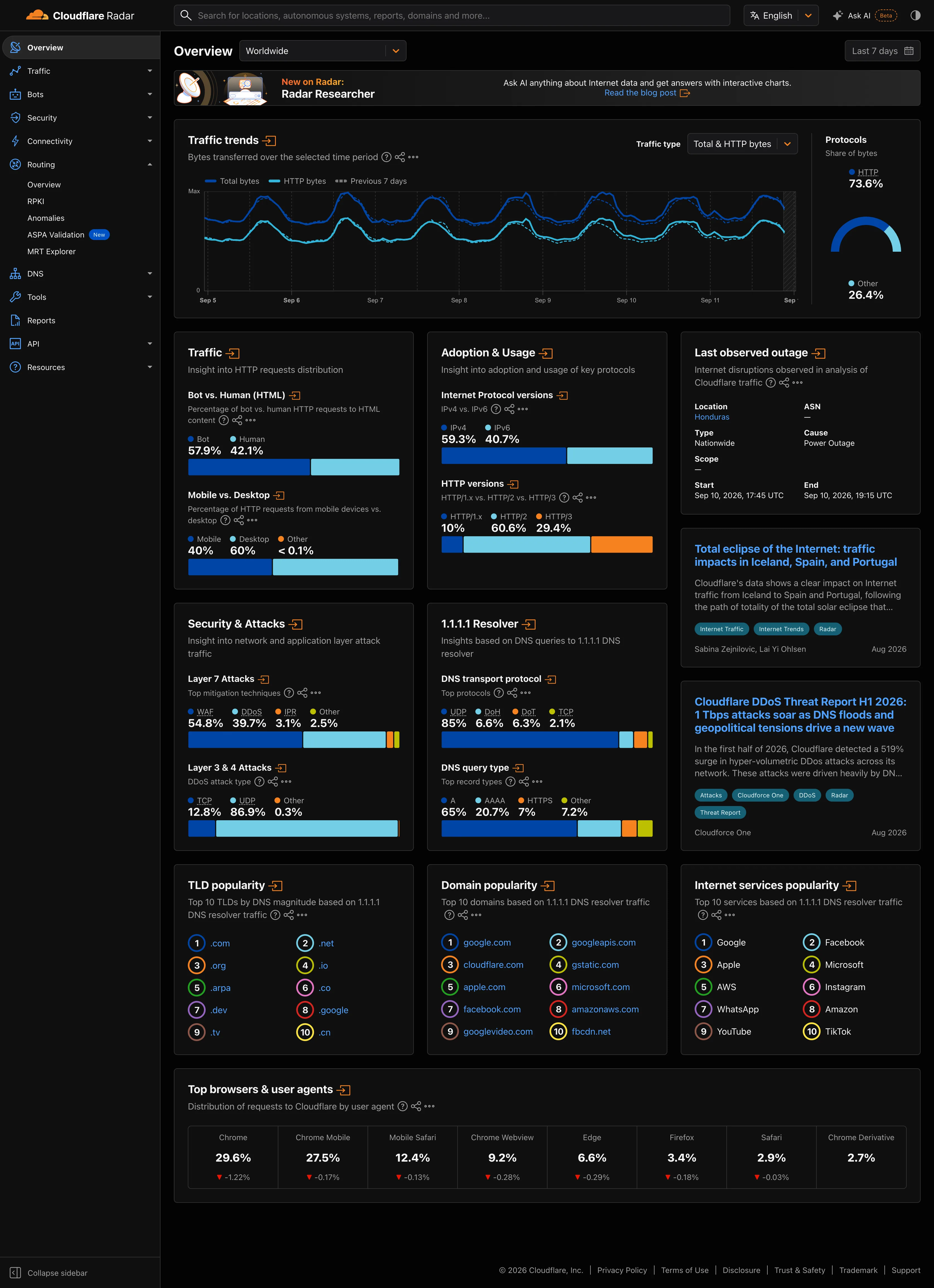
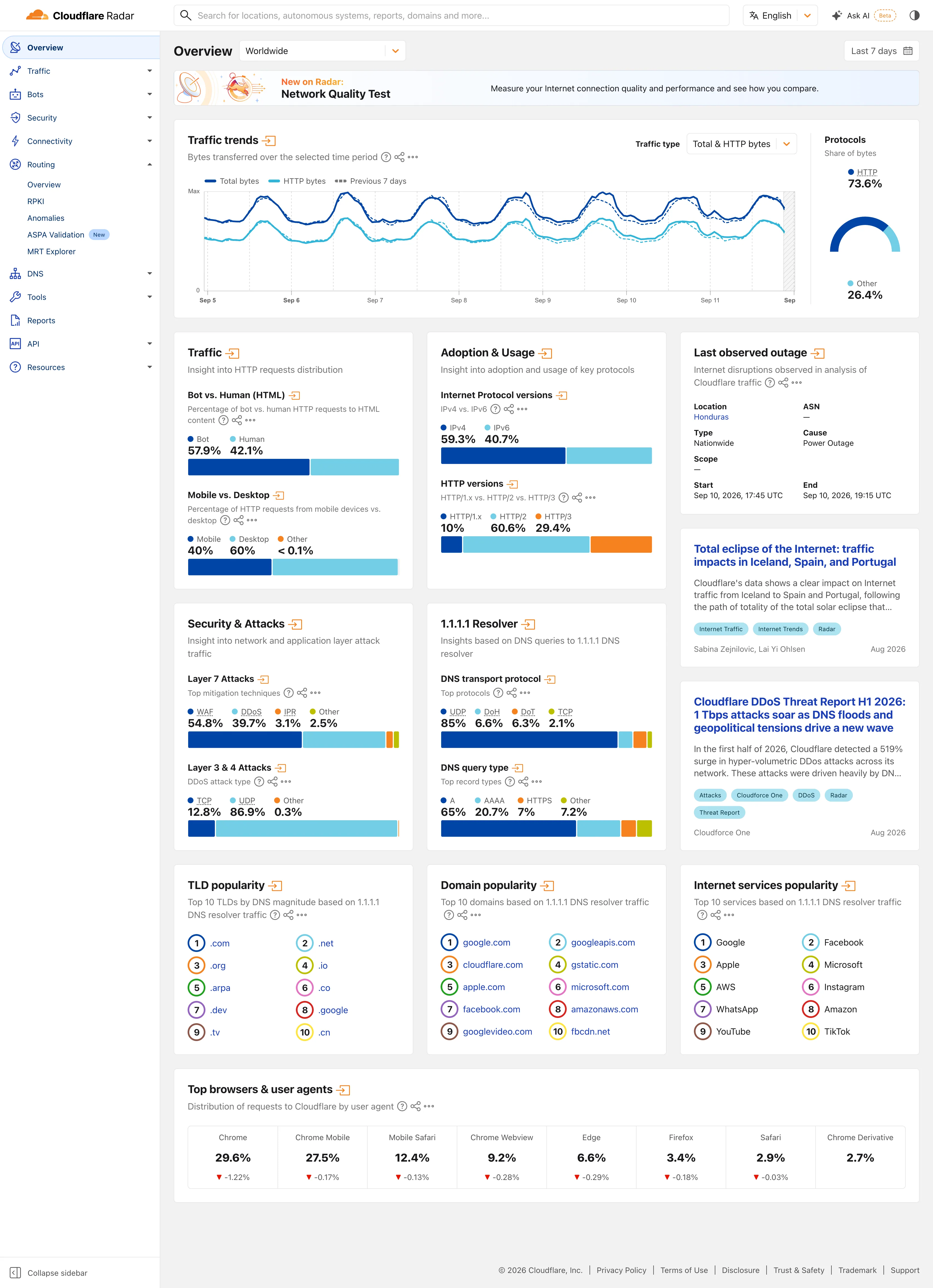
What the direction means. Up is not good. Up is good for revenue and bad for p99, and the color has to encode good and bad rather than up and down. A green arrow on a rising error rate is worse than no indicator at all, because the viewer trusts the color faster than they read the label.
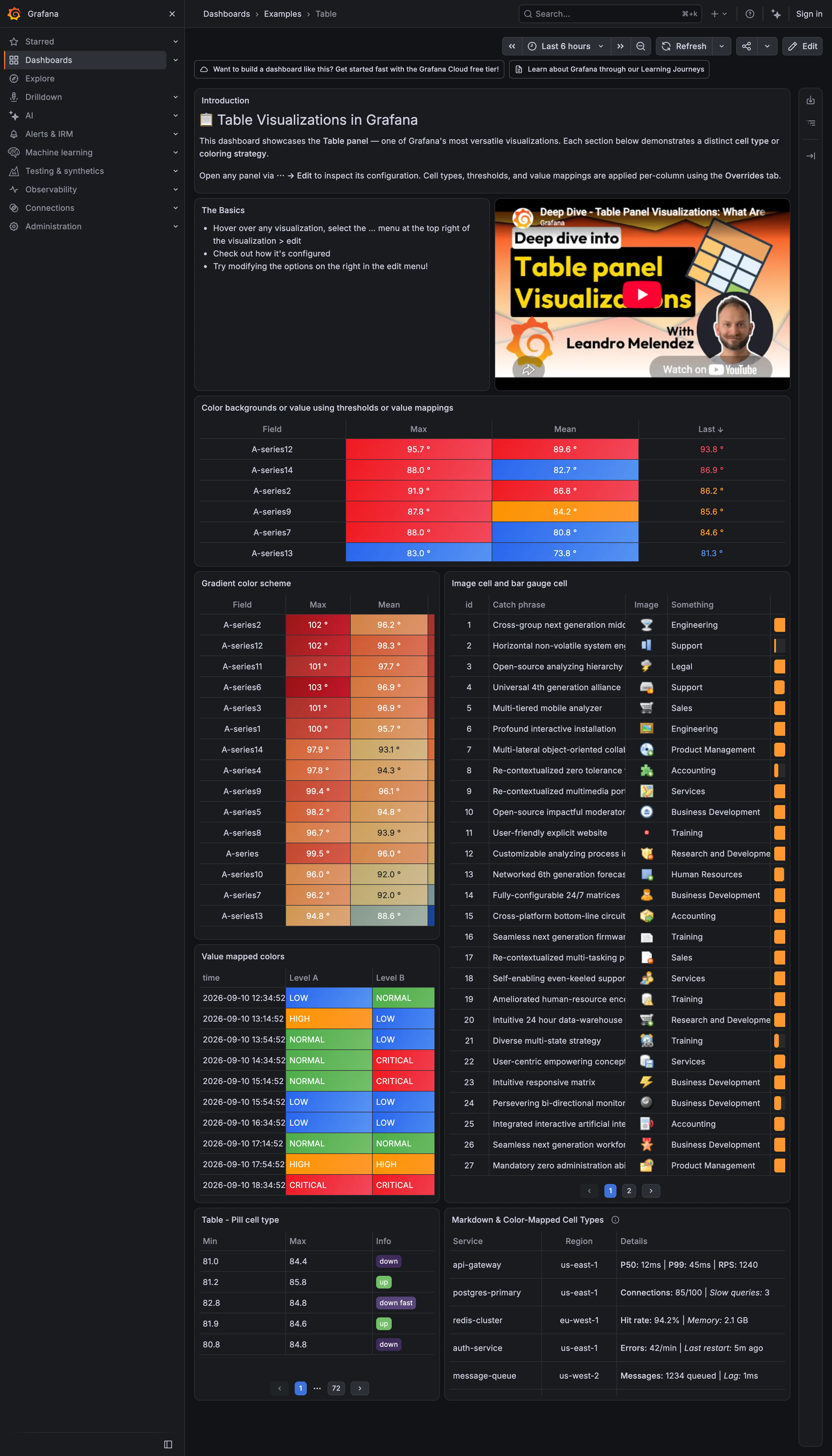
Grafana’s stat panel has a “Show percent change” option, off by default. The documentation says only “Set whether percent change is displayed or not” and never states which two values it compares, which is the whole question. Anyone reading the tile is trusting a comparison basis the product declines to name.
Use when
The viewer checks this number regularly enough to have expectations about it, and there is a defensible thing to compare it against.
Don’t use when
The series is too noisy for a two-point comparison to mean anything. If the metric routinely swings 30% hour to hour, a delta reports noise with the same confidence it would report a trend. Show the shape instead.
Trade-offs
A delta is two numbers pretending to be one relationship, and it discards everything in between. A value that dipped hard and recovered reads identically to one that never moved. It also invites over-reading of small windows, because a percentage computed on a small base produces large, meaningless numbers: three errors up from one is +200%. And once colored, the delta starts driving behavior on its own, which is fine until the comparison base is wrong and nobody has looked at it in a year.
Checklist
- What exactly is this compared against, and can the viewer see that without asking?
- Is the comparison window the same length as the current window?
- Does the comparison respect weekly and seasonal shape, or does it manufacture a Monday crash?
- Percent or percentage points, and is the label unambiguous about which?
- What is the denominator, and is it large enough for a percentage to mean anything?
- Does color encode good and bad rather than up and down?
- What happens when the prior period had a zero, or no data at all?
- Is the arrow redundant with the sign, and if so, is it earning its space?
- Does the delta round to more precision than the underlying data supports?
- Who can change the comparison basis, and does changing it change any alert?
Compare
Grafana ships percent change as a stat panel toggle and doesn’t document the comparison basis, which makes it easy to put on a wall and hard to defend in a review. Sentry frames the delta as a comparison between two named periods on the issue and release views, so the base is on screen rather than implied, which is the right instinct even when it costs space. Stripe draws the prior period as a ghost line behind the current one instead of reducing it to a badge, turning the comparison into a shape the viewer reads directly. Plausible puts the percentage next to every top-line number and keeps the comparison window locked to whatever the page filter says, so the delta can never disagree with the chart above it.
Related
KPI tile is the container this almost always lives in, and the two are usually specified together. Compare periods is the same idea given a whole page instead of a badge. Sparkline is the other way to supply context, and it answers the question a delta can’t, which is what happened in between. Semantic status color and red/green direction coloring are where the good-versus-bad decision actually gets encoded, and where it goes wrong.