Skip to content
KONIGI

Dashboards / Color / Dark-first data palette

2 of 6

Dark-first data palette

Ops dashboards live on dark screens all night and the chart colors have to survive it.

Updated September 10, 2026

Problem

The palette was chosen on a white background in the afternoon. It ships to a room where the lights are off, the screen is charcoal, and the person reading it has been awake for nineteen hours.

Solution

Design the dark version first and derive the light one, rather than the other way round, because the dark case is the constrained case and the one that actually gets used at 3am.

Inverting a light palette does not work, and the reason is worth understanding. On white, a colour is distinguished largely by its darkness—you can pick from a wide range of lightness values and every one contrasts with the background. On charcoal, every usable colour has to be lighter than the background, which collapses the available lightness range and forces hue and saturation to do work they were not carrying before. Colours that were clearly different on white converge into a set of similar pale tints on black.

The specific casualties are predictable. Saturated blues disappear into dark backgrounds. Pure yellow and pure white are painfully bright and cause halation, especially for viewers with astigmatism. Mid-tone greys that read as “muted” on white read as “barely there” on charcoal. And the amber that meant warning becomes almost indistinguishable from the yellow that meant one of the series.

NN/g’s research is a useful corrective against treating dark mode as strictly better: light mode measured better for people with normal vision on reading and acuity tasks, because positive polarity produces more light, contracts the pupil, and sharpens focus. Dark mode measured better for people with cloudy ocular media such as cataracts. The honest conclusion is that neither wins outright, which is the argument for supporting both properly rather than picking one and inverting.

WCAG’s non-text contrast floor applies to chart elements as much as to buttons, and it is the requirement most often missed in dark themes, where a series line at 2:1 against the background looks fine to the person who chose it on a good monitor.

Use when

The primary context is dark: NOC walls, on-call tooling, terminals, anything watched overnight. Also whenever the product offers a theme toggle, because both themes then need to be first-class.

Don’t use when

The output is print, PDF or a projector, where dark backgrounds waste ink and wash out. If a dashboard is regularly screenshotted into documents, the light theme is the one that ships.

Trade-offs

Maintaining two palettes doubles the work and doubles the drift, and the second theme is usually the one nobody checks. Dark themes flatter poor contrast, so problems surface only on the cheap monitor in the actual control room. Photographs, logos and embedded content assume white and look wrong. And a dark chart screenshotted into a light document arrives as a black rectangle, which is a small daily friction for teams who write incident reports.

Checklist

  • Was the dark palette designed first, or inverted from a light one?
  • How many series colours stay distinguishable on the actual background at the actual size?
  • Is pure white or pure yellow used anywhere large, and does it halate?
  • Does every series colour meet the non-text contrast floor against the dark background?
  • Do the status colours stay distinct from the categorical series colours in both themes?
  • Have both palettes been checked for the common colour vision deficiencies?
  • Has this been looked at on the worst screen it will actually run on?
  • What happens when a dark chart is pasted into a light document?
  • Do grid lines, axes and labels recede properly, or do they compete?
  • Does the theme follow the system preference, and can it be overridden?

Compare

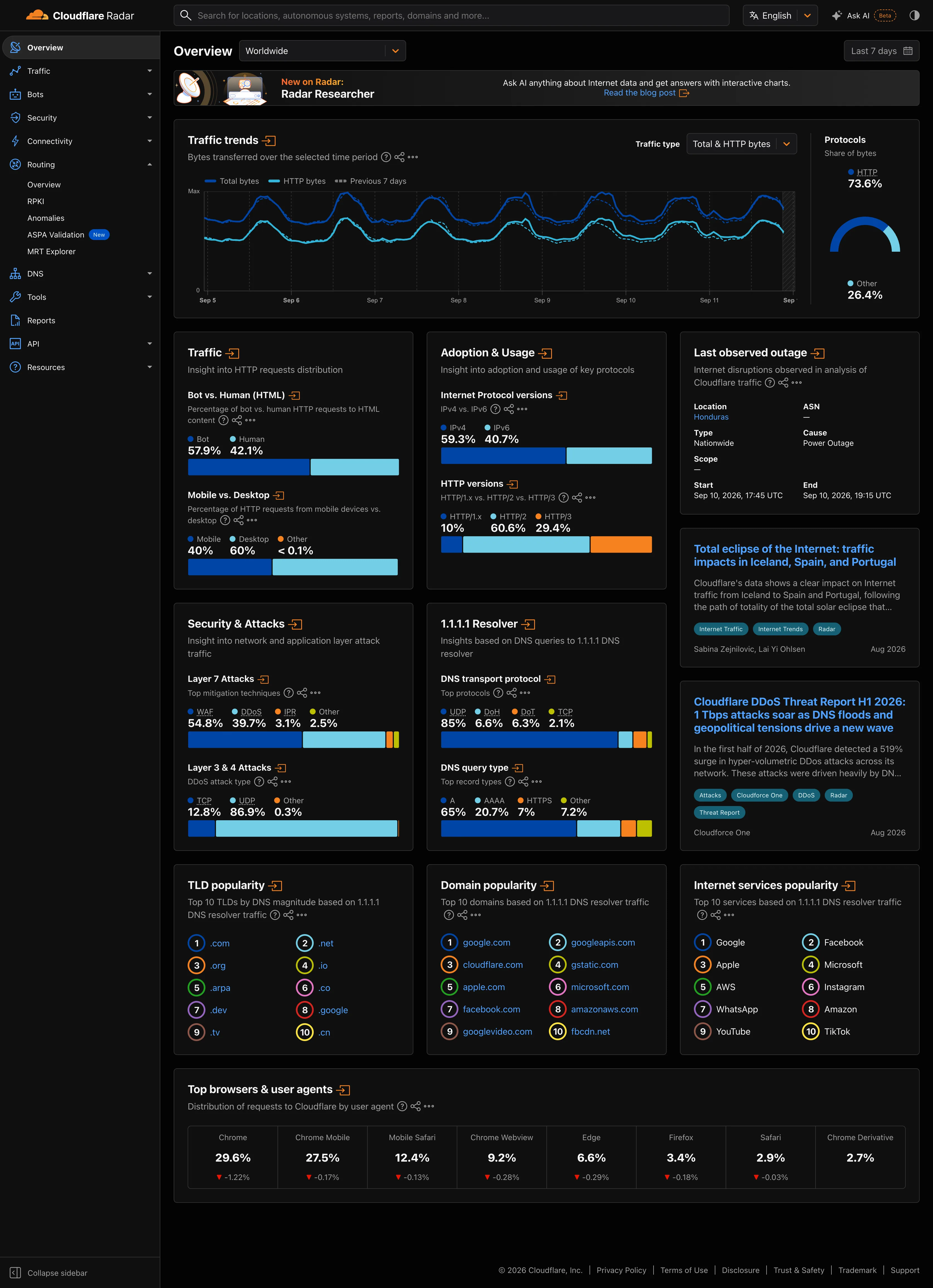
Grafana ships dark as its default theme and has done for its whole life, which is why its palette reads as the reference NOC palette and why its light theme has always felt like the derived one. Netdata also defaults dark and pushes further into density, which makes its per-series distinctions harder and its resting state calmer. Honeycomb supports both and leans on a heatmap where the colour ramp rather than the categorical palette carries the meaning, so the theme question is mostly about the ramp’s endpoints. ColorBrewer predates all of this and is still the most useful reference for the underlying problem, because it was built around whether a scheme survives colourblind viewers, photocopying and projection, which is the same durability question a dark theme asks. Cloudflare Radar ships both grounds as equals and holds its hues fixed across them, which shows what that costs. Capture the same page twice and the dark blue that dominates on white is the line closest to the background on charcoal, while the pale blue that was the quiet one carries the chart. Nothing was swapped; the lightness relationship simply ran out of room.

Categorical series palette is where the distinguishability problem gets solved in detail. Semantic status color has to stay separable from the series colours in both themes. Grayscale with alerts is the discipline that makes a dark palette workable by needing fewer colours. Wallboard mode is the context where the dark palette meets a bad screen and a long viewing distance. Sequential and diverging scales covers ramps, which behave differently again on dark grounds.
Dark-first data palette anatomy The same six grey chips, from light to dark, shown over a white ground and over a charcoal one. On white almost every chip separates from the background. On charcoal only the lightest three do, and the usable lightness range collapses to a third of what it was. The same six values, two grounds 88 72 56 40 24 08 On white On charcoal 1 2 1 THE FULL RANGE On white, a colour is separated from the ground mostly by how dark it is, and nearly every lightness value is available to you. 2 THE RANGE COLLAPSES On charcoal everything usable has to be lighter than the ground. Hue and saturation take over work they were not carrying before. Which is why inverting a light palette doesn't work, and why you start here.
Wireframe — the pattern's anatomy, not any one product's version of it

Implementation

A palette designed on white and shipped on charcoal usually fails, because the mid-tone amber that read as warning on paper vanishes. Every value here is measured against both grounds, and the rows that miss the floor say so.

Tokens
--muted-foreground--status-critical
887256402408
1.4:1 below floor2.2:1 below floor3.6:16.5:111.5:117.8:1
On white · 4 of 6 reach 3:1
887256402408
12.5:17.8:14.7:12.6:1 below floor1.5:1 below floor1.0:1 below floor
On charcoal · 3 of 6 reach 3:1

ContrastLadder.tsxEvery palette value on one ground, with the WCAG ratio each reaches and the 3:1 non-text floor applied per row.

import { contrast } from "./contrast";

/** WCAG 2.2 SC 1.4.11. A chart element carries meaning, so it is non-text
 *  content and 3:1 is the floor, on every ground the chart will be shown on. */
const FLOOR = 3;

export type Step = { label: string; color: string };

/**
 * One ground, every value of the palette on it, and the ratio each one
 * actually reaches. The ground is a prop rather than the page background
 * because the point is to run this against the charcoal the chart ships on,
 * not the white it was designed on.
 */
export function ContrastLadder({ label, ground, steps, floor = FLOOR }: {
  label: string;
  /** The background the chart will be drawn on, as #rrggbb. */
  ground: string;
  steps: Step[];
  floor?: number;
}) {
  const rows = steps.map((s) => ({ ...s, ratio: contrast(s.color, ground) }));
  const passing = rows.filter((r) => r.ratio >= floor).length;

  return (
    <figure className="m-0">
      <div className="grid grid-cols-[auto_220px_auto] items-stretch gap-x-2">
        {/* The labels sit outside the ground, so they stay readable on charcoal. */}
        <div className="flex flex-col justify-around py-3 text-right text-[11px] tabular-nums text-muted-foreground">
          {rows.map((r) => <span key={r.label}>{r.label}</span>)}
        </div>
        <div className="flex flex-col gap-1.5 rounded-md p-3" style={{ background: ground }}>
          {rows.map((r) => <span key={r.label} className="h-7" style={{ background: r.color }} />)}
        </div>
        <div className="flex flex-col justify-around py-3 text-[11px] tabular-nums">
          {rows.map((r) => (
            <span key={r.label} className={r.ratio >= floor ? "text-muted-foreground" : "text-status-critical"}>
              {r.ratio.toFixed(1)}:1{r.ratio < floor && " below floor"}
            </span>
          ))}
        </div>
      </div>
      <figcaption className="mt-2 text-center text-[11px] text-muted-foreground">
        {label} · {passing} of {rows.length} reach {floor}:1
      </figcaption>
    </figure>
  );
}

contrast.tsRelative luminance, the contrast ratio, and a grey at a given L* so a ladder can be stated in lightness.

/**
 * WCAG 2.2 contrast, the way SC 1.4.11 measures a non-text element against
 * its ground. Small on purpose: the check has to be cheap enough to run on
 * every colour against every ground, not once on the one someone remembered.
 */

const channel = (c: number) => (c <= 0.03928 ? c / 12.92 : ((c + 0.055) / 1.055) ** 2.4);

/** Relative luminance of a #rrggbb colour, 0 for black and 1 for white. */
export function luminance(hex: string) {
  const n = parseInt(hex.slice(1), 16);
  const [r, g, b] = [n >> 16, (n >> 8) & 255, n & 255].map((v) => channel(v / 255));
  return 0.2126 * r + 0.7152 * g + 0.0722 * b;
}

/** Contrast ratio between two colours, 1 to 21. */
export function contrast(a: string, b: string) {
  const [hi, lo] = [luminance(a), luminance(b)].sort((x, y) => y - x);
  return (hi + 0.05) / (lo + 0.05);
}

/** A neutral grey at a given CIE L*, so a ladder can be stated in lightness. */
export function greyAtLightness(L: number) {
  const Y = L > 8 ? ((L + 16) / 116) ** 3 : L / 903.3;
  const c = Y <= 0.0031308 ? 12.92 * Y : 1.055 * Y ** (1 / 2.4) - 0.055;
  const h = Math.round(c * 255).toString(16).padStart(2, "0");
  return `#${h}${h}${h}`;
}

demo.tsxHow it is called: six greys by L*, once against white and once against the charcoal the chart ships on.

import { ContrastLadder, type Step } from "./ContrastLadder";
import { greyAtLightness } from "./contrast";

/**
 * Six greys stated in CIE L*, run against the two grounds the chart will
 * live on. On white the dark end passes; on charcoal only the light end
 * does, and the usable range is the rows that clear the floor.
 */
const STEPS: Step[] = [88, 72, 56, 40, 24, 8].map((L) => ({
  label: String(L).padStart(2, "0"),
  color: greyAtLightness(L),
}));

export default function Demo() {
  return (
    <div className="flex flex-wrap gap-6">
      <ContrastLadder label="On white" ground="#ffffff" steps={STEPS} />
      <ContrastLadder label="On charcoal" ground="#1c1c1e" steps={STEPS} />
    </div>
  );
}
What it renders. Identical markup in all three panes, with only the token values changing.

Examples

Captures whose hotspots reference this pattern, grouped by product and dated. The dashed boxes are this pattern; hover any box for the note.

Cloudflare Radar

A public dashboard with no account, no filters worth the name, and an audience of journalists. Designed for people who will read one number and leave.

Worldwide Overview, dark September 11, 2026 Public site, signed out; no version string exposed medium · dark · desktop-web
The same page and the same figures, captured minutes apart on the other ground. Only the promotional strip at the top differs, and it rotates. Radar is worth the pair because it does not restate its palette in the dark: the hues are the same, and what changes is how much light each one carries against what is behind it. In the traffic chart the dark blue that reads as the heavier of the two series on white is now the one closest to the background, and the pale blue that was the quiet one carries the chart. The stacked attack bars show the milder version of the same thing—WAF still holds the largest share and still looks it, but the lighter segment beside it pulls more attention than its 39.7% has earned. The red on the browser deltas is the one colour that reads the same on both grounds, which is what you want from a colour carrying meaning and what a colour carrying identity cannot promise.
  • Dark-first data palette Same two hues as the light capture. On charcoal the darker series is the one fighting the ground.
  • Categorical series palette Four categories, four fixed hues, held across both grounds. Which one dominates the eye is not held.
  • Delta indicator The one colour that reads the same on both grounds, because it is carrying meaning rather than identity.
Show 2 more examples Hide the rest

Grafana

The reference implementation for panel grids, template variables, and stat panels; most other tools are defined by how they differ from it.

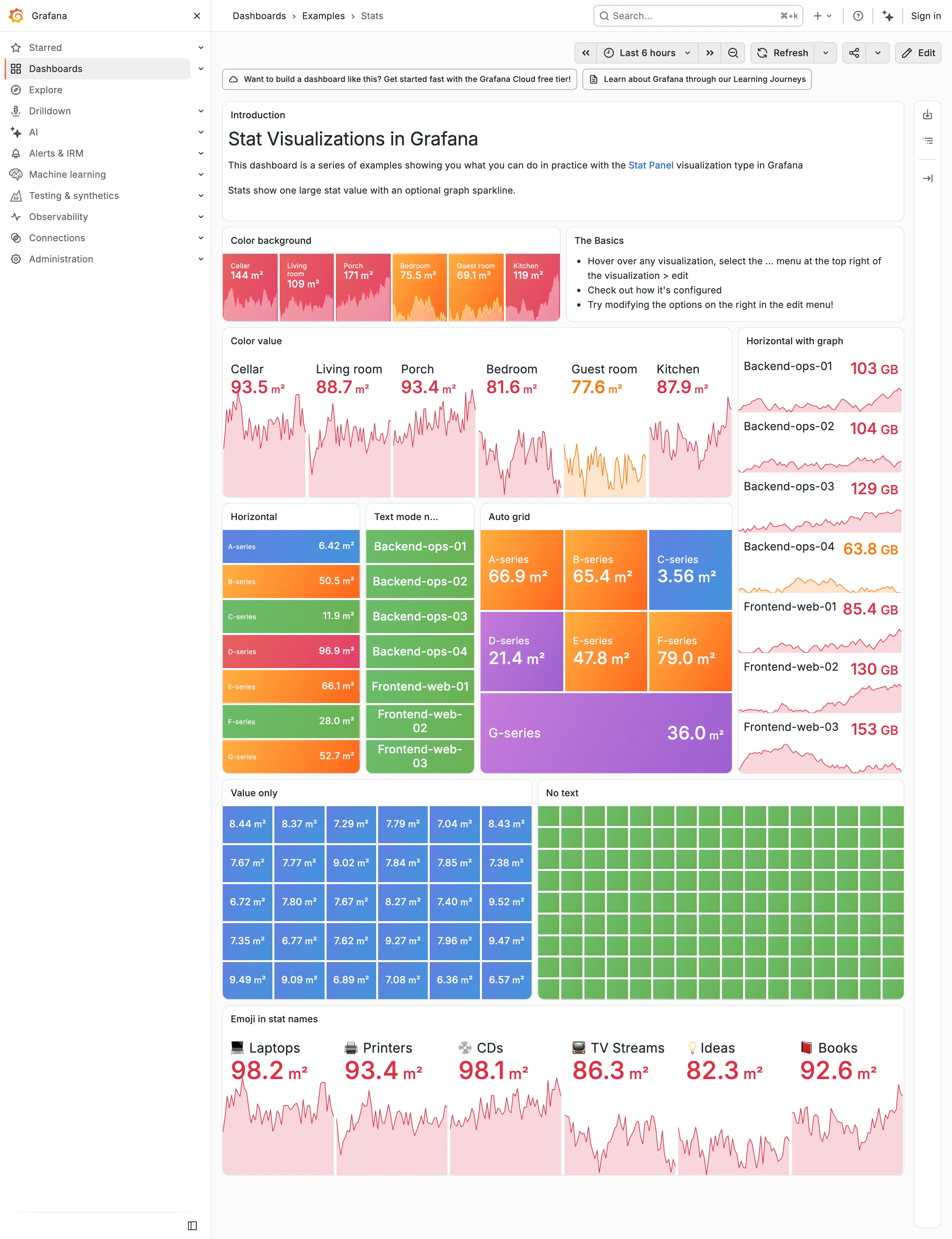
Examples / Stats, light theme September 10, 2026 Grafana Play (signed out; ?theme=light) dense · light · desktop-web
The same dashboard as the dark Stats capture, same data, same palette, one URL parameter apart. Put them side by side and the palette turns out to have been designed on charcoal. On the dark version the value colours carry because they are brighter than the ground—reds, oranges and greens against near-black. Here they have to carry by being darker than the ground instead, and the same hues arrive as pale pink and pale salmon. Look at the Color value panel: six numbers at 30-odd pixels, and 93.5, 88.7, 93.4, 81.6, 77.6 and 87.9 are all light pink on white. The column on the right is worse, because 63.8 GB lands on pale orange. Nothing about the theme switch is broken, and nothing was chosen for this ground. That's the whole argument for designing the dark case first and deriving the other one: the constrained case should set the lightness range, and here the unconstrained one did.
  • Dark-first data palette The same six values as the dark capture. Bright-on-charcoal became pale-on-white, and the contrast went with it.
  • Dark-first data palette 63.8 GB in pale orange on white. On the dark version the identical colour was the readable one.
  • Semantic status color Whole-tile fills survive the switch, because the text sits on the colour rather than being the colour.
  • Grayscale with alerts Ninety green rectangles, identical in both themes. Nothing here can read as abnormal on either ground.
  • Sparkline The area fills under each value drop to near-white here, so the shape that was legible on charcoal is a smudge.
Grafana — Examples / Stats
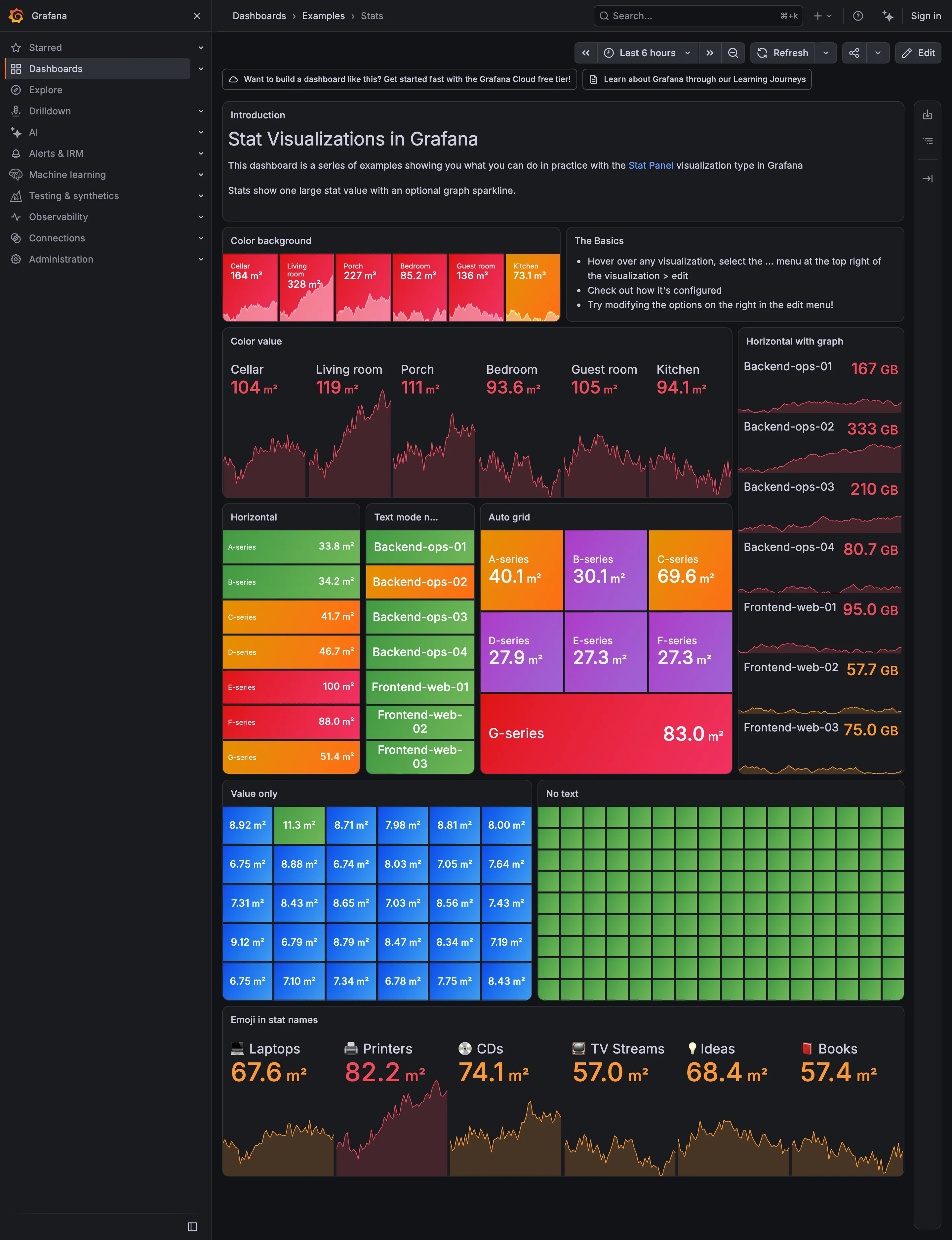
Header KPI strip. Six tiles sharing one anatomy, which is the arrangement that reads as a row rather than as six things. KPI tile. Label, value, unit and a sparkline behind it. No delta, no base, no window. Dark-first data palette. The dark half of the pair. The same six values in the light capture arrive as pale pink on white. Semantic status color. No text at all. Colour is the only carrier, which is the WCAG failure stated as a feature. Sparkline. A column of them, each scaled to its own series, which is the comparison Tufte warns the arrangement invites. KPI tile. Thirty numbers with no labels—the value with nothing attached to it. Grayscale with alerts. Seven rows, seven different colours, no resting state. Nothing here can read as abnormal. Semantic status color. Whole-tile background colour: the loudest channel available, spent on all six.
Examples / Stats September 10, 2026 Grafana Play (signed out; no version string exposed) dense · dark · desktop-web
A showcase rather than a working dashboard, which is what makes it useful: it is Grafana demonstrating every visual option the stat panel has, in one place, with nothing else competing. Two things are worth reading it for. The first is that across roughly sixty tiles here, not one carries a comparison. Every option on display is about how the number looks—background colour, value colour, orientation, text mode, grid packing—and none is about what the number should be measured against. The panel type that most needs a delta and a base is being shown off without either. The second is the colour. Every single tile on this page is coloured, and the "No text" panel is ninety-odd green rectangles carrying no label and no value at all, which is colour as the sole carrier of meaning at its purest. Both of those are reasonable for a catalogue of options and neither survives being copied onto a real page.
  • KPI tile Label, value, unit and a sparkline behind it. No delta, no base, no window.
  • Dark-first data palette The dark half of the pair. The same six values in the light capture arrive as pale pink on white.
  • Sparkline A column of them, each scaled to its own series, which is the comparison Tufte warns the arrangement invites.
  • Semantic status color Whole-tile background colour: the loudest channel available, spent on all six.
  • Grayscale with alerts Seven rows, seven different colours, no resting state. Nothing here can read as abnormal.
  • KPI tile Thirty numbers with no labels—the value with nothing attached to it.
  • Semantic status color No text at all. Colour is the only carrier, which is the WCAG failure stated as a feature.
  • Header KPI strip Six tiles sharing one anatomy, which is the arrangement that reads as a row rather than as six things.