Skip to content
KONIGI

Dashboards / Screenspace / Wallboard mode

6 of 6

Wallboard mode

The dashboard is on a wall, ten feet away, with no mouse.

Updated September 10, 2026

Problem

The dashboard someone designed at arm’s length on a good monitor is now on a television across an open-plan office. Nobody will touch it, nobody will scroll it, and the people it is for will glance at it for a second at a time from ten feet away.

Solution

A distinct mode, not a resized page. Chrome removed, type scaled up, panel count cut hard, colour reduced to a resting state, and rotation between a small set of views if one screen cannot carry everything.

The viewing distance changes every design constant. Text that reads at 60cm needs roughly three to four times the size at three metres. A twelve-panel grid becomes four. A legend with eight entries becomes unreadable, so series need direct labelling or need removing. Anything requiring hover is gone, since there is no pointer.

Grafana handles the mechanics with kiosk mode, which strips navigation chrome, and playlists, which rotate a set of dashboards on a timer. Rotation is the standard answer to too much content, and it carries a real cost: a viewer glancing up sees whichever view happens to be showing, so the thing that most needs attention is visible only part of the time. Rotation is acceptable for awareness and unacceptable for anything anyone is expected to catch.

Colour discipline matters more here than anywhere. ISA-101’s approach—greys at rest, colour reserved for abnormal—was developed for exactly this situation, an operator watching a screen for a long shift who must notice the one thing that changed. A wallboard where six panels are always coloured has spent its entire signalling budget before anything goes wrong.

The unglamorous failure is the physical one. Wall screens run for months, get left on a stale page after a reboot, and are frequently the wrong aspect ratio at the wrong brightness in a room with a window behind them.

Use when

A shared space needs shared awareness, the content is few enough to fit at distance, and someone is genuinely going to look at it.

Don’t use when

Nobody in the room can act on it. A wallboard whose numbers belong to another team is decoration, and worse than decoration, because it consumes wall and trains people to ignore screens.

Trade-offs

Wallboard mode is a second design of the same content, and the second design is the one nobody maintains. It becomes ambient: present so constantly that it stops being seen, which is exactly the opposite of its purpose and takes months to become apparent. Rotation trades completeness for coverage. And a wallboard is a public artefact, so anything sensitive on it is visible to visitors, contractors and whoever walks past.

Checklist

  • What is the actual viewing distance, and is the smallest type readable from there?
  • How many panels, and can each be understood in a one-second glance?
  • Is anything dependent on hover, scroll or click?
  • What fraction of the screen carries colour when everything is healthy?
  • If views rotate, what is the cost of missing the one that mattered?
  • Does the page recover on its own after a reboot or a network drop?
  • Is stale data obvious from ten feet, or does the page look fine when frozen?
  • What is the aspect ratio and brightness of the actual screen in the actual room?
  • Is anything on screen that shouldn’t be seen by everyone who walks past?
  • Has anybody looked at it, from where people stand, in the last month?

Compare

Grafana provides the mechanics directly with kiosk mode and playlists, so the wallboard is the same dashboard with chrome removed, which is convenient and means the layout is rarely redesigned for the distance. Datadog offers TV mode with a similar stripping of chrome, and its tag-scoped pages make it easy to put the same layout on several screens scoped to different teams. Netdata is a poor fit by design, since per-second density is built for close inspection rather than distance, which is a useful reminder that not every dashboard has a wallboard version. Public status pages are the best-designed wallboards most people encounter, because they assume an unknown reader at an unknown distance and reduce accordingly.

Grayscale with alerts is the colour discipline this pattern depends on. Header KPI strip is usually the only thing that survives the cut. Semantic status color carries the signal once colour appears. Dense small-multiple layout is the opposite treatment of the same content, for close expert reading. Freshness indicator matters most here, because nobody at a distance can tell a frozen page from a calm one.
Wallboard mode anatomy The same dashboard at a desk and on a wall. The desk version is twelve panels with chrome, a legend and small type. The wall version is four panels, no chrome, type several times larger, direct labels instead of a legend, and grey until something is wrong. Sixty centimetres, then three metres At a desk Checkout 99.4% P95 312 Queue 7 Errors 4.1% On a wall 1 2 3 1 EVERY CONSTANT CHANGES Text that reads at 60cm needs three or four times the size at three metres. Twelve panels become four. An eight-entry legend becomes nothing anyone can read. 2 NO POINTER Anything that lived on hover is gone, so series get labelled directly or dropped. 3 GREY AT REST Six always-coloured panels spend the whole signalling budget before anything goes wrong. Rotation is fine for awareness and useless for anything anyone is expected to catch.
Wireframe — the pattern's anatomy, not any one product's version of it

Implementation

Read from ten feet away, with no mouse and nobody watching most of the time. Type goes up several steps and interaction goes to zero. The only thing that should change unprompted is state someone needs to walk over for.

Tokens
--card--card-foreground--muted--muted-foreground--border--status-critical--status-warn--status-unknown

Checkout

99.4%

P95

312

Queue

7

Errors

4.1%

Wallboard.tsxAt most four tiles, enforced by the type. Nominal is the same ink as the label, and a stalled feed is drawn as a state rather than left looking fine.

import { cn } from "@/lib/utils";
import { freshness } from "../freshness-indicator/freshness";
import type { Status } from "../semantic-status-color/status";

export type Tile = { label: string; value: string; status: Status };

/** Four at most, and the type says so. Twelve panels at three metres is
 *  twelve panels nobody can read. */
export type Tiles = [Tile] | [Tile, Tile] | [Tile, Tile, Tile] | [Tile, Tile, Tile, Tile];

type Props = {
  tiles: Tiles;
  /** When the newest sample arrived and how often one should. A frozen page
   *  looks fine from ten feet, so stale has to be a state the board draws. */
  lastArrival: Date | null;
  expectedEveryMs: number;
  now?: Date;
};

/** Grey at rest. A nominal value is the same ink as its label; colour is
 *  spent only on a state someone should walk over for. */
const VALUE: Record<Status, string> = {
  nominal: "text-card-foreground",
  warn: "text-status-warn",
  critical: "text-status-critical",
  unknown: "text-status-unknown",
};

const clock = (d: Date) => `${String(d.getUTCHours()).padStart(2, "0")}:${String(d.getUTCMinutes()).padStart(2, "0")}`;

export function Wallboard({ tiles, lastArrival, expectedEveryMs, now = new Date() }: Props) {
  const { state } = freshness(lastArrival, expectedEveryMs, now);
  const frozen = state === "stale" || state === "unknown";

  return (
    <div className="relative grid grid-cols-2 gap-4 rounded-lg border bg-muted p-5" role="region" aria-label="wallboard">
      {tiles.map((t) => (
        <div key={t.label} className={cn("rounded-md border bg-card p-4", frozen && "opacity-40")}>
          {/* No hover, no legend, no chrome: the label is on the tile. */}
          <p className="text-xs uppercase tracking-[0.12em] text-muted-foreground">{t.label}</p>
          <p className={cn("mt-1 text-5xl font-medium tabular-nums", VALUE[t.status])}>{t.value}</p>
        </div>
      ))}
      {frozen && (
        <p className="absolute inset-x-5 top-1/2 -translate-y-1/2 rounded-md bg-status-critical px-4 py-3 text-center text-2xl font-medium uppercase tracking-[0.12em] text-card" role="alert">
          {lastArrival ? `stale since ${clock(lastArrival)}` : "no data"}
        </p>
      )}
    </div>
  );
}

demo.tsxHow it is called: four tiles, one critical, data twenty seconds old against a thirty-second cadence.

import { Wallboard } from "./Wallboard";

/**
 * Four numbers for a screen across the room. Three are at rest and drawn in
 * the same ink as their labels; errors has crossed its threshold and is the
 * only colour on the wall. The clock is fixed so the board renders the same
 * on the server and in the browser.
 */
const NOW = new Date("2026-09-15T09:00:00Z");

export default function Demo() {
  return (
    <div className="w-[360px]">
      <Wallboard
        tiles={[
          { label: "Checkout", value: "99.4%", status: "nominal" },
          { label: "P95", value: "312", status: "nominal" },
          { label: "Queue", value: "7", status: "nominal" },
          { label: "Errors", value: "4.1%", status: "critical" },
        ]}
        lastArrival={new Date(NOW.getTime() - 20_000)}
        expectedEveryMs={30_000}
        now={NOW}
      />
    </div>
  );
}
What it renders. Identical markup in all three panes, with only the token values changing.

Examples

Captures whose hotspots reference this pattern, grouped by product and dated. The dashed boxes are this pattern; hover any box for the note.

Grafana

The reference implementation for panel grids, template variables, and stat panels; most other tools are defined by how they differ from it.

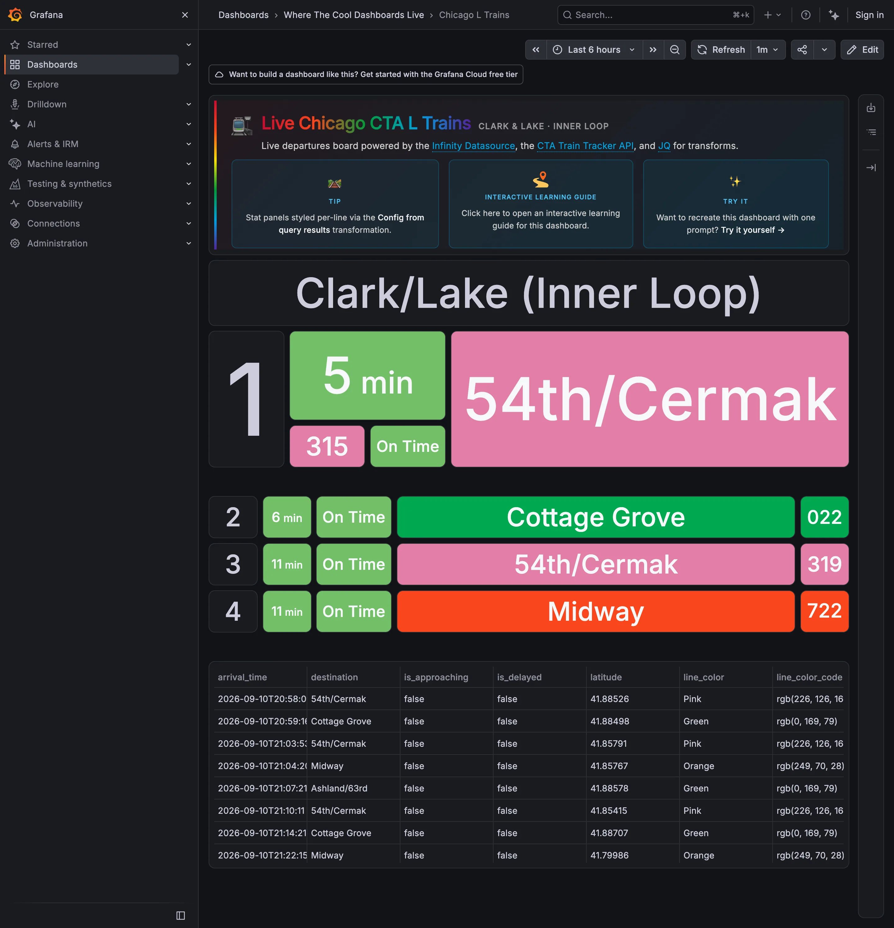
Where The Cool Dashboards Live / Chicago L Trains September 10, 2026 Grafana Play (signed out; no version string exposed) sparse · dark · wall
A live departures board for one platform, built out of stat panels against the CTA Train Tracker API, and it is the clearest wallboard in the gallery: four rows, type large enough to read across a concourse, no chrome inside the board and nothing to hover. The next train gets three times the height of the three behind it, which is the layout saying "start here" without a word of copy. The interesting problem is the colour. Pink, Green and Orange are the CTA's own line colours, inherited from the world outside the screen and already known to every rider—which is the best possible reason to use a palette. But the status chip beside them is also green when a train is on time, so on the second row "Cottage Grove" is green because it is the Green Line and "On Time" is green because it is on time, side by side, meaning two unrelated things.
  • Wallboard mode The next train, three times the height of the rest. Readable at ten feet with no pointer.
  • Panel grid Rows two to four at a third the size. Panel size is carrying the priority.
  • Semantic status color Green for on time, next to green for the Green Line. One hue, two unrelated jobs, one row.
  • Freshness indicator A countdown rather than a clock time, which is the right call and hides how old the feed is.
  • Data table The raw feed under the board, including the rgb string each line colour came from.