Problem
Someone is about to page an engineer, approve a refund, or tell a room of people what the number is. They can see the value. They cannot see whether it describes right now or twenty minutes ago, and the two lead to different decisions.
Solution
There are three different times involved, and most dashboards surface at most one of them:
- When the page last ran its queries
- When the underlying data last arrived
- What window the value actually covers
The first is easy and nearly useless on its own. A dashboard set to refresh every thirty seconds is giving the viewer feedback about the dashboard, not about the data, and a refresh that succeeds against a stalled pipeline produces a confidently current-looking page full of old numbers.
The second is the one that matters and the one that fails quietly. Prometheus is precise about this: an instant query returns the newest sample less than the lookback period ago, five minutes by default, tunable with --query.lookback-delta. So a value that arrived four minutes ago and one that arrived four seconds ago render identically. Nothing on the panel distinguishes them.
The failure mode at the far end is better behaved. When a target goes away, its series is marked stale, no value is returned, and it disappears from the graph at its last collected sample. Absence is at least visible. The dangerous case is the middle: a source that is degraded rather than dead, still inside the lookback window, still drawing.
Nielsen’s first heuristic is the general form. Keep people informed about what is going on, through appropriate feedback, within a reasonable amount of time. On a dashboard the thing they need informing about is the data’s age, not the page’s.
Use when
Any number someone will act on inside minutes, and any number shown on a screen the viewer didn’t personally load. Wallboards especially, because nobody in the room knows when the tab was opened.
Don’t use when
Never skip it outright, but scale it down. On a monthly strategic report the cadence is understood and a loud “updated 4 seconds ago” is noise pretending to be rigour.
Trade-offs
Relative timestamps read well and depend on the viewer’s clock, which on a wallboard PC nobody has looked at in a year is its own hazard. Absolute timestamps are honest and force a timezone decision. A green “live” dot is the most common lie in this pattern: it usually means a socket is open, not that data is arriving, and it survives exactly the failure it appears to rule out. And the freshness display can itself go stale, which is the joke that writes itself and still ships.
Checklist
- Does this show when the data arrived, or only when the page refreshed?
- If the source went quiet five minutes ago, what does the panel look like? What about an hour?
- Is a stale value visually distinguishable from a current one, or only from a missing one?
- What is the expected arrival cadence, and does the indicator know it well enough to say “late”?
- Does a “live” indicator track data arriving, or just a connection being open?
- Relative or absolute time, and whose clock and timezone is it using?
- On a wallboard, can someone across the room tell whether the page is current?
- Does auto-refresh mask staleness by making the page feel alive?
- When a query fails, does the last good value stay on screen, and is it labelled as last-good?
- Who notices if the freshness indicator itself stops updating?
Compare
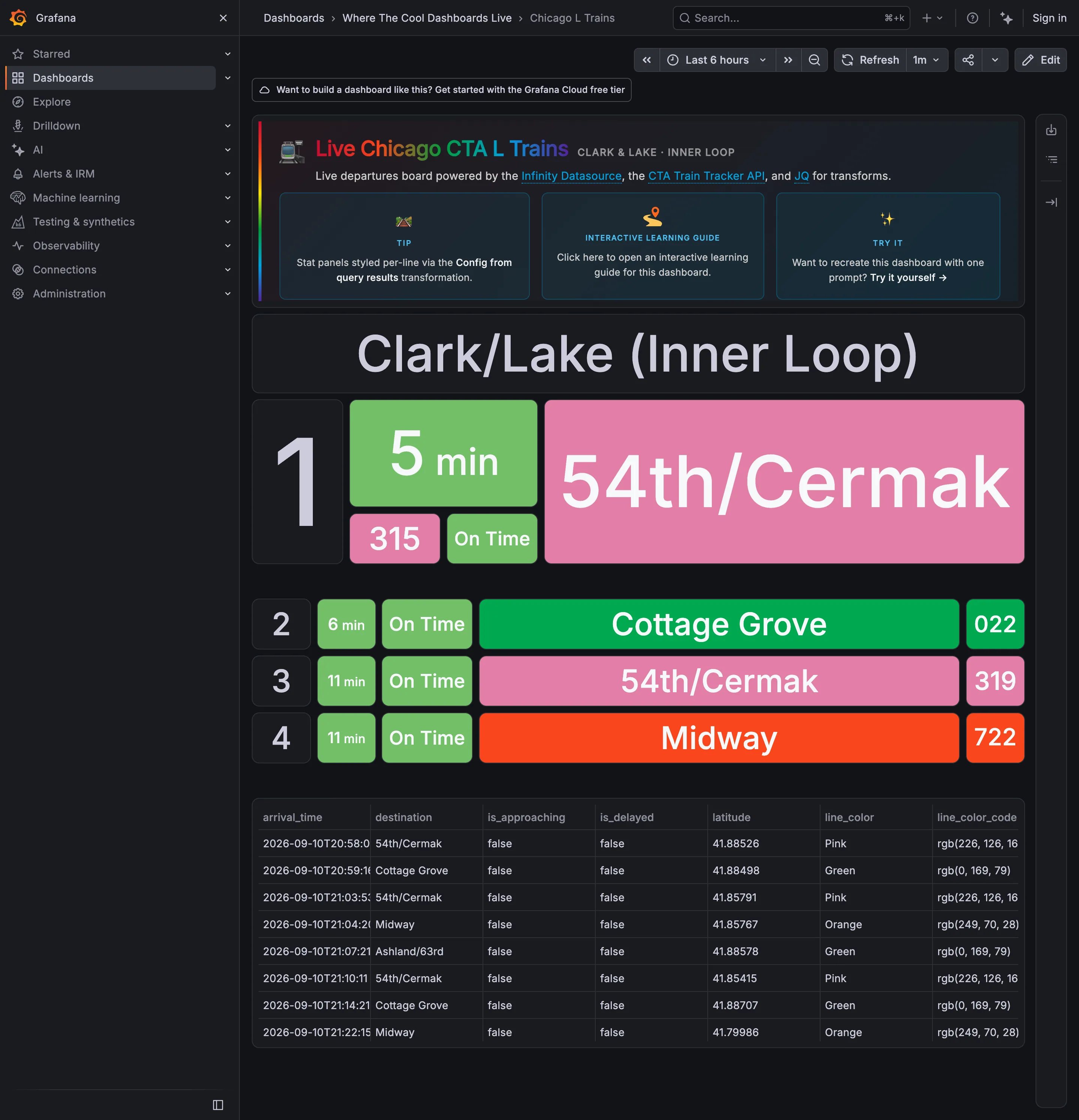
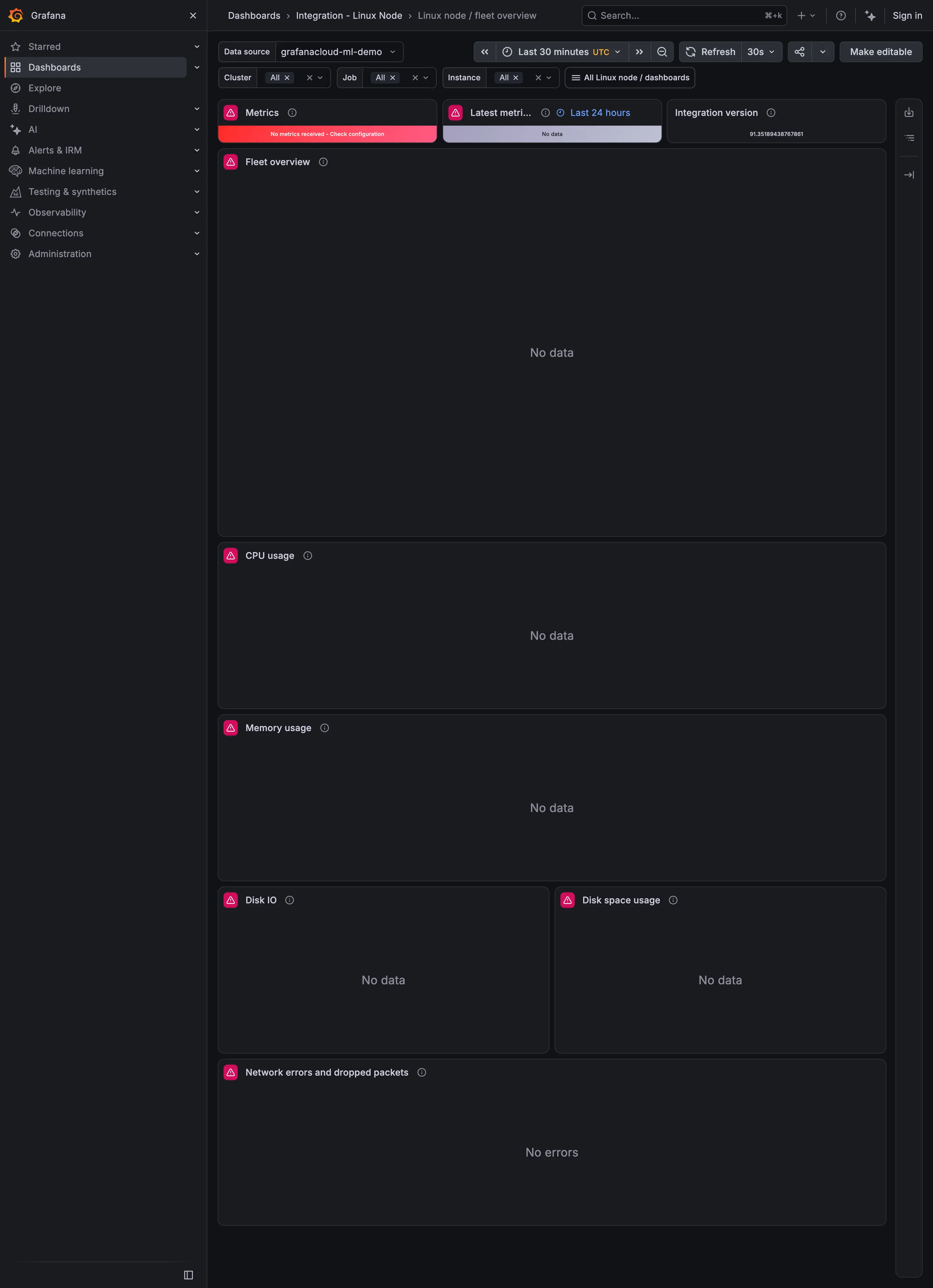
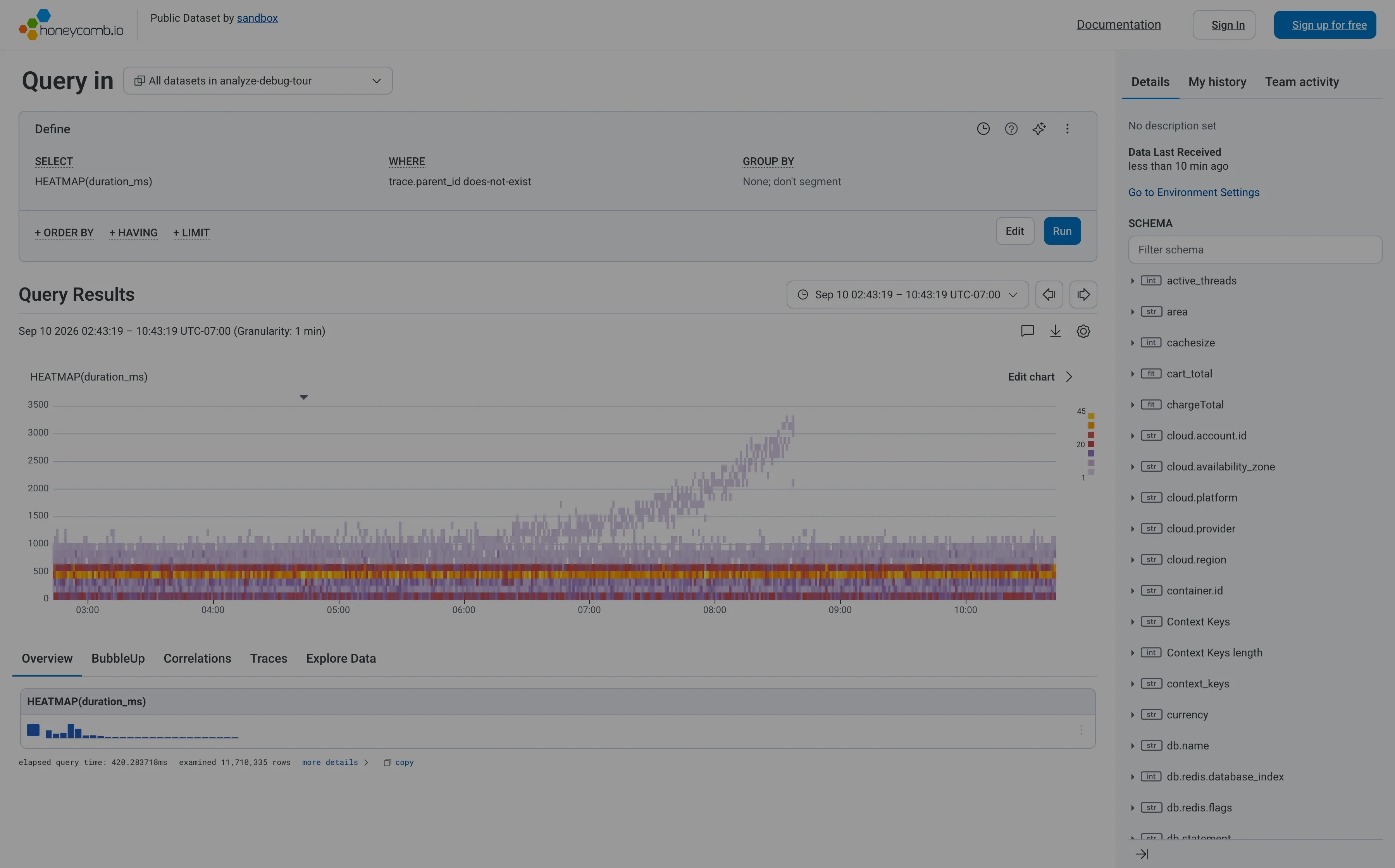
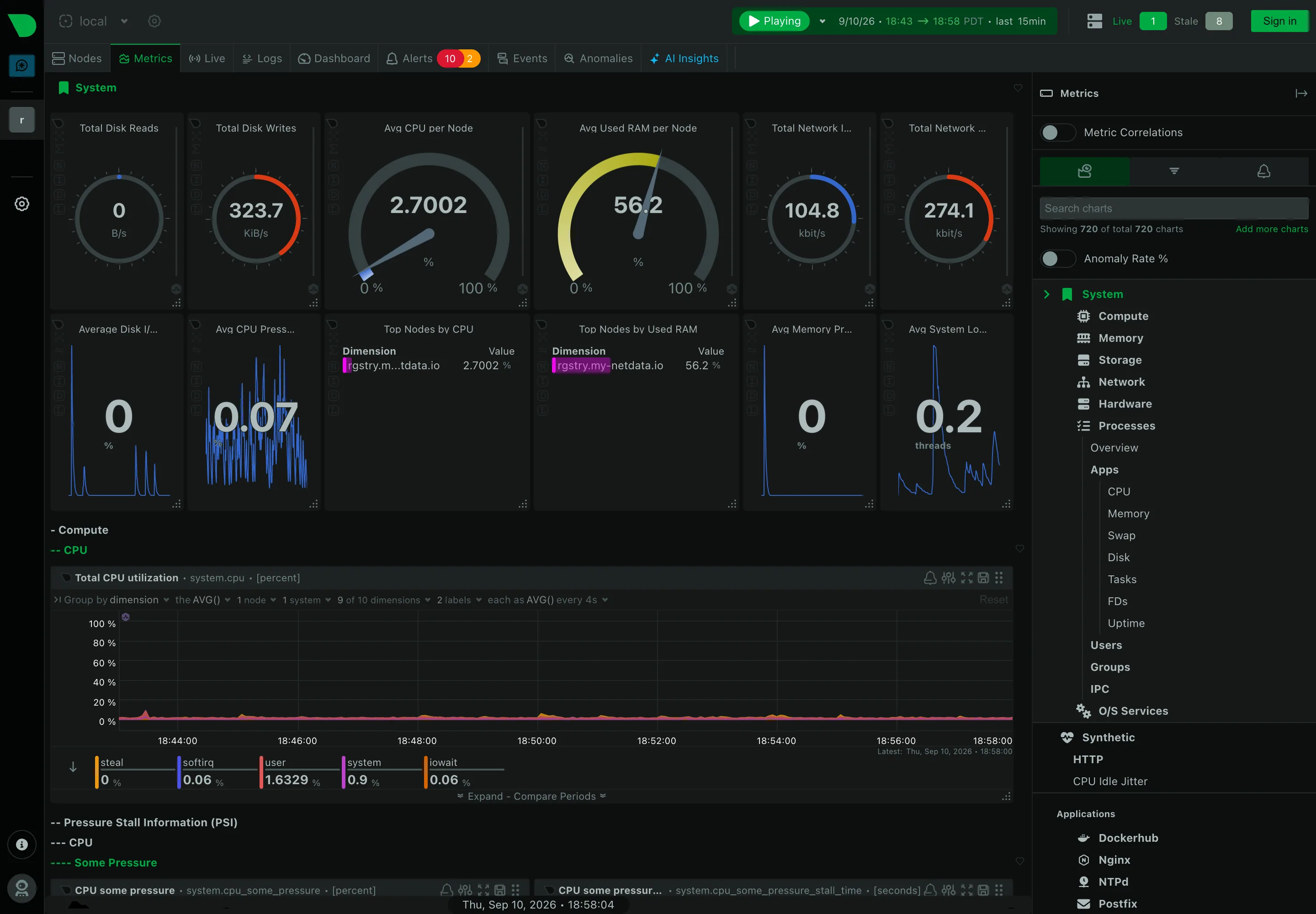
Grafana puts a refresh interval on the dashboard and reports on itself: the control tells you the page will re-query every thirty seconds, and says nothing about whether anything new arrived when it did. Netdata sidesteps the display entirely by drawing per second, so freshness is legible as motion and a frozen chart is its own alarm. Sentry works in events rather than samples, so “last seen” is a property of the issue and travels with it into the list, the detail view, and the alert. Honeycomb makes the question mostly disappear by being query-first: you asked for a window, the answer is that window, and there is no ambient “now” quietly drifting underneath the result.
Related
Data source badge answers where, which is the other half of the provenance question. Error and stale state is what should happen once the answer to “how old” becomes “too old”. Time-range picker sets the window the number covers, which is the third of the three times above. Loading state is the moment before this one. KPI tile is the container that most often shows a number with no age attached to it at all.