Problem
The dashboard has forty panels and each one runs its own query. For the first second or two the page is a grid of empty rectangles, and an empty rectangle is indistinguishable from a panel whose query returned nothing.
Solution
Show the shape of what is coming, sized correctly, with a signal that work is happening. Then replace it in place, without the layout moving.
Nielsen’s three response-time limits set the bar and they have not changed since 1993. Under 0.1 second the system feels instantaneous and needs no feedback. Under 1 second the user’s flow of thought stays unbroken, though they notice; still no special feedback needed. Past 10 seconds attention is gone, and the interface owes a percent-done indicator and an estimate so the person can do something else meanwhile.
Dashboards live almost entirely in the awkward middle, and the middle is where skeletons belong: too slow to feel instant, too fast for a progress bar to be honest.
Three requirements decide whether the implementation helps.
Occupy the final space. A skeleton that is the wrong size makes the page reflow when data lands, which is worse than a blank because the thing the viewer was reading moves. This matters most on the dense layouts where the pattern matters most.
Be distinguishable from empty and from broken. Motion does this cheaply: a shimmer says working, stillness says finished. A static grey box says nothing and gets read as “no data” by anyone who arrives mid-load.
Fail into a state, not into permanence. A skeleton with no timeout is the worst outcome in the family, because it claims work is ongoing forever. Every loading state needs a deadline and an error state behind it.
Use when
Panels take longer than about a second, which is nearly all of them, and especially where many load independently and finish out of order.
Don’t use when
The response is genuinely fast. A skeleton that flashes for 80ms is visual noise and makes a fast page feel busy. Delay showing it by a couple of hundred milliseconds so quick responses never trigger it at all.
Trade-offs
Skeletons make a page feel designed and can make it feel slower, because a shimmering placeholder holds attention in a way a blank does not. They are extra markup that has to stay in sync with the real layout, so they drift and eventually stop matching. Forty animating placeholders is its own cost, on the GPU and on anyone sensitive to motion. And a well-made loading state can disguise a genuinely slow page, which removes the pressure to fix the queries.
Checklist
- Is the skeleton the same size and position as the content it replaces?
- Does the layout stay still when real data arrives?
- Is loading distinguishable from empty, and from error, at a glance?
- Is there a delay before showing it, so fast responses never flash?
- Is there a timeout, and what state does it fall into?
- Do panels load independently, and does the page look coherent half-loaded?
- Does anything animate, and does it respect prefers-reduced-motion?
- On a wallboard, what does a viewer twenty feet away see during load?
- Does a refresh clear existing data to skeletons, or update in place?
- Would showing the previous values, marked stale, serve better than a skeleton?
Compare
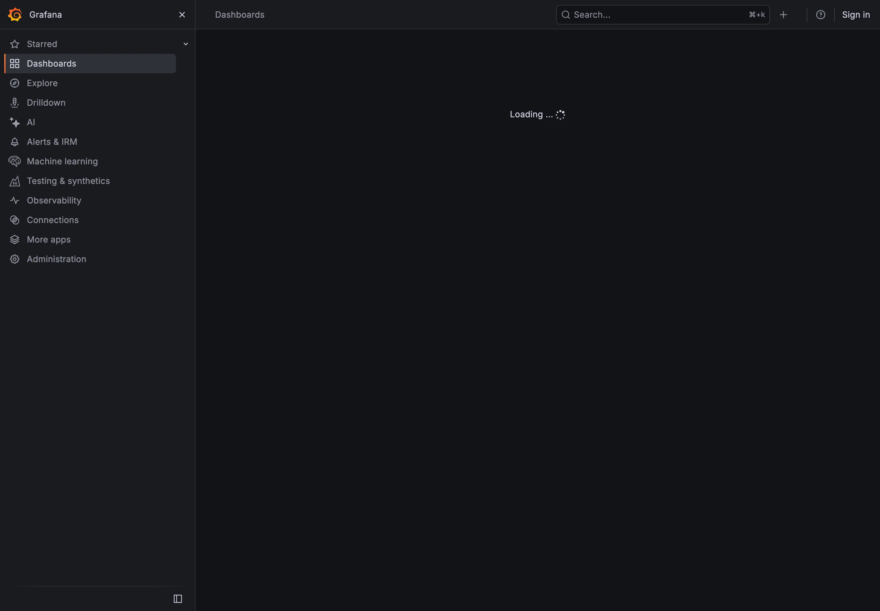
Grafana loads panels independently with a per-panel spinner, so a dashboard settles progressively and a slow panel is visibly the slow one rather than holding up the page. Netdata sidesteps the pattern by streaming: charts begin drawing as data arrives rather than waiting for a complete response, so there is little gap to fill. Sentry uses shaped skeletons that match its list rows closely enough that the transition to real content is nearly invisible, which is the pattern done well on a predictable layout. Honeycomb shows query progress rather than a placeholder, which suits a product where a query can legitimately take long enough that Nielsen’s ten-second rule applies and an estimate is owed.
Related
Empty state is what a finished load with no results must look like, and the two are confused constantly. Error and stale state is where a loading state has to land when the deadline passes. Dense small-multiple layout is the context that makes this pattern load-bearing. Freshness indicator is the better answer when old data could be shown while new data loads. Panel grid is what has to hold still while everything arrives.