Skip to content
KONIGI

Dashboards / Product mechanics / Filter bar

7 of 10

Filter bar

The viewer needs to narrow a large set by several attributes and see what's applied.

Updated September 10, 2026

Problem

There are nine hundred thousand events and the viewer cares about the production ones, from the checkout service, in the last hour, that failed. Four narrowings, and after applying them they need to be able to see at a glance which four they applied.

Solution

A persistent row of controls above the content, each narrowing the set, with every active filter visible as a removable chip. The state is the bar; the content is a consequence.

Two properties do nearly all the work, and both are about visibility rather than about filtering.

Applied filters must be legible without opening anything. A dropdown that says “Service” when three services are selected has hidden the thing that determines what is on screen. Chips showing service: checkout are longer and correct. This is Nielsen’s first heuristic applied to state rather than to progress: the person has to be able to see what the system is currently doing.

Removal must be as cheap as application. Filtering is exploratory, and exploration means overshooting. One click to add and three to remove produces viewers who stop narrowing.

Beyond that, the interesting design questions are about the filter values themselves. Should the bar show only values that exist in the current set, and update as filters are applied? Doing so prevents dead ends where a viewer selects a combination that matches nothing. Not doing so is much cheaper to build, and is why so many filter bars let you construct an empty result and then leave you wondering which choice caused it.

Grafana’s approach is worth studying because it is structurally different: variables are declared on the dashboard, populated by their own queries, and referenced inside panel queries, with the selection carried in the URL. That makes filtering explicit, shareable and chainable—one variable’s options can depend on another’s selection—at the cost of every filter being something an author had to build in advance.

Use when

The population is large, several attributes matter, and different viewers narrow differently. Any triage surface.

Don’t use when

There is one dimension and few values. Three tabs beat a filter bar with one dropdown. Also avoid a filter bar as the only way in: a page whose default state is unfiltered and unusable has pushed its information architecture onto the viewer.

Trade-offs

Filter bars accumulate. Every new attribute someone wants is one more control, and a twelve-control bar is a form. State becomes invisible in screenshots, so a filtered dashboard shared into a channel is routinely misread. Filters can conflict with each other in ways only discoverable by hitting an empty result. And a bar that persists filters across sessions will eventually greet someone with yesterday’s narrowing and no memory of having set it, which is the most confusing five minutes a dashboard can produce.

Checklist

  • Can a viewer see every applied filter without opening a control?
  • Is removing a filter as cheap as adding one, and is there a clear-all?
  • Do the offered values reflect the current set, or can a viewer construct an empty result?
  • If the result is empty, does the page say which filter caused it?
  • Does the filter state go into the URL?
  • Do filters persist across sessions, and does the viewer know?
  • Can filters be chained, so one narrows the options of the next?
  • How many controls before this stops being a bar and becomes a form?
  • Does everything on the page honour the filters, and do exceptions say so?
  • Does a screenshot of this page carry enough to be read correctly?

Compare

Grafana makes filters a declared object rather than an ad-hoc control: template variables are defined on the dashboard, populated by queries, chained so one constrains the next, and carried in the URL, which makes state shareable and every filter something someone had to anticipate. Honeycomb puts a query builder where the bar would be, so narrowing is composing a query and there is no fixed set of filterable attributes—the cost is a higher floor for a casual viewer. Sentry uses a single search field with a tag syntax, trading discoverability for speed once learned, and softens it with autocomplete over real tag values. Datadog scopes a whole page by tags from one control, so filters apply uniformly across every widget by construction rather than by each panel remembering to honour them.

Template variable is Grafana’s implementation of this and the entry that covers the chained-variable case. Cross-filter is the gestural alternative that narrows by selecting rather than by choosing. Search across panels covers free-text narrowing. Saved view is how a useful set of filters stops being retyped. Ranked list is what usually sits underneath and only means something once the population is narrowed.
Filter bar anatomy A filter bar showing every applied value as its own removable chip, with a clear-all beside them. Below, the same three filters collapsed into a dropdown reading "Service (3)", which has hidden the thing that decides what is on screen. The state is the bar; the content is a consequence service: checkout env: prod sev: 1 and 2 clear all 1 2 The same three, hidden Service (3) Which three? Not on screen anywhere. 1 CHIPS, NOT COUNTS A dropdown reading "Service" when three are selected has hidden what decides the screen. Chips are longer and correct. 2 REMOVAL COSTS ONE CLICK Filtering is exploratory and exploration means overshooting. One click to add and three to remove makes people stop narrowing. The open question is whether the bar offers only values that exist in the current set. Doing so prevents dead ends. Not doing so is much cheaper, and is why so many bars let you build an empty result and then wonder which choice caused it.
Wireframe — the pattern's anatomy, not any one product's version of it

Implementation

Narrowing a large set by several attributes, with what is applied visible without opening anything. Applied filters belong as removable chips, and the result count belongs beside them so an empty result has an explanation.

shadcn
npx shadcn@latest add button popover command
npm
lucide-react
Tokens
--card--card-foreground--muted-foreground--border--chart-1
service: checkoutenv: prodsev: 1 and 24 of 9 alerts
  • p95 latency above 800 ms for 5 minsev 1 · 14:52
  • Card auth error rate 3.1% (threshold 2%)sev 2 · 14:47
  • Queue depth 4,200 and risingsev 2 · 14:41
  • Deploy 4a91c: canary failing health checksev 1 · 14:30

FilterBar.tsxA chip per applied filter, one click to remove, clear all, a count beside them, and a menu that offers only values the other filters leave.

import { useState, type ReactNode } from "react";
import { Plus } from "lucide-react";
import { Button } from "@/components/ui/button";
import { Popover, PopoverContent, PopoverTrigger } from "@/components/ui/popover";
import { Command, CommandEmpty, CommandGroup, CommandInput, CommandItem, CommandList } from "@/components/ui/command";

/** One narrowing: a dimension and the values allowed through. */
export type Filter = { key: string; values: string[] };
export type Row = Record<string, string>;

/** "1 and 2", "checkout", "a, b and c". A chip says the values, never a count. */
const list = (v: string[]) => (v.length < 3 ? v.join(" and ") : `${v.slice(0, -1).join(", ")} and ${v[v.length - 1]}`);

const passes = (row: Row, filters: Filter[]) => filters.every((f) => f.values.includes(row[f.key]));

/**
 * The state is the bar; the content is a consequence. Every applied filter is
 * its own chip, removal is one click, and the offered values come from the
 * rows the other filters leave, so the viewer cannot build an empty result
 * from the menu. The count sits beside the chips, and an empty one says which
 * chip did it.
 */
export function FilterBar({ rows, keys, filters, onFiltersChange, noun = "rows", children }: {
  rows: Row[];
  /** The dimensions a viewer may filter on, in menu order. */
  keys: string[];
  filters: Filter[];
  onFiltersChange: (filters: Filter[]) => void;
  noun?: string;
  /** Renders the rows that pass. */
  children: (rows: Row[]) => ReactNode;
}) {
  const [open, setOpen] = useState(false);
  const matches = rows.filter((r) => passes(r, filters));

  // Which chip emptied the page: the one whose removal brings rows back.
  const culprit = matches.length === 0
    ? filters.find((f) => rows.some((r) => passes(r, filters.filter((g) => g !== f))))
    : undefined;

  const remove = (key: string) => onFiltersChange(filters.filter((f) => f.key !== key));
  const add = (key: string, value: string) => {
    const cur = filters.find((f) => f.key === key);
    onFiltersChange(cur
      ? filters.map((f) => (f.key === key ? { key, values: [...f.values, value] } : f))
      : [...filters, { key, values: [value] }]);
    setOpen(false);
  };
  // Options for a key come from rows that pass every other filter.
  const options = (key: string) => {
    const others = filters.filter((f) => f.key !== key);
    const chosen = filters.find((f) => f.key === key)?.values ?? [];
    return [...new Set(rows.filter((r) => passes(r, others)).map((r) => r[key]))].filter((v) => !chosen.includes(v)).sort();
  };

  return (
    <div className="rounded-lg border bg-card">
      <div className="flex flex-wrap items-center gap-2 border-b p-3">
        {filters.map((f) => (
          <span key={f.key} className="inline-flex items-center gap-1.5 rounded-md border border-chart-1 bg-chart-1/10 py-0.5 pl-2.5 pr-1 text-[11px] text-card-foreground">
            {f.key}: {list(f.values)}
            <Button variant="ghost" size="sm" className="h-5 w-5 p-0 text-chart-1" onClick={() => remove(f.key)} aria-label={`remove ${f.key} filter`}>✕</Button>
          </span>
        ))}
        {filters.length > 0 && (
          <Button variant="link" size="sm" className="h-auto p-0 text-[11px] text-muted-foreground underline underline-offset-2" onClick={() => onFiltersChange([])}>clear all</Button>
        )}
        <Popover open={open} onOpenChange={setOpen} modal={false}>
          <PopoverTrigger asChild>
            <Button variant="outline" size="sm" className="h-6 gap-1 px-2 text-[11px]"><Plus className="size-3" aria-hidden /> filter</Button>
          </PopoverTrigger>
          <PopoverContent align="start" className="w-56 p-0">
            <Command>
              <CommandInput placeholder="Narrow by…" className="h-8 text-xs" />
              <CommandList>
                <CommandEmpty>Nothing left to narrow by.</CommandEmpty>
                {keys.map((key) => (
                  <CommandGroup key={key} heading={key}>
                    {options(key).map((v) => (
                      <CommandItem key={v} value={`${key} ${v}`} onSelect={() => add(key, v)} className="text-xs">{v}</CommandItem>
                    ))}
                  </CommandGroup>
                ))}
              </CommandList>
            </Command>
          </PopoverContent>
        </Popover>
        <span className="ml-auto text-[11px] tabular-nums text-muted-foreground" aria-live="polite">
          {matches.length.toLocaleString("en-US")} of {rows.length.toLocaleString("en-US")} {noun}
        </span>
      </div>
      {culprit ? (
        <p className="p-3 text-xs text-muted-foreground">
          Nothing matches. Removing <span className="text-card-foreground">{culprit.key}: {list(culprit.values)}</span> would bring {noun} back.
        </p>
      ) : children(matches)}
    </div>
  );
}

demo.tsxHow it is called: the rows, the filterable keys, the applied filters in state, and a render function for what passes.

import { useState } from "react";
import { FilterBar, type Filter, type Row } from "./FilterBar";

/** Alerts from the last hour. Three filters applied, four rows left. */
const ALERTS: Row[] = [
  { at: "14:52", service: "checkout", env: "prod", sev: "1", title: "p95 latency above 800 ms for 5 min" },
  { at: "14:47", service: "checkout", env: "prod", sev: "2", title: "Card auth error rate 3.1% (threshold 2%)" },
  { at: "14:41", service: "checkout", env: "prod", sev: "2", title: "Queue depth 4,200 and rising" },
  { at: "14:30", service: "checkout", env: "prod", sev: "1", title: "Deploy 4a91c: canary failing health check" },
  { at: "14:28", service: "checkout", env: "prod", sev: "3", title: "Cache hit ratio below 90%" },
  { at: "14:22", service: "checkout", env: "staging", sev: "1", title: "Pod restarting in a loop" },
  { at: "14:15", service: "search", env: "prod", sev: "2", title: "Index lag 90 s" },
  { at: "14:09", service: "cart", env: "prod", sev: "1", title: "Redis primary failover" },
  { at: "13:58", service: "search", env: "staging", sev: "3", title: "Slow query logged 12 times" },
];

export default function Demo() {
  const [filters, setFilters] = useState<Filter[]>([
    { key: "service", values: ["checkout"] },
    { key: "env", values: ["prod"] },
    { key: "sev", values: ["1", "2"] },
  ]);
  return (
    <FilterBar rows={ALERTS} keys={["service", "env", "sev"]} filters={filters} onFiltersChange={setFilters} noun="alerts">
      {(rows) => (
        <ul className="flex flex-col divide-y">
          {rows.map((r) => (
            <li key={r.at + r.title} className="flex items-center gap-4 px-3 py-2 text-xs">
              <span className="text-card-foreground">{r.title}</span>
              <span className="ml-auto shrink-0 tabular-nums text-muted-foreground">sev {r.sev} · {r.at}</span>
            </li>
          ))}
        </ul>
      )}
    </FilterBar>
  );
}
What it renders. Identical markup in both panes, with only the token values changing.

Examples

Captures whose hotspots reference this pattern, grouped by product and dated. The dashed boxes are this pattern; hover any box for the note.

Tableau Public

Thousands of dashboards made by people who are not designers, published without a review step. The best available sample of what the pattern language looks like in the wild.

Emergency Department / Clinical Dashboard September 11, 2026 Tableau Public embed view; emergency department patient flow workbook dense · light · desktop-web
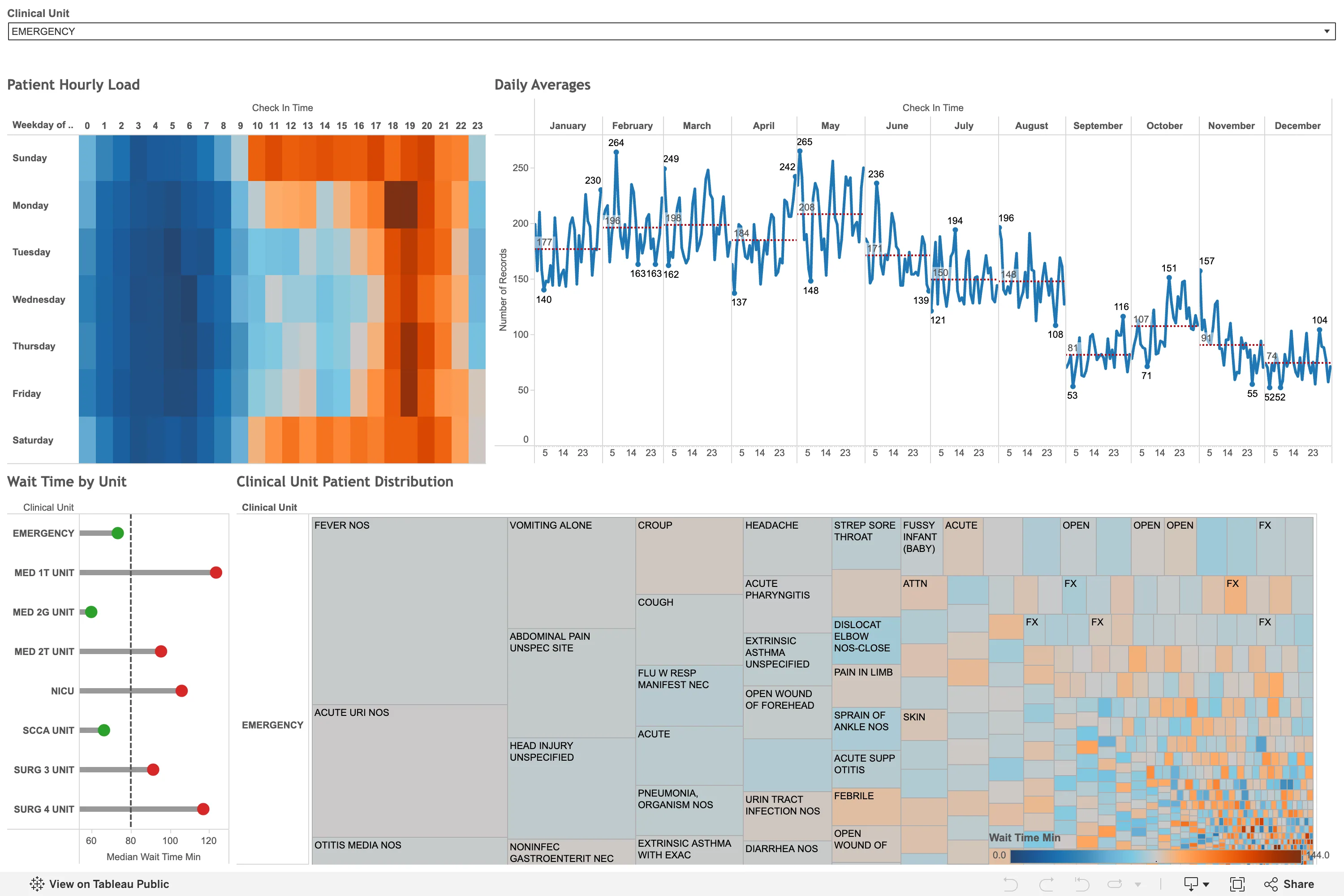
Worth recording partly for what it is not. I went looking for a bed map, and what the public web has instead is this: analysis about an emergency department rather than the board the department actually runs on. There is no row per bed, no occupancy, no waiting-for column. Track boards live inside the patient record and never leave it, which is why that pattern has no example here and probably never will. What this does have is the punch card the calendar-heatmap entry names as the better answer for anything with a daily rather than weekly shape: weekday down the side, hour of day across the top, and the busy band from roughly ten to twenty-one is legible instantly without anyone labelling it. Its ramp is the problem—a blue-to-orange diverging scale on a patient count, which has no meaningful centre, so the midpoint sits wherever the data happened to average. The treemap beneath it degenerates into a mosaic of unlabelled slivers about a third of the way across.
  • Calendar heatmap The punch-card variant: hour of day against weekday. The busy band reads in a second, from the layout alone.
  • Small multiples Twelve month panels on one shared y-axis, so the seasonal fall from 265 in May to 52 in December is comparable across all of them.
  • Sequential and diverging scales A diverging blue-orange ramp on wait time, which has no meaningful centre, so the midpoint is wherever the mean fell.
  • Target and progress Each unit against a median reference line, green below and red above. A target marker doing the work of a threshold.
  • Filter bar One dropdown, full width, showing its selected value rather than a count. Everything below is scoped to it.
Show 5 more examples Hide the rest

Grafana

The reference implementation for panel grids, template variables, and stat panels; most other tools are defined by how they differ from it.

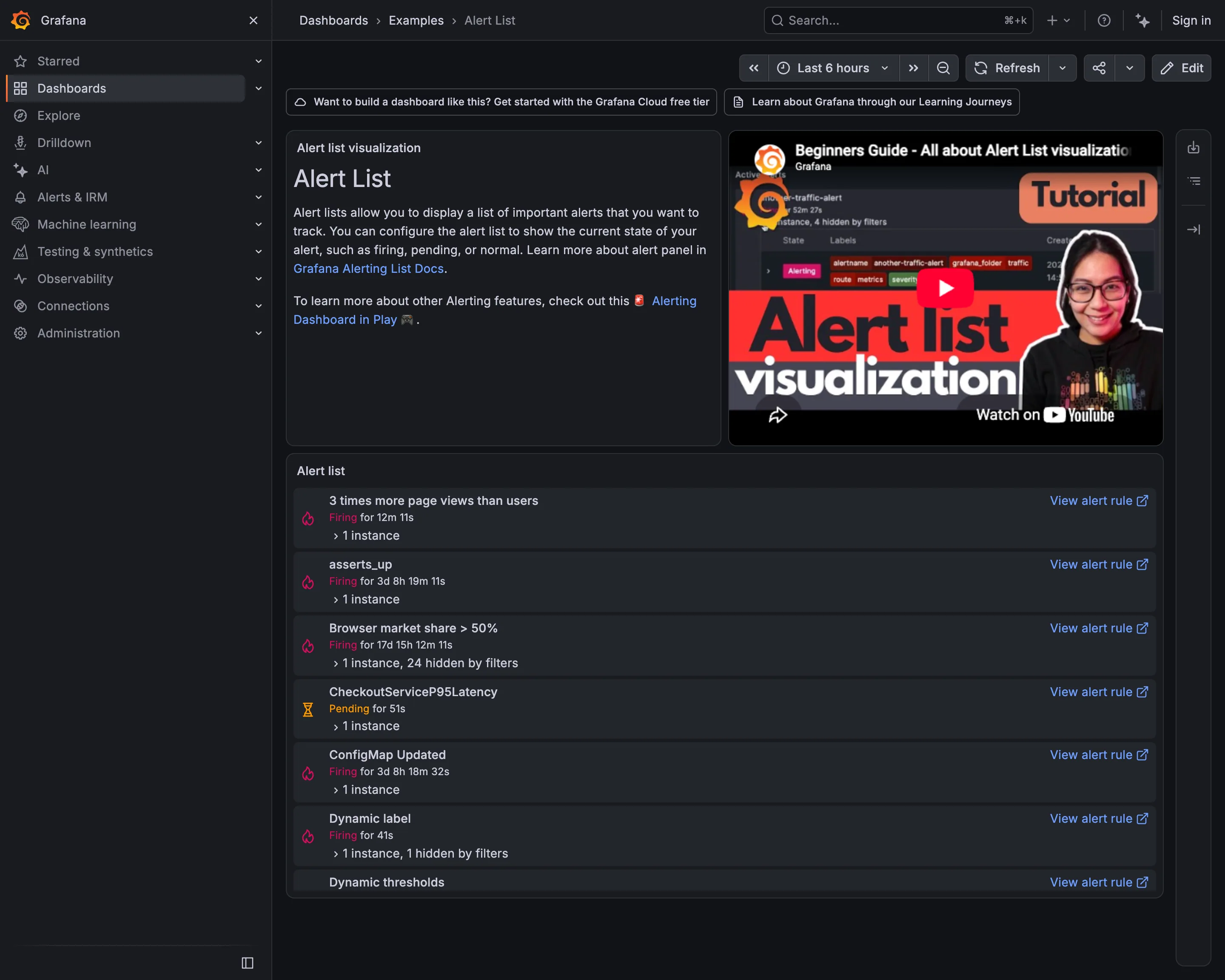
Examples / Alert List September 10, 2026 Grafana Play (signed out; no version string exposed) medium · dark · desktop-web
Seven alerts, and the durations are the story. "Browser market share > 50%" has been firing for 17 days, 15 hours and 12 minutes. Two more have been firing for over three days. An alert that has been true for two and a half weeks is not telling anyone anything—it has become part of the background, and the list it sits in is now a list you scroll past. The other thing worth reading is the names. Six alerts, six conventions: a full sentence, a metric identifier in snake case, a camel-case service name, a two-word phrase, and two that just say "Dynamic". Somebody arriving at this list at three in the morning cannot tell from the names what is broken or how badly, which is work the naming could have done for free.
  • Alert rule attached to panel Seven rules in six naming conventions. Nothing in the list conveys severity or subject.
  • Alert rule attached to panel Firing for 17 days. Still actionable, in principle; nobody has acted for two and a half weeks.
  • Semantic status color Pending rather than firing: the threshold is met and the duration isn't. Two states, both named.
  • Filter bar "1 instance, 24 hidden by filters"—the list saying what it is not showing you.
  • Drill-down The route from an alert back to the rule that defined it, on every row.
Demo / Annotations September 10, 2026 Grafana Play (signed out; no version string exposed) medium · dark · desktop-web
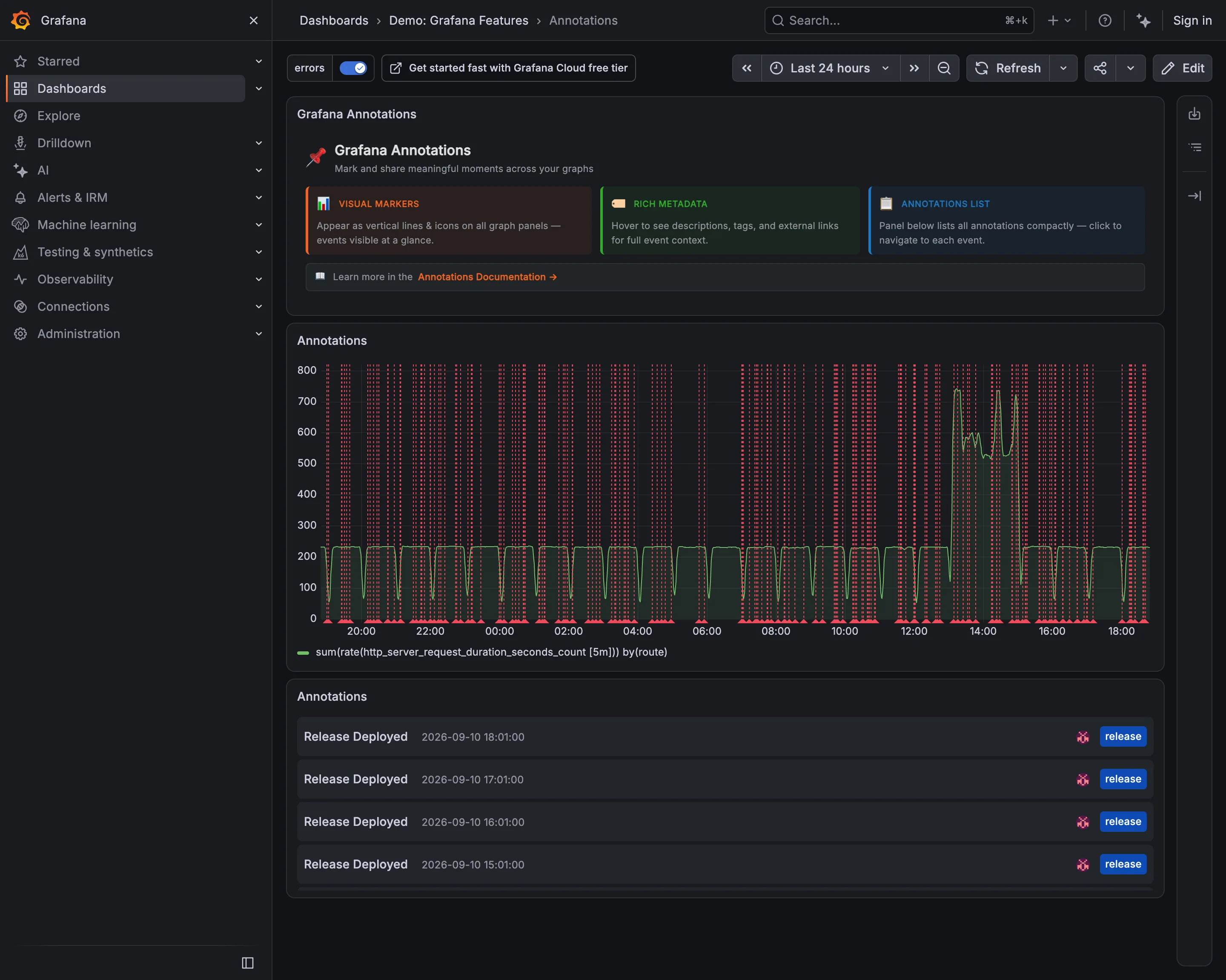
The header on this dashboard says annotations "appear as vertical lines and icons on all graph panels—events visible at a glance", and the panel directly beneath it is the counter-example. Roughly fifty red dashed lines across twenty-four hours, evenly spaced, and the request-rate series behind them is genuinely hard to follow: the fence is denser than the data. Every one of those lines is a real event correctly recorded, and the tag filter in the top left is switched on, so this is the filtered view. That is the whole problem with automatic annotations—they are complete and they never stop arriving, and completeness at this cadence is indistinguishable from noise. The list panel at the bottom is what makes them usable again: the same events, four of them, timestamped and tagged, in a form you can read.
  • Annotation Fifty deploy markers on a 24-hour chart. Each one is correct and together they are a picket fence.
  • Annotation The same events as a list, tagged release and timestamped. Readable in a way the chart is not.
  • Filter bar The tag filter that makes this survivable, already on. The chart above is the filtered version.
  • Time-range picker Twenty-four hours, which is what sets the marker density. An hour here would be three lines.
Examples / Dashboard Variables September 10, 2026 Grafana Play (signed out; no version string exposed) medium · dark · desktop-web
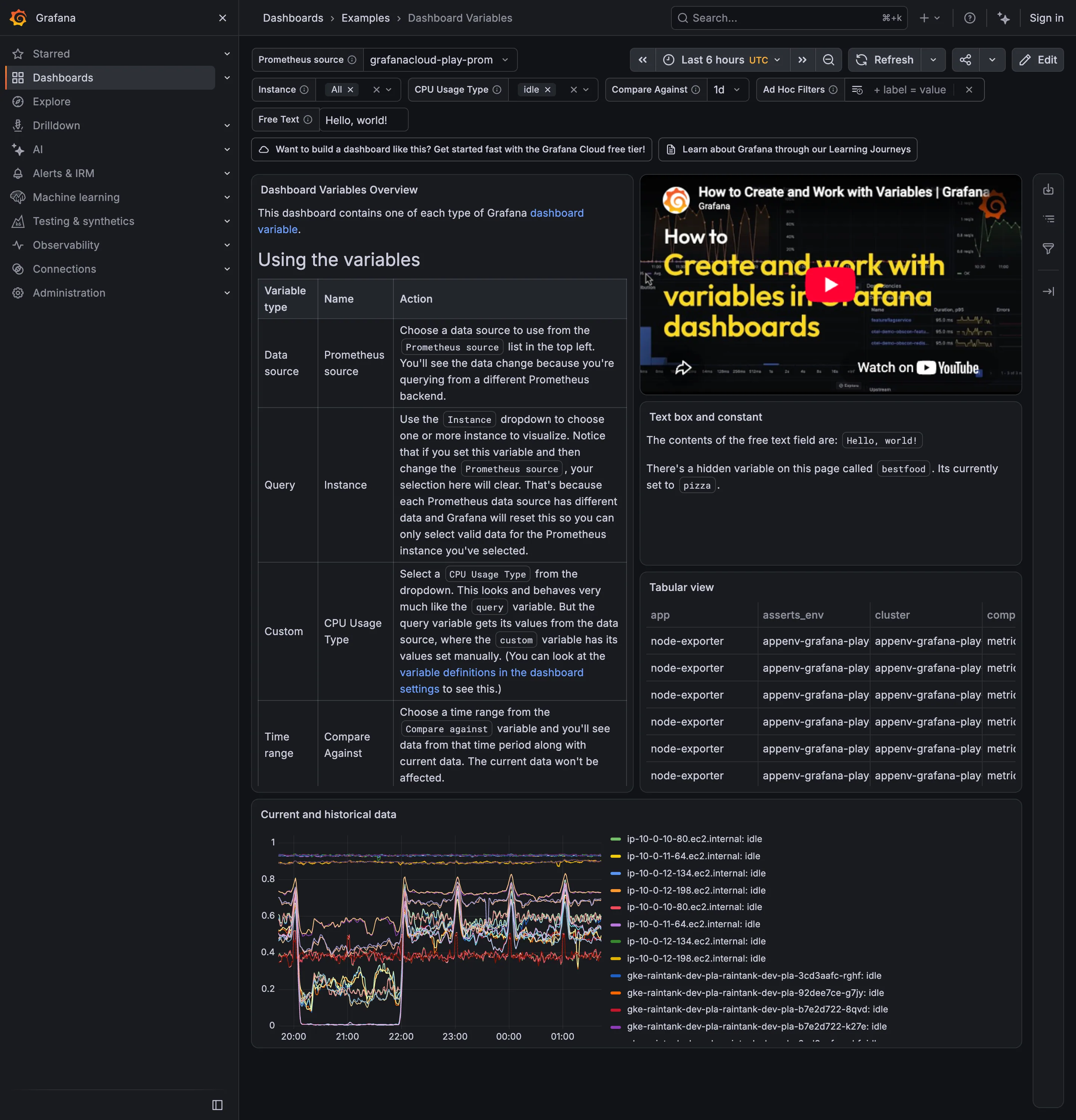
Six selectors across the top and the page is unusually honest about what they cost. The middle panel says there is a hidden variable called bestfood, currently set to pizza, which has no control anywhere on screen—state affecting the page that a viewer cannot see or change. The overview panel says that setting Instance and then changing the Prometheus source will clear your selection, because the two variables are chained and the second one invalidates the first. Both of those are correct behaviour and both are the reason parameterised pages get distrusted. What the top row gets right is the display: Instance and CPU Usage Type show their selected values as chips with an × rather than as a count, so what is filtering the page is legible without opening anything.
  • Template variable Six selectors bound to every panel's query, with the chosen values carried in the URL.
  • Filter bar Values as removable chips rather than a dropdown saying Instance (3).
  • Explain this metric Names a hidden variable set to pizza. Prose is doing the work a control should.
  • Categorical series palette Twelve-plus hostnames differing only in the middle digits, with twelve-plus colours to match.
  • Data table Four columns visible, the fourth cut mid-word, with no horizontal scroll offered.

Kibana

Query-first rather than panel-first: the search bar is the primary control and the charts are downstream of it, which inverts Grafana's arrangement.

Kibana — Discover / filebeat logs
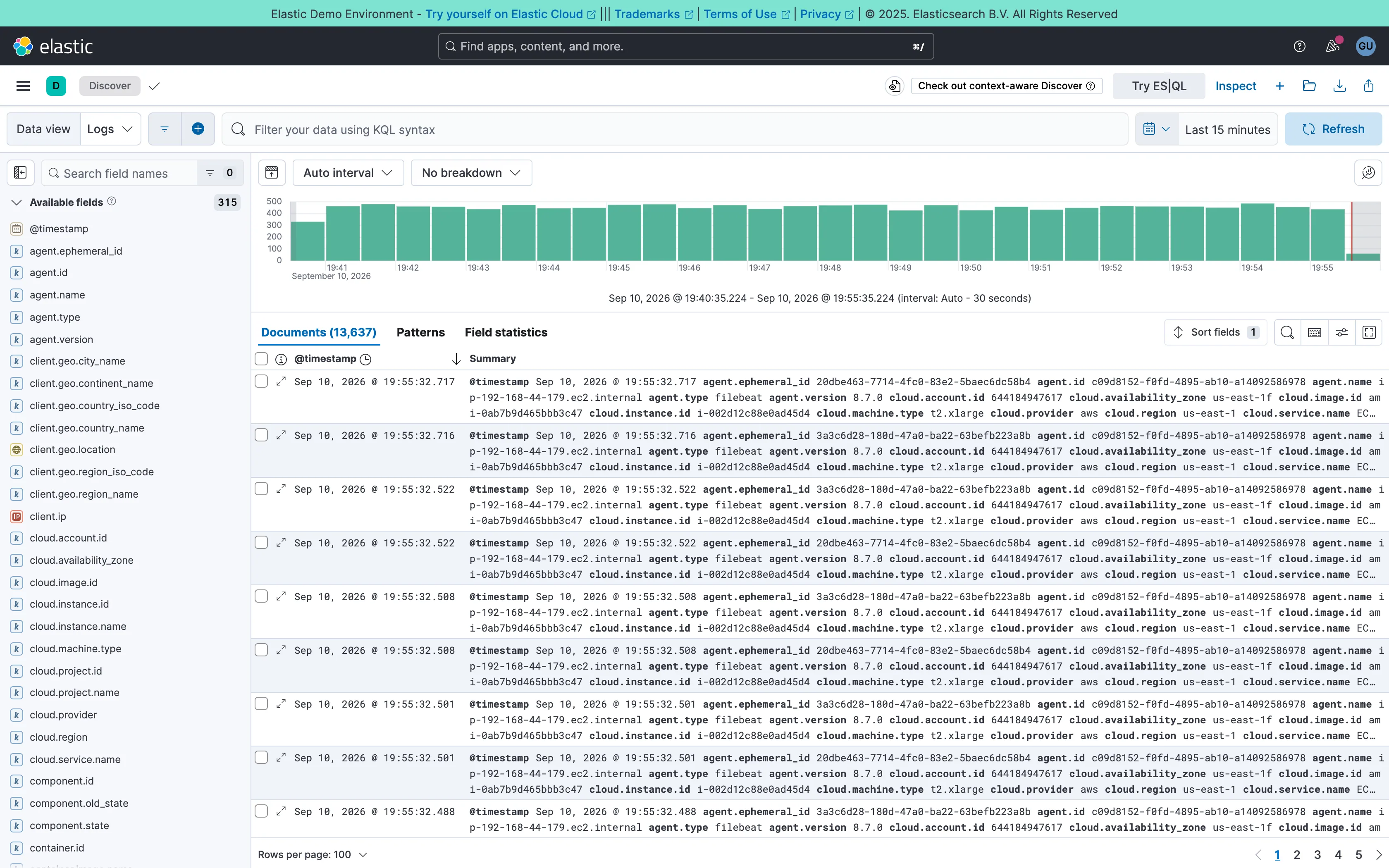
Two-pane list and detail. Fields on the left, records on the right, both on screen at once. The oldest working shape for a queue there is. Data table. One column called Summary holding every field on the record. Complete, and unreadable at a glance. Histogram and distribution. Volume over the window at a 30-second auto interval. The final bar is the bucket still filling, and it always reads low. Filter bar. A query language in the bar rather than chips. Powerful, and it hides what's applied from anyone who didn't type it. Detail on demand. An expander on every row. Inline rather than a side panel, so it pushes the rest of the list down. Time-range picker. Relative by default, with the refresh control beside it rather than buried in a settings menu. Search across panels. 315 fields, so the sidebar opens with a filter box. Past a certain count a tree is a filing system nobody browses.
Discover / filebeat logs September 10, 2026 Elastic demo environment (guest session; no version string exposed) dense · light · desktop-web
Two panes: 315 fields down the left, 13,637 documents on the right, and a volume histogram over both. The left pane is the good half—it opens with a search box rather than a tree, which is the only sane way to navigate that many fields. The right pane is where it falls over. The documents table ships with two columns, a timestamp and "Summary", and Summary is every field on the record concatenated into one cell: agent.ephemeral_id, agent.id, agent.name, agent.type, agent.version, cloud.account.id, cloud.availability_zone, and on for three wrapped lines per row. It is technically complete and it cannot be scanned, so the first thing anyone does here is pick columns—which is to say the default view's job is to make you configure it. Underneath, the pager reads 100 rows per page across 137 pages, and the sort control sits above a table showing the first of them.
  • Two-pane list and detail Fields on the left, records on the right, both on screen at once. The oldest working shape for a queue there is.
  • Detail on demand An expander on every row. Inline rather than a side panel, so it pushes the rest of the list down.
  • Data table One column called Summary holding every field on the record. Complete, and unreadable at a glance.
  • Search across panels 315 fields, so the sidebar opens with a filter box. Past a certain count a tree is a filing system nobody browses.
  • Filter bar A query language in the bar rather than chips. Powerful, and it hides what's applied from anyone who didn't type it.
  • Time-range picker Relative by default, with the refresh control beside it rather than buried in a settings menu.
  • Histogram and distribution Volume over the window at a 30-second auto interval. The final bar is the bucket still filling, and it always reads low.
Kibana — Dashboards / [Flights] Global Flight Dashboard
Panel grid. Twelve columns, and the biggest panel is a table rather than the headline chart. Size isn't carrying priority here. Ratio and rate. Delay rates up to 100% with no denominator anywhere. One flight and a thousand flights render identically. Stacked composition. Stacked to 100%, so the total is discarded on purpose and only the mix of delay types remains. Annotation. Event markers along the top of the series, numbered and grouped, on the data's own axis. Header KPI strip. Five tiles in three different sizes and two different layouts, so the row reads as five things. Compare periods. "vs 1 week earlier, 76.9%"—the comparison base is named and the expression isn't. Filter bar. Declared controls under the query bar: two pickers and a price range. Both mechanisms on screen at once. Share and embed. Share, export and full-screen in the header. Whether the range and filters travel with them is the whole question.
Dashboards / [Flights] Global Flight Dashboard September 10, 2026 Elastic demo environment, sample flight data (guest session) dense · light · desktop-web
Two things on this page are worth arguing with. The first is the table on the right, sorted by delay rate: Chicago/Rockford 100%, Syracuse 100%, Birmingham 75%. A hundred percent of flights delayed is either a catastrophe or one flight, and nothing in the table says which, because the denominator isn't a column. The cells are on a red ramp, so the two rows that are almost certainly a sample of one are the loudest thing in the panel. The second is the tile row: Delayed 25.2%, then beside it "Delayed vs 1 week earlier—76.9%". Seventy-six point nine percent of what? It could be last week's rate, it could be this week as a proportion of last week, it could be the change. Three different numbers, one label, and the tile picks whichever the query returned. What the page gets right is the filtering: a KQL bar for people who know the syntax and three declared controls underneath for people who don't, both visible at once.
  • Ratio and rate Delay rates up to 100% with no denominator anywhere. One flight and a thousand flights render identically.
  • Compare periods "vs 1 week earlier, 76.9%"—the comparison base is named and the expression isn't.
  • Share and embed Share, export and full-screen in the header. Whether the range and filters travel with them is the whole question.
  • Filter bar Declared controls under the query bar: two pickers and a price range. Both mechanisms on screen at once.
  • Panel grid Twelve columns, and the biggest panel is a table rather than the headline chart. Size isn't carrying priority here.
  • Stacked composition Stacked to 100%, so the total is discarded on purpose and only the mix of delay types remains.
  • Annotation Event markers along the top of the series, numbered and grouped, on the data's own axis.
  • Header KPI strip Five tiles in three different sizes and two different layouts, so the row reads as five things.