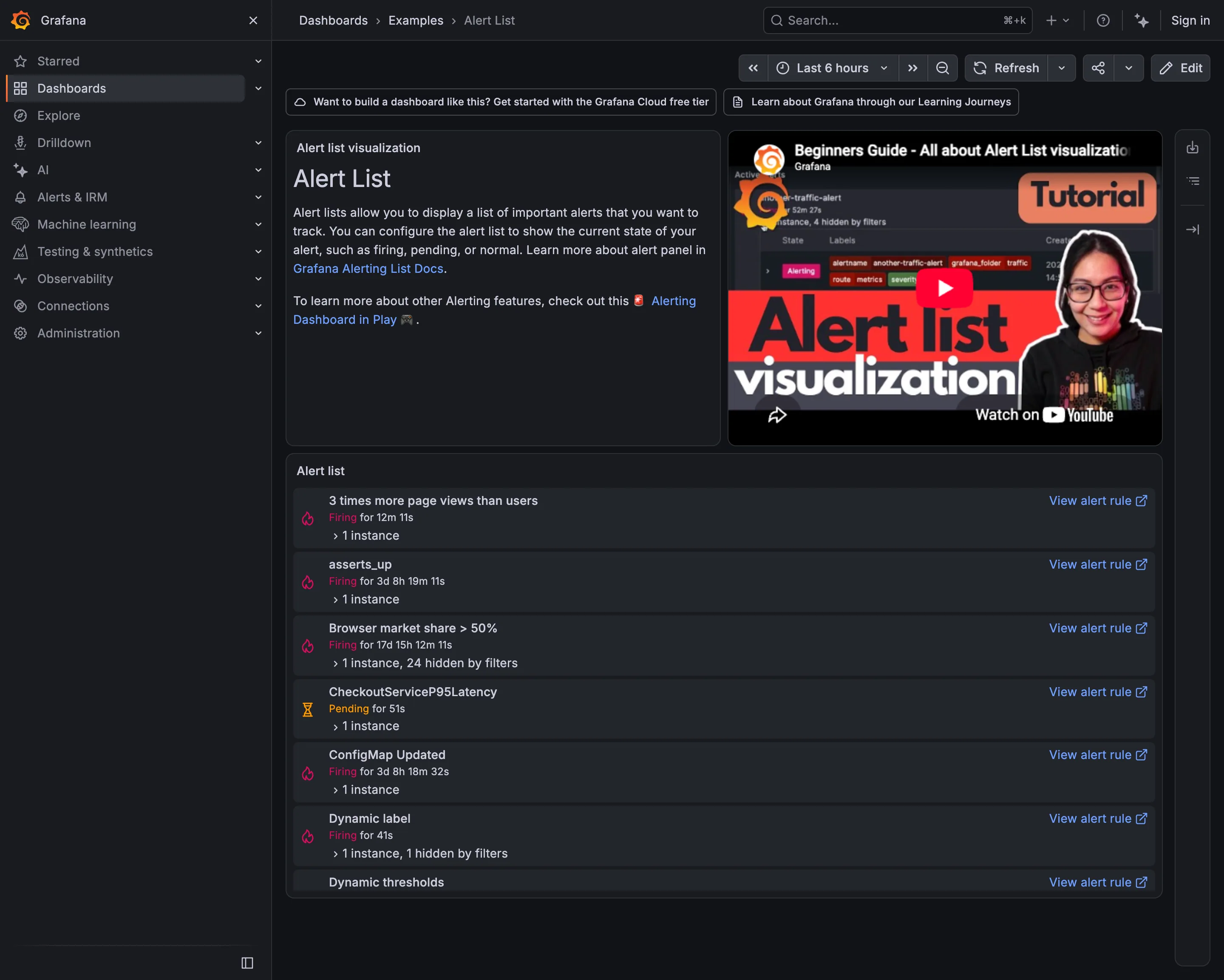
Problem
Someone is looking at a chart and realises they cannot watch it forever. The thing they want is for the chart to watch itself, and the moment of wanting that is while looking at the chart, not while sitting in an alerting console three menus away.
Solution
Let a rule be created from the panel, carrying the query with it. The line you just drew becomes the condition, and the panel and the alert stay describing the same thing.
The proximity is the point. An alert defined elsewhere drifts from the chart within a quarter, and then two numbers exist: the one on the wall and the one that pages someone. Attaching the rule to the panel makes them one object, which is the only reliable way to keep them equal.
What the pattern must not do is make alerting easy enough to be thoughtless, and here the Google SRE book is the correction worth carrying into the UI. Every page should be actionable. Every page response should require intelligence—if a page merely merits a robotic response, it shouldn’t be a page. And catching symptoms is worth much more effort than catching causes, with causes reserved for the very definite and very imminent.
A one-click “alert on this panel” button is at odds with all three, because the easiest rule to create is a static threshold on a cause-shaped metric like CPU, which is exactly the page that wakes someone for something no user noticed. The interface should make the useful rule as easy as the tempting one: ask for duration as well as threshold, ask what happens on no data, and ask who it goes to.
That no-data question is the one products get wrong most often. Grafana treats it as a first-class decision with four mappings—Set No Data state, Set Alerting state, Set Normal state, Keep last state—and defaults to creating a DatasourceNoData instance rather than quietly calling silence healthy. A rule that cannot distinguish “the metric is fine” from “the metric stopped arriving” is a rule that will be silent during exactly the outage it was written for.
Use when
The metric has a defensible limit, someone owns the response, and the chart is where people already look. Best where the panel and the rule genuinely describe one thing.
Don’t use when
Nobody would act on it. An alert nobody can respond to trains a team to ignore the channel, and the cost lands on the next alert rather than this one. Also avoid it when the condition needs several signals: a per-panel rule encourages single-metric thinking.
Trade-offs
Panel-bound rules scale badly. Two hundred panels means two hundred rules with two hundred owners, each edited by whoever last touched the dashboard. Duplication follows, because the same condition gets attached to the same metric on four dashboards, and now one incident pages four times. The rule’s lifecycle also gets tied to the panel’s: delete or restructure a dashboard and the alerting goes with it, usually unnoticed. And a static threshold on a chart that autoscales looks reasonable while the traffic pattern quietly outgrows it.
Checklist
- Is this symptom or cause, and if cause, is it definite and imminent?
- Could a person act on this at 3am, and would the action be more than restarting something?
- Is there a duration condition, or does a single spike page?
- What happens on no data, and was that chosen deliberately?
- Does the rule use the same query as the panel, or a copy that can drift?
- Who owns this rule, and do they know?
- Does the same condition exist on another dashboard?
- What happens to the rule if the panel or dashboard is deleted?
- Is the threshold still right for current traffic, and when was that checked?
- How often has this fired, and how often did it lead to action?
Compare
Grafana creates alert rules from panels and forces the no-data decision at rule-creation time with four explicit mappings, which is the most honest treatment of the failure mode most products leave implicit. Prometheus keeps rules in version-controlled config rather than in a UI, so they get reviewed, diffed and owned like code, at the cost of the create-it-while-looking-at-it immediacy this pattern is named for. Datadog makes the monitor the primary object and lets dashboards reference it, which inverts the relationship and stops the same condition being redefined per dashboard. Sentry derives alerting from issue behaviour—new, regressed, spiking—rather than from a threshold on a line, which sidesteps threshold staleness entirely and only works because its data has a natural notion of “new”.
Related
Threshold line is the visual half of this pattern and should be drawn from the same number. Metric targets is where the limit ought to be defined and owned. Error and stale state covers what the panel shows when the same condition that should alert has instead produced silence. Semantic status color is how the fired state reads on the page. Status history is the record of what this rule has actually done.