Problem
The line is at 340ms and climbing. Whether that matters depends entirely on a number the viewer either has memorised or doesn’t have at all, and the chart is the obvious place to put it.
Solution
Draw the limit on the same axes as the data. Once it’s there, “is this bad” becomes a question about geometry rather than recall, and it can be answered from across a room.
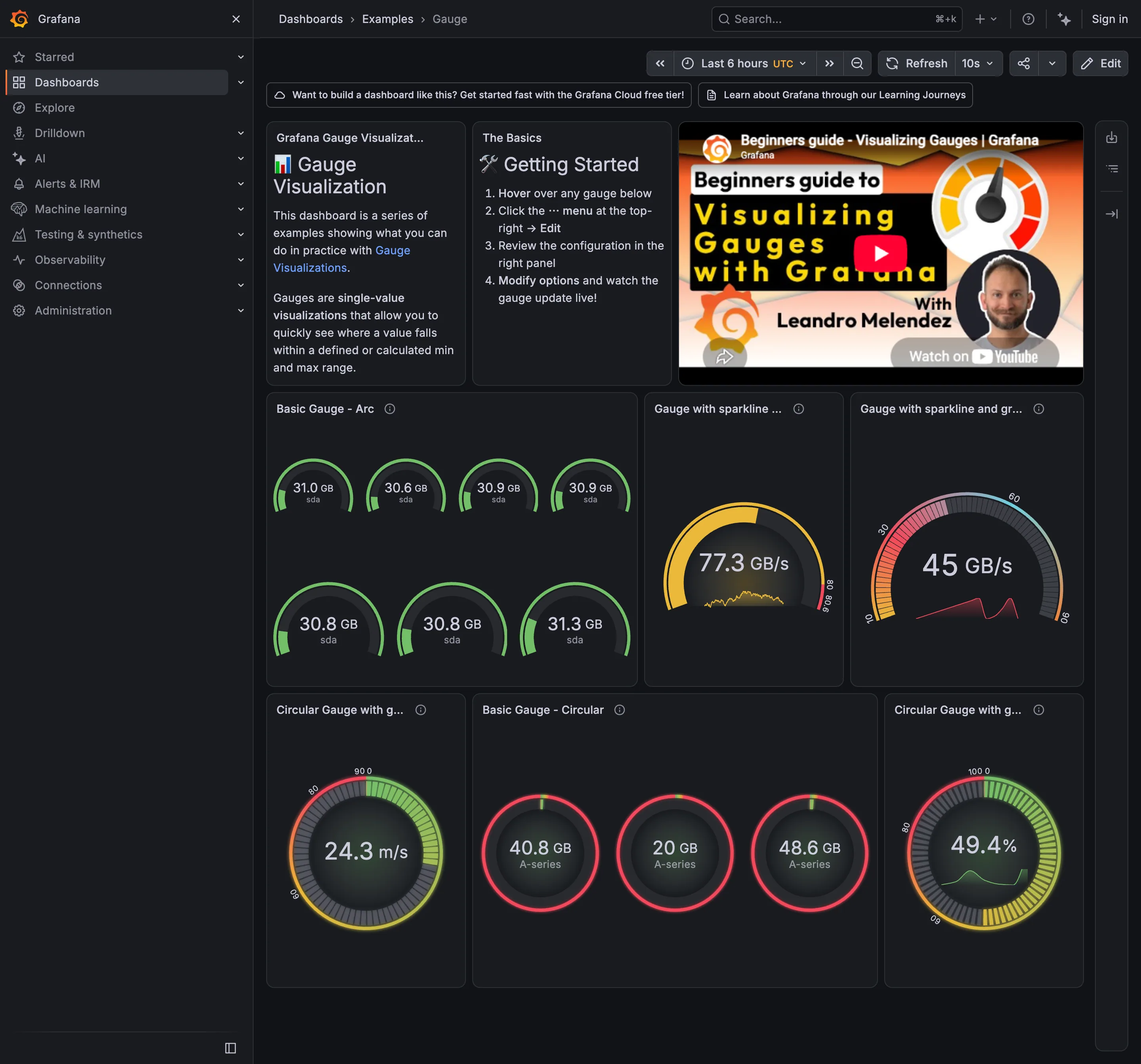
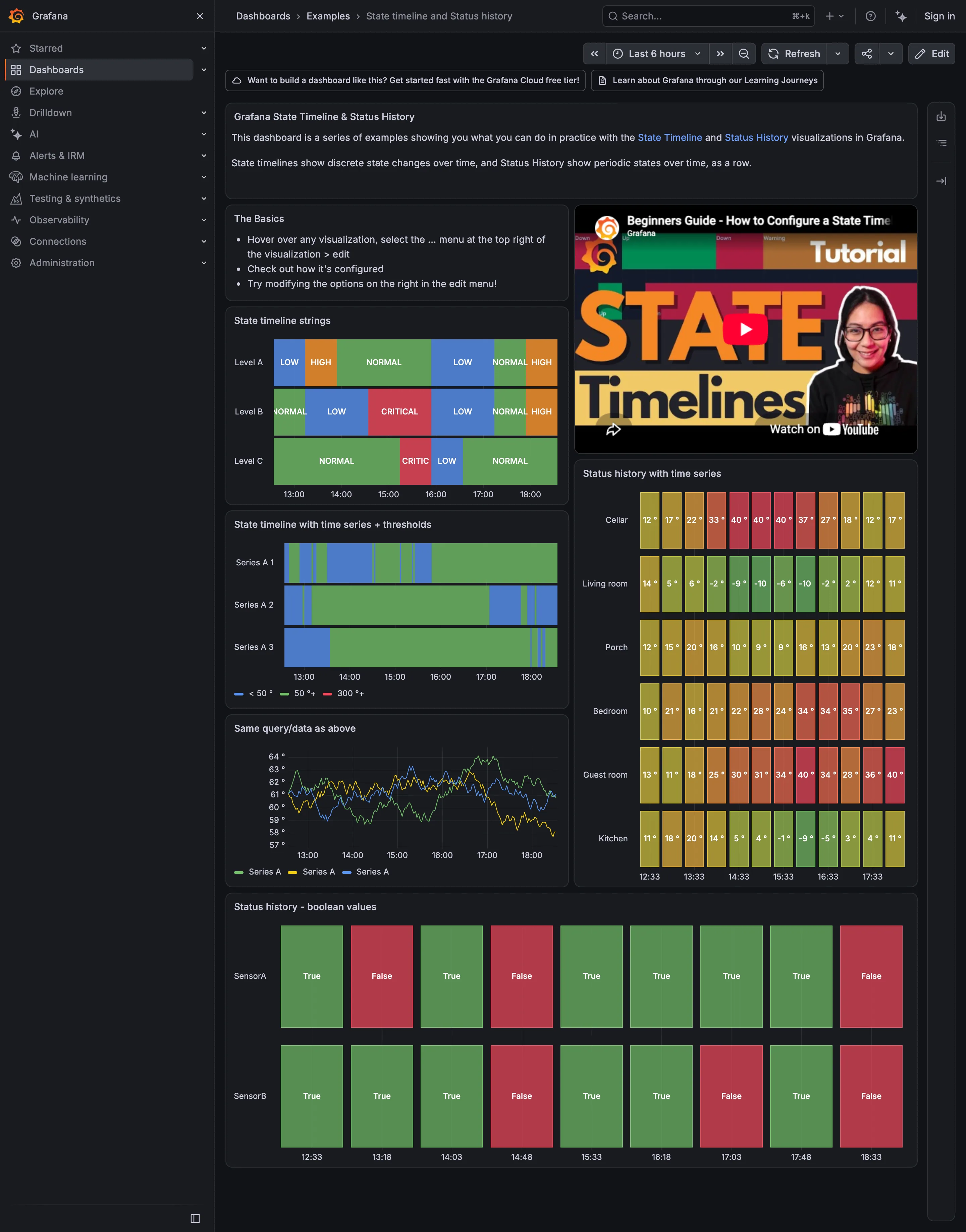
Grafana’s implementation is worth reading as a spec. Thresholds come in two modes: Absolute, “defined by a number”, and Percentage, “defined relative to minimum or maximum”. Out of the box a panel arrives with Base = green and 80 = red in Absolute mode, which is the single most consequential default in the product, because a threshold at 80 is meaningful for CPU percentage and arbitrary for everything else. Plenty of dashboards ship with it untouched and a red panel that means nothing.
The display options are more interesting than they look. Show thresholds offers Off, As lines, As lines (dashed), As filled regions, As filled regions and lines, and the dashed variant of that. The choice between a line and a filled region is not decoration. A line says “here is the limit”. A filled region says “this whole zone is bad”, which reads faster at a distance and costs contrast against the series itself. Dashed says “this is annotation, not data”, which is exactly the distinction a viewer needs when the threshold sits close to the line it’s judging.
The harder question is what the number is doing there. A threshold on a chart is a claim that someone decided what “too much” means. If that decision lives only in the panel’s JSON, it will be wrong within a quarter and nobody will know. Error budgets are the version of this pattern that keeps its provenance: the limit derives from a stated objective, and the display shows consumption against it rather than a bare line.
Use when
There is a real limit and crossing it means something: an SLO, a capacity ceiling, a contractual latency, a safety limit. Especially useful on a chart someone monitors rather than explores.
Don’t use when
The limit is aspirational. A line drawn at a number nobody agreed to teaches viewers that lines on charts are decorative, which then costs you the next one that matters.
Trade-offs
A threshold is a single number standing in for a judgement, and it hides the judgement. It also invites binary reading of a continuous quantity: 79 and 81 are nearly identical states rendered as opposite colours. Static thresholds age badly, because traffic grows and the limit doesn’t. They fire constantly on noisy metrics unless the alert behind them has hysteresis the chart never shows. And a filled region competes for the same visual channel as the data, so a busy chart can end up with the warning zone more prominent than the series crossing into it.
Checklist
- Who set this number, when, and against what?
- Is it absolute or relative to the axis range, and does the panel say which?
- Is this still the default 80, and if so, is 80 meaningful for this metric?
- Line or region, and does the choice suit the reading distance?
- Is the threshold visually distinguishable from the data series?
- Does crossing it trigger anything, or is it decorative?
- Does the alert behind it use the same number the chart draws?
- How does a metric that hovers at the line render, and does it flicker?
- If this is an SLO, does the panel show budget consumed rather than only the current value?
- What happens to the threshold when the y-axis autoscales past it?
Compare
Grafana ships thresholds as a field property with a colour ramp, six display styles and a default that survives into production more often than it should, so the pattern is everywhere in Grafana dashboards and correct in fewer of them. Honeycomb replaces the bare line with an error budget: the objective is declared, and the chart shows how much of the allowance has been spent and how fast, which answers “should I act now” rather than only “am I over”. Datadog ties the drawn limit to the monitor definition, so the line on the chart and the condition that pages someone are the same object rather than two numbers that drift apart. Netdata ships alarm limits with its collectors, so the thresholds arrive pre-set by whoever wrote the integration, which is a good default and a bad excuse not to revisit them.
Related
Anomaly band is the answer when there is no fixed limit and “normal” depends on the hour. Alert rule is what should be attached to the line if it means anything. Metric targets is where the number ought to be defined and owned. Semantic status color decides what crossing it looks like. Time series is the chart this pattern is drawn on.