Problem
Raw time series lie by omission. Traffic drops every night. Latency rises every Monday at nine. A static threshold line fires all night or misses the daytime spike, and the on-call engineer learns to ignore it. What the viewer needs is the shape of normal, drawn on the chart, so the eye does the comparison.
Solution
Draw a translucent band around the series that represents the expected range for this moment, computed from the metric’s own history with seasonality. The line stays the line. The band is quiet, usually gray. When the line leaves the band, that segment changes color, and that color is the only alarm on the chart.
The band has to be honest about its own confidence. Datadog exposes three algorithms (basic, agile, robust) with different tolerance, and the width of the band is the visible expression of that choice. A band that’s too wide never fires. A band that’s too tight is a static threshold with extra steps.
Use when
The metric has a daily or weekly rhythm and a human is watching for departures from it: request rate, error rate, queue depth, sign-ups, spend. The band is most valuable on the overview chart people glance at, not on deep-dive charts where they’re already investigating.
Don’t use when
The metric is supposed to be flat, in which case a threshold line is clearer and cheaper. Or when history is short; a band trained on three days of data is a guess drawn with authority. And never on a chart whose viewer can’t see or change the algorithm, because they’ll trust it anyway.
Trade-offs
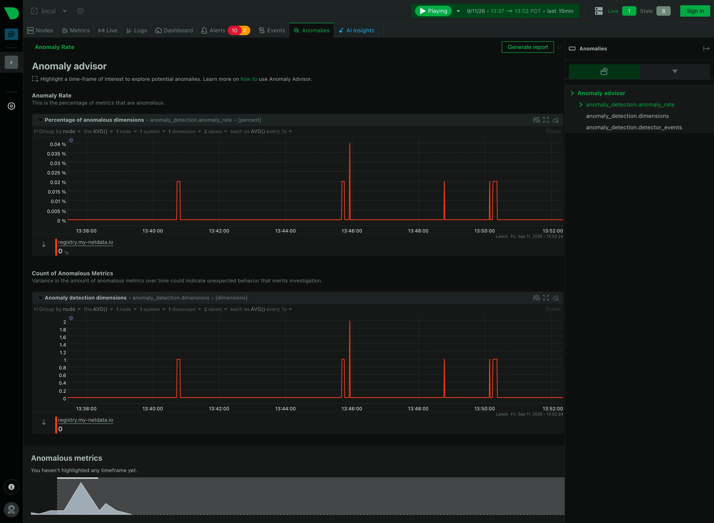
Bands add ink to every chart they’re on and hide the series behind them when the band is wide. They shift attention from absolute values to deviation, which is right for operations and wrong for capacity planning. They also produce a new class of false positive: a metric that’s abnormal and fine, like traffic after a product launch. Netdata’s approach of showing an anomaly rate as its own small ribbon above the chart, rather than a band on it, trades chart cleanliness for a second thing to read.
Checklist
- Is the band visibly quieter than the series? Gray or very low alpha, no outline.
- When the series leaves the band, does only that segment change, and does the color match the site’s semantic status scale?
- Can the viewer find out how the band is computed and over what history?
- Does the band exist on the time range the viewer is looking at, or only on the last few hours?
- What happens at the right edge, where the newest points have the least history?
- Does hover show the expected range as numbers, not just the actual value?
- If an alert is attached to the band, does the chart say so?
- Does the band survive the switch to dark theme without becoming invisible or glowing?
Compare
Datadog draws the band on the chart, gray, and recolors excursions; it’s the version most people picture. Netdata puts anomaly rate in a separate ribbon above every chart, computed per second, so the band never obscures the data but the eye has to travel. Grafana has no native band; teams fake one with a shaded series from a forecast query, which is a tell that the pattern is more product than chart type. Honeycomb skips the band entirely in favor of BubbleUp, which asks the user to draw the anomaly and then explains it, a cross-filter answer to the same problem.
Related
Time series is the substrate. Threshold line is the simpler sibling for flat metrics. Alert rule is what the band usually feeds. Auto-insight is the band’s textual cousin, the “we noticed” feed. Semantic status color governs what the excursion looks like.