Skip to content
KONIGI

Dashboards / Meta information / Explain this metric

3 of 6

Explain this metric

Two people read the same tile and mean different things by it.

Updated September 10, 2026

Problem

The tile says “Active users: 41,208”. Marketing means anyone who opened the app this month. Engineering means anyone who made an authenticated request in the last 24 hours. Finance means anyone with a paid seat. All three read the same tile and leave the meeting agreeing on a number none of them share.

Solution

Put the definition next to the number. An info affordance on the panel opening a short, plain-language statement of what is counted, over what window, with what exclusions, and who owns it.

The content is the hard part, and it is four things rather than one.

What is counted. In the viewer’s words, not the column name. “Anyone who made at least one authenticated request” beats count(distinct user_id).

Over what window. Almost every disagreement about a metric turns out to be a disagreement about the window.

What is excluded. Internal traffic, bots, test accounts, refunds, cancelled orders. Exclusions are where two honest implementations diverge and neither party knows it.

Who owns it. A name. A definition with no owner is a definition nobody can correct, and it will be wrong within a year.

The failure mode this pattern addresses is specific and expensive: not that the number is wrong, but that it is right under a definition the reader doesn’t hold. That failure produces confident, articulate disagreement, and it survives any amount of chart polish.

The structural version of the answer is a modelling or semantic layer, where a metric is defined once and every surface reads that definition. That is better than tooltips and much harder to retrofit. The tooltip is what you can do this quarter; the model is what stops the problem recurring.

Use when

The audience is mixed, the metric name is ambiguous, or the number gets quoted outside the room it was shown in. Any tile that ends up in a board deck.

Don’t use when

The metric is genuinely self-evident to everyone who sees it—a CPU percentage on an engineering dashboard needs no gloss, and adding one dilutes the affordance where it matters.

Trade-offs

Definitions rot faster than charts, because the query changes and the tooltip doesn’t, and a stale definition is worse than none: it is authoritative and wrong. Writing them well is slow, and writing them badly produces the sentence “Active users is the number of active users”. Tooltips also hide the definition behind an interaction most viewers never perform, so the people most likely to misread the number are the least likely to check. And a definition that admits a metric’s messiness can undermine confidence in a number that was, in fact, fine.

Checklist

  • Does the definition say what is counted in the reader’s language?
  • Does it state the window?
  • Does it list exclusions—internal traffic, bots, test accounts, refunds?
  • Does it name an owner?
  • Is the definition stored with the metric, or retyped per dashboard?
  • When the query changes, what makes the definition change?
  • Is the affordance visible enough that someone who doesn’t know they’re confused might click it?
  • Is the same metric defined identically everywhere it appears?
  • Does the definition distinguish this metric from the similarly-named one next to it?
  • Could this be a modelling-layer definition rather than a tooltip?

Compare

Looker answers this structurally with LookML: metrics are defined in a modelled layer and every chart inherits that definition, so the tooltip is generated rather than written and cannot drift from the query. Grafana has no notion of a metric definition at all—panels carry a description field, and whether it holds a real definition or nothing is a matter of author discipline. Honeycomb sidesteps some of it by keeping raw events: the derivation is visible in the query rather than hidden behind a metric name someone chose months ago. Sentry has an advantage most products lack, in that its core objects are concrete enough to need little definition; an error either happened or it didn’t, and the ambiguity lives in grouping rules rather than in counting.

Data source badge answers where the number came from, which is the other half of the same trust question. Ratio and rate is the pattern where a hidden denominator does the most damage. Metric targets is where a definition becomes load-bearing, because a target on an ambiguous metric is an argument waiting to happen. KPI tile is the container that most needs this and most often lacks it. Hover detail is the interaction, and the entry that warns against making a tooltip carry a paragraph.
Explain this metric anatomy A tile with an info affordance in its header and the panel it opens, holding four things: what is counted in the viewer's words, over what window, what is excluded, and who owns the definition. Anatomy Active users i 42,109 Last 7 days Active users WHAT IS COUNTED Anyone who made at least one authenticated request. Not sessions, not page views. OVER WHAT WINDOW A rolling seven days, recomputed hourly. WHAT IS EXCLUDED Internal staff accounts, known bots, and anything from the test tenant. 1 2 3 Owned by growth-analytics 4 1 WHAT IS COUNTED In the viewer's words, not the column name. 2 THE WINDOW Almost every disagreement about a metric turns out to be about the window. 3 EXCLUSIONS Where two honest implementations diverge and neither party finds out. 4 AN OWNER A definition nobody owns is one nobody can correct, and it will be wrong within a year. The failure isn't a wrong number. It's a right one under a definition you don't hold.
Wireframe — the pattern's anatomy, not any one product's version of it

Implementation

Two people read the same tile and mean different things by it. The definition belongs next to the number, not in a wiki nobody opens, and it has to name who owns it so a disagreement has somewhere to go.

shadcn
npx shadcn@latest add popover button card
npm
lucide-react
Tokens
--card--card-foreground--popover--popover-foreground--muted--muted-foreground--border
Active users

42,109

Last 7 days

MetricDefinition.tsxThe definition as four required fields behind an info affordance on the tile: counted, window, excluded, owner.

import { useState } from "react";
import { Info } from "lucide-react";
import { Button } from "@/components/ui/button";
import { Card } from "@/components/ui/card";
import { Popover, PopoverContent, PopoverTrigger } from "@/components/ui/popover";

/**
 * Four fields, all required. A definition is not a sentence; it is what is
 * counted, over what window, with what left out, and who to argue with. Leave
 * any one out and two honest readers of the tile will still disagree.
 */
export type Definition = {
  /** In the reader's words, not the column name. */
  counts: string;
  window: string;
  excludes: string;
  /** A team or a person. A definition nobody owns is one nobody can correct. */
  owner: string;
};

type Props = {
  label: string;
  value: string;
  /** The window the tile shows, which the definition should agree with. */
  range: string;
  definition: Definition;
  onOwnerClick: (owner: string) => void;
  /** Start with the definition showing, as when the tile is the exhibit. */
  defaultOpen?: boolean;
};

export function MetricDefinition({ label, value, range, definition, onOwnerClick, defaultOpen = false }: Props) {
  const [open, setOpen] = useState(defaultOpen);
  const rows: [string, string][] = [
    ["Counts", definition.counts],
    ["Window", definition.window],
    ["Excludes", definition.excludes],
  ];

  return (
    <Card className="w-[220px] p-4">
      {/* A div, not a p: the popover renders inline here in the preview, and
          block content inside a paragraph splits it. */}
      <div className="flex items-center gap-1.5 text-xs uppercase tracking-wide text-muted-foreground">
        {label}
        {/* Non-modal: a definition should not lock the dashboard behind it. */}
        <Popover open={open} onOpenChange={setOpen} modal={false}>
          <PopoverTrigger asChild>
            <Button variant="ghost" size="icon" className="size-5 rounded-full" aria-label={`What ${label} means`}>
              <Info className="size-3.5" />
            </Button>
          </PopoverTrigger>
          <PopoverContent side="right" align="start" className="w-[360px] normal-case tracking-normal">
            <p className="border-b pb-2 text-sm text-popover-foreground">{label}</p>
            <dl className="mt-3 grid grid-cols-[76px_1fr] gap-x-3 gap-y-3 text-xs">
              {rows.map(([k, v]) => (
                <div key={k} className="contents">
                  <dt className="text-muted-foreground">{k}</dt>
                  <dd className="m-0 text-popover-foreground">{v}</dd>
                </div>
              ))}
            </dl>
            <p className="mt-3 flex items-center gap-2 border-t pt-2.5 text-xs text-muted-foreground">
              Owned by
              <button type="button" onClick={() => onOwnerClick(definition.owner)}
                className="rounded-full border px-2 py-0.5 text-popover-foreground hover:bg-muted">
                {definition.owner}
              </button>
            </p>
          </PopoverContent>
        </Popover>
      </div>
      <p className="mt-3 text-3xl font-medium tabular-nums text-card-foreground">{value}</p>
      <p className="mt-2 text-xs text-muted-foreground">{range}</p>
    </Card>
  );
}

demo.tsxHow it is called: Active users over seven days, opened on arrival.

import { MetricDefinition } from "./MetricDefinition";

/**
 * The tile with its definition already open, since the definition is the
 * thing being shown. The owner chip is where a disagreement goes.
 */
export default function Demo() {
  return (
    <div className="min-h-[240px]">
      <MetricDefinition
        label="Active users"
        value="42,109"
        range="Last 7 days"
        definition={{
          counts: "Anyone who made at least one authenticated request. Not sessions, not page views.",
          window: "A rolling seven days, recomputed hourly.",
          excludes: "Internal staff accounts, known bots, and anything from the test tenant.",
          owner: "growth-analytics",
        }}
        onOwnerClick={() => {}}
        defaultOpen
      />
    </div>
  );
}
What it renders. Identical markup in both panes, with only the token values changing.

Examples

Captures whose hotspots reference this pattern, grouped by product and dated. The dashed boxes are this pattern; hover any box for the note.

Netdata

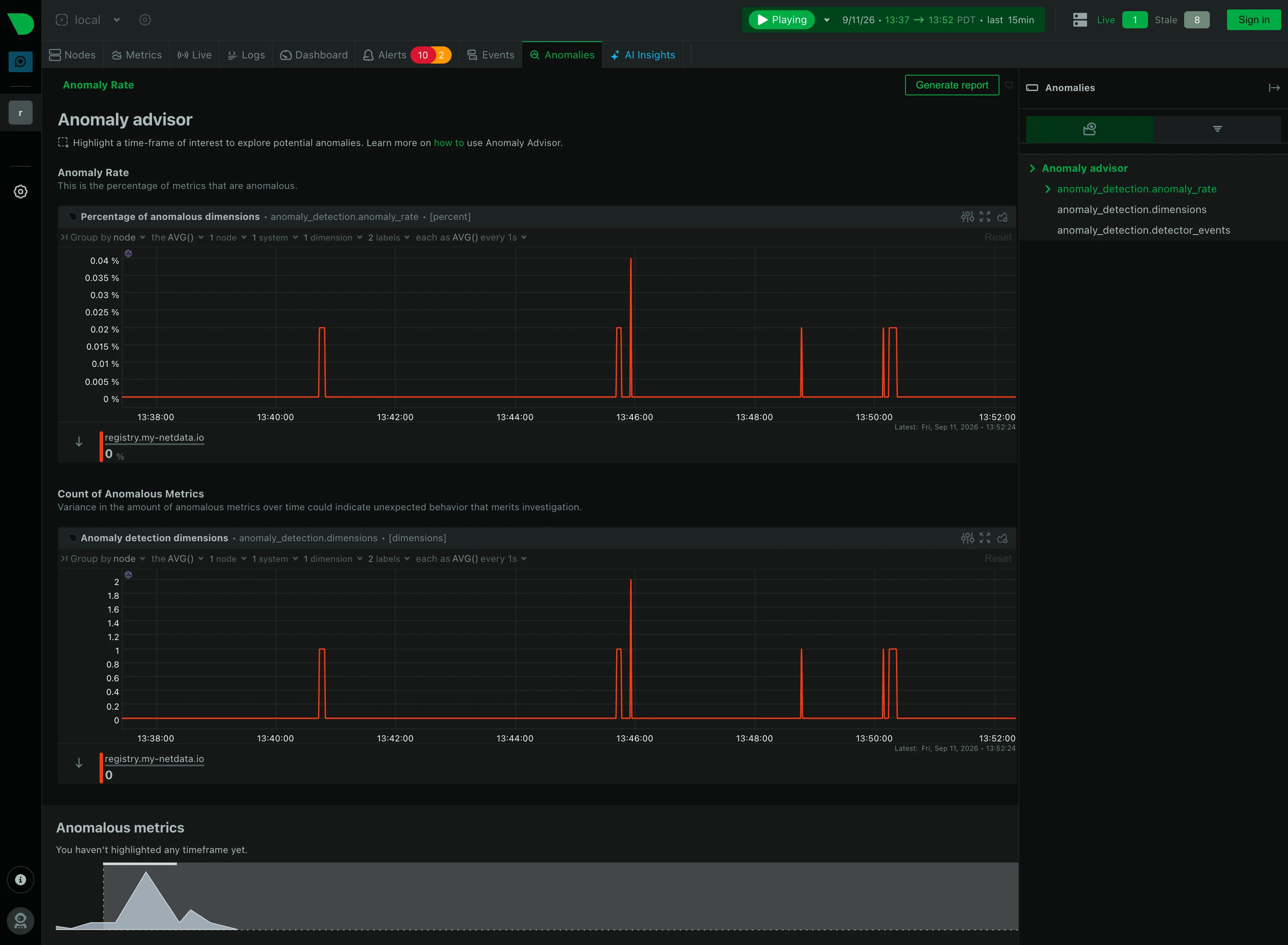
Per-second charts, hundreds per node, with a per-chart anomaly ribbon instead of a band on the series.

Anomalies / Anomaly advisor September 11, 2026 Netdata Agent, Anomaly advisor (public registry node, signed out) medium · dark · desktop-web
Netdata answers the anomaly problem without drawing a band at all, and the difference is worth recording. Rather than shading an expected range around each series, it scores every metric continuously and plots the result as its own series: the percentage of dimensions currently anomalous, and beneath it the count. Both sit near zero for most of the window and spike to about 0.04% at five separate moments. The trade is clear once you see it. A band tells you whether this metric is behaving, on the same axes as the metric, and needs one per chart. A rate tells you whether anything at all is behaving, in one chart, and cannot tell you which thing without a second step—which is what the panel at the bottom is for, and why it currently reads "You haven't highlighted any timeframe yet." The finding requires a brush selection before it will name a single metric.
  • Anomaly band Not a band. An anomaly rate as its own series, so one chart covers every metric instead of one band per chart.
  • Explain this metric Every section carries a sentence saying what it counts, directly under its heading rather than behind an icon.
  • Cross-filter Highlight a timeframe and the page names which metrics drove it. The selection is the query.
  • Empty state "You haven't highlighted any timeframe yet"—the reason for the blank, and the action that fills it.
  • Share and embed Generate report, top right. Whether the highlighted window travels with it is the question the button raises.
Show 1 more example Hide the rest

Grafana

The reference implementation for panel grids, template variables, and stat panels; most other tools are defined by how they differ from it.

Examples / Dashboard Variables September 10, 2026 Grafana Play (signed out; no version string exposed) medium · dark · desktop-web
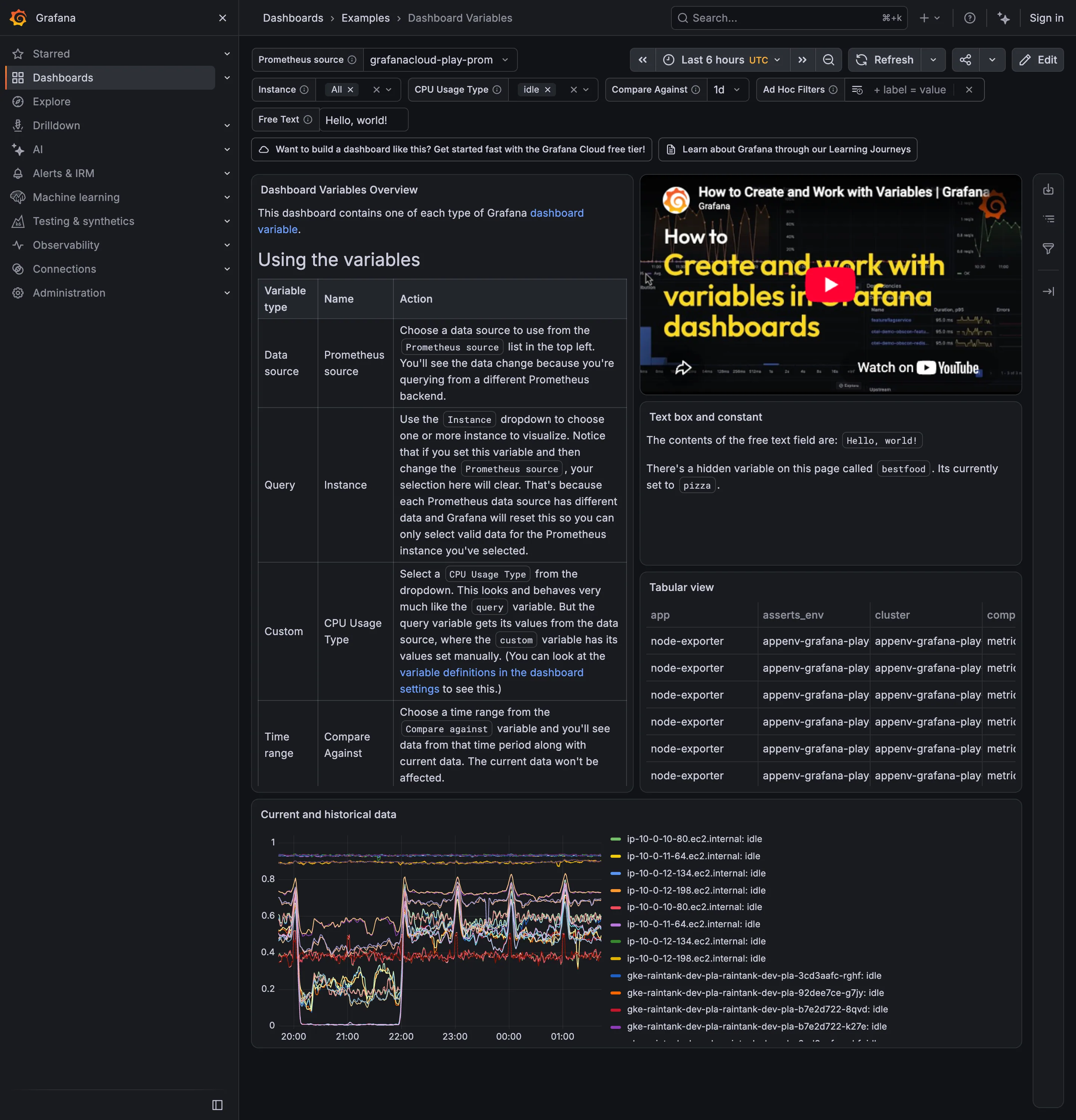
Six selectors across the top and the page is unusually honest about what they cost. The middle panel says there is a hidden variable called bestfood, currently set to pizza, which has no control anywhere on screen—state affecting the page that a viewer cannot see or change. The overview panel says that setting Instance and then changing the Prometheus source will clear your selection, because the two variables are chained and the second one invalidates the first. Both of those are correct behaviour and both are the reason parameterised pages get distrusted. What the top row gets right is the display: Instance and CPU Usage Type show their selected values as chips with an × rather than as a count, so what is filtering the page is legible without opening anything.
  • Template variable Six selectors bound to every panel's query, with the chosen values carried in the URL.
  • Filter bar Values as removable chips rather than a dropdown saying Instance (3).
  • Explain this metric Names a hidden variable set to pizza. Prose is doing the work a control should.
  • Categorical series palette Twelve-plus hostnames differing only in the middle digits, with twelve-plus colours to match.
  • Data table Four columns visible, the fourth cut mid-word, with no horizontal scroll offered.