Netdata
Per-second charts, hundreds per node, with a per-chart anomaly ribbon instead of a band on the series.
netdata.cloud , opens in a new tab Live demo , opens in a new tab
Patterns seen here 16
Captures
3 captures, newest first. Hover any box for the pattern and the note.
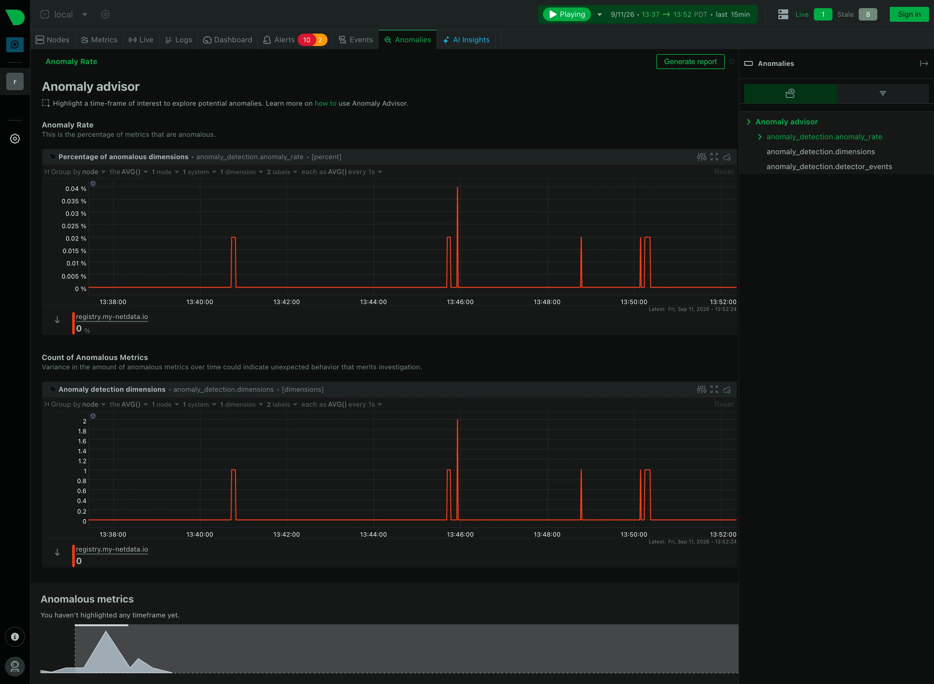
Anomaly band. Not a band. An anomaly rate as its own series, so one chart covers every metric instead of one band per chart. Empty state. "You haven't highlighted any timeframe yet"—the reason for the blank, and the action that fills it. Cross-filter. Highlight a timeframe and the page names which metrics drove it. The selection is the query. Explain this metric. Every section carries a sentence saying what it counts, directly under its heading rather than behind an icon. Share and embed. Generate report, top right. Whether the highlighted window travels with it is the question the button raises.
- Anomaly band Not a band. An anomaly rate as its own series, so one chart covers every metric instead of one band per chart.
- Explain this metric Every section carries a sentence saying what it counts, directly under its heading rather than behind an icon.
- Cross-filter Highlight a timeframe and the page names which metrics drove it. The selection is the query.
- Empty state "You haven't highlighted any timeframe yet"—the reason for the blank, and the action that fills it.
- Share and embed Generate report, top right. Whether the highlighted window travels with it is the question the button raises.
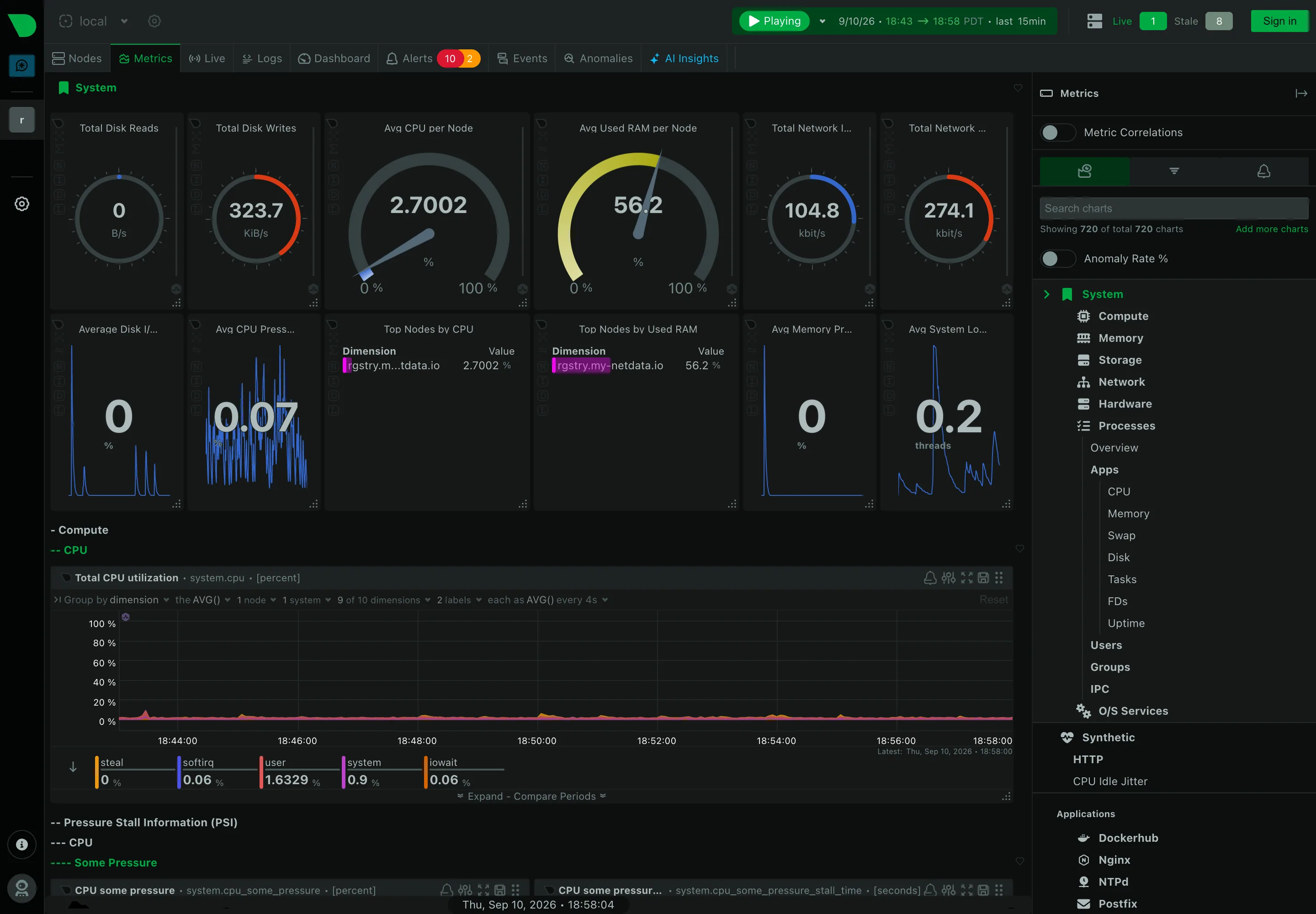
Header KPI strip. Twelve tiles in two rows, in four different layouts. It reads as twelve things rather than one strip. Sidebar and canvas. The rail is the dashboard. A generated tree of every metric family the agent found. Gauge and dial. Arcs for disk reads and writes, where the maximum is invented—this is a rate, not a capacity. Dashboard builder. A query builder inline in the panel header: group by, aggregation, node and dimension count. Search across panels. 720 charts, so search is the navigation and the tree is the filing system nobody browses. Semantic grouping. Sections generated by the collector rather than chosen. Consistent, and about nothing in particular. Compare periods. Offered per chart rather than per dashboard, which is the scoping trap: one panel shifted, the rest not. Freshness indicator. Live 1, Stale 8. Most products would have drawn all nine and said nothing.
- Sidebar and canvas The rail is the dashboard. A generated tree of every metric family the agent found.
- Search across panels 720 charts, so search is the navigation and the tree is the filing system nobody browses.
- Header KPI strip Twelve tiles in two rows, in four different layouts. It reads as twelve things rather than one strip.
- Gauge and dial Arcs for disk reads and writes, where the maximum is invented—this is a rate, not a capacity.
- Semantic grouping Sections generated by the collector rather than chosen. Consistent, and about nothing in particular.
- Freshness indicator Live 1, Stale 8. Most products would have drawn all nine and said nothing.
- Dashboard builder A query builder inline in the panel header: group by, aggregation, node and dimension count.
- Compare periods Offered per chart rather than per dashboard, which is the scoping trap: one panel shifted, the rest not.
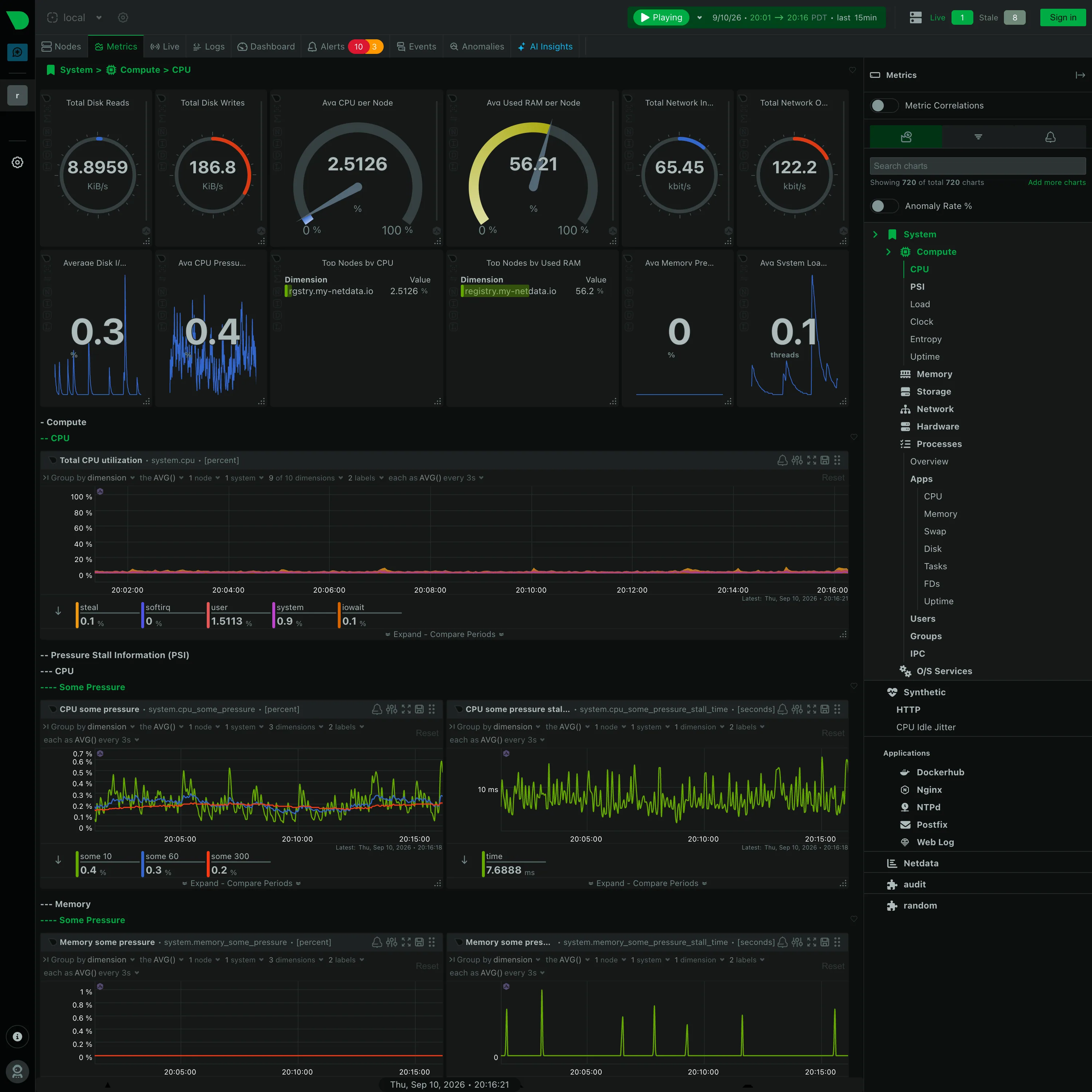
Gauge and dial. Six arcs. Two are percentages where the endpoints mean something; four are rates in KiB/s and kbit/s on an invented maximum. Collapsible row. Four levels of section, depth carried by leading dashes. Generated by the collector, and never edited. Legend and series toggle. The legend is a value table: steal 0.1, softirq 0, user 1.5113, system 0.9, iowait 0.1, each with its own bar. Dashboard builder. A query builder in every chart header, so the panel is a live query rather than a saved configuration. Overview then detail. System › Compute › CPU. The breadcrumb is the only thing telling you where in 720 charts you are.
- Collapsible row Four levels of section, depth carried by leading dashes. Generated by the collector, and never edited.
- Gauge and dial Six arcs. Two are percentages where the endpoints mean something; four are rates in KiB/s and kbit/s on an invented maximum.
- Legend and series toggle The legend is a value table: steal 0.1, softirq 0, user 1.5113, system 0.9, iowait 0.1, each with its own bar.
- Dashboard builder A query builder in every chart header, so the panel is a live query rather than a saved configuration.
- Overview then detail System › Compute › CPU. The breadcrumb is the only thing telling you where in 720 charts you are.