Skip to content
KONIGI

Dashboards / Product mechanics / Dashboard builder

4 of 10

Dashboard builder

The person who needs the dashboard has to be able to make it.

Updated September 10, 2026

Problem

The person who knows what the dashboard should show is not the person who can write the query. Every dashboard has to go through someone, and that someone is a queue.

Solution

Let people build their own. A panel editor with a query interface, a visualisation picker, options, and a canvas to arrange the result.

The design problem is a straight progressive-disclosure question, and NN/g’s rule is the test: disclose everything people frequently need up front, so they reach the secondary display only rarely. On a panel editor the split is unusually hard, because the surface has to serve someone adding a fifth stat panel to an existing page and someone building a heatmap with a bucketing strategy, and those two want almost nothing in common.

The choice that most determines the outcome is where the difficulty sits. Query-first editors—pick a metric, then choose how to draw it—put the data model in front, which is honest and blocks anyone who does not know the metric names. Visualisation-first editors put the picture first and make the query a detail, which gets more people to a result and produces more results that are subtly wrong.

The thing builders consistently fail to provide is the editorial layer. A tool can make it easy to add a panel and cannot make anyone decide the page is finished. So dashboards grow monotonically, and the failure mode of a good builder is a thousand dashboards nobody curates, with six versions of the same page and no signal about which is authoritative.

The other structural question is whether dashboards are artefacts or code. As UI objects they are fast to make and impossible to review. As files they are diffable, reviewable and version-controlled, and much slower to change. Mature estates end up wanting both and having to choose per dashboard.

Use when

The audience knows their domain, the queries are within reach, and the alternative is a bottleneck that means dashboards do not get made at all.

Don’t use when

Correctness matters more than throughput. Anything feeding a decision with consequences wants review, and a builder that lets anyone publish is a builder that lets anyone publish something wrong that looks official.

Trade-offs

Every builder trades correctness for reach, and the wrong panels it produces are indistinguishable from the right ones. Edit mode on a shared dashboard means anyone can change what everyone sees, usually without review, and often by accident. Sprawl is the default end state and pruning is nobody’s job. And a builder makes the tool’s data model the ceiling on what can be asked: people build the dashboards their editor makes easy, which is not the same set as the dashboards they need.

Checklist

  • Who is the intended builder, and do they know the metric names?
  • What is in the first screen of the editor, and is it what most people need?
  • Can someone produce a subtly wrong panel without any warning?
  • Is there a review step before a dashboard becomes shared?
  • Can edits to a shared dashboard happen by accident, and is there history?
  • Is there a way to tell an authoritative dashboard from a copy?
  • Are dashboards editable as files as well as in the UI?
  • What prunes dashboards nobody opens?
  • Does the builder encourage a default that is good, or one that merely works?
  • Is there a template for the common case, so people start from something?

Compare

Grafana is the reference: a panel editor with query, transform and visualisation tabs, plus dashboards as JSON that can be exported, version-controlled and provisioned, so a team can choose UI-first or code-first per dashboard. Datadog offers a similar builder over its own tag model, which makes scoping easier and the data model harder to escape. Looker puts a modelling layer in front, so exploration is safe by construction and adding a genuinely new metric is an engineering task, which is the clearest expression of the correctness-versus-reach trade. Honeycomb barely has a builder, because the primary artefact is a query rather than a page, and boards are collections of saved queries rather than composed layouts.

Panel grid is the canvas being arranged. Resizable card grid is what happens when viewers as well as authors can rearrange. Template variable is the mechanism that keeps a built dashboard reusable instead of hard-coded. Explain this metric covers the definitional problem a builder makes worse by scaling authorship. Share and embed is where a built dashboard goes next, and where its errors travel.
Dashboard builder anatomy A panel editor: a preview above, a query pane below it, a visualisation picker and an options drawer down the side with most of its sections collapsed. Below, the thing no builder provides—a count of a thousand dashboards nobody curates. Anatomy of a panel editor preview Query prom-prod Visualisation Options Panel Axis Thresholds Value mappings 1 2 1 WHERE THE DIFFICULTY SITS Query first puts the data model in front. It's honest, and it blocks anyone who doesn't know the metric names. 2 WHAT'S COLLAPSED The split has to serve someone adding a fifth stat panel and someone choosing a bucketing strategy, and they want nothing in common. A builder makes adding a panel easy and cannot make anyone decide a page is finished.
Wireframe — the pattern's anatomy, not any one product's version of it

Implementation

The person who needs the dashboard has to be able to make it. Live preview beside the query is the mechanism, because the alternative is a save-and-look loop that punishes every experiment.

shadcn
npx shadcn@latest add card button dropdown-menu textarea toggle-group collapsible input
npm
recharts lucide-react
Tokens
--card--card-foreground--muted--muted-foreground--border--chart-1

preview

Query

Visualisation

Options

PanelEditor.tsxPreview over query, picker over options. The visualisation set is closed, the preview redraws from the picker, and only one options section is open at a time.

import { useState } from "react";
import { Bar, BarChart, Line, LineChart, YAxis } from "recharts";
import { ChevronDown, ChevronRight } from "lucide-react";
import { Button } from "@/components/ui/button";
import { Card } from "@/components/ui/card";
import { Collapsible, CollapsibleContent, CollapsibleTrigger } from "@/components/ui/collapsible";
import {
  DropdownMenu, DropdownMenuContent, DropdownMenuRadioGroup, DropdownMenuRadioItem, DropdownMenuTrigger,
} from "@/components/ui/dropdown-menu";
import { Input } from "@/components/ui/input";
import { Textarea } from "@/components/ui/textarea";
import { ToggleGroup, ToggleGroupItem } from "@/components/ui/toggle-group";

/** The picker is a closed set. A new visualisation is a code change, because
 *  each one needs a preview renderer and its own options. */
export type Viz = "timeseries" | "stat" | "bar";
const VIZ: Viz[] = ["timeseries", "stat", "bar"];

/** Options are grouped so the first screen is what most people need. Panel is
 *  open; the rest are one click away for the person choosing a bucketing
 *  strategy. Field names double as keys into the options bag. */
export type Section = "Panel" | "Axis" | "Thresholds" | "Value mappings";
const SECTIONS: Record<Section, string[]> = {
  Panel: ["Title", "Description"],
  Axis: ["Min", "Max", "Unit"],
  Thresholds: ["Warn above", "Critical above"],
  "Value mappings": ["Match", "Show as"],
};

export type Point = { t: string; value: number };

type Props = {
  sources: string[];
  source: string;
  onSourceChange: (source: string) => void;
  query: string;
  onQueryChange: (query: string) => void;
  /** What the query returns right now. The preview is live because the
   *  caller re-runs the query on change and passes the result back in. */
  result: Point[];
  viz: Viz;
  onVizChange: (viz: Viz) => void;
  options: Record<string, string>;
  onOptionChange: (field: string, value: string) => void;
};

const SERIES = "hsl(var(--chart-1))";

function Preview({ viz, result }: { viz: Viz; result: Point[] }) {
  const last = result[result.length - 1]?.value;
  if (viz === "stat") return <p className="mt-2 text-3xl font-semibold tabular-nums text-card-foreground">{last}</p>;
  const Chart = viz === "bar" ? BarChart : LineChart;
  return (
    <div className="mt-2 overflow-x-auto">
      <Chart width={340} height={74} data={result} margin={{ top: 4, right: 0, bottom: 0, left: 0 }}>
        <YAxis hide domain={[0, "dataMax + 8"]} />
        {viz === "bar"
          ? <Bar dataKey="value" fill={SERIES} isAnimationActive={false} />
          : <Line dataKey="value" stroke={SERIES} strokeWidth={2} dot={false} isAnimationActive={false} />}
      </Chart>
    </div>
  );
}

export function PanelEditor({
  sources, source, onSourceChange, query, onQueryChange, result, viz, onVizChange, options, onOptionChange,
}: Props) {
  const [open, setOpen] = useState<Section>("Panel");
  const heading = "text-[11px] uppercase tracking-wide text-muted-foreground";

  return (
    <div className="grid grid-cols-[1.5fr_1fr] gap-2.5">
      <div className="flex flex-col gap-2.5">
        <Card className="p-3">
          <p className="text-[10px] uppercase tracking-wide text-muted-foreground">preview</p>
          <Preview viz={viz} result={result} />
        </Card>
        <Card className="bg-muted p-3">
          <p className={heading}>Query</p>
          <DropdownMenu modal={false}>
            <DropdownMenuTrigger asChild>
              <Button variant="outline" size="sm" className="mt-2 h-6 gap-1 px-2 text-[10px]">{source} <ChevronDown className="size-3" /></Button>
            </DropdownMenuTrigger>
            <DropdownMenuContent align="start">
              <DropdownMenuRadioGroup value={source} onValueChange={onSourceChange}>
                {sources.map((s) => <DropdownMenuRadioItem key={s} value={s}>{s}</DropdownMenuRadioItem>)}
              </DropdownMenuRadioGroup>
            </DropdownMenuContent>
          </DropdownMenu>
          <Textarea value={query} onChange={(e) => onQueryChange(e.target.value)} rows={2} spellCheck={false}
            className="mt-2 min-h-0 resize-none bg-card font-mono text-[10px]" aria-label="Query" />
        </Card>
      </div>

      <div className="flex flex-col gap-2.5">
        <Card className="bg-muted p-3">
          <p className={heading}>Visualisation</p>
          <ToggleGroup type="single" value={viz} onValueChange={(v) => v && onVizChange(v as Viz)} className="mt-2 grid grid-cols-3 gap-1.5">
            {VIZ.map((v) => (
              <ToggleGroupItem key={v} value={v} className="h-8 border bg-card text-[10px] data-[state=on]:border-2 data-[state=on]:border-chart-1 data-[state=on]:bg-card">{v}</ToggleGroupItem>
            ))}
          </ToggleGroup>
        </Card>
        <Card className="bg-muted p-3">
          <p className={heading}>Options</p>
          <div className="mt-1 divide-y text-xs">
            {(Object.keys(SECTIONS) as Section[]).map((name) => (
              <Collapsible key={name} open={open === name} onOpenChange={(o) => setOpen(o ? name : open)}>
                <CollapsibleTrigger className="flex w-full items-center gap-2 py-1.5 text-left text-card-foreground">
                  {open === name ? <ChevronDown className="size-3 text-muted-foreground" /> : <ChevronRight className="size-3 text-muted-foreground" />}
                  {name}
                </CollapsibleTrigger>
                <CollapsibleContent className="flex flex-col gap-1.5 pb-2 pl-5">
                  {SECTIONS[name].map((field) => (
                    <Input key={field} value={options[field] ?? ""} placeholder={field} aria-label={field}
                      onChange={(e) => onOptionChange(field, e.target.value)} className="h-6 bg-card text-[10px]" />
                  ))}
                </CollapsibleContent>
              </Collapsible>
            ))}
          </div>
        </Card>
      </div>
    </div>
  );
}

demo.tsxHow it is called: a Prometheus rate query drawn as a time series, with the Panel section open.

import { useState } from "react";
import { PanelEditor, type Viz } from "./PanelEditor";

/**
 * One panel mid-edit: a Prometheus source, a rate query, the time series
 * picked, and the Panel section open. The result is fixed here; a real app
 * re-runs the query when it changes and the preview follows.
 */
const RESULT = [
  { t: "09:00", value: 18 }, { t: "09:10", value: 30 }, { t: "09:20", value: 24 }, { t: "09:30", value: 48 },
  { t: "09:40", value: 40 }, { t: "09:50", value: 60 }, { t: "10:00", value: 56 },
];

export default function Demo() {
  const [source, setSource] = useState("prom-prod");
  const [query, setQuery] = useState('sum(rate(http_requests_total{job="checkout"}[5m]))');
  const [viz, setViz] = useState<Viz>("timeseries");
  const [options, setOptions] = useState<Record<string, string>>({ Title: "Checkout requests", Description: "req/s, 5m rate" });

  return (
    <PanelEditor
      sources={["prom-prod", "prom-staging", "loki-prod"]}
      source={source}
      onSourceChange={setSource}
      query={query}
      onQueryChange={setQuery}
      result={RESULT}
      viz={viz}
      onVizChange={setViz}
      options={options}
      onOptionChange={(field, value) => setOptions({ ...options, [field]: value })}
    />
  );
}
What it renders. Identical markup in both panes, with only the token values changing.

Examples

Captures whose hotspots reference this pattern, grouped by product and dated. The dashed boxes are this pattern; hover any box for the note.

Tableau Public

Thousands of dashboards made by people who are not designers, published without a review step. The best available sample of what the pattern language looks like in the wild.

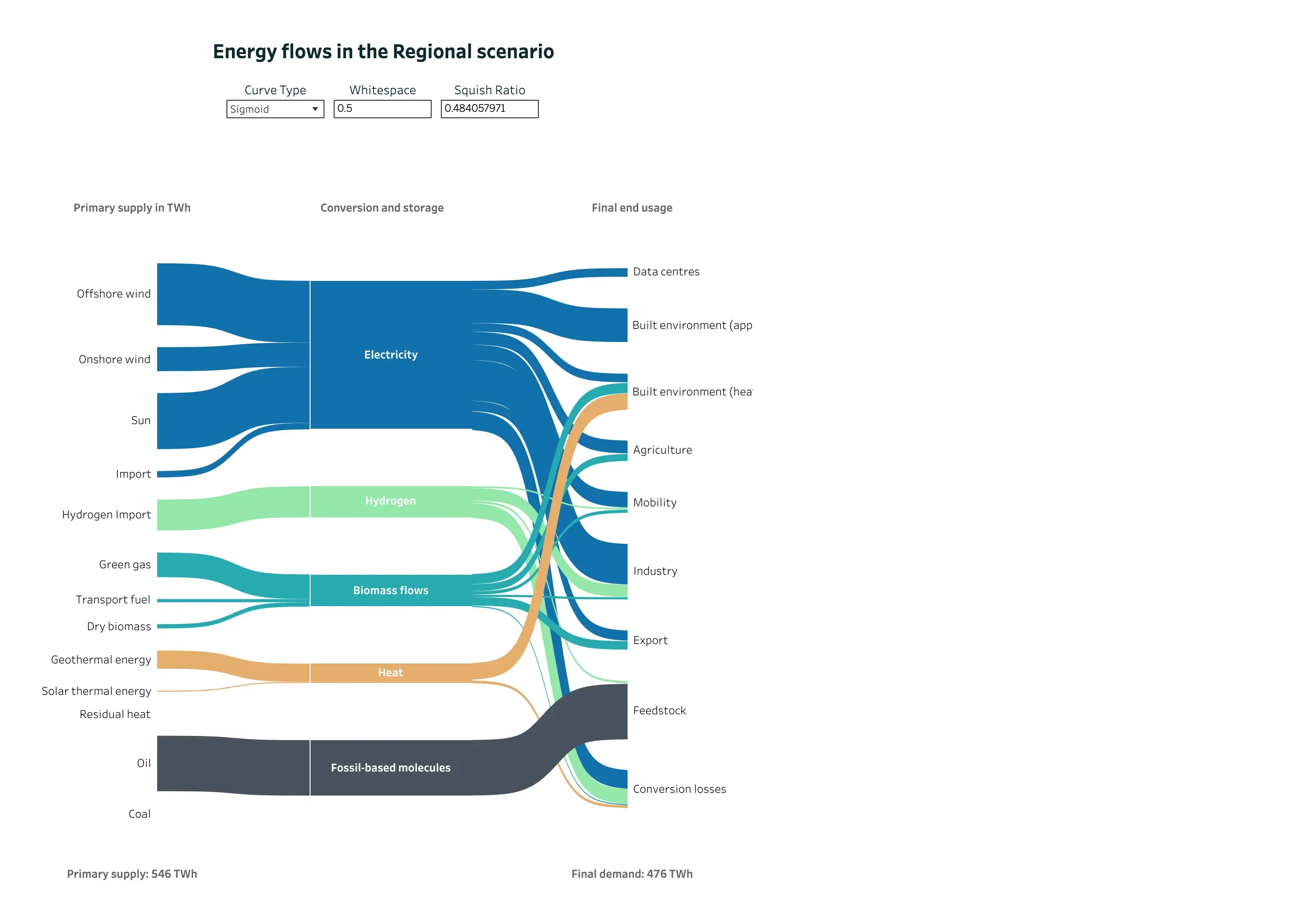
Energy flows in the Regional scenario September 11, 2026 Tableau Public embed view; workbook published by Chia Yu Lin medium · light · desktop-web
A Sankey doing the job it was invented for, published by an analyst rather than designed by Tableau. The entry argues that the form comes from engineering, where what enters a node leaves it, and that conservation is what makes band width readable as quantity—and that product analytics breaks it because people leave and nothing accounts for them. Here conservation holds and is stated: primary supply 546 TWh at the bottom left, final demand 476 TWh at the bottom right, and the missing 70 TWh has its own destination node called Conversion losses. Nothing disappears off the edge of the diagram. Colour is doing identity rather than status—blue for electricity, green for hydrogen, teal for biomass, orange for heat—and it stays consistent across all three columns, so a carrier can be traced from supply to end use without a legend. The one oddity is that the author has exposed the layout parameters as live controls, including a squish ratio printed to nine decimal places.
  • Sankey and path Three columns of nodes, link width as volume, and crossings kept to the few places where a carrier genuinely switches rank.
  • Sankey and path Conversion losses as an explicit destination. This is the node product analytics leaves out, and the reason its widths stop adding up.
  • Ratio and rate 546 TWh in, 476 TWh out, both stated. The diagram's own arithmetic is checkable from the page.
  • Categorical series palette Five carriers, five hues, held constant across every column so a band can be followed end to end.
  • Dashboard builder Curve type, whitespace and squish ratio exposed as reader-facing controls. The last one reads 0.484057971.
Show 4 more examples Hide the rest

Home Assistant

A card grid people genuinely rearrange, on a wall tablet, which is where resizable layouts either work or quietly stop describing the house.

Home Assistant — Demo dashboard
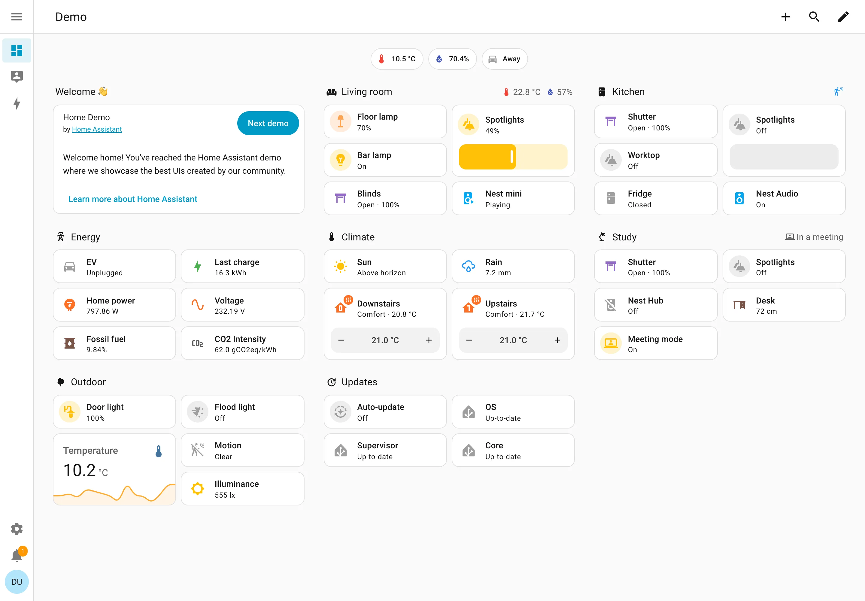
Resizable card grid. Cards a household arranges itself, grouped by room. Sections are one column each rather than a free canvas. Semantic grouping. Grouped by where the thing physically is, and the group header carries that room's temperature and humidity. Sidebar and canvas. Collapsed to icons by default, because on a wall tablet the canvas is worth more than the labels. Sparkline. One card carrying a number and the shape behind it, with no axis and no legend. Semantic status color. Amber means on, and the card says 49% anyway. Colour repeats the word instead of replacing it. Header KPI strip. Three chips above everything: outside temperature, humidity, and whether anyone is home. Dashboard builder. A pencil in the corner. Editing is one click from reading, which is why these pages actually get rearranged.
Demo dashboard September 10, 2026 Home Assistant public demo (signed out) medium · light · desktop-web
The grouping axis here is physical space—Living room, Kitchen, Study, Outdoor—which nothing else in this gallery uses, and it works for the same reason process mimics work: the viewer already holds the model. The thing worth stealing is the state labelling. Every entity says its state in words: Open · 100%, Off, Closed, Playing, Up-to-date, Unplugged. The amber tint on an icon repeats what the word already said rather than replacing it, so the page is readable with no colour at all. That isn't accessibility diligence so much as an audience constraint—you cannot train a household on a colour key the way you can train an on-call rota, so the words have to carry. Each section header also doubles as a summary: Living room reports 22.8°C and 57% humidity beside its own name, and Study reports "In a meeting". And this is a control surface as much as a display—the Spotlights card is a slider you drag, the thermostats have plus and minus.
  • Resizable card grid Cards a household arranges itself, grouped by room. Sections are one column each rather than a free canvas.
  • Semantic grouping Grouped by where the thing physically is, and the group header carries that room's temperature and humidity.
  • Semantic status color Amber means on, and the card says 49% anyway. Colour repeats the word instead of replacing it.
  • Header KPI strip Three chips above everything: outside temperature, humidity, and whether anyone is home.
  • Sidebar and canvas Collapsed to icons by default, because on a wall tablet the canvas is worth more than the labels.
  • Sparkline One card carrying a number and the shape behind it, with no axis and no legend.
  • Dashboard builder A pencil in the corner. Editing is one click from reading, which is why these pages actually get rearranged.

Honeycomb

Query-first; heatmaps and BubbleUp replace the dashboard-of-panels model with draw-a-region cross-filtering.

Honeycomb — Query / HEATMAP(duration_ms)
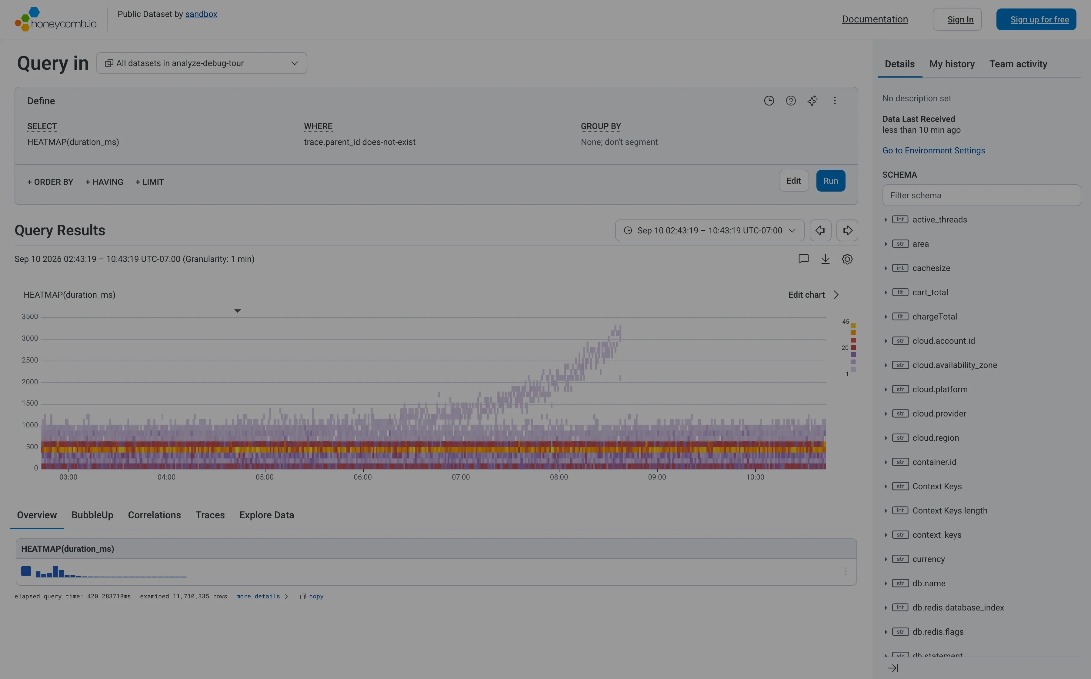
Heatmap. Linear y-axis, so the band holding most requests is six percent of the panel height and the empty top half gets the rest. Search across panels. The schema is the navigation, and it opens with a filter box rather than a tree you're expected to browse. Dashboard builder. No panel to configure—the query is the page. WHERE trace.parent_id does-not-exist is how you say root spans only. Tabs as genres. Five readings of one result: overview, BubbleUp, correlations, traces, raw. Each tab is a different question, not a different subject. Freshness indicator. When data last arrived, not when the page last ran. The one of the three ages that actually matters. Time-range picker. Absolute, with the granularity stated beside it, and arrows that step to the previous window rather than retyping it. Data source badge. Elapsed query time and 11,710,335 rows examined. The panel reporting its own cost and scope, which almost nothing else does.
Query / HEATMAP(duration_ms) September 10, 2026 Honeycomb sandbox, public dataset (signed out; no version string exposed) medium · light · desktop-web
My heatmap entry cites Honeycomb as the argument for log-scale y-buckets, so it's worth recording that this is Honeycomb's own sandbox rendering the same chart on a linear axis. The result is the failure the argument warns about: the ticks run 0 to 3500 evenly, the dense band where almost every request actually lives is squashed into the bottom sixth of the panel, and the top half is mostly empty. What survives anyway is the thing a percentile can't tell you. The solid band under a second doesn't move across the whole window, while from about 07:00 a separate purple tail climbs to 3000ms and keeps going. Two populations, one of them fine and one of them deteriorating. A p95 line over this data would have risen and said nothing about which. The other thing worth stealing: the footer reports elapsed query time and that it examined 11,710,335 rows, so the panel tells you what it cost and how much it looked at. Cookie banner and a no-signup onboarding modal were removed to take the shot; nothing of the product's own UI was.
  • Heatmap Linear y-axis, so the band holding most requests is six percent of the panel height and the empty top half gets the rest.
  • Dashboard builder No panel to configure—the query is the page. WHERE trace.parent_id does-not-exist is how you say root spans only.
  • Tabs as genres Five readings of one result: overview, BubbleUp, correlations, traces, raw. Each tab is a different question, not a different subject.
  • Search across panels The schema is the navigation, and it opens with a filter box rather than a tree you're expected to browse.
  • Time-range picker Absolute, with the granularity stated beside it, and arrows that step to the previous window rather than retyping it.
  • Data source badge Elapsed query time and 11,710,335 rows examined. The panel reporting its own cost and scope, which almost nothing else does.
  • Freshness indicator When data last arrived, not when the page last ran. The one of the three ages that actually matters.

Netdata

Per-second charts, hundreds per node, with a per-chart anomaly ribbon instead of a band on the series.

Netdata — Metrics / System
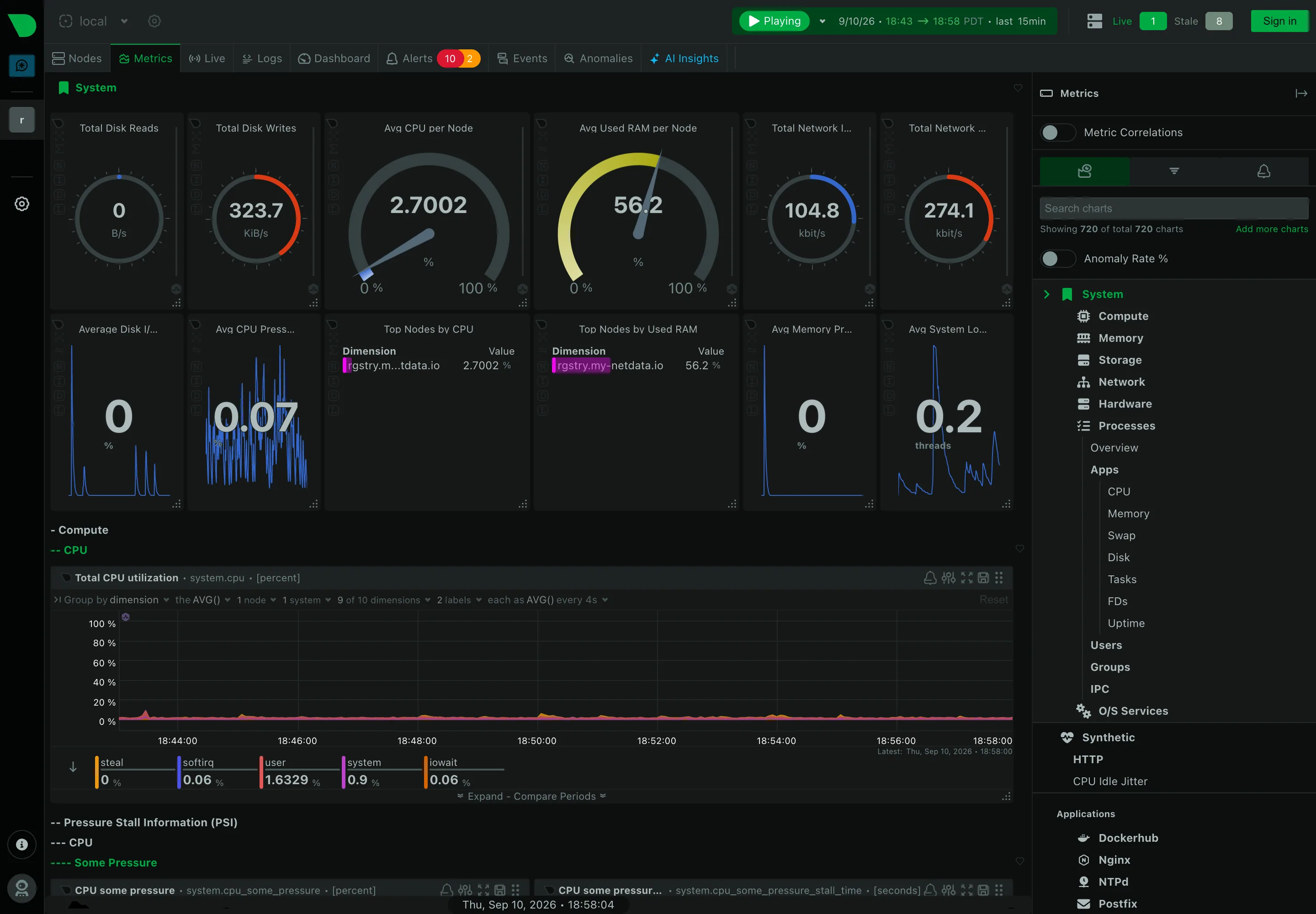
Header KPI strip. Twelve tiles in two rows, in four different layouts. It reads as twelve things rather than one strip. Sidebar and canvas. The rail is the dashboard. A generated tree of every metric family the agent found. Gauge and dial. Arcs for disk reads and writes, where the maximum is invented—this is a rate, not a capacity. Dashboard builder. A query builder inline in the panel header: group by, aggregation, node and dimension count. Search across panels. 720 charts, so search is the navigation and the tree is the filing system nobody browses. Semantic grouping. Sections generated by the collector rather than chosen. Consistent, and about nothing in particular. Compare periods. Offered per chart rather than per dashboard, which is the scoping trap: one panel shifted, the rest not. Freshness indicator. Live 1, Stale 8. Most products would have drawn all nine and said nothing.
Metrics / System September 10, 2026 Netdata Agent v2.10.0-686-nightly (public registry node, signed out) dense · dark · desktop-web
Structurally the opposite of Grafana, and worth the comparison. Nobody built this page. The right rail says "showing 720 of total 720 charts" and the tree beneath it—System, Compute, Memory, Storage, Network, Hardware, Processes, then Apps, Users, Groups, O/S Services, and every application it found—is generated from what the agent collects. The canvas is the same hierarchy rendered downward, four levels deep, headings prefixed with dashes: System, then Compute, then CPU, then the chart. There is no editorial layer at all, which means nothing is missing and nothing is prioritised. The header also does something most products won't: it reports "Live 1, Stale 8" beside the node count, so eight of the nine machines behind this view are not currently reporting and the page says so rather than drawing their last known values.
  • Sidebar and canvas The rail is the dashboard. A generated tree of every metric family the agent found.
  • Search across panels 720 charts, so search is the navigation and the tree is the filing system nobody browses.
  • Header KPI strip Twelve tiles in two rows, in four different layouts. It reads as twelve things rather than one strip.
  • Gauge and dial Arcs for disk reads and writes, where the maximum is invented—this is a rate, not a capacity.
  • Semantic grouping Sections generated by the collector rather than chosen. Consistent, and about nothing in particular.
  • Freshness indicator Live 1, Stale 8. Most products would have drawn all nine and said nothing.
  • Dashboard builder A query builder inline in the panel header: group by, aggregation, node and dimension count.
  • Compare periods Offered per chart rather than per dashboard, which is the scoping trap: one panel shifted, the rest not.
Metrics / System › Compute › CPU September 10, 2026 Netdata Agent (public registry node, signed out) dense · dark · desktop-web
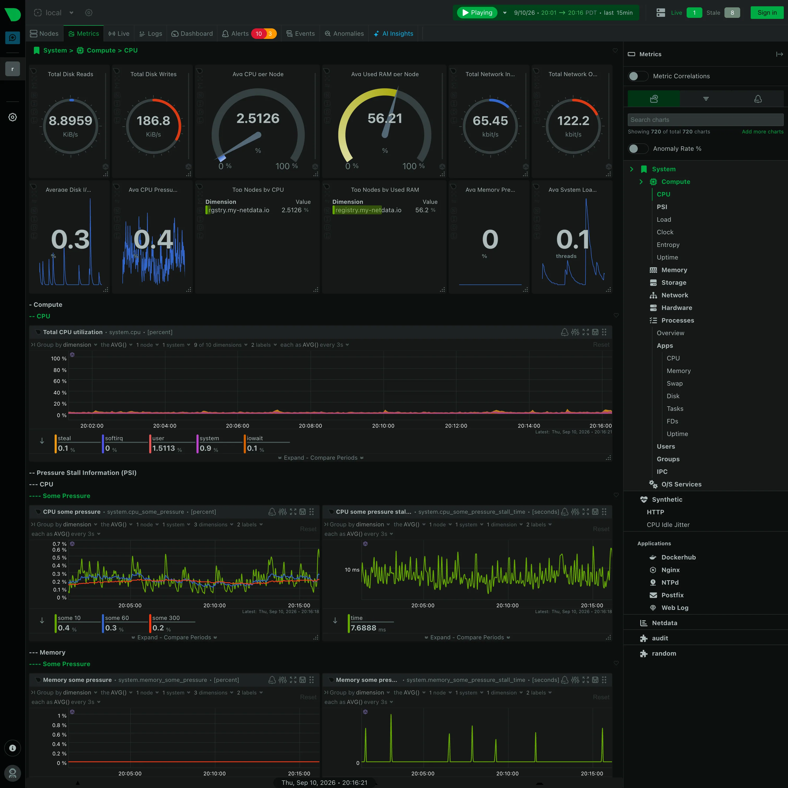
Further down the same generated page, and the section nesting is the thing to look at: "− Compute", then "−− CPU", then "−− Pressure Stall Information (PSI)", then "−−− CPU", then "−−−− Some Pressure". Four levels, each collapsible, each named by the collector rather than by a person, and the depth is signalled with leading dashes because there was no design pass to give them a hierarchy in type. It is consistent and completely unedited. Every chart also carries its own query builder in the header—group by, aggregation, node count, dimension count, sample interval—so a panel here is a live query you can re-scope in place rather than a saved configuration. Worth noting what is not in this shot: the sidebar has an Anomaly Rate toggle, switched off, and Netdata's answer to the anomaly problem is a separate derived rate per chart rather than a band drawn around the series. This capture shows the control, not the thing it draws.
  • Collapsible row Four levels of section, depth carried by leading dashes. Generated by the collector, and never edited.
  • Gauge and dial Six arcs. Two are percentages where the endpoints mean something; four are rates in KiB/s and kbit/s on an invented maximum.
  • Legend and series toggle The legend is a value table: steal 0.1, softirq 0, user 1.5113, system 0.9, iowait 0.1, each with its own bar.
  • Dashboard builder A query builder in every chart header, so the panel is a live query rather than a saved configuration.
  • Overview then detail System › Compute › CPU. The breadcrumb is the only thing telling you where in 720 charts you are.